


In the most recent issue of Inspirations Magazine (Issue #71), you’ll find an article by yours truly about finding inspiration from the past for needlework designs today. In the article, I highlighted sources for out-of-copyright needlework designs that can be adapted to all kinds of different embroidery techniques.
Besides designs from these old publications, I also like to glean ideas and inspiration from old pieces of needlework. One area of needlework where stitches, techniques, and materials are used in interesting combinations is old church embroidery. Whenever I get the opportunity (and have permission), I photograph old pieces of ecclesiastical embroidery, and often when I’m looking for ideas for materials, for interesting combinations of threads for certain effects, or for some kind of inspiration for a design, I’ll flip through my ever-growing collection of photos of church embroidery pieces. I also have a tendency to collect old worn out pieces of ecclesiastical needlework. Damaged beyond repair, they make a great learning tool.
Using an example from my collection of photos, I’ll show you what sparks my interest.
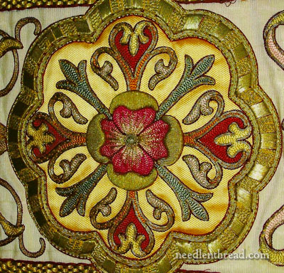
Here’s the overall piece. The colors – especially that background fabric – are somewhat bright, but the whole piece would have been even brighter when it was new, as the gold has tarnished considerably over the years. I’m not too wild over the colors, myself; it’s the stitchery that interests me the most.
The majority of silk embroidery in the piece is done in chain stitch. Whether or not this particular chain stitch is worked with a regular needle or a tambour needle is hard to say.
There are several types and treatments of gold metal threads in the piece.
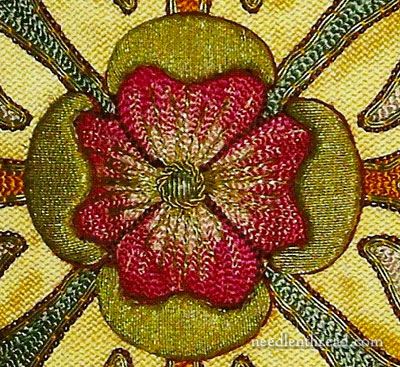
First, there’s this central flower. The very center is made of gold purl (or bullion), and around that is stitched more purl, in a technique called s-ing. S-ing is somewhat similar to working a stem stitch (only backwards) with chips of gold purl.
The colored parts of the petal are worked in chain stitch, in three colors – a darkish pink-red, a pink, and a goldish-yellow. The chain stitching is worked in lines straight up the petal, but following the contours on the outside walls of the petals. Over the petals, radiating from the middle, a metal thread is couched in lines. It looks like a very wiry check thread.
The outside “turn overs” on the petals are made from card that have been stitched over with a fine gold wire (like a passing thread, only a bit more wire-like). The gold wire is couched only along the outline of the card – the wire does not pass under the card, and there is no stitching on top of the card. A couching stitch is taken at the side, each time the wire is passed over the card and turned to pass over the card again. In this manner, the gold looks like a satin stitch. The surface is very smooth and is not broken up by any couching stitches. The card lifts the gold up above the rest of the design – it’s really quite thick (I’d say about 1/8″). Around the outside of the whole flower, a red outline is stitched in a fine stem stitch.
There are some strange colors used here, are there not? There’s the deep bright red, a bright yellow, a tannish color, and …. yes …. an old burnt orange. Well, I think they’re a bit strange, especially when you throw in the metallic blue-ish grey on the other part of the design. It seems to work overall for the style of the piece, I guess, but it still causes me to shake my head a bit and wonder.
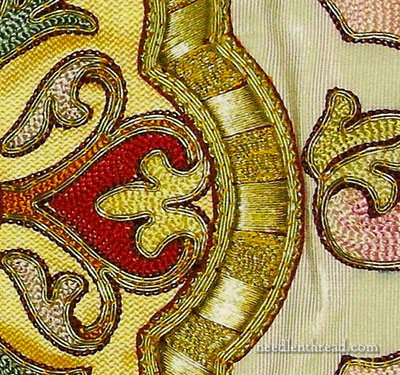
But it’s the gold here that caught my eye. Around the edge of the medallion, you see an edge treatment that, in some form or another, is pretty common on medallions like this on old vestments. The “rosette” that borders the design is made again from card (or board), about 1/8″ thick. In the same manner that the turn-overs on the flower petals were stitched, the board is covered with a gold wire, like a very smooth passing thread, and a crinkled wire, like a very fine check thread (or rococco), alternated in blocks. Outlining the gold-covered board on each side are two pairs of heavier passing thread. Outside the passing thread, you’ll find some pearl purl that’s been stretched quit a bit. At first, I thought this wavy thread might be rococco or even a larger check-type thread, but in fact, it is hard, like a wire. It’s not milliary wire (which could be used to achieve this look, too), because there’s no straight metal wire to which the wavy wire is attached. The pearl purl is couched in the valleys of the stretched coils. On the outside of the pearl purl, you can see a dark red line, which is a stem stitch outline in silk thread.
I like this edge treatment! I’d like to give it a try on something Very Small. On a large piece, I imagine it would take quite a bit of time to cover the scalloped rosette.
So if you were to see this piece of embroidery, what would catch your eye? Anything in particular? Do you like to look at old pieces of needlework for ideas for design and technique? What types of things do you look for in pieces like this, if you do? I’d love to hear your take! Leave a comment below, if you like – it could make for an interesting discussion!
Hi Mary,
I so appreciate your musings about this piece of ecclesiastical embroidery. I learn so much as you comment on each detail. I have often wanted to learn goldwork, have purchased books to teach myself, but it’s only with your recent project of the tudor rose that I thought I had enough direction to tackle it.
I have been fascinated all my life by fabrics, textile design and decoration. Your web site has furthered my knowledge and I so look forward to reading your newsletter everyday.
Now that I’m getting into goldwork and enjoying it so much, the inspiration of the old ecclesiastical pieces is very welcome. Thanks.
“I also have a tendency to collect old worn out pieces of ecclesiastical needlework. Damaged beyond repair. . .” This caught my attention in this morning’s blog. Just when do you decide any piece is beyond repair?
In my retirement I volunteer one day a week at church. I do clerical work, cleaning, fundraising, whatever needs to be done. One day I found a small cloth, approximately 36 inches square. It was covering a table at the side of the altar. The lace border was in tatters. I can’t fathom why an altar society member even put it out. I got permission to take it home to repair it. Forty hours later I’m still working on it. I retrospect I probably should not have considered it salvageable. How do you make those decisions? What criteria do you use?
Hi, all – thanks for your comments! I’ll try to answer some questions….
Kim – “damaged beyond repair” could mean a lot of things: something with the ground fabric in tatters or severely stained, mildewed, water damaged, or the embroidery threads worn away, or the gold damaged, embroidered elements missing (I see this in goldwork a lot – full leaves fallen off a design, for example), and so dark from tarnish that the piece is no longer attractive, or simply no longer serviceable for the altar. “Damaged beyond repair” can mean a lot of things, but it boils down to the fact that the piece can’t be salvaged in any way and reused. It’s always sad to see – especially when the problem arises from a lack of care – but I figure if the pieces aren’t usable for their intended purpose, at least they can be instructive if studied or taken apart.
Carrie – Where do I get my photos? Various church sacristies, in museums that feature church embroidery, in altar guilds and so forth – whenever I travel (and sometimes, I travel just for this purpose), I try to visit sacristies of churches, cathedrals, basilicas, etc., where they may have some vestments stored that are worth looking at. I normally contact the place ahead of time and tell them what I’m after. Several friends who do a lot of traveling keep an eye out for these kinds of things for me, too. And I have a few contacts who send me fragments (or whole pieces) of ecclesiastical work that’s no longer usable. This sort of “collecting” of church embroidery images has been a hobby for a good 20 years, since I took an art history course my first year in college. I’ve got thousands of photos, but not all of them are worth looking at to learn anything from. So that’s pretty much how it all started, and I’ve built and organized a collection of photos and pieces since then. I’m always interested in acquiring new images or worn out pieces! So if you know of any…..! 🙂
Cheers –
MC
Great article and review of an old piece. I’ve been trying to locate where to get a copy of Inspirations. Any suggestions?
Where do you get all of your photos of the old pieces? I’ve been searching the web, and have come across a few things, but nothing to compare with your photos, especially for ecclesiastical embroidery.
As a newbie at this, the old pieces help to identify design ideas, stitches and techniques. It takes a while and hours of looking at photos and then back through resources to figure things out. The most challenging part as an inexperienced embroiderer is knowing how and what to do to execute a beautiful piece.
Your site is a great help!
Now I have an excuse to stop by the needlework shop this week – I think they are the only ones who carry Inspirations here any more.
When I had the opportunity to go see the Czech kroje (not sure on the spelling) exhibit they had at the Cedar Rapids Czeck-Slovak Museum about 8? years ago, they used the padded simulated satin stitch with silver threads quite a bit on the head pieces. Those costumes are another wonderful bit of inspiration also. I should find my photos and look them over again.
Interesting question on the colors, there are so many reasons they could have been chosen – in fashion at the time, traditional for the region, looks good at a distance and/or under candle light, it’s what they had to work with, etc. It would be interesting to know why. I know you’ve had several items that up close I thought “?!?!?”, but it worked extremely well when seen from a distance.
If I find any photos of the kroje that are decent (I fear the camera at the time wasn’t the best and flash wasn’t allowed), would you be interested in them?
I love this kind of work,though it requires a tremendous amount of skill. I would love to do something like this with an on line tut but I don’see that haPPENING. i LOVE EVERYTHING ABOUT IT
Mary,
Your work is extraordinary. I never miss your posts and have read almost everything on your site. One day I may grow up in experience and be able to do needle work like you do. You are my inspiration.
Carol
Hi Mary,
I got the new Inspirations Issue 71 yesterday and sat down right away to read your “Inspired by the needle” article. Congratulations!
I, too, love to take photos of old embroidery pieces and always ask whenever there is something that catches my eye. My interest is domestic embroidery . More often than not, the guides as stately homes will let me photograph (without flash of course) needlework when they sense how excited I am to see it. Usually their visitors are impressed or awed by collections but rarely are people excited by something they see. I think our enthusiasm is infectious and the guides or curators love to share their passion with someone.
I recently was allowed to take some photos of a bed hanging in a stately home in England and my camera settings weren’t quite right. The photos looked awful when I first previewed them but with the magic of Photoshop they turned out pretty well. They will provide inspiration for upcoming projects as well as happy memories of a great visit.
Whenever we travel, I always check out where they might be any kind of textile collection since I never know what I might find.
You’re right about the past providing resources for our designs today. I just found a new (to me) web site called Baroque Embellishments and the author references the Folger Shakespeare Library in Washington DC’s online collection of books. Specifically she provided a link to the Commonplace Book by Thomas Trevalian published in 1608 which has a number of pages of embroidery designs.
http://luna.folger.edu/luna/servlet/view/search?sort=Call_Number%2CAuthor%2CCD_Title%2CImprint&search=Search&q=trevelyon&QuickSearchA=QuickSearchA&os=300
Isn’t the internet wonderful?!
Liebe Grusse,
Kathy
Hi Mary, thank you again for another wonderful post. I am particularly intrigued by the use of cardboard under gold thread. I had always wondered how gold wire could be used without the couching threads breaking up the smooth surface of the worked area.
I noticed the general dullness of the piece, probably because of the tarnished gold as you mentioned. The flower petals had few color/gradation changes which made it look very flat and stiff.
I was surprised to the striped border, and really like the idea of doing that.
I love to look at antique ecclesiastical artwork of all types. Partly, I enjoy how the colors have changed over time and how the churches use different colors to announce the different seasons of the church year or occasions in the church. The color choices have meaning in the ecclesiastical community from which they are taken and need to be understood from the context they are used and borrowed to get the full meaning behind them. For example, red is the color of the Holy Spirit as well as the color of blood and matyrdom. Royal Blue has now replaced Royal purple as the color for the season of Advent in some churches to set it apart from the season of Lent. And my favorite rose pink is the color of joy as well as the color used during Lent to mark the light coming into the world and the easing of the rules of the season as we draw ever closer to Christmas and Easter. Third week of Advent and Lent are both Rose colored in the ancient church. Black is the traditional color for Good Friday and Ash Wednesday. While many rules have changed and ideologies challenged, the liturgical colors still have meaning in our traditional liturgical churches and it is considered wrong to request specific colors for weddings or private ceremonies.
G’day there, Mary,
It’s usually design and/or colour that attracts me initially. If the attraction is strong enough then I zoom in further and take an interest in the stitches. With this piece it’s the graphics first then the lovely old world charm of the colours. The colours are kind of like a reflection in a slightly discoloured pool or puddle. The sheen and shine is like the sun hitting different angles of the breeze-disturbed surface of the water. I like it.
Cheers, Kath.
Mary,
Thanks so much for sharing how your collection started. While I don’t have any personal photos or old pieces yet, I’ve complied some ecclesiastical embroidery “favorites” on flickr. I’m not sure if the link will work, but here it is. http://www.flickr.com/photos/64398055@N08/favorites/
Thanks again,
Carrie
Thanks as always Mary, not only for showing and telling about something so interesting but for stimulating such comments from others. Debbie’s comment about when and why different colours are used in church brought to mind the time long ago when I was getting married. The date was set before I thought about the church calender and by the time I realised that it would still be in that endless phase of “xth Sunday after Trinity” when the vestments and hanging were all green it was too late to change. However on the 30th November when I walked into the church on my father’s arm I noted at once that everything was red! It wasn’t until we were in the vestry signing that the priest said to me that it so happened that this day is St Andrew’s day and saints’ days were decked out in red. In retrospect I guess it was one of those trivial things that really don’t matter but somehow I did not want the green. And if we had waited a week all would have been white for Advent.