


Last year, I visited San Carlos Borromeo Mission in Carmel, California, and while there, I had permission to take photos of the vestments in their museum. I wrote a brief comparison of two sets of vestments, one from the museum in Carmel (this Salvator Mundi set) and the Splendor Patris set at the vestment museum in Clyde, Missouri, because the faces in the two sets struck me as similar.
I thought I’d show you two motifs from the Salvator Mundi set – one of which I plan to use as a springboard for another embroidery project.
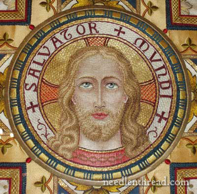
This is the main image on the back of the chasuble. It is Christ, Saviour of the World. For the color scheme in which the vestment is embroidered, I find the face and hair somewhat muted. It surprises me every time I see it. I like the treatment of the image, but I am surprised that the hair is not somewhat darker. Still, the colors and embroidery all seem to blend together so well, that I think it’s a very artistic rendition of the image (much more so than the similar vestment in the Clyde museum, which I don’t think is rendered quite as artistically).
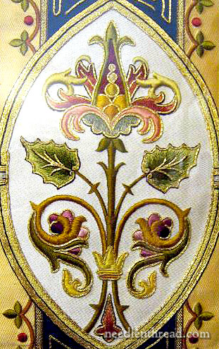
The set is embroidered in a color scheme that’s pretty nice – I like the muted reds, corals, blues, greens and golds. This is the motif I’d like to replicate in part, and then work up a variation. I think it would make an good study in silk embroidery, with a touch of gold – and a great piece for satin stitch!
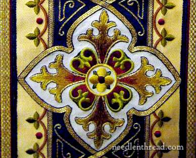
This little inset cross is also nice – it’s what I call a “typical” vestment cross. You find similar styled crosses as insets on vestments from the 1800’s (and perhaps earlier) through the mid 1900’s on vestments from all over the world. They don’t always have the same color scheme, maybe the decoration around the cross is slightly different, but the way it’s inset into the embroidery design down the back of the chasuble is fairly common. I like the treatment – I like the way the gold border surrounds the motif, and I think the colors on the arms of the cross are quite fine. Notice the black line on the very outside of the cross and around the gold that outlines the cross motif. This tiny line of dark is so important on ecclesiastical work. Because the items were made to be seen from afar, the tiny dark line really makes the elements stand out.
It’s a nice set of vestments. What I really like is the color scheme and that larger motif above. It reminds me of the elements on the silk stole I embroidered years ago, only they seem dull in comparison. The deeper colors of this motif above, and the use of gold to outline, make it rich.
So what do you think? Do you think this motif (the middle picture in the post here) would make a good study in silk work and satin stitch? Do you like it? Or no? If not, what don’t you like about it? I’m just polling about for opinions here! Input is always much appreciated! Feel free to leave a comment, if you have any suggestions, ideas, opinion, and so forth! I’m all ears!
I think the middle picture would indeed make a good project. I hope you might consider making it an online teaching pattern!
I love the combination of the Gold and the silk and as you have already mentioned the colours are gorgeous. More than anything I love the background information that you have included.
Absolutely gorgeous!!!!
The second picture would be more effective with the shading of the third? The color changes are too abrupt for me.
So many similarities between the two versions of Christ. The second artistic version lost the attention to circle of cheekbones-eyes-and forehead that created an other-worldliness. Almost like an icon.
As soon as I saw the middle photo, before I read the text, I thought what a lovely embroidery project this is. I love it! the leaves seem large to me, I would consider making them smaller and putting two on each side, but other than that, it’s absolutely beautiful and would look wonderful in silk and satin stitch.
We really need to drive up the coast (I do it every 4 years or so) and see that mission and the museum.
I especially love the cross inset and the way the colors blend into each other from gold to red and red to gold. I didn’t realize until you pointed it out that the black stitching really sharpens the image.
On another note: I finished my pall and took it to church last night. I kind of snuck it in as I was changing the linens. I’m happy with the embroidery but had a devil of a time attaching lace. I’ve ordered the appropriate linen from Hedgehog for another try but would like to find a way to finish the edge that does not involve lace. Your post about stem stitch points was especially helpful to me. Thanks very much.
Breathtaking!! How is it humanly possible to create something so exquisite?
I love love love that middle motif. It is just lovely, the design, the choice of colors, the stitching, all of it. It would make a wonderful inspiration for similar pieces.
Love it. Thanks for showing it.
I don`t know about the middle motif; i ammuch more drawn to the vestment cross (nice photography BTW)
Can`t see my stitching being quite so refined (I tend to be impatient) but it’s something to aspire to!
Hi Mary,
Another great post! Thank you for sharing all your background and history of the two pieces.
I think that drawing/embroidering the human face with any meaningful translation of expression and to have it look just right without turning into a caricature is HARD. I’ve been stumped for years on this particular aspect with my own projects and so I keep watching and hoping to learn how to do this.
I’m always fascinated whenever you touch upon faces in your embroidery. I read with great interest your September 21st, 2008 post, and your July 11, 2010 post. At some point, you’d mentioned a large project that you were thinking about doing. I’ve been keeping my fingers that it was going to be a large ecclesiastical piece with a face so that I could see how you tackled it. Does this mean you’re going to go for it? Oh, be still my heart!
Well, rereading your post, maybe not, since your focus is on the middle picture. I love the color choices. But I’m partial to fall colors, and these happen to be a lovely selection of greens, rusts, and gold with enough pink and blue to not scream “Autumn”.
The gold isn’t overwhelming. I agree the small black line does a great job of making the overall design pop out against the white background. For some reason, it reminds me of Jane Nicolas’s newest book on persian tiles. Perhaps it’s the graphic design against the white background with the goldwork…
This seems like it would be a great study for silk and satin stitching.
PS: I really like the face of Christ in the Carmel vestment. There is a slight upturn in the mouth that makes the face look more loving and less stern than in the Clyde, Missouri face. It’s one of the subtle details that sets the two apart.
The middle picture would definitely be a challenge for us novice. Lots of curves to agonize on …lead on teacher.
Good day Mary
I second Judi Burks’ post. I would love to stitch along with you on this.
Good morning, everyone! Thanks so much for all your comments on this post, and your valuable input!
I’m not quite sure if this would be an online piece, or if I would put it together for a “real life” class. Yeeeeks. Well, eventually, it would probably end up an online piece!
Yes, I agree about the circles in the middle of the top thing, and I’d adjust the leaves, too. Great minds think alike!
Here’s the link to the whole stole picture: https://needlenthread.wpengine.com/2006/10/silk-on-silk-satin-stitch-complete.html It wasn’t steamed out yet – that’s right after coming off the scroll frame.
Well, you’ve all inspired me to Get Busy! Unfortunately, at 5:24 a.m., my mind is saying one thing…. and my body is saying something about returning to bed!
~MC
Hi Mary,
I am thrilled with your website – I have told my mom about it and showed my husband the website and my husband agrees neither of us have ever seen anything that rivals your website! It is absolutely splendid AND watching your video made all the difference on my satin stitch. I ripped it out three times but now I have a finished product I can live with (on a pillow case that I made from heavy linen). So – Thank you!
The silk stole you made is marvelous – you remarked that the colors seem too abrupt in some cases. I think they are beautiful. I have a book that my mom gave me from the fifties written by Mary Martin – she was a huge embroidery and needle point devotee and she includes her work in this book and some of it is pretty fantastic. I will work on figuring out how to send you some photos if you like.
Sincerely,
Peggy Horn
Mary, I knew you would pick something good for your next project, and this is REALLY good! I look forward to following the steps you will take as you work through the motif. I am curious: when you select fibers for this kind of project, do you like to first choose the gold threads or the silk thread colors instead?
Given I gasped when I saw it, I think it’d be wonderful to do in silk and gold.
I’d loose the circles in the top ‘flower’ and make it’s leaves in colours that are a bit less “clowny”.
Also notice some heavy padding in there.
I’m in love!
I love the Ecclesiastical Embroidery you show us. It would be a challenge ,but I`m up for it!I have to dip my toe into the water with Ecclesiastical Embroidery some time and I do like all three pieces.The are an interesting study in colors, shading,and light. Will you make this an online study? I d hope so.
Karole
Short answer: Yes, do it!
I just recently saw this piece in person and it was my favourite of the vestments that were on display. I, too, love the colour scheme. There’s something about the dark blue that pleases my eye. I think that both of the elements you show in the post would make lovely embroidery designs.
I looked at the images and thought “Hey, that looks familiar”…I tried to take photos of this very chasuble in June on a visit to Carmel. Mine didn’t come out so nice. I really like the color scheme and design–I’d like to give that middle motif a try someday. I don’t actually know anything about ecclesiastical embroidery though (the Catholics have all the fun!), so I can’t speak to that. 🙂
Hi Mary. I just love, love, love the colors on the second photo. The beautiful violets and roses, pinks, robins-egg blue and the greens you would see in nature. I love delicate shading. It is is bright and rich and delicate at the same time and very eye-catching. I kept looking at it because there seemed to be so much to see. However, I really do not like the third one. It assults my senses – it’s “in your face!” I don’t like the vivid (almost violent) maroons, acid yellows and deep blues of the third picture. There’s nothing comforting or natural there, and it makes me not want to look at it and study it after looking at it for a moment. The center picture is reverent and kindly at the same time. It makes me think of how I picture Jesus; gentle and loving.
It would be a lovely piece – especially the bottom half of the design, which I think could easily stand alone.
I really liked both the second and third embroideries and it reminds me a lot of those that Coleen Goy at Roseworks in SA designs. The colours are beautiful and it would make a fab project to do on line – hint hint!! I have great difficulty getting help here on the Isle of Man and so I greatly appreciate your daily newsletters which are really insprirational.
Mary, what fabulous work, thank you for showing it.
I think the smaller cross motif would be a wonderful exercise in silk and satin stitch, but the other would make an excellent Jacobean or crewel work design. I would love to see what you do with them.
They’re all exquisite examples of embroidery. I like the middle motif; it certainly would make a great silk study. However, I must admit I’m partial to the third motif- the colors and composition are very striking. If someone wanted a non-religious motif, the arms of the cross could easily be changed to four fleur-de-lis. Thank you for more beautiful examples to get the creative juices flowing (as if I didn’t already have enough works -in-progress:)
Dear Maria,
Congratulations for your work. Wonderful. I admire you and your performance. I would like ask you about the various techniques to do this embroidery. I’m not sure what kind of linen and material may I use.
Thank you for all free patterns.
Kisses,
Leny
I love this motif. It is so very intricate, it seems like a big undertaking, but looking at the other things you’ve done, it seems you’re just the one to do it! What will you do with it? Will it become part of an actual vestment, or is it something you will do for your own collection?
I think the colors are gorgeous, but I sometimes think I would need a graphics program to play around with color to be able to visualize what specific changes do the effect of the overall impact. I do love coral, and greens. I’d like to see more shading in the corals. But seriously, I really don’t know what I’m talking about..:)
WOW! I can’t wait to see what you do with this. It is so beautiful!!
Mary, I think the middle vestment would be a marvelous piece to work on and would love to see your rendition in silks. I so admire all of the work and explanations that you put into your works of art. I want to do something special for our church in memory and would love to know more about covers for ashes.
Unlike the casket covers they now lay a handkerchief sized linen in white on the little urns and boxes and would love to have more input on what to do and how to design a cover for the one in our catholic church.
I love the middle vestment piece too. I would do that, or at least put it in the rota!
I rather liked the colors and design of the silk stole you did earlier–my colours, I guess.
We use the same white linen on urns with cremains in the Episcopal Church and I would love to make some. Okay, one and then maybe another.