


Art museums always fascinate me. My favorite part of any art museum is the galleries of paintings. Oh, sure, it’s nice to see artifacts and sculpture and so forth, but I really love looking at paintings. One thing I always look for in paintings is textiles. To me, there’s nothing more amazing than an artist’s rendition of embroidered clothing, fine lace, and so forth.
Often, when I’m squizzing around the internet looking for inspiration, I end up in online art galleries. Besides making note of art that features textiles, I find myself looking at color palettes. Looking at the colors that the masters have used in their work can be an interesting lesson in color, and with technology today, it’s pretty easy to extract color palettes from an image.
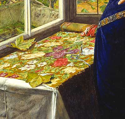
Take, for example, the above image. I like the colors. They remind me of late summer moving into autumn.
Now, let’s move over to a color palette generator and have some fun. For this exercise, I’m using DeGraeve’s color palette generator.
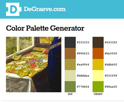
Two options pop up – dull and vibrant. I prefer the vibrant. Unfortunately, the generator doesn’t pick up what I would call the “poisons” in the image – the blue in the gown or the purple on the tapestry. Still, it’s interesting to see (in solid color form) what colors it does pick up, and to see how those colors work together.
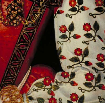
Here’s another one – looks like a pretty basic color set. (I love, love, love the sleeves in this portrait!)
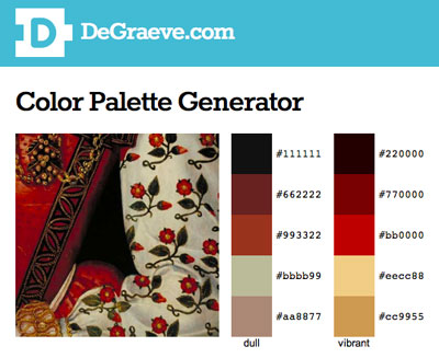
And again, I like the vibrant option that was picked up by the generator. It kind of reminds me of something I’ve seen before….
So if you’re looking around for color ideas for a project, consider taking a look at art galleries and color palette generators. I reckon that the master painters really knew something about color, so I don’t mind taking a light lesson from them when I need some ideas!
There are other color palette generators online that can be fun to play with. Just google “color palette generator” and you’ll come up with plenty with which to wile away your Saturday!
Have a great weekend!
Since I have no sense when it comes to color combos I tend to rely on others. With quilting I can get a print and pick colors from that. With needlework I just look at nature. There are some odd colors combos in flowers that seem to work out just fine. My favorite is the Stargazer Lily with the deep magenta, pinks, white and an almost lime green. I would never have thought of that one. LOL
I enjoyed your fun and informative blog post today. Thanks for sharing the color generator with us!
Merci Mary.
Un “Color palette generators” sera très utile dans ma broderie. Je ne suis pas habile à trouver les bons tons. Je n’ose pas assez.
Thank you Mary. You are my COLORS every day. Louise Québec
Thank you for this great tip! I had no idea this technology existed and it will come in handy. I struggle with color combinations in designs and choosing the “right” shade combinations is an ongoing challenge for me.
By the way, Mary, would you consider doing some posts (or a post) on “how to successfully select/determine colors for designs” that might include a combination of examples, and print or electronic references, etc.?
-Sharon in France
Mary, I knew NOTHING about these color palette generators. This is all very interesting! Thank you!
Wow! That is a really GREAT tool. I had *no* idea this was available. Thank you, thank you, thank you. 🙂
This is amazing – What an excellent tool! I can think of dozens of uses for this – thanks so much for posting this
Très sympa votre site, merci pour l’idée du “générateur de couleurs” j’ai testé et cela me paraît utile, de plus je peux gagner du temps dans le choix de mes couleurs…
Vive la broderie et les brodeuses !
amicalement.
Françoise.
What a great way to figure out “what color is that?”
Thanks. I tried it out with some photos of flower and was surprised at how they came out, especially contrasting and accent colors.You are a great teacher.
Wow!!! I had no idea that a “color palette generator” existed!! Very, very cool…I love it and look forward to playing with it!
Do keep in mind, though, that the purples and blues are what often makes an object in a painting look round, or have dimension.
Because these colors are normally painted very, very transparently on the shaded side of an object in a painting, I can see how it could look jarring when seen in the pallete generator. The tricky part is finding the right purple or blue.
Carolyn in SoCal
I should have added in my previous comments that a really good example of adding these “dusty” blues and purples to dimentional objects in a painting is to look at a cluster of grapes or berries.
Carolyn in SoCal
Wow! I’ve never heard of online color pallette generators – this is great! Not only will I have fun with it, but I’ll show them to our school’s art teacher – he will think they are great! Thanks, Mary!
Hi Mary,
Colour must be in the air! I was just scanning in a set of my over-dyed tapestry yarn in browns, greens, yellows and oranges. Then I open the scan in an image editor (gimp, in my case), convert the image to “indexed” colour palette and save the palette.
The point of all of the above is that I can take any image, convert it to “indexed” palette and then easily map one of my yarn palettes on to it. Or, I can take any line-drawing and colour it in with my personal colours. It makes deciding which colours to use much easier!
Cheers,
Jen
Mary, thanks so much for the link to the color palette generator!! I had no idea such a thing existed and just use the Color Picker in Photoshop to find one color, but never thought of an entire palette. What a great idea. I will play indeed, and not just on Saturday!
Blessings to you,
Laurie
Hi Mary, thanks for your very informative post today, but could you tell me why you refer to blues & purples in the first image as being ‘poisons’?
Oh, I’m not sure about the second image, but I think I recognise the first image as it is a favourite of mine.
Regards,
Marian
Hi, Marian – Well, because they’re not what you expect – colors thrown into the mix, that seem surprising, but that somehow ‘work’. ~MC
G’day there Mary, My heart skipped a beat when I saw that first painting. (I’m on medication for the inconsistent heart beat but inspiration like this overrides medical intervention!)
Please, can you tell me where to find that painting on the net.
I’m a drapery fan. Love it in artworks of any kind incl photography. I’ve made a number of artworks concentrating on fabric. My favourite is of 11 glass heads, in 3 rows, I draped in various fabrics from a striped teatowel to embroidered fabric. I strategically tied the fabric covered heads in various ribbon and narrow strips of fabric etc, to accentuate the facial shapes. I did both pastel and oil paintings and titled the main one “Wrapped Audience”!
And yes, that Colour Palette Generator is of great interest. Thanks for the beaut info on that.
Cheers, Kath
Thank you for useful link. It work the best about live color images.
I posted on my blog, the goldwork sampler from “Beginner’s guide to goldwork”. I used metallised threads, DMC mouline and sewing threads – polyamid silk.
You could also convert the HEX values (e.g. cc9955) to RGB with your imaging software (I use the Gimp) or here:
http://easycalculation.com/rgb-coder.php
and then enter the RGB values (e.g.204,153,85) here:
http://mortal_elf.tripod.com/automagic.htm
and it will come up with the corresponding DMC thread numbers (the latter might not always work; you may need to up the variance – in the example the variance was 12).
groeten, Saskia
Dear Mary
Thanks so much for this tip I will certainly play around with this idea and what a good one, I never knew you could this!
Regards Anita Simmance
I’m so sorry, I gave the wrong link above. The page for convertering HEX code to RGB is:
http://easycalculation.com/color-coder.php
Again, my apologies.
Saskia
P.S. It is a painting isn’t it?? Sorry about the previous rave on of my art. I really would love to look that picture up, painting or otherwise.
Cheers, Kath
Hi, Kathy – I think the painting is in the Tate gallery. Can’t remember the name off the top of my head. “Marian”, maybe? It’s a pre-Raphaelite…
MC
G’day Mary, Thanks just so very, very much for that info.
It’s “Mariana” by Sir John Evertt Millais, 1851, and it’s wonderful. The story of it is interesting and as melancholy as she looks. The embroidery and leaves are symbols of the passing of time. She couldn’t marry her betrothed because her dowery was lost in a shipwreck! I think Shakespear was mentioned.
Thank you again, Cheers, Kath
That’s it! Thanks, Kath!