


Remember last week when we discussed color choices and stitches for embroidery?
Today, I want to mention another point about color choices for embroidery projects, and it is this: the colors you choose, even if you like them (but especially if you don’t), can make your embroidery project a misery to work on.
There can be a number of reasons for this – sometimes they can be emotional or psychological. But one reason is more objective – it is a physical reason. It has to do with the eyes.
While the eye can see some seven million colors, there are certain colors and color combinations that can irritate the eyes, tire them out, even cause headaches and make the eyes go all squiggly-wonko.
So sometimes, when we combine certain colors in embroidery, our poor eyes end up strained and fatigued.
And while we might like the color combination – or we might think the color combination is fun and exciting – actually embroidering the color combination may be a different story.
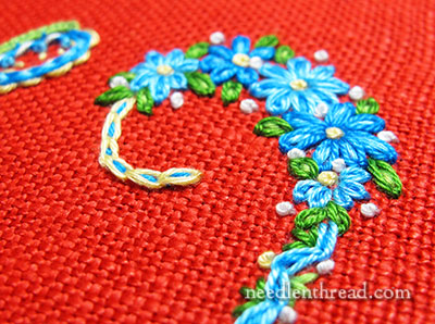
Working on an intense red background (this isn’t an orange-red – it’s a true red-red) with blues, greens and yellows that are also intense is an example of color choices that can weary the eyes while working with them.
Color choices like this can “trick” the eyes. When we focus for a while on a particularly intense color especially under the bright lights of a needlework lamp (or in the bright sunlight), the muscles in the eyes get tired. All the thousands of little “color decoder cones” in the eye that decode that particular color become fatigued, and to make up for the fatigue, all the other color-decoding cones for opposing colors get busy, decoding.
What happens? When you look away from the color, or move your focus slightly away from the color, you’ll see “ghost colors” or an after image in an opposing color to the color you were looking at.
These after images – which can look like a shadow or a different color altogether – can be irritating when you’re concentrating closely on a piece of embroidery.
Bright yellow is said to be the worst offender when it comes to eye fatigue. Bright colors reflect more light and overstimulate the eyes, irritating them (and usually irritating the person they belong to!).
So while a little splash of sunny yellow is a good thing and a very cheery thing, when considering colors (when it comes, for example, to decorating your house), “they say” (I don’t have a reference, because this is coming from memory, but I think it’s a well known point) that people are more likely to be irritated, angry, or frustrated in a bright yellow room. That’s why a conscientious teacher, for example, would never paint an entire classroom – or even a good portion of a classroom – yellow.
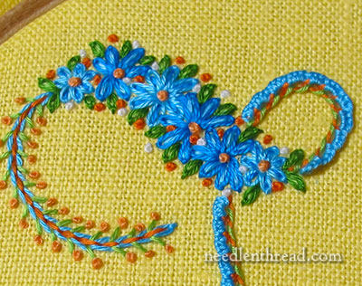
The sunshine yellow linen in the photo above, worked essentially with the same color scheme as the embroidery on the red linen, is not as difficult to work on as the red. That’s because there’s more of a contrast between the yellow and the embroidery on it than there is on the red piece. So, on the yellow linen, it’s easier to see the embroidery while it’s underway.
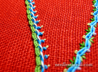
Still, stark contrasts can also play tricks on the eyes when you focus on them for too long.
If you’re working on a bright colored fabric that is already fatiguing to the eye, and you introduce bright contrasting colors that you have to focus on intensely while stitching, you may find when you move your eyes that you get a negative ghost image or after image on your fabric. Again, this can be really annoying while you’re stitching!
Color choices for embroidery are often a personal, subjective consideration (as evidenced in the comments on last week’s article on color choices for embroidery), but you can see that there are some points that are objective about color choice, too.
The moral of the story: if you’re launching into a Big Project, take pity on your eyes and choose your colors wisely!
But whether you are working on a project large or small, with vivid colors or not, one good habit to develop while stitching is to take an “eye break” every couple minutes – glance away from your embroidery and focus on something more distant. This will keep your most precious tools (your eyes) from over-fatiguing themselves.
Any eye tips to share? Feel free to have your say below!
Hi Mary,
A few years ago I was embroidering a motif on really bright, electric blue silk, with a deadline. In order to be able to keep working I taped some amber coloured theatrical lighting gel over a light and shone it on the fabric. It “killed” the blue enough to be able to work on it for as long as I needed and could be turned off to double-check the overall colour scheme. The same thing could be done with a gel the opposite colour of whatever bright thread or fabric one was using. CAUTION, however; use only theatrical lighting gel, which is meant to withstand the high temperature of being close to a light source, not just any old clear tinted plastic which could constitute a real fire hazard. Sheets of gel can be ordered on line, or if you are near a large city, usually can be bought at theatrical supply stores.
Great idea! I bet that in a pinch using a red headlamp would work too. Many of the headlamps sold for camping have, in addition to the usual white light, an option to use a dark red lamp. The red turns everything one color, it might work to ease eyestrain from the contrasting colors. Not as good as the gel idea, but it might work when all else failed.
Mary D’s idea is brilliant and I’d never have thought of it! A simple idea if you’re working on canvas, Aida or anything else with holes is to lay a cloth on your lap in a contrasting colour to the canvas so that you can see the holes more easily.
This is what I thought. I posted a genuine response rather than ‘lovely, stunning.. and the like.
Thank you so much Mary, for articulating maybe more than just accentuating colors.
best regards. Chandra _ Leigh
Interesting, thanks.
Dear Mary
I never knew that the eye can see so many colours. I agree that embroidering on the bright coloured fabrics as you show in the photos above, can fatigue the eyes and can make them squiggly-wonko. I must remember to have a break every few minutes while embroidering especially as I use a magnified lamp although once I am engrossed in sewing I forget everything else. I never knew that about yellow I love yellow I used to have a room partly decorated in yellow. Thanks for a great read and your advice on how to preserve our eyes.
Regards Anita Simmance
Many years ago, before desktop PCs were the norm, I had an electronic typewriter at work with a single line of text displayed on an LED display. It was green, and I stared at it so much, as a secretary, that I always had an orange after image from it. I found over time it took three days for the effect to disappear. It only happened when I was on vacation; a weekend wasn’t long enough. I would see the odd coloration when I looked at anything white or light colored; nothing was ever truly white. It was as if I were wearing tinted glasses. I tried to explain this to others, but they laughed it off. It’s interesting to me to read your post explaining all this. I never knew a yellow room would affect your mood. Wow. I had a yellow room for years when I was growing up.
Hello all,
One thing I learned early in my stitching is not only the corelation between thread and material, but also the influence that surrounding colours can have. My first apartment had an orange and red shag carpet-(an indication of my age). I,unconsciously, chose colours with that influence in my perifery and wondered why the finished embroidery did not work in another setting. So, light and the colours of walls and floors may influence you negatively if they are not neutral.
One of the projects my eyes found the most difficult was fine counted cross stitch on navy blue fabric. Not something I would have chosen myself but a friend asked me to do it for a fund raiser and it was very challenging particularly at night. I’ve also found as I’ve gotten older that I don’t see color at night (and under artificial light) the same way as I do during the daylight. I avoid making color selections at night.
Cataracts, as we age, affect seeing color. I stitched a strand of pink into a solid red area and didn’t “see” it until after corrective cataract surgery. And I thought it was only glare at night that was bothering me! Other friends have said they, too, had difficulty recognizing colors while stitiching before they had cataract surgery. They realized their problem, I didn’t. This is one area of aging that can be corrected with great success, thus adding many more “stitching years”.
Hi Mary
Having breaks is a great thing for tired eyes, looking into the distance is also good as we spend so much time either looking at embroidery, computer screens and TV screens, all short distance. If you can’t go outside and look into the distance, close your eyes and imagine a long rolling lush green meadow, fields of waving grain works as well.
On another subject I just loved the tale of the “Squirrel Who Wasn’t” you are so clever, in so many ways, love the term squiggly wonko
Regards
Sandy Sthn Highlands Australia
I have a yellow bedroom and I love it. Of course I don’t spend much time there unless I’m sleeping!
What a great topic to discuss. I have noticed the imaging at times when working on needlework or other types of projects dealing with colors. I truly had never thought too much about it but I realize now that I would subconsciously adjust where or how I would sit to change the way the light would reflect off of my work.
I love the idea of the theatrical lighting gel that Mary D mentioned. Kudos for a great and a SAFE option!
Hi, I love the look of the flowers in the first picture. What kind of stitching did you use?
Mary I was wondering if you had the patterns for the monograms that you are working on. They sure look like a fun lettering project. Thanks, Carla