


I mentioned a couple weeks ago that it’s always a good idea to pick colors you enjoy embroidering with. If you Absolutely Cannot Stand a certain color palette, it would be difficult to carry through an entire project working with those particular colors.
Now, I love a blue-and-white, or a blue-and-yellow, and even a blue-and-natural color palette. And that’s what I had in mind for a Jacobean design that I have now started (and stopped on) twice.
Third time’s a charm?
I was having a hard time nailing down a range of blues I really liked. I tried to mix in some yellows to see if that would help. And then I tried blues and natural tones. And I was just never satisfied.
Then I kicked everything aside with a resounding harrumph (metaphorically speaking), and sat on it all for a while (equally metaphorically speaking).
And then I changed my mind all together.
I decided I wanted to modernize the look of the design. It’s a classic Jacobean-style design (if you’re a Needle ‘n Thread patron on Patreon, it’s available there).
A good way to modernize a classic design is through color and stitch choices. In order to do so, I needed to steer away from the typical classic colors of Jacobean work, as well as the typical colors that I would normally reach for.
I started thinking about things that I find mesmerizing. Things that I like to look at. Things that make me happy or intrigue me when I see them. And I started thinking about the colors of those things.
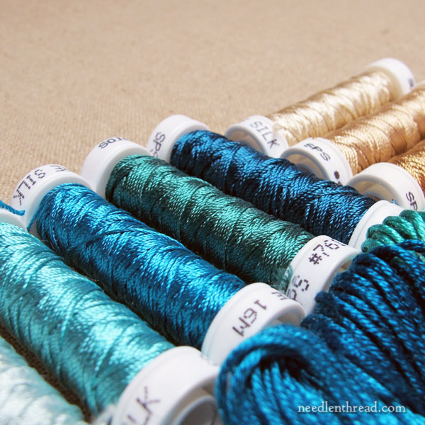
One thing that I find mesmerizing is sea glass. My eyes could wallow in a collection of sea glass for hours and not grow tired!
When I started thinking about sea glass, and then the sea, I started seeing color possibilities everywhere in my thread drawers.
What the heck?! Suddenly, there were ranges of blue-greens and green-blues I had never noticed before! Sandy shades started materializing before me as attractive, desirable colors. I might be on to something, I thought.
I started pulling colors and piling them up, then eliminating the ones I knew I wouldn’t want.
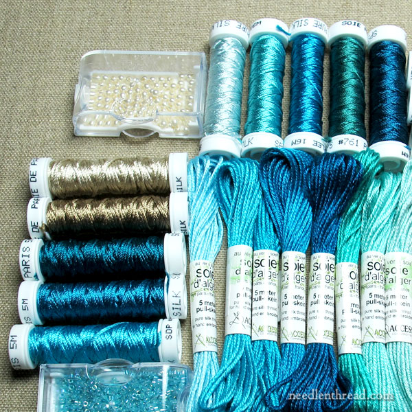
Eventually, I came up with a decent spread of blue-greens and green-blues, along with some sandy options. These gave me a good place to start.
Then, as I contemplated the design and I contemplated the colors, I realized I needed a third – a color that tied into the sea-ish theme, but that wasn’t the sea itself.
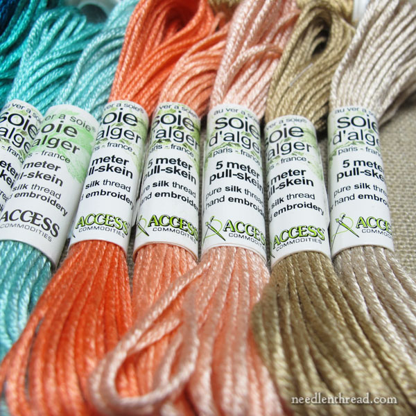
And I settled on a rather bright, but warm and delightful, orange-coral. I pulled three shades that blend well together.
This is a color I would never normally select on its own, but it works well with the sea palette.
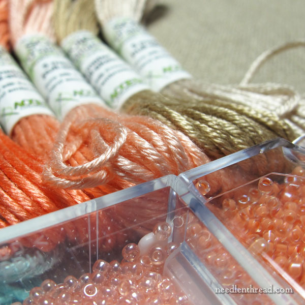
Then, it was time to consider beads, because I want to use beads on this project.
And lo! I was gobsmacked that I had several that seemed to work well with all the colors I pulled. This rarely happens. Why in the name of all that is bead-ish would I ever have beads in these shades of orange?
It’s a sign, I said.
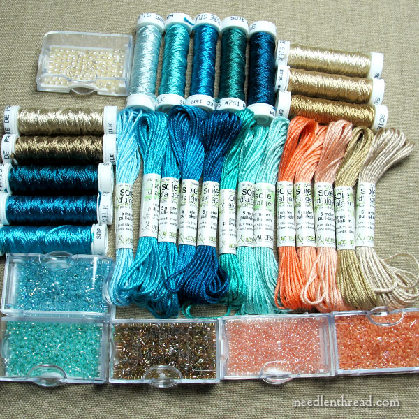
The whole collection, laid out, made me rather happy!
I really should have photographed the threads on white, but … we’ll save that for later. You can get a pretty good idea of how the colors work together. I certainly won’t use every single shade and thread type (I’m pretty certain, anyway!), but I like to pull an excess of threads and colors, just to make sure I have a good variety to pick from when I start stitching.
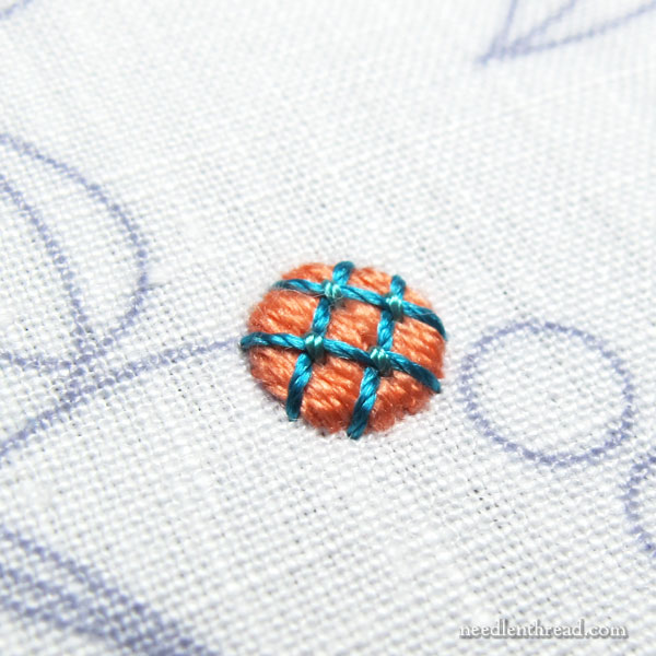
Since I was very excited about finally settling on a color collection that I will really enjoy stitching with, I had to try them out.
I picked an accent element in the design and stitched a wee dot in padded satin stitch using Soie d’Ager. Then I couched a lattice design over the top of it with Soie Perlee.
Silk. Sea. Stitching.
Satisfied!
I’ll share progress with you as I work my way through this design, along with any kerfuffles along the way!
More soon!
Yup. Listening to your inner voice is often exactly what it takes sometimes (especially an inner voice like yours based on so much experience). Best of all you are back to enjoying stitching this design. That’s the best.
I’m excited over this project Mary and look forward to seeing you progress on it! The colors are purely divine!
Delightful post! I have to admit, your “wee dot” just made me smile. Just…adorable!
I ADORE these colors. I want to stitch this before I even see it finished.. will you make a kit or give a list of supplies? Hooray! Another project!
That’s a wonderful color palette! I’m looking forward to seeing this develop.
Love your new color scheme!
Mary, I sympathize with you on this torturous journey. I have a crewel work Jacobean design in a similar fix. I started it YEARS ago for an EGA correspondence class using the recommended Appleton Wools. I’d never embroidered with wool before and had none on hand so I went over to Needle in a Haystack and selected a nice range of colors for the project, bought the traditional linen twill for the ground, came home and started stitching on a simple stem section of the project.
Well, after stitching about 6 inches of stem stitch I knew I HATED embroidering with wool and put the project away. I’ve had it out several times since then thinking, I’d like to finish this piece and make it up into the pillow I intended. Then I thread up a needle, start to stitch, pull through a few stitches with the wool and remember why I set it aside. The feel of that wool dragging through the linen is like fingernails on a chalkboard to me and the colors just look sad and dull. I simply can’t stand it.
So this time I decided to pull out that 6 inches of wool stem stitch and start over with cotton floss. Even better, I’m going to try out floche for the first time. I think I’ll end up using a combination of floche and standard DMC floss because I ordered up a limited number of colors in floche, but now I’m ready to really start stitching this pretty little design in some bright colors and lovely smooth cotton floss. My order of floche from NIAH came more quickly than I thought it would under current circumstances and opening that envelope full of pretty bright colors and petting that smooth floche was a happy moment in these anxious times.
Thanks for sharing your tribulations and providing inspiration to get stitching again!
Oh YES! Excited about this one!
suzie in idaho
I rarely comment but I have to say that I LOVE!!!! this colour palette that you have laid out for this project. It makes me want to stitch along with you and I can’t wait to see the progress and future posts on this project.
Heather
This is one of my very favorite color combinations! I use this a lot–not just in needlework, but in my Christmas tree decorations, my clothes, my bedding–lots of stuff. I can’t wait to see this project!
That is an absolutely gorgeous color choice!
I fell in love with a free needlepoint pattern from DMC many years ago of a sandy beach with frothy, ruffly white-turquoise waves and a big peachy starfish, and I’ve thought of that colour combination ever since as, naturally, “sand, sea and starfish” 🙂 Your sample dot is so pretty and I can’t wait to see the whole design stitched up!
Is that the one with the kind of lacy white foamy edge to the water? That’s a neat piece! I only wish the bargello-like waves weren’t quite so regular, but other than that, I think it’s a really neat design. Perfect for a sunny screened-in porch at my dream-beach-house-that-will-never-exist!
Those colors a luscious. That flower? reminds me of a button I have in my collection from my mother.
A beautiful choice of colors, perfectly stunning! I can’t wait to see your progress on this piece with my absolute favorite silk to stitch with. Love the cases you have your beads stored in.
Boy, do I love your colors, Mary! While I’m sure I have some of the blue colors (but not nearly enough!), I’m equally sure I don’t have any orange – thread or beads. That combination makes me want to go thread and bead shopping, always a bad sign says my hubby.
I can’t wait to see this one!
Gorgeous! And the stars must be aligned for Jacobean blue-and-coral designs, because this immediately made me think of the more muted version in the “Mabel Figworthy’s Fancies” blog posts on her RSN Certificate Jacobean project!
mabelfigworthy.co.uk/fof/2020/04/08/a-cat-shaped-outline/
Nice! I love Ilke’s work! Her snail in that piece is fabulous!
Yes, it’s a popular color scheme these days, I think – along with peacock colors, which I toyed with as another option. There’s a needlepoint piece that someone sent photos of, with the same sea glass color scheme, with just a touch of coral, too. Also, the Modern Jacobean I worked a year or so ago from Inspirations has a similar color scheme – though it leans more towards the greens and no coral. Popular – dare I say “trendy”? – colors are bound to make the rounds!
Love, love, love those colors. And everything is always better in silk, right?
Can’t wait to watch your progress.
Absolutely!!! LOL!
Question, Mary. Can you tell me the color numbers you used on your wee little dot? I am obsessed! While looking around (online) for fabric to do a blackwork chessboard, I came across a Wichelt 14 count aida cotton in a color called “tropical orange.” For a chessboard??? But I keep going back to it. And if I’m gonna do tropical orange for the fabric, then I might as well get my thread in the blue you used, too. This is getting crazy, but … I think I’m gonna love it.
Hi, Gee – I don’t usually put together a final color list until I finish a project, so I don’t have that list on hand right now. As I work through the project and eliminate (or add) colors that work, I’ll put together a list.
No problem, Mary. I’ll just guess about the blue using the photo.
Beautiful color choice. Blue-greens in every nuance are some of my favourite colors, yet I rarely seem to use them in embroidery or when painting. Probably because they are rarely used in the motifs I’ve been stitching (flowers, fall, christmas). Great choice for a more abstract design; I’m so looking forward to seeing more of these colors.
Like a lot of people in the comments section, I’m looking for the colour numbers. I’ve been wanting to try the silks you love and now that I’m in hibernation, this seemed like a good time to try. Besides, it will give me a chance to support my local store.
Hi, Barb – I haven’t narrowed down the colors yet. This is the palette I’ve pulled to work the design, but I will end up making changes as I go, until it’s finished. If I tell everyone “here’s the color list” and they go forth and buy $100+ worth of thread and beads, and I only use half the color list or I make changes and add or subtract colors, that will leave people out of pocket and out of temper. 🙂
Dear Mary
Lovely colour threads for the project and very bright and springy, summery great for the season. It looks an exciting and interesting project all the different colours and the beads did you create the pattern yourself? it looks quite a big project by the amount of thread you have chosen andI’m sure you won’t have many Kerfuffles along the way as you are so talented. I look forward to the progress on the project and I can’t wait to see the pattern.
Regards Anita Simmance
I just ordered almost that exact selection of colors in silk. I can barely wait the two or so weeks it will take before these ship!
Will definitely be following! Love all your posts.
Yes, the sea is an endless source of inspiration. I think I realized exactly how pretty sea colors looked a few years back, and since then have compiled what must be dozens of sea-themed patterns and ideas. (Almost all of which I still need to stitch!!) I think much of my best work has been nature-inspired.
I am very new to embroidery. It didn’t take long, though, to figure out that assortment pack from a local craft store was not the floss I wanted. I’d like to invest in some better thread, but the idea of choosing colors one at a time is, to say the least, daunting. Any suggestions for color assortments of better grade floss? I am loving the pallette of your Jacobean Sea Glass. I’d love some suggestions of basic colors. I tend towards florals so far.
I think DMC floss is a great way to start, and your best bet is probably just to pick a selection of colors you like. They do have some color packs – you might check the DMC USA website and see if they have anything in stock that would work for you.
Oh oh oh!! My idea of a perfect pallet of colours. I simply must save up and buy ALL the colours and varieties of silk threads- sumptuous.
Look forwards to seeing the process and, I’m sure, beautiful end result in your archive.
You also have perfect sense of humour..