


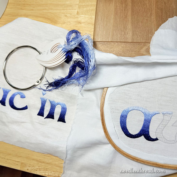
It was a week ago this past Monday that I mentioned I wanted to finish “in” last week, on the embroidered maniturgium that I’m working on.
I finished it.
And this week, during some snatched stitching time, I started “Altum.”
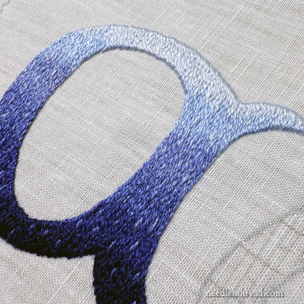
I had this idea as I was moving along on the lettering that I wanted to add a little downward movement (if that’s the right term) to the sense of water depth.
I’m not exactly sure what I was thinking – but it was something along the lines of trying to pull a little touch of each layer of shading into the layer below it. Glints of water? Dripping water?
Water moves, after all, and I found that the layers of shading needed a touch of Something More to hopefully enliven the sense of water a bit.
So I made things drippy.
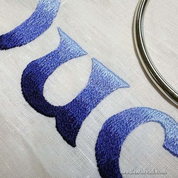
Here, you can see part of duc, where I haven’t done anything but stitch the layers of shading. I’ll have to go back and add some stitches, because…
…it was when I got to in that I concocted a plan and tested it.
Starting from the top of the letters, I took each shade of blue and worked some random straight stitches in the lighter shade above over, onto the darker shade below.
I did this down the letter.
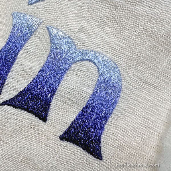
You can see it here on the A in Altum, too.
It’s not as noticeable from farther away (see the very top photo), but it’s just a little hint of something that adds some downward movement to the shaded stitching.
I think I like it.
I better like it. At this point, it would be a mess to go back and pick it out. Ha!
The deep down secret hope to be finished with the lettering this week were alas unfulfilled. We’ve reached Friday, so I know it’s not going to happen. Next week? Yes. I should be able to manage that. Wish me luck!
Next week, we’ll also have a little sneak peek of a completely unrelated project that we’re working on. Ironically, it’s also shades of blue.
So that’s where we are on things. I hope you’ve got a captivating project going, too! And that you have a wonderful weekend with your needle and thread!
Oh, when I read your description of wanting it to look like the water was dripping I couldn’t picture what you meant, but when I first saw the completed “drips”, I actually gasped. It is so effective – really something special. The drips really brighten and add subtle texture and interest. Here’s wishing you luck in finishing the lettering in the coming week!
Yes, the scattered stitches look not so much like “drips” (I can’t really picture water “dripping” IN water, anyway?), as like, I don’t know, occasional little bubbles rising from the depths or something? Definitely contributes a sense of depth and motion!
Great choice! The contrast deepens the darkest blue and there’s a sense of movement and dimension that wasn’t as perceptible before.