


Still plugging along here on the Floral Glove project, I’ve managed to finish the silk embroidery on the central floral element on the needlecase. The other day, I showed you how I adjusted the shape of the flower. I received a few e-mails and comments requesting a before and after shot, since some readers weren’t sure which shape they liked best. So, here they are:
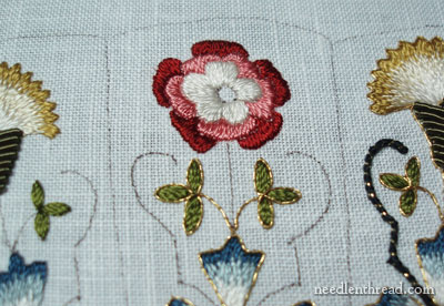
This is the before shot – the flower prior to picking it out and changing the shape a little bit.
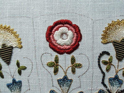
And this is the after shot, with the “new flower” in place.
I prefer the symmetry of the new flower, but did you notice something that happened with the new? The petals became less distinguished. The gold outline, however, will take care of that.
What’s your pick? The before? or the after? Leave a comment and let me know! Next, I’m moving on to the gold outline.
I’m a bit swamped with company this week, after a busy graduation weekend, so if I don’t reply to e-mails right away, please understand! I’ll do my best to catch up in quiet moments!
Happy Memorial Day! Have a terrific week!
The second one is better, definitely. The first one has this wonky look, not at all characteristic of your beautiful style of work. Is there going to be something in the center? (Hint, hint)
Hi Mary,
I have become a fan of yours lately. I think the second flower is great but yes, as you correctly said the red and pink petals have become thin but I like the shape of the white flower. Good job.
Regards,
Anju
Hi Mary,
The old flower looks like it was stitched by me and the new flower looks like it was stitched by you. I much prefer the new flower. It’s what I aim for in my needlework.
Happy Day!
JoanB
i like your second attempt the best, looking forward to seeing it after you’ve applied the gold – i presume to outline?
what is Memorial Day for? what is it in memory of? (it’s a holiday we don’t have here).
After for me….
Dear Mary,
Definitely the “after” and like you said it will become more defined once you did the gold outline. Enjoy your Memorial Day. Love Elza xxx
hi Mary,
I much prefer the second one: it looks fuller and I agree that the gold will help define the petals when you put it in. I love th whole project and wish I could have signed up for ti! What a beautiful thing it will be when it’s finished.
Can’t wait to learn all about ahd try gold work…just saving up for the supplies!
Have a good week.
Kathy
Mary –
I definitely prefer the second flower – much more symetrical. Thank you for the before and after pictures – I hope that someday I will be able to embroider something that looks something like this piece – I really love the way it is coming out. Where did you come up with the pattern? Will it be available on your website or can you point me in the direction to get a pattern somewhat like that? I really love the gold flowers also.
Hi, all – Thanks for your comments!
To answer a few questions –
Kimberly, the design comes from Thistle Threads. It is a kit that comes with an online “class” and the design belongs exclusively to Thistle Threads, so I’m afraid I can’t share this particular one. Sorry!
gigi – yes the gold is to outline each layer of the flower. Memorial Day in the US is a day on which we honor those who have died in the service of their country.
Debbie – yep, there’s something in the middle. I’m debating right now, though, about padding the area first, because of the dark lines. I’ll let you know what I do!
MC
Hi have a great Memorial Day the ‘new’
flower-waiting to see the completed f;ower
ansu chennai
Mary, I have to agree with JoanB. Only the first flower looks like it was done by me on a really, really good day. The second is perfection done by you!I’m so glad that you reworked the rose. Lovely job!
I find the symmetry of the second more appealing.
Surprising myself, I like the original, less symetrical flower better because the petals show up better. I’m looking forward to seeing the finished flower.
I’m impressed with all you accomplish while working. I haven’t had TV in over 20 years, but with a large yard and riding motorcycles I’m not nearly as productive as you. I’m just getting into crewel work, but love the feel and shine of sild.
You are right (of course!)..the first rose is nice but actually looked a little distored now compared to the ‘reverse sewing’…your work is beautiful!
I prefer the second one. ^_^
The outer petals look less distinguished compared to the first one because there is no space between them. It was the negative space between each petals. You can still correct it,if you want. Besides, you might need a millimeter or two to accommodate the gold threads if you want the gold to at least touch the edges of the pink petals and make sharp “V”s.
Just a suggestion. Vince
Definitely the After shot. Maybe I am a bit blinkered but I do like things to be right and not ‘maybe right’. Can’t wait to see how the finished needle case will look.
Definately the second one. The first one reminds me of the flower you got with iron-on embroidery transfers. The second one much better.
I like the modified flower that has been worked now. Though the petals are thinner, the whole flower looks complete now. The new flower somehow has depth which was missing in your earlier rose which had the petals too spread out.
Enjoy your long Memorial Day weekend.
It looks nice in the second. I’d have taken a slightly different approach though. I’d have just picked out the white portion and squared that yp, not altering the outer leaves. The only thing that bothered me about the first one was the off centre centre. 🙂
I’m a bit odd. I like the central part of version 1 and the outer portion of version 2. I think both have merit from a design perspective. The asymmetry of version 1 plays nicely against the two thistles in version 1, but the outer petals are a bit wide apart. Version 2 is a bit more harmonious because of the regularity, but loses some of the interest because it is playing so nicely with everything else.
The symmetry of “after” is nice. If you are going for the clean, perfect look that is the one to choose. However! It is too perfect for my preference. I like “before” better. It feels more natural, artsy, hand-crafted, maybe folksy? Would love to have seen it with the center done and finished with gold. It might have won you over, too.
the second one is very much better.i feel it is completely shaped .
Hi Mary,
I thought the first flower was cute, but really do like the 2nd flower the best.
Have a great day!
I like the revised flower much better! It has a much more pleasing appearance. The first one seemd to just go all over the place.
I prefer the after flower – the first one looks like a beginner was trying it for the first time. The after is beautiful!
dear mary,
you astound me. the first rose , to me looks like it came from a beginnerd kit when placed next to your rose. i really liked the first rose. but now, what you have done with it, well it’s just plain gorgeous. your spot is the first one i go to when i finally get the time to sit at the computer. i always want to see, what did mary do yesterday?
always in stitches,
terri sue
I do like things to look perfect also, but I believe we humans can not make anything perfect. Only God can do that. Flowers in nature are never the same in all ways. They may look exactly alike, but examine them closely and there are differences. Just like our fellow beings, no one is exactly like another. If you are going to display it in your home, do it the way YOU want.
I’m definitely in love with the second version. It seems to match the style of the blooms on either side, more symmetrical and balanced looking. Not so wonky. The petals look puffier for some reason but that’s OK. And the gold will make them pop.
I think they are both lovely, but I lean more
towards the second one. It looks more like a
natural flower to me. I think it will really be impressive with the gold around it.
Your work is always beautiful because your
stitching is always great. Thanks for being
such an inspiration to us all.
I like the original.
Aesthetically I think they both look nice, but for different reasons.
The first one looks more natural, more realistic.
The second one is more a flower of design, it has all the symmetry that most people like to see.
I prefer the ‘before’ as I feel it’s truer to the design. The ‘after’ rose is lovely, but much to modern looking to me especially given the historical aspects of why the piece was created.
Mary I do like your qualities of persevearance and perfection in whatever you do. You strive to bring out the best. The second definitely looks a lot better ..your expert hand is at work.
Upon seeing the second flower, I sighed an inward, “ahhhhh”. Yes, the gold outlining will make everything more defined.
Both are beautiful, although now that I can see what was in your mind, I understand why you decided to redo it. You’re right, the petals do run together like this, so the gold outline is more important in the “after” version.
Happy stitching!
Hi Mary,
I prefer the second one, too. My grandma taught me to embroider, and if it didn’t look right, she made me pick it out and redo it. I’m glad she did! I’m afraid I would have done exactly what you did. It looks so much better! Love your site and your beautiful handwork!
no. 2 is way better. great job, beautiful work
Hi there Mary,
I have to admit to preferring your alterations to the Rose………….I prefer the “order” too! It is just so much more pleasing to the eye.
The first one, just makes me notice the gaps!
Definitely the second flower!
Looks beautiful, you did the right thing!
Of course the second one is the best. I am glad you decided to do it over. It was worth the time you had to take to get it right. I haven’t made a embroidery piece yet everything I do is just samples as I am learning and collecting materials right now. I want to try the gold work. My daughter in law was here this weekend and I got her started on embroidery. I will be sending her your link so she can continue learning. Thanks for sharing.
the re-do looks lovely! I have just reviewed your lessons for long and short and maybe I have the confidence to try it again thanks to your excellent tutorials. Thanks for them – they are wonderful! Melody
I prefer the second flower.
Definitely the second one is incredible, however, I probably would not have picked it all out, then had the ability to redo it so it looks so terrific. You are amazing.
I like the symmetry of the second version.
Dear Mary,
I liked the first one for its antiquey look. You could have just pulled out the part that showed background material and restitched that.
Just my opinion of course!
It reminded me of a visit to a quilt shop with my husband. He saw a couple of embroidery machines working. He stopped and watched for awhile. Then he turned to me and said, “So why do you bother?”
Hi,
i really think that you did the right move Mary as the flower looks so much nicer and you are correct the gold will take care of the petals. Love your webpage, take care
Joan
AFTER, blends in soooooo much better with the flowers on either side and actually looks “neater” for want of a better word.:O)
The second rose Mary!! Hands down! As you said in a previous post, the rose is meant to be stylized, and it`s much more symmetrical now….
It’s really a great difference! Love the new one! great work! 🙂
I like what you did with the flower. Looks good!
Deb Puma
I still like the first one better. I think the designer made it a little asymmetrical on purpose, with the goal of having it look like a period piece.
Personally, I like that kind of not-quite-perfect touch in needlework. It allows us to see the human hand that created it. You can probably get that perfect look with an embroidery machine, but it requires a human hand to do a skilled but not perfect stitchery. To really foul things up, you need a computer.
Hi Mary:
I have to admit to being a wee bit deflated that the majority have chosen the more perfect #2. I believe that above all, unless the intent is to showcase one area or element, an art piece ought to have a feeling of unity. I feel that the rose in this second version, steps forward and calls out, “Look at me…aren’t I beautiful?!” However, I have to admit to a bit of hyperbole in making my point! LOL!! In stepping forward, the other elements are diminished, and naturally take a back seat to the “peacock.”
Hmmm, would I take him apart, and restore his more humble self??? NO WAY!!! Nor would I try to make the “carnations/thistles?” more perfect as, in spite of my theory of unity, there ought to be a focus in every piece of art. Just maybe not with tux, tie, and spats.
Mary, this piece is absolutely exquisite, and I honestly wouldn’t change one thing!!!
Carolyn
AFTER, AFTER, it’s wonderful this work! I love it!
Well, I really thought that I would like the more symmetrical second version, but find that I actually prefer the first one. Of course, it will look different again with the gold outline and with the centre completed.
Hi Mary! I am reserving my opinion (I know, unusual for me) on which version I like better until I see the goldwork around the ‘After’ version.
Have a great weekend, and congratulations on the beginnings of summer vacation.
Oh, BTW, I am going to John Marshall’s in a few weeks. Thought I’d bring along some goldwork samples to see if we can compare sizes and put it up on his website. Was thinking sizes 1, 5, 7 Jap thread (or is T69,T70, T71, T72 a better measure?) for the skeined gold thread. Any hints what I can use to size the flat thread?
Definitely the after — looks great.
Second looks beautiful. In Je we sometimes have to correct the designs because of distortion on the fabric, frame, etc. You did it perfectly. Sometimes I over correct. I’ve transferred using the light below before. thanks for the reminder and hope you had a good Memorial Day.
Another voice of dissent–as a fan of historical embroidery, I emphatically prefer the before. It just looks much more like Elizabethan embroidery to me, which is rarely perfect and symmetrical unless counted. I also prefer the squarer shape of the petals. It doesn’t look “amateur” to me, it looks less stylized.
I’m glad you’re happier with your revision, though!
well the econd looks nice with the symmetry than first now.
I also like the first one better, but they’re both lovely 🙂
I actually thought I would like your version better, I usually do. I was so surprised when I liked the original, it looks more in keeping with the piece. However, I will reserve judgment until I see the goldwork. No matter how it turns out, I learn so much from your blog.
I definitely like the symmetry of the ‘after’ flower better. Good work!
Hi Elaine Baeza,
I did have to laugh at your husband’s words!
I do like a man who likes to live dangerously 😛
From another Elaine,
Cheshunt, UK
PS. I can’t really decide which flower I prefer. By inclination, I prefer symmetry and would tend towards the second. However, I love Elizabethan embroidery and the informality it often shows has its own appeal. Either way, your work is beautiful Mary.
What is website?
I am impressed by both designs. Definitely the second one looks better but only someone who embroiders would have noticed the problem in the first design. Did you also redo the blue section beneath the flower? For some reason it has a neater appearance and also is closer to the other same pieces in comparison.
Your work is so beautiful. Thanks for sharing it with us.
Your re-worked version is really very nice and I like it on its own, but on comparison I find asymmetry of the original is more appealing to me for some reason.
Loved the original flower…and can’t believe that the amended version is even more beautiful! Super job Mary!
The second one looks beautiful. It is neat and symmetrical.
I like the after. Although I can see why they made the before. In Nature things are not as perfect as we can make them with embroidery.
The second one just looks so much more complete. I think the before is cute, but the after is gorgeous.
I like the after picture. Though I cannot fault your work you are such an inspiration to me!
I like the second one — *BUT* if it’s supposed to be a piece of Elizabethan Embroidery, it looks just *wrong* That’s not a Tudor Rose. That’s a flower that just happens to have different colored petals inside and outside.
I’ve seen more symmetrical Tudor Roses, but they still look like Tudor Roses.
Both of them are gorgeous, though. It’s *your* embroidery — and depending on the purpose/use of said embroidery — use whichever one makes you happy!
I prefer the second flower. I agree with you about the symmetry. The first one would be more for folk/primitive embroidery. Your work is beautiful and I love your site. I am so glad I found you.
c’est absolument superbe
belle soirée
rose
Your were right Mary to unpick that flower. I did think at first you were being too “picky”, but on seeing how you changed it, it is so much better.