


Oooooooh. I’m in a bind. A pickle. A dilemma. A quandary, even. In short, I am bemuddled, addled, flustered, and even… confused. I’m feeling just a bit like Winnie the Pooh, when he realized he had fluff in his head. And it’s all because of LINEN!
I’ve begun work on the pall I was talking about yesterday twice now, and I can’t decide on the linen to use. Both linens I’ve started out with have shortcomings for this project. May I tell you about them? Maybe someone out there will have a better solution for me that will put my mind at rest!
This was the first beginning of this pall project, and the embroidery design I chose is quite different from the one I showed you yesterday. I’m working this on a fine weave Belgian linen, a very fine weave. The linen itself is rather light, much lighter than the linen I’ve been working on in recent projects (like the blackwork fish and the floral glove). It’s not handkerchief weight – not that light – but it is relatively light.
And because it’s light, I started stitching on it with the finer sizes of coton a broder (30 and 40). But I didn’t like the fact that the design was so fine, because I wanted it to have some texture to it. But … too much texture, I thought, would not quite “fit” with this weight of linen.
What I like about this linen, and what made me select it in the first place, is that it is “bright white.” It’s the kind of bright white that, if you hold linen next to it that is just “white,” the “white” linen tends to look off-white or creamy. I really like the bright white, because it looks so very crisply white, which is nice.
But eventually, the weight of the linen won out over the bright white, and I went in search of a slightly heavier linen. Unfortunately, I didn’t have too much on hand to choose from, as my linen supply is almost depleted. I considered Alba Maxima, but it was really too heavy and thick-looking for the project, I thought (though I have made palls out of it before…)
Then I came across a piece of Alabaster Angel by Legacy, and I figured, ok. This would work. It seemed a bit smoother than the Alba Maxima, and so I set about working with it.
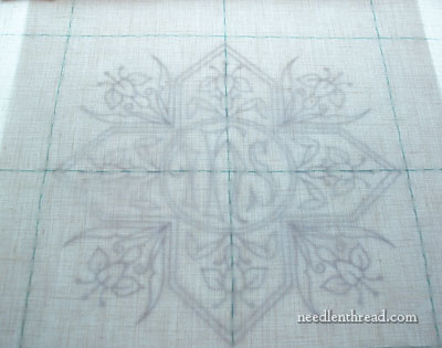
I went through the whole set up process on this piece. Since it is an even-weave, more or less, and since the weave is so visible because it’s not as fine (weight-wise) a linen as the Belgian linen I was using, I marked off guidelines along the weave of the linen, to make sure the whole piece was absolutely squared up. Then I put it on the light box and considered the design.
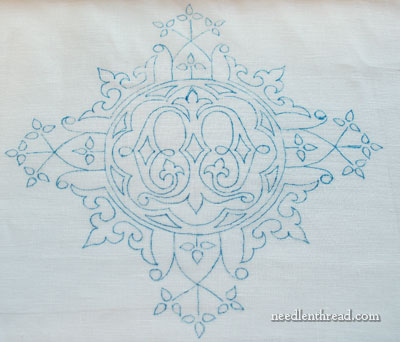
Since the linen was a lot heavier, I switched to the heavier design, and I enlarged it so that the pattern fills the pall. This way, I could use heavier weights of thread and achieve some interesting texture.
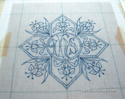
I traced the pattern – I’m using the Paper Mate Flair pen I spoke about the other day – and, once on, the design seemed very bold, and then the linen seemed very heavy, and then I started thinking I had made a mistake…
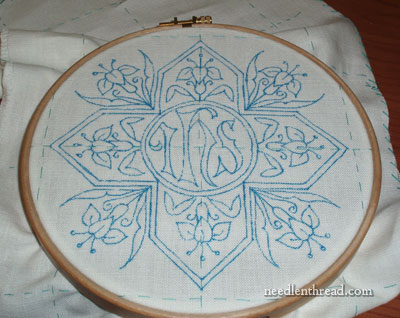
But before throwing the towel in, I hooped the piece up and decided I better put some stitching in. So I did….
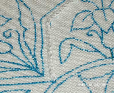
Every type of line stitch I tried – from simple chain to whipped backstitch (which I like to use because it makes a nice pronounced line) to stem stitch – just didn’t do it. The line looked lost on the linen. So I resorted to a #16 coton a broder (the largest size I have) and worked some lines in Portuguese knotted stem stitch, which creates a nice textured line that was heavy enough not to look lost on this linen.
What I don’t like about the Alabaster Angel for this project is that it is a heavy linen – it seems almost “rough” for ecclesiastical linen – and it is “white,” but not bright white, so next to anything bright white, it looks almost creamy. This is even true, to an extent, with the threads on it. The coton a broder is definitely bright white and it seems very white against the linen.
And so, I face my dilemma. I don’t know why I’m having this dilemma in the first place; I normally don’t have to deliberate over ground fabric choices too much! But this project doesn’t seem to be coming together too well, and I don’t feel very confident about it. So this is where you come in – I figure 4,652 heads are better than one!
This is what I’m looking for: I need a linen that is a nice smooth-handed linen, fine but not transparent (heavier than shadow work linen and handkerchief linen), with a nice close weave that can support some texture, though not necessarily heavy texture, and that is Bright White. But I don’t have any in my stash, and I don’t have time to make a mistake on an order. If I order it and wait for it, it has to be the right stuff. Time is starting to run out…
Sooooo…. any suggestions on linen? Or any suggestions about the two projects above? Should I just stick with one or the other and forget being too persnickety? What to do, what to do? If you have any advice, feel free to leave a comment! I will consider right heartily anything you have to say!!
I’m probably barking up the wrong tree, but why don’t you use a different kind of fabric, color of fabric, or color of thread? Maybe it’s time to think outside of the box. (I love cliches!) No seriously, why don’t you try cotton, velvet, silk or satin? How about blue thread or lt. blue, or a shade of yellow, or gold or white on a different color background? It seems like you are caught in a perfectionist quandary, where you can’t proceed until everything is just right. Well, Baby Bear, I hope you find the right linen. I’m just a beginning embroiderer, so you would probably do well to listen to more experienced ones…
Best of luck!
Anne
Hi Anne,
because a pall is a religious article, the colour white and it being made of linen is associated with the shroud of Christ.
Hi Mary,
I would have liked to see the first sample with some stitching on and I wonder how much you completed before rejecting it. I know that you are very experienced so your instinct is probably right on this, but I think that the design is quite intricate so the light texture would be enough when all the lines are complete. I think that it would look rather delicate and lovely.
Alternatively, you could satin stitch much of it.
I know how doubt can completely prevent me from progressing a project but I think the first one is worth pursueing.
Good luck.
See whether a local Church has some linen Altar Rail cloths from the days when they used them. The ones we found were lovely material to work with. I’d offer you some, but my store is all used up!
Sorry Mary, I dont think I can help as I would have suggested a heavier hankerchief linen.
Dear Mary,
Firstly,
Thank you for responding to MY inquiry re: where to purchase linen a few days ago.
Now this is just a thought, but have you considered using the lightweight linen that you prefer, but using a very lightweight white foundation fabric? I’ve heard this recommended
for fine embroidered pieces from people that do much more of it than I have. I’m not certain how it would work for your piece, but I thought I’d pass on the suggestion. Good luck and again your workmanship is so lovely.
Cheers
maggie in maine
How about 40ct Ricamo Linen. Nice weight…evenweave (counted it myself)and seems pretty bright white to me.
I sometimes get mired in decisions when starting a new project. This too shall pass. LOL
I am commenting all the posts. But it doesnot appear. I wounder why?
viji
I am learning things from you. So eaqurly waiting to see what you are going to do with.
viji
What about adding an interfacing behind the first linen? It would add a bit of weight and stability to support heavier embroidery, while keeping the texture of the fine linen. Most likely I’d line the entire piece, not just the embroidered section.
I also would like to see a photo of what you’ve done on it to compare.
Hi, all – thanks for your comments and ideas! I’m considering two: 1. to line the first linen. I think, in fact, that this is what I will definitely do. I want to keep the “fineness” of the first linen. 2. I might just do a color – a pale gold silk, instead of white. I’ll let you know what I decide and post pictures, that’s for sure! And more input is most welcome, of course!
By the way, neither of the pieces are a waste – I’ll probably still use them for palls. I just want the one I’m making now to be really nice… so I’ll keep at it until I reach the right combination!
Maybe this would be a good project to try using a different color rather than doing white work?
I cannot comment on your linen dilemma since we don’t really get fine linen here but I love the delicacy of the first design and I would love to see how you progress with the pall. Good luck
Hmmm I may be biased since I’ve been on a silk ground fabric kick for a while now, but…
Maybe if none of your linen looks good, it might be that you really don’t want linen?
Maybe try a nice silk? or a low nap velvet?
You can always put a linen backing on the pall later.
~Juliet
I have always used handkerchief linen for palls, we have no other choice in my country. I use white mouliné thread almost all the time, but sometimes use rayon thread. One or two strands of thread, if I wish to add texture. On JHS I have used gold thread, and for the Virgin I use blue thread. Thanks for the beautiful drawing. Hugs
I would go with the Alabaster Angel piece that you have started. I think we get too wound up in the “musts” of ecclesiastical objects. Jesus was a carpenter who used hand tools, a person who was poor and worked for the poor and marginalized members of society; he didn’t require the finest things.
I would consider using a 17 thread ct linen with about 48warp it’s a med at and gorgeous in white. You might even consider using a rayon silky toe fabric just more of a pain to embroider on but very lovely.
Hi Mary
I have a little window of time to read your problem with the linen and I have to say, I thought it was me when I think I am ‘overthinking’ a problem and when I share my thoughts with anyone else, I get that “is this woman MAD, what on earth is she worrying and fretting about”? I am sooooo glad to know that you, an expert, have the same concerns and wonder if you would consider an idea, that of couching some fine white cord instead onto the linen – the couch stitch may just overtake the weave that way and raise it up slightly.
And now I am going back to fretting over the new bathroom we are having installed and wondering how to ask the builder what he will be doing about the ripple in the bathroom ceiling and the fact that I want the join in the edging of the strip to be exactly in line with the edge of the window board and not halfway down the bath!!! I can feel a long discussion coming on.
Kind regards as ever
Gill from the UK
I think you need to use your original choice but double it! I know its difficult to keep the grain lines straight but it could give you the weight you need. Just a thought.
Cathy S
I’m sorry that I don’t have a comment that will set you in the right direction. I have been asked to make an altar cloth to be used at my daughter’s college (Wellesley College for Women in MA). They are currently using a plain linen table cloth. The nun who is the Director of the Catholic Campus Ministry has left the details to me. I have bought several pieces of linen to practice and even after I wash them, they seem too heavy and the weave seems too pronounced. Do you have an online source for linen that you can recommend? I will be embroidering by machine since my handwork is not good enough for this type of project. Thank you for your help. I enjoy reading your blog and living vicariously through your beautiful stitching projects.
I do think a bright white is a better choice because it has more impact when you are viewing from the pews. Probably the only people that are really going to notice the design are the clergy and acolytes and the altar guild. I’ve seen palls close up, but I can’t see any actual designs when I am sitting in the pew.
I like the idea of pale gold (which would also emphasize the brightness of the white), but anything much brighter would seem odd to me–I’ve never seen a white pall that didn’t have whitework (or pale-thread-work). But that’s just me–my congregation is pretty high church, so vestments and altar linens tend to be more traditional.
You’ve inspired me to get cracking on a Pentecostal stole (for a December ordination).
Mary,
Elena of Italian Needlecrafts ( http://www.italian-needlecrafts.com ) has some beautiful Italian linens is various weights. Italian linen comes in two kinds of white – one is quite brilliant. Dash off an email to her explaining your problem and I’m sure she’ll know what to tell you and she’s fast with her deliveries!
italian.needlecrafts@gmail.com
Sotema Linen (the stuff she carries) is absolutely gorgeous to work on.
Hi, Have you thought of Belfast Linen which is a light fine weave or Dublin linen which is a bit heavier.
I feel the same when I try to figure out which do I use & are their interchangeability between cross stitch, canvas & Bargello embroidery. I completed my very first original (Bargello)design (inspired by others)on Aida 14 ct if I remember correctly. It is to be a Christmas present for my granddaughter. While I angst about if it was the right fabric for the job it turned out beautiful & I have no doubt that she will love it.
GOOD LUCK!!!
Hi Mary!
There´s a gabardine of cotton I use most of the times for embroidery. Its white is completely a bright white. It has a beautiful weight and is very easy to stitch. I could suggest that linen. Your design is so pretty that I think I´m going to SAL with you 😉
Best Regards!
Marissa
🙂
Hiya Mary,
What a lovely design you have there. You’ve had many good suggestions so far. I was wondering if 55 ct Kingston Linen may do the trick. They have a lovely white and whilst it IS a fine Linen it is not overly so and holds up to different textures of threads quite well.
Kingston is pretty easy to come by. I’d suggest dropping into your LNS and giving it a feel. Any chance to molest fabric and threads I say !
I wish you luck !
Thanks, Chrissy! I have a few scraps of Kingston left from a previous project. It’s a nice linen, and if I had a larger piece of it on hand, I think it would work! I’ll have to eventually order another piece. I ended up going with the first linen, doubled.
Unfortunately, I let my supply of white linen run down. Normally, I’d have enough on hand of different types of white linen to choose the right stuff for a small project. But somehow, my supplies have dwindled rapidly in the past year, and I never noticed!
Jeanine, thanks for the reference to the Italian needlecrafts site. I’ve ordered some linen from her in the past, and it is beautiful stuff! The types I got are more suited to Assisi; I wish I had ordered some of her linen batiste! Maybe in the future!
Thanks everyone, for your suggestions! They’ve been very helpful!!!
Mary,
I don’t know about the linen, but for texture, you can’t beat Mountmellick. The design you’re using is probably too small and intricate, but for a larger piece like an alter cloth…oooh, how lovely!
Patrice
Thus is very interesting to me. My son is in seminary & I am hoping to see some vestments for him in the future. Do you sell your designs?
Hi Liz – I have a church patterns e-book available here: https://shop.needlenthread.com/product/church-patterns-book-one-e-book