


Do you ever suffer under the delusion that you’re making a lot of progress on your needlework, but when you step back to take a look at what you’ve done, you find yourself smacked in the face with the cold, dead Fish of Reality? That’s me right now! Wow. Yesterday, I was patting me on the shoulder, telling me that there were no worries, that I was almost done with this project! What the heck was I thinking?
No matter – we must always subscribe to the notion that some progress forward, be it even a little, is a good thing. It isn’t stagnating, after all, and – better yet – it isn’t going backwards. So here’s my wee bit of progress so far on the hand embroidered pall that I’m currently working on.
Last week, I told you all about my linen dilemma and the difficulty with choosing the right linen for this project. I decided to take the advice of several readers and double the fine linen that I originally started with.
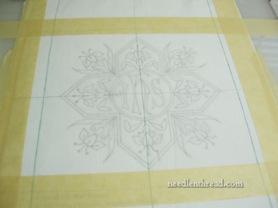
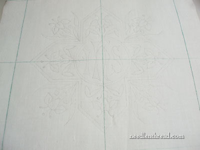
Before doubling the linen, I marked off the 6″ square that will be the pall, centered one layer of the fabric over the Cross & Lilies pattern that was taped on my light box, taped the whole piece of fabric securely over the design, and traced the design with a mechanical pencil, using a very light hand.
Ut oh. A Mechanical Pencil??! What happened to the big “tracing with a Flair” plan?? If you recall, on the first couple attempts with this project, I traced the design using a Paper Mate Flair, which is a water-based marker that washes out completely from the linen. Ok, ok. I concede!! While I’m ok with using the Flair on the linen – you can see, in fact, that I marked the parameters and the center lines of the pall with the Flair – for this particular design, the Flair makes a line that’s too thick. It is distracting! And a thick line is never as precise as a fine line, when it comes to an embroidery design, in my opinion.
Furthermore (yep – I’ve got more excuses!), the design for Attempt #3 here is much smaller than my previous designs, which all stretched out to the edge of the pall. This design, set in a pall that’s half an inch smaller all around, is set in the center of the 6″ square, with a good inch on all sides – it’s just barely 5″ square. With the design being smaller and finer, I wanted a very fine, precise line. So I used a pencil!
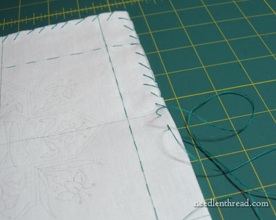
Once I had the design on the top layer of linen, I basted together the two layers (along the outside lines that mark out the dimensions of the pall), and then I whip stitched around the edge of both fabrics to keep the fabric from fraying.
I don’t normally whip stitch around the outside of a project, because I normally mount my needlework on Evertite frames before I work it and I don’t find the whip stitching necessary. With this project, though, I’ll be using a hoop, and since a hoop is handled a lot more, the edges of the fabric are more likely to fray.
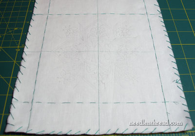
So this is the whole thing, set up and ready to go. With that finished, it was time to consider threads. I thought about white-on-white, as that’s what I normally do on a pall, and I that’s what I normally prefer. But with this fabric, I thought silk would be a better match. And I didn’t have a lot of choices in white silk.
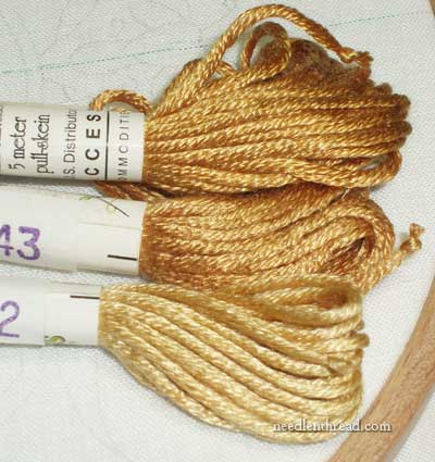
I decided to go with two tones of gold-colored Soie d’Alger, for a couple reasons: 1. when stitching with one strand of Soie d’Alger, the line is nice and fine; 2. It’s an easy thread to stitch with, and I don’t have a lot of time to mess around! 3. (ok, several reasons…) I have it on hand; 4. I like gold on white.
I debated for a long while about doing the lilies in color, in shaded long and short stitch. But without a lot of time, I didn’t want to risk not getting it done.
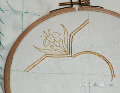
The design is only going to be outlined, then – and the whole project is being done in stem stitch. The main structure of the design (the cross and circle) are worked with two strands of the darker gold in stem stitch. All the lilies are going to be worked in one strand of the lighter gold in stem stitch, and I haven’t decided yet what I’m doing with the IHS in the middle – I’m considering long and short stitch shading in gold on the lettering, but I don’t know how that will work together with the rest of the design, so I need to think about that for a while! (Any ideas?!)
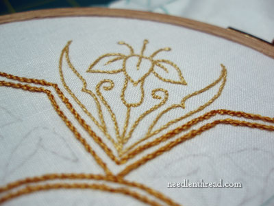
You know what surprised me most as I worked on this part? The difference between stem stitch with one strand and stem stitch with two strands of silk. I realize that two strands “doubles” the size of one strand, but in fact, the two-strand outlines seem more than double in size, compared to the one strand in the light gold.
I’m not sure yet, you know. I don’t know if I will like the overall effect of this piece. But I won’t know until I get more done on it. And by that time, it’ll be too late to turn back!
Now this Dead Fish of reality, it does not happen to be BLACK by any chance? Only asking. It might just be the reason for all your problems. :))) Love Elza Bester xx
The effect should be of almost quadrupling the apparent size. The part of your stem stitch where the threads from the previous stitch are lying side by side with those of the current stitch will be twice as wide; where the current stitch crosses over the previous stitch it will be twice as high.
Even though at any given instance the line is just either twice as wide or twice as high, the eye perceives it as an overall volume that is both twice as wide and twice as high, hence four times as big.
Ever the perfectionist, you seem to have hit upon the right answers to all your linen and thread worries. The 2 strand stem stitch merely acts as a counterpoint to the delicate single strand lilies… Looking good so far. Good luck with your project
Mary,
Since you said the design is smaller and with Sivani’s comment about how the eye will perceive the image,will this account for its small size in anyway? I mean, will it appear bigger than it is because of the thickness of the threads? This would be a good thing, Yes? I do not know much about these things before I stitch, but I do notice it during and after I have completed something and either I am disappointed or pleasantly surprised. It would be nice if you could take a picture of this project Mary so we can see it as you see it( not so close up but an arms length away 🙂
Maria in Kansas
might the colors have an effect on the single-strand vs the double-strand stitches also? The lighter color “reads” as finer even if it had the same amount of strands used as the darker color? For me that often seems to be the case.
If you are not liking the thickness of the double-thread stem stitch (it always seems to turn out “bouncier” than the single-thread version), you might try a single-thread stem stitch and then whip it. (Whip it good?!! ala DEVO)
I’ve loved reading about the pall for two reasons:
1. I don’t know much about liturgical/ecclesiastical embroidery or vestments and I’m getting a FASCINATING education.
2. Your work is gorgeous and has inspired me to learn more!
Gail is right. If you use 2 strands of the lighter gold it would still look smaller. Light shades recede.
I like the outlining that you have done so far. The single strand of the light gold gives the lilies a delicate feel, while the double strand of dark gold lends a feeling of strength to the cross.
I’m having a difficult time picturing the IHS in long and short shading. I would consider using a satin stitch with generous padding to give it more prominance. I’m not sure whether I would choose the light or dark gold, but I’m leaning toward the light. The padded satin stitch would probably give it adequate weight. The darker gold might seem too heavy. The darker gold of the cross will serve as more of a frame for the light gold lettering.
G’day Mary,
Some good-thinking thoughts there in the comments. It’s all relative I suppose. I’ll never forget the enlightenment when I finally realised (then understood) relativity with colour, light and shade. What the teacher had tried so patiently to point out, one day just clicked. I never let on I couldn’t see it but no doubt she wasn’t fooled! So thank you ladies for stiring up the old grey matter. It’s cold and wet here but now I mightn’t go back to bed after all! Just gotta get the bod going now.
With your comments Mary of steps backward and progress, I saw this yesterday. ‘Only a Genealogist regards a step backwards as progress’. Now, they have never watched your do and unpick and do it better method of embroidering eh.
And it’s looking lovely. I really like the colour and the lilies are etheral with the thinner paler gold, which I feel suits the project.
Cheers, Kath
Have you thought about using chain stitch filler for the IHS? Perhaps using each of your 3 golds, one to a letter, to delineate them. I find that chain stitch as a filler often works better than long & short on a small linear design. It fills without the density of long & short or satin.
mary, me encantaria poder opinar”’creo el dorado de le dara ,majestuosidad ,y en 2 tonos luz y sombra
estoy muy facinada siguendo este proyecto¡esta muy gratificante
gracias
Hi Mary!
I really like the two toned gold on white stem stitch, and I am surprised as you are in the difference between the one and two strands. I never would have thought it so noticeable. I’m afraid that the center IHS would be too heavy in Long and Short. I would try it out in crayons on paper first to decide.
In the Monty Python theme, Where’s the fish???
I’m with Elza. Your dead fish of reality IS black and white. I think your pall is beautiful, but I have to say, I’m not crazy for the golds. I thought I would be, but now that you have put so much work into it and we see it, I like it better with white on white. Can’t wait to see it finished.
Hiya Mary,
Boy, do I love this project! I am learning so very much and am even thinking of doing something similar to donate to a local church.
I really like the gold on the white. I do feel though that the two strands of darker gold may over power the one strand of the lighter gold. But not seeing it in person it’s hard to say.
I’m a massive fan of silk shading with long and short stitch, however, I think you will be unhappy if you go that route for the lettering. From what I can see those letters are crying out to be padded and then satin stitched. I have the feelings that the thread painting will sit to flat and if you keep the two strands of the darker gold you will need to counter balance it in the letters.
However, I think you are brilliant and that this project as with all your others will turn out just perfectly beautiful!
I can’t wait to see more!
I’ve been playing with the scale of the stitches for Tricia’s Goldwork Masterclass and finding that the effects of those changes are also greater than I expect. There’s something interesting going on here and I am not sure quite what!
“the cold dead fish of reality” Thanks for the chuckle. I needed that today. Just found your site and I am not sure how I haven’t seen it before. Really enjoying it!
sorry to bring your attention to an old post but I had to say this. I’ve made two palls with this design, I did the lilies in split stitch and the rest in chain stitch, with white thread. Both priests really enjoyed the finished palls, as much as I enjoyed making them. Thank you so much for making beautiful designs available for use. God Bless!