


The next step in the Mission Rose embroidery project after finishing the bud has to do with the corners on the inside area of the design, just outside the inner frame around the rose.
My plan there is a little bit of appliqué…
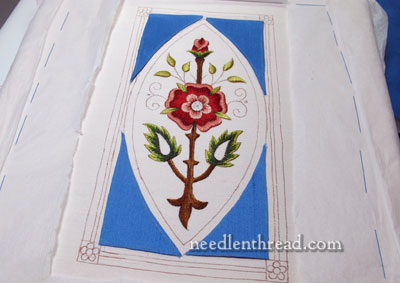
…in blue, as a matter of fact.
The silk I’m using is a gorgeous blue. The camera doesn’t capture the color just right, I’m afraid, and even if it did, you might not see it just right, because color varies from monitor to monitor.
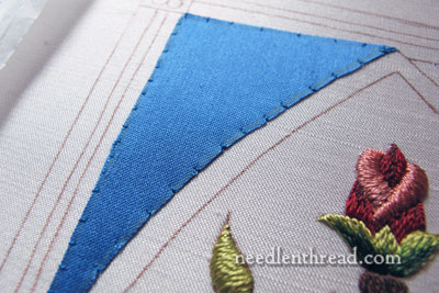
The blue silk is fixed to the fabric with tiny stitches just along the edge. The appliqué piece is cut just slightly outside the design line, so that it is a hair larger than the area.
To stitch the silk in place, I’m using a regular sewing thread in the same color blue, bringing the needle and thread to the front in the ground fabric just outside the blue silk, and taking it down just inside the blue silk, with stitches that are no more than 1/16″ long.
The frames, both the inner marquise-shaped frame around the rose and the outer frame – will hide the edges of the appliqué.
I love the extra color in the piece, and I love, love, love this particular blue silk. But this whole approach could end up being a mistake – I haven’t decided yet. Any thoughts on your end? Feel free to leave a comment below!
I’ll fill you in on the nitty-gritty on the appliqué once I finish getting the corners in and decide if the appliqué will stay or go!
If you’d like to follow along with the entire Mission Rose embroidery project from start to finish, including pattern, materials, and so forth used for the project, feel free to visit the Mission Rose Embroidery Project Index, where you’ll find all the articles relating to this project listed in chronological order.
Hi! Might have been better to applique the marquise shape to the silk? (after reinforcing the silk with a stiffer fabric) Time will tell. Love your projects.
Judy
Hi, Judy – yes, I thought of that from the beginning, but the blue showed through the light fabric. I could have worked with four layers and managed it, but it would’ve been a bit tricky…
Wow! I really love the blue silk addition! I’ve never done appliqué before, so would personally be nervous doing it, but it will look great once you’re done filling in the areas of the border surrounding it, I bet. When you do appliqué, do you just lie the fabric flat against the surface piece, or do you put something between the surface work and appliqués to add dimension (batting?)
I really really like your blue silk fabric. It works so well with the colours of the embroidery. I would keep it. I’m not sure I would had thought of adding it. It is a none obvious choice and it is what it makes it even more special.
speaking as a quilter who prefers applique, I think the blue color is spot on, but the solid color fabric looks very flat & distracting from the beautifully textured embroidery. Frankly, it looks like you were looking for a short cut to finish the project. Why not consider one of the lattice stitches you’ve been sharing with us in a monochromatic scheme?
Hi, Lynne – Well… it’s not finished yet!! 🙂 Just wait!
I agree. I like the piece better without the blue. If you really like the blue punch, Mary, could you use a blue mat for a frame when finished? (Assuming this is for framing.)
I agree, it does look like there was a little bit of a short cut, but on the other hand that blue is fantastic. Since the edges would have gold on them, what about doing (for lack of a better word) swirly vines with roses in a similar style using the same color thread.
With the blue, what then goes on top of that? Will it be gold work or some other embroidery? This is looking beautiful. The blue really brings out the reds in the rose. If you don’t keep the appliqué, do still do something with a similar shade of blue!
Hi, Michelle – yes, it will be goldwork along all the edges, so you won’t see the edges. Glad you like the blue! ~MC
I think the silk looks great and you did a terrific job of matching the thread to the fabric, but did you try needleturning the silk and using an invisible hand stitch to applique it down? I’m assuming you did the blanket stitch by machine?
I’m not certain what you’re not happy about. I think it is gorgeous!
Hi, Cindy – no, no machine work here. It’s a tiny straight stitch, holding the piece of silk in place. I’ll be stitching on top of it, following the outline, with gold, so that will do the rest of the holding. I’m not unhappy with the blue – I like it a lot – I’m just not sure how it will all work out with the gold frames. I think it’ll work great – but I’m still fiddling with getting the four corners “just right.”
Wow, Mary, I think the blue makes the whole piece pop.
Hi Mary,
Love the appliqué. I think that both the color and fabric perfectly set-off the proportions of the rose, stem and even our friend the bud. Can’t wait to see the rest!
I like the blue. I like it better in the top photo, than the closeup. Maybe this is one of those situations where a bit of distance is needed for it to make sense? Like when you were working on the Marion Medallion. You were Not Happy with one part, until you were away from it overnight and saw it from a distance when you walked into the workroom the next day. IIRC, when you walked into the workroom that morning, you had every intention of ripping out.
I think the blue silk is a lovely addition. Rather like matting a beautiful photograph, it highlights the work you’ve done on the rose. I hope you’ll keep it, and I look forward to seeing the “frame”.
I really like the appliqués I think it frames the rose beautifully. If it ends up looking too flat or the wrong color at the end then you can do couched Gold work similar to what you’ve done in the ground on previous pieces. Perhaps even using a color other than gold or silk chord to shift the blue. I’m blown away by how perfect your appliqué is. Bravo!
I think the blue looks great. It helps “smarten up” the main pattern.
Mary, there is a belief in both Native and African handwork that there must ALWAYS be a mistake so the work has a “nose” and can then breathe, and also to remind us that nothing is perfect except Creator.
What you have done us remarkable, but in the end it is YOUR call.
I think I’m the odd one out here. To my eye the blue isn’t the right shade, too clear and bright or something, but maybe my screen isn’t doing it justice. I’ll be interested to see how the frames affect it. Having done some applique quilting, I’m also surprised you didn’t turn the edge but if your frames encroach over it, it should be ok and you don’t have the extra thickness at the edge.
Hi, Meg – You’re right about seeing the color in a different monitor. it isn’t a bright clear blue. It’s a little deeper and richer than the photo shows. Cncerning the applique, on this type of work, you wouldn’t turn the edges for that very reason – you’d end up with the extra layer to contend with in the covering. You won’t see the edges of the fabric at all – they will be secured by the overlying goldwork.
Mary,
It looks like an art deco stained glass window. I would keep the blue. It stylizes the piece and makes it very elegant (not that it wasn’t without it, but it just gives it a certain panache). I like it a lot.
The blue is lovely! It really highlights the rose without distracting from it. Keep it!
LOVE IT!!!!
otherwise it’s a sea of unrelieved whiteness.
I read all the other comments first. While I think the color is absolutely good in that it makes the rose pattern pop, to me it’s too flat and the technique doesn’t relate to anything else in the piece. I believe someone suggested perhaps doing some lattice pattern in there with the same color-it would retain the color and give it some texture and at the same time relate to the rest of the piece. But- it’s your piece and your vision- I feel confident you will come up with a solution.
Mary – I love the blue! What a gorgeous pop of color!
Mary,
I love your choice of blue. You have a great eye for contrasting colors. I’d be curious to play with this applique bordering method. It’s prettier than the standard matting, in my opinion.
I really like the silk applique. It looks very elegant. Nice choice
Mary, this is gorgeous. I like the way the blue silk brings out the Mission Rose — so much better than leaving it white. More embroidery in the corners would have been fussy, don’t you think. That is a wonderful color of blue, I found as similar color to knit for my new grandbaby. Of course, the silk takes the dye so much better than the merino wool I am using. Looking forward to your next project. I am working on the sampler. Thanks you for the generous help. Regards, Charlotte
Wow! That is a gorgeous blue silk, and I agree with the other comments that it makes your design really pop.
Will you try to incorporate the blue anywhere in the center motif, or will you bring the colors in the central motif out into the corners? Or will the goldwork be the thing that ties it all together? I love a mystery, and it’s so fun when you string us out waiting for the next design development, Mary. It’s almost like participating in one of those mystery embroidery projects. 😀
Personally, I’m on pins and needles to find out how you did your applique, especially if you didn’t turn the edges under. How is the silk not leaving little frayed edges and hairy threads everywhere? Did you line it with something? It appears to be perfectly flat, with no wrinkles or pulling anywhere, and I am in awe. AWE! I tell you.
Enjoying your progress immensely. And the ongoing serial cliffhanger. *wink*
It’s going to be stunning!The gold work around the blue areas will soften them a bit and everything will look more harmonious. Right now the silk looks “stark” but it’s not finished yet! I think the design needed the blue areas, the flowers looked a bit lost before, now that area pops more as the central focus.
My first thought was ‘Aargh! That’s a bit bright! But then I imagine in the gold borders and it suddenly starts to sing. I love the way it pulls the colours in the rose together and makes them warmer. Once there’s some goldwork on the rose too and some colour in the outer corners, it’s going to sing and dance!
Mary, I also love the blue silk, but I am thinking the the brightness of the blue detracts from the relatively muted colors used with the rose.
I agree. The gold borders will the soften the brightness of the blue and bring the colours all together. I don’t think you’ve made a mistake at all.
I like it! ‘Nuff said.
Mary, I also love the blue silk, but I feel that it overpowers the relatively muted fibers used on the rose. Even adding a gold “frame” the eye would still be drawn away from the beautiful rose.
I like it!
Dear Mary
I love the blue silk it really goes well with the rose the red and green would have been to much and white wouldn’t be right either,so I think you have chosen the right colour and fabric can’t wait to see the goldwork added, thanks for sharing this with us.
Regards Anita Simmance
Another oddball here. I’m not crazy about the blue. I think it draws the eye away from the pop of the rose. Perhaps if the blue was covered with a lattice (or lace) work stitch it would work for me. I think a more muted color would “push” the embroidery to the forefront.
Nonetheless, your work is simply stunning.
No matter how this piece turns out, it will be memorable…And as always, the stitching is impeccable.
Love the blue! Sets the rose off beautifully. Can’t wait to see your ideas develop.
Hi Mary:
The blue silk is gorgeous. I love working with opposing colors and this particular combination is perfect. I agree with Vivian above, it looks like an Art Deco/stained glass design. We are all waiting excitedly for the goldwork finishing, I am sure that will make the whole piece perfect.
Susan (S. Raleigh, NC)
Mary,
I agree that blue is gorgeous, but I don’t think it is quite right for this project. I think blue is a terrific idea, but I would suggest a blue that is deeper in shade, closer to the intensity of the thread colors. IMHO, the “lightness” of the blue color distracts & overwhelms the fabulous stitchery. Perhaps, there is just too much contrast for me
Gayle in Maine
While the blue looked nice in the first picture, in the close-up, it just didn’t look right. I don’t know if it was the space between your stitches, or the fact that the stitches could be seen so clearly. I was taught that either you should not be able to see the stitches in applique, or that the stitches should be a fancy stitch (like the blanket stitch) that would outline the entire piece being appliqued. Having read other comments, and knowing that the stitches are going to be covered, I feel better about it. Are you planning to put some design or flourish in each of the blue areas? I’m thinking that just the gold on the edge might stick out like a sore thumb. Part of it will depend on what you are planning for the outlines or frame of the piece.
Oh dear, after my ‘oops’ yesterday, commenting on something I hadn’t even seen, I’m not at all sure I should be opening my big mouth again.
But here goes … I love blue, especially that beautiful french ultramarine/lapis lazuli blue. But I am not sure of it in this context. Knowing how fantastic Mary is at bringing all the disparate elements together into a cohesive whole I think I stop now and wait for the next instalment.
BTW Mary, is the background fabric of this pink or was that something else?
Again, apologies for jumping in too soon.
Hi, Christina – yes, it’s a pale, pale pink – hard to tell it’s pink if you don’t have white right next to it…
I love the extra color of the blue silk.
I am not one for contrasting colors, I am more of a tone on tone kind of gal.But I feel you have framed the Mission Rose with a beauiful matting.
Sometimes it is hard to see the finished project when we think outside the box but maybe that is now great designs are born!
I love it! I feel that I will love it even more when I see the complete project finished.
Mary you are a great Inspiration to me.
Thank you for being who you are.
ok. I am intrigued. It looks like a bit funky. I bet the finished piece will be delightful, fresh and fun. I can’t imagine what goes on those blue corners, and I am betting that the boa constrictor rose bud has something to do with it. Curisoity killed the cat though Mary, so let’s see this!
The blue is a stunning contrast! For some reason though, it bothers me to see the stitches around the edge. They look almost crude or sloppy next to the delicacy and intricacy of the embroidery. If it would be possible to appliqué thd blue with hidden stitches — I have never used silk to appliqué, so I don’t know how hard it may be — I think you would be set.
Hi, Holly! Don’t worry – the stitches will be completely covered! 🙂
The blue silk fabric sets everything off beautifully and adds more focus that ever to your wonderfully stitched rose.
The blue is not a mistake. It’s beautiful and makes the rose really pop. Keep on, I’d like to see how this one is finished.
Claudia
I love the blue in the corners and as long as the seam allowances will be covered you should be fine in the end. I just hope you have left enough edge so that the silk won’t ravel. You put a smile on my face every time I read this. Thanks.
Another odd one out here: I think a more muted and deeper shade of blue would go better with the the colors of the rose. It’s just too bright for my taste. I also like the idea of some sort of lattice stitch over it as it too big an area of something that is plain. It seems to need some sort of texture to it. At any rate, I’m really looking forward to seeing how this turns out!
Mary, I love the blue fabric and the idea of applique here. With the blue, the colors remind me much more of medieval artwork. My favorite (which I have framed and look at all the time) is “Le Morte d’Arthur” (http://www.heureka.clara.net/art/le-morte-darthur00.jpg) with its vibrant colors and especially the deep red dress with the beautiful blue cape. See also those beautiful greens nearby, which remind me so much of your leaves. I wouldn’t have imagined that an embroidery piece would hearken so beautifully, and yet it does. Bravo at least 100 times. I can’t wait to see what you do next!
Best,
Pamela
Northern California