


You know, I love embroidery thread. But there are times – there are many times – when sitting down with the stuff can be rather frustrating.
For me, selecting colors for my own projects is usually more frustrating than not.
The other day, I sat down under a good, true spectrum light with a Whole Heap of Embroidery Floss on the table in front of me. My goal was to select a range of colors from that Whole Heap – a range that would impart a certain impression or idea that I have in mind.
Do you know, it took me forever to finally say “That’s it. For better or for worse, I’m done.” I sat there picking through floss for more than two hours!
At the end of that ridiculous amount of time, this is the range of colors I came up with:
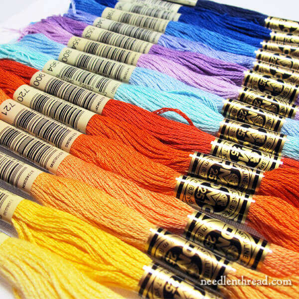
Now, this isn’t meant to be any Deep Dark Secret here, but without saying the “theme” that I want these colors to impart, can you guess what impression or idea or theme I’m trying to get across with them?
In other words, when you see these colors, what comes to your mind right away?
Maybe if I change the orientation of the line-up:
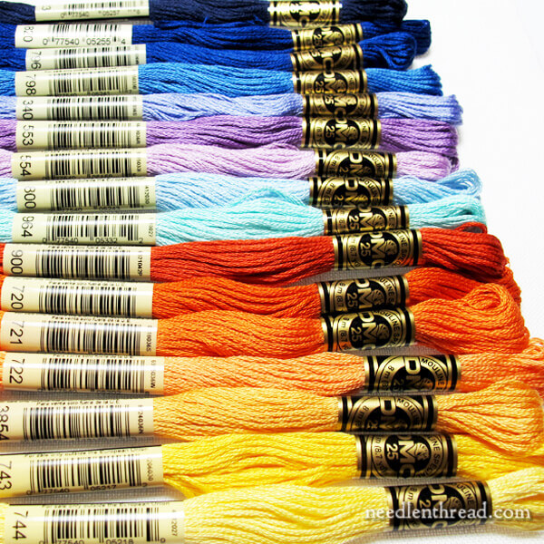
What do you see?
Anything?
I’m never 100% positive about colors.
I’m embroidering one of my own designs, and these are the colors I’ve pulled to get me started.
What generally happens next, once I start stitching, is that I eliminate some colors and add others.
I might even start mixing in different types of threads.
And sometimes, none of it works and I go back to the drawing board.
Before I start stitching, though, I thought I’d show you the results of messing about with color for a couple hours, and ask you if this collection of color imparts any particular impression or idea on your mind when you see it, and if so, what idea? What impression?
If you want to help me gauge my color success, I’d love to hear your thoughts in the comments below!
A jolly Thursday all around!
It looks like a clear, sunny October day in Colorado to me.
Yeeeessssss….but….no. That wasn’t it, either. Oh dear! But I do love sunny October days!
ROYGBIV-Looks like the spectrum to me. Are you stitching something with a rainbow?
Mmmmm….no, that’s not it. Ut oh. I’m in trouble! The impression is not coming across!!
Except that there isn’t any green …
I thought sun and sea, tropical beach (golds, blues, and some purple in the sky as the sun dips into the Caribbean) – but maybe I am just reacting to October in London. Which is predominantly grey.
LOL! The sunset part is right! not the ocean, though!
Looks like a sunrise or a sunset to me!
Fire and Ice?
Right away, I saw sunset.
would it be a sunset ?
Yes, it would!
I am probably prejudiced because I’ve been trying to do landscapes in oil paint so I see the sky, mountains, and autumn leaves.
Whatever you have planned with these threads, it will be gorgeous!!!! Such peaceful colors.
I see a sunset over the gulf.
The rainbow, sans green. Happy tones, no subtlety. Flowers.
Looks like the colors of a sunset at sea, or a field of sunflowers with a backdrop of a sunset.
If you change the order around a bit, you have almost got the whole spectrum there, in different degrees of intensity of course!
I see a sunrise in an early morning sky.
Your colour spectrum looks like sunsets.
It definitely reminds me of all the colours of a glorious sunset. Can’t wait to see what you’re going to stitch! Jean.x
Whilst I can’t guess what theme you are going for, I will say that your colour choosing process is no different to mine. I also choose, add, discard and eventually come out with a palette that may, or may not, reflect my original thoughts and intentions. And if it is way off the original picture in my head, what does it matter? All that matters is that the final outcome is something that gives me the kind of pleasure I was hoping for.
Similar with me. The initial colour palette I choose (and even blog and/or Instagram about) may or may not be the one I actually use. I tend to change several shades, drop some completely and add in others. None of the design is final until stitching is complete!!! 🙂
Colors remind me of a field of wildflowers or sunflowers against a colorful sunset.
Or, something against a multicolored sea….
It looks like a sunset over water.
Hi Mary. first thing I thought of was a sunset with dark night sky above. Can’t wait to see what you’re really doing..
Yes! That’s it!
Fire, water and sunsets (sunrise?) to me…
If you had green in there I would guess a botanical theme. Since you don’t, I am thinking it will be one of your kaleidoscope designs. If it was me, I would use it for something underwater! Looking forward to seeing the design.
I also see a lovely fall day, but I see it in the Smokies (since I’m a North Carolinian). But I can also see a beautiful sunset.
To me it says u will be doing something from hot to cold or verse visa. OK I’m thinking a beach scene., void of Palm trees, with the occasional beach umbrellas , blue water, blue sky with a warm sun in the sky, very few clouds if any. Uhmmmm that would be nice.
Umm… I’m getting, maybe, Mexico. The warm yellows to reds remind me of the embroidered flowers on Mexican dresses, while the aqua, right next to the red, brings in an ocean feel. And the deep blues reflect their pottery.
Although, I could go in a whole ‘nother direction!
Seemed kind of sunset to me or maybe sunset on water.
Looks like a sunrise or sunset to me. Lovely array of colors!
I see flowers and sky, or maybe a blue monogram with bright flowers.
I see all the seasons, even though Spring appears to follow Autumn in the selection layout.
Definitely rainbows to my eye!
Well – it’s not in a garden because there’s no green and too much blue. It’s not colorful tropical birds because they’d have to be in the tropics, which would have green. So I think it’s a sunset over the ocean. Possibly a sunrise.
Your colors at first made me think if a rainbow. But then I thought, if I were going to paint a picture with these colors, what would it be? My first idea was a garden, but there are no greens. So my idea is a stormy fall day with all the yellows and oranges being leaves and all the blue tones being the stormy sky and water.
The plots remind me of fall and pumpkins and leaves on the grass combined with clear cool autumn skies
Mmmh – Sunset?
Beach and Sea (without palm trees)?
Summer beach scene?
Looks like a rainbow of color.
It looks like temperature gradients to me; cold to coldest & hot to hottest.
It looks like a sunrise to me, as the dark velvety night gives way to a bright new day.
I see hot and cold, and day and night !
Your color selection makes me think of a lovely sunset into night sky.
Perfect! That’s it!
It reminds me of a clear, sunny day and sky, also–or bright summer flowers.
The sunset!
🙂 Yes! Sunset into evening / night….
It looks like a sunset in the islands, blue , blue ocean and oranges and golds of a setting sun.
If it were upside down, I’d say the sunset over the ocean. Very pretty colors, Mary. I think that middle orange is one that tries to make it’s way into every project I work on.
Sunset.
Yep!!
I see a setting sun shading into the night sky
Exactly.
Hi Mary,
I see autumn. Colorful leaves, a stream, and mountains, on a day when the clouds are hovering in front of the sun.
How about that?
I see two different things – sunrise to sunset and tropical flowers! I totally understand about sorting floss – it’s all pet of the process that I love so much!
Have to see the design otherwise its impossible to guess if those were appropriate colours. Plus how much of each? Does it have a little yellow or is yellow the dominant? Are they equally used? If yes, then what will make the image pop as so many of them are strong colours. Need more info….
Dear Mary
I have looked at the colours of thread in the photo and I notice there is no green thread so I don’t think it is for a flower design. Perhaps another Kaleidoscope project only with more thread colour. As you have very light colours and dark colour thread perhaps a project that blends light and dark colours. Oh I don’t know but that is all I’ve come up with. Anyway it looks interesting I can’t wait to see what it is you are embroidering but I’m sure you will let us know. Thanks for sharing your thread colours with us for your new project.
Regards Anita Simmance
It makes me think of the sun and the moon. Day & night.
Looks like a rainbow to me!
A beautiful rainbow. Love the colors.
I see fire. Or a Southwest design.
I know what you mean. When I am choosing threads for any project, my mind changes. But in the end, no matter what colors I lay/place next to each other they look pleasing. And its that point that I start stitching.
Sunset on a lake? ..although my first impression was the rainbow also haha
A sunset or sunrise?
I see two different sceneries one Autumn leaves and reflection in water. 2nd senecio I see a very blue sky with fluffy clouds and a beautiful field of wild flowers with a broken wooden fence in the for ground
First impression: northern seashore in autumn
Second impression: rainbow
Looks like a box of crayons. Could it be a child’s motif you are going to stitch?
It looks like a sunrise!
I thought of seeing a sunset sky at St Petes Beach
It looks like a sunset or sun rise to me! 🙂 Lovely!
I’m with you, it drives me crazy when I have to put together my own color schemes.
How about fire and ice? Or some variant thereof.
Maybe a sunset
Yes…sunset, into evening.
Sunset in darkening sky!!!!
Yep!
Maple leaves on a crisp sunny fall day. Sunrise and sunset. Happiness!
Mary, to me it reminds me of the full spectrum of the rainbow. They are bright, happy make you smile colors.
Sunset? I envision the sunset like a Maxfield Parrish painting where the colors gently change from dark to light.
Maybe if you asked the question in a different way it would help. “I want to embroider a (insert subject here.) Would the colors I have chosen be appropriate for that image?”
Yes!
It looks like day to night to me
Yes! That’s kind of it!
I see RAINBOW
I see the changes in the seasons, fall leaves winter snow, spring rain and summer heat
This looks like cornfields and blue sky in the summer to me.
Definitely a beach on a clear sunny day.
I see an Impressionist palette.
Sunset against the sea?
Sunset, yes. Not necessarily the sea, though!
Hi Mary!
Ocean sunset? A lovely selection however you use it.
Hoping you are thriving,
Sara
Yeeesssss….not necessarily “ocean,” but sunset…yes.
I thought that I left a comment but this looks blank to me. Any way I see 2 scenerios with these colours the first one I see Autumn leaves refection in water like a lake or river 2nd scenerio I see a field of wild flowers with a clear blue sky a few fluffy clouds and in the foreground a broken wooden fence
Crayola crayons…the big box! 🙂
My first thought was “night to day” or “daylight to dark” when the colors were reversed. But then the flower colors were there too, so I am not sure.
Ahhhhh….yes, you’re getting there! Whew. 🙂
Reminds me of a cornfield at sunset. Pretty, whatever it is.
The way the floss was laying I got the impression of going from winter to spring or spring to winter depending on which end you started from.
Perhaps I’m being too literal, but my first impression is one of Sunshine and Water. After that, I went to a fantasy castle wall tapestry.
I live in the West where we have gorgeous summer sunsets on a regular basis. As the sun sets, the sky is streaked with beautiful yellows, oranges reds & pinks fading into light blues & lavenders & then the deepest, darkest blues of the night sky. These colors remind me of a fabulous sunset!
And I live in the Midwest, where the sky does Exactly the Same Thing at Sunset – and that’s exactly what I was trying to do! 🙂
Sunflowers or pumpkins with a gorgeous blue sky and maybe morning glories?
I was thinking of a sunrise over the water.
Fire and Ice? Winter and Summer? Love and Loss?
Hi Mary,
The ocean and one of those Chinese Junk (sailboat?). I mean the boats with the red sails and golden boat. Water is green and blue of course.
Cynthia of Vancouver Island, BC, CA
The first thing I thought was “sunset.” Beyond that, I’ll wait for you to reveal.
Campfire at dusk?
I have just come to realize that I will always be hopeless at choosing colors and have instead focused on improving my skills at stitching. I will leave the palette choosing to those with an artistic bent.
I’m no artist, but I’m a darn good craftsman.
Reminds me of a beautiful sunset over the bayou.
This is probably a very pedestrian answer, but I’m wondering if you are embroidering a vibrant sun as it sets over the rollicking Pacific. You can tell I’m a gal from the West.
In addition the repositioning of the threads didn’t create any change for me.
Sunset over the sea?
Sunset sky, when you changed the orientation.
For me these colours spell out rainbow! Then again, flowers are easily brought to mind by strong beautiful colours. It is constantly wonderful how Nature can put any colours together and they look stunning, whereas we were always taught that certain colours did not “go together”. That is quite absurd, isn’t it? Colour is always so uplifting, I think.
I could see stitching a brilliant sunset from this palette; might even go for a green “flash”.
I see a rainbow
I see a sunset over a lake/ocean.
What I see from those colors is a beautiful sunset on the lake.
Looks like a sunset over water and darkening sky. Or maybe a sunrise.
Fire and ice?
positive, sunny, cheerful
Picking colors is my favorite thing. I’m usually pretty good at it..regardless of the medium. If I want a range of colors, I usually go to the color guide from the floss company, select some, fill in with others and possibles at the ready etc.. I also keep in mind what a professor said to me while still in school(MA in theatrical costuming) He said to pick your color scheme, then put everything else away. Experiment within your chosen scheme. If you don’t and keep pulling other colors in, pretty soon, it will look a muddled mess and the original intent will be lost. I do try to follow this principle and it has worked well for me. It looks like you’re doing “my method”. Sometimes it’s hard to tell looking at a skein what the color will look like one thread at a time so I change within that family. Am looking forward as always to seeing what you’re up to.
Love the colors you selected. Looks like fall. I follow your newsletter- love it
I forgot to list my web-site..it’s less than a week old so I need to remember to do that!
I see a sunset. Possibly light on water as well, but certainly a sunset.
I love your color choices. The first thing I thought of was southwest colors.
My first thought was a flower garden but there are no greens–then it looked like a sunset or possibly a sunrise. JoyceAnne
I thoughtat first it was a fall day as well but obviously it’s not judging by the comments.
After looking at them again I am reminded of two things, sunflowers or sunlight.
Maybe it’s something for a nursery? A continuation of your monogram series?
They are beautiful colors anyways. I’m sure your project will be wonderful as always
-RM
Wintery skies on Thanksgiving.
High energy reds, yell0ws. Calm, soothing lighter blues. Lots of contrast; but also some gradation.
No greens; missing the whole yellow-blue mixing range. No neutrals, tans, browns, black, white, creams, ivories. Nature usually includes some greens and neutrals….so, thus far, just observations for today…
Thank you for retaining and strengthening the accessibility of various topics on your website. The effective search process greatly increases the value of this site. We return to it frequently for reference on techniques, projects, materials, sources, and advertisers.
We open your emailings with anticipation and are never disappointed. Thank you again, Mary.
Summer Sunset
Sunrise or sunset over the ocean. It’s a beautiful selection!
I see rainbow hues
Over the rainbow with your colors
There was the beginning of a rainbow, with significant colours missing. I wondered what plan you were following that negated red. I enjoy trying to follow your thinking every time you e-mail. The thought of you sitting bent over your threads for two hours was wonderful. Embroidery clears the mind of all the dross in the world. Thank you for writing to us all. Peggy
Autumn leaves and sky. I love October blue skies, especially when there’s a ginkgo tree or some stormy purple in the blue.
It certainly looks like a rainbow to me!
Looks to me like night shading to day, with the sun coming up at orange. Or actually, maybe more the other way around, with an orange sunset?
Looks like a vivid sunset to me. (These are more or less the same colors of fabric I’m using for a series of small sunset-inspired quilts.)
I see either fall trees and a sunlit sky/sunset OR a sunset over water.
Sunrise/sunset?
It looks like a sunset sky to me!
Well the colors make me think of rainbows and unicorns!
Mary,
It looks like as marvelous sunset over water.
I marvel that you only took two hours to choose colors. My color choices usually take days or a week.
Then there are changes depending on the lighting, or my mood, or
The design takes over.
These colors make me think of sunrise and sunset. Movement through time.
I love reading your emails by the way, even though I do more dreaming of hand embroidery than actually doing it. Your work is lovely and your emails are like listening to a close friend talk about a shared favorite subject. Thank you for your insight.
Barbara
My first thought was Fire and Ice. Regardless, I love how the colors look all together!
I see a sunset.
I’m seeing a fiery sunset. All those beautiful yellows and oranges shading through lavender to a deep blue evening sky.
Sunset.
Looks like a sunset to me!
I see oceans and autumn leaves, or possibly a sunset (since there’s no brown/branch color), but admittedly that’s where my mind is right now. I just really like colorful ocean, sunrise/set, and autumn leaf pictures, and will probably see them all the time without other context 😀
The colors remind me of each evening’s sunset over the Northern California Pacific Ocean. We are treated to spectacular displays of reds, oranges, yellows and purples over deep, darkening blue water.
My first impression was a sunrise or sunset and winter…like a frosty lake but not quite frozen.
A sunny fall day, like the Sep/Oct ones in Colorado.
I am looking at a sunset or sunrise depending on which end you start. There could be mountains and/or water then shards of color blending either to dark or light. I know that landscapes are not your go-to designs, but this is what I see, probably because I am a quilter and a painter too!
It seems to me a sunset with some autum leaves
I know you didn’t ask for advice, but for me the lighter violets aren’t really saying ‘sunset.’ I realize you need something other than just the blues for the sky, but perhaps darker purple-y shades?
Definitely a sunset. Can’t wait to see it!
I guess I am worse than you Mary, or else I’m just tired. Nothing specific comes to mind. At first a hummingbird, but the last ones blew that away. lol
Looks like a rainbow!
coolness with a touch of warmth
Looking at these colors brings blue skys with cumulus clouds and brilliant fall leaves to my mind.
It reminds me of a sunset over the river with a storm brewing!
Good morning, Mary
I see the the gradual changes in light from earliest morning to darkest night.
I’m looking forward to seeing what you plan to do with this collection!
I have the same difficulty with making thread choices!
Be well, Barbara.
A brilliant blue bird among the vivid yellow leaves of a maple. Or a cooling evening with a harvest moon, high and cold yellow.
Since it is fall here in Michigan, I see the colors of the Maple Trees in my yard in the reds, oranges and yellows. The blues could be the sky from day to evening to midnight.
I love a good fall day.
Thanks for sharing so much about embroidery with me (us). I have learned so much just following you.
God bless.
I feel sunset -country -sky-maybe a lake of stream–eager to see what you were aiming at. Betty
Those colors remind me of the brilliant and beautiful New Mexico landscape.
I would have said a rainbow would feature somewhere.
Looks like a happy rainbow hued project. All of the hues are in the bright ranges.
I like bright and cheerful colors. Your colors and shades are great. Dying of curiosity!
I think after 100 comments, we know what motif you’re stitching next. 🙂
I first thought fire and ice from that color selection, too, but I went a totally different way with it – stars and planets against space, like a fantasy space painting. Maybe a representation of a nebula – those are always neat. Nothing with green tones (like Terra), but that leaves an awful lot – Titan, Pluto, Saturn, Jupiter-like planets, planets with all kinds of rings, yellow stars like the sun, or cool red ones or super-hot blue stars. And all the marvelous colors to be found in a ‘star nursery’.
Just thought I’d throw my thoughts in the ring. For color, as it were. *wink*
-Monika in Mobile
I think you are going to be doing a lot of shading/embroidery painting. You have a few main colors, so the design will not be too complicated or detailed, but there will be enough elements to warrant the shading. It will be bright and colorful when you are done.
I see marigolds. Mums, nasturtiums, maybe a water feature with koi and with delphiniums or decorative accents. Realizing I am a very new newbe. With a desire to learn and little time. I sew and quilt , mini garden , I live in the southwestern desert and that is a challenge. Will watch to see what you make.
It looks like all the different shades of the sky from morning till night, which is the dark blue night sky.
First impression was late summer into autumn and then fall
Beautiful work. Cannot quite get my mind wraped around all the techniques. Need to practice more
Sunrise/sunset….these are the colours I often see early in the morning and late in the evening when the sun is going to bed here in amazingly beautiful southern Arizona.
A sunset over the beach
I could see one of two themes. Autumn leaves and sky/mountains. The other would be coral reef and sea/ocean with some sky.
Hi Mary
Mostly your colours remind me of autumn, except for the mauve shades – not sure on that one. Mary
My first thought was pumpkins, but no black so not Halloween. Then sun, sunshine, sunset . . . and I peeked at other comments. So now I can think sunset in a Van Gogh type palette. A fun experiment would be to see what palettes other people come up with for a sunset. For example, I would mute the colors and add peaches, pinks, mauves, and some periwinkle for my idea of a sunset. I bet there could be at least a half dozen interesting palettes that all convey sunset ideas!
Hi Mary,
These colors remind me of a project I want to do also, a pretty special bird. http://www.jessfindlay.com/blog/the-15-most-spectacular-hummingbirds
It’s a beautiful color pallet for whatever project you choose. I’ve really enjoyed using Trish Burr’s Color Confidence book for both my quilting and embroidery. It’s amazing how colors put side by side will blend and create another color.
I spend a lot of time choosing colors also, and then add some, and take some out. One of my dilemmas was to make a flower less mauve and more red & pink.
It’s a time to slow down and enjoy the beauty.
Blessings,
Sharon
Ooh, lots of first impressions: sunset (dark sky following down the sinking sun), desert landscape with starry night, and summer and winter. I can’t wait to see what you’re up to!
PS. I’m a recent reader to your blog and it is just so lovely. I made one of your closeup photos of your flowery initial A for the background on my iPad.
It is a very happy palette, indeed. And it looks like summer, as the rain is ending and a rainbow appears in the sky. I like it a lot .
Sunset!
To me its like a sunset, with the yellows representing the sun up to the the dark night sky where it’s still too light for the stars to come out.
looks good
like the range
Lovely blue sky colors above a flowered desert landscape.
Well, there’s no green in it. So, I don’t see anything in nature. The only thing I can think of is a kaleidoscope.
It made me think of Day and Night. ???
Hot and cold, fire and ice!
Bonsoir Mary
Le choix des couleurs me font penser à une belle journée automnale(forêt) au bord d’un pointd’eau (lac, étang…;)
Cordialement
Rainbow. But there are two colors that don’t fit in the order they are presented. But overall, Mary, I think the colors you have chosen will work well together.
Sunflowers, poppies, lavender and bluebells.
looks like you’re doing a nearly set sun sunset
A beach? a sunset on the sea? Autumn in forest?
these are inspiring colors…
I see water, the horizon, sky and a sunset.
Yes, sunset is what I saw before I read the other comments. I always love the purple to deep blue parts.
Looks like the colours of a beautiful sunset
I see beautiful fall leaves under a blue sky tinged with pink and lavender.
I see lovely large African daisies, lovely dark orange ones with purple centre’s, yes the craziest colour’s in the world but oh so beautiful. I saw them today at our Nat Bot gardens at Kirstenbosch which I know you will have heard of. But just colour, wonderful colour and large daisies not lazy daisies. Enjoy the colours!!!!
Certainly looks like a beautiful rainbow and Roy G. Biv!
This looks like an autumn sunset to me…. I like the color selection. I might add black as well.
It reminds me of sunrise and sunset. Love your work!
Beautiful, sunny autumn day with a deep blue sky and mountain peaks.
Sun and moon, something celestial…
This reminds me of a photo of the Caribbean….the tropical waters and the rich orangey yellow sun.
In Christ,
Gail J.
Mary, you’re not alone in pondering colors. Could this selection be a sunrise or sun set? Or possibly a natural gas flame?
Red and yellow autumn leaves and purple blue skies, that’s perfect. And I would add some greens, perhaps in olive shadows.
I think you are doing a project for a beautiful day and I think your choices are perfect.
Thank you very much for sharing all that you do with us. I love embroidery and enjoy all of your instructions, ideas and photos. Valerie
At first I thought of spring flowers but how can it be if there is no greenery ? The oranges & yellow make me think of fall leaves, or pumpkins but then there are no browns…. So my next thought was Easter eggs… Clearly, Mary, I have no idea at all 🙂
Autumn sunset at the lake
I saw a beautiful sunny day at the beach
I initially though tropical holiday, but then noticed no green.
So, hmm deep indigo sky, mountains in the distance, sand, sunset
So is it sunset in the desert?
Looks like a sunset turning into the dark of night to me. Glorious colors, regardless of the project!
The blue-purple range makes me think of the sky at the very tail tag end of sunset – bright right around the horizon, but mostly purples and blues above. The yellow-orange series doesn’t really click with the blues for me, I think because of the light purples. They are nice, but they don’t say anything specific to me. You could do any summer flowers or fall leaves in them.
It looks like a sunrise or a sunset to me
This reminds me of super hot sunny day at the beach. A tropical beach with turquoise water and white sand and hot hot sun!
Looks like the start of a rainbow….ROY G BIV……a rainbow name to remember the color order. But you are adding shades of the rainbow. Going to be gorgeous whatever it is. I can’t wait to see it……
Oops///no green. Still gorgeous….
My guess is an Autumn harvest type scene with a lovely clear blue sky. It is a jolly Friday in NZ – the last long weekend before Christmas. Sun is shining and sky is a pale blue, the fore ground is very green after all the rain we have had. You have a good one. ttfn
I think it looks like the Greek Islands.
I too have trouble choosing a pallet for a project. My mind steers me to blues, purples and golds!
Sunset?
Oooh – I love the contrasts between the oranges and the blues, but also the gradual shading… I think of a field of flowers – bachelor’s buttons, iris, sunflowers and marigolds. Or a pot – lobelia and orange petunias… I love to see the strongest colors juxtaposed against each other, as well as the gentle fading from one to the other…
autumn trees over a lake
Beautiful colors reminding me of a perfect fall day with the close of our beautiful trees when they turn.@
Thank you so very much for sharing your beautiful work, teaching and nformation with us.
Valerie
Hi Mary,
Another wonderful article…I had given up hand embroidery for a long while – I work at a quilt store and am an instructor for machine embroidery and software classes, so my attention wandered.
Since finding your site and the beautiful work you do, I’ve been inspired to get back to the relaxing process of hand embroidery.
As a former graphic designer, my eye was drawn to your color scheme for a bright, fall floral bouquet.
Thank you for your continuous inspiration to us all!
Sincerely,
Susan
I think it looks like the sunrise or sunset depending the blues start at the bottom or the top. No matter I like them!
That definitely says RAINBOW to me. Can’t wait to see the finished product, and all the steps in
between.
I go to the fabric store and find a printed fabric that grabs me for the colors or theme. The designers are more talented them me in choosing colors. I buy a piece and bring it home, them pull colors from my threads that match the fabric colors. Works most every time for me.
Definitely a rainbow! Gorgeous selection though. Care to share the numbers? I can read most of them but not all.
the color range looks like a sunrise (or sunset) over an ocean
I thought of a sunset on on the sea
I imagined the colours with the blues at the bottom and yellows etc at the top and straight away saw a sunset over mountains or the sea.
I love your website and look forward to seeing your newsletter every day.
Many thanks.
Lisa from Auckland, New Zealand
It could be autumn or fall, as I believe you say, in my part of New Zealand or it could be a glorious sunset.
Looks like a beautiful light spectrum or rainbow colors. Really broken down by many shades for blending.
Hmm, I see koi swimming in a lily pond. As far as more abstract impressions go, I get something like…coziness on a cold day.
I also have trouble selecting colours for a project. I have turned to my patchwork shop. Those designers know all about what goes with what. I decide the main color for my project and go and look at fat quarters with those shades, and voila! I have a range of colours that will work. At least I now have a starting point.
Regards from Sunny Kapiti Coast, Wellington
I’m thinking Pumpkins…maybe Halloween…ish .
Whatever, I’m sure it will be beautiful, a feast for our eyes with those beautiful colours.
If your focus was on the darker colors, I’d say richness and drama. If the lighter colors predominate then I see more fun but still drama. Good drama.
I know that frustration so well. That is one when one does needle painting like me, occurs time and again. Like you, I look through my stash and select the colours I think will go with the project. Once that is done I am ready to start. As I progress, I suddenly find that there is a certain shade of green I want that just is not there. I have plenty shades of green, but that shade I want, does in all likelihood not even exist. At the moment I am busy with a Protea flower. It is pinkish flower so I though how difficult can pink be, four maybe six shades ? At the moment I have already chosen and working with about 20 shades and I am sure I will add more. But hey, I think that is where the fun of embroidery lies, choosing the right colours as you have seen it in your mind’s eye, even if it is time consuming 🙂 Regards Elza, Cape Town.
Mary, I see a sunny day at the beach – sea and sun colours. I live near the coastline so that could be the reason for this interpretation! 🙂
Best wishes to you from Dianne
First I’ll say I’m thankful I get your blog newsletter. For some reason today when I went to your website, no matter how I clicked or how many times I clicked on “continue reading” it just wouldn’t respond. (sigh)
Your colors look similar to the colors I’m using on a project for the Orlando quilts many of us are making. So yes, we’re using rainbow colors. Perhaps you have a rainbow project in mind as well?
I see a calm, warm, evening sunset at the beach.
I get a cheerful, but cozy feeling from these colors! (I hope this comment isn’t ruining your project! Ha, ha!)
Could be my monitor but with about 1/3 of threads looking like they are in the orange family, I would guess you are planning on doing something to do with pumpkins. I love peach and salmon colors, but straight orange for me isn’t a color I really like which is weird since I was born on Halloween. I prefer reds and pinks and always a variegated thread or two or three as well. Still not sure of my colors for my kalidiscope.
Looks like it might be a dark night with the purples and blues with lots of orange pumpkins and a bright yellow moon.
Hadn’t read the other comments before leaving mine, but I can certainly see a sunset in your colors. I would have probably had more pinks and purples as that is what our sunsets over Lake Erie (I’m on the eastern side so they are magnificeint!) would look like! My son and I call them Sky Blue Pink. Which was his interpretation as an autistic kid of painting the town Red!
Fire and ice?
Happiness! Thats it is with all those gorgeous colours sitting together.
I see a sunset!?
For me, it shows all (or most of all) the colours of autumn : the magnificent leaves on a magnificent sky. The richness of the contrast. I’m sorry if I don’t have the vocabulary to express it perfectly, but I think you’ll understand me.
Have a very nice week-end,
Diane
Sunset
Hi, well you may think my imagination is way out there, but what I see when looking at your choice of colors is a beautiful mountain range at sunset. When the skies are full of those bright oranges and yellows. And each mountain peak and their shadows are deep blues and purples. But then while writing this I thought how cool if it were even an expanse of dark blue ocean again at sunset with the deep oranges and yellows. I am probably way off, but am almost excited to find out. ~SuzyJCinColorado~
I see in your colour selection the beach and sea or the desert and a shimmering lake
Regards Linda McCrae
Beach and ocean
Mary, it’s a fall sunset!
What a view. Looking at the horizon just as the sun is saying its final goodbye for the day you see the vibrant burst of oranges and yellows. As your eyes move upward purples, lavenders and pink give their nod to the evening! Finally moving heavenward you see a glimpse of the bright azure blue sky still holding on. Finally the deep blues as the light of the sun can no longer reach up and luminate. A beautiful show of a fall sky falling asleep!
Who doesn’t love a fall sunset!
Marilyn from Dubuque, Iowa
Sunset over the water (or a sunrise)?
Or a bowl full of goldfish but no water plants?
A rainbow?
Love the range of colors. I see a sunset over Lake Superior. Can’t wait to see your project.
Happy Stitching, Louann
Looks like a rainbow to me! Very happy colors.
Night and day ? ying and yang ? love the two combinations but such opposites ! looking forward to seeing the outcome. good to see you forging ahead love Chris from Australia
Hi Mary
Love those colours, to me they remind me of a Queensland Summer, glorious sunsets and the gorgeous colours of the beach and coral. I live two streets away from the beach and reef.
I also think it looks like fall with the rusty oranges and yellows. The blue is a very clear sky. My mind automatically goes to nature. I am not an abstract embroiderer. Can’t wait to find out.
Looks like a RAINBOW theme to me!!
Ah, I’m the exact same, though for me it’s a matter of colour matching. Colour matching is the bane of my life- sure DMC has so many colours but still I can’t find the right shade of green or brown.
Nothing more disheartening than going to a needlework store with many lines of floss and still have to compromise on the shade.
Your colours look lovely and put me in mind of a sunset over the ocean!
Sunrise or sunset over the mountains?
Wow, so pretty, so fun! My first impression is sunset on on water, then sunset on coastal view with mountain cliffs and lavender flowers. Gosh it could be anything! Flowers, birds, carnival, abstract, and on and on. I can’t wait to hear what it will be!
It looks like football team colours.
Very bright and designed to draw the eye
Fall by the ocean – my daughter.
Arizona sun.
The colors make me think of sunset on the water or perhaps sunrise on the water, depending on the amount of yellow and orange you use. The blues are dark…so I’m thinking sunset.
I immediately thought of a large lake with variations of blues surrounded by Fall colors. I loved the imagery that came to mind.
P.S. I love your postings…keep hoping your inspirations will rub off and I will do more needlework!
Fiesta! Is the first idea that came to my mind.
I see a distinct hot vs. cold.
Colors remind me of a beautiful sunset in the Florida Keys!
Looks like a landscape.
I see sunset over darkening hills
I almost always have a hard time making ANY decisions on everything.
So imagine how hard it is for me to fit embroidery thread colors together . I get so frustrated.
Only thing that helps me, A friend went and got me a couple different color wheels.
It helps about 50 % of the time… but now I have and issue with..what color wheel to use. I certainly under stand your frustration too.
I had seen where someone put together packs of color threads that go together. I loved them but can’t find them again. If you know let me know please.
I also live variegated threads. but I don’t think I like clashing colors together…
I do stitching cards so I can tell faster if I like my combo. They are all small projects but I love it.
Thank you.
Tropical ocean water at a coral reef.
The colors remind me of fall on a clear day with blue skies.
Colors of sunset
Sunset of course.
Your beautiful array of colors says “Kansas sunrise or sunset!” I’ll look forward to seeing the process, progress, &project!
Tropical fish and birds.
Can’t speak for northern climes at this time of year we but are getting to summer.
Throw in a bit of green and black and Bob’s your Uncle.
Don’t keep us waiting too long!
A sunset over water.
I am not guessing because I cheated and read some of the comments. But to me it looks like a central Australian landscape, perhaps the Flinders Ranges or similar (for those of you familiar with the area). Now I know it is a sunset, I am having trouble. Maybe sunsets in Kansas are more orange than ours but most sunsets I have seen have a certain amount of pink. Sorry Mary, it sounds as if I am being picky, but I am definitely not, just writing down thoughts. I’d like to know more about the colours in sunsets around the world…..
I don’t see brown or green so there are no trees or leaves. I will guess a beautiful graduated color kaleidoscope design.
Project thread color selecting will be our doom, haha!
Your selection makes me think of an autumn pumpkin patch or tree grove at dusk and then on into a clear, starry night.
A beautiful sunset over the ocean is what I picture with that color lineup. I sometimes spend hours figuring out the right colors for my needle painting, and also end up changing things up as I get into the project. 🙂
I see a sunset!
Sunset over the ocean to me!
I’m thinking maybe a sunset, or a night sky over the desert?
I see a sunset in these colours. They look so yummy!
How about rainbows?
These sure look like the colors of a fire streaked sunset over cool tropical waters!
Autumn leaves in the trees against an October sky.
Seems like two hours well spent to me! How do you keep your threads so tidy?
My whole heap is indeed that! And where are your half skeins? Do you always start with nice new skeins for each project? The paper bits are even on straight! It must be a super power!
Hi, Debra – I keep whole skeins in drawers, according to color families. I try to keep partial skeins intact with the paper sleeves on for as long as possible. When that becomes impossible, they go in little individual bags, with the color number on the bag (if I still know what the color number is). When I’m taking a picture like this, I definitely have to straighten the labels before hand!
I see a sunset over water with a few clouds
Those sunsets sound absolutely beautiful, Mary. It will be lovely to see them thread painted.
Forget theme , i am busy gushing over blues and purple.
To me, the colors say “fall.” I envision the reds and yellows as leaves, the blues as the evening sky, and the colors between as fall flowers.
It just turned cool enough to need a jacket in the Indianapolis area yesterday. It hasn’t frosted yet, so fall flowers are still in bloom. The leaves are turning, because they change by the length of the day light cycle.
Of course, it could also be a very pretty mandala.
I saw a rainbow as well.
I see rainbow 🙂
These colours remind me of twilight. A bright sunset fading to those lovely faded blues and mauve so of twilight.
Looks like twilight above the ocean
For me, the colours that you have chosen conjure up images of a vivid sunset at the beach. The gold/ rust/ orange of the setting sun rippling on the blue calmness below.
I too had a mess with colours but now I have bought a box with bobbins and placed them in order of numbers of the tread. Would like to send you a Photo, but I do not know how to do it.
Regards Jette Sauerberg
Could it be another kaleidoscope in the making? Just love the colours!!
Looks like you’re thinking about the color wheel. It’s surprising to me that more thread companies don’t create a perfect fit to the “Color Wheel” it’s very difficult to get the right colors even in DMC floss where you have so many to choose from. A thread box with a color wheel would be a great combination to sell together.
Right. No green.
To me, I see sunset moving into the dark night.
Maybe it’s just the season, or the beautiful fall colors I just saw in Colorado, but I see the theme as Autumn, especially with the intense red/orange/yellows with the sky blues! I will be looking for the real piece!
Having lived in Texas, these colors remind me of bluebonnets and Indian paintbrush, especially at sunset—stunning!
http://herronstock.photoshelter.com/gallery/Texas-Hill-Country-Bluebonnets-and-Wildflower-Landscape-Photo-Images-Gallery/G0000_9Cgk6ZbVTw
Looks like a beautiful Texas sunset to me.
Your color choices remind me of the colors of the evening when the sun is setting.
It gives me an impression of a sunset.
I see a beautiful woodland fall sunset from light to dark or a or a spectacular beach sunset from dark to light.
Good Morning Mary! Your color palette is noteworthy for containing no green & no neutrals. Taking a stab, your colors represent hot & cool to me. Subject?? This seems like a “stay tuned” moment!
It’s a very eclectic assortment of colors that I really like, a lot! I would have thought “flower” but without any green and lots of blues I’m thinking something with water. Perhaps an underwater garden? Or perhaps something with fish and coral? Can’t wait to find out what you’re thinking.
That color palette suggests several possibilities. It is a partial color wheel but suggests either a dawn atmosphere or one of dusk near a body of water. For a garden, green and brown are missing
What came to my mind right away: There’s no green!
Mary, they make me think of a sunny Autumn day; blue skies and beautiful tree colours!
Brings to mind a sunset over a sea, but could be many other things!
Looks like a sunset to me!
Sun rise, Sun Set…. or Water….. or Autumn…… nope not Autumn….. of course it could be anything at this stage.
I see fall trees and blue skies 🙂
Sunset over the sea?
Talking about colours… a few days ago I found a text about how to identify if different colours have a low or high contrast to each other.
It’s a german website, but maybe its understandable with google-translator:
http://www.lanade.de/blog/stavanger/
Just scroll to the pictures of the balls of wool in colours and in grey-shades. The Pictures in the first row are the original colours. The pictures in the second row are the same, but changed to grey-shades with a picture editing program.
You see the different contrasts of the balls of wool much better on the black-white pictures.
I’m really exited by this solution and maybe Mary or someone of the readers on this site could use the information in their new projects.
Mary, I’m really, really curious what you will stitch with the taken colours. My mind pictures a black tree in front of a wonderful sunset in Winter…
I thought of a sunset over the ocean.
These are the colors that I would use to make a sunset. But! That is just way too easy. You would have to be doing a sunset in a particular style, otherwise…. I just don’t see it. A bird? Butterfly? Another colorful animal? Could it be a super rare picture of a plant without green in it? Hmmm…. You’ve been doing quite a few monograms lately… Possibly something pastoral with an eye-rollingly sentimental quote and a rainbow in the back? That you’re even asking means that a person could possibly guess the answer… meaning that it would be a thing recognizable by color… so not one of your circle thingies… Or monograms… Throwing caution to the wind, I’m betting on a tropical bird. With no enthusiasm for my choice. Dude, this is gonna drive me nuts.
I don’t know, this new comment format is confusing me. I thought there were just a few dozen comments, but now I see there are 327! Just as well, maybe…
Sunset or autumn leaves were my two guesses. I like the choice of lavender for part of the sky. I think you may find that darkest orange is too dark and drab. For shadows in the clouds, you may want to consider a medium-dark purple-grey. And some hot pink would brighten those clouds.
Now that some of the humidity is gone, I’ve been enjoying those clear sapphire evening skies. Can’t wait to see your plan!
Has to be a beach at sunrise or sunset …. or mountains at sunset ….. or another happy monogram ….. or who knows. Except for green, it could be almost anything. Can’t wait to find out!
Is it Holloweenish?
Pure chroma. Wow!
Fire and water. Perhaps a sunrise or a sunset over a sea.
Looks like a sunset. I love your site.
A field of pumpkins and tall grasses after a few frosts, on a bright day. How about a dot or 2 of black for some crows?
Oh Mary! You are not alone in your quest for the perfect colors and threads. As a long time stitcher I have been guilty of changing colors and even stitches in bought patterns to fit my taste and now I have started to design my own pieces and spend many hours choosing colors, threads and fibers. My guilty secret is I really enjoy all the time spent doing it!
Thank you for all the wonderful posts and great tutorials.
Rainbow?
I’m seeing a lovely range of Fall colors. Anyone else see this?
A sunset over the ocean
I see the fall colours here in Ontario, Canada with a beautiful sky above. Our leaves are just about gone now but these colours bring them back, if only in my mind.
I’m seeing a fall set of trees in lovely oranges and yellows with a beautiful sunset in the background shaded with violets and deep blues.
I see no green!
Rainbow. Or sunset at the beach.
Beach scenes come to mind
The blues and purples make me think of sky or water. The yellow/orange/red say fire to me. I also considered monarch butterflies (need black), flowers (need green), and a sunrise or sunset (need pink, and the colors are too bright). Maybe a fiery dragon flying in the sky? Or a goldfish swimming in the water?
Reminds me of the seasons but whatever it is it looks happy.
Not quite sure why, but “a day at the beach” comes to mind. Two hours isn’t bad for picking colors. When I choose my own colors for a project, I start with an idea, go through my stash, pick out what I can. Let it sit for a bit, look at it some more, maybe ask my family and/or stitching friends how they like it, and think some more. Especially for canvaswork, then I may gather up several of these works-in-planning and spend several hours at a (relatively) nearby needlepoint shop tweaking some more. And yes, I’ll frequently throw in some extra threads to accommodate switching during stitching. Colors change, depending on what’s next to them.
Love the colors. To me it looks like a color way to stitch tropical birds.
A cheerful array of colors for a window box of flowers.
A Fall day on a lake
Your colors immediately make me picture the sky. It could be a clear blue sky, or a magnificent sunset. I really like both ranges of color. Louise in Cobourg.
Those colors are lovely! I see in them a field of yellow and orange daisies under an sky of multi shadings of blue. What do you think, Mary.
I’m thinking Rainbow, but I don’t see green. So maybe I’m off. But I’m wondering if you are gathering colors for a new medallion? Can’t wait to see what you have lined up! 🙂 Hugs, H in Healdsburg
Sunset?
It looks like a sun set or autumn colours to me !!
Good morning Mary, I love your questions! What I think about when seeing this line up is a rainbow or by any chance another mandala?
I see the sun rising over the ocean. That being said I live in Oklahoma, so what do I know about the ocean.
They put me in mind of a beautiful summer day, oh it’s raining, but look over there, there is a beautiful rainbow, and see how the beautiful flowers glow after the shower.
A beautiful summers day, a brilliant rainbow or autumn is on it’s way. Enjoy them all, life is too short to miss a days stitching.
I see a sunset over a Caribbean Sea, at least what I imagine it would be!
Mary, it looks like either a sunrise or a sunset to me. 🙂
Sun, sea and sand.
Looks like a sunrise and a sunset. We have awesome ones in Oklahoma.
The colors are great,they look like my sister’s flower garden.
This looks like a rainbow to me. Something bright and sunny, and fresh from a rain.
Wendy wagner
Colours of a Caribbean sunset….