It almost seems irreverent to refer to any church embroidery as ugly. But … the fact is, some church embroidery is ugly. The case in point: parts of an old vestment I’m going to show you.
While overall, the vestment has its ugly aspects, there are still several commendable elements on this old piece. And there’s a lot to look at, think about, and study in it.
But oh! There are several things that really bug me about it!
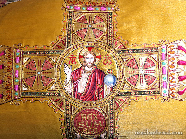
Unfortunately, I did not get a full photo of the back of this piece before it was taken apart. Some of the embroidery – particularly, the center medallion you see in the photo above – has been salvaged from it. That’s the same medallion I showed you up close here a few weeks ago.
So, this garment is called a chasuble. To understand what a chasuble is, you have to delve back into the history of ecclesiastical (or church) garb. For centuries – for millennia, actually – the chasuble has been used to garb the priest during the liturgy.
There’s a lot of symbolism behind ecclesiastical garb, but we’ll just stick with some basic information about the use of the chasuble.
By the middle ages, and ever since then, the chasuble, because it is so visible during the liturgy, was often ornately decorated. The decoration serves a couple purposes:
1. It sets the chasuble apart from common garb. It’s meant to mark the office of the priest, and as such, it is considered a sacred thing, and only worn by those who minister at the altar of God. It is only worn during the celebration of Mass, so if you ever see a Catholic or Anglican priest in a movie wearing a chasuble doing something like officiating at a graveside service, then the director didn’t do enough research.
2. Because the chasuble is very visible, it can serve as a teaching tool or as a catalyst for devotion. That is, the images on it can instruct and they can also encourage contemplation, prayer or devotion. This is, after all, the whole purpose of decor in a church. Statues, stained glass windows, images, crosses, mosaics – all of these elements of decoration are meant to lift the mind and the heart to the Divine.
It’s not unusual, then, to see figure embroidery on old chasubles and other liturgical garb, because the figures can either tell a story and instruct, or they can inspire devotion.
So that’s to give a little background behind the chasuble and other decorated ecclesiastical garb worn during liturgical functions.
On this piece, set in a large ornamental cross that decorates the back of the chasuble, is the central medallion depicting Christ, shown in the photo above.
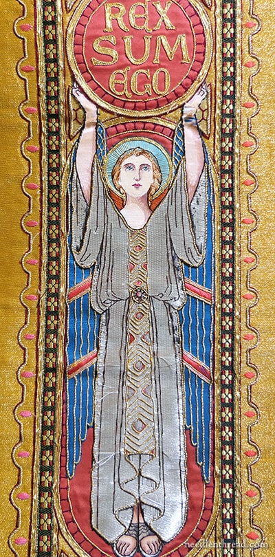
Below the central medallion, down the center of the ornamental cross, is this angel.
The image of Christ in the medallion can’t really be classified as any particular style. It is rendered in a style typical of ecclesiastical figure embroidery from the mid-1800’s through the mid 20th century.
The angel, on the other hand, has a definite “art deco” feel, and because of its style, we can gauge the approximate age of the vestment – early 20th century, any time around the 1920’s and 30’s.
On its own, the angel has a lot to recommend it. It’s in very bad shape, but, for those who like this style, it presents a nice image.
The angel isn’t entirely embroidered. It’s a conglomeration of different appliquéd elements, decorated with touches of embroidery.
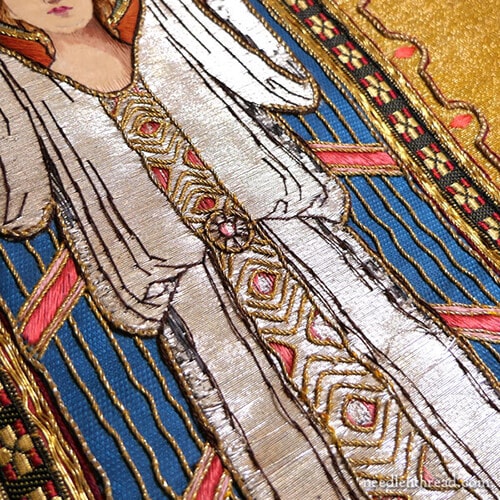
The angel’s gown, which shines a lustrous silver, is a kind of cloth of silver, probably made with a synthetic silver thread. Otherwise, considering the overall wear on the piece, it surely would have oxidized more by now.
Details on the wings, the hands, the face, the hair, and the feet are all embroidered by hand, but the whole element is not embroidered – just enough detail to make it look embroidered.
The whole thing is assembled to look like one piece, by ingenious layering that allows such a piece to be created in a lot less time than it would take to hand embroider the entire image.
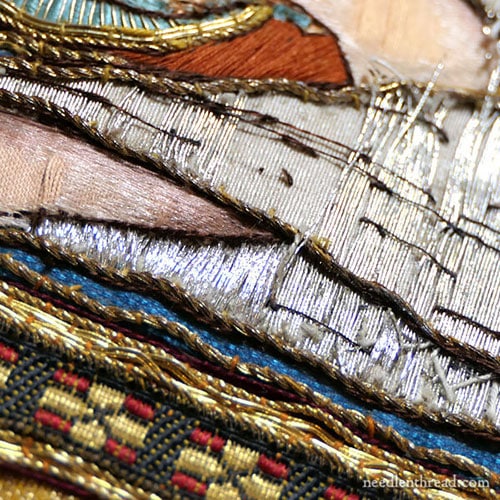
There’s quite a bit of damage and decay on the angel. In one area, someone attempted to cover up some of the missing silver in the gown by a messy satin stitch job using what looks like silver imitation Japanese thread.
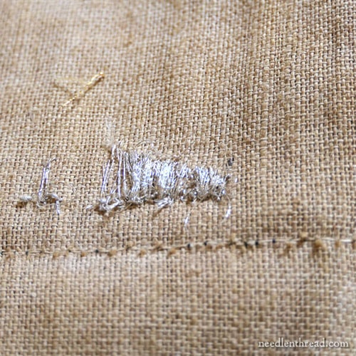
Here’s the back of that attempt. I have no idea when that was done, but most likely, decades ago – and probably closer to the time it was originally made.
The Setting Around the Figures
The figures are ok. They’re not bad. They’re not the greatest I’ve seen, they’re obviously embroidery workhouse productions rather than bespoke work, but they are nice as far as design and even execution go.
Given the relative niceness of the medallion in the center and the decent representation (though in bad repair) of the art-deco angel, the ornament on the rest of the cross is baffling.
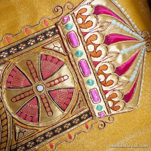
The rest of the setting – the large ornamental cross in which the figures are placed – features…well, for lack of a better word that isn’t disrespectful… colorful ornament.
Each end of the large cross shape is tipped with an onion dome.
The onion domes are garishly colored in fuchsia, burnt orange, hot pink, turquoise, baby blue, and dark red (a typical color used for outlining on gold vestments), all on a gold background.
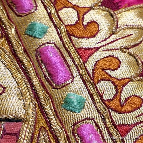
And, disregarding the state of disrepair, it is still quite evident that the embroidery on the ornamental area on the cross, for the most part, is very poorly done. It certainly wasn’t accomplished by highly skilled embroiderers.
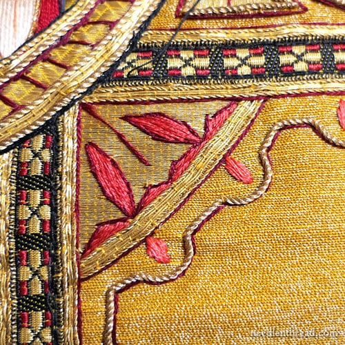
All the embroidery around the ornamental cross is pretty sloppy. This isn’t just a matter of time displacing the embroidery. In some areas, the stitches are over-crowded and they overlap and twist around each other; in other areas, they are fraught with uneven spacing.
Sometimes, the stitch spacing is so far apart as to expose the fabric or padding underneath an element. Upon examination, the thread is whole, still under tension, and hasn’t shifted. It’s in the place it was stitched.
Incoherent in Design
There’s a lot to be said for design coherency. The idea of coherence in design isn’t new – it’s something that artists have strived for, for centuries. Coherence in design for vestments and vesture used in churches was particularly advocated by architects and designers like Pugin in the 1800’s.
In this particular chasuble, there’s a definite lack of coherency in design elements and color choices.
The onion domes hint at a more Eastern style of design. The central medallion is certainly a more Western depiction of Christ. The angel, as discussed above, is very art-deco, which was a fairly universal art movement, but prominent mostly in Europe and America before World War II.
The colors on the central medallion are typical for that depiction of Christ, with golds and reds prominent. There’s nothing unusual there, taken on its own. But when you combine that figure with the figure of the angel, very symmetric in shimmering silver and blue-blue wings, and then you add in the onion domes with fuchsia, hot pink, rusty orange, baby blue, and turquoise, coherence pretty much flies out the window.
The Ground Fabric
I do like the ground fabric for the whole vestment. The vestment is made from cloth of gold.
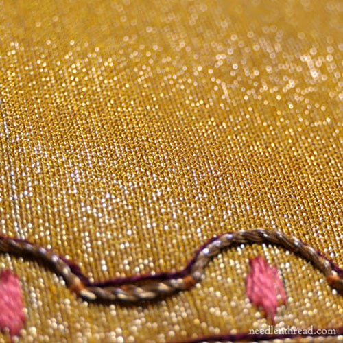
The cloth of gold has darkened a bit with time, but it is a fairly nice cloth with a fairly high content of metal thread in it, which makes the cloth overall very stiff.
It’s got a nice golden sheen, and despite the darkening, it’s still a beautiful fabric. While it shouldn’t be salvaged for secular use, areas that are in good shape could be salvaged for ecclesiastical use.
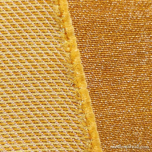
You can see a clear difference between the old cloth of gold (on the right, darker) and a new piece of cloth of gold manufactured today. The older fabric has more gold thread to it, the weave is different and closer, and the fabric comes off as much richer.
Compared to it, the new cloth of gold tends to look a bit skimpy.
Salvaged Pieces
To tie up, the vestment itself has parts that are worth salvaging for re-use, especially the central medallion, which is in very good shape.
The angel is in bad shape and not salvageable for sacred use.
The cloth of gold has some areas that are in very good, sturdy shape, and could perhaps be salvaged for further ecclesiastical embroidery, especially for appliqué elements (like sacred monograms).
Anything that’s not salvageable for sacred use would not normally be salvaged for secular or mere decorative use. For example, you wouldn’t normally take that angel and work it into some kind of multi-media artwork that’s not meant to be devotional in some way. It could, at a stretch, be mounted in a frame behind glass as a kind of devotional image. You also wouldn’t take the cloth gold and work it into, say, a crazy quilt or something like that.
Why not?
The vestment, though not useable, is still considered a sacred thing and it would be considered inappropriate use.
The normal order of business would be to burn what remains if it isn’t able to be used on something sacred.
So those are my meanderings about the good, the bad, and the ugly on this particular piece. I’m still working on this salvaged piece of ecclesiastical embroidery, and as soon as I have some decent progress on it, I’ll share processes and techniques with you.
If you’re interested, you can read my other explorations in ecclesiastical embroidery by browsing through the articles under the tag “ecclesiastical embroidery” here on Needle ‘n Thread.
Enjoy the weekend!



thank you for this article – very informative. I particularly appreciate that you say not to use the salvageable parts for non-ecclesiastical purposes. I don’t think people always understand that church vestments are sacred…not even some of the priests who use them! Your blog is always interesting and a delight to read! On my list of things to do when I retire (19 months!) is to start at the beginning of your blog and read through it all and make notes of all your tips and try all the stitches – I want to made a stitch book…one of my retirement goals which my son and DIL will be so excited to have when I’m gone! :0) thanks again
Wow, really interesting, Mary! Thanks for your detective work into the history of the piece and sharing all of this fascinating information! I’m not religious but I think it’s great that you remind us that sacred vestments/objects should be respected and not used for secular decor (no matter what religion/faith they come from).
Could those onion domes simply be crowns – some of the Queen’s crowns would have very similar shapes to these – gold inset with jewels and velvet domes (sometimes with pearls)? Whatever they are, they don’t improve the piece.
I assumed the onion domes were crowns (of the sort work by European royalty, seen in the Crown Jewels etc), which would make it less incoherent in terms of design inspiration…though certainly not in terms of colour!
That was really interesting. Not being artistic in the least, I wouldn’t have noticed the different styles of art in the chasuble. I did notice the variety of colors but that’s about it. I’m glad you explained about not reusing bits of the gold fabric for other secular projects. I couldn’t figure out why. But we wouldn’t take left over communion and feed it to the pigeons in the park either. 🙂 Great article.
Thanks so much for the articles on Ecclesiastical embroidery. They tick off a lot of my personal interests, and you do such a wonderful job explaining. I’m only a beginner embroiderer, so it’s wonderful to hear your insights on the stitching and construction in addition to the liturgical and historical aspects.
Fascinating! Enjoyed reading all the info — history, styles, uses, just all of it. Quite informative!
Good morning, Mary. It was a very interesting read. As an orthodox Christian, I would not call those ends on the cross onion domes. They look much more like crowns to me. And the colors make a little more sense (only a little) if the embroiderers were trying to emulate crowns. Crowns to represent the Kng of Kings makes sense too. I always enjoy your posts on ecclesiastical embroidery.
What an interesting composition…it seems that the colored embroidery is very inconsistent with the laid gold ground. Could the original intent have been semi-precious stones instead of the poorly worked imitations? Did someone add the carnival-like crowns to the more restrained cross. The deco angel seems to have an art nouveau face. Entertaining speculations.
Thank you, Mary, for your background and explanation of this piece of vestment. What I really appreciate though, is your regard of the piece and your explanation of it’s future if it is not restored. As God is Holy, so are the vestments used in sacred acts. I suspect that the burning of any sacred garment creates a sweet smell unto the Lord.
I am curious as to how you became involved in the history of Ecclesiastical garments, and in their restoration? I also appreciate your comments on how the media uses the garments incorrectly; I too, was ignorant until your education!
What a beautiful, informative post Mary – thank you for the history lesson, and especially the the reverence with which you treat the subject. I have a question about the angel that you indicated was Art Deco in nature. I agree it is deco, though I also see some elements of late pre-Raphaelite/Arts & Crafts movement in it as well, which could help explain the eastern influence onion domes/use of non-traditional colors (more eastern bazaar, if not slightly bizarre) in some of the other places as well. From a historian’s perspective on liturgical garments, did embroidery “keep up” with trends in the art world, or did it tend to lag behind? Also, is this American? British? European?
Again, thank you for the lovely post – it gave me needed respite, contemplating our interpretation of the Divine, in a day fraught with work & family concerns.
Good morning Mary! It occurs to me that this chasuble has a “loving hands at home” feel to it. I know that in the first quarter of the 20thC there were many items available to the ordinary embroiderer in semi-stitched state – dresses in particular. I wonder if some enthusiastic lady got hold of a kit and stitched her heart out for the greater glory. Thanks for sharing the progress of this particular piece. Charlotte
I really enjoyed the critique. I always learn so much about embroidery when you explain in detail. Thank you very much.
I see what you mean about design coherence! I like the onion-domes, the Christ medallion, the Maltese (?) crosses on the main cross, and the embroidered border AROUND the main cross – as separate elements! But my first impression, on looking at the first picture, was: Pink gumdrops? I can’t say that made me feel very contemplative!
And I’m in agreement with Suzk – thanks for mentioning that once something has been dedicated to the service of God, re-purposing needs to be done carefully.
Wow. There are some things to like here, and the angel is nice…but those onion domes.
Hello! Thank you for your discussion. I had a thought when you were talking about the odd colors and stitching on some of the decorative elements: perhaps the stitcher has developed cataracts? That does change color appreciation a lot.
best
Karen
The medallion with the angel strikes me as odd, too. The text translates as “I am King,” which I don’t think is found in the Bible or any liturgical text. I would have expected to see “Rex Regum” (“King of Kings”) or something like that.
Please forgive my ignorance in this area but I am intrigued by the letters(?) above the head of Christ. Can you please tell me what they are – A and W perhaps – and what they signify? I am more used to seeing IHS and this is different. I have also tried to work those letters into Cyrillic with no joy.
It’s the Alpha & Omega symbols, in Greek.
Hello Mary, do you have time to tell us where one can source Cloth of Gold? Thank-you!
Hi, Natalie – there’s a link in the article above to Watts & Co in the UK. It’s quite pricy. :-/
I much prefer today’s simple ecclesiastical embroidery designs. Although I think the design you discuss is really overkill, it is integrated to represent the theme “Rex sum ego,” or “I am King,” in the angel’s banner, although I can’t say I really like it. It may just be a distortion of the photograph, but the size of the angel seems disproportionately large compared to the central medallion, the figure of Christ the King which should take precedence. I believe your so-called onion domes are really crowns with multi- coloured precious jewels.
Yes, you can’t really tell the proportions on this piece, because you can’t see the whole piece with the elements in context.