


I have a friend who takes pictures for me of ecclesiastical embroidery that she comes across in her travels.
When she leaves town, I never know if she’ll run into something picture-worthy, but when she does… it’s always exceptional!
On her last excursion, she was able to photograph an antique altar frontal. This piece was donated to the monastery that owns it, and the provenance is not known.
But there’s something about the style of piece (we’ll talk about it below), and of course, there’s the sheer beauty, skill, and splendor of the piece that’s worth noting, even if we don’t know anything about where it came from.
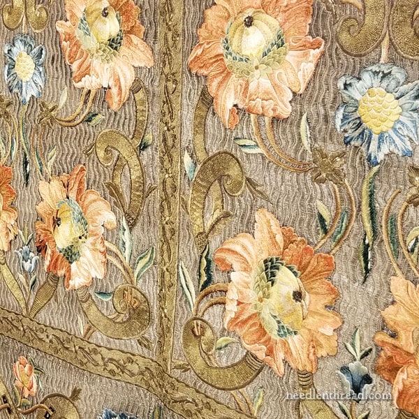
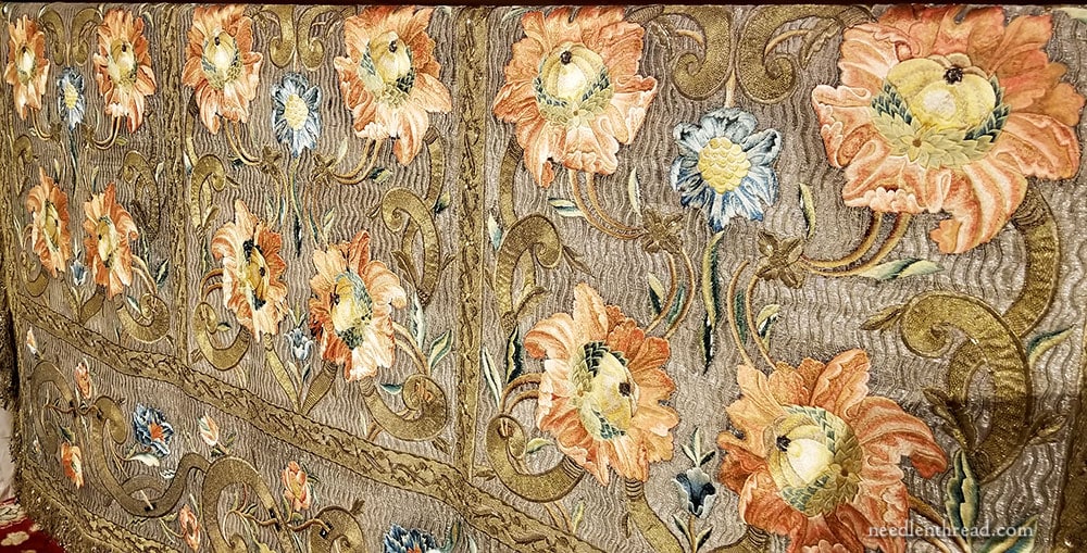
The first thing that strikes me about this piece is the overall sense of movement in it, thanks to the goldwork embroidered background and the exuberant flowers that seem to spring from the background.
The whole background of the panel is embroidered with vertical, wavy lines of gold. Breaking across the background, there are larger gold swashes that swirl into silk embroidered flowers in corals and blues.
The photo below is the whole altar frontal – click on it for a larger version:
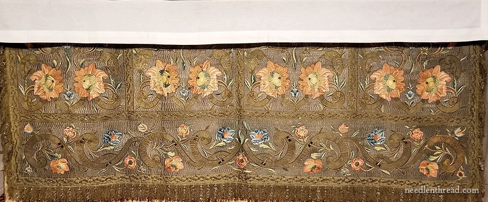
You can see the movement of the whole piece in the photo above. The top edge of the frontal has a linen altar cloth hanging over it (the white at the top of the photo that creates the horizontal shadow line).
Notice how the whole panel is made up of five areas, blocked off by what looks like more goldwork in straight, wide ribbons. This is a galloon of sorts – a wide, probably pre-made banding, used to connect the separate pieces of the whole panel.
Again, much of this is guess work, without seeing the piece myself, but this is what I’m guessing:
The top four sections were probably worked as individual, small panels before constructing the larger panel. The bottom longer, horizontal section was also most likely worked as a separate individual panel. Then all the pieces were put together on one backing cloth, with the galloons (banding) over the joins. They blend in with the overall design, but they also mark out the design layout of the piece.
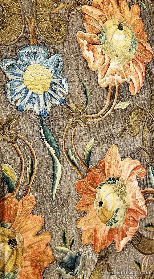
The frontal is in good shape, overall. You can, however, see a few spots where the silk is worn.
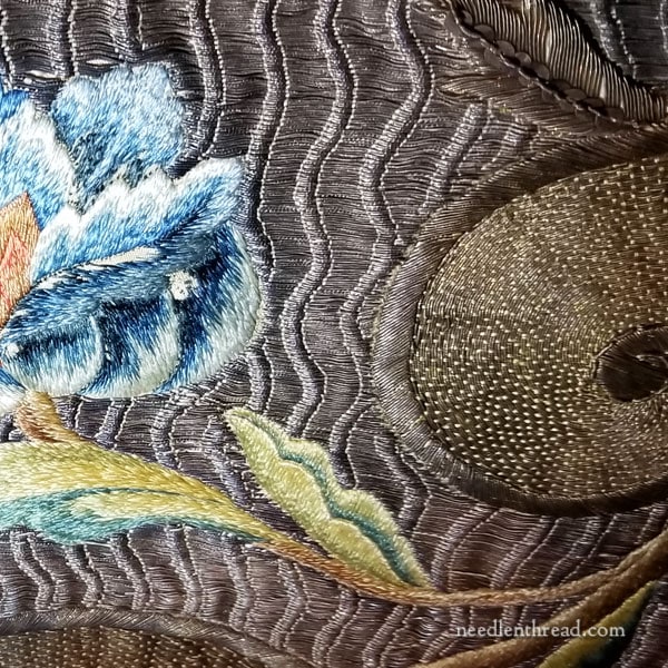
If you follow the long vertical leaf below the blue flower downwards, you’ll see some jagged, whiter areas showing on that leaf. That’s where the silk is missing.
There’s another little bit of silk missing on this beautiful blue flower above.
But look how vibrant and beautiful the silk still is!
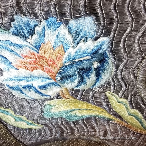
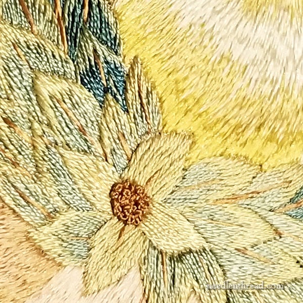
Here’s that whole flower.
In the photo above, you get a good sense of the gold background. You can see that the floral work and the goldwork background were embroidered on the same ground fabric. The flower is not applied on top of the goldwork background. They work right into each other as the gold moves around the edge of the flower.
This tells me a little bit about the piece. It was certainly conceived and executed as we see it now. This is not a salvage job or a repair job, where a piece was altered (no pun intended). The galloons, the fringe, the background goldwork – all of it works well together and seems to have aged together. There doesn’t seem to be any sign of repair, any cutting and re-assembly, or anything like that
It was also not an assembly-line job, where different embroiderers of different skill levels worked on elements separately and then brought them all together into the one piece, using appliqué to assemble. While the four smaller panels may have been worked on separate frames and then joined on a whole cloth along with the horizontal lower panel, the individual embroidered elements are not a matter of assembly line work.
Considering it in that light, I think it is a more valuable piece of embroidery. It probably cost much more to create it, than if it had been an “assembly line” processed piece, like we see in much ecclesiastical embroidery, especially from the late 1800’s through the first half of the 1900’s.
A little shift to the right on the blue flower, and you can see not only that beautiful silk shaded leaf, but you can also see the goldwork swash, worked with a bricking pattern over the laid threads.
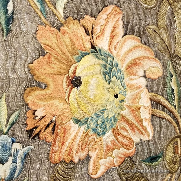
One of the magnificent coral flowers, up close.
There’s something about these flowers that are reminiscent in style to Morris, don’t you think? Very exuberant flowers with acanthus-like petals – very natural in movement and flow, yet quite stylized in design. Perhaps this hints at the era in which the piece was made?
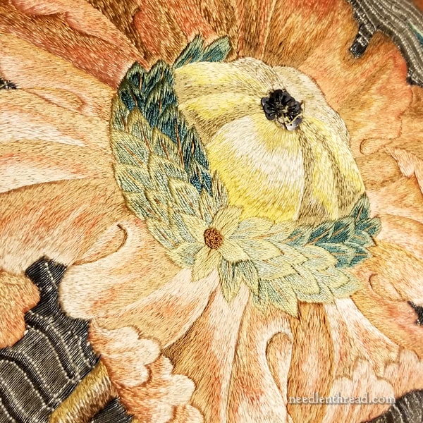
The spangles at the top of the center yellow section are wearing the threads. And they are quite oxidized to black.
The spangles started me thinking!
Can you imagine how brilliant this piece was, when new? How the gold shimmered and shone?
I get different reaction when I show new goldwork to folks who have only seen old goldwork – either in museums or in church use. Over time, thanks to age and environment, the gold threads oxidize and darken. Sometimes, people who are more accustomed to seeing aged goldwork react with surprise to new goldwork. They often tend to think new goldwork looks gaudy and brassy.
But just imagine – all of these old pieces of goldwork that you come across in museums, in books, online – they were once shimmering in golden glory, just like new pieces of goldwork created today. How glorious and brilliant they must have been!
I would love to have seen this piece in its glory, brand new!
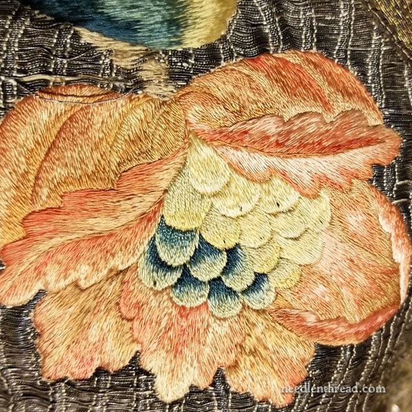
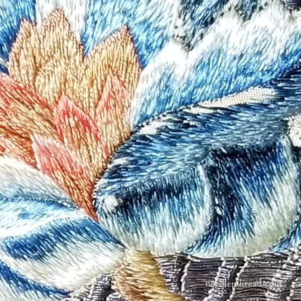
This silk is in extraordinarily good shape. I love the shading on the petal turnovers!
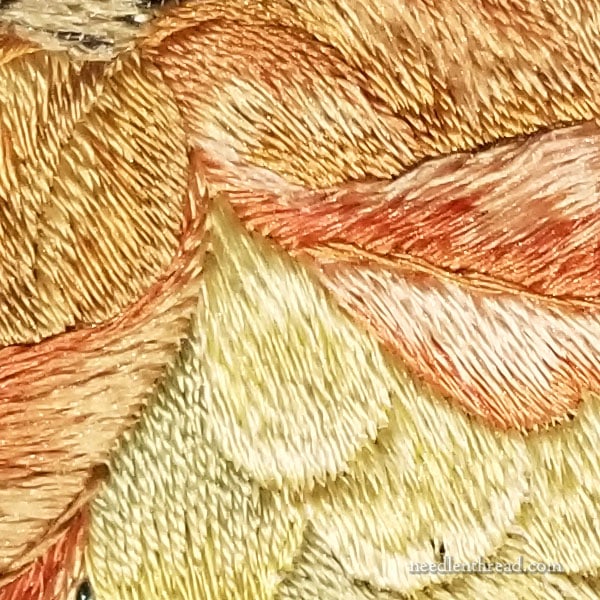
I know the close-ups aren’t as sharply in focus, but they give you a good idea of how the light plays off the silk, when it is stitched in different directions.
You also get a sense of the different twists in the silk threads, another aspect that affects the play of light on silk.
Click on the photo above for a larger version.
This is what I love about old goldwork. It still gleams! From the side, a little farther back, you really have a sense of the movement of the gold, while enjoying a small glimpse of what the gold might have been more like, in its earlier days.
And just check out the gleam on that silk! Oh, the wonder of silk – because its sheen is naturally occurring (it is the nature of silk), it will never lose that property!
So there’s a little bit of inspirational, hand embroidered beauty to start your week off! I hope you enjoyed the photos and my thoughts while processing them. I’d love to study this piece in person and learn more about it, but for now, the vicarious excursion will have to do!
And thanks to Louise for thinking of me and taking the time to take photos! Always appreciated!
What a gorgeous piece! Could you say a bot more about the wavy background? In the pictures (possibly because of the way my monitor is set up – colour accuracy is always a challenge on monitors!) it looks lamost like old silver rather than gold – at least a different colour from the big swirls.
Also, how is it likely to have been done – string padding underneath to create the waves, with the gold couched over the whole ground and being raised in places by the padding? Great to see all the different effects!
It’s oxidized gold. You can tell from the side views that catch the gold hue still. It is normal that the colors of golds in different elements will look slightly different – either because they are different threads, their stitching treatment is different, etc. Yes, I’m guessing it string padding on the left side of the waves, and the gold is couched over that. You can see how the gold has fallen slightly (scooping downwards) over the rest of the wave, where it isn’t couched.
Exquisite beyond words! Like you, I’d love to see this in person.
I’m mesmerized looking at this!
Astounding!
The design looks so reminiscent of Mary Morris. A friend and I were in Guilford England a number of years ago looking at all the beautiful ecclesiastical stitching when we rounded a corner and came upon a memorial piece a stitcher who worked at the Morris studios had made for her brother who died in WW I. The piece was breathtaking. This piece is so similar! It brought back so many memories and makes me want to dig out my pictures from the trip. thank you for sharing.
Mary, can you tell us where the altar frontal is? Even a general area or country would be interesting to know.
It’s in a monastery in New Mexico, I believe.
I was mostly admiring the main floral motifs (they are amazing) but then in the one image, I noticed how those blue flowers look like Rembrandt tulips – so beautiful.
I realize some of the shadowing comes from actual shadows 😉 but did they also use a pale silvery gray for some of the lower ‘shaded’ side of the petals?
What a grandiose masterpiece, I would so love to see it in person! Where is the monastery?
I had some difficulties, too, to perceive the gold in the background. On my screen it looks brownish. I thought it was couched in vertical lines, that the wavy lines only were the gold thread. Thanks to your reply to Ilke’s question, I now can see that the gold threads are carried horizontally and cover the whole background.
The flowers are so incredibly beautiful, the marvellous gold swirls and all … I never tire of looking at it. So, do you think the frontal was made in the mid or late 1800s, influenced by the Arts and Crafts Movement?
Thank you and your friend for taking the photos and sharing with us!
Can you tell us where this piece is, Mary?
It’s in a monastery in New Mexico, I believe.
Dear Mary,
Thank you so much for sharing this, it is so beautiful. I really love ecclesiastical work, something about it makes me happy. This is really a lovely pc. I have spent over an hour blowing up the photo’s and taking really good look.
Roxanna
A big thank you to both you and Louise for sharing this piece. It is exquisite.
Dear Mary
A beautiful piece of embroidery so vibrant and the silk thread still shines. As you say it must have been spectacular when it was first embroidered and definitely looks Morris in style. Imagine how long this would have taken to embroider the mind boggles. Thank you for sharing this stunning piece of ecclesiastical embroidery alter frontal with us and for the lovely photos. Beautiful piece.
Regards Anita Simmance
I notice that the silk that is missing seems to be the darkest colors or at least the shading seems to be tending that way. Given the age of the piece, the dyes had to be natural dyes and very dark colors tended to be mordanted with iron, which is quite destructive. I have seen ‘mourning’ quilts where all of the black silks are totally disintegrated, while the other colors are intact.
I am so glad you shared this. I am ever more fascinated by goldwork.
Wow – what a gorgeous piece! Thank you so much for sharing that, Mary, and walking us through it. Love the close-ups. I, too, would love to have seen that in the original.
I hope your friend knows that you are not the only one who appreciates her photos. This piece must have been magnificent when shiny new and in flickering candlelight, because it’s still gorgeous, even with some damaged silks & oxidized gold work.
This is truly a work of Art. Just gorgeous.
Dear Mary,
I enjoyed reading this post when it came out; now I’ve taken the time to really examine and muse over the photos – and to save a number of the images.
The sense of movement is wonderful – aided in the flowers by the different directions of stitching and the different threads as you pointed out. I hadn’t originally noticed the different twists and thicknesses.
I’ve saved some of the photos because there is a little bud of inspiration growing.
Thank you for showing us this.
Helen
I have the same reaction on seeing new gold work versus aged, even though I understand why there is a difference and have seen quite a bit of gold work.
In reading this article, it occurred to me that gold work originally would NOT have appeared so bright, as when it first came into use there was no electric lighting. The places it would have been seen—staterooms and churches, for example—would have been quite dark even on the best of days. When used/worn outside, the effect would have been different because of completion from sunlight.
As you pointed out in an article on a chasuble, objects appear different from a distance, too.
That’s a good point on the lighting! Still, most churches – especially by the High Gothic era – were built to let in a lot of light, but often, that light was dappled with color, too, thanks to stained glass. And, as you mention, when it was in full light, the light was natural, which does make a huge difference. Great point! Thanks!