


Last week, on my Facebook page, I posted a photo of my current embroidered tree project similar to the photos below.
I asked folks this: If you were going to remove and re-stitch one leaf, which one would it be?
In retrospect, when I sat down with this project yesterday (I didn’t finish it by the weekend – I got sideswiped by some other work), I decided that two leaves have to go.
Which ones would you remove and re-stitch, and why? I’ll tell you my thought processes below!
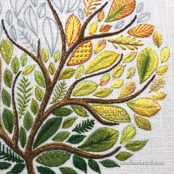
So here’s a shot at the most of the tree so far.
There are two leaves that are bugging me. One is slightly bugging me. The other is Really bugging me.
Now, normally, if something is only slightly bugging me, I might let it pass. In the scheme of things, when all is said and done, when the project is stitched, whatever is slightly bugging me may sink into the background or may work out to look better than I originally thought.
But when something is Really bugging me, it has to come out.
Often, folks will say, “You’re the only one who will ever see it.” And that might be true (in this case, I don’t think it is…I think other people will see it pretty clearly), but when it comes down to it, we’re the ones who look at our embroidery. If, every time we look, something askew stands out at us, it will be a perpetual little thorn.
I figure it’s always better to tackle that little thorn right away, as quickly as possible, and move past it so it doesn’t nag us for the rest of the project.
When faced with a little stitching kerfuffle that bothers you, have you ever set a project aside and never returned to it?
I find that, if I tackle the little molehill right away, it won’t become the looming mountain that bothers me so much that I can’t get back to a project!
So that’s my reasoning for this next step on this project, which will be some un-stitching. I just don’t want to be annoyed every time I look at it, and I don’t want it to turn me off from the rest of the project.
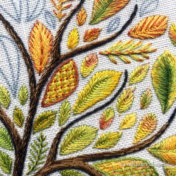
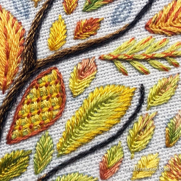
You’ve probably figured out which leaf (and maybe leaves – the second one isn’t so obvious) needs work. It’s the one that slightly jars.
It’s the leaf with battlement couching outlined in coral.
When I used this technique on the other side of the tree (I wrote about it here), I outlined in a much lighter yellow, which blended well and didn’t set off the leave so starkly from the other leaves around it.
The darker coral outline jars. It sets the leaf off and makes it stand out too much from the surrounding leaves. The outline, at least, must go!
The other leaf isn’t as obvious. It might not annoy you as much as it annoys me, and you might not even notice it, once the tree is finished and you aren’t looking at it close up.
It’s the green and yellow leaf just to the right of the coral-outlined leaf. There’s a stitch on the lower left side of the leaf that is out of sync with the stitches around it, causing the leaf to look bent in a way that doesn’t fit with the shapes of the leaves in the whole piece. I can probably unstitch just to that mislaid stitch and correct it.
Did You See It?
Did the coral outlined leaf stand out to you, too?
Do you see any other leaves that you think you’d change if you were doing the same project? How would you change it (or them)?
Feel free to weigh in with your thoughts, insights, and suggestions below!
I’ll be back to working on this project this afternoon. I have a two hour stitching spot on the schedule, and, barring any interruptions, I should have these leaves corrected and several more in. Here’s hoping!
Hope you have a Magnificent Monday and that you get an opportunity to hang out a bit with your needle and thread!
Mary,
I love this tree! My favorite season is autumn and my favorite colors are green and the colors of autumn. The variety of leaves is so pretty. This is a winner!
Hi Mary,
Before you take them both out, start with removing the coral outline and replace ite with something in the yellow family You might find that the second leaf doesn’t stand out as much. I like the fact that it’s a little wonky. Adds character and makes the tree more realistic.
That’s my two cents.
By the way, thanks for encouraging all of us to stitch. I’ve been playing with needle and thread more often:)
Miriam
Good morning
I immediately saw the one on the right because it’s not finished like you always do. Although the one on the left is different from the other leaves I thought it’s a matter of choice.
I would love to embroider like you! Your work is simply beautiful!
Dear Mary, you do such beautiful and imaginative needlework, but u r your own worst hypercritical critic. Probably that attention to detail gives you the inspirations for your meticulous work. I can just barely see your dissatisfaction with the coral edged leaf, but it is too beautiful, and unnecessary work, to remove stitching, as all will meld together into a striking unit when the work is finished.
But if u must, please only remove the vivid edge for something a bit subdued. You do such lovely work. And there is SO much to do and for u to show us.
The one outlined in coral is def a redo in my opinion, it’s glaring. I have to agree on our choice for your other one also. Goodness maybe there is hope for me as yet. Haha
I do like your leaf that is outlinedd with yellow a few pages back though.
Thank you for this discussion. It highlights that even the best have difficult stitching moments. Your thought process of the trouble spot and how you address it, especially the reverse stitching, is invaluable insight that I can carry over to my other stitching projects. Thanks again!
I “hear” your pain but your work is so beautiful I don’t really think you have to re-do any of the leaves. We are the most critical of our work. I don’t know why, but we are! If I were in your shoes, I would re-do both leaves because it would “bug” me every time I looked at this piece. I don’t think you need to do it, but it’s yours to do as you wish. Good luck.
Actually I don’t like either battlement couching leaves. They seem out of place and the top line of the other leaf does bothers me. I am just a beginner. Just my opinion.
Thanks for your knowledge.
I agree with you about the battlement stitched leaf outlined in coral. I like the battlement stitch but it could be outlined in a lighter color. However, I really like the “imperfect” green and yellow leaf. It looks naturally imperfect as a real leaf might look.
Sorry to say, but all of the coral leaves bother me. It’s either a spring tree or fall tree.
Here in Kansas, the trees change gradually, and they often display the whole spectrum of green to reds in one tree. With some trees, the green glows from the middle, but with others, the base of the tree remains green – from dark to bright, while only the tips go yellow to red.
Hi Mary! Thank you for sharing!
Yes, I actually noticed them both right away. But, because I’m still new to hand embroidery, I wasn’t sure if I was just being picky, or what, until I read your comments.
Glad I noticed them both! That gives me hope that maybe I DO have a good eye for this! Wooo hoooooo!
Honestly I didn’t really “see” the outlined/couched one as much as the other (little Miss Detail here) and yes, I would have to fix that slightly out-of-sync stitch too. The reason I didn’t really “see” the other wasn’t because it perhaps is too much different as the change to the darker rust color actually is what’s bothering me. Perhaps that will change as you continue, but I loved your subtlety from the greens to the yellows. Going into the rusts now seems like a lighter band of yellow between the darks. I love all the colors, but I think I would have preferred having some of the rusts included first and heavier lower, then moving into lighter mixing with the yellows. But that is just me, and you always seem to “come out on top” with gorgeous finishes so perhaps I should keep my mouth shut!!! I bet I’ll be eating my words. LOL. Do think this will be beautiful when finished…
PS. How’s your mom doing? Still keeping her in my thoughts and prayers.
I feel your pain! In knitting we call it ‘tinking’ – knitting spelled backwards. If the wheels really come off, it gets frogged. (Because a frog’s sound is ‘rip-it, rip-it!)
First, the entire work is wonderful. However, since you TOLD us to LOOK for a leaf to remove, I went to the leaf on the right. It felt not quite right…
However, I have no problem with the leaf on the left. Where it is situated, the shades that you have used on the leaves going up from that leaf, the weight of the tree limbs, all those things do not make it stand out to me. It seems to blend in just fine.
I think they all look great as is, it would depend on how you will continue with the piece.
I agree with you about the coral outlined stitch. The small inconsistency to the leaf to the right of it not so much. It has a lighter look that the other leaves, but that inconsistency is not offending to my eye…although I do thoroughly understand that you might feel compelled to “fix” it. I think we all tend to be our own worse critics and, when stitching a “natural” thing (leaves, flowers, trees)
I remind myself that it is often the slight inconsistencies of the natural world that often make it so compelling….
As always, I find your posts and your wealth of beautiful,projects, help and information so very helpful! Thank you!
I fully agree with you that work is required on the yellow and green leave just right of the couched leave that most of us agreed should be changed.
Mary I heartily agree with you regarding the leaf embattlement stitched being a thorn visually and I thought so the first time you posted the project. It’s stiff looking and has no linear flow and the dark outline makes the leaf stand out from the rest and looks static to me. removing the outline stitches may resolve it all. That darker color offers no transition to the interior colors of the leaf.
That other leaf you mentioned does not visually take my attention and may relax and join overall surroundings once the embattlement leaf is reworked.
My humble visual opinion.
To be honest, it was the secondary leaf with the uneven outer edge that caught my eye first. The leaf with the coral border didn’t jump out at me, perhaps because the visual weight of the outline is near the dark stem. But I do understand if it bothers your inner eye. I’m a custom picture framer and have been known to straighten other peoples’ pictures.
This is very beautiful! I really love the coral outlined leaf. It unique, has character and “stands out from the crowd.” I would give it a friend or two in strategically placed spot(s) over the other side of the branch/tree. Doing this could balance out the colours in the overall piece and resolve some of the tension of it being on its own with it’s extra definition . A few more coral outlined ones could add flow back into the piece and extra interest into the colour scheme! Whatever you end up doing it’s a stunning piece of work xxx
I love your stitching, but you are correct the coral outline stitching does stand out. However, it is worked beautifully. I would take it out too.
Hi Mary! I like the coral outline color, I wonder if the stem stitch is what is too heavy? Maybe a split stitch outline or backstitch would work?
I noticed the wonky leaf edge, but only because I was hyper-scrutinizing and leaves in nature are not perfect after all☺️ I also noticed the leaf in the bottom picture, on the lower right with the signature through it could maybe use another row of the green, but only since you asked
You are such a treasure for us all, a wonderful teacher and generous resource, I appreciate all that you do!
Your needlework is so beautiful and inspirational. At first, I didn’t notice the leaf you didn’t care for but once you pointed it out, I think the outline could be a lighter shade but only that. What stood out to me (before your leaf problem was mentioned) was the leaf to the right, (the one you thought might not be so noticeable). The other leaf I didn’t like was on the right side of the branch next to this leaf. It is third from the bottom. It looks a little misshapen. I think the stem should be removed.
You should know that I notice these things because of the close-up photos. The “big picture” probably would change my constructive criticism, except the yellow leaf.
Yeah, I saw it! It just isn’t subtle and “blend-y” enough! Love the rest of the design!
This is always the difficult part for me…is it the color or the color transition or something about the density/complexity of the leaf in relation to the others around it. I see why you chose the coral… there is a subtle need to create a transition to the other coral leaves. Maybe you should try for either color or pattern in this spot. This leaf variation maybe better suited to another spot on your tree. When I get stuck I go to a doodle cloth and try different approaches to the problem before ripping it out….sometimes when we look at the whole it can actually work or just require a tweak. Overall this is gorgeous! Enjoy the process.
The long slim very dark green to the right of the central stem jumps out as being too solid. I would suggest a touch of shading perhaps.
The second one bothered me more. The first made me think of fall. It’s making me rethink something i’m working on where I let a mistake slide thinking i would be the only one who would see it…
I noticed the second leaf first. I agree; if it is going to bother you, then you should take it out and re-do it. We all have creative stitching moments that we wish we had fixed when we first noticed them. To fix or not to fix, that is the question.
This is lovely piece, and you should enjoy it.
If it’s the one I think it is, I agree; because it just doesn’t seem to flow with the others around it. And, I totally agree with your philosophy about fixing something right away before it destroys your momentum. You always do such beautiful work that people would never notice what you consider a “mistake.” You’re a real inspiration for those of us who aspire to do such quality work.
Oh, the agonies of being a perfectionist!
The outline of the battlement-couched leaf didn’t bother me at all. It does stand out a bit, but I saw that more as a feature making it a focal area, not as a problem.
Now, the other leaf did jump out at me, and that is one I’d have to fix if it was mine! Yes, it may be a subtle thing, but our eyes look for patterns, and when something breaks a perceived pattern it causes a visual dissonance, a kind of unease, and that is what I got when my eye skimmed over it all, that little off-set stitch jumping out!
It’s a beautiful piece, and I understand why you want the best for it: perfection!
I definitely thought the one outlined in the orange colour didn’t fit, but I think if you were to re-do it similar to the other above, but maybe blended with a bit of green, it would all work together.
I agree with Miriam. The leaves are beautiful.
I can see your point of modifying those leaves and for YOU being annoyed with it. However if I were personally stitching it, I’d be tempted to leave it (except maybe not the coral stitched outline.) The piece depicts nature & nature is rarely “perfect.”
I agreed immediately with your first choice as the color is way too aggressive. But I would hold off on your second choice until the first is corrected. I actually dislike the skeletal aspect of the leaf to the right of the yellow and green one you chose as a problem. That feels wimpy to me.
Those are the two that I saw also. However, it’s lovely work! I am fairly new to handwork. I have a lot to learn,
I find it interesting that you do embroidery on material that I would think might
generally be used for cross-stitch. Perhaps I am just naive about more sophisticated
stitching. I guess in that vein I think the juxstaposition of the heavily textured basket
weave leaves jars – with the more natural “veining” textures of the rest of the leaves and tree. I would see the textures as jarring – more than the colors. Variance in texture is interesting, but even in the stylized tree I think the eye notices something here is “off”.
I do think novelty of stitches is really interesting, but perhaps the tree itself is setting the format of what nature imposes and our eye recognizes that. Just a thought!
The piece is really lovely, as is all of your work. What a delight that you share it! Thank you!
Elizabeth
Hi, Elizabeth – You’re seeing the embroidery very close up, which is why the weave of the linen looks larger. This is a closely woven plain weave linen in a moderately high count (about 50 threads per inch). Linen is pretty much my go-to fabric for this type of embroidery. There are different grades of linen, though. I like the good stuff, admittedly! 🙂
I love , love the stitch, but the coral outline is a little jarring. Maybe a lighter outline color might help.
I was able to order the Madeira Cotton Floss from Sewing Parts Online.com
Each was 1.25 plus local postage in the USA.
I see what you are talking about with the orange outline being stark and yelling look at me. The other one, can’t you add a half stitch over the one that is there to fix it? I’m a novice so I don’t really know if it would do to lay another halfway longer stitch over that one that isn’t making the transition between those stitches making it look bent. Love your blog.
Hi Mary,
your work is beautiful and will remain so if you unpick it or not. Sometimes we judge our own work with such a severe eye.
I’ve been encouraged by you, Mary.You have played a part in getting me to
do some things that I am pleased that I have done.
Thank you, have a happy few hours stitching. xx
Hi Mary. You are so devoted and so industrious! Admirable. I have been recommending that my students in my guild stitchery class sign up for your newsletter.
You asked which leaf to tear out so I will give you my 2 cents worth. I agree the leaf with the battlement couching doesn’t work. If it were me I would remove the leaf to the left too, the one in yellow and coral. I would try to place a little bit of green in that leaf to relate back to the others and probably not put coral around the edge of it. Those straight coral straight stitches are doing the same thing as the battlement couching leaf, outlining in coral. The coral could be used to represent a part of the leaf that is beginning to die. In that case it would be represented by a spot or blotch somewhere near the edge of the leaf but not all around the edge.
I am designing an embroidered Easter egg. I thought it looked okay the way I drew it, however one band around the egg is wider in one place and is not symmetrical. Only noticed this after I embroidered it. I don’t want to pull that band out because I did it in brick stitch, a lot of work. I will use this error to guide my students in their work. If I knew how to post a photo of it on your Facebook page I would.
Regards. Roma
OK, Mary, I’ll give you the coral leaf. It sticks out like a sore thumb with the coral outline. BUT I probably wouldn’t have used that technique in the first place, to me it is a bit heavy for the rest of the leaves, as is the basket weave one just a bit below. The colors for that one are nice, but again, the look needs to be lighter, less complex(?), more “flowy”(?).
I see what you mean with the other leaf, but it doesn’t bother me too much and I would leave it.
Having said all that, I’m falling back on my mistake mantra: “If you’re going to look that close you should have done it yourself!” I don’t take anything out unless it smacks me in the eye the minute I glance at it. Which is just about what you’ve said.
I did see it, the battlement couching really stood out from the other leaves! I honestly don’t have an answer to what else to put there, (I’m relatively a follow along embroiderer and I am trying to get beyond it, so I am practicing with needle painting at the moment!) but I am sure you’ll get it! 🙂
Yes that was the first one I spotted then you also have one in greens. I also liked the one at the top with yellows greens clean in it. But everything pulls together l would put one just like the coral somewhere else maybe to balance the picture
I agree with you about the coral outlined leaf – at least the outline needs to be changed as you say.
The other leaf which I would consider changing if the work were mine, would be the green and yellow woven leaf with the green outline (a few leaves below and slightly right of the coral outlined leaf). Looking at the photos you’ve posted today these two seem to be the only leaves where the direction of the stitching doesn’t flow with the line from the tip to stem of the leaf. Most other leaves also have a line down the centre of the leaf. I think this change of direction of stitching makes these two leaves stand out too much
I agree with you I both cases and in fact the leaf with the coral outline has bugged me since I saw the first picture! The other one doesn’t bug me as much but I see what you are taking about. Redo the first and see if the second one still bothers you. If it does, redo that one also because you will see it for the rest of your life!!
Hi Mary,
Yes, I agree that the colour in the battlement couching leaf is too strong, but I also think the same applies to the leaf in the fork between the branches with the coral/brownish toothed edge, and the leaf upper to the right with the coral/brownish lines (veins?) through it. The shading is all wrong, in fact in those it is not there at all in those three, just a big jump between colours. The other leaves are much more subtle in their shading so these look out of place.
All the best, LAR
I did spot the couched leaf. Although it is beautifully stitched, I agree it does look a little out of place. I didn’t spot the second one though. I love your inspirational emails…. thank you
I have no problem at all with the first leaf you mentioned as of being off-kilter. I think it sort of introduces the other leaves that are in the same colors. The other leaf I can see that the leaf has some wonky stitches like I might make but not the kind you usually make. I can see where you would want to fix it. I think the whole piece is turning out lovely!
i didn’t really notice it until you said something about the outline! thats going to make me crazy now!
Disclaimer first, I don’t embroider except labels for my quilts on a machine!! However, I agree with you the two are a little like a hitchhiker’s thumb, but…rather than frogging, can you add some different colored threads to what is already there to soften the abrupt color change on the little leaf and add another color thread to the outline of the larger leaf to “variegate” the thread? As a longarm quilter, unless it is essential, frogging doesn’t happen and if adding something else can make it work, I would rather do that!
Yes they are jarring… i would take them out
My eye went right to them they distract greatly from the rest of the work
Funny, but initially there were no leaves at all that would bother me. Not until you were urging us to find the malefactors and I was struggling to detect them by hook and crook. But I would never have blamed these two. Thought it might eventually be the big one to the right of the of the one with the battlement couching because of a certain unevenness in the left edge? and … mayyybe … the smaller one to the right of that last one … with one stitch to the left in a slightly other direction … ? But no! that would be extreme nitpicking, really!
The dark coral outline on the battlement thingy, however, doesn’t bother me at all. There’s more of these brownish hues in the foliage, so for me, it fits quite well. And the scarcely recognizable skewness in the other? Well …
That’s how perceptions can differ. 🙂
Angela from the Ore Mountains
If something bugs it comes out straight away. Once I decided to leave something in, and it still bugs every time I look at it to this very day. . It never became better , rather worse. When I looked at your piece, before reading the story, I immediately picked the very same leaves. What you are going to do with them, is up to you, but I personally will take them out. I won’t call it a mistake, more something that did not come out quite the way I expected it to. Love Elza Cape Town. xxx
I totally agree with you. The one with the coral outline stands out. At least take the coral off. The one with the green outline stands out, too, but to a lesser degree. Otherwise it is a beautiful piece.
The two leaves you picked are the exact two that caught my eye. The first one just doesn’t fit. The second one I would take out completely because to me it looks like a fish that has been splayed open and the backbone is exposed. Maybe I’m just hungry. It’s beautiful work though.
Yes I did notice the coral outlined leaf, for pretty much the reasons you stated.
No other standouts from me.
I remove objects that nag me all the time, especially when I know the overall end project won’t suit me. In fact last week I removed serial objects such that my linen was a mass of smudged pencil lead. I was going to throw it away, but decided to give it a cleaning & see if I could salvage it. I have, & what I learned was that no matter how small, I am not creative/artistic enough yet to just ‘wing’ a voided embroidery piece. I must create most of design ahead of time & transfer it. I’ve done that & all is well…so far! I’ll tack my question on to this feedback b/c I have such trouble transferring!! What technique do you use to get those lovely, perfectly drawn leaves? Using a pencil I get bumpy jumpy lines. Using transfer pens, the lines end up much wider than I like-so a leaf stem requires 2 lines wide of stching instead of one. I would love your feedback on this topic, beyond your past addressings as I have read those. Thanks! Diana
I did notice the coral outlined leaf. Even though you have used that color in other leaves, the color blends in with those other leaves. It looks different from most of your leaves as mostly have a middle rib and radiant from that. The coral couching inside the leaf stands out as different also. You have one or two woven type leaves but they are smaller and lighter in color. I generally put projects aside while I consider how to modify them and try to get back to them before I forget them. This is not a major overhaul however as you have only one that you don’t like and the other one could just be a leaf that is not perfect in shape- there are many of those in nature. I like seeing your work in progress and hearing about your thinking process. Thanks!
The coral outline jarred a bit, but if there were more coral in the surrounding area, I don’t think it would be that jarring. I think that coral just needs somebody to talk to – it is out there all by itself. So, I agree with Miriam Kahn that taking off the coral outline and replacing it with something else may solve your problem. The wonky leaf did not bother me a bit – it could be waving in the breeze!! It is one of those things visible under the microscope, but not from 5 feet away.
The coral outline stitched leaf should be copied like the one to the right. Then it would be more balanced. Only rip out the one! It’s lovely anyway!
Hi, Mary! I agree that the coral outline is too dark, & I see your point about the bend in the leaf next to it. But the two I chose to restitch are the coral outline & the other woven textured stitched leaf. It’s the weaving that’s throwing me off. While the stitches are quite pretty, I think those leaves look artificial next to the others. Most of the rest of the leaves look “naturally leaf-like,” if you see what I mean. Thanks for sharing your thought process with us; I always learn so much from your analyses!
The one that I would have to undo besides the one outlined in coral would be the one outlined in green with the couching that sits in the notch between the two branches. I guess it bothers me because to me it doesn’t look like a natural leaf. I just like smoother lines.
Yep, I went straight for the coral outlined one, I wouldn’t have like it if it were my piece either, it’s too different, I’m glad we are on the same wavelength, my admiration for you knows no bounds, so Im glad our thought processes are the same
There are two more leaves I would change. They look like ba;sam needles, have no outlines, which most of the others have. I would add outlines so they look like they are part of the same tree, or al least fill in between so the leaf shape looks complete.
I love the couching design on that leaf! Although, I would have to agree that the border is a bit bold — but hey, this is a sampler — it adds into the variety of stitches/colors. Idid not see that leaf as a possibility for rejection.
Now, the irregular leaf did appear as a possible candidate, but in the bigger picture, it doesn’t stick out…
I definitely picked the yellow and green one for exactly that stitch that was a little off – only because that would make me nuts.
I might have picked the outlined one but I couldn’t see anything wrong with the stitching. I just didn’t like the outline (too much contrast) but wrote that off as a personal preference. I feel much better knowing you want to freshen it up a bit.
A thousand times thank you for your wonderful work and inspiration!
The only other leaf that bothers me is the large leaf to the right of the other two. I find that the dark green in the centre is so out of place.
Hi Mary. I totally agree with you about the leaf outlined in coral. My eye went straight to it. It would be interesting to see it again with a softer colour outline. The other leaf that jars to me is the yellow leaf on the right hand side with the dark green centre. Unless there are going to be more leaves like this to balance it of course. Thanks for the opportunity to comment. You are very brave putting it out there!
Kind regards, Linda
Actually, the things that stood out to me most were the coral outline (I would change it to a yellowish shade) and a leaf to the right of it, but not the one you mentioned. The leaf that would have bothered me was the large needlepainted one near the right edge of the tree that has a green patch in the middle. Maybe it is just me. The darkness of the green drew my eye pretty strongly (to the point that the coral outline felt minor). But perhaps the green was merely there to balance out other colors elsewhere in the tree, in parts that I can’t see from the pictures, or that haven’t been stitched yet.
I think the whole thing is just gorgeous, and I love the gradual manipulation of color and texture!
– C. L. Fingristion
Mary, no matter what you stitch, it turns out beautiful but after you pointed out the offending leaf I agree. I never found the second one but I think after you correct the coral outline you won’t like the one to the left. I can’t wait to see how it turns out. Happy stitching!
Yes, the leaf that immediately jumped out at me is the same one that you identified. That outline is jarring. I didn’t really notice any others but you stated two, so I studied further. The second one that stood out to me was the leaf to the upper left of the battlement couched leaf. Yellow with small spikes of a darker color. But if you hadn’t said two corrections, I would not have picked it.
Mary, I thought the leaf with the battlement crouching was ok, but the adjacent leaf that you mentioned , jarred!
I saw it; it stood out too much.
I noticed the green and yellow leaf far more than the coral – no reason, I just did. So correct the green and yellow, and leave the coral as a testament to imperfection. I think there is no true beauty without it on some level.
Yes I spotted the large leaf with the coral outlining. It is altogether too “heavy” looking. Once you have removed the outline you will be better able to see if the couching can stay or not.
No, I didn’t think the small leaf to the right was out of sync with the rest, seems fine to me.
Seeing as you have asked, I think that it is purely personal choice when it comes to unpicking stitching and frankly, neither of those leaves really jarred for me, but if your eye is always drawn to them first, then they should go – or at least that red outline should be changed. As far as the wonky leaf, it is difficult to get nice rounded edges on evenweave fabric so you may have to unpick and re-sew just that last colour around the edge (not the whole leaf). To be honest, the two that really jarred for me were the two yellow and red ones so maybe it is that the red is too bright against the yellow. However, if you hadn’t asked, I would have thought the whole lot was lovely. I love reading your emails and really appreciate you sharing your knowledge. Thank you so much.
I think this piece is lovely but I don’t quite feel the leaf done in yellow, green, rust and in “squares”, right underneath the branch – fits in.
I should have responded when you first posted this, but I got side tracked as well. When I looked at your leaves I loved all of them, except the two that are bugging you. I agree that the darker thread you used to outline really does make it stand out. I didn’t like it at all.infact it drew my attention almost immediately. I also personally like leaves to look realistic in this type of project. So I think that’s why it bugged me. It does just stand out, jump out at you…lol
I think I would pull it out also. To me it doesn’t fit in.
That’s my two cents worth!
Yes, I agree that the coral outlined leaf needs to be taken out, but not so much for the outline. To me, the pattern is what stands out more prominently. To me, the other one that also appears to be pattern that I probably would not see in nature is the plaid pattern to the lower right of the coral outlined leaf. These changes of course, are totally up to you because a quick glance and I wouldn’t have noticed it. It’s only when you “really look” that you’ll notice the difference. Hope this helps. Good luck, love your work!
I looked at the embroidery and was surprised when I found out that it was the coral outlined leaf that you didn’t like! I thought it was the greeny yellow one just below it as the stitching isn’t even, so I would take that out and re-do it but the other one…… I cannot see anything wrong with it. Maybe you would explain what you see and do not like Mary please?xx
Yup you’re right, the coral outline has to go. Didn’t see the other one, but now you’ve mentioned it I can’t stop seeing it!
Lovely work by the way!
Hi Mary,
I would outline all the leaves that have the coral color in it, that makes 3 big leaves or I would just remove it.
It does stand out.
Have fun! and thank you so much for all you do!
Simone
My eyes immediately went to the coral outlined leaf. It is too bold. Funny how we just can’t “live with stuff”; however, we do put alot of time and effortinto these works of art and so they do have to live up to some high expectations……even at the expense of spending more time taking out stitches and restitching. Your piece is absolutely gorgeous and the stitching is incredible.
I actually really like the coral outlined leaf – maybe the outline makes it stand out more when you look at the piece as a whole. I would also start by just changing the outline color. The second leaf you mentioned was the one that really bothered me but I can’t put my finger on exactly why.
Hello!
I think the outline is the only real issue for me. If it was a lighter color I think it wouldn’t stand out so much. I love this piece overall and you make me want to learn and do more projects. I just started my embroidery journey, and hope to one day be as ambitious and creative as you!
Thank you for inspiring me to branch out and try new stitches!
Kayla
Interesting, my eye picks out the 2 lattice fill leaves as the ones I’d be redoing if this were my project. All other leaves use stitches that more closely follow real leaves veining. The lattice fill leaves totally ignore any attempt to be realistic. Unless there will be many more lattice fill leaves to come and blend these 2 in more?
Hi Mary, I had to closely look. I did not notice the coral outlined leaf but perhaps it’s the scale of the photo. I did notice the yellow green one next to it with the out of sync stitch. You’re work is stunning and your perfectionism makes it so.
Thank you for the blog.
Valerie
I’d picked the coral outlined leaf but also picked the one above it in redish orange and yellow but for different reasons. I just dont like bright red and yellow next to each other. Nor am I a fan of very bright colours, prefering muted earthy tones, which is odd since I am a child of the 60s when everything was bright and garish. However, like you, if something irritates me in a piece of work, I cant rest until Ive unpicked it, even if no one but me will ever notice it.
This is such a wonderful example of multiple techniques and great variety.
When I first looked at it, I agree with you on both of your choices for rethink and redo.
I saw the coral immediately because of the bright yellow. Several other leaves have the coral with a light green, I love these. Maybe begin with changing the coral to a softer colour so the stark contrast is eliminated.
I am sorry to say that the other leaf that is bright yellow with coral outline also stands out to much for me. Maybe add some green to the leaf to soften contrast.
I just love your work. I believe they should be in a museum.
Thank you much for brightening up my life and love of embroidery.
When you said one of the leaves bothered you I picked that leaf. But then I looked at it again and being, I think, more critical. The leaves with coral in them do make themselves known but I do enjoy the variety. I think it makes the project interesting. I don’t think I’d take them out if I were stitching the project. The fact that there is more than one with the coral makes them seem to belong. Personally, I like them.
I must confess I didn’t see it until you pointed it out. The first one I can see doing over, but I must confess I wouldn’t do anything with the second one. LOL
In the photo that you have there are 3 leaves that stand out for me. The green & yellow caught my I first 9& bothered me most), & both of the battlement stitched leaves bother me.
The green & yellow for the same reasons as you said.
The battlement stitched leaves do not seem to fit in with the other leaves, I think just because the effect is so striking a style contrast to the other leaves.
I think if it was mine, I’d take out ALL the red/coral/brown stitching in the one leaf.
In the other one, I’d take out the dark green buttonhole stitch, and I’d restitch it in a lighter green and a split stitch or an outline stitch. I just think that green is too dark and the line is too thick for the rest of that leaf. This is the leaf I noticed first.
I see what you refer to with the more obvious leaf, but the second, even though I leave the picture, then return to see fresh, does not jar my eye in the least. I just found your blog this morning. What a pleasure to meet you.
Hi, Lynn! Welcome! The second leaf didn’t bother me as much, either, but it’s just that little bend on the lower part of the leaf that needed adjusting. As it works out, I ended up replacing the entire leaf! :-/
Looking forward to the kit.