


Cloth of gold is an interesting “misnomer” today. When cloth of gold was really cloth of gold, it was… well. Cloth of gold!
Today, cloth of gold is more like “cloth of metallic with no gold in it” – or cloth of gold-colored metallic.”
I’m not really complaining, because if cloth of gold were Cloth of Gold, it would be entirely unaffordable. As it is, cloth of gold-colored metallic is already pretty pricy.
In any case, I’m playing around with some fabrics to figure out how I want to appliqué some gold lettering for another “vesperale” or altar cover – similar to the one I made here, but not as complicated, and not featuring heavy goldwork.
Keeping in mind that, in most churches that would use an altar cover featuring lettering of this size (they are 6″ letters), the altar is far enough away from the congregation that you can’t really see much detail in any embellishment.
So, with this second altar cover, I decided it is more economical sound and more feasible, time-wise, to use a gold cloth to appliqué the letters, trimming them out in (most likely) a gold metallic cord.
The Problems
There are two problems that I need to overcome: what cloth to use… and how to do it!
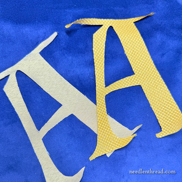
I have three “cloth of gold” options, but we’re just going to look at two today, because that’s what I was recently playing with.
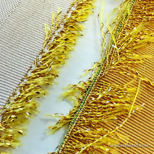
You can see by looking at these two fabrics up close right along the selvedge that they both have metallic “foil” in them. The selvedge on fabric always gives everything away – if you want to know what’s in a fabric, go to the selvedge!
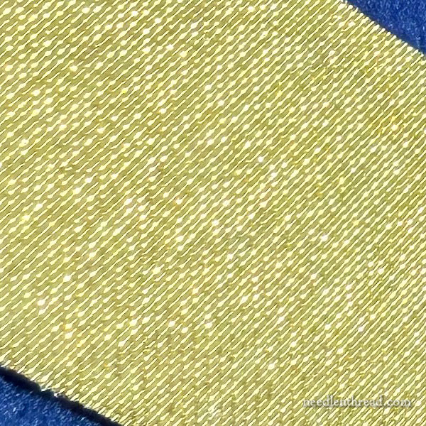
It’s hard to give you a sense of the two fabrics in photos. The paler fabric is quite shimmery – the metallic runs across the whole surface, is very fine, and it’s really a beautiful fabric in person. It’s not as structured as the darker gold, nor as stiff.
It shimmers.
But it does not look like lurex. I promise!!
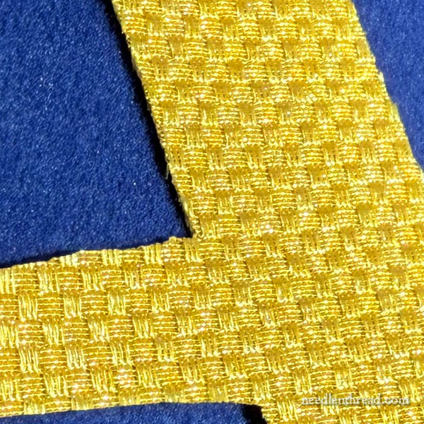
The darker gold fabric has this kind of bricking or diaper pattern to it. The metallic only runs through every other tiny block, so you definitely get the effect of a pattern, but also the glimmer and glint that you’d expect from cloth of gold.
Cutting out Letters
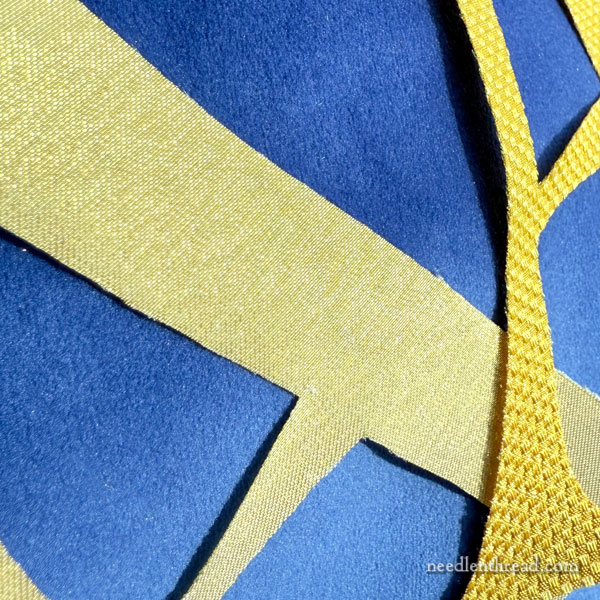
As you can see, I’ve cut out two letters, one in each type of fabric, corresponding to the exact outline of the letter. I wanted to see what the fabric looked like in letter form against the ground fabric, so I could see which one looked better.
In fact, as far as the color goes, it doesn’t really matter too much. Both would look good.
But I’m not sure which fabric would be easier to use or more reasonable to use.
When it comes to actually appliquéing with any of these fabrics, I’m not exactly certain how I’m going to go about it, because I’ve never done appliqué with fabric like this for something as precise as a letter.
I’ve been consulting a number of books and weighing my options.
There are a couple points I have to take into consideration:
1. The Fabric Moves
This is not a stationary piece of needlework that hangs on a wall for display. An altar cover is something that is put in place and removed usually more than once a day. It is folded for storage while it’s not in use. And when it is placed on the altar, of course, it’s got to be manipulated to get it where it needs to be.
The movement of fabric is an important consideration when you’re doing this type of work. And the frequency of the movement is also important. If it’s only moved once a year, that’s one thing. Several times a day? Totally different wear-and-tear.
2. The Cut Edges Fray
The cut edges of this type of fabric are prone to fraying. So I have to think about the approach to appliquéing with it.
Do I line the back with an interfacing? (Adhering to the gold cloth, not the blue cloth – the letters have to be removable from the blue cloth.)
I don’t really want to use an adhesive interfacing, because I know that time, humidity, movement, etc., can take a toll on adhesive interfacings. Do I want to risk that? On smaller, more intricate pieces like letters, would it make a difference, once they’re sewn in place?
Do I cut the gold letters larger than their outline, and use some kind of turned appliqué to appliqué them? This fabric is pretty stiff – I’m not sure how well it would take turned appliqué. And would the turned appliqué stand up? And wouldn’t it be a Royal Pain in the Neck in the corners and smaller detailed areas?
Do I appliqué straight, unturned, but slightly larger edges onto the fabric, and then cover the excess with an edging? I don’t want the letters to look proportionately “fatter” than they’re meant to be. I could couch a gold cord edging along the design line, and then, over the exposed excess (which should, in principle, be relatively minimal), I could then add another outline that’s the same color, or slightly darker than, the blue ground fabric.
Any Experience?
If you’ve had any experience with this type of work, feel free to reach out with any advice or any anecdotal experiences you’ve had.
I’m not really keen on using something like lurex or anything like that – that’s simply not in the plan – so I need to figure out how to make this work.
I’ll take any input you might have. After all, if two heads are better than one, then tens of thousands of heads should be even more effective, right? (Unless you happen to be cooking, where too many cooks… etc., etc.)
Innnnnn any case. That’s my appliqué dilemma. It will likely require a bit of experimentation and trial and error.
I’m kind of used to that.

Depending on how truly thick the fabrics are I would test turned interfacing applique. It would allow for better control of those wild edges, possible seam grading or hand binding to slow down any sneaky threads that want to wiggle out due to so much use. The question is would it make your edge too bulky? Personally I think this is a better option than turned applique or raw edge as those edges can be better controlled invisibly. If needed some archival glue on the raw edges since it can be hidden. Not a fan of glue but on some of those type fabrics need to slow down the wiggle factor. Not a fan of fray check type stuff, can age poorly by getting stiffer and prone to yellowing over years. Can be fine but I am sure you know, a risk.
In case someone doesn’t know what turned interfacing applique is, you sew a piece of interfacing to the piece right sides together. Carefully turn and press (with heat or without, just depends) then applique down. Like making a pillow. Usually would sew around all sides, slice an opening in the interfacing to turn the piece right side out.
Looking at the fabric and the lettering you cut out and the fact that the fabric easily frays, I would suspect that turned appliqué will a painful experience. (However, I suspect an appliqué pro would have fewer problems than me. )
I know you stated you do not want an adhesive interfacing, but that may be your best bet. You can look at Pellon SF101. It is a thin cotton interfacing with adhesive on one side. you can adhere it to the letter and then appliqué it to the background cloth for removal later and it seems to hold up to handling. I’ve used this product often to stabilize cotton fabrics that I embroider and/or appliqué. At https://www.pellonprojects.com/products-categories/interfacing/ you can see a larger selection of their interfacing products.
If you do not want to use a fusible interfacing, there is a product called Fray Check (some info for use https://knowingfabric.com/how-to-use-fray-check-on-fabric-projects/). I think this will be much more fiddly to use than an interfacing.
Another option is to take a sample of your cloth of gold to a local quilt shop and explain what you want to do and see what options they may suggest. They often have a wide array of interfacing available to address most any need.
Thank you for all you do for the embroidery community.
Kjasper
Mary, I’ve got a couple ideas – will list them here in case someone else has tried these already & has more experience with any drawbacks.
Turn-under appliqué techniques won’t work cleanly, as you suspect. But appliquéd letters are the way to go. When I was figuring out how to get black lettering onto a small quilted hanging, an experienced friend suggested ultrasuede since its cut edge doesn’t fray. To eliminate fraying for your woven golds, I’d try
1. A light linen or cotton backing would stabilize the letters. Using a whole piece of the gold cloth, outline the desired letters using a very fine pen or pencil; pin or baste the backing so it’s smooth and stable. Using a short stitch length, machine stitch on the letter outlines. Cut out the letters leaving a small margin as you do for an embroidered appliqué. *You might test-apply a thin line of Fray-Check along this margin. It solved a fraying orphrey band issue I dealt with, and didn’t affect the color.*
Then tack & stitch down the letters onto the vesperal ground, and finally couch around the letters with whatever thickness of gold or colored thread you want.
2. An alternative material is a faux embroidery leather (I’m guessing real gold kid is quite expensive). I cut a ring from an 8”x24” roll of Kimberbell Embroidery Leather for a Trinity symbol. It was easy to draw on, and straightforward to cut because of the flexible medium-weight paper medium, but has a good, solid kid-looking gold surface. And it can be hand washed or dry cleaned. I couched it onto the ground using a fine-width machine zigzag of YLI #100 yellow silk over a line of metallic gold #5 DMC pearl cotton. Only drawback I found was that too-vigorous ironing removed the gold from the paper in one spot. But that 8 x 24 roll cost me $10.00, so it was simple to toss the damaged circle and replace with a new one. Glad to send you a photo if you’d like to see what you think.
Kathy
Mary, I would have all the same questions as you, and no answers! I find most applique with goldwork rather tedious, and I haven’t gotten to the place where I can do it neatly. Most people at my church don’t say anything, but I can see how bulky or lumpy some of my goldwork embroidery/applique is on a pulpit fall or chalice veil. Sigh.
I’d guess that needleturn won’t work with such heavy fabric, but the edges will certainly fray, so you need some sort of galloon/trim covering. I suspect that a gold inner “ring” and a dark blue outer “ring” as you propose would be the most secure option.
Please share your experiences with us.
Hi Mary, I made an altar cloth last year for my church’s 100th anniversary and I appliquéd 9” gold lettering to it. I started with a gold tissue, but ran running to the hills! I thought about using fusible interfacing on it, but before I got started, my cousin gave me some scraps of gold metallic knit fabric. She had quite a bit more I could use, and it worked a treat. I did use that double sided sticky stuff, can’t remember the name of it (my old gray cells are evaporating even as I type) to get the placement just right, machine stitched around veerrrrryyy close to the edge, and then couched red cord around the perimeter of each letter. Looked lovely from a distance and not too bad right up close. Good luck and God bless!
I truly LOVE applique, and have done it along with quilting for many years (I am retired, to give you an idea of my age =) Long before they had adhesive materials, you would simply hand stitch it down by rolling under the edges (cutting in where there are corners) and hand sewing tiny stitches along the edge to avoid any fraying. This works well, and looks beautiful. I believe the best fusible web (especially for better placement and finer fabrics) is Steam a Seam 2 by the Warm Company. It is very thin, and even if you choose to still sew under the edges by hand, it will give it strength, not allowing it to move when placed properly and washing nicely. I know that others use adhesives when simply turning under the edges (as well) when they are concerned of fraying. I have not yet used that method. The Steam a Seam 2 can also be machine stitched, and again will handle some washing. GOOD LUCK, and thank you so much for all of your advise. I have loved your website over the years.
I do all kinds of appliqué except this kind. That said, fusible adhesive sheets like HeatnBond (the one name brand that comes to mind at the moment but there are more) come in various weights and make appliqué a joy because it is fantastic for the fraying problem. Because if the handling and use of the alter covers, do also sew the edges. You then shouldn’t have to worry about adhesive wear. Fusibles make appliqué more joyful. I can position and know it’s going to stay where I want it. If I want a temporary hold, I just tap a spot w the iron. I’ve used fusible w wool felt, silks, cottons and batiks. I get clean edges and perfect placement. The one caution I have for you is not to over press or over heat. This makes your fabric to stiff and difficult to sew through. Iron press shorter is the mantra here. This is especially important if layering pieces. I hope this was helpful, Mary.
My needlepoint finisher taught me to line the backing fabric (not the needlework) with light weight iron-on interfacing to stabilize it/keep it from fraying. Would that work? It would stay light weight enough to roll and move like a lapel collar or pocket flap would … and then you could tack it down like padding or with a buttonhole stitch like you do in stumpwork around the wire?
A really easy way to do this might be to machine stitch to interfacing (backwards?), cut an ‘X’ in the interfacing, turn it right side out; then stitch it down. A lot of quilters who appliqué prepare their pieces this way.
Needing the letters removable adds a whole level of complication! That fabric being so ravel-y doesn’t help. Throw in that you don’t want to do iron-on interfacing on the letter backs….hmmm. The letter edges will need something permanently attached to stop the fraying and hold up to the abilities of whoever will be removing and reattaching them in the future.
I think I’d try using a light non-adhesive interfacing on the letter backs (same size as the cut letters, baste the snot out of it so it does not shift. Then baste something like perl cotton or heavy fishing line to the letter outline. Then turn the letter edges over the outline and stitch them down right next to the perl cotton or fishing line. That would support those fabric edges and give all stitches something besides the appliqué fabric to hold on to. A larger cord inside the turned edges might give a nice raised edge, instead of using a separate cording on top?
Diane has a good idea I’d forgotten about. Tip – make a small clip in the interfacing before sewing it on. It’s much easier to separate the fabric and interfacing to make the X after sewing and less worry about accidentally snipping the fabric.
Hi Mary, I replied to your email but perhaps this is the best way to reach you…
Hi Mary… could you try a combination of reverse applique and back basting?
Trace the letters onto the top of your background fabric. Place the fabric for your letter beneath the background fabric, face up. Baste the two fabrics together, meticulously following the traced letter shape.
I’ll often use a chalk pencil to trace the fold line (traced line) to help with marking the line. Then cut away the background fabric, leaving enough to turn under, to reveal the letter fabric. Then cut a few stitches of the basting thread so you can turn under the raw edge.
This may be of help. Although she’s doing regular applique. https://www.facebook.com/share/v/1ECJWRrtLL/?mibextid=wwXIfr
Jeanna Kimball does fine work with the back basting method. https://www.facebook.com/share/v/16VcXxEsBv/?mibextid=wwXIfr
Love everything you do for us, your sister stitchers!
I’m a big fan of Applique, but I always use cotton fabric, it’s easier to work with it and it can be easily embroidered.
Thanks so much for sharing your experience, it makes me wanting to try different types of fabrics, I’m sure the results will be amazing.
I was wondering how this was going? I’ve been down with an injury for a while, and just started to get caught up.
Years ago I headed some teams that made Worship Banners for churches. We used satin, lame, taffeta, and other fabrics (usually shimmery and often slippery).
Time as well as skill prevented much actual sewing. We did some stitching, and fabric glue. But our favorite especially lettering, was that iron on interfacing you are leery of.
In honesty, although the banners were often packed for travel, the did not have the day to day folding and moving you described.
There are many different weights and textures now available; I wondered if it might be worth experimenting with something very light. Just enough to stabilize the edges of the lettering. When the letters are appliqued with something like a satin stitches around the edges, the stitching would hold everything securely. I doubt anything would shift.
But again, I’d experiment first.
Can’t wait to see what you do.
I like the idea of sewing around the letters using interfacing and flipping the letters rightside out so the seam allowances are inside (a slit in the interfacing allows the turn and the slit is hidden under the letters). Then you can decide how to edge with a small appliqué stitch or edge stitching, cording or couching.
I would not do raw edge on this ravel-prone fabric, and as much as I love needle turn appliqué
I am not sure it will fold readily to lay smooth without being pressed so this might be more tedious than you want to mess with for this item.
Looking forward to see what you do.
Hi Mary!
I know you have finished this project, but if another comes your way, what about gold kid leather? The RSN uses reasonably frequently in gold work and I think it would look kind of neat. You could even texture backing felt (with high and lower padding) and then adhere all with gold check or sequins or beads or stitching , what do you think?
Something to ponder while Anna is away.
Regards
Margaret
Mary, I am quite late to the party but having just re-read your article this question popped into mind. Did you ever consider cutting the fabrics with a hot knife? It would definitely need a test sample. In couture sewing one of the finishes that can be used involves heat. In couture houses a candle or a small burner is run along the seam to seal it. They have probably adopted the hot knife as that technology improved. In small dressmaking shops the edge can be more consistently applied using a burning cigarette, if you can believe it! I have used both approaches and the cig is less risky and just as effective. If you become adept with such a technique the low flame works as well without the having to stop and somehow puff the cigarette to heat up the working end.
Just a suggestion/question.
Regards
Margaret