


I’m in a kerfuffle. A kerfuffle is a fuss, usually caused by conflicting views.
Did you know that the angle of viewing your embroidery can change the way you feel about it? It can! And when different angles of viewing your embroidery conflict, you end up in a kerfuffle.
And that’s where I am.
To add to my kerfuffle (I promise you it really is a word), this is not really today’s article – today’s article got hijacked by the kerfuffle, because I need your feedback!
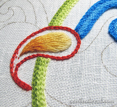
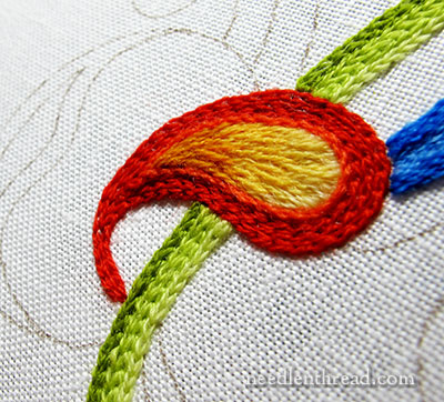
See the yellow-orangey swash in long and short stitch there? There’s something about it that bugs me. From this angle, it doesn’t look all that bad, I suppose.
I wish I had a slightly darker yellow than the middle yellow for the tip, rather than the orangey yellow, but I don’t, because the thread I’m using doesn’t have a slightly darker yellow option in that color range. I’m ok with the orangey yellow, but I don’t love it.
But that’s not my kerfuffle. My kerfuffle is that there’s something about the shading that bugs me.
Maybe if you look at it and squint, you’ll see what I mean?
Did you squint?
From farther back and with the red finished, it bugs me less. But still, but still…
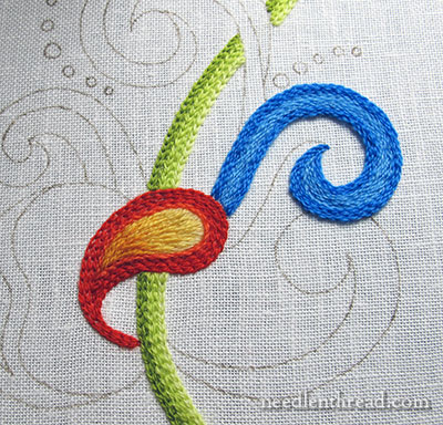
Let’s turn it a little bit and look at it at an angle.
From this angle, with the lighting as it is, you get more shadows on the individual stitches, and the thing looks rough, indeed. But you can also see better what’s bugging me.
Is the orangey-yellow shading just too abrupt? Is there too much of a definite line where the shade changes?
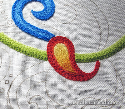
A different angle altogether! You can see that the orangey-yellow does stretch into the medium yellow with a few stitches, but I think that the medium yellow needs to stretch farther down into the orangey-yellow, to soften the transition between the two colors.
Notice, too, that the stitches look much smoother from this angle, because the light is not creating harsh shadows from the individual stitches.
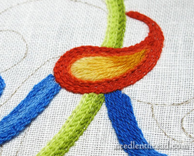
Now we’re completely upside down. The stitches look smoother here, too, but … there’s still that definite, clear transition into orange.
Don’t pay too much attention to that dark blue swash coming off the red on the lower right. I think that’s going to go! But woe is me – picking out wool threads worked with long and short stitch is so very messy!
I like the red tambour work around the middle swash. I’m not necessarily sold on the color combination, but the red worked up nicely in the tambour chain stitch.
So, my kerfuffle: Is the orangey-yellow transition irritating enough to go back and make changes? Should I sneak in some stitches to see if I can repair it, before giving it up completely and picking it out? Or should I change the color scheme altogether and switch the yellows to a different color?
I’d love to hear your take! Feel free to leave your comments below!
I love that yellow and how the colors moved into the red. Don’t change it.
I think it looks great in the first picture before you filled in the orange. So I think the problem might be the orange not the yellow. Maybe there is a softer shade of orange to gradually go to the outside orange. I would keep the blue, looks great with the green. However, remember don’t be to hard on yourself. All in all it looks terrific to me. What a wonderful stitcher you are. Are you snowed in ? KS got hit badly I hear.
I think it looked better with the space around it, I would take out the last orange chain stitch which seems to stand proud of the shading, which by the way is very well executed.
I like it the way it is. I esp like the blue and orangey red. Maybe a couple of stitches in the paisley.
It’s fine! If this is going to be hanging in the Louvre then by all means I’d redo it but otherwise it is quite acceptable. Happy stitching.
Dear Mary, is it possible the coulourscheme is troubling you?
Kind regards, Monique
Hi Mary, As I am currently working on some long and short stitch with a limited palette, I appreciate your “kerfuffle”. You are a perfectionist and only you would notice a problem. I think, as you stated, it is the limitation of your colors. The darkest color may look abrupt to you because there is not an intermediate color between it and the next shade. I am having the same problem.
Would I suggest taking it out? Hmmmm. While I would never tell my students to be that fussy, I would be. (Ask me how many times I have done the ribbon I am working on!) If you continue to be bothered I would probably suggest you take it out; but I would also try to see if I could correct it first by easing the transition.
I can see your dilemma; if I were working on this piece, I would make more of a noticeable transition from the light color at the top thru the middle section. Looking at the piece as it is, all I see is light, and then dark – nit much of a variation inbetween.
I agree that the transition is abrupt but not so much that a few stitches won’t take the edge off.
Gary
I think you may be surprised with it if you progress the area around it. The last few photos make it look like the paisley shape is rolling over the blue line, it seems to give it motion. I say hang with it a little longer then decide!
I mean green line, not blue!
I think you are right, the orange just messes it up! I think just shades of yellow might be the trick and get rid of the orange altogether?
I like the colour. It’s autumny. If it was mine I’d try to bring the middle shade down into the dark one a very little. There’s just one sort of a roll of the darker thread seems to be making it too heavy. i.e. the second one up from the bottom of the top picture. Right down the middle there seems to be a space you could put a thread of the middle shade and slightly, slightly, catch into that roll of dark thread? Or/and could you cheat and try to pull that thread back with a tiny matching one. Impossible to describe! How do you manage to make everything so clear for us. You are a gem!
I think what is bothering you is you are using
several primary colors, solid primary colors,
and that is shaded, and not a primary color.
Just my opinion.
Agree thatthetransition from the orange is a bit abrupt. How about “extending” a few stitches of the orange;i.e., make them longer – just a few. A shame to pull out all of the stitching. Or alternatively, why not add a few stitches in green?
Leave it Mary. Take the Buddhist approach. It is what it is.
Also because i can let a little thing like that bug me, too, Tell yourself, It’s supposed to be that way!
I agree that the orange/yellow is too prominent and that the medium yellow should extend a little further down into the orange/yellow. Perhaps there are too many very bright colours in the design but that really would depend on what it is to be used for. I think if it were me I would take the a few stitches of the orange/yellow out and replace them with the medium yellow and I am not altogether sure about that bright green.
Oh Mary, Mary you suffer all the small stuff. This area is what 8, 10 stitches? and the wool doesn’t come in another yellow gradation. Possibly a few more long and short stitches will soften the transition but don’t start ripping it out. When the project is complete this will all be part of the beauty of the highly textured surface that makes crewel wool work. It is not silk.
Hi Mary
Do you think perhaps that it is just quite a large amount of hot colour all at once – and perhaps the red and yellows aren’t quite the right shades. I agree that it does look better upside down – maybe because the warmest colours are at the bottom – so not top heavy.
Guess you will just have to frame it upside down???? The light certainly does make a difference and I have found that often in my own work too.
Beth
I would try a few – not more than 3 – longer stitches of the darkest shade that reach up into the shape before taking it out. My biggest challenge with shading is to ease the colors into each other and that’s what I think is needed here.
Yes, I agree with this for this striking piece of work.
Hi, I looked at the embroidery again.
If the area was not confined and the yellow
allowed to “blossom” out,like a flame, I think you would be much happier with it. Perhaps then you would really need to get rid of the blue & green as it might not “fit” in to the scheme.
I always reckon if it bugs me now, it’s always going to bug me, and if you feel strongly enough to write about it, I guess that’s probably the same feeling!
On squinting at the bottom of the orangey bit it seems to blend into the red a bit making it disappear into it (although that may be what you intended). Like the colours, but if you can’t get the right yellow, have no solution. Hopefully someone else has some more constructive thoughts!
Mary. I think it is too early to tell if your colour and shading are appropriate for the whole project. I think that this one is a ‘do some more but this bit is still being auditioned.’I agree that your stitching is a bit bumpy. Perhaps, too many stitches for the space available.
How is the Gold piece progressing?
Thanks for your book recommendations. Very helpful.
I would take the orange out and redo it. The color is fine, but the fact that you are thinking about it means you would be happier if it was redone.
What if, instead of the red, you used a slightly lighter shade of blue? As well, take the edge off by making the transition less abrupt. Just a thought.
Personally I find no kerfuffle in your stitchery. Love that word immensely! My daughter is a book blogger and I can’t wait to share this word with her. She’ll get a bang out of it. Your stitching is amazing. I love your blog as it gives so many wonderful details. I hope to back into embroidery sometime in the New Year. You inspire me.
As someone who doesn’t allow orange in the my house, I have to say I actually like the looks of the yellow/orange /red combo especially against the yellow-green line. What is very jarring to me is the blue–it shows up on my monitor as a very bright, electric blue and is very distracting. When I put my hand over the blue lines, the green and red/yellow area seems to go very well together. Technically they are analagous on the color wheel. Color is so personal that it is difficult to judge someone else’s choices. My solution in cases like this is to continue working on other areas and see if the whole design can eventually come together–at this point the single motif is–well, sticking out like a sore thumb. Once the entire design is finished you may not even notice this one element.
I think you should try to fudge it with a few extra stitches — if you really don’t like it then, you can always rip later. Of course, no one else would ever be so hard on it but one does always need to satisfy one’s inner critic!
I say listen to that intuition! It is a bit abrupt and a few stitches can remedy what you yourself already see. Maybe even add some purple into the red to push the yellow colours. In my own work, if something like that happens then I got to be true to it and make the change, otherwise it just bugs the heck out of me! I dearly love your site and your work! Stitch out the kerfuffles; it’s beautiful stitching! Maybe it will be in the collection of the Louvre!
I think the two lightest colors work wonderfully as is. i think the trouble is with the darkest color meeting the red border. Is the red an orange/red as I am picking up? Mabye the darkest color could have a maybe a coral tinge or a warmer color towards the red family. Obviously, I am not a color expert with the proper vocab.
Mary,
I think I would sneak in a few more long stitches of each shade further into the preceding one, if you see what I mean. From one of the angles that you shot a pic it looks almost like straight bands of color instead of graduated. Think of a flower with long single veins of color (lilies?) going further up the petals against the primary, lighter tones.
I my opinion the darkest orange thread looks heavier the the other threads. The pale yellow and the yellow orange blend well but the last color seems to jump out at me but I’m no expert.
I am not an expert on color or use of color but I do think that the problem with the yellow orange colors that were used in this piece are not in the same color intensity as the colors surrounding. Maybe a Brighter yellow to a brighter orange would help. One other thing that popped into my mind is that maybe flipping the light to dark (light color in the tip and darker color at the top of the tear drop) would make a desirable change to the piece.
Funny…when I first saw the picture, before I read your comments, I said to myself, “that’s a lovely job of shading.”
I’d leave it.
To my untrained eye I think it looks Ok…But maybe a few stitches of yellow worked into the orange would help blend it better….Your work is beautiful,I really enjoy your lessens on Gold work as well as tambour….Thanks…Dot M.
It’s gorgeous! Maybe you will like it better when more stitching has been done around that section. Your stiches are all so beautiful – can’t wait to see it finished.
Dear Mary,
I do not think it is the middle orange that is out of tune. in my opinion it is the yellow at the end that is to short, to little, stitches are to small, something like that.
love
annelot
Hi Mary –
The problem is with the red outline. Its brightness and intensity make it look harsh in comparison to the yellow/orange piece. The gradation from yellow to orange is fine, except that the lightest yellow is a bit too light. But, the problem is definitely with the red.
I noticed that the green and blue are bright and intense as well. One alternative is to use bright colors for the entire piece. Unfortunately, this would mean eliminating the yellow/orange gradation, which is working well.
Best wishes,
Mary Ann
Would shading out to in be better, not top to bottom?
…perfect just as it is. I wouldn’t change a thing.
I think you need to extend the darker orange, I think there is too much light. Could you add some darker orange amongst the light orange to extend the area it covers?
Hi Mary
I’ve never used this thread but when I’ve done needle painting it has been with one strand of DMC floss. Hazel Blomkamp is a great one for mixing the threads to suit the location. Get it out and try again with something more forgiving!
Happy Christmas
Jenny
Your work is impeccable, however you asked us to look carefully. I love the swish. The colors look just right to me in the yellow. The red color looks like an outline, so I don’t see where it needs to fade into the yellow. Now, that lighter blue bothers me and I am not sure why. Maybe the two blues need to be blues that are closer in hue. It just seems abrupt looking at it. All in all, I think your work is flat out gorgeous anyway you do it.
Hi Mary, I do think there is a little line of demarcation between the orange and yellow-orange, but I think a few stitches would fix it or maybe make it pop with some cross-hatching. As always it is your work so it will be perfect I’m sure. Happy Holidays, NJ
I think you are being too hard on yourself. It is gorgeous. If there were a different yellow, maybe a tad darker it might work a teeny bit better, but not enough to get your knickers in a bunch! The overall effect is amazing, the colors are bright and wonderful. If you want to get in a kerfuffle over something, you should see my jellyfish tentacles that I have agonized over for weeks!
This is just great – keep it up!
I know you say that the rt blue is going – good- because everything else has gradation and that doesn’t – it doesn’t fit- also I would think that you could take the y/o from the oval section and combine it with a lighter color and get rid of the y/o by the tail that butts up to the red
The orange and reds don’t match well. Also the shading direction on the reds conflicts with the shading on the yellow to orange. Consider making the extending the pale yellow more and shade down into a red instead of the orange.
The way the shading stands now (the gradation), it kind of indicates a strong light source — while the surrounding red indicates none!! If you just shaded the yellows and left out the orange, it might be easier for the eye to understand??? In the end, not a “big deal,” but it is fun brain storm with everyone.
I really like it the way it is. It gives a bit of dimension to the piece and the yellow and orange is the prettiest part to me now. With the blue one clearly meant to be a subtle background to show it off!
Quilters use paint, sharpies etc to blend colors. The transition seems abrupt to me. Add a few stitches or a few light swipes with ink!
The yellow-orange shaded area looks very different when placed next to the red — doesn’t the red bring out more orange? Perhaps that is part of the kerfuffle?
Shelia in Oklahoma
I agree with you as far as the abrupt line between colors. I’m no expert but at first glance that my immediate reaction was that it looked like 3 color blocks. The blending is just not noticeable.
I like it the way it is generally speaking. It doesn’t look bad and I’m not even fond of orange. If I try to analyze it, I’d say the only thing that seems a tiny bit off is the design is rounded and curvy and the transition almost goes straight across from yellow to orange. The shape of the color change seems to clash with the curves. Now whether you could bring the orange up in an arc to match the arc of the large rounded end somewhat or do streaks of orangish color up into the yellow like flames, I don’t know which would work. Maybe neither one. But that’s my penny’s worth, not even worth 2 cents. 🙂
I really think the orangey-yellow works well, within its motif unless you were seeking more contrast between it and the red outline. Perhaps you would be happier with a darker yellow in the medium range? But, personally, I quite like that yellow-to-orangey transition the way it is.
What bothers me is the tone of the whole yellow-orangey-red motif. It uses very warm color tones, while the accompanying nearby tones are very cool shades of blue and green. The cool and warm tones seem to be working against each other, and perhaps this is what really frustrates your eye about the orangey-yellow.
I don’t find it at all irritting. I loveee the change. You certainly find changes like this in nature. Don’t let that kertuffle burst your stitching bubble for if you do it double you could be in more trouble. (Read double as again). Leave it alone, it is fine as is!
I love the orange to yellow shading. The problem you see might be due to the proximity of the bold orange red outlining the orange-yellow bit. That outlining shrieks at me, at least on my monitor. It seems to completely overpower the more subtle orange-yellow gradation.
Perhaps it’s not the angle. The red out edge of the leaf is strong. Maybe the beginning orange should be a strong red-orange pulling the outer red into the orange. OR…using some of the red (long and short) into the orange which would make a transition into the orange from the red
beautiful work!!! I think the darkest color should be only two rows of chain stitch. then make the inner part with the long and short stitches bigger. The dark chain stitch is a nice contrast in my opinion there is just too many rows. Thank you for inspiring me to do my best!!
Mary Sue C
Love the shaded yellow paisley! Don’t like the block of red surrounding it. The other stitched areas are gradually shadded and the red appears as a solid mass. If you have to use the red, shade to that color.
Hi Mary,
I actually like the red, yellow, orange motif and think the blue and green may be throwing you off because the whole come across as the three primary colors. I think once you get other colors into the mix, you’ll feel better about it. The blue may be the real problem, the other colors say autumn but the blue throws it.
Your long and short stitches are great. That’s my favorite crewel stitch. Hope you start to enjoy your project.
Best regards,
Cookie
I think the dark yellow is too dark or the light yellow at the other end is too light, but if you hadn’t said something, I probably wouldn’t have noticed.
I think the piece is lovely and beautifully stitched.
Since you are bothered by something, I think it may be that the transition from yellow to orange is not as gradual as you want, caused by the lack of thread color choice.
If I looked at this before reading your comments, I would certainly never have thought it was anything other than beautiful.
Wow! Now I’m in a kerfuffle, albeit a sympathetic kerfuffle! lol
I squinted, and the red/yellow/orange looked fine; it looked better when I covered up the blue… Somehow the brightness of the blue is throwing off the softer tones of the red, yellow, orange and green. If you’ve already decided that the blue has to go, then take it out and see if that doesn’t resolve your kerfuffle…
You can then move on, choosing what to replace the blue with, perhaps something in the same softer tones…
Just a thought… have you tried taking a photo of the piece in black and white? That might also help you see what is standing out, throwing the mix off…
I think that I would first try sneaking some extra stitches of the medium color into the darker, especially midway between the edges. Removal (at least, for me) would always be there as a last resort.
I love the color! the yellow to orange-yellow does not bother me however I do agree with you that the transition is not smooth enough at some angles. I would probably try to smooth the transition a little. Otherwise, it looks great!!
I would leave the yellow area alone for a while. Then after doing some additional stitching elsewhere on the piece if you are still unhappy first try adding a few discrete stitches. Finally if that doesn’t work start pickin away. Anyway, that’s my two cents worth.
Dear Mary
Yes I agree it does depend on the light. Well what a dilemma, I don’t know Hmmmm I’m in a Kerfuffle for you when I saw the first photo I liked the orange and yellow so I would say stay with it the stitching is perfect. I’m having the same problem with a Robin I’m embroidering I can’t get the reddy/orangey mix for the breast of the Robin I’m in a real Kerfuffle as well. Help! I’m glad we all have these dilemmas in embroidery and can share our worries, I hope you get inspiration on what action to take.
Regards Anita Simmance
You are right on cue…the orange has to go. It seemed okay until you added the red.
ONLY since we are critiquing this gorgeous work of yours and TRYING to find fault (goodness, it’s difficult with such beauty)….In my novice opinion I think the orange does transition into the red too thoroughly at that point. When looking at the shape before the red filling tightly around it, it did have a more satisfying eye appeal. So would there be a solution for the color to be different somewhat immediately around the orange/ylw shape?
Try adding a few stitches in the middle yellow–it wouldn’t be much more to take out if it doesn’t work, but it might be just the thing, and you can go ahead with the project.
Hi. I agree with a comment that the transition is too abrupt. I feel if you add more yellow through to the tip it would give you a softer effect
Hello Mary, I would change the red outline to orange eventuelly. You worked the swirl in blue shades (light, middle and dark) and the string in green shades (light, middle and dark gree). So, the hight contrast of red and yellow in one shape is what bothers me. I would work the entire shape in orange shades or yellow shades ???
Only another opinion. Thank you for asking us. At the end, you will make the right desicion, I am sure! Regards, Connie
Before removing it and starting over, I would try putting more yellow into the orange. Your stitching is wonderful.
I agree the orange is throwing off the look. Perhaps it’s due to the orange being a flatter, darker hue than the other colors. The rest of the colors have a wonderful sense of lightness and purity of color. The orange looks muddy next to them.
Mary I see what is bugging you. There is diffently a line where the dark yellow goes into the softer yellow . It’s too dark you need a colour to blend in. I know how hard that is because I have the same problem sometimes when I’m doing thread painting but if you are like me it will be only you that will notice it and know that it’s bugging you. But the piece is going to look beautiful. I always love the colours you put together. Merry Christmas
Try to repair it by lightening up the orange. It looks too dark to me. But love the look of the red.
Hi Mary, I feel embarrased to give advise to you, but here it goes. I feel that the “jump” between the orangey color and the medium yellow is too abrupt, that it needs a softer, and I would say “easier”, pass between the two colors. Since that color doesn’t exist in that thread, could it be “faked” by interspersing a bit of the orangey on the medium yellow, and perhaps a bit of medium yellow on the passage to the light one?
I know I am not “discovering America” but that is probably what I would try.
Thank you so much for your excellent, and fun, newsletter!
At first glance I thought the yellow-orange area lookd good, perhaps a little more medium color would improve this area, but after looking at the whole piece, something was off. The blue is too bright for the red, yellow-orange area. I would have used a teal, but it looks like there is a lot of blue to take out, so either the red needs changing, or the yellow-orange area needs to be changed. Since I don’t know your personal color style, it’s hard to understand how you envision the completed piece. You may want to do more work on this piece before tearing out.
The shading itself is great. The problem for me is the red outline. It is the same value as the red orange and blends together. In photo one, where you have a white outline around the graduated shape, it looks fine. If you want to keep the red, use another lighter color in the bottom of your shape. The orange- red is a less intense color, next to all the other intense colors and that might be what’s bothering you.
Or Try another color outlining the shape, much darker or much lighter than any color in the gradation.
You sure got a lot of opinions!
Robin
I think if you add a few strategically placed orangey threads working up into the light yellow more, it might look more pleasing. I like the orange, but I think there’s a bit too much light yellow and that makes it appear unbalanced overall. This is really nit-picking, though, over what is b e a u t i f u l stitching work.
Agreed on all counts.
And that’s how a lot of us came to be dyers… 🙂
SJ
It is incohesive. It reminds me of that childhood song “One of these things is not like the others, one of these things just doesn’t belong…”. I vote for a re-do, but knowing you, Mary, I’m sure you’ve already done just that!
I like the idea of sneaking in some stitches before taking it out. You will have more options and if it doesn’t work you were going to rip anyway. I personally like the orange but I do not know what you were trying to achieve.
First of all, I love your blog even though I no longer do embroidery because of arthritis. As to your kerfluffle, what bothers me the most is the dark orangey/brown at the inner point. I actually like the two lighter yellow/orange colors as they give a nice contrast to the red, but that darker color seems to clash with the red. I look forward to seeing what others think.
Dear Mary I looked at your problem every which way up and came to the following conclusion:
leave it alone until you have done some more to the work around it. Then look at it again and see it in the context of the rest of the design. If it still bugs you then take it out. You will never be happy and will always see it as a ‘fault’! Probably no-one else ever would though!!! It’s rather like missing a stitch out in a design – only you ever see it!
Liz
I really like this as is. To me it looks like the yellow is coming out of the red outline. I think it is great looking.
Oh my God. I cannot believe you have an issue with this. If I could do long and short like you, I would be showing this to all my friends. No kerfuffle there.
Love the combination of stitches to give texture.
The orange stood out to me when I first saw your color scheme. I admit I put a finger over the orange in the photo and thought, fixed.On my monitor it seems to have a touch of brown that the other colors don’t. Where is the ‘light’ coming from? You can create another color in long and short by alternating two colors every stitch. I think I would sneak a few medium yellow stitches into the orange to tone it down. I would also like to see the blues next to the yellow. Makes a huge difference what colors are next to each other. Have fun!
Hi, Mary. Since you’ve asked for advice, I think the shading looks nice as it is. But it’s bothering you, so maybe you could add a few longer orange stitches to make the transition more gradual. Then go ahead and start the next section. After a while you can look back on this yellow/orange area and see if it still bothers you. When it’s surrounded by other stitching, it many look better to you. You can always take it out later.
–Ruth Lyon
I am a graphite and watercolor artist who also does surface embroidery. I love subtle shading.
Looking at your work from another perspective, such as upside down or with a mirror certainly helps.
My personal preference would be to tweak the silk shading to be a tad more gradual, especially if you could just add these threads easily. Then again, the shading in the tambour work matches the silk shading/long short stitch that you currently have.
I am coming from a bias. I spend way too much time tweaking my work. Is this a commission piece? or a personal challenge/experimental piece? Are your goals focused on color or stitches?
As an aside, I always look at each piece I do as something that will last through the decades or longer. It isn’t because I think much of myself. It is because of the great grandmother I never knew. My grandmother kept three things from her. A cape, one shoe, and a broken pair of glasses. (It was related to the hard times during the depression.) I highly doubt that she would have chosen those items for posterity, but they are still in the family! When an aspect of a piece bothers me, I think of her!
If you feel the work does not add up to your standards, correct it. You will feel better about it. After all, it could last over 100 years! :))
I suspect your kerfuffle, in part, is because the red/orange/yellow stands out so distinctly from the cooler blue and green and is highlighted even more by all the open white area surrounding it. I’d leave it for now because I think when you place additional stitches and fill some of the surrounding areas the “irritation” will fade from your sight… as will the limited gradation of the yellow/orange/red palette of your fibers. You could well find that too smooth of a color transition in those hues would make it more visually bland and that the less gradual transition of color is needed to make it sing. Happy stitching!
For me the orange part does not contrast enough with the red. I understood that you are going for a lot of contrast and color in this project. May be go for lighter yellows in the middle of the red
I think it’s gorgeous as is! Hope my kerfluffles look as good as your’s!
I can now see the kerfluffle. But it was difficult to see. If it really bugs you ,you should add more middle shade but I think it looks fine.
I rather like the yellows to orangy yellow shading and am less enamored by the red around it, but I suspect that when you get some more shaded shapes, and I am assuming there will be more of them, that I won’t mind that either.
Well…. in my humble opinion you are being a bit fussy, or should I say in a needless kerfuffle. While I agree the shading could be more cohesive the color range available is what it is and I believe it will be fine. Especially when the piece is finished. At the present state of completion your eye only has a few elements to look at and when completed the yellow paisley shape will just flow into the busy pattern. If you decide it is unacceptable when finished you can always change it then. Fow now I would leave it alone. Just my way of thinking…
Hi Mary,
I may be re-stating a few other remarks but this is how I see a solution. The other two colors in the picture use tones of the Same Color. Three colors in green and (it appears? …)two colors of blue. I think if you used the same hue (red) but perhaps a light red or pink and a medium red or medium pink your transition would be much smoother. The yellow is intersecting with the blue and the green and it really increases it’s contrast by being juxtaposed with those colors. Ye In addition to that, green is red’s complimentary color and blue is a triad to the red. Anyway, that’s the ‘fix’ I think would be attractive. I apologize if I sound pompous, after four years of college art I’m just please to offer something of use (i hope).
please remove my request to have individual responses sent by email, I’m overloaded! Don’t see a way to undo this.
Thanks,
Cookie
My suggestion would be to take a few extra stitches of the orange and darker yellow going more deeply into the other color in a random manner.
In the past I have removed wool stitching from an area, so my tendency is to try all other methods first!
Hi Mary,
Maybe it’s not the color/shade you are using. Perhaps you can bring the darker up along the edge a bit more, rather than a straight across color change. It will make the center color look more padded in the exchange of color. Might only need a stitch or two along the edge.
Fun colors, though!
when I do shading the lines are more jumping. I learned to make more longer stitches. Than you have a more smooth line.
Good luck with it
Yes – I’d say you should just add a few stitches in that transition zone and see if that solves it.
I wonder if it’s the change in stitch texture that’s the issue? Perhaps if you worked a second area in the long and short stitch it would look more balanced? Of course, if you still hate it hen it’s twice as much to remove!
I can see what you are reacting to, and I wonder if it is in part because the transition between colors is a bit abrupt? If it is bugging you, then better to make some sort of change, or you will never be comfortable working on the project. I think that it is difficult for the rest of us to assess because it is still in the early stages of being embroidered and difficult to know what the final feel of the project will be. One final thought – in a different stage of my life I designed and made very elaborate appliqued and embroidered dance costumes. One of the things I would always do was look at the costumes at different distances and under different lighting conditions to see if they were going to work well through the range of settings they would be used in. I don’t know what the final use for this piece will be, but framed and hanging on a wall is very different than the lid on a box. That is a factor that might be taken into consideration. What works perfectly in one setting can be bland or too intense in another. I’m sure that you already do exactly what I suggested, but I thought I’d bring that aspect into the discussion.
Wow, Mary, you are a picky one!! But in a good way, don’t get me wrong. Since I would probably not keep changing the angle of the finished piece (that’s what I mean by picky – obsessive, tee hee!), I would vote to stick in a few (very few) more lighter oranges up into the yellow. But don’t overdo! Ha, listen to me, a rank amateur compared to your skills…
Mary, I don’t think it’s the shading at all – it’s the colour combinations that aren’t jiving. I’m not sure what would work, but there is something about the ones you’re using…
Mary – What angle will the finished piece be shown? That is how you want to look at it. Everyone is focusing on the yellow/orange..when more stitching is completed it will look entirely different. I think you should complete more of it, take another look, then decide; if your eye continues to focus on it, it may need to have some correction. The total story is always better than just one sentence or view as it may be.
Sharon
I agree with you that it’s not quite right. And for me, the problem is the dark orange part. It seems to fade into the red too much, ie not enough contrast between the inside and the border of the motif. And, I agree that the color change is too abrupt. Given those two things, I would be taking out the dark orange and making it a lighter color, more yellowie.
Hi Mary,
I’m enjoying your experimentation with this piece. I think the problem is that there is too little contrast between the second and third colors in the ling and short section so that from most angles it looks like the same color . How much time you invest in changing that depends on what you plan to do with the piece when it’s finished I think. If it’s gust a learning experience I would just leave it and say lesson learned. If it’s more important that that, I would try adding in some darker strands to see if it gives more contrast. If it’s a gift or something you will have on display take it out and try a different middle color maybe an orange. Those are my thoughts. Thanks for all your work. I love opening your daily newsletter to see what your working on Nd I’ve learned so much from you. Thanks again Connie
like the long and short stitch colours and gradation doesn’t displease. Don’t like the red though, just overpowers.
Your embroidery is always inspired and lovely. I think the orange part of the long and short stitch element is off–. The intensity does change based on the picture. Its most noticeable when the reds (I think there are two colors of red–yes? One line immediately around the yellow orange element and then another red that makes up the majority of the red element. I think it is because the other threads seem to have a cool undertone while the orange doesn’t. I don’t think it is your long and short stitch.
I’d pull the darker color up more on the outer curve allowing the colors to transition with the comma shape rather than crossways which interrupts the visual flow with “layers” If that doesn’t do it, maybe a couple of random “specks” in the lighter area.
The transition from the orange to the gold is a bit abrupt, I agree and perhaps a gentler orange would be better.But it doesn’t bother me because in so many flowers there is this somewhat abrupt change. I’m more bothered by the tip which is so light as to almost disappear.
My first thought is contrast is needed between the red and yellow/tan, perhaps a very thin line of grey or brown. It’s really fun wat hing you work. Dorothy
My first reaction to the yellow was ‘Wow, I like that’, but as you explained it and showed more pictures I do see what you mean. There is quite a sharp change in colour and it is a pity that you don’t have a light colour to take the place of the organey-yellow.
I’m a real stickler, so I would likely pull it out and try a different range of colours. But it’s up to you … I’m probably too picky for my own good.
I guess the real question is, is it always going to bug you or can you find a way of being at peace with it? If it bugs you, take it out.
My gosh you are pickey! Everything isn’t going to have a smooth
transition – Look at the overall ‘picture’ – If it bothers you enough
and it is for YOU – then change it if you must – but otherwise
will it really matter? Stress less and enjoy it more. 🙂
1. I think you’re too close to this work to be the best judge. This might be one of those leave it a few days and look again situations.
2. whether the transition is abrupt is very much a matter of what you intended. To me it looks defined, but not abrupt, and I’m fine with it. If however your intent was a seamless transition, well, hm. But is that vital? is all I’m saying.
3. consider the angle from which the viewer will in fact be looking at it, and see if that pleases you. Or if a couple of cheat stitches need to be sneaked in there to soften the transition.
Well, that’s me!
oh my goodness. don’t think anyone would have noticed that had you not mentioned it. yes, there is an abrupt change but it is still beautiful. i wouldn’t change it.
Hello! as well as being a stitcher, I am a professional artist. I could spot the problem right away. In working with color we speak about each color having a value of dark to light and next of having a ‘temperature’ which is warm or cool.
The red is overpowering the orange/yellow stitching; the value of the orange to the red is approximately the same and this means that they ‘blend’ into each other without a visual separation. The red stitching is a cool red, while the orange/yellow is warm. These colors are creating a discordant unit, not a unity. You either have to change the red or change the orange/yellow or add the tiniest bit of something one way or the other to have them work together.
One suggestion is to add some gold threads into the orange/yellow segment. The gold will break up the light by giving more light into that area. This should help. Another suggestion is to edge the red or the orange/yellow segments with gold. This will separate the color values while unifying the whole area.
There are other ideas, but these might be the most workable without having to take anything apart for a major change.
Hope this helps!
Cheers!
Bev Bunker
Just add a few more orange stitches coming back into the yellow,kick it to the kerb and move on to a bit that gives you pleasure
Hmm, I like the central shading (I love warm yellows). I don’t like the red-orange sitting bang next to it. For what my opinion is worth, I think I’d look at the three outside rows, going inwards as red, red-brown, darker brown (if you definitely want red outside), or even red, darker grey-red and dark grey. That would give the central part its own definite identity, rather than leaving it unsure if it’s part of the red, red-orange or not. The L&S stitching is very nice, don’t lose it. But make sure there’s some more naturalistic shading here and there on the piece, as it’s a major contrast in style to the flat shading of the chain sections.
How about a few strokes, with a light touch, of fabric paint on the area in question to provide a smoother transition.
Hi Mary,
I think that the orange of the variegated thread is too close in colour to the outline thread colour. I would try bringing the yellow further down into the tail of the paisley shape so that there is more of the yellow and less of the orange. Good luck!
Ann
It’s not the orangy-yellow that is the problem, it is the red. It doesn’t go with the orangy-yellow or the blue or green, all vying for dominance.
Kerfuffle is a good word, one of my mother’s favourites!
Hi Mary
It’s not the yellow/orange that’s wrong, it’s the blue that really jars on me.
Regards , Kim.
Whether there is actually anything wrong with the transition between yellow and orangish-yellow, your eyes will always tell you there is. Therefore, change it. There’s nothing worse than finishing a piece and having the aggravation of seeing that one little problem area every time you pass it. In the last photograph the problem was more obvious than in any of the others. I would take it out, however much I didn’t want to. That being said, your work is always so lovely and interesting that this is a pretty minor thing, isn’t it?
I think it looks wonderful! Don’t change anything!
I can see what you are saying, but I think the shading and the colours are fine.
Why don’t you continue to work on the piece so that you will have more contrast with other colours in the design before deciding to alter it or unpick it? If after that you are still not happy, I would shade a couple of the darker threads into the medium threads and then a couple of medium threads into the lighter threads so that the colours blend more throughout the area.
Hope my input is worthwhile,
Claire
Maybe if you add a little bit more of the lighter yellow it will blend in more. I don’t think there is enough of the lightest color to make a difference. 🙂
Doesn’t bother me. I have the feeling it will always bother you.
Well Mary, As my sister always tells me…. ” WE are our worst critics.”.
Are you going to be doing more long and short stitch on this project? I ask because the other shading is done in rows, not gradual. That’s what is throwing the look off (ever so slightly) for me. Maybe change direction…take your long and short stitch from the outside in, not from bottom to top. Or change to rows of chain stitch like you did the red/orange. But, if you are going to do more long and short then leave it for awhile and see how it fits in later.
I must say that I love the colors! I’m going through a bright and bold faze right now…just bought some fabric in these colors to make a quilt for myself(after Christmas of course).
I didn’t notice until you mentioned it and now I can’t unsee it!
Me encanta, soy una gran admiradora de sus trabajos.
To me the orange is kinda like a blob sitting a little uncomfortably with the yellow, but it seems to disappear with the red there. If it were me I would take it out, it just doesn’t ‘feel’ right.
Perhaps it’s time to walk away from it have a cuppa then come back to it refreshed…Your work is always wonderful Mary, it’ll work out =)
Hi Mary. It reminds me of the flames in a fire. I think may be abrupt compared to some of the other shading that you do, and this is just, different. I’m not sure what it will look like in the whole finished thing, though. Soooo, can you can wait a little and see?
Would it be possible to(if you choose to take it out)separate the strands of the orange and the middle yellow? Take one strand of orange and one of the middle yellow and work them together to get a better transition.
Hi Mary,
I think your stitching looks great. I wouldn’t change it. I will give you my six-penneth worth of an opinion!! I think pehaps the palest yellow is not quite working. The other colours are strong. The orangey-red chain stitch border and the orange and dark yellow long and short stitch all tone together but the palest colour yellow is too light in some angles of the photos. Is your kerfuffle growing with this comment?!! Sorry!! Truly when the whole piece is completed I think it will look fantastic. Best wishes.
There is so much white around the colored parts it’s too hard to tell yet. Will there be more of this orange to yellow stitching in the design? I say, leave it until you’ve done more stitching, but I think the problem is that the yellows are too pale to go with the more intense red and blue.
Hello Mary, I think it is the colour orange that seems to bother me. I wonder if a lighter red /orange would suit instead while maintaining the yellow. To make red colour it has a mixture of orange in it to on the colour scale, so perhaps if one introduced that shading there it would be easier on the eye. Good luck with your decision making.
I will suggest you do a few more yellow stitches into the orange to just lighten it up a little . Otherwise I think it is beautiful. I love your interesting embroidery projects, it is like my “daily fix” to see your latest one. Thank you for the very interesting and beautiful embroideries. Kind regard, Daphne
Could it be that the darker orange gets lost in the red? On a gray scale they would be pretty close.
Mary, I have had this same problem. I discovered if I used one strand of the darkest color along with the next color all the way to the tip, the color seemed to gradually lighten and the fusion of color was more evenly displayed. Fot instance, 1 strand of darkest color + 1 strand of the next lighter color, & so on. Hope this helps! Best of luck, Missy in freezing Colorado.
Sorry Mary…I think you should try to repair it. I do think there is a definite line and the color change too abrupt from two of the angles.
Mary, I would try to sneak in a few stitches to see a) if it solves the problem
b) if it shows you it will solve the problem if you re-stitch with the same colours
Of course, if it bothers you that much, maybe removing those colours might be the solution, but if it were me, I’d try the first 2 choices…..
I think that with the Red, it doesn’t quite blend. Possibly use more of orangey red colour on the outside, or varied pinks on the middle, to merge it a bit more without a definite break. Or did you want the middle to stand out from the edge. If so then you need something a bit deeper red to crimson, perhaps.
If you really want to change that beautiful piece of art – you could switch the dark orange and the lighter yellow – so it transitions from light at the base up to dark?
I think the orange is the problem. Although, overall, when the whole thing is finished it probably will not be noticeable
Mary
I love a kerfuffle! Thank you forinvuting our involvement
A new set of orange/yellows with more choices is my solution.
Rip it out! It will be worth it!
Roxane
Dear Mary, I’m so glad you have only asked us our opinion on a splash of orange and yellow edged with a reddish orange. Life’s too short! Just add a stitch or two of orange amongst the yellow and everything should be OK.
Oh, My! That is a kerfuffle indeed. And thanks for validating that word, it was just the word I need on another issues altogether.
When I squint, the orangy looks too red, and runs into the red loop around the motif. Perhaps just a darker yellow and no orange at all? But, oh, hear, that does mean removing threads. Thanks for letting us suggest, as if we know 1/10 as much as you about color and design in embroidery!
Looking at all the pictures, one after another, I think the problem is the bright red that is right next to the yellow/orange piece. It’s brighter than the surrounding red. It needs to be another shade of red–more of an orang-y red would be better. Or, even make it the same shade as the rest of the red.
I agree with #2 and 11 above, too.
Hi there Mary, I like the long and short (yes the transition may look a bit abrupt but it looks good). What I might do is take out the orange chain stitch (is it orange?) and make it the red colour of the rest of the swirl. Somebody else mentioned leaving it until you have filled in some more of the piece; that for me is a good idea.
I like the juxtaposition of different (seemingly disparate) colours – rather Glazig.
I like it. I don’t recommend squinting unless you need new glasses. Also, you have tons of area yet to stitch, and those yet-unstitched-colors will impact those you’ve already stitched. If you have some snow – go shovel some. You’ll come in and be glad of the warm yellow!
I had a similar problem a while ago:Shading between white to pale blue. I was working in long and short on the draperies of Japanese kimono so any hard line showed, but I had all the three shades there was in the set. My RSN teacher took one look at my problem added just two stitches from the darker into the middle set and bingo problem solved. So try just two stitches if you feel the need – you never know it might be the secret fix. Love your work, you newsletter has kept me sane whilst moving from England away from all my embroidery contacts, to the north of Scotland.
Hello Mary,
And what if the orange was the main hue, with just a hint of light yellow at the base ? Roses with two colors usually come with that pattern on the petals : darker hue on the edge and lighter one at the center.
Or : adding some long and short dark orange stitches just on the edges and up ? (But not up up, just up to the middle up ?)
Or : in a similar logic, adding some long and short very light yellow stitches just on the edges and down to the middle of the bottom dark orange patch ?
Or last : is it possible to separate strands and try one half dark orange with one half middle yellow as a transition between the orange and the yellow patch ? (ok this one is quite unethical, but I never stop at what’s supposed to work, and sometimes get amazing results that way)
Thank you for sharing that one, I just LOVE technical issues !
Good Luck,
M.
Hi Mary, hope you are staying warm! Have you considered applying a fiber reactive dye right on the threads? I never would have ever thought of doing that before, but I have been experimenting, and I have to tell you, it’s been fun and enlightening:)Happy Holidays! Lisette
I like the yellow but the orange seems to blend in with the red. How about adding more subtle changes of yellow. Yep, that means RIP….
From a total newbie, feel free to take anything I say with a grain of salt. But I have painted with oils and acrylic, so I’m wondering if what’s bothering you about the shading is the coloring. Your yellow/orange color at the base of the petal seems to lean more on a brownish hue (or burnt orange hue) than a reddish-orange hue (at least it appears that way on my monitor). It’s subtle, but it’s possible it’s just enough to jar your eye. That said, the piece is lovely and I can’t wait to see the progression of it.
Dear, dear, DEAR Mary!
It’s not a kerfuffle at all. It’s a mindset of perfection. No flower is perfect (whatever that may be) is it? No leave if perfect, is it? No dear, a kerfuffle, is a state of mind.
There. Now I feel better. I hope you do too!
Lynn
Hi Mary
I love the word Kerfuffle. We have in our street a young lad who recently got his driver’s licence and has his first car. It is a big old utility which he drives to work to milk cows. He has a sign across the top of the windshield:
“Causing a Kerfuffle” it makes me smile when I see it.
Your kerfuffle: yes I think there is a distinct line in the shading, sneak some stitches in first, if that doesn’t work, reverse sewing!!
Sandy NSW Australia
G’Day, I think you need more of the darker orangey colour to balance it out. Cheers, Kaye
Hi. I can see your problem. It’s really obvious in the last photo. Why don’t you try making a blend with equal numbers of the two threads as a transition. I have done a Teresa Wentzler (God I hope I spelled her name properly. So rude not to) anyway I think the shadows in the lighter colour are producing a shade that seems very similar to the orange too. You are a very talented, creative woman & you will figure this out. Some would think you are being a perfectionist. Not possible actually to attain perfection (doesn’t exist) but excellence is. I look forward to the solving of the problem.
That’s hard.I’m lousy with color so I really don’t see the problem. Maybe if I ever get to your level of expertise I’ll notice stuff like that more easily .
Mary, I really like how you ask our opinions on your work. It shows that you value the input of a number of people, most of whom you have never met and who, for all you know, are simply klutzes at embroidery. I am speaking for myself there of course. However, colour is my thing. I have lived and breathed it all my life, studied it, worked with it and loved it. So I know where you are coming from with this kerfuffle. And unlike many of your correspondents, I agree with you: The darkest of the 3 is too dark. I reckon if you can’t get another lighter colour in that range I would simply use 2 colours, that is take out the darkest ones and replace them with the current mid-tone. I hope that makes some sense and also that this is my opinion only. Otherwise I think this is looking great, and I love the blue.
I respect your kerfuffle. 🙂 it may be the detail you will always see if you don’t change it. Or, it could end up being your favorite part if you keep it for a while and see how it looks in context. I paint sets for plays and have learned nobody sees the details like the artist who sees the parts vs the viewer who sees the whole. Our eyes just “go there” every time! But I have had some mistakes become my favorite thing so I’ve learned to push through and wait to see if I’m still bothered at the end of a project. I can’t wait to see what happens! 🙂
If I were doing this piece I would rethink that whole middle teardrop the background colour is deep red perhaps if you went from a light pink to a pink red the element would not stand out so- or change the bronzy orange to a light reddy orange?????????????
Since you asked………..I think perhaps the rounded end of the variegated pasel (my word) needs to have the same orange as the tail to give dimension.
Personally I would shade the red orange like you did with the inner piece, it would smooth out the transition between the two pieces.
I could see the shading starting from the bottom to the top of the rounded end of the paisley to give a softer flow to the colors.
It is interruptive to the look of the whole. The darker shading down at the bottom of the shape blends in with the red of the edge. Thus the eye sees the yellow middle as a part that is not cohesive with the actual outer shape. In my view, the inner part should either be consistently light (yellows) or darker (oranges), not both.
That being said, sometimes we look at things too closely and too much – and then we can’t see the forest for the trees. Or we don’t see the whole, we only see the parts, and are often too critical of our own work. Your stitching is beautiful, your work is lovely, your website is wonderful.
Put it away for awhile, then bring it out without looking at it, set it up somewhere and let yourself be surprised by it from a distance This gives you the perspective (similar anyway) of someone seeing it for the first time.
Or work on another part of it, and see how it fits in.
Hi Mary
I like it as it is.
Sharon
I agree with you, Mary, it needs a slightly lighter shade of orange to be perfect. However, I don’t find it objectionable.
About you kurfuffle, I am not sure I like the oranges and yellows with the red. Maybe the red is the problem. Just my 2 cents.
G Daniece
First, you embroider beautifully. I see what is bugging you, and it bugs me as well. It seems to me that a middle tone is missing, so the change in color is very abrupt. Also, the darker orange color is a bit dead, and up against the red it appears even more dingy. The lighter yellow is very washed out. All colors but the darker orange are much clearer. Maybe undue and go with a different set of yellows? I am hoping to learn to embroider as well as you one day!