


I wasn’t quite up to finishing the anticipated post on gold threads (perhaps tomorrow), but I didn’t want the day to go by completely without contemplating something embroidered. So I’m putting up these two pictures of an example of silk shading in ecclesiastical work, to see what you think …
These two pictures are both from the same wide decorative band down the front of a cope. The embroidery is done by hand, probably in silk, with a bit of gold thread in there, too, I think.
So here are the pictures:
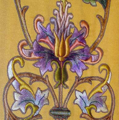
Above this part of the motif, there are some green leaves. I missed them in the cropping, but they’re the same colors as in the photo below:
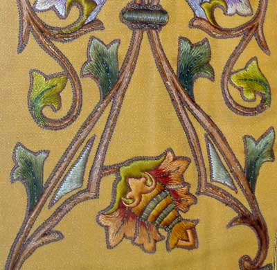
Instead of concentrating on the stitching here (though you’re welcome to comment on that, too, if you wish), I wanted to ask you to look at the colors. What do YOU think of the color scheme / combinations here? I’d love to hear your opinion!
I’m ever-so-slowly coming around, but it’s taking a bit longer than I thought to feel quite up to par! Don’t give up on me! I’ll be back in “full swing” soon!
Give you up?!!!
We wouldn’t give you up if we all had to come in a body and nurse you back to health!!
I don’t know anything about color or color design, but I think the color scheme here is, well, different. Something is just not quite right. . . Perhaps the chartreuse and the gold?
How does this piece look from a distance? Does it “work” better that way? I know distance can have a huge effect on the way colors look.
Christiana
I literally gasped out loud when I saw these.
Sooooooo gorgeous.
And I love the colour scheme.
Might use a darker green than the one shwon on the calyx of the flower in the second photo tho.
What a beautiful piece of embroidery! I love the pink and purple areas and the greens used. That lower flower is what looks off to me too. The green on it’s top seems to clash with it.
I love the colour scheme, I’m a sucker for purple at the best of times, and actually, I think the chartreuse brightens the design and gives it some zing. It wouldn’t be an intuitive choice for me, but it kind of works.
And you are bloody marvellous, blogging away like a good ‘un after surgery! Put your feet up, we’ll get by for a little while!
I know this might sound a little “cutsie” about the colors but the first thing that went through my mind was the subtle colors of the “old cartoons” when they first started using color. I loved those cartoons and found looking at this piece reminding me of something soothing in my life. They are rich in muted shades.
Annie
Hmmm, the stitching sure is pretty, but I’m not really getting the warm fuzzies over the color combination. But I don’t really care for the brown/pink or brown/teal combinations that are all the rage now for girl’s bedding either. Perhaps the colors were stylish at one time. Or perhaps I don’t know a thing about colors and how they work together. I know what I like to look at though, and this color combination isn’t doing it for me. I am sure the whole piece together and maybe from a distance, like Christiana suggested, is quite beautiful though.
Glad to see you are improving!
MGM
I am so glad that you are feeling better. I feel guilty even checking to see if you have posted each day.
The cope is wonderful. I do agree with Elmsley that the green should be a different shade, but I feel that I am not nearly talented enough to judgesuch great talent.
Beautiful! And I was thinking, before I got to your question, that I love the striking color combinations! They’re different and somewhat unexpected and I love that.
I think I have to disagree with Megan on using a darker green…I love that chartreuse in combination with the other colors used in the second flower.
-Jeannine
I think it’s beautiful. And the color scheme… very Art Deco. 🙂 I’d hang it.
No way I’d ever give up on you, Mary. You’ve become a centerpiece to my needling life!
It always takes longer than we think it will to recover from surgery. Don’t be surprised to find yourself dragging, even after other discomfort has gone. Just let go and rest.
My oldest daughter had the same surgery (34) and the nurse had told her she would be out shopping later the following day … well , not quite, took her two weeks. We all recover at different rates. So take your time…we all will be waiting. The work shown is magnificent!!!
Thanks again for your daily posts.
Annie (Michigan)
I really liked the colors on the first pic but the
lower flower colors on the second pic did not seem to go with the rest.
Please take it easy – surgery is surgery and you need time to recoup.
Hugs & better days ahead.
FredaB
I like the colors, and the combination (I’ve seen real irises in ODD combinations!) but I think they don’t work awfully well against the light gold – either the colors need to be more intense, or the gold background needs to be quite a bit lighter or darker . . . or something . . . . It blends, a lot, to my eye.
Any idea how old it is, or where it was embroidered?
And on the cope-hood Christiana is restoring (posted last week) – does she know when/where it was done?
Surger is, after all, an invasion of your body – take it easy!
Sandy
Praying your recovery is swift. I so appreciate your hard work and sharing with us. I have learned more here about embroidery than anywhere else!
Although I personally love the purple/peach/pink colors in the main Jacobeanian type florals, they are a bit feminine for many priests. 🙂 Purple and pink (unless on a purple vestment) are not usually the favorite colors to be used for those I know.
However, I can not see anyone rejecting these no matter the colors. I so wish I had such skill.
For the first time in my elder life I’m making our priest a set of vestments and am going to machine embroider parts and hand embroider the rest. You’ve given me so many lovely ideas. Many thanks!
Lavenia Boswell, Jax, FL
Sandy, THAT’S what was “funny” to me about the color scheme: the backround!! I couldn’t think what it was, till you pointed it out.
Neither the priest to whom the cope belongs, nor the parishioners and I have any idea where it came from, or when. The priest found it in a basment closet.
Unless Mary can shed some light on the subject, it will stay a mystery!!
I’m curious to know whether it was a group effort or an individual. . .
Christiana
I love the color scheme in the first picture. The light and dark are embroidered to pull your eye to the center flower. The second picture has an element that I learned in painting not to do. You have leaves for one type of flower yet both yellow-green and blue-green were used. You don’t see this in nature.
Sandy B
As an artist, and trained to use color to stand out and to please the eye, I have to say these colors simply don’t work together at all. I, personally, really don’t like the color combinations used for the stitching or with the background color. The colors seem very drabe and muted together and against the background. They just seem to get sucked into each other and fade into the background. When I scrunch my eyes up, the colors seem to all appear the same and all become one. Not a very pleasing at all.
I wonder if these colors were used because it was used during Lent which would account for the purple and other soft colors.
Certainly hope you will be feeling better soon but you are wonderful to even get out something every day which is always so interesting.
Thank you and God Bless!
Well, since you all gave your opinions, I’ll go ahead and give mine…!
The stitching is nice, and the colors of the embroidery aren’t soooo bad, in my opinion. I don’t “love” them, and I probably would never pick them in this combination (completely), but they’re ok. It’s the background fabric that just does me in. I cannot look at this piece and like it much, when I see the background. I think, if I could take the embroidery and put it on a different background, it would look much better.
I may play around with that digitally, for the fun of it.
I’m also not so keen on the satin stitching in the top photo, at the top of the flower. It’s too crowded looking, I think, and it makes it look somewhat distorted and too top-heavy, in a thickish sort of way.
I’ll play around with it and let you know if I ever come up with anything!
Thanks for your comments!!
If this is an old piece, then some of the colours may have faded. Sometimes though a bit of “oddness” in a colour sheme canhelp to draw the eye of the beholder. Perhaps this was intentional?
I’m not an embroiderer yet… but I have used this approach to colour in display work of various types and it seems to work.
Your colors are awesome.
I have a question, im looking for a extramly detail description on how to do beading and emboridary. Im doing my own beading on my graduation dress. Ill probley end up buying a book on it but it doesnt hurt to ask?I need to know the best way of doing it.
Hi, Violet –
I think your best bet is to buy a book. If you look up Yukiko Ogura’s book “Bead Embroidery,” you might find just what you need. Hope that helps!
MC