


Yesterday, we mused over the stitching of the central monogram on the Medallion project. I was considering padding the monogram with felt, and working long & short stitch over the felt to fill the monogram. But the felt that I chose was a very dark blue, deeper in color than the silk thread I am using for the stitching. And this presented a problem: I couldn’t see the stitching well enough against the dark blue felt.
But I liked the effect of the long & short stitch over the felt. So, to be able to accomplish that, I had to find a solution. Some readers suggested other filling techniques, and there are a few that I think would work well, but not for this project right now. When I’m up against a deadline with a commissioned piece, I try not to spend too much time playing around with too many ideas (I already wasted a bit of time with the initial framing problem and the first work on the monogram). For this piece, against the time frame I’m facing, I need to concentrate on getting the job done with techniques I know will work to get the results I want.
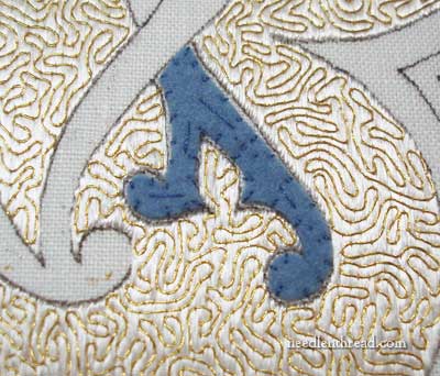
The solution I came up with in this case, since I like the felt padding under the long & short stitch, was to find a different color of felt that would work below the blue silk thread. One reader suggested matching the felt to the linen (in this case, it would be white felt), but because of the fuzzy nature of the surface of felt (even a good, tight wool felt has a slightly fuzzy surface), I didn’t think white would be the thing. I searched through the wool felt I had on hand, and came up with this muted blue. It’s not nearly as dark as the navy blue I used in the test piece, the stitching was visible enough to make it a decent choice, and the blue was blue enough that it won’t cause any problem should a speck peek through.
I’ll show you a bit later how I cut the felt to fit the pattern. Once I had all the felt pieces cut out, it was just a matter of securing the felt to the surface of the fabric and stitching. To secure the felt, I used a regular (blue) sewing thread, worked a couple long stitches in the middle of the felt piece to keep it in place, and then stitched all around the edge with small, evenly spaced stitches.
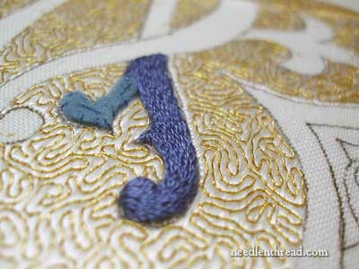
Then, beginning at the top of the felt, I worked the filling in long & short stitch. Long & short stitch is most often seen with shading techniques, but it also works up into a wonderful solid filling. The colors on the monogram are solid, one entwined letter slightly darker than the other. The only shading (and I’m still debating this) will be done on the fleurs de lis coming off each side of the monogram. If I do shade the fleurs de lis, it will be very subtle shading.
You’ll notice that the felt and the filling on the monogram don’t quite fill the whole monogram space. The filling doesn’t quite meet the edge of the background around the monogram – there’s a tiny bit of space left there for the gold edge that will surround the monogram.
The felt raises the stitching slightly above the background filling – not enough to put it in high relief, but just enough to set it up a bit.
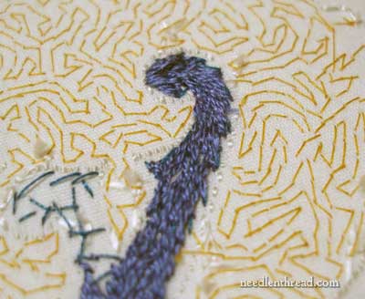
And just for the fun of it, here’s the back of the embroidery. In the area on the left, you can see the tacking stitches that hold the felt. The solid blue is the back of the long & short stitch in silk.
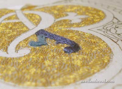
It was suggested that the monogram be worked in gold instead of blue silk. The problem with this is that the piece is meant to be seen from a distance. Because the background is predominantly gold, if the monogram were worked in a solid gold filling (even with a blue outline), the contrast would not be as great, and the design would not be as easily recognizable from a distance. With church embroidery (or any embroidery piece that will be viewed by an audience or congregation from a distance), it’s important to keep contrast in mind.
So that’s the decision on the monogram, and the stitching on that is underway. I’ve had to take a little break from the project to take care of some other looming events (the Nesting Place class is almost ready to launch again!), but I hope to show you some good progress on this next week. I’ll also show you how I prepared and cut the felt for this piece – an easy technique that is helpful in any kind of raised needlework or appliqué project, where an intricate design needs to be cut from felt.
If you’d like to follow along with the progress of this project from beginning to end, you’ll find all the articles about the Medallion Project arranged here for your convenience.
If you’d like access to all the tips and techniques discussed in the Medallion Project, including complete step-by-step coverage of the Tudor-Style Rose, conveniently collected in one document, interlinked, referenced, and indexed, why not add the Marian Medallion Project e-book to your library? It’s packed full of all kinds of embroidery tips for undertaking a project like this, all in a convenient electronic format for easy searching.
Lovely! Are you doing the final monogram in blue? What about a cocoa-blush or muted golden saffron or a lilac based greytone. Those are all very muted shades.
However, the sapphire you chose is very regal next to the metallic tones.
I am really enjoying the vicarious experience of watching this project advance! Thanks much!
Mary, I like this!!!!I love the blue “raised” long and short stitch for the monogram! Just great!
Mary,
Thanks so much for sharing! The monogram is going to turn out beautiful. I’m so glad you explained about Long and Short stitching – that it can be done in one color. I have been thinking and wondering about that. Now I know it can work and will go forward with that on my project.
Also, your suggestion for raising the stitches might solve a problem I have. I transferred a design to my blue linen background with prick and pounce, but (foolishly) used a red marker to connect the dots. Some of the letters need to be stitched in white. The red ink comes off on the white stitches. I can try to raise the letters using white felt to see of that will avoid the problem with the red ink which currently has me stopped, trying to work out a solution.
The photo of the back side shows the detail of how everything should look when executed. Most helpful! It’s the hand embroidery equivalent of seeing and learning couture sewing techniques (like the little red dress on the cover of the March 2012 issue of Threads magazine for sewers.)
PS – The back cover of The March Threads issue has a great vintage style gown with a hand embroidered design worked in gradations of color done in French knots and silver pearl purl. It’s worth a look for anyone who might like to do surface embroidery on garments.
Looking great – front and back! 🙂
I’m looking forward to hearing about how you deal with your felt, as I always find getting shaped felt for goldwork a real pain. Mind you, I suspect half the battle is finding good quality felt.
Dear Mary, It looks pretty awesome.The blue is just right for the contrast to the gold. When I am faced with a problem, I carry on with something else on the project and while I am embroidering I will always find a solution. Thanks for sharing yours with us, Something to remember for one self . Love Elza Cape Town. xx
Dear Mary
After yesterday’s post I couldn’t wait to see your decision on the final technique for the monogram, what a good idea to use a different shade it means you can identify any spaces in the stitching. It’s beautiful and I love the back I wish my backs would look like that.
I was wondering as a commissioned piece whats the deadline for the piece and how long do you require to start/complete such a complex project?
Regards Anita Simmance
Hmmm…good choice. I think this is going to look wonderful and I like the idea of subtle shading on the fleur de lis flourishes. Are you going to choose a different stitch or slight color change on the other letter?
Hi Mary,
Have you done a little outlining on the monogram? I noticed what looks like a row of very tight “pearl-like” stitches and on the back there are some very precise stitches that suggest something going on.
As to seeing the back of the work. You wondered why people ask so often. When I took garment construction in college an instructor emphasized the importance of what people don’t see with the final outcome. The theory was, I believe, that when you take special care in the process the outcome will be that much better in quality and longevity.
When I stitch I often imagine an old school marm watching over my shoulder that I do everything according to tradition. No shortcuts or sloppy work allowed!
Doreen B.
It looks really good. Interested to know how you cut the felt.
A lighter blue makes sense. It is looking good. I wondered how you would manage the heavier embroidery being done after the laid work. Looking forward to how you handle the outlining so you don’t snag the laid work. Beautiful piece.
Hi Mary,
Wonderful as always and look forward to more!
I checked out the marvelous gold work numbers that the Royal School did for the 450 yrs celebration, the link given in comments yesterday…thank you to that person and you for the link, it was so fun to see that work.
Looks so beautiful! Waiting to see how the finished piece will look.
Hi Mary,
I had a feeling you would do that! Absolutely gorgeous work, I’m enjoying seeing this progress and learning so much from your updates.
This is going to be awesome when done! I totally understand where you’re at as far as colors and where the piece will be viewed from. Muted colors may be great up close, but when viewed from 20+ feet, maybe not, especially if in a dimly lit place. I know final viewing distance is something I never really consider in a project. Then again, for me, across the room will be considered distance viewing.
I really love seeing this project progress. I know it’s a bit late now, but if you do come across this problem again, you can use felt to match the background as you can shave felt using an ordinary razor, that would help with the fuzziness – wool felt of course!