


Lately, I’ve been sharing progress and thought processes, designing process, and so forth on this embroidered maniturgium that I wrote about here.
I’ve made a little progress, and I’m into the stitching now. There are always adjustments to make, and there’s always the battle against persnicketiness, but at some point, on projects like this, you just have to take the leap, make a decision, and start, trusting that, overall, the idea will work out.
So I started.
But first, I experimented with some colors and threads. I mentioned I was doing so in this last article on this project, so you can see some of my thought processes there.
On the right in the photo above, you can see the experiment with the Soie de Paris – a stranded filament silk with a high sheen.
On the left, you can see where I test stitched with some Soie d’Alger – a stranded spun silk.
As I mentioned before, the Soie de Paris is a little more finicky to work with. It snags on everything. It requires a bit more concentrated effort. It’s a lot slower to work with, for me.
But it’s got a great sheen.
And it has this brighter shade of blue to the line-up of threads I have available, that seemed to work really well when getting across the idea of depths of the sea.
But, but, but, but, but…
A couple things: I didn’t necessarily like the drastic difference in the shades of blue – it makes for a kind of blocky look. This can certainly be mitigated somewhat by better stitching. But still, it’s a pretty drastic difference in the blues.
And … GOLLLLLY. It was just a pain to work with – especially because, mentally, I knew I had ten letters to stitch. The slower stitching would make the project drag out.
And there’s much to be said for feelings of pleasure vs. feelings of frustration when I’m facing a project. If I feel like I’m always fighting against the project in some way, it’s hard to motivate myself to face it. That’s how I felt when playing with this thread.
Now, don’t get me wrong! I love Soie de Paris! I’ve used it on a lot of projects! But I just didn’t want to face it on this particular project.
So, even though the Soie d’Alger (spun stranded silk) is a slightly different, less vibrant blue scheme – a little less tropical sea-ish-ness – I decided to go with the Soie d’Alger.
Once I made that decision, I was relieved.
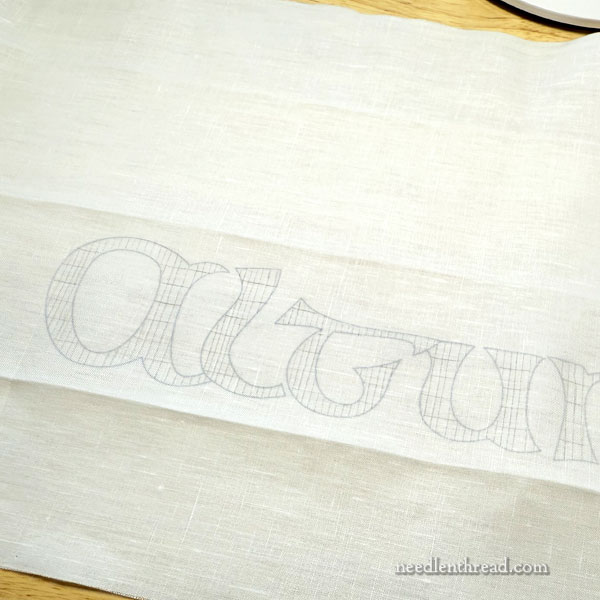
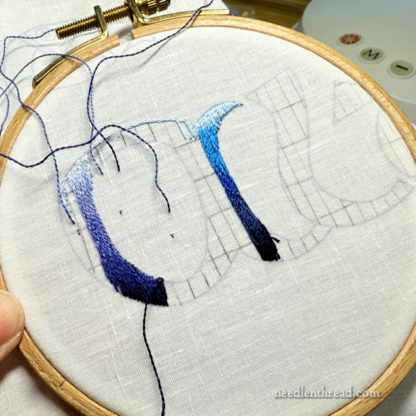
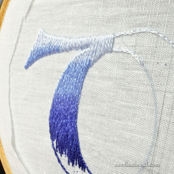
Next step was to set in my shading and directional lines.
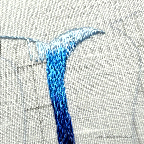
I mentioned before that the shading on the letters has to be from top-down, vertically, over the shape of letter. This is to reflect the idea of depths of water.
This poses a bit of a challenge for me, because I’m inclined to stitch lettering in the direction of “ink flow” – the direction you’d write the letter.
But I can’t really do that, if I want to get across the idea of depth of water with the letters.
I guess I could skip that whole idea, simplify the process enormously, and just shade the letters following the ink flow, but… but… where’s the fun in that?
Heck, when you can complicate things, why not?
For me, straight down, vertical shading is significantly more challenging. And to keep myself from straying off the vertical approach, I need vertical directional guide lines.
Additionally, I need the horizontal gradient of shades to level out consistently, more or less, across the letters – so I also needed to draw in horizontal lines that marked off the changes in shades of blue.
I just used a pencil, ruler, and some low residue artist’s tape for all of this.
Then I started stitching.
The first letters (the “D” in “Duc” and the “A” in “Altum”) – as well as the lower case “L” and the dot on the “i” – are taller than the other letters, so they have more shades of blue in them. They have a lighter blue at the very top.
I figured all the letters need to end with the same dark, dark blue, so that the “depth” of the water – the base of all the letters – is the same.
There is still a bit of blockiness in the shade changes. I would like to lighten this up a bit, and to that end, I may go back and work in some sketchy shades here and there where the shade changes occur.
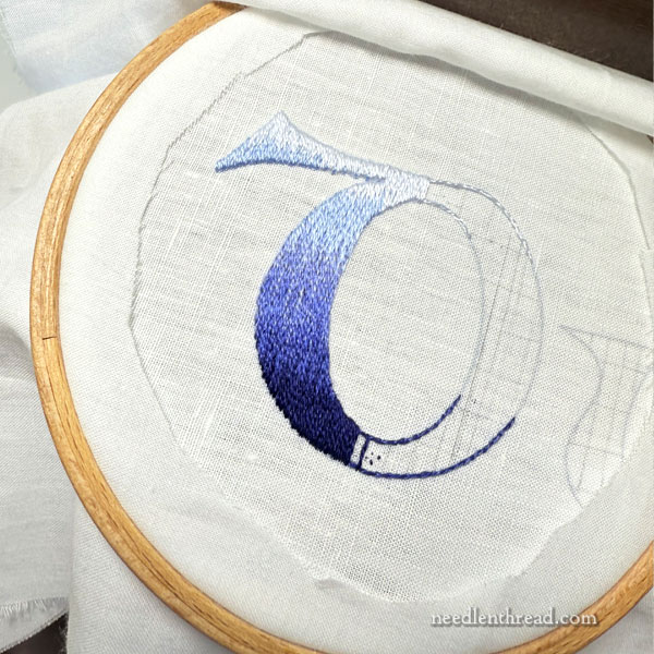
You can see that the base of the letters is really, really dark.
The letters will be outlined, so I’m not hugely concerned about slight warbles along the edge. Perhaps I should be more concerned. We’ll see how that works out! Jiggly edges are always so much more evident when embroidering with a very dark thread on a white background. Admittedly, in my head, I’m pretty relaxed about the edges because I plan to outline them. But it seems like such a cop-out, doesn’t it?
So, here we are, with that project well and truly under way.
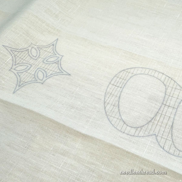
While I’m working on the lettering, I’m thinking about the fish on each end of the linen. You can see the fish in the last picture in this article. How am I going to stitch them? What colors should I use? Should I be more realistic in color choice, or should I be a bit more fanciful?
I have plenty of time to think about that, because I don’t think these letters are going to develop at high speed.
Hey, Mary. You have been thinking about the fish. When I first saw your sketch, I thought how pretty they would look with their scales outlined in silver. Or even with an iridescent filament carried in the scales themselves. Fish are fantastic embroidery subjects!
Thank you for taking the time to share your insights on the color and thread selection process.
This looks great! I like your thread choice and the design.
I think the color scheme flows better without that bright blue. The vertical shading is such a nice choice and is going to look excellent with all the prep you’re doing! It’s a measure ♾️ times, mark once type of design
If a mere amateur is allowed to comment, your fish should be ORANGE! Beautiful vibrant contrast-y orange shading to yellow and a hint of gold. Glorious and glistening as befits the item in question.
About the fish, I think they would look terrific in Or nué. Another thought, perhaps in shades of red silk? Or scarlet? The Celtic books that have lettering and animals are often brightly coloured. I can see them in an orangey colour ut lean8ng to red.
Hmmmmm
Just a suggestion.