


Remember last week, when we discussed the angle of viewing this wool embroidery sample, where I’m playing with tambour embroidery in wool, along with a few other stitches?
Well, I fixed the long & short stitch filling on that little paisley shape in the center, and I thought you’d want to see it. And as things like this always go, once I fixed that, I started in, ripping out another section, too.
Don’t worry. Eventually I’ll get it.
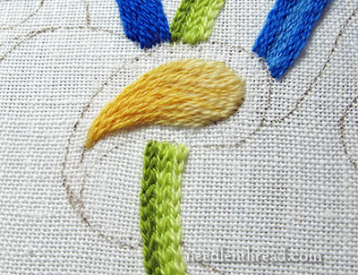
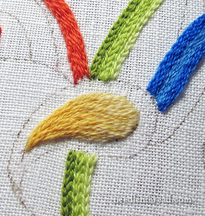
This is the fix on that center area. Basically, I eliminated the darkest part in the orangey yellow.
Here’s the original, so you can see the difference:
I like the fix better, personally, but what do you think?
The fix isn’t as “fiery”, but it seems easier on the eyes to me.
Working in long & short stitch with three colors of yellow, I started at the broader part of the drip – er, the paisley (I keep calling it a drip! so derogatory to the poor thing!) – and worked the lightest yellow, and progressed through the three shades to the darkest at the tip.
If you’re wondering about long & short stitch and how to accomplish this kind of shading, you can check out my long & short stitch sampler, where I go step-by-step through shading various shapes using long & short stitch.
The nice thing about working with wool is that it’s a bit heavier than single strands of cotton or silk, so the shape fills up a lot faster!
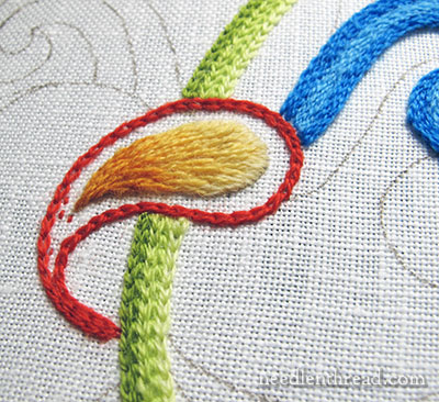
While I was about that fix, I ended up taking out the darker blue section to the top left of the drip…
…and I replaced it with a red-orange. That’s done in long split stitch right now, since it is supposed to be padding.
But guess what? I already don’t like it. Not the color, though – just the placement and the stitch idea that I had for that space.
This piece really isn’t so much about “perfect color choices.” It’s a sampler to blend a few techniques together, using wool thread. I picked a pretty simple color palette in bright colors because I wanted to work with bright colors. In general, bright colors photograph better. Also, it’s winter, and bright colors are nice change to the bleak winter weather and landscape!
So there we are, with the first noticeable fix. I probably won’t get back to this piece until much later this week, or maybe not even until after Christmas.
I’m shooting for a Christmas finish on the Mission Rose, and I’m just over halfway done with the outer frame on that. So it will definitely occupy my stitching moments in the next several days!
Your Input on Needlework Topics
Yesterday, I begged your input on needlework topics for Needle ‘n Thread in 2014, and wow! You really came through! Thanks so much for your comments, ideas, suggestions! There are many of them, and I’ve been working through them, making lists, and categorizing them.
If you haven’t added your voice to the general dialogue, feel free to stop by yesterday’s blog post – you can enjoy meandering through the comments at the end of the post, and perhaps add your own ideas for future needlework topics on Needle ‘n Thread.
I do like the fix more, too, Mrs. Corbet. I agree that it is not as harsh.
I just know you can finish the Mission Rose by Christmas! You can do it! And might I add, I LOVE the Mission Rose! What an amazing project!
I finished Holly and Joy yesterday! When the picture gets to you, would it be all right if you tell me what you think by answering a comment I leave on your site? I’ll leave one on tomorrow’s article and you can tell me what you think then.
Faithful Reader,
Sarah
Hi, Sarah! Oh, good – I can’t wait to see it! Congratulations on finishing it! Now, if I can be just as confident in finishing the Mission Rose, right?! ~MC
That does look so much better. I had a feeling it was the orange that complicated the colour palette, but it was difficult to be sure until you took it out. I like the shaded yellows and I think the softer red-orange balances the zingy blue and green nicely. Colour is a very interesting thing! I’m looking forward to seeing what you do next with this sampler, once Mission Rose is completed.
I have to admit I liked the original paisley, with the dark orange, better. There isn’t enough contrast in the new one for me.
As for the formerly blue, now orange section, I wonder if purple would work, being the third of the secondary colors. I guess it kind of depends on what you’re going to do with the outside of the paisley shape.
I wish you had removed the red “frame” around the paisley motif before you took out the darker orange, and then I believe you would have seen (this is something I teach all the time to adult art students) that the problem is not the thing you think, it’s the thing next to the thing you think! at this point, the bright orange would be fine in the motif, now that the red is gone, which was a good move.
Hi, Liz! Thanks for the input!
Actually, the red frame is going back on, not quite exactly as it was, but almost… I like the red. I do plan to tweak it a little, though.
~MC
I don’t wish to offend anyone here but as I was one who voted to remove the orange from the paisley and work with just the yellows, I disagree with Liz’s assessment about the red. I think even with the red removed the orange would still have been wrong where it was and I think when the red surround goes back it will look very fine. To me, the orange next to the yellows was too great a change for this type of stitching.
It is great that we have this forum where we can disagree but still be friends. My husband and I were just discussing the notion of ‘criticism’ – the constructive type versus the put-down variety. I am pleased to say that there is very little of the latter here – we are all happy to add our ‘2 cents worth’ to the discussion and leave the rancour well out of things. Thank you for yet another great aspect of your blog, Mary.
I agree with Christina P. The red may have also been a problem, but I didn’t like the abrupt change to the darker orange. The second shade of yellow progressed from the first and then there was the abrupt change. I don’t think it would have worked with three colours with the two following ones being an abrupt change but it would have been consistent and perhaps interesting.
Dear Mary
Such a busy time I haven’t got down to any embroidery since the weekend. But hoping to spend all day tomorrow on my Robin project which I hoping will be completed by Christmas as it is a present. I do like the new yellow thread colours and so lovely bright for the time of year when everything is dark. I love your picture on FB with the tree and love the embroidered tree skirt any chance of showing that in close up and how you did it? love your slippers. Thanks for sharing this with us at this busy time.
Regards Anita Simmance
G’day Mary,
I liked the original, but having said that I really need to wait and see what else will be going on around the paisley drippy thing before making a more informed decision. The plainer one is a nice softer resting place for the eye in the middle of the brightness though.
The Mission Rose, without a doubt, will be a glorious Christmas finish.
Cheers, Kath
It looks lovely!
Yes!!! You have done a fantastic job as usual. That works much better. Best wishes for the festive season.
Tear drop ! 🙂
I like this much better!