


Last week, I finished the flowers on the Secret Garden embroidery project – finally!
Two feelings welled up inside me upon completion of the flowers: 1. that sense of elation you feel when you’ve finally plowed through to a seemingly elusive goal; 2. that sense of trepidation at what comes next!
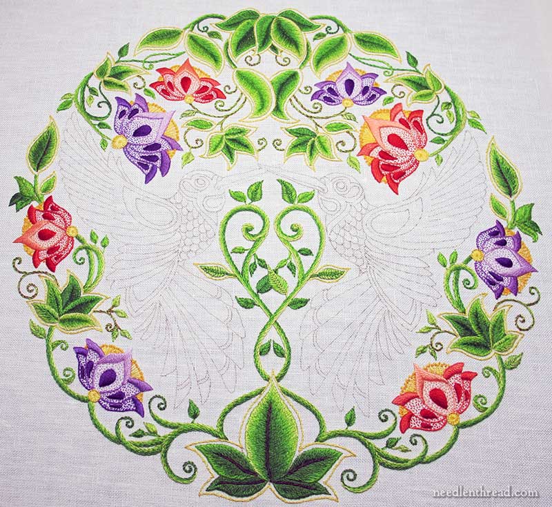
And what does come next on this particular embroidery project?
The Birds, of course. But there’s a part of me that keeps wanting to put them off.
I could go in and stitch some veins on all the large leaves.
I could add some embellishing dots along the vines, like the dots along the vines in the original design.
I could pick out a few little areas that I’m not 100% sold on, and re-stitch them.
I could do all those things.
But … the birds! I must tackle the birds!
The Color Conflict
Why the hesitation? Because I’m having a color kerfuffle. A conflict, of sorts.
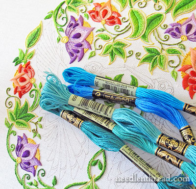
Throughout this project, I’ve been inundated with emails, with photos on social media, with links to hundreds of hummingbird photos and images online, from real hummingbirds to the most fantastic stylized renditions of hummingbirds, all from well-meaning souls who wish to help me along the way when it comes to choosing colors for the birds.
An overwhelming number of the images I’ve seen and saved over the past many months involve colors that I wouldn’t normally think about using.
Among those are bright (what I call “electric”) blues, turquoise-greeny blues, and tropical ocean greeny-blues.
So I threw some of those shades onto the project thus far.
Especially when it comes to the other greens already in the piece, when I see these new colors on top, the word Conflict comes to mind.
On the other hand, if these types of colors dominated the birds, the birds would certainly stand out.
Stylized vs. Realistic
So, I thought I’d throw the color question out to you! What colors do you envision for these flittering hummingbirds? Do you see bold, bright, aggressive colors? Tropical, “hot” colors? Majestic jewel tones? What do you imagine on hummingbirds?
When pondering the question, please keep in mind that the whole image is stylized, so the birds do not need to look realistic. They can look completely unreal, fantastical, made up. Or, they can fall somewhere in the middle – stylized, yet within reason.
What they can’t look like is completely realistic. The design itself precludes that. Take the tail feathers, for example – hummingbirds don’t have long tail feathers. The designs on the head, the shaped neckband, the scalloped layering on the chest, the layered wings – you won’t see these on real hummingbirds.
What’s Your Take?
So, with that in mind, what’s your take on a color scheme for the birds? Do you expect to see something vivid and bold? Something subdued and moderately realistic? Do you expect the colors to meld right in with the surrounding greenery and flowers? Do you think the birds should stand out aggressively from their setting?
So there you go. I’m opening the color question up to you, because I’d love to hear how you would approach the color on the hummingbirds. If you have any thoughts on the subject, please share them below. I’m eager to hear what everyone has to say on the color question. Inquiring minds want to know!
Wonderful peacocky blues, from medium-dark ultramarine at the other edges through to aqua, and on to some of the lighter greens in your leaves (not green in areas too close to the leaves). Deep rose through reds and oranges to your warm yellow (again, away from the same reds and yellows on your border) for the heads and chests, Beaks in warm, reddish browns to show up well on the white. You might get the dark purple into the piece of the back beneath the wings and the eye-shaped section of the upper wing.
That pthalocyanine blue, the top skeins in your photo, is a very hard colour to blend in with others successfully – it’s just too intense compared with anything except fluorescent colours. I’d use other bright blues instead. They’ll look quite bright enough in context.
Just my thoughts, as you asked, of course. I’ll be interested to see what colour you eventually choose and I’m sure they will look gorgeous.
Mary, this is just so beautiful! No hummingbirds in Australia so I won’t know and won’t tell if you don’t use realistic colours.
Mary:
I think parts of the birds should coincide with the colors of the flowers. Not much – just the end of the tail feathers for example. That would convey why the brids are there – so they can blend in with the flowers. I like the blue jewel tones for the body of the bird with lighter shades to highlight sections of the bird.
Oh dear! My immediate reaction to ‘what’s your take on the colour scheme’ would be turquoises of course – that’s humming birds, isn’t it? But I totally see what you mean about the conflict. Tricky one. And actually there are plenty of hummingbirds that are not turquoise at all – there are dark greens with purple flashes, reds, all sorts, and anyway, as you say these aren’t real. So given all that – I think I’d throw a load of cottons on to my embroidery and see which ones look nice and take it from there! Maybe the more bluey blues, not greeny ones, with some purple thrown in too?
I think you should make the birds ruby throated males. The colors would just fit in so well with the flowers and all. And they are bright enough to stand out.
Considering the stylistic nature of the piece so far, I do not think that “realistic” is the way to go. i really like the top, dark blue with the colors, but the lighter tealy blues just seem a little off. Perhaps just playing around with your shades…
Mary,
I would totally go for the bright blue 🙂 I am always a sucker for really bright blues, and I think they would look lovely and striking with all the bold green and red in the framing flowers and vines. I could also see maybe some darker or more muted colors in places on the birds to sort of even out the intensity of the colors, but I think that intensity is what makes this piece so interesting.
Golds!
PS I have the book and love it. There is an owl page and one with goldfish. Both are very tempting.
Golds were my suggestion, too! 😀 *waves hand at comment further down*
I’m thinking of picking up this book and seeing if I can convert an image into something quilty, since that’s my main interest. 🙂 But this site is really making me want to try embroidering something! XD
What a delightful challenge to have! I would love to see the birds in jewel tone blues – darker than the ones in the above picture. Then, as in real life, flashes of bright yellow (silk or rayon maybe?) that catch the eye. I’m sure that whatever you choose they will be gorgeous! 🙂
Good morning, Mary.
I realize that this is a work of art and not a photograph of the real world, but IN real life no bird is going to say ‘Hhhmm, I can’t get to the nectar of that flower because our colors will be in conflict’. I actually like the contrast between the blues and the rest of the work.
when I do my own hummingbird project, I am going to stitch the birds in a blend of realism and fantasy.
By-the-way-, there are hummingbirds out there with longer tails…
Go with what pleases your heart.
I love this project and cheer you on,
Hugs, Marlon
I think the birds should be done in the same colors as the flowers, so that they blend in and then suddenly you realize they’re there. There are already so many colors going on in this design, and you might even pick a flower color and do a bird monochrome in shades of one color, another bird in shades of another color, also monochrome.
It’s an exciting design, to be sure.
Mary, I like the jewel tone idea. Let them shine.
I second that!
Well, Mary, I’ll add my two cents’ worth. To me the work thus far is so colorful/joyful I’d continue in that vein with the bright blues/turquoises and add touches of the yellows/oranges found in your flowers.
It is a conundrum, though, isn’t it?
The hummingbirds that we have in central Texas are a muted charcoal with some iridescent highlights so you could do a more muted charcoal/purple/green with iridescent highlights reflecting your flower colors perhaps.
Jewel tones! I think you need to start with a deeper blue than those you posted. Maybe DMC 995, 3843, or 3844. I’d love to see you work in the colors you’ve already used as well.
It’s beautiful, good luck!
Hello, I would suggest going with the lovely brights. If for no other reason than it is so nice to have and excuse to use such cheering colours! It will look lovely. Can you tell me what you are going to do with this piece once it is done?
Dear, Mrs. Corbet, I have to confess that when I saw those gorgeous blues my heart started screaming YES YES YES in every language I know! I adore those blues, they’re possibly my favorite shads in all DMC land. However, I understand your trepidation as well.
I think it’s amazing that you’re opening up something so personal as your color choices to us strangers, so here’s my two-bits… I think the birds should be the focus. From the composition of the entire design they’re meant to dominate. So, I’d play that up as much as possible, but to keep continuity with the flowers I’d also add touches of the same color families in the feathers. For example, in a piece I’m working on mow, I put one strand of Dark Peacock Blue, and one strand of my darkest purple, and will stitch the flower with that. it looks fantastic. It could be a way to tone down the “conflict” you see with those blues to mixt them with colors similar to the ones you’ve already used.
But again, the birds are meant to dominate so have fun!
As to the stylized or realistic debate… I agree with you that these cannot be realistic. However, there’s also an option to look at all those real hummingbirds and take elements you like and mix them all up! That’s what I’d do using the boldest colors.
I hope this helped, and didn’t add to the pressure. Thanks for teaching me how to spell Kerfuffle.
I really agree with this posting. To add a bit, (as I believe the birds are the focus) in thinking of a painting, I know that to bring the focus to an area you want the “darkest darks next to the lightest lights”. So Darker blues with a lighter light whatever that might be- maybe flashes of a very light blue, done on the wings? I haven’t the time to analyze the piece 🙁 but I love the jewel tones idea, and the “fairy world” quality, rather than realistic. The flowers are “real”, why should the birds have to be? I know you have wonderful color instincts Mary, so I have no doubt it is going to be fabulous. I can’t wait to see it.
As I look at the shapes on this piece I fins myself wondering what would it look like if you treated/colored the wings and tail feathers as if they were leaves, and then used the top most color of the blues in the picture. It could be quite striking to treat the birds as if they are another flower, albeit a much brighter flower.
I just looked at pictures of hummingbirds on bing…what an amazing array of colors. Perhaps you need to look at them because I saw a couple which would be beautiful on your design. I didn’t realize that hummingbirds had such a wide variety.
For my taste, the two bright blues at the top are too bright and would be competing with the flower/leaf colors. They also seem to be the same intensity which could become boring. I prefer the blues at the bottom but the range needs to go darker. Blue is definitely the color for the birds but which one?
Hi Mary!
I like the blue colors, but I’d match the values of the existing colors. Maybe make the dark, bright blue darker (see the purples) & start from there.
I think matching the values would allow you to use contrasting colors without pulling your eyes out.
I forgot to add how beautifully you’ve done this piece so far. You are truly a master!
HI,
I think towards the tips, next to the other bold colours already used, the darkest blues, on the turquoise/blue side rather than green; i would then use other colours mixture of the colours already used red + green; purples + green; red+purples…..so that would be some browns but only those contrasting well with the turquoises…..not many colours mind you; i would rather use the same colours of turquoises and browns in metallic thread rather than introducing too many colours.
I think Blue is the right color, just think the color you chose ‘blends in’ too much..Thinking more of a true blue family would be what I would do.Then of course maybe a touch of the yellow, golds in the tail feathers. Although I have yet to see anything you did , that I did not love!!
I have just started this project, and I think I’m going to do my flowers in shades of red, then I’ll do the hummingbird in red, gold and any vivid green I haven’t used in the leaves yet. Maybe a peacock blue on those little lines in the tail feathers. I’m considering using seed beads on the throat and chest of the birds. That little dewdrop shaped piece, and the armored looking chest piece. Very dark red seed beads. It may be too gaudy, I’ll have to see at the time. I have a long time to ponder, though. I have three leaves done so far.
I admit, I did mention the species of Hummingbird that I am familiar with the other day. My father has managed to take a few photos of them in our yard in the past couple of decades, so I am biased. They are greyish with shiny greenish backs and the males have a shiny reddish head, but I did not mean that it is what you needed to put on your project. I apologize.
What would I put there? I admit, blue is one of my favorite colors so putting the colors you have above on there would not bother me in the slightest, but this is your project so I will just give you my two cents and you can “spend” it any way that you like. 🙂 I would not personally do the bird in a weird “rainbow” type thing, I did do a dragon once, as a gift, with rainbow stripes on him (long story) but dragons are fanciful. If a hummingbird was my project, I would look on-line for photos of hummingbirds, choose numerous colors that the different species have, and then settle down with a cup of tea and the finished flowers and flop the colors around to find something that goes with the flowers but that are actually colors that you might see on a real species of hummingbird. Maybe not together, you know, the head color might be from one species, the neck from another and the tail color from another couple of species for example. I know that it is stylized but I would still use colors that are on hummingbirds. I would not make it look like a Macaw or other sort bright parrot, I would include some gray or brown as well.
Remember, the colors on photos may not be accurate depending on circumstances, lighting might be wrong, the camera might have been mal-adjusted etc, and also, what you see on your computer screen might not be the actual color of anything (even floss, that is why I do not purchase floss (or fabric) on-line unless) the way the screen works, almost always affects the way colors appear. I say that because if you like the color but it does not mesh well with the flower colors, you could find a similar color that does and choose that one. Maybe the color is on the throat of the real hummingbird, but you want to put it on the tail, that would be fine with me. 🙂
So I guess I am in the “stylized within reason” club. 🙂 Just my two cents, I am sure you will be able to hash this out.
Mary, my thoughts are following close to what Sue Jones had suggested .
So many times we can over think things too. Medium to bright blues, yellows, gold and rose can bring this little bird to life.
Always makes me wonder what the Good Lord was thinking when he created these little jewels?
Can’t wait to see them come to life!
I really like the electric blues, but I think the other two shades will die against the bright green. I’d try a blue purple, hunter green, yellow-orange, magenta and the electric blue. Obviously, I’m not going for realistic. Speaking of which, I saw a super close up photo of a hummingbird last week, and the chest feathers are scalloped. There were also spots of magenta under the eyes. I do not envy you these choices, but after the rosebud project, I know it will be beautiful.
Just pick a favorite from nature…God’s creations don’t need embellishment.
There is a hummingbird in the UK that has a very long tail. It is mainly emerald green and dark blue in color.
Hi I haven’t written to you before but I follow you with interest regularly. I think a more muted blue would be lovely highlighted with a jewel toned blue. That should reduce the conflict of some of the colors and then the highlights of bright would still allow an opportunity to balance the blue with the other colors.
After viewing a few thousand images produced by a search, I noticed that a lot of hummingbird wings have grays shaded from dark to light starting at the leading edge. And the body and head colors are iridescent. I would consider a very shiny thread for the birds no matter what colors you choose. I was especially attracted to one where the color ranged from pale peach to a vibrant orange. Oh, and there are surely long tailed varieties somewhere in the world.
Most interesting! …a color kerfuffle for me wil never ever happen in VERBAL terms… Let me explain: yes, I’ve just had to have read w o r d s in your newsletter to find out about your quandary, Dear Mary. Yet all that made it only more difficult for me to have an opinion! …colors for me are a FEELING, even though by profession I need to name, explain, define them eventually.
So, in this case, what I’d do is place the colors I am considering on top the embroidery, and move/remove/add them, till I FELT HAPPY – instinctively.
I hope this sheds some type of light on the matter!
All my best,
Karin
Mary- the blue is a great addition, it finishes up the color wheel of color. I might add another darker shade of teal. Also, make a color pencil sample to size and lay them on the embroidery to see the color impact. I’ve been following your blog for sometime now and love your insight and artistry.
Best to you
Sharon
The lightest 3 skeins of electric blue is clashing with the purple and green. Consider making the birds a light royal blue that fades dark and into a dark emerald green at the end of their feathers. Also consider placing the darker turquoise on the crest of the birds and using colors from the flowers as highlights, especially in the bands at the end of the feathers.
Dear Marie,
With such a lush garden, I would see hummingbirds in shades of red, burgundy see on their throats in any case of suspected black, green olives to the tail feathers, mustard aussi.Cela would highlight the birds and would create an overlay? It’s just a idée.Merci Mary.
With the bright intense colors you’ve already used I would say something soft is out. I think it would stick out like a sore thumb. Or bird.
My opinion is you need to stick with the same color values you’ve chosen for the flowers. Blue of course, with a raspberry chest – where the little scallops are? Those scallops seem very small to me, but YOU could probably do a color shading on them from dark raspberry to light. 🙂 or alternate scallops to have different shades of raspberry.
I don’t think the blue conflicts with the other colors, I think it rounds out the palette. Wings – blues of all shades to look iridescent. I wonder what would happen if you color shaded the wings in blues, and then went across the stitches with a silver thread (only letting little bits of it show)? Like a shot silk fabric…? It might add that ethereal feeling of a hummingbird.
If it were me, I wouldn’t put too much more green in it, but just a little bit to tie it in with the green you already have. But I think the blues and raspberry will really pop them out, making them the focal point – as they should be 🙂 karen
I have hummers throughout the day at my nectar feeders. The males have jewel like feathers at their necks, red or green, for the varieties here in Arizona. The rest of the feathers for both sexes is rather a drab grey/brown/black combination. I would envision a shimmering metallic colored thread at the throat arae but let the rest of the body retreat into a quiet and demure color pallet.
What about shades of golds with touches of other colours? Blues and gold work well together if you wanted to introduce some blue to the piece, or you could pull in greens to complement the leaves, or perhaps purple to hark back to the flowers? (Or some combination of golds plus several other colours, though my feeling is that simpler is better with these lil guys.) The birds deserve to really stand out, but they should be in keeping with the shading style you already have on the leaves and flowers – I don’t know if I should call it stylised realism or realistic stylisation? 😉
(I thought about downloading that top image above and colouring it in a graphics program, but I don’t think it’d really help since a flat digital colour won’t really resemble a stitched area.)
The hummingbirds I see a lot of tend to blend into their surroundings with occasional vivid flashes of colour. Could your hummingbirds be in yellow that blends with your leaf yellow, flashing another bright colour here and there? Sort of like the leaves with flowers in the rest of the design, but miniaturized into a single wlement within it?
… Er, that was supposed to be ‘single element within’ …
The flowers are lovely and such bright colors! I think that the birds need to be dark, to make them recede slightly from the flowers so as to not overpower – dark teal, aquamarines and turquoises with gold/ochre tones for the under parts. A little Accentuate here and there for iridescence? Maybe!
HI
Hummingbirds come in all kinds of shimmery colors. If you are concerned that the electric blue colors will be to much the center of attention and the flowers will become secondary……..go with adding more teals and magenta/ruby colors mixed with purples. That way the color scheme is “tied” together a bit more and you may feel that the piece is more harmonious……just a thought.
Thanks
Lynn
PS STUNNING by the way WHATEVER colors you go with!
I would be looking at the values of your colors. So far, you have arather even range of colors from quite light to medium dark (or so it looks on my screen). For the birds, I would have a range that was either lighter or darker — probably darler as those colors would be richer. Then I’d be looking at colors that were related to what you have but not the same. So a slightly bluer green, a oranger red, etc. I would also probably have a table covered with thread. I often have a bright idea about color that turns out to be a dud 🙂 but I can never tell without trying everything. And I do think this is a really high quality problem!
True blues, shading from dark — especially shiny, or even iridescent if that’s possible — to light, almost white, with something light but very textured on the breast patches, and yellow and gold highlights where real birds have patches of color (e.g., the ruby throat on a hummingbird, the shoulder patches on red-wing blackbirds, the flashes under the wings on yellow-rump warblers).
No, no, no – not the turquoise, greeny-bluey shades. All along I’ve imagined the hummingbirds in dark blue jewel tones. Can’t wait to see what colors you choose!
Mrs. Corbet,
If I was stitching the project, I’d want them to go with the project. Not match and blend with everything, but GO with everything. I’d not want them to stand out TOO much.
And so I think the birds should be moderately realistic, like the rest of the design. Or, as you worded it: stylized, yet within reason.
For colours I see maybe purples and blue-ish greens(?).
You’ve come so far on the project! It looks magnificent! I can’t wait to see what the colours turn out to be in the end 🙂
Sarah
I was looking at your leaves and flowers and asked myself – she’s used just about every color on the color wheel. What’s left for the birds? You got it: blues! Certainly they need more than that but saving the blues for the birds (no, not blue birds) will make them stand out.
To me, pastels are out. The “hot” tropical colors would seem to blend too much with the flowers. So again, that leaves the brighter blues. Hummers tend to stand out anyway as the “flying jewels” they are. Almost any other color you want to add will tie in nicely with the colors you have on already.
Hi, Mary. Before I even began reading your post, my first thought was that all the colors you have worked with so far are on the warm end of the spectrum. I feel you need to add contrast and interest by now using cooler colors, and so immediately thought blues. If you feel the blues will be too stark, you could throw in a deep purple to tone down the contrast. The piece right now speaks light and warmth. Again for contrast you could add in darker, cooler colors. That is why I suggest the purple. I think the darker cooler colors will actually calm the piece down and help balance all that is going on right now. Just my thoughts. Sandi
As soon as I saw the first pic and before I’d seen your thread possibilities, my gut said “Turquoise!”. Then I saw your threads and thought “Yum!”. But reading your qualms I started to doubt myself. So being the scientific sort, I wanted a reason for my turquoise inclination. The coral flower is (I believe) DMC 350 which is hex #ED455A (nice conversion chart here ( http://www.csh.rit.edu/~vance/pages/color.html ). I set that as the main colour in my favourite palette generator to see what I’d get. Using an adjacent colour scheme, I get approximately the purple and yellow from the Secret Garden. If I rotate 180 degrees, I get the greens and teal. Check it out: http://paletton.com/#uid=65z0D0kmGv0d4L2irAVsgt6tVmo So I think using turquoise/teal/greenish-blues will just be using the complements of your current colours. I say go for it!
Oh bold, bold, definitely bold! Jewel colours. The garden is fabulous so far, I’m fascinated and look forward to seeing what comes next.
Try shades of orange. Bittersweet to russet.
The birds are surrounded by green and orange is opposite on the color wheel.
Such a lovely dilemma – though it could also make me put a project aside for years, only to find it later ans promptly finish it, wondering what the fuss was about!
One possibility would be to do them in gray-scale, or taupe-scale, like an etching.
However, I see them standing out a bit but not dramatically. With hummingbirds, I think dark green and iridescent and a touch of red on cheek or neck… and you already have a couple of dark greens and a red. Now for the sheen …
hh
I would have said blues until I saw them on the project above. now I’m thinking yellow. I think you’d need more colours than just yellow in there. By the way, I have no idea at all what colour a hummingbird really is! I think the birds need to stand out, but they don’t need to be vibrantly coloured to do that, being a different colour to those already used will help them stand out. I did wonder if they needed to be slightly padded, but I’m not sure it will fit with the style of the piece.
I just realized that, during the entire stitching of the project, I was certain that the hummingbirds would be stitched in the deeper tones of Lavender…..
I cannot visualize them in any other color.
Dear Mary
I can understand your colour kerfuffle, for the stylised birds to be centre stage I like the idea of bright, vibrant colours such as reds, oranges, yellows, turquoise, greens and gold colours or use the same colours as the flowers, but I would want the hemming birds to be different and stand out so I would choose an assortment of bright colours. It is a difficult choice and I look forward to seeing the colours of your choice, watch this space.
Regards Anita Simmance
I am a lover of ‘brights’ so I really like what you laid out on your piece above! But I don’t know what ‘real’ hummingbird colors would look like. I suspect you could brighten them up a bit with whatever one would use to get the irridescent look they can have, but……..probably all in all to drab for this piece. I say, go for the bright! I see NO CONFLICT at all. I think those colors are perfect!!!IMHO
Hmmmm… my immediate reaction to the flosses in the photo was sort of an “ick” on the two upper skeins but a real “aaah” for the turqoise group… especially the darkest shade on the bottom. I love the idea of incorporating the colors of the existing flowers and leaves into the birds coloration. To my eye that would make the entire piece so much more cohesive, and I think that one’s eye would see the flow of color in the entire design. If too foreign a blue was used I think the birds would be the only thing you see. They are large enough that they will pop no matter what, but I don’t think I would want them to overwhelm the piece.
Your color and shading eye is so exquisite I doubt you’ll have any real trouble coming to your decision… and I’m equally certain that your completed piece will be stunning no matter what you do.
I am frequently kerfuffle myself waffling over thread choices and sort of stall myself out on projects while I rethink thread and color choices. I’m pushing myself – or at least trying to – away from safe choices and trying to enlarge my stitching comfort zone.
Am eager to see on what you decide. I’m enjoying following your project.
Love this project…I think jewel tones would be nice…and also someone had mentioned the ruby throated hummingbird….those would be beautiful colors…I am going to start this piece in the fall,will be anxious to see what colors you choose!
So Mary, you are throwing this dilemma out to us loyal followers—-that is a brilliant idea. I have lived in Wyoming and had dozens of hummers come to my feeders. We are now in Connecticut and if I can keep the squirrels from destroying my feeders they are regular visitors. Although the colors you pictured are really beautiful, I don’t think they would make a great hummingbird unless you would use them accents in the throat area. My suggestion would be warm jewel tones—emerald, ruby and a darker warmer turquoise. In bird articles they refer to these tiny treasures as little jewels of the bird world. You do such beautiful work I know that whatever you go with it will be perfect.
This is exactly exactly what I’m thinking! The jewel tones of royal blue and emerald green with possibly ruby red in the neck.
I think the jewel toned hummingbirds are beautiful, but the ones found in my area are much more nondescript. For your picture I would consider the black chinned hummingbird or leucistic hummingbird.
My two cents: use jeweled colors, since these ARE hummingbirds after all. Keep to some of the traditional colors of hummingbirds (which you already have plenty of examples of) but use colors that compliment your greens and flower colors. You have a very fine eye for colors and blending and matching, Mary. You have shown that in other projects. Go with your gut.
As to your request for ideas concerning thee hummingbird colors: I feel that making the color on the birds ‘liquid’, meaning starting with the beaks and head using rich jewel tones and as you work outward towards the border blend the threads towards a light infused brilliance.
Mary
I like using the color wheel. You have used the three secondary colors, green, orange and purple. I’ve seen many successful quilts using All the colors!
So then you would need to add blue, red and yellow or cyan, magenta and yellow. You have already used some yellow and red so you need blue. And if you are using the whole color wheel plan, you can add any color with it. I would stay with pure colors, like you have already, not greyed or dull. When you add greyed colors to something, it makes the bright colors pop and in this case if the hummingbirds were not bright colors, the flowers and leaves would stand out. I vote for blue, turquoise is wonderful, and then anything bright goes. I can’t wait to see it!
I’m just learning to play with the color wheel to help pick through my scraps for quilting. On my color wheel if draw an X on the – you have hit 3 of the 4 arms of the X, You have reds, and purples and yellow/green shades. The 4th arm of the X hits deep ish blue green shades and/or blue purple shades.
Don’t know if this will help any, like I said, I’m just learning the color wheel. And I’m going by the pics on my computer when I look at your work and sometimes the colors are not true.
Hi
Mary listed the DMC colors she used in one of her earlier posts on the project so you can match them exactly without messing with the monitor.
If you can’t find the post, please ask her because she went through a lot just choosing the colors so far and they are readily available at JoAnnes or I got them on line do 49cents a skein.
Hi Mary,
The hummers I see most often in my area are ruby-throated hummingbirds. They are shimmering bright lime to dark greens with rose-red to red-orange throats, which I think would fit beautifully with the color scheme you already have. Take a look at google images for the ruby-throated hummingbird.
What you have worked so far is just stunning – and I’m alternately inspired and intimidated.
Thanks for it all!
I do think you should pull in some blues but when I look at what you have completed so far I think that also using some of the darker colors you already have would give the piece some balance. For example, the dark purple is only used in the center of the flowers so you could use that somewhere on the birds. Same with the reds, greens and yellows but these would be highlights/accents and the dominant color could be a blue in a tone similar to the lighter shades of the flowers.
Can’t wait to see what you come up with. It’s been so much fun to follow this project and see it come together.
Cheers,
Jacquelyn
Good morning Mary
I have done what I do every time when I search for new colors to add in embroidery or patchwork : I make some piles of the cotton of the colors already used (I have plenty of white little cards with pieces of cottons rolled up) , and try to add new ones, and see the best when I mix all a little bit. For me – just for me, the DMC colors 800 to 820 are good-looking. And can be mixed with all of the other colors on the birds.
Your embroidery is very fine and delight us.
If this project were mine? Deep jewels, with emphasis on greens, rubys and purples. But I would definitely add some of those stunning turquoise in just to jazz it up a bit more. Why don’t you use markers and color some pages to see what pleases your eye, Mary? I would think that would be the most sure way to go about it.
I do think the rich ‘electric’ turquoise range is the way to go on the birds, with tiny flashes of red and purple to pick up the flower colours. I have to say that my colour choices for the flowers would have been different, but as you’ve gone that way, you could also consider deep green and aqua shades for the birds. I like Sue Jones’ suggestions … or, just to be awkward, you could turn the humming birds into magpies and go black and white!
Well, since you ask… I was hoping to see majestic jewel tones — deep purples, reds, royal blue, deep green – some gold as an accent. But I love the idea some other people have thrown out of using some / all of the colors from the flowers so they blend a bit.
I’m really enjoying following along as you stitch this, and I’m looking forward to seeing what you choose. I’m sure it’ll be fabulous!
Hi Mary,
It is beautiful thus far. I would pull out my Colour Confidence by Trish to help choose colors. It has come to my aid many times in deciding on a shade or hue. Stylized coloring with maybe some almost black underlining to make them stand out. Similar to how the yellow made the leaves pop.
When I saw the finished flowers and that you were looking for color ideas- my first thought was that they should certainly be blue! I’m of the opinion that they should really contrast the colors and be more bright and eye catching!! I LOVE watching the progress made on this beautiful garden, it’s been such a pleasure to gain ideas and styles for my future and smaller projects! Can’t wait to see what the final color combo will be for the birds!!
I think a true blue added to some of the aqua would be appropriate. Your work is so gorgeous and I feel silly putting in my two cents. This is just IMHO.
Lynne
This was a great lesson Mary. I thought one way, than walked it through, then looked at it another way and walked it through and felt overwhelmed. I look at the beautiful greenery and how it moves with such serenity. The flowers pop with vibrancy. You made me really look at those birds and how they play in the design. They are unlimited in complexity. If they were a separate piece what an adventure in color, but they have to develop without losing the gracefulness of the piece.
I sometimes turn my piece upside down so I am no longer looking at the object, but just shape and it helps me. I know aqua values are such a universal eye pleaser and work with all colors.
I would possibly work with three values of aqua as the vein and leaf work were done and incorporate the values of the flowers into the bird. But than again……..:)
Oh it is coming together so beautifully!
I think vibrant colors on the hummingbirds would look super awesome bringing the whole piece together. I cannot wait to see the finished product.
I see the birds in your flower colors. Perhaps just a touch glitzier…Is that a word?…I think I would TRY some metal threads worked into your floss to see if it would let the birds stand out without shouting that they are there.
If I was doing this project (which I’m not YET—but have been following closely) I would probably take some color copies of what you have so far and then experiment with some good colored pencils and see what I come up with.
If realism is what you’re after, you may as well just take up photography.
Gosh – until I looked up Hummingbirds on Google I had no idea there were so many varieties and colours – you have an enormous choice – are there threads which have the same reflective properties as birds wings! If I were beading it, I would use dicroic Delicas!!! Good luck
The colors you have chosen so far for the birds are excellent. Thinking of what the natural colors are in the birds I would go for some darker hue of the ‘red’ flowers to shade into the breasts repeating those colors. Then I think I would use some of the darker greens with the blues for the rest of the feathers and the head perhaps using long and short stitch on the wings and tail feathers and your gold for the beaks and eyes. You might carry a lit tie of the purple into the head.
I have to agree with Sue Jones:
“Wonderful peacocky blues, from medium-dark ultramarine at the other edges through to aqua, and on to some of the lighter greens in your leaves (not green in areas too close to the leaves). Deep rose through reds and oranges to your warm yellow (again, away from the same reds and yellows on your border) for the heads and chests, Beaks in warm, reddish browns to show up well on the white. You might get the dark purple into the piece of the back beneath the wings and the eye-shaped section of the upper wing.”
This would just be gorgeous. Love, love, LOVE the peacock blue-greens.
This Spring I was on a retreat where the hummingbirds were so “tame” that they not only hovered but perched still on a wire near the feeder. I was particularly taken by the iridescence of the ruby red at their throats! It absolutely glowed! SO I would recommend jewel colours that would pick up that beautiful glimmering.
I am in awe of your work and continually inspired by it. Thank you!
Hi Mary,
I have been thinking hard about colours and stitches for the hummingbirds.
I have started the birds heads and bodies in vivid teal blue,turquoise,and pink,I think I’m pleased with the effect.
I have stitched the leaves and flowers in D.M.C cottons but have used Silk Mill silk for the birds as it has a wonderful sheen to it. I am still thinking about how to do the wings. The colous are certainly bright,but the whole piece has a tropical feel about it so I hope it will work.I have sent a photograph of my progress so far.
I am very interested to see how other people do the wings.
Thanks for the opportunity to chat,
Sue Gooding. England.
I think light, bright, colors will make the finished project look too “busy”. I would like to see the birds done in deep jewel colors – deep teals, purples, etc. Good luck – I have a feeling that whatever you choose will look beautiful!
Hi Mary, I see these birds either in bright Fall colors (lots of orange shadings and brown with a hint of magenta.)or bright turquoises and blue purples and gold.
In Christ,
Gail J.
I think I would keep them neutral, or mostly neutral. There is enough interest in the detail and shapes themselves. There is so much interest in the birds that they could dominate easily, maybe they could be an area of interest, but soft interest, a pleasing rest for the eye instead of a competitive filler. They would be more intriguing in neutrals.
I vote for blues, then pulling in some colors from the flowers.
Mary, I love the colors you have shown nice and bright and cheerful . If you wanted to you could add some orange and yellow on his head and throat area. Looking forward to seeing what you do. Diana.
Birds: mix of subtle and jewel tones/mix of blues and blue-greens
I have also been wondering what colours you would choose for the birds and suspect that you have already decided what you would like to do. I see that you already have a lot of suggestions. It is looking gorgeous but here is my suggestion,
Your colour scheme is a Triad of green, orange and violet. By adding the BlueGreen, (turquoise/jade) then red/orange, yellow /orange and blue/violet will look wonderful and be compatible. But your colour range to date has been very middle of the line with neither much that is really dark or really light,
Choose the darker and darkest shades to make the birds stand out and yet belong to their environment. Audition the dark shades in DMC colums 3, Mauve in coloum 5, all the shades in coloums 8 and 9, light yellow in 11 and the golds the top of 16. I love those ruby reds in 16. Without the embroidery and the skeins in front of me, I find it is very hard to tell what will go. You also need a very small amount, like 2% of a colour that does not belong at all like 817 red.
I think that playing with the colours has got to be my favourite part of being creative. Ones ideas can prove so wrong and what theoretically will not work at all looks gorgeous.
Have fun and I look forward to seeing our choices.
Dear Mary,
rich jewel colours please
Regards.
Allison
Hi Mary,
Personally, I see something which stands out on the rest. Not at all realistic, indeed. Lively but not inevitably clear colors, which will make that we shall see at first birds, before any the rest. Between that and saying which of these colors…
So glad you addressed the whole stylized vs. realistic thing. I am always in a color kerfuffle. My very logical side wants to be realistic and that does not always lend itself well to good color choices. Thanks for putting a name on my conundrum. It will help me to focus on the big picture when choosing colors for my next project.
Mary, this is beyond beautiful. I’ve never seen someone who can do finer stitches. And, I’m grateful for all of the sharing you do; it must take so much time.
The Secret Garden is already perfect as is, but,I suppose something is in order to fill the space…NOT those colours in the photo! Yellows & blues? Wouldn’t be my normal choice but as the wreath of leaves and flowers doesn’t use those maybe the birds in the same hue family of yellow and blue would work in…as I study it I feel as if I’m missing a colour to suggest!
Something on the darker side with metalic purple feathered in.
My suggestion would be predominately blues that harmonize with the other color tones mixed with subtle greens and definitely use the yellow somehow to tie the birds in with the yellow outline on the leaves.
Hi Mary
When I am in a quandary over colors I always break out my enormous collection of crayons and colored pencils. I xerox a copy of the design making about 10 or more copies. Then I sit down and color til I have the most satisfying combination. It’s amazing how much fun you will have coloring. It is quite satisfying ( no wonder we spent so many hours as children coloring). Inevitably your colored combination will match up to your threads by blending.
I have enjoyed this project and await your final color selection.
I expect the colors of the birds to be vivid and bold, but at the same time I expect some of their colors to meld in with the surrounding greenery and flowers. My parents had hummingbirds on their back porch. First you would notice the glint of color (some gold perhaps) before you could distinguish the bird from the flower and foliage. I think some of the coloring in the birds should be a green, a yellow, a purple, an orange, and a red that has already been used in the flowers and veins–just a strand or two here and there.
I see the yellows, oranges, and reds being used in the beak and some of the more exotic flourishes of the head, then going into the greens and teals on the main part of the head and body. The wings and the tails are were I see more teal and purple, with an occasional line of red and gold. I especially see gold on the circles of the feather between the wing feathers and the tail feathers, on the little “teardrops” of the next four tail feathers, and on the bands of the last six tail feathers; also on the triangles of the second wing feather. I don’t want to see a lot of gold, but just enough that would catch your eye as they flit from flower to flower or sit on a wire.
I think you have a real problem here. I’ve been thinking for a while that the colours are all vivid, and wondering if my monitor is showing them brighter than they are in reality. Turquoise would just be too much. I agree with the comment suggesting the Ruby Throated. I’m Looking forward to seing this project completed.
I am relatively new to your sight but I am so in awe of your talent and have really followed your progress. I like the idea of the bright bold colors although some muted colors as highlights might be interesting too! However you proceed am so looking forward to the finished project. I thank you for your website and all your postings. The information has been invaluable. God Bless and good luck!
I’m thinking wonderful golds and greens with either touches of the coral oranges and/or purples used in the flowers. Golds and greens could range from very dark to pale, but not subdued. Adding the blues changes the color palate completely; is that something you want to do?
I would want my birds to stand out rather than fade away into the background. That’s what this piece is about – the birds.
hi, I would use bright, juicy colours on the hummingbirds!
I enjoy reading you blog!
Have a look at mine!
Mary,
I would use REALLY deep, rich jewel tones to set the birds off from the bright colors of the flowers and leaves. Maybe somewhat iridescent (as the hummers’ colors actually are)??
I think – if it were me – I’d do them in the same colors as the vines and flowers, and in somewhat the same way: “Framework” in greens, then other feathers, what’s coral on the Left-hand bird would be lilac on the right-hand one, and vice versa. Because the design is both complex and stylized, I’d keep the birds as part of the design-as-a-whole rather than as Separate Birds.
Here in southern New Mexico we have lots of hummingbirds most of the year. I love photographing them and many of the shots are in my flickr set. So I have been waiting to see what you do. To me almost all the hummers that come to my garden have some type of greens and blues in them (except for the Rufous who is brown with coppery tones) the colors show depending on how the light hits them. Lots of good info and I can’t wait to see what you do. The flowers look WONDERFUL!!
I think the blues would look great myself. And as far as the images being not realistic, I disagree! Google ‘Hummingbirds’ and then click images. There ARE long tailed hummingbirds, they are found in South America (I think.) And the over lapping feathers on the breasts of your birds, those are also represented in nature as well. I saw quite a few that would work on your pattern color-wise. :>)
I think the birds should be a focal point, and stand out from the background. I can see the body in deep sea blue and hot pinks in the wings.
When it comes to greens I do not worry about it too much because when you think about it, does Mother Nature? There are conflicting greens there yet everything melds together in a profusion of colour, & looks gorgeous.
Vivid and bold! It will give the piece depth and dimension because the birds will be the focal point that way. It will also make the flowers beautiful in their own way because of the depth and dimension from the vivid and bold hummingbirds. Also-those vivid colors are what was actually used during Colonial times in America (contrary to popular belief but proven by restorers in Williamsburg). I think the overall look and feel of this piece reminds me of things from that time and I would love the bold and bright colors.
I see cobalt blue and emerald green with dashes of ruby red and dark royal purple.
Mary, I too think that the peacock-type colours will clash. I would do the hummingbirds in a yellow/gold – I think they would then ‘glow’, making them distinct from the flowers. This would also tie in with the yellow you have already used.
I think that shades of blues from very light to very dark. A splash of the purples and corals would be lovely accents to carry the theme. Even some of the greens would be nice
Hi, Mary, Throw a nice rich brown in with those blues and I think they could work. Looking forward to seeing YOUR solution.
Hello Mary,
Everything you say about the color is exactly right on. I lean to gold in various shines, polishes, and hues, with a bright red (ruby-throat) throat.
Have been enjoying your posts and your work through out this project.
Claire
Hi
I definitely would want the birds to stand out from the background but be in harmony with the background colours. I am planning to do your beautiful hummingbirds and was thinking blues with a bit of yellow for the birds – but then my vines and leaves are blue green so I think it should work. Not sure where that gets you I’m afraid.
Regards
To me, the birds are the main feature of the picture. They must dominate the vines and flowers. But not clash with them. So I would pick the electric blues, but also use the bright yellow in them. This would link into the yellow already there.
Jewel tones are good
Jewel tones sound great. But I think it’s going to come down to your putting downs colors until they ‘shout out’. “We’re It!” And then it will be perfect!
I see tropical colors with gold/yellow to tie in with the flowers. Beautiful so far and I’m sure it will be finished in a way we will love.
I also vote for more from the ultramarine family, tempered with emerald greens. Also mixing in some really fine silver and gold thread for irridencense (sp?). I don’t think hummingbirds have a lot of different colors on each individual bird, just different shades of the same colors. I’m not a fan of the turquoise and aquamarine family. You could add in small touches of crimson in the throat area, purple and golden yellow.
Hi Mary,
I would hold up various colors of thread to the area until something struck me as right. I would also take a copy of one bird and color it with colored pencils, pressing hard to get the intensity of the finished stitching. Then cut that out and hold it up to the finished embroidery and see how it looks. I don’t think the answer is those electric blues, either. The problem is not only one of hue, but of value. Most of what you have now is in the middle value range. I think you need more darks in those peacocks. Like — a dark Peacock Green! I might also try to work touches of that into the rest of the piece to unify it.
I really think that a deep steel blue-grey would contrast brilliantly with the bright colours of the flowers and leaves. Too much extra colour could confuse the eyes
Blue, definately blue. I like the three lowest blues with accents from the flowers.
You may already have this somewhere, but can someone help me out? What are DMC jewel tones versus DMC “hot” tropical colors? I’ve been trying to choose tropical colors for another piece I’m working on and am tearing my hair out! I can’t translate what I see on my computer to DMC threads! Wah.
I think if you do some shading with the DMC 500 green series, add a deep coral red and some bright yellow, the bright electric blues could be used as glimmers in the feathers. Either way you go, your piece will be very striking and beautiful.
Add black to your teal to balance the heat of the orange flowers
To me the birds are the dominant part and the flowers and vines in the back ground. I do not understand what you really mean by Magestic Jewels, but if it is colours of emeralds, sapphires, rubies, topazes ans aquamarines. What wonderful colours and fun in the end to do.
Linda
I like the ruby throated hummingbird. Its’ appearance has a metallic greeny bronzy iridescence. The ruby throat also appears metallic. I would use shades of green/blue mixed with a blending of metallic green and bronze threads. I believe Sulky has a variety of filaments. The ruby throat would bring in the colours of the flowers. We have lots of hummingbirds here and the one thing I know for sure is that there colours look best in bright sunlight. I did discover today that there are albino or leucistic hummingbirds. So if you can’t make up your mind, go with white!
Irridescent jewel colors. Every hummingbird I have seen has the most magnificent jewel tones, especially the jade greens and metallic purples.
Beautiful, mine looks so clunky compared to yours (and I’m going so slowly, haven’t even come close to finishing with the green yet). I really don’t think stranded cotton works as well as your floche … or alternatively, maybe my fingers don’t work as well as yours! Anyway, colours for the hummingbirds, as with many others my first thought was irridescent blues and greens, but having looked at some hummingbird images, lots of them are shades of peach, orange and red – which could look lovely with the colours you have already used. Then maybe adding some flashes of gold, or some sparkly beads. But I’m sure whatever colours you eventually settle on, it’s going to be magnificent. Can’t wait to see the next stage.
Birds in the Secret Garden.
Body: definitely fuchsia.
Head: peach/apricot.
Neck: a streak of bright yellow.
Wings: beetle wings contoured in turquoise.
Go, Mary, go.
Hi Mary. The colours on the photo are all the same tone. I would add a really light light and a really dark dark, and when stitching, use them sparingly, but tactically, placing tham adjacent to each other where you want the viewers attention… Best wishes.
Hello Mary,
I agree with you about the ‘electric’ blues; they do dominate a little too much. Maybe some softer blues would work better so that the whole embroidery becomes more unified rather than the flowers or the humming birds dominating. There are also some humming birds that have shades of purple which although strong do not have the dominance of ‘electric’ colours. Good luck with your ‘kerfuffle’. Michael
Congratulations on the flower finish…and I understand your color dilemma. I’m a big believer of coloring before commitment. One nice thing about this project is the coloring book pages of the pattern. You’ve already got the copies – So haul out your crayons or colored pencils, have at it;then cut the biddies out and place them on the already finished work. If you do a couple of samples – you’ll KNOW – and then the stitching will be the ‘easy’ part!
When I think of hummingbirds I always think of the ruby-throated variety with the iridescent green bodies with the hint of blue/purple and the rich jewel tone red throat. So my short answer is jewel tones–dark emerald with rich purple, red and a bit of a darker turquoise.
I’m sure whatever you pick will be lovely. 🙂 You have such a good eye for color.
LOL, are you sure you wanted to add more confusion to the issue? Here’s my suggestion:
Decide what’s important. If you want the hummingbirds to be the feature of the piece, then they should stand out in a contrasting colour, like the blue.
If you want the hummingbirds to blend in, to not be visible at the first glance, but emerge over time, then I would use more realistic colours like the greens and red/pinks you’ve been using, maybe with a hint of blue here and there.
The colours follow from the priorities you set. You’re the creator, it’s your choice, Mary!
Hi Mary, It might be a little late, but maybe they shouldn’t be called hummingbirds. In which case opens up your entire palette. I’d probably audition a whole bunch of color families. Perhaps the deeper shades of turquoise, into the teals and then deep blues. I’d probably go a bit more intense in the shades of color than what you’ve done in the flowers. Of course it all must go with what you’ve stitched. It will be lovely in any case!
White necked jacobin hummer has lots of blue, but they are less aqua and more cerulean. Perhaps a brighter, more true blue combined with some smokey to almost black tones would be the adjustment you’re looking for.
http://10000birds.com/tag/white-necked-jacobin and http://www.whywelovebirds.com/p184673823/h22530C80#h22530c80
The white necked Jacobin hummer would be perfect! it has the exact color choices I was thinking about
This puzzled me as well. Right now, you basically have a triad of orange (the red and yellow together end up looking red-orange or orange), purple, and green. The green seems the most dominant. I think a large mass of blue or blue-green would be jarring, uncomfortable. Just me perhaps. No color would be dominant. Green is to some extent the most dominant now. I read someone’s suggestion about browns, dark browns. I think that might work. It would still be in keeping with your current color scheme. Mix in perhaps a little green and some red/yellow and that could work. I like the idea of the sparkles (iridescent floss) as well. If it were me, I’d be spending hours with all my floss on the counter under good light and would start laying some possibilities on top of the piece as it is so far. Neutrals plus a touch of color would feel good I think. Having a large patch of blue for the birds would not feel good because there’s nothing in the flowers and leaves to coordinate with. Pardon my meanderings. I’m tired from the garden work and decided to respond and add my three cents. I do love problems like this. Like I said, I’d be spending hours and hours with all my floss surrounding me and it would be very satisfying. Part of the joy. Of course, that’s how I’ve ended up with so darn much floss of all kinds.
I really like the 3 turquoise blues you picked – I would add medium to dark teal & then accent with colors from flowers, in carefully chosen spots. Think the teals & turquoises would be more harmonious with your overall colors than the electric blues – but you already knew that!!!! LOL!!!
Mary,
I’m in the “throw various floss colors on your work to see what grabs you” camp. I think it is essential that you include some jeweled/sparkly threads for the head and throat along with some very rich, dark colors–red or sapphire blue or purple or green as part of the mix. Apart from that, just dig into your wonderful stash and see what makes your heart sing.
Dear Mary,
I love the blues, electric and turquoise. I also like the idea of bringing in deeper shades of the flowers and greenery as highlights. I would not know where to start to put all the colours together so I am trusting in your wonderful judgement. But please, please, blues!
Jude
If it were my project, I would use either the same colors I had been using or colors that match. I would want the birds to stand out but not boldly or aggressively. I personally would not worry about realism and would go with as pretty as I can do. Yet, this is your project and it SHOULD come from your own self – do what actually makes the whole thing uniquely yours- a one of a kind piece that others cannot duplicate! (like a single face standing out in a crowd)
Mary, who am I to suggest to you? Still – one does! I think the bird should be closer to reality with beautiful grays/taupes on wings and tail feathers. The throat should be several shades of ruby/blue-red and perhaps his “epilets” a group of royal-blues and purples. His eye should be black and his beak darker grays.
The piece is just splendid, and your work and dialog always inspire. Thank you,
Jan
One tends to think of hummingbirds as very colorful, but in fact the ruby-throated hummingbird is predominantly a neutral gray or brow, with touches of color at the head, and of course, the throat.
Although these hummingbirds are stylized, it might be very effective to make the bodies in soft shades of neutrals, as they are surrounded with so many bright colors. It would tend to draw the eye there to rest. Then, of course, you can have some fun with the colors of the throat and head, to create a focal point. I don’t think you need to match colors with the existing flowers and leaves – the composition is balanced with the two birds on either side, and if you repeat the same colors on each of them, perhaps with some differences in the shading to make them slightly individual, then it should still look balanced and “matched” to each other.
I think I would be tempted to use a touch of metallic on the heads and throat.
Well, I like those bluey-greens and teals. They fill some deep hole for me, colour-wise. But I take your point in terms of them not “going” with the flowers and vines. Still, if you picked out the detailing with some metallic thread, used some metallic Kreinik thread interwoven with the matte floss you’re using, that might mitigate the glaring-ness of the clashing. It would look (and be) deliberate. After all, hummingbirds’ wings are a little iridescent, they do shimmer. How about going the whole-hog and adding some red-wine shades worked into the blues. I just saw a clip on FB of a person holding a hummingbird feeder and being swarmed by these little birds, and one thing I noticed was the wine shades that seemed underneath the blues and teals. Even their beaks seemed to have a little maroon in it. I’m thinking quite a deep merlot/shiraz colour, a deep rich purply-red.
I tend to think of hummingbirds in terms of deep jewel tones on the body feathers such as teal greens, bronze-tinged browns and dark golds with touches of iridescence. If red is used I think it should be clear, bright ruby with no hint of purple or brown.
GinniB
I’d do the hummingbirds realistically… I forget what it’s called but there is 1 in South America I think that has a lot of black but a vivid purple throat.. it’s just beautiful… in fact I’d say take a web trip over to Cornell’s website and search their hummingbird library… they’ve got real pics of them all. 🙂
http://www.allaboutbirds.org/Page.aspx?pid=1189
So…don’t have formal color suggestions BUT…I think the choice needs to be very vibrant. And though I usually gravitate to a subdued palette, I don’t think that would work well for this piece. Unless…subdued but with some iridescence? Golly.
Hi Mary, I love the colors of blue you want to use for the hummingbirds. I would mainly use the bright rich blue you show with undertones of the lighter blues. That is what I recommend. Connie
Turqoises lavenders and purples
I picture electric blues and bright yellows. That may look blue and gold macaw-ish though.
Ya know what might look neat? electric blue and silver threads.
I’m enjoying this project very much, thank you for posting your process!
Someone did mention this already, but I just want to say it again. There ARE hummingbirds with long tails! Check out the Green Hermit, the Long-tailed Sylph, or the Booted Racket-tail. 🙂
I think the bright & light coloring of the flowers and leaves would be nicely off-set by some richer/darker colors on the birds. Maybe not so much that it would become overwhelming. I like the look of the Velvet-purple Coronet, for example.
xxoo
P.S. Meant to add that no matter what colors you choose, the birds can’t possibly look less realistic than real hummingbirds.
I would make the wings and tail and top of the head emerald green — shifting to teals and possibly a dark turquoise. The greens you have in the leaves at the center bottom are very much what I see on the hummingbirds that live in the NW US. The chest or “throat” I would make brilliant red to orange — which I think would balance that side of the color wheel in the center of your design. Good Luck!
Mary,,where can I buy the Secret Garden book.
Hi, Mary – here’s my review of it, and all the information on where to find it, depending on where you’re located, is at the end of the review: https://needlenthread.wpengine.com/2013/12/this-is-not-an-embroidery-book-or-is-it.html
Mary, if you are in the USA, you can order it thru the bookstore “Barnes and Noble.”
In Christ,
Gail J.
hi. hmm…stylized sounds very interesting…i would suggest neon colours with splash of bold bright colors and some beige colors…example neon pink,a splash of bold red and beige color….neon (fluorescent colour) will give an electrifying and a trendy look to the humming bird..so, yup, i go with neon-bolb-subtle combination…
Hummingbirds traditionally blend in to their surroundings and should here too. I have the coloring book (plus gave one to my sister-in-law) so I am awaiting your color choice here. I am ready to begin my flowers, with your tutorial! Thanks for such a wonderful project