


Last week, I introduced you to the very beginnings of a goldwork project that is due to grow in size and time commitment over the next less-than-a-year.
Since then, I’ve moved on to try a few more materials and techniques. Let’s look…
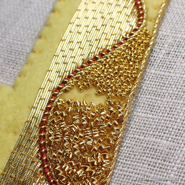
Chip work is a technique in goldwork embroidery that can be very useful for supplying texture. When you use chip work, or chipping, as a random filling, you can achieve a whole heck of a lot of texture and sparkle fairly quickly.
When chip work is lined up next to couched, smooth threads, the contrast between the two types of filling can be dramatic. Or subtle. It depends on the lighting, really.
Last week, I tested a few ideas:
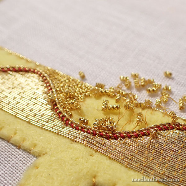
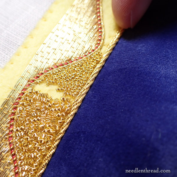
First, I lined the wavy element filled with couched smooth passing thread with a small bit of gilt twist and a small bit of stretched pearl purl twisted together with some nice silk.
Then, I tried a couple kinds of chipping.
In the photo above, the lower chipping (does that not sound like the name of an English village?) is gilt bright check purl #5, which is rather a large metal thread. The upper chipping is gild wire check purl #10, which is significantly finer.
Besides being finer, the #10 wire check purl is not as sparkly as the bright check purl. And although you can’t tell so much in the photo, the #10 has a much nicer gold tone to it than the #5 bright check, which tends more towards a darker, almost coppery gold over time, as it oxidizes. I don’t know why the difference, as I think they’re made from the same wire, but that’s what I’ve noticed in projects I’ve worked.
Below, I’ll include some links to articles on metal threads and techniques that will give you more information, if you’re knew to metal threads and goldwork embroidery.
The problem with the #10 wire check – besides the fact that it is really small stuff, so it requires a bit more patience and a bit more eye effort – is that, because it’s fine, it takes longer to fill a space with it.
I also have a tendency to cut my chips small and (most unfortunately) to cram them too close together. I’m reminding myself to chill out on the cram factor.
Admittedly, I also find the chip work more difficult since losing part of my vision. There’s the whole sparkle thing going on, that makes it somewhat difficult to distinguish details anyway, but it seems worse without full use of my left eye. Will I get accustomed to it and figure it out? I hope so! We will see! (No pun intended…)
Anyway, the #5 bright check is too large, compared to the threads around it. It sits up too high on the felt padding, and it dominates the scene a little too much. It’s also more bling than I’d like. And I am not fond of the way it oxidizes. So out it went!
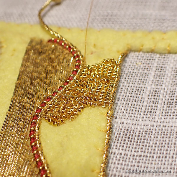
I took a moment to remind myself that the chips don’t need to be minuscule. So in the upper section of the area that I intend to fill with chip work on this letter, I made the chips a bit larger.
Not only did I like it better, but I found I didn’t crowd them (as much). They’re also easier to see, and they fill the space a lot faster.
So I might settle on the #10 wire check purl, as I do like it. Once I get re-used to working with the fineness of it, I think it’ll go fast enough.
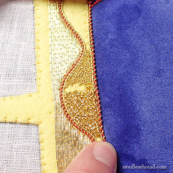
Getting ahead of myself a little bit here, I wanted to see the letter on the blue that will be the background. The fabric’s not in yet, so there’s not a lot I can do at this point aside from playing with the few swatches I have on hand.
I like the heavier stretched pearl purl with the silk along the edge. Something to consider…
I also tried a heavier gilt twist.
I’m not discounting either right now, but the fact is, I’m a sucker for the stretched pearl purl with the red silk in it.
It’s all just fun and games on this end, as you can see! LOL!
Hope your week’s off to a great start!
For Further Reading on Goldwork & Metal Threads
If you’re looking for other articles on metal threads and goldwork, these will give more information on the threads and techniques I’m talking about above:
Stretching & Couching Pearl Purl
Stretching & Threading Pearl Purl
Goldwork Rose: Filled Dots with Chip Work
Goldwork Instruction
One of the best goldwork books available for extensive goldwork instruction is Alison Cole’s Goldwork Masterclass. I keep this book in stock in my shop, where you will find a curated collection of fine embroidery books from around the world. If the book is out of stock, drop me a line and I’ll send you an email as soon as they arrive again.
If you want to read more about the book, you can find my review here.
I like the heavier gilt twist as the edging.
The red stretched purl shines more as a highlight. Edging the letter in the red seems overload and , to me, detracts from the design.
Glad you are feeling better. Give it time – your eyes will adjust the more you do.
Darcy Walker
Hi, Darcy, that’s a fear I have, too, about the red, but…. keep in mind the letters are 6″ tall, and the space they are occupying is Huge. I don’t know that the red – as fine as it is – could overload the design. The problem I’m having with the gold when seen from a distance is that it “fattens” the letter without making a clean cut on the edge. So I know I’m going to have to finish, or mostly finish, a letter and try both options, considering them from a distance, which is primarily how the finished project will be seen.
Thanks for the encouraging words on the eye! I’m trying to be patient. It’s not my forte, I’m afraid, but … live and learn! LOL!
I think it’s really good to see the experimental stages. Too often it seems as though a project emerges fully formed, which , of course, it doesn’t. Also that it’s fun to experiment and that it’s ok not to use all the options you try out.
I have never heard of nor seen any chip work. So very beautiful. I always learn something new from you. Thank You for being so giving with your knowledge.
Dear Mary
I like the Agatha Christie pun Chipping village that is one of my favourite A Murder is Announced. Anyway back to the goldwork project. Like you I like the stretched pearl purl and red silk I think it looks so elegant with the other gold they complement each other. I do hope you have solved the gold shortage and am able to purchase enough gold for the project. Thank you for sharing with us the testing on the goldwork project and for the photos.
Regards Anita Simmance
Hi Mary!
Ah! If only I lived closer to you. I would hustle my bustle over to do/help you with gold work! What a splendid life you live! I know that not everything is roses and gold chips but still…..
Anyway, have you considered stitching the purl purl down with blue or deep purple or even a clear green? Ordinarily I would be right there with you stitching it with red but somehow it seems a little “meh!”
Maybe it’s just my computer display.
Have a good day and enjoy!
Regards
Maggie
Thanks, Maggie!
Blue or green would sink into the background (which is blue) and get lost. On ecclesiastical work, red is often used to border goldwork (and other embroidery on gold and other colors). It helps make the edges more pronounced and visible from a distance. Often, goldwork is couched with red, too. It just depends on the design, layout, color scheme, etc.