


Perhaps color is an age thing.
Or maybe appreciation of color is an age thing? or could it be desire of color?
I don’t know.
I find that, more and more, I like color. LOTS of color. I like more color. I like color combinations, and more color combinations. I like color contrasts.
And I don’t rightly care all that much if the colors I like are “in” or not. Fashion color trends don’t seem to dictate my choices of – or desire for – color.
Is it an age thing? Or have I just become more open-minded?
I will chalk it up to the latter, and I will chalk it up to the latter for all those people out there who are accused of garish color choices “because they’re old.” I do not think it is age. I think it is the understanding and acceptance of the fact that Life Should Be Colorful. Color begets joy, darn it.
I got to thinking about this in depth for two reasons: 1. color plays a Huge Part in embroidery life;
And 2. Well…
There’s the Matter of The Blue Shelf.

Just wait a sec! Don’t write me off!
The studio is not really a super-colorful place, you see. It’s mostly white. The walls are white, most of the furniture is white, the cabinets are white, the window blinds are white. The floor is some indiscriminate old laminate that’s supposed to look like wood and is passable under the circumstances, and some of the furniture (my Uplift tables and our tea station) have light wood tops.
But overall, the impression of the place is white – on purpose, because I like bright, sunny, and … bright.
But then, one day, I was perusing Facebook Marketplace looking for an organizational shelf for my garage at home, where I could store my beeswax stuff. (I make these beeswax petites for the shop in my garage at home. It’s not really a garage. It used to be the original Needle ‘n Thread studio. You can read about it here).
And low, I came upon a rather blue-blue, very blue shelf.
I am not sure why it called my name, but lordy, how it did! To the point that I drove almost two hours in one direction to fetch it.
It doesn’t even fit in my garage. And it’s not an organizational shelf.
In the scheme of things, it’s not all that well refinished, either. The background is contact paper (I’m going to re-do it with the same contact paper, but a little more neatly), and the whole thing is painted this inordinately bright cobalt blue.
But wow. I saw it, and I thought, “I must put that in the studio.”
(Anna was skeptical.)
But I did it. I went and got it.
And I put it in the studio.
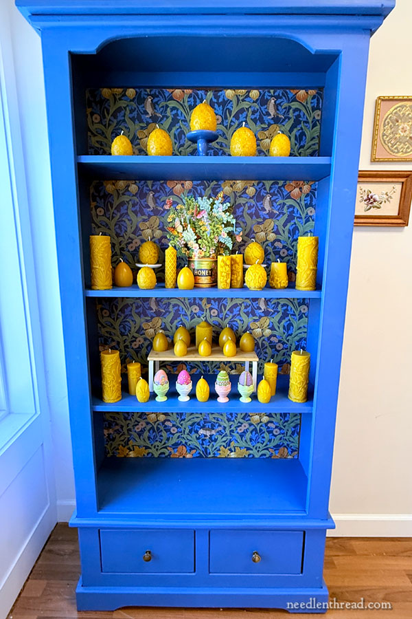
Onto it, I put my latest batch of beeswax candles that I pour while making beeswax petites for the shop.
Right now, they’re pretty much all Easter / Spring themed.
I knew, in my heart of hearts, that the candles would look great on that shelf!
It’s true that the shelf lets off a definite blue glow in that corner of the room when the sun is shining. It might be a bit much, but I can’t help it. I still love it!
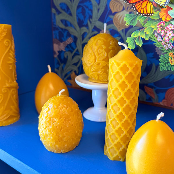
I use cap wax to make the beeswax petites and to make candles. It’s a glorious wax – deep gold – with an almost-heady, rich honey fragrance.
How could it not look good against this blue?!

Sometimes, I talk through these things in my head, mostly to convince myself.
It could actually be slightly garish.
(But don’t tell Anna I said that.)
And we did have to shim up the right side of the shelf, because it sits kind of crooked. It’s the floor – we are in a 150+ year old building in Kansas. That’s just what happens to floors. Anything we put along that wall tilts north.
And it is also true that the paint job and the papering job were not very well done.
But you know, I would never have thought to refinish a shelf this way, with these colors and that background paper. I don’t know that I would have had the courage to be this bold in my color choices.
But wow! When I saw the shelf, I just knew I wanted that splash of color in the studio.
And I succumbed.
Have my color preferences become garish? I don’t really know. And I don’t really care. That blue shelf makes me happy.
I think it’s important to keep this in mind as we contemplate projects – whether needlework or otherwise. Choose colors you like that make you happy. Otherwise what’s the point of these wonderful gifts of vision and sunlight that we enjoy? I say appreciate them and make the most of them!

And what better time to do that, than Spring?
This is my favorite tree in my backyard. It is abundant with blossoms right now – and covered with bees!
Happy Spring, my friends!
I loved your shelf ! The studio must have looks beautiful ! I love colors!
I think if you make dark blue, burgundy and green candles they will look perfect on your shelf! It lookslike courful.
I think the shelf touch is very elegant and gives a special charm to your studio!
Huggs from Rio de Janeiro, Brazil.
Angela
First, I’m jealous! I love that cabinet. And you’re ahead of upstate New York in flowering. We barely have a little green in the grass as yet.
But I REALLY love your cabinet. Blue has always been my favorite – and that particular blue is my most favorite! And it’s not an age thing, I’m certain. I got to see the building where I lived when I first got married back in 1974, an old one-room schoolhouse. I picked out a wallpaper I liked and we put it on one wall of the main room. Then I picked my favorite blue out of the wallpaper, and we painted the rest of the room: a darker version for the trim and the wainscoting, a lighter version for the rest of the walls. Imagine your cabinet on all four walls and you’ll get the idea.
I didn’t realize it until fairly recently, but I’ve used basically the same colors every place I’ve lived. And I always love it!
So be happy in your blue cabinet – and don’t let anyone tell you it’s “too” anything!!!
Happy Easter, Mary!
I’m with you Mary! We’ve lived through fashion and home decor changes, and the last decade or two has really overloaded me with beige, beige, black, way too much black, and beige.
I am thirsty for color, I’m parched from the blah colorlessness that became our world.
YouTubers Nicole Rudolph and Bianca of TheClosetHistorian and Abby Cox have curated their maximalist environments that helps address some of the color quenching I need. (And Bianca has done some very pretty beaded brooches that might appeal.)
Your blue, blue, very blue cabinet joins the party. Anna just hasn’t reached her desaturation trough … yet.
That last photo of the white blossom and the brilliant blue sky is absolutely the inspiration for your blue shelf against the white of the studio. Maybe it was a conscious decision, maybe a subconscious one, but if it brings you joy, it’s right! I am definitely with you about colour – it is so important to me too and more so as I get older.
I love it! The cobalt blue highlights the beauty and detail of the beeswax candles. The pop of cobalt amid all the white has a Scandinavian vibe.
I happen to love color. I painted an old hutch Benjamin Moore Caliente (red) and Purple Rain to house my fabric paints, brushes, and related books. It’s a work in progress. Seeing the patterned background of your cabinet gives me an idea on how to finish the interior of my hutch.
Enjoy!
I love your blue shelf. And you make sense when yousay pick colors that call toyou & make you happy. In the same way, when I make an embroidery for someone i try to pick colors & topics they would enjoy. So enjoy your colbalt blue shelf.( I have bed sheets that same color & they make me happy too)
Mary-
that shelf is absolutely Joyous Blue! and that paper! It’s as if someone knew you were going to use it for your beautiful beeswax creations. What serendipity that piece made it’s way to you!
Oh My Word how I love the shelves with the golden beeswax displayed – beautiful, stunning eye-catcher! Let them call us garish! It’s truly not! I too am big and bold with color now – we’ve earned it! Happy Spring! Snow tomorrow in New England Lol
Yes, yes, and yes! It is a glorious shelf and makes me smile just to think about it. Color is a gift, and we are so lucky to live in a time when color is available to everyone.
Oh, no – you could NOT have found a more PERFECT shelf for those beeswax goodies! That blue, the contact paper, and that golden yellow are all a match made in heaven! And, from the pictures it really looks just fine – I wouldn’t bother with redoing any of it. Congratulations!!!
I love your shelf! It’s absolutely perfect for showcasing your beautiful candles
It’s beautiful.
You go, girl!!!! There is no such thing as too much color, especially blue, and when something throws itself at your ankles pleading to be taken home all you can do is hop in the car, drive two hours and put it in the front window! And it does serve a very useful purpose – it keeps the direct sun off those pieces of embroidery on the wall that Anna spent all that time framing up. I can almost smell the honey from here. Easter joy to you and all the folk. Charlotte in California
Oh, that corner does glow! What a glorius blue and a perfect complement to your beautiful – truly stunning – candles. Makes me happy just looking at it. Thanks for sharing the joy!
Lovely, Mary!
One can never have enough Blue (or, my favorite: Periwinkle)!
Well done, Mary!
I love that shelf! It may indeed be garish, but I love it! Congratulations on a color breakout, Mary. Happy belated birthday!
Love it!! I think that it would not look glaring in a deeper shade such as a navy blue; with gold knobs and motifs to show off the golden candles.
Your Blue Shelf made me happy. It’s gorgeous! Don’t ever get rid of it.
Katrina
Joyeux printemps !
Vôtre meuble est magnifique ,la couleur de la cire va très bien avec le bleu et le papier peint du fond .
Quelle gaieté !
It’s certainly a bold choice, but I do agree that it provides a pleasing contrast to your beeswax items. I think a shelf like that needs careful handling to fit in a space, while white or muted colors are probably easier choices.
The felted eggs look kinda misplaced, to my eye, and I’d worry that the surroundings would draw attention away from the embroidery. I’d try displaying some whitework instead.
There are many reasons why your color preferences might be changing, and you might simply have spent too long with very white furniture. People like change! And color preferences can be so very personal – I won’t work on something if I don’t like the colors. The ability to customise a project to suit my preferences is half the fun anyway, for me.
I hope you find a compromise so you’ll both enjoy.
That shelf is stunning. Absolutely gorgeous. Happy Easter.
The blue is terrific! Sometimes you just need to take a leap and do something that feels right!
Oh, I love that color! Bravo for having the courage to express yourself this way! I have been fighting the “bland black white and gray” decor ideas for decades now… my color passion emerged when I was in my forties so maayy be it’s an age thing… but I doubt it because I was very into the 60’s mod colors back when I was young. I have painted my kitchen orange and green… with sunflowers and morning-glories for murals…. and silver for the cabinets… and my sitting room is dark raspberry… but I love to paint and do get carried away. I painted myself a desk almost as bright as your blue and covered it with flowering vines and birds…. So YAAY for color! I personally think it is fear of other people’s opinions that keep the current trends so bland. Rock on with the beautiful inspiring colors!
And needlework is such a wonderful way to indulge the color love!
I’ve heard that when people get cataract surgery, many of them repaint their rooms as they “can’t believe they chose that color”. So. Part of it might be things going on with eyesight. Realizing that we won’t be struck down by lightning for having a personal style that doesn’t follow what’s “in” helps a lot, probably more than anything eyesight related.
A few weeks ago, I walked past the bath & kitchen towel aisles in our little WM and thought “how sad and depressing” being all white/gray/black. Months ago, they decimated the paint chip selection – all whites, grays, beiges, the few colors were chalky pastels – sad sad sad. I know, those non-colors are supposed to read calm and relaxing, but at a certain point it becomes boooooorrrrrring! Sad and boring.
I love your cabinet, and your candles are gorgeous in it. And it *is* an organizational shelf. Anything with shelves and/or drawers in an organizational item.
Hi, Gail – I’m personally pretty happy to see that the “gray” trend is subsiding somewhat. For a while, it seemed like *everything* in interior and exterior design and so forth was gray, gray, gray. Gray floors, gray walls, gray furniture. Gray clothes, gray accessories, matte-gray cars… How depressing. I was never able to get into that trend, and I’m glad to see that it is finally ending, and more color is coming back into interior and exterior design on houses, businesses, and so forth!
Blue is my favourite color, and this shelf is beautiful! The paper on the back of the shelves just adds to it. You are lucky to have found it.
I LOVE it. It’s stunning, it’s gorgeous, it’s perfect for your absolutely gorgeous, yummy candles (and embroidered eggs). I’m soooo glad you went for it. It is NOT garish, it is a showpiece. ;
Well, my computer did something “dumb” and posted in the middle of a sentence. At any rate – it’s all stunning and good for you for listening to your heart. Maybe “someday” I’ll get to see it “IRL”. 😀
I adore your blue shelf! And the combo of it and the candles are a beautiful thing. You can enjoy it just a tiny better extra on my behalf every time you look at it in person. 🙂 Thanks for sharing your delight in color.
I love The Blue Shelf! It’s beautiful, especially with the contrasting beeswax candles on it. It would be a shame if that shelf went unappreciated. Excellent find!
I wonder about the age thing, too. I will be a senior citizen in a matter of weeks and I have noticed over the last few years or so that I LOVE deep bold colors – especially red! That shelf is amazing and I can see why you love it! It looks particularly stunning with all those sumptuous gold-colored wax pieces displayed on it. Such a great idea to have papered the back of the shelf in that gorgeous paper – which reminds me of William Morris prints somehow. Happy Easter!
I agree with you Mary, go for it when you like something. I once had a kitchen with ice cream cones wallpaper that made me so happy. And about your gorgeous tree, I had been dreaming to visit Japan for years. I selected the dates to make sure I would see the cherry trees in bloom. I’m just back from that trip. I brought back photos of those trees and sashiko thread and print, as well as a book bought at the museum dedicated to an artist, Itchiku Kubota, who spent his life designing and realizing wonderful kimonos that are tie-dye, ink-painted and embroidered .
Mary, I think that bookcase is stunning! Whatever flaws it may have, it meets the one essential criteria that overrides all other factors: it makes you happy. No need for apologies or excuses or explanations – those things just provide encouragement to critics.
It’s a glorious shelf, it brims with joy and self confidence – and the bees wax looks fabulous on it. Enjoy it!
I love the blue shelf. It looks incredible in your shop.
I’m pretty conservative with my decorating choices, but I love having a bright piece to contrast all the neutrals.
I have a tall 2-door cabinet with shelves in the basement. I want to paint it and move it up to my craft room. It is currently a dark tan with a matte light green inside. I think it was my grandma’s pantry in the 1940s or 1950s.
I love that shelf unit. It is -just- a tad on the emphatic side, but that just means it will look as good empty as it does with things on the shelves. The beeswax items really work well, pulling out the golds in the background without being overwhelmed by the pattern. One might think you worked with color and design a lot!
I’m actually rather jealous of it. I have sloped walls in my sewing room, so nowhere to display something like that. If I ever win the lottery, I’m having one side of the house built up so I can have lovely full-height walls. (Or building a house…)
WOW! The royal blue with the golden beeswax looks so…ROYAL! Besides, maximist styling is back in – so you are perfectly trendy 😉
I also would never have dared create it, but if I saw it for sale I would’ve wanted it too! And I agree with all the other commenters – as we get older we learn that you decorate with what you love, not what “matches” or is “in”.
Blue is my faborite volor,
I LOVE that! I would’ve gone to get it too. I think the color thing has more to do with being confident in your own enjoyment, and not feeling llke you need others to tell you what is popular. Sometimes that comes with age. Sometimes, it’s an artist thing where color exploration is more expected.