In keeping with the religious feast of today, Good Friday, I thought I would share some photos of some ecclesiastical embroidery. I find this piece featuring Christ carrying the cross rather interesting from a number of angles.
This is a hand embroidered medallion on the back of a chasuble. The piece, we will see, is actually a combination of techniques. From far away, it looks like it is completely hand stitched, but it isn’t.
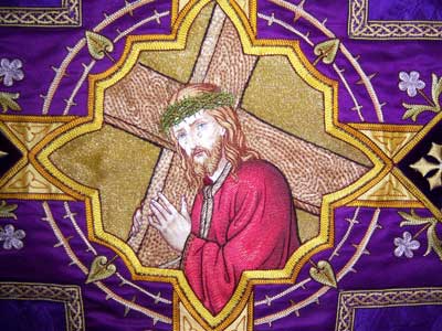
The first interesting thing that strikes me about this whole piece (and the vestment) is the use of color. It is not at all subdued! My preferences don’t generally lean towards combinations of very bright colors on vestments. But this particular piece certainly makes use of some bright tones, and I think it does so effectively.
Remember, as we progress through these photos, that ecclesiastical embroidery is generally worked to be seen from a distance. You’ll notice that embroidery in the photo above (with the image somewhat distant) looks very smooth.
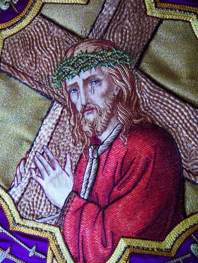
The different pieces of the image – the face, hands, cross, garments – are all actually from different fabric, appliquéd and then stitched over in certain areas. Certain areas, especially noticeable on the face, are also tinted, to provide a “painted” look. The effect, from far away, is that the face is embroidered with intricate shading, when in fact, the embroidery on the face is rather simple.
The texture on the cross is interesting. I think I like it better close up than I do from far away, but I suspect that from even farther away than the above photos allow, the cross probably looks better.
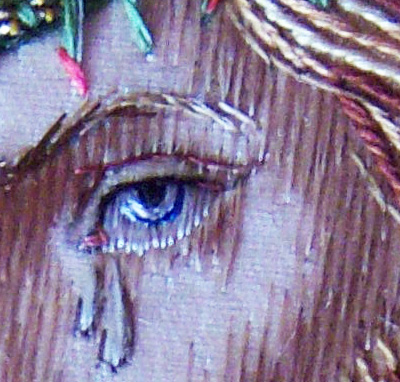
You can see here a close-up of the eye and the stitching around it. They eye is completely embroidered in blues and black and white. The stitches at the end of the whites of the eye – at the base – really catch the light, and the effect is one of watering eyes, fitting with the tears that flow down Christ’s face.
Notice the stitching on top of the eye – a black line along the top of the eye, and then, at the crease of the eyelid, a dark mauve line is stitched. Notice, too, the corner of the eye, with the pink stitches. From far away, these are not noticeable – look up at the first picture again. But they all combine to form very clear facial details from far away.
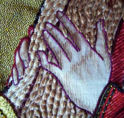
The hands, too, are only embroidered where shading is required. Notice that the outline of the hands is a very strange purple. Up close, this looks bizarre! But if you look at the first photo again, you can see that, from far away, it works.
You can see that the texture on the cross is made by couching a thick bundle of threads in a puffy couching technique.
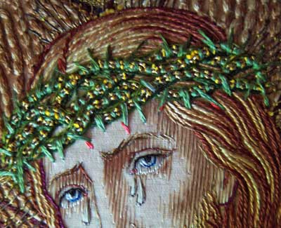
The hair is stitched in long curving lines of stem stitch, in various shades to give it depth.
The crown of thorns is rather uniquely executed. I’ve never seen a green rendition of the crown of thorns, and the way it is stitched is kind of interesting. Again, there’s some nice texture here. The crown is apparently made out of two Japanese gold threads loosely twisted together, then couched with green floss. The couching stitches are close around the gold threads, and then, in spots, the green juts out to form a thorn. So you get glints of gold – just a little bit, not a lot – and the yellow in there is the core thread underneath the Japanese gold, where the gold wraps have been moved. Some of the thorns touching the face are tipped with pink. Notice that they aren’t tipped with a bright red, which I think, from far away, would be too confusing to the eye. It would not be obviously blood, but rather darker spots, whereas the pink accentuates the tip of the thorn against the flesh. If you look at the second picture above, you can see this.
This whole piece is actually very simple. The image itself is not too full of detail – notice there is no background detail, for example. This style of hand embroidery combined with appliqué was worked on vestments from at least the late 1800’s through the mid-1900’s, and is actually still done today. The combination of appliqué and stitching reduced the production time on pieces that would otherwise have taken easily twice as long to embroider. It is humorous to read some of the old ecclesiastical embroidery books from the turn of the 20th century (early 1900’s), where the authors insist that the combination of appliqué and embroidery should only be done when nothing else can be afforded!



Hullo there Mary,
Our Good Friday is coming to a close. We're having a quiet Easter at home.
Thanks for pointing out all the various techniques used on this piece. I was quite amazed. Seeing it in sections like that is very helpful.
I'm glad you didn't have to pull this one apart to see how it worked! Nothing ventured, nothing gained though eh.
Cheers, Kath
Amazing the simplicity of the applique and simple embroidery on the skin features that gives it such a smooth look, but also all the depth of shadows. These pieces are truly works of art.
It's an interesting point about the strong colours – last year I spoke to a member of the York Minster Broderers, who make ecclesiastical embroideries for the Minster, who said to use stronger colours than you would normally. She pointed out that in a large space with dimmer light than we find at home, subtle colours and shading effects just disappear – to get what *appear* to be subtle effects in the space where they're intended to be seen, use colours and styles that in a different context would be anything but! I think this piece is an excellent example of that.
It looks as though there is a light wash of color or paint that is then barely covered in embroidery floss.
The books that insist on avoiding the combination of different media are trying to elevate embroidery above folkart, to a level closer to fine art.
Folkart needlework ypically contains applique. This is commonly found among native island and indigenous needlework samples.
Apparently in the world of fine sewing, applique work is not so great! Too bad, since it is a favorite of mine!
Thanks, Mary! This is a fantastic analysis of how such subtle lines and colors have been used to create this. It's stunning!
I have been completely stumped for months on how to progress with a project of which the human face and hands are an important piece. I've been so dissatisfied with my results. I really appreciate your excellent pictures and explanations. Thank you so much! I'm re-inspired.
Happy Easter. Peace be with you. 🙂
Hi Mary–
Could you describe the stitching on the robe a little bit? That was the part of the picture that really caught my eye. It looks like it's row upon row of satin stitching in multiple shades of red, but as you've shown in your post, what we think is there might not be.
Carol S.
Hi, All –
Thanks for your comments!
Carol – the robe is an appliqued piece of fabric (probably red) that has been painted lightly to form the overall shadows. It has been stitched over in long parallel lines of split stitch (each split stitch is rather long, around 1/4 – 1/2" probably, so it's not a close, heavy split stitch line, but rather a long light split stitch line). The split stitching lines are worked in various shades of red, to match the red shading on the fabric applique, and they are worked with a space between each parallel line – the space of a line of stitching, basically, that has been skipped. The defined folds are worked with dark lines, maybe in stem stitch to give them a little more thickness, and these are actually stitched along the definition lines of folds and such. Imagine a coloring-book drawing of the same image, and the way the folds would be indicated with lines and curves in the coloring book. Those lines and curves are stitched in dark colors.
So that's how it's done, pretty much….
MC
Fascinating to see the techniques used to make the design work. I've done a little work for our church, and it is very difficult to change your thinking to allow for how far away people will be!
Blessed Good Friday Mary,
Thank you for the beautiful,interesting,yet necessary embroidery.
Karole
Mary,
Are the threads on the face painted to give the shading? They look very specifically varigated, and I can't imagine a randomly varigated thread working so perfectly to get such tonal shading. Or is the fabric underneath painted? What do you think?
Many thanks for your opinion…
Okay, never mind. 🙂 I'm such a dork. I bounced back and forth between the pictures and have decided that the artist embroidered with a light floss, and then painted over the floss AND the fabric.
(I wonder what paint they used? Acrylic? Special Fabric paint? What didn't bleed all across the fabric, but didn't look so stiff either? Hmmm…)
Hi, Sheila –
Actually, the fabric would be painted – just lightly, where the shadows are meant to be – and then the stitching is done in regular silk, in different shades depending on the area stitched…
MC
Thankyou for the images and your analysis of them
Mary, thanks for sharing your insights on this piece. Do you own this too?
Very good study. One learns a lot in studying other people´s works, in addition to one´s own.^_^
Thanks for this wonderful post, Mary.and for your lovely comment 🙂
we are many but not all together…
Have a Good Easter weekend with family.