


Last week, I mentioned running into a stitching wall on the Medallion Project. There’s something rather deflating about getting some hundreds of hours into a goldwork and silk embroidery project – fiddly hours, you know! – and running into a wall. Something seriously deflating.
I attacked that wall in innumerable quick sequences, without photographing each one. I was engrossed, engaged… perhaps a wee bit enraged… and the camera was the last thing on my mind! I did catch the second-to-the-last attempt to scale the wall – the last attempt being the one that catapulted me over it. I’ll tell you about it and show you what I did. You can let me know if you agree, disagree, feel sick when you see it, or what!
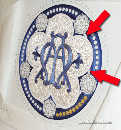
The little areas in question are these small sections of a band that runs behind the main central element of the Medallion.
You can see some of these sections pointed out in the photo above. See them?
Initially, my plan was that these should be gold. So I tried them out in gold, couching a fine gold tambour thread in that area. The gold tambour thread I used is the same gold thread that I used in the Tudor-style rose, and it was an awful experience all around. It was a pain in the neck to couch the gold in those small spaces, but worse than that, it just looked yucky. I was stumped!
I relied on the age-old trick of walking away and coming back to it later. After all, maybe if I came back later, I would find it wasn’t as bad as I thought, right?
I came back later.
It looked bad.
I wept.
No, not really! I make it a policy never to cry over cut threads. Instead of weeping, I attacked! One after another, I tried every idea that popped into my silly head.
I tried filling with other gold threads – the Japanese gold I showed you yesterday, check thread, to give it some crinkle and texture (oh, double yuck – didn’t work at all in that close area). I tried filling with color – the lightest blue used on the monogram part of the project, which ended up looking somewhat dirty and dull. I tried filling with the darkest red used in the roses, but there wasn’t enough contrast in the shades between the dark blue and the dark red, and it just got lost.
Contrast! I needed contrast.
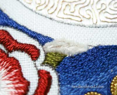
So I tried filling with Soie Ovale (the background silk used in the center part of the Medallion). But it was too stark. I tried filling with the creme Soie de Paris (also used on the Tudor rose, in the center), using split stitch, which looked matted, and then stem stitch, and finally satin stitch – which was my final attempt in the photo above.
Between every little trial, a thought bubbled up inside me: Maybe you should try that rosy pink color used in the Tudor rose…
No, no! my innards cried. It would look…. so….Pink….
You see, I am just not a Pink Person.
But a little voice inside me kept nibbling away: But it would provide contrast. And it would tie in with the roses…”
I rebelled until I could rebel no longer. There was nothing for it. I had tried everything else! Why not at least try it?
So I did.
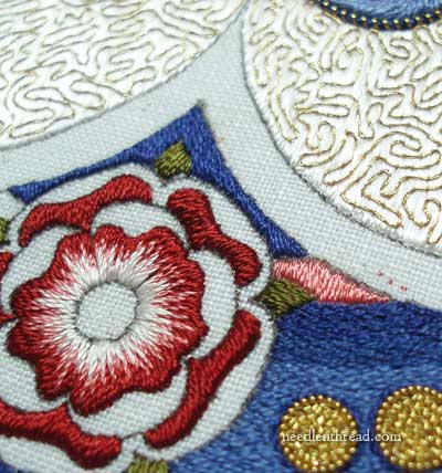
I tried the pink Soie de Paris, in a satin stitch.
And I saw it and thought…
Maybe if I add a tiny bit of gold on the edges?
And I set about making the requisite mess, adding the gold.
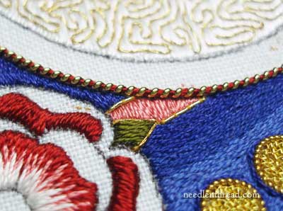
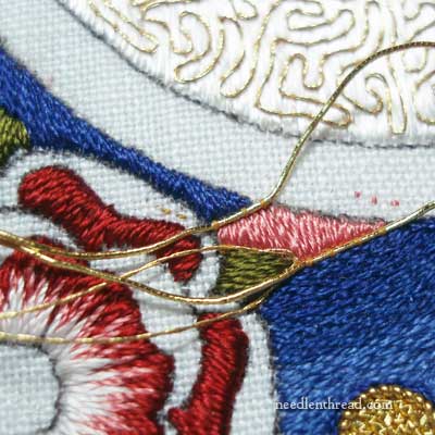
And then, placing some stretched gold pearl purl and red silk onto the very edge the center cinquefoil, I stepped back…
and I said…
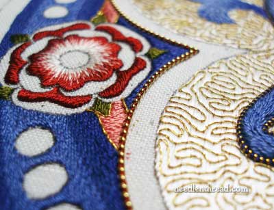
I’m ok with pink.
Sometimes, the unexpected – and even the unwanted – just works!
At least, I think it works – what do you think? Have your say below!
If you’d like access to all the tips and techniques discussed in the Medallion Project, including complete step-by-step coverage of the Tudor-Style Rose, conveniently collected in one document, interlinked, referenced, and indexed, why not add the Marian Medallion Project e-book to your library? It’s packed full of all kinds of embroidery tips for undertaking a project like this, all in a convenient electronic format for easy searching.
Oh, I like the pink, so often that tiny little voice is right.
It looks great…the gold and the red/gold beads really add the right touch.
Just love it! It lifts the roses away from the background, makes it look like the pink bands are holding them up. Perfect. Just the right amount of contrast, very subtle.
Hi Mary, I can’t say I am a fan of the pink. I don’t find it rich enough for the other colors in the project. Just my opinion, maybe I am just not a fan of the color pink? Will be interesting to see what your other subscribers think. It is a beautiful piece of work; only wish I was as good a needle artist as you are. Take care, Colleen in Canada
I agree with Colleen. Maybe a mauve instead of pink? But then you’d need wine colored blossoms. I just feel that it’s too colorful – ! Thank you for sharing such a lovely project, Mary!
I think it looks really beautiful! Enough contrast, but not to much. Specially with the gold, it just look amazing!
It’s lovely. Just perfect. Especially with the gold.
I’ve been really into your medallion project almost from the beginning. I look forward to receiving your daily email.
Because of your emails I’ve learned about possibilities. The possibility that I can do pretty surface embroidery too. The possibility that various threads allow. The possibility of different stitches. There’s a shop that specializes in threads about an hour from where I live. Because of the possibilities, I know now that I HAVE to go check it out.
Thank you,
Mary
I think it looks lovely….it draws the eye around. and pops out more of the rose.
Yes, yes, yes!! It works. And I think you’ll be glad for the pink in the end, because it helps the red roses snuggle into the blue and gold sea.
Hi Mary- I think it looks perfect! With another blue, gold or white I think that element would have been lost. The pink makes it clear that it is a separate entity/pattern, and ties together with the roses beautifully. I think you passed the obstacle course with flying colors!
I love the way it looks, but there is a little voice in the back of my head that’s saying ‘What IS that pink thing?’ Did you think about possibly making it a larger leaf?
Absolutely perfect, but then I love pink and red together so I think it goes beautifully with your Tudor Roses. I also love the choice of gold threads all round.
Hi Mary,
I am an attacker too. There have been times when I want to weep over my needlework but I’d rather just keep fighting until I get it right…or I’ve pulled out too much hair for one day..which ever comes first.
I’m so not a pink girl. I am a yellow girl. That said, I think your pink looks lovely. The gold outlining it gives it almost a Churchy ( is that a word? ) stained glass kind of look. The pink contrasts the blue brilliantly making the blue look even richer.
No matter what you decide I am sure it will be nothing less then perfect !
~Chrissy
I think it looks great Mary. You are so clever and so patient and determined.
Hi Mary,
I had wondered how you were going to integrate the red roses into the sea of blue and gold. Now the roses are unified by a ribbon that belongs to them. This anchors them in the composition. Good choice!
Oh, it’s beautiful! That was a great fix to a sticky problem! Trust your gut.
I love your colours , Mary….my thoughts are the pink is just right…
WoW!
It works! Mary, I am so enjoying your posts on this stunning project.
Hi Mary,
I think it’s just wonderful – Those times really stretch the creativity inside. I love
them –
Jane
PERFECT!!! Your subconscious knew what was needed and after trying all other solutions it perculated to your consciousness. It’s just beautiful.
Brava! In sewing and embroidery, I have often found that a pink or a purple is the color that makes the others pop, or provides the accent that causes focus to shift where it belongs. I save scraps of pink and purple material and threads for those “just in case the other ideas don’t work” situations.
It looks great! I really like the contrast of the pink with the blue. The pink is such a nice color. I think it’s the hue that goes so well with the blue and gold
Why not call it “rose”, and pretend it was intended to be there from the beginning as a nod toward Laetare and Gaudete Sundays? It’s hard to tell from the one segment just how it will look, but I think it will look fine, but you will see the full effect of the pink ring segments before we will. Certainly it was a good idea to add the gold.
The pink looks good, but have you thought about a deeper green? That might make the wreath look like a rose vine
I’m okay with the pink! It does pull the rose colors out into the design a little more, maybe anchoring the rose into the rest of the design. It is quite effective. Charge ahead!
I admire your tenacity and patience. The embroidery is exquisite and I think the pink is just right with the new edging.
That will learn you! Pink is great. Pink rules! Seriously, I love hearing that you go through the same stresses as the rest of us. I love your tenacity; how generous you are with your time. I think the pink looks great. I’m glad you didn’t quit until you got it right – even if you had to use pink.
I think it looks wonderful! It does make the roses pop out. I am learning so much from following you on this project, it is hard to put it all into a short comment. Many, many thanks!
Mary, I am not much of a “Pink Person” either, but I must admit that it certainly “hits the spot” in this section of the project. And I love the gold edges – a great finishing touch to that area!
Hi Mary,
I am definately not a pink fan, and my initial thought was “…oh no…” But I flipped back and forth between the pictures and finally I can agree that, with the addition of the pearl purl and other gold/red stitches, it works.
The lesson I am taking from this is when you lay out a design try to plan for the tinest detail. Otherwise you can get into a corner and find “what the heck was I planning on doing with that area!!!”
I hope this is the last wall you hit and can continue the project smoothly.
Regards,
Doreen from Maine
Hi Mary,
Actually I like the touch of pink—-but then again I am a person who LOVES color in her needlework. I also think that the embelishments you made were perfect too.
Dottie
Mary, personally I think it not only works, but it brings out the pink in the rose, that I had not noticed before. Makes the shading of the rose more interesting. The gold around the edges also brings it all together. But what do I know?
Jane
Georgia Gal
Good Morning Mary,
I think you made the wright choice with the pink and the gold around it.
I understand perfectly what problem you had
to choose the perfect thread and color. Being
a long time embroiderer, I encounter these problems and sometimes I can make changes many times before I am happy with the result.
Happy Stitching and a great day to you.
Louise
Wonderful and so unexpected.
I think it’s perfect, Mary. Great choice.
Hi Mary,
I think the pink looks odd, like an after thought. I would have just continued with the blue and no gold edging of course.
Perhaps this is just a continuation of the leaf and should be in a darker/lighter shade of green? Only a suggestion. Who am I to critique such beautiful work!
It’s perfect!! I see why you hesitated but … this is lovely! I am so glad you found the perfect solution!
I love it! And I love how you capture all the debates that goes into making a masterpiece! Thanks for sharing.
I like the pink and think it is just right!
Mary,
I too dislike pink. But your efforts have proved that every colour has its place. It works perfectly!
Congratulations on being so close to finishing this monumental (for me) piece of hand work, so beautifully done.
Greta
I love how it looks with the pink, the eye follows the lines from pink to the rose wonderfully. I used to hate stitching in pinks/purples until I had my daughter…now I’m used to them!
I would have liked to have seen a picture further back and got the whole picture. But from what you show I like. Yes, just thinking about pink there would seem all girly. But tied in with the rose red and lined with gold it doesn’t stand out so much. I do think it looks quite good!
I’m kind of liking the pink.
As I was reading your trials, a thought popped in – would it work to use bits of paint chips for such color tests? I know you wouldn’t get the same sheen and texture, but might it work to cut a bit and then step back to check the color?
I think that thinking pink was definitely a perfect solution, which only goes to show that we ought to listen to that inner voice more often.
I HATE pink… but the gold made a statement and gave it a happy ending. Congratulations!!
Fabulous…pulls it all together. Sometimes you hit upon an idea like that and people think you are a genius. They don’t realize the agony you went you experienced before the break through. Good job! It looks beautiful.
Save the Pink
It’s a very good idea.
Well, I’m not a pink person either but it’s such a small amount it looks OK IMO. I’m really curious to know what colour you are planning to use for the larger circle that surrounds the meandering gold work? That one really makes me wonder.
Karen In Canada
I think I would like the red rather than the pink (I am not a pink person either). The gold would separate it from the roses, and the ‘circle’ of red with the roses in it would be great.
There is too much blue to repeat the blue.
It is BEAUTIFUL! You are a master stitcher! I love your daily blogs, and LOVE LOVE the pink.
It is beautiful! great choice.
I like it, especially with the stretched pearl purl and red silk. It adds a bit of dimension behind the cinquefoil.
I actually am surprised, I like the pink! I don’t really like the gold outline though. I think it’s the gold around the leaf that I don’t like.
This piece has been such a joy to see as you have shown us each step. Such a pleasure to see your work in progress. Thanks for shaing your talent with us.
Hi Mary,
Great idea to use the pink as a neutral color. It actually gives depth to the rose medallion since it brings the eye to the center of the rose.
Debbie
I think it is perfect. I am of Irish heritage-I believe in that little voice.
Mary, I can SO relate to what you went through. I have run into similar situations in my bead embroidery. In fact, usually about half way through a piece I think it’s a total disaster and put it away for a while. No failures yet!
I very much like what you came up with. It adds life and continuity to the design.
Marilyn in Las Cruces
Yes, yes, the pink is right! ‘Just the right amount of contrast – it softens all the blue.
I like it and it’s not to much
Oh Mary,
It works, it *definitely* works. So glad you found the solution you needed. It may not be a favorite color for you, but it POPS, adds so much depth and dimension to the design, and helps to ground the red roses into the blue, cream and gold.
Sharlotte
I like the pink – it breaks up the blue and gold work and blends in well witht he rose. It looks GOOD!!!!
Hello Mary,
I think the first time I saw your medallion project I was struck by the sheer magnitude of it all. What you have created is stunningly beautiful and a work of the heart. You should be so proud.
Since I am a Lutheran by birth, I noticed what I will call “Luther’s Rose”. You perhaps have made that distinction also. The five flowers spoke to me historically from my childhood….so I have given it some thought. I Googled Luther’s Rose. I believe I came up with 18 pages of pictures of various representations of it. From doing that, it seemed to me that pink was a completely new element that didn’t really fit with your previous stitching. Pink is not a liturgical color. But then I looked at your beautiful outlining and thought it might work. The difficult thing is that you will have to be the final judge.
If I were in your situation, I would look at those pages of luther’s roses. Maybe some small element will jump out at you and either reinforce what you have done or make you decide to change from pink to another bolder color. I have thought of a rich purple that would be a background ring reflecting the bright blues and reds that you have used already. Purple is such a great liturgical color and represents strength and royalty in my opinion.
So there you have it from me. I admire you so deeply and am so thankful for all you have taught me.
Karen
No offense, Karen, but this is not a Luther’s rose. The rose has a long historical symbolic association with the Virgin Mary. The red and white roses were combined following the English war of the roses to form what is known as the Tudor rose. It is frequently used on Roman Catholic liturgical items. This is a Marian medallion and the rose in red and white is very appropriate.
By the way, rose(a form of pink) is used in Roman Catholic vestments for Laetare Sunday during Lent and Gaudete Sunday during Advent.
I think the pink works splendidly. Thanks for sharing.
Mary,
Funnily enough, my immediate thought when I started to read this article and saw your dilemma was ‘PINK’! before I got to the end and saw what you had decided. so I think it looks great. What are you going to put in the wider band next to it?
Hi Mary,
I’m making the jump from NP2…. I do like the pink, and I’m not particularly a pink person myself either. But, it picks up the paler pink shading in the center of the rose, and compliments rather than distracts from the design in that section. Your efforts paid off handsomely!!
Chris
The pink looks lovely as does the gold thread outlining it.
As a tip for other readers, sometimes I find that if I set my camera to the “black and white” mode, it helps me determine if there is the right amount of contrast between the threads I want to use. The built in grey scale of the photo is fairly affective in showing gradations of contrast.
Mary, I love the pink it really does seem to work, but what I like the most is knowing that I am not the only one that is doing things and then looking at it and knowing that it won’t work and then taking it out.
Sharon K.
*L* I was reading this, looking at the pictures, thinking I hope she goes with a orange lean, and that pink has an orange (not red) lean! Orange is the compliment to blue.. looks great! Pinks will lean cool or warm. there is what my two little cents say.. YEAH!!
I wouldn’t have thought so…but I really like it! – from what I can tell. I wish you’d give us a “long” shot…its hard for me to visualize the overall effect without seeing it far away…that said- so far, so good!!
congratulations!
You’re right. Whoda thunk it?! It’s gorgeous.
Mary,
I like it up close. I think I would like to see it from away, a step back so-to-speak. I have to do that sometimes on whatever project I’m pondering.
I can’t wait to see the whole project completed. Even though I feel a sense of pride and completion when I get done with a project, I also feel a little sad. Like when you finish a really good book or a wonderful vacation with a friend has come to an end. Does anyone else feel that way?
Happy Stitcher in Florida,
Sandi
Good for you, for trying something you are not normally fond of. It’s just the right thing in that spot, isn’t it! Intuition usually does work that way, even though sometimes we fight it for awhile.
I think the pink sets helps define the leaf better. I’m not adverse to pink and it’s already used in the rose, so why not? Keep up the amazing work. LOVE reading your post every day.
I think you are quite right, it works! And beautifully, too. (I also don’t like pink as a general rule, but sometimes it is the only thing.)
Cathie
I didn’t even look at the other comments. I am definitely NOT a PINK person either. However, the warm pink you added in that small amount looks just perfect. The gold around it makes it a little warmer still. I am not thinking PINK when I look at the piece. It’s an accent that works, like a touch of pink on a red flower. So you should feel very pleased with the outcome. Good color choice. I love color problems/solutions. Yours works.
It looks lovely…adds a very interesting dimension to your exquisite piece. Thank you for sharing your process…I so look forward to seeing the step by step details…
Mary I think it looks good! When the rose next to it is completed I think it will pull it all together beautifully. This is an amazing project, and I hope you’ll share the ‘after the embroidery’ part so we can see the finished product!
Perfect solution! How I admire your perseverance…Pat
Mary, I think the very subtle bit of pink is beautiful. It barely looks like a shadow next to the rose and the blue! Your tears should now be of joy!
Anxiously awaiting the next detail,
Claire
I think it’s fine but what makes it work is the fact that it’s not a candy floss pink, a baby girl pink. It’s a warm shade with almost a hint of peach in it. That’s how it looks in the photo anyway. Not sure how it looks in regular daylight. Could you finish one of the roses completely and show another shot from distance? The close ups don’t give me a feel for how it will work or stand out.
What’s going to go between the vermicelli and the roses? That blank band?
I LOVE the pink…who knew?
I so understand why you didn’t want to add pink at first – I had a pink bedroom growing up and I did not ask for it. I came home from a visit to my grandmother’s and there it was: Pink flowers with lots of green leaves. Doesn’t sound so bad, but let’s remember this was the 70’s. These weren’t small flowers or even medium flowers – they were LARGE flowers. My mother was quite pleased with herself because she made the curtains and bedspread. There was even a pink and green stained-glass hanging lamp and a pink, feathered birdcage which I am pretty sure she did not make. Oh,and yes, the walls were painted pale pink. Oh dear. I didn’t get rid of the pink until we moved some seven years later.
Now in my 40’s I find I have forgiven and almost forgotten the bedroom. After all, I really love my mother and I never told her how I truly felt about that horrid pattern. And, when you think about it; pink is really a gorgeous color.
It looks good! The pink pops out and gives a nice contrast to the surrounding areas. I would have thought that area would be continuous blue. Well, pink does have its uses, right?
I love it!!! That little it of pink and gold sets it off with just the right amount of contrast needed. The project is coming out absolutely stunning.
I can’t wait to see it finished.
Janiceb
I think the pink looks great! the reason…it pulls and highlights the pink in the tudor roses and helps them be not just red so gives them more depth. It also helps the overall design be not just red white blue and gold. Makes the whole design sing.
Bette
It works!
Your persistance paid off. Listening to that little voice is generally a good thing. I like it!
I like it
Just remember that you asked for comment! I really don’t like it. I think the pink chops up the area into too many little bits of color. The rose already does that to lovely effect. The background should be left to be just that – background, therefore, blue, one or both of the blues fore and aft of it. I DO like pink, just not here. I probably wouldn’t have used satin stitch for the area closest to the inner circle, but would have continued split st. or stem st, whichever you used in the other blue area, and, thus, would have had a continuous area of split/stem in blues. Again, remember, you asked. Having said all that, your work is some of the loveliest I’ve seen since my friend/teacher/mentor Mary-Dick Digges died.
I like it. The pink draws from the rose. Complements the green leaf, ties in with the couched gold. It is very pleasing to the eye. Furthermore, the pink works very well with the blues. For me, it’s comfortable, that’s a silly comment but, when I am auditioning beads for fringe of an amulet bag and I finally hit the right color, shape and size, it’s the YES! moment. Now you can move on. The wall has been conquered. Congrats!!!
I LOVE THE PINK! It helps to bring out the little bit of pink in the tutor rose. Just the right accent I would say.
Mary: Pink is an appropriate color in church work. Pink is used as the third Sunday in Advent-pink works. there is just that tiny bit. You were right to listen to that small voice. It is Beautiful.- Collette KCMO
Mary, your work is superb. I love pinks. However, after flipping & flopping between your photos I am not a fan of the particular pink you have selected. Not certain if pink is the very best choice for this area. I do like the gold bordering the pink but pink still doesn’t quite fit with the regal colours you have selected. The light tone of the pink certainly makes the rose stand out from the background which is wonderful. What about a rich ivory to taupe shade?
Linda A, Ontario, Canada
Perfect! I saw the pink yesterday, and loved it. In the photo above, it looks even better. Well done!
I know about the tears, but I’m an attacker too (sometimes I kick my stove before I attack my problems with my crewel!).
Being an absolute beginner and dead scared of goldwork all I can say is that this is so beautiful!
I just love all your posts where you show and tell about the details, problems and your thoughts about what to do. Great lessons 🙂
Oh, I think it totally works! Just that little bit of extra pink, with the refinement of the gold, ties those small bits in with the whole medallion! Good work, Mary!!
Sometimes the color that you don’t like is the color that fits perfectly. I think it looks wonderful!
Mary I love this art in progress, but I am not a fan of the pink. I think it is just too different. The color seems to pale in comparison to the rest of the work. I believe when you step back from the piece the pink will be a distraction, and because you have had so much trouble deciding on that small space your eye will be drawn to this odd color. I like the thought of maybe a green (and I don’t like green and love pink).
Mary
I would have never thought of the pink working
like that!!! I love it! And thank You for all your hard work. I look forward to this email everyday!!!!!
Robin Marks
YES! That says it all…I noticed the pink on yesterday’s peek and wanted to chime in then…but I was having problems with my keyboard. Now that I can see even more – I can say…yesyesyes YES!After all, this is a marian piece and wee bit of the feminine is quite proper. I think what really makes it work is the way you are using the gold bordering and the red wrapped pulled purl. YES.
The pink is very pretty. I’m personally a pink person and I usually put it with some sort of green. It kinda breaks up the colors and makes it have a rich feel to it (as if the piece didn’t already have a richness to it!) in any case I think it looks lovely. You’re a genius.
Mary I like the Pink but I was thinking maybe white with the gold or would that be to big a contrast…..The Piece is beautiful…Thank goodness your doing it and not me I really would not know what to do..
Have a great day
I don’t care for the pink….don’t know why exactly…maybe it’s cause i don’t know what that space is meant to be. is it a band linking the roses, is it a vine? if it were me, since i don’t know what the space represents, i think i would continue with the same blue which would, in my opinion, hightlight the roses more. just my opinion.
sharyn
Finish that rose, then give us a close, medium, and long shot, please? That’s really what we need to see to say YEAH or Um…. 🙂
With just what you’re showing us, I kinda like it. 🙂
I am not sure about the pink, Mary. I want to see more. I think the circle it defines ties the other elements (blue red yellow white)together. On the other hand, the pink is still pink. Here’s my suggestion: take the original design you have on paper (you have one, right?), small scale, and using colored pencil just quickly splotch in the areas’ colors. Don’t have to stay inside the lines, just scribble an area enough to see the color relationships. Or if you don’t have a small paper copy of your design, just take some colored pencils and make several patches of color, trying to use generally the sizes that represent the amount of color, ie big patch of blue, smaller patch of gold, smaller patch of red, smaller patch of pink.
Well, you needed another thing to do, right?!
I recommend this ‘try on’ to everybody. It’s not fool proof because you won’t be able to get the colors identical to the colors of the threads, but it helps.
Oh, Mary, it’ is possible that little voice wasn’t yours; the spirit of creativity probably comes from higher voices than ours 🙂 I think your solution verges on “heavenly”, and I’m not a pink person either. I especially dislike pink and red together, but there’s something so rich and lovely about these shades combined. Maybe it’s that the “pink” has a hint of coral in; that the red isn’t “lipstick red”, or that it was done by a MASTER … but to borrow a phrase from a clothing designer friend of mine, it’s “Perfectly Pink”! Stitch away with confidence and peace LOL.
Cathy in PA
It’s gorgeous! The shade of pink is beautiful and contributes just the right contrast while still a nice reiteration of the rose. It provides a “lift” in the midst of so much deep color. Your choice was inspired.
I love it! But then, I’m a pink person too! It really does look good.
ok. I guess I will be the odd person out here. IF I was to give a name to that space–i.e. leaf, flower, circle, etc. I would have no label. I think you might be wiser to make it the same blue as around that whole band. Otherwise, it looks like if it was stained glass, a piece to hold the next section together. Especially if your original source could have been a cartoon for a stained glass rose window? You are like me, you “worry” a section till you are happy with it… so if the time crunch is here for this piece, stay with the pink…otherwise think royal blue?? Hugs!!
BEAUTIFUL!!!!
I too am not a pink person, but this works. I think that if we listen to that small inside voice more often, we would have less mistakes, at least I would.
Can`t wait to see it finished.
Just perfect! Well done for persevering!
The pink is perfect
I like it!
I can empathize with the dilemma over using pink. I’m not a pink person, either, and this medallion doesn’t scream, I need pink. But I think, by jove, you nailed it. It does offer a nice contrast that emphasizes the interesting lines and shapes in the design. It is a very small amount of pink, so it doesn’t dominate the design, rather like a touch of lipstick on your mouth. It would help if we could step back and look at it, but it does look nice the way you photographed it. Keep it, I say.
It works – well done!
Isn’t it amazing what contrast will do? The process can be so frustrating at the time, but so rewarding in retrospect. Thank you for sharing it with us.
Nancy in Newport
Fabulous! It’s the perfect solution and looks more than beautiful. It ties the roses into the rest of the design.
I love the color pink so I think it looks good! When you get everything else around the areas stitched it will blend in more anyway. We get so engrossed with one little section when we stitch that we forget the way others will see it.
It works beautifully, indeed. All is well that ends well …
I like the pink, in fact, I think it’s the right pink (icy pink). It’s enough contrast from the red and blue without competing with them. The gold thread framing the pink is perfect. I enjoy your newsletters so much. I feel like you’re talking directly to me, not lecturing from a podium. Thanks.
The right way to see pink – soft, unobtrusive and allowing other colours to shine out. I really like it and thank you for solving a puzzle for me. Spent ages yesterday trying to compare the gold work close up on your ‘On The Edge’ posting from a few days ago to see if I could work out which piece I was looking at. I couldn’t because there was pink in there you hadn’t shown us yet.
Lynne Humphrey St Albans UK
Mary, I agree. I do not like the color pink either. But, I do like the color “rose”. I think of pink as the color of bubblegum, bright, garish, screaming at you. I think of the color “rose” as softer, somewhat subdued, quiet. To my eyes the color on your work looks rose to me. I also see that this small space is a broken inner circle and should be in the background and not stand out. From the picture the gold perle purl with the red tends to push the pink-rose color to the back very well and the flower will push the pink-rose into the background even more. Also remember this will be viewed from a distance. So…. I RELLY like your color choice and do not believe you could have made a better one! Isn’t it funny how you have one thing in mind when you plan a piece and making a few changes as you go along just improves the look?
Hi Mary, I think the pink is a nice tie-in to the rose. If you had used another color, the roses would have looked like a separate element from the rest of the medallion. The pink connects the roses to each other and because they are connected make the roses an integral part of the medallion versus a colorful addition. By adding the gold purl and red silk you then pull them eye away from the pink and define the Tudor rose as the prominent design element.
Hi Kathy,
That’s it, the pink is like a ribbon connecting the roses together. It’s like ribbon you buy at the store that had roses already on it, umm like a garland. Very good insight. I’m surprised at some of the other color suggestions. Although welcome, it just seems that Mary has a fantastic grasp of how to use the color wheel.
Always,
Melissa
Hi “MM” (Marymentor 🙂
At the risk of being a traditionalist, I think those look like extensions of the “vine” holding the leaves and roses, and I’d be tempted to do them is some kind of a softer green than the leaves ?…..well…..that’s just me. <3 Judy in Pittsburgh .
It looks to me like a good color choice!
My first choice would have been gold and I would have tried various versions of gold, expecting something to work.
When I saw your first pic with the pink I said “wow” when I saw the last pic I said “OH! WOW!”
We have a stain remover in the UK that has the slogan “Trust Pink!”. I think you can trust pink in this case.
Hi, Mary, Before I can decide whether or not I like it I would want to see it from further away. All the photos show a close-up. But the really important thing is not whether or not I like it but that you do.
Yes it works !! Your work is wonderful Mary
Have a nice evening,
I like it !
I understand your frustration, but would encourage you to listen to your intuition. It was giving you the answer all along, despite your reasons for not liking pink. You have such a wealth of experience that your intuition is well developed (like a well-formed conscience?) and you need to listed to it before you reject it.
Looks fantastic!
Love it, you got it spot on. Marie
I’m not a pink person either but you are right, it works!
I think you’ve made the right choice, Mary, as the pink complements the blue by “lifting” it. Another row of blue would have swamped that area and the pink “links” the roses into the circular pattern around the central medallion. Did you try using the red in the roses to fill those spaces at any stage? Perhaps the red might go.
Oh, Mary, I’m not a Pink Person either! I would have had a hard time with that decision as well, but it looks to be the perfect thing for the design. Sometimes we have to put away our dislikes and go with what the design demands. Good for you! 🙂
Hi, Mary! First of all, I’m going to defuse this and call it “Light Red” instead of the p word, especially because that is the purpose it is serving in the Tudor Rose. I do like the way it floats the roses, making them into one element instead of 6 separate ones. My only wish is that it was just a ~touch~ darker, but not enough to start blending with the darker blues and green. Could be my monitor, the act of photographing, the sheen of the thread (we’ve seen how that works with the gold!) Thanks for sharing the ups and downs for all our education!
Gail
Hi MAry,
Wow! That pink looks great, I think you have made the right decision, looking forward to seeing the finished medallion!
Perfect ! Just Perfect !
Mary, it’s perfect. Unexpected, but just right.
I think that is just perfect! And unexpected x
Hi..I think it works. THe areas are a separate element behind the rose and monogram. The gold outline defines it but does not take away from the element. I think when the rest of the design is completed it will give the project a little zap.
Mary,
I have been quite fascinated watching the development and progress of this piece. I am new to your website (since just before Christmas) and I love your comments and presentation of the work. My passion is canvas work but am truly attracted to thread painting and gold work and will work up the nerve to actually attempt some projects especially after following this particular series. Thank you for your postings each day. They are something to look forward to.
Heather
Love it – pure and simple, I love it, it just brings it all together somehow and adds some life to the overall design.
At a distance it will not be that noticeable, but it will still bring the life to it.
Blessings
Maxine
Yes! Yes! It looks so beautiful! I am so glad to hear that you must rip and redo your stitching too. (Not that I would with ripping on anyone!) But it makes me feel beter about my own decision to remove stitching when I am just not satisfied with it. Thanks for your newsletter! It is a great help.
Hi Mary – I think the whole thing is just amazing and I am enjoying every minute of watching the progress – its just great.
Eleanor
x
Sorry, Mary, it just doesn’t do it for me.
Well, I was wondering what you were going to do there! Hard to say from close up. Love the gold edging, but I think solid blue would have been better. It would, though have made the roses look like they were floating and I don’t know how you would have gotten the blue stitches from above to blend with the blue stitches in the band. So, all, in all, it is good, but stripey. (WAY better than I could ever do!)
The problem with using a blue there, I suspect, would be that the contrast between the center, the roses, and the outer band would just make the roses look like something ‘just stuck on’ rather than a unified part of the piece.
It’s going to be really interesting to see how Mary handles that inner circle….
I like the pink. In fact, in the first couple of paragraphs, I was thinking I’d probably go with the light rose from the tudor roses, so it surprised me when that’s what you did.
Have you ever made photocopies of your patterns and colored them in with colored pencils or watercolors to try out the stitch colors?
think I might have imsgined the whol space to be leaf and done long and sort shaded stitches
Mary, it does it for me, looks good, think of it like medication to the dilemma, take the good with the bad, as the bad tasting is sometimes what is good for us, it is really taking shape now, happy stitching, you will be flying through it now you have sorted your dilemma.
Wow!That looks great.
O, the pink is the perfect solution in my estimation. Well done! 🙂
Aloha Mary,
At the angle shown by the camera, the pink looks like a band/ribbon holding the roses together;rather detracting from the roses. Too busy in color. Did you try extending/blending the blue of the last band into the area of the concave point? Personal opinion but I believe from a distance the blue would look better.
ji
It IS a band holding the roses together. If you look at the photo of the entire medallion, you can see there is a ring of dots on the outside, then the wreath of flowers, and the medallion with initials sort of “sits” over these two elements.
Absolutatly BEAUTIFUL!
Dear Mary,
It works. But not with the usual exclamation mark! I’m sensing “it works” is not good enough. Personally, I quite like pink in its place. But on your beautiful project I’m thinking “looks good” doesn’t crack the mustard (the sharp – top end so to speak). Does it look stunning? There’s a resignation about using the pink to “make it fit in”. When I look at the first larger image of the whole project with the two red arrows without the red Tudor roses worked, I think what tiny strip of colour lifts blue and gold ….. and I think I’d try a lime green. Just a thought. Perhaps hold all the colours of your DMC thread collection in place against the project to see what other options there might be … perhaps there’s a more satisfying higher brick wall to be scaled. The gold edging is good.
Love your work!
Louisa
Your stitching is amazing in this project Mary. To me, it seems that tying in the roses with that piece of pink area is the way to go. I’m not sure if I like it because I wonder if that sorta circlish pink area will stick out and draw the eye away from the focal point?? Don’t know for sure. I’m certainly not an expert at color coordination. I’m beginning to turn to my daughter because she’s good at it …
I love the pink and gold!!! Although it was your last choice, it was the right one. The contrast sets makes the rest come alive!!!!
Wonderful choice!!!
Great Save…Great solution….sometimes the little voices in your head make sense.
I think the pink edged with the gold looks absolutely fantastic. It adds a lovely color to all the blue and gold. I love it! I especially like the gold edging on the leaves that lay across the pink. I hope you edge the rest of the leaves as well. I like consistency and symmetry.
What type of linen are you using, and how will you be incorporating the medallion in a vestment?
I stick to embroidering antique designs onto linen and cotton albs for my pastor. Thanks for all the inspiration and lessons.
Peggy
Oh Mary, what a dilemma. I am afraid I am with the nay-sayers. I love pink, it is one of my favourite colours, but here it is not quite right to my eye. I think the problem is that there is not enough of the pink in the rose to draw them together, or even look as though one is a repeat of the other; it just looks like another colour has been tossed in the mix (sorry, I am trying hard to be tactful but tact is not something I am noted for). Also one of my least favourite combos is yellow/gold with pink.
What is planned for the outer part of the central medallion around the gold and white? Whatever you put in there may change the whole ballgame again.
I hope we are still friends.
It works, ties it all together.
G’day Mary,
My first thought was “pretty”, and then, hang on there, that’s not my usual thought for Mary’s embroidery. So, I started some inner delving, instead of just an accepting pass-over. I am not a pink person, it’s a pretty colour and nature has the last say but…?
Well, the result was,
THE pink is good with me, AT THIS STAGE.
It gives a further dimension to the rose, bringing out the pink there.
It has a tonal bridging effect from the light background to the richer completed portions.
It’s a ‘nice’ foil for the green.
The gold outline gives a continuance with the whole, anchoring the smaller colour pieces, grounding them.
Just some thoughts from my delving. Was good for me to think about it properly.
Great stuff Mary, again! Cheers, Kath
plz try something different
I love the pink! Color that allows it to hold its space. I also look forward to your posts about this projects. It will be so exciting when it is finished, but I especially appreciate your sharing of the times you struggle with it – like we all do. Thanks for making the ripping out part of it!!!
Mary, It just looks soooo beautiful. No need to say more.
Dear Mary, I am not a pink person either so the dilemna or should that be tri/quad problems are understandable. I would like to see it front on & also wait ’til at least one rose is completed to see if the colour compliments this. My instant reaction was purple (where did that come from) then I thought perhaps I was thinking a purply blue. Looking forward to seeing more photos so can get a clearer picture (Sorry.)
Thank you for allowing me to input on this wondrous project. Best wishes for future stitches, thinking of you – Susan
I like the pink. I was thinking the roses would look really stark against the blue since red and blue are really intense next to each other. I also think it ties in really well with the Mary theme. A lot of the different Marys have touches of pink in her clothing, and a really blue cloak/head scarf.
Great Tuturiol. Your work is just beautiful. Will have to but this on my new things to learn list..Thanks for sharing this with us. Jenn
The pink works for two reasons. One is that in color theory using those contrasting colors lifts other colors up. This works exactly right in your piece. Secondly pink as I just read in an article is not a color that exists on the color wavelength. It exists in nature of course but it is something of an enigma in a light band, which I think is why pink is something our eyes are drawn to. Google “No such thing as Pink” it’s a fascinating article.
I probably would have tried to go navy instead of pink thinking it was another part of the rings around the roses and not an extension of them. At first I thought of using black, but that might be too dark against the blue. The rose pink works fine and coordinates well with the roses that you have stitched. In the long run it will be beautiful and one of the joys of stitching these things is that none of us would have two the same and they both would be perfectly acceptable and beautiful to those that receive them. I’m enjoying your progress on this and will look forward to your final product. Finishing is always a joy, no matter what.
In comment about the Lutheran rose, in Lutheran circles we get caught up in the red and white, but must remember that Luther was Roman Catholic and he would have used the ancient traditional rose colored vestments as well if/when they were available to him. Although they are not commonly used in Lutheran churches any longer, these traditional colors of the church are used and welcome as alternative colors during specific days and times of the year. As a Lutheran seminarian I did some research on these vestments because I love these colors and was tired of the manly looking vestments. I discovered that it is in much more recent history that we Lutherans have gone to the five colors instead of the traditional catholic colors. We have eliminated rose from Lent and Advent and we often use red and scarlet interchangeably when ox blood red and scarlet have very different meanings and black is also often not used although it is the traditional color of Ash Wednesday and Good Friday. Gold is saved for Easter, although most churches will use white because they do not have gold paraments. More reasons for us to keep making goldwork! The orthodox churches have beautiful vestments in all kinds of colors. Not that you all needed this lesson, but it serves as a good reminder for all of us as we come to Easter that no denomination has a monopoly on Grace, Peace and Love and we all show our theological identities in different ways in worship as well as our artful presentations because of what Christ did for us not because of what we choose to do for Christ. I’m sure no one after the stitching is finished will even consider what else could have been done, but all will enjoy and praise what is done too the Glory of God.
I think it is the perfect choice! Congrats on working it out.
It looks lovely!
Céline
Perfect!!
I feel your pain – been there, done that with my knitting and quilting. But the rewards when everything falls into place – pure bliss…
Mary – I’m not a “pink person” either (altho it’s my favorite color for roses) – being a redhead, I was heavily discouraged as a child from pink clothing, bedroom walls, etc. And I loathe cotton candy. But it’s a perfectly valid color, and in this case, I think it’s going to work – it’ll tie the roses together instead of leaving them spotted around the piece. Leave it alone! 😉
Hi Mary,
The pink looks to my eye like a stylized stem supporting the rose-a stem that will ‘age’ to brown in a natural context. So…the natural elements of your lovely design are still ‘growing’!! I love it when nature surprises us with colour.
From the land where there are really more than forty shades of green,
Aileen
When you put the pink in and asked for comments, I hesitated. I needed to see more the design first. Today’s blog photos allow me to see more, and also see where you intend to fill in with more gold between the red and the pink. NowI am wondering if that will make the pink take on even more of an orange cast. I think it will be very pretty, because the effect from a distance may be another shade of gold.
OK, my 2 cents worth (not sure they’ll be worth that amount tho! LOL)
Being an artist, (a newbie at this stitching thing!) I’ve learned I need to keep within a “palette” of colors. Then I need to stay with in that palette. OK, with paints you can mix your colors, threads don’t work that way. But I would still see it the same way- to stay within a palette. The pink works ok, I don’t dislike it, but it suddenly introduces a new color. Someone mentioned doing a colored pencil sketch which I think is a very good idea. You do have a teeny, tiny bit of the pink in the roses, but so little I am not sure it’s enough for the “palette”. I think I would go for another shade of green- I think lighter (green being the opposite side of the color wheel so it would “pop” the roses more, but not jump out at you- or is there a stitch which would integrate the pink with the other reds of the roses? It is hard without seeing the piece larger with all the colors included. I’ve tried to find a photo, can’t seem to find one with the blues and the roses as well. 🙁 Personally I’d go with another “same hue” green in a different tonal value.
No matter your decision, thank you for a wonderful email I look forward to each day and what beautiful work you do!
I agree with Carol comment #10 and Helen comment #37 – in that I don’t think the pink works well. I would have preferred to see it in a shade of green next to the roses as an additional leaf element.
I often find in situations like this that my first go-to is pulling an accent color into the background is the way to go. And here’s the proof that it works! The color doesn’t look foreign and often makes the accent color pop in the original design.
Beeeautiful, you did good!!
Kudos to you for constructively thinking about it and sticking with it. You’re right – sometimes the unexpected is just the thing! A personal story – I thought I hated purple – avoided it like the plague- and then I took a class from Toni Gerdes – her purple heart on black canvas…Voila! That was the answer for me – using the black to provide contrast – the piece is stunning! I now like purple and will consider using it a lot more.
I love it!!! I once visited the Monastery of Melk in Austria, and the chapel was this opulent monstrosity of dark pink marble with gilt fixtures everywhere, it was a total assault on the senses, which initially made me feel ill!! However, I stayed longer and it grew on me, and now pink and gold is one of my favourite colour combinations (I even had pink and gold Christmas decorations one year, I always like to change it up). I LOVE your website, your projects are so inspirational and your patterns are so beautiful. Thank you so much for sharing all of your knowledge, I can’t wait to try some of these patterns.
I bought a white silk dress with painted pale pink cherry blossoms. It is lined.
I wondered if I should line the dress with double faced iron on lining before embroidering the flowers.
Any comments would be appreciated. Mary
I think iron on interfacing on a dress – especially if it is supposed to have drape to it – might be a mistake.