


Over the last few months, we’ve looked at some pieces of old embroidery featuring silk and goldwork. The three pieces we’ve examined so far (this example of Chinese embroidery, this gorgeous tambour and goldwork embroidery panel, and this goldwork and silk on velvet piece) are all in fairly good condition for what they are.
Today, I’m going to show you another old fragment featuring silk tambour embroidery and metal threads.
It’s not the most beautiful piece of embroidery you’ll ever clap your eyes on. In fact, as far as my preferences go, I’d say it’s a bit on the ugly side, the poor thing.
There are some intriguing things about the fragment as well, though, and the whole thing begs to be examined more closely. But let’s start with a brief look.
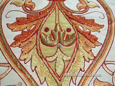
This is the central part of the fragment, and the main part of the design. The silk embroidery on here, with the exception of the bright red cord-like outline around the gold parts, is tambour work. The colors are not bad overall. The rust-to-gold progression works, as does the darker burgundy outline around it. Looking at the piece up close, the bright red around the gold doesn’t quite fit, though.
From far away, this brighter red would perhaps make the goldwork stand out more, but for some reason, in my eyes, it cheapens the piece.
The background behind this center area is an appliquéd fabric that has some texture to it – it’s like corduroy, almost, only out of a finer fiber (maybe silk?) alternating with a gold thread between the “bumps.” We’ll go into this more thoroughly later. I don’t particularly care for the use of this fabric here, and I think the two burgundy dots above the goldwork element in the center are unnecessary and distractive to the design.
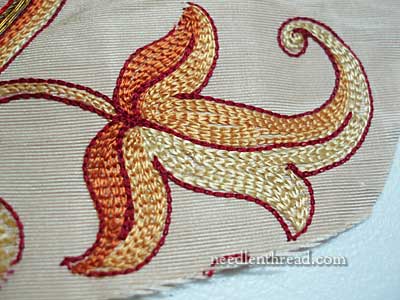
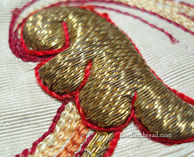
You’ll notice that the tambour work on the outside of the photo looks like the normal chain stitch, but inside, on the “leafy” parts of the design, you can see that the stitch used is slightly different. It has a bit of loft to it, kind of like punch needle embroidery.
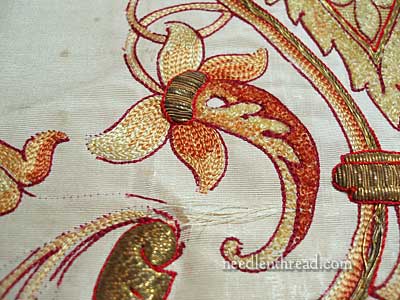
You can see in this element of the design the combination of regular chain stitch tambour work (on the leaves) and then that fuzzy stuff going on in the long central “bud” part of the element.
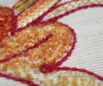
There the fuzzy stuff, up close. It almost looks like a collection of little knots, but up close (and I’ll get closer a little later on), it’s more loopy than knotty.
The areas on the fragment that have this loopy stuff going on are much more worn than the areas of just plain chain stitch. The loopy stuff, stitch wise, is just not as secure as chain stitch, plus the nap of it exposes it to rubbing and wear more readily.
The tambour work on this piece is not nearly as well done as the tambour work on this piece of embroidery. There’s quite a bit of overlapping and gapping on this piece. From far away, of course, the color is there, so it looks ok, but when you get closer to it, the attention to detail and precision is somewhat lax.
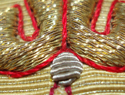
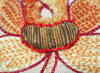
Now, a bit on the metal threads. Flatworm is used in the piece, and it is used over card padding (you can see it above, surrounded in bright red). This card padding approach is a pet topic, so we’re going to go into this more thoroughly, and I’ll actually take a piece of this apart for you to see inside it, and to see the stitch structure.
Then, there’s this one little dot of silver purl. That’s the only silver on the piece. And it looks original – no evidence that it was some kind of replacement or repair. It puzzles me.
And there are a few other areas of goldwork that feature purls, both smooth and check. We’ll take some of those apart, too.
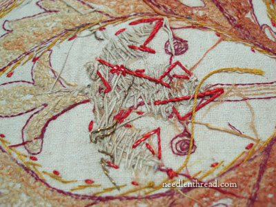
The back always tells a tale. We’re going to cut this whole area apart.
Here’s another example (a nice example) of the flatworm, worked over padding. We’re going to cut some of these open, too.
So, that’s a brief look at the fragment. Next time we visit it, I’ll have a full photo for you, with measurements, some conclusions on what the fragment is from, and we’ll start taking it apart!
I Love this kind of stuff. I especially love it when I don’t feel guilty taking a piece apart! This is a piece that has little value whole, but can reveal some interesting things when dissected. And it’s Much Better than dissecting frogs!
If you have any questions you’d like me to explore during the process, feel free to leave a comment below and ask! If I know what you’re wondering, I may be able to capture answers for you with photos.
A swell Friday to one and all!
I’m very intrigued and look forward to the dissection.
G’day there Mary,
How very intriguing. All the where’s and why-fore’s you’ve mentioned certainly made me look at the piece with my mind’s eye, and wide open at that, instead of just with my ‘look it over a bit’ eye.
Was wondering if I was in the right classroom for a bit. Thought I might have strayed into the practical science one as had the frogs on my mind too, before I got to your comment on the same!
Looking forward to the scalpel treatment. Yes, I’m intrigued, and it’s all your fault! : )
Cheers, Kath.
Oh…we’ve well and truly jumped back into winter here in NSW. A lot of snow, wind, ice, rain and freezing. Roads closed with snow on the Blue Mountains and other places. Mid winter, yes, but mid spring catches us ‘underwears’! We don’t get snow just here but get the wind off it. I grew in a snow area.
The silver purl dot looks very silver, not tarnished. And a lot of the gold is still fairly gold-looking too. Any ideas of the age of this piece? It seems as though it must be rather recent for the metals to retain their colors.
Mary, I just have to say that I have learned SO much from this blog! You are a wealth of information and your blog is a treasure!
The tambor work, fluffy vs. chain looks very interesting. I am wondering if the fluffy part is just regular chaining “un-done” that is the chain unlooped from the other stitches.
Perhaps there was more silver on other portions of the embroidery, not included on this fragment?
I look forward to this experiment, even though even taking apart a worn piece like this hurts a little.
Jane
I am not sure if it’s ugly, I think it’s just very traditionally Chinese although I agree; the choice of background color and fabric is poor.
I am dying to see you dissect it, though. I am really looking forward to it.
Oh Mary, you are too much of a tease…let us see the whole thing. I have to see as entire piece before I can pronounce it ugly; although the colors are not my favorite (I’m not really into the cream/orange/red family so much).
Hmmm? provenance? The parts you are showing look fairly commercial if not professional, European or Indo/Asian for the Euro trade? I see you tagged it ecclesiastical – age anywhere from the late 18th to 20th c? …I guess if it’s destined for an autopsy – then snip away and keep us in the loop. Looking forward to ‘the rest of the story’!
The “fuzzy stuff” almost looks like places in the other examples where the gold has worn away and only the core is left. Except, on this piece the loops are farther apart. Is it just pulled through with the tambour hook? If it’s not anchored down, no wonder it is coming off.
I look forward to your taking it apart and commenting on what you find. It can only improve my work.
Hi Marymentor:
I agree, this is not aesthetically pleasing to me at all, technical expertise notwithstanding. Jeez, the first picture looks like an orange rendition of Santa Claus or a very old Jack Frost. I think the colors are too harsh. But then again that’s just me….well….you did ask . 🙂 :-)….Judy in Pittsburgh.
It looks like a face in the middle, with a silver nose and the two eyes above. It is a shame that the design is poor, as the stitching looks pretty good, except for the tambour work.
But a great piece to take apart and study.
I think the fabric must be silk faille.
Although I am constitutionally unable to dissect an old piece like this, I am looking forward with great interest to the results of your scalpel-wielding. These aren’t my favourite colours either but apart from the red outline cord, the whole thing doesn’t look too bad to me.
Do you have a date for it? As you pointed out none of the metals look particularly tarnished which points to its being newer rather than older, but it would be nice to know when and where it was made – oh, and why, of course.
Anticipation…..
Hi Mary,
Stand back fellow embroiderers – the design is “The Green Man”, the dots are eyes, then see the mouth beard, leaves growing from the face etc. I suggest that the design is from Renaissance Italy but worked its way up through France to England.
Please leave it whole – even if you don`t love it someone in Europe might!
Best wishes and well done for opening up this informed discussion,
Phillipa Turnbull, UK