


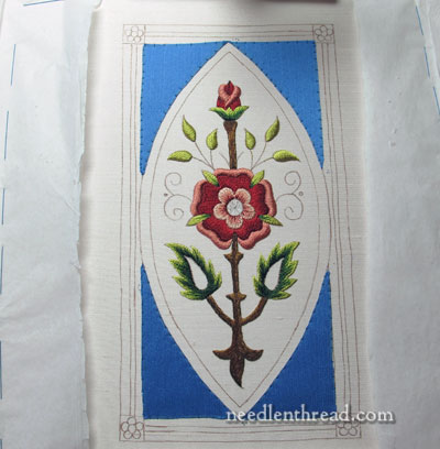
It’s been a little too long since we visited the Mission Rose project. Last time we looked at it, we were discussing the question of whether or not it was a mistake to appliqué blue silk into the corners around the central marquise shape.
Opinions were really divided on the addition of the blue! I’m glad, because that means that you feel comfortable expressing your needlework opinions on Needle ‘n Thread, which contributes to that sense of community that a blog is all about – we can discuss needlework things, and we can even have divergent views on this or that approach, but we still go forward.
In the long run, the whole Final Decision thing still falls back on me. Darn! It’s one of those situations where you can please some of the people most of the time, and most of the people some of the time, but you can’t please all the people all the time. Right?
But I am going to ask those who don’t really like the blue – those of you who are scratching your heads, raising your eyebrows, and wondering about my state of mental health – one big favor…
Give it time! It might grow on you!
This portion of the design is not completely developed yet, and you’re not seeing the finished result. You may never like the blue, and that’s ok! But try to keep an open mind until it’s completely finished.
That, in fact, is what I’m doing. I’m “waiting to see.” I like the blue ok, but I’m not 100% sold on it. I think it’s going where I want it to go. But it has quite a way to go before it gets there!
So let’s talk a little bit about the technical side of this appliqué stuff.
I’m using a beautiful blue (the pictures don’t do it justice!) silk from Japan that a friend sent to me from his travels abroad. The silk has a wonderful body – it is not limp, but crisp. It’s not thin-thin, but it isn’t thick, either. Just like the itty bitty baby bear’s porridge, it’s Just Right.
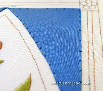
Before tracing the shape of the appliqué onto the silk, I ironed a fusible interfacing called Mistyfuse Ultraviolet to the back of the silk. You can find some good information on how to use Mistyfuse on Sue Bleiweiss’s website, here.
Because Mistyfuse is a paperless fusible web-like interfacing, I used parchment (Reynold’s parchment, straight out of my pantry) to cover the Mistyfuse when ironing it onto the fabric. I fused the Mistyfuse to the back of the silk, and then I traced the pattern onto the silk. Then I cut the shapes out, just outside the tracing lines. The interfacing helps keep the silk from fraying and from shifting during the sewing process. Please note that the silk is not fused onto the embroidery ground fabric! It is tacked on with tiny stitches.
To sew the appliqué in place, tack all the corners, stitching from just outside the appliqué (on the ground fabric) to just inside the appliqué, about 1/6th of an inch in. Once the corners are done and holding the piece in place, work these tiny stitches perpendicular to the appliqué edge all around the shape.
By the way, if you think the blue is bad, see that yellow off to the left? That’s going on next!
Concerning the unfinished, raw edge of the appliqué, that will be completely covered. You won’t see the edge or the appliqué stitching once all is finished.
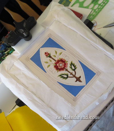
I was told recently that the rose looks like it is worked on burlap and it looks huge, because my pictures are too close up. So the photo above is to give you a sense of the size of the piece. The whole project is not very big! But I think the close-ups are necessary, if you really want to see how the actual stitching is done.
What’s Next?
Next is the preparation for the goldwork! And I will show that to you in a couple days. Once the prep work is done for the goldwork, I think we’ll all have a better idea of how the blue works in the piece.
More coming up! Stay tuned!
As usual, questions, comments suggestions? Have your say below!
If you’d like to follow along with the Mission Rose project from start to finish, you can find all the articles relating to this project listed in chronological order on the Mission Rose Project Index page.
I’m coming down on the side of liking it. It’s a beautiful blue and I can’t wait to see what you do with it. (Very curious about the yellow as well!)
Thanks also for the Mistyfuse information. I hadn’t heard of it, but it sounds useful.
The BLUE is the perfect choice – the absolute foil to the combination of colors in the motif. It now looks even more stylized just as you said. Very pretty. I agree that the close-ups are a MUST. It is a huge part of your sharing, right? Don’t stop the close-ups – Mary! As for the yellow thrown in there as a teaser- we all know that it is the base of your Goldwork and will get covered over by Karats…Can’t wait to watch the progress.
🙂 You’re absolutely right – it will be! But I love it when the yellow felt is in place, without the gold on it. It’s like an idea that’s beginning to form that you’re really excited about, even though you haven’t worked the details out yet. ~MC
On seeing your work I immediately liked the blue addition to the “Mission Rose Project.” The yellow to the side frightens me a little. However, it’s clear that there’s quite a bit more to be done on the project. Since I’ve found no reason not to trust your judgement, in embroidery, I look forward to seeing a magnificent, finished Mission Rose Project with the glorious yellow complimenting it so well.
The blue, to me, is a beautiful color, very clear and not too bright. Now that you are adding the yellow, I am convinced you are headed in the right direction. What could be wrong with a red-yellow-blue color scheme? For me, the important thing is the relative quantities of each, with one dominating and one only a small accent.
Mary,
I am not an embroiderer, per say, but a quilter. However, I must tell you how much I enjoy your blog and website, and how beautiful your work is. I really look forward to your posts and love watching you develope your projects. Thank you so much for sharing your gift with us.
I am thinking that the blue is fine. I mean roses appear in front of the sky, blue, grey, cloudy, or sunny every day. 🙂
Wow – what is Mary going to do with that yellow fabric?? Can’t wait to see!
What I really like about the idea of applique on embroidery is that it gives depth and interest to the piece. Also, it combines needlework skills and takes the work to another level.
After all, we do embroidery to express an artistic view in our mind with our needles.
I have a wonderful pair of old embroidered pillow cases, probably done in the late 30’s early 40’s, showing a lady with a parasol and full skirt walking in a flower bed. Her skirt and parasol are appliqued with fabric and lace. Every time I look at these I think of the embroiderer who wanted me to know this woman was walking in the garden and her embroidery was not just a flat picture of a woman and flowers – it expresses her command of needlework skills.
In my mind I see your Mission Rose piece as a glorious stained window. I am so anxious to see what you do with this!
Paula,
I to see a beautiful stained glass window every time I see this piece. Have to say I wasn’t sold on the blue at first, but like it much more in the “stand back” shots. 🙂 Can’t wait to see were the piece goes.
*too
Hi Mary,
I think the blue is just gorgeous. It is the perfect blue for your palette on this piece. I don’t think your fabric looks like burlap; in fact, in that first picture today it has the sheen of silk that seems to be missing from the blue fabric. lol It is so hard to capture the exact sheen of a fabric. And that true blue color is REALLY hard to get right. I tried and tried to get photos of morning glories to come out their beautiful cobalt blue color and they always trended very purple.
I think it looks terrific!
Susan in Texas
Honestly, I like the blue. It’s not a direction I would have imagined but it brings some life to the piece that the stem was tamping down. Those elements balance each other and really let the pinks in the rose glow.
I thought the blue was a bit of a shock at first, but the more I looked, the more I liked. I suspect it will be the same with the yellow. After all is done, I’m sure it will all work well together.
Regarding the photos, I love your closeups because they *do* show the stitching so clearly. Occasionally I wish there was something in the closeups as reference to the size of what your showing. But please don’t compromise the quality of your close-ups for that!
Laura posted her comment about the yellow as the base for the upcoming goldwork as I was writing my comment – now the yellow makes sense! I’m not a goldworker, so I was wondering “where is that going to go?!”. Now I understand
I think your Mission Rose will be beautiful. How will it be finished? Will it be framed?
Mary, Please do not use the yellow!!!!
The blue, I think makes the mission rose POP.
It’s Just beautiful the way it is.
mary I really enjoy your e-mails so much.
Thank-you For all you do.!!!
Oh, My, Mary, that blue silk is just right. It allows the different shades of reds and greens to shine with no one color or shade being too dominant. I’m sure nothing would have worked as well as that color and shade. I’m still waiting with baited breath to see what you do with those Dr. Seuss-like leaves, as you so appropriately called them.
Hi Mary; i can’t say i like the blue all that much but as i know how you operate, i’m expecting a very high standard from you. i look forward to seeing how you use goldwork on the blue….
i really like the way the mission rose is working up too!!!
my “tudor rose ornament” is in a holding pattern as i am re-thinking the fabrics and looking around. also thinking about doing a compansion ornament of the mission rose, but the fabrics are still the hold up.
Love the blue, am excited about the yellow. But then I’m a quilter – I go for the bold.
I love the blue! The yellow looks a bit intense though. Can’t wait to see what you do with it.
Jo
Durham NC
I still love the blue. If the real color is any better than what I see on my monitor, I think I’d cry. It’s the perfect foil for the shades of pink and red. Can hardly wait to see the gold work!
Good Morning Mary,
I didn’t like the blue at first but it is sort of growing on me. It will be interesting to see how the yellow fits in. Looking at the embroidery from a bit of a distance does help to see the overall composition. The next time you show a photo, could you please put a ruler or a quarter next to it so we can get a sense of scale?
I think the blue gives the piece a stained glass effect. I can’t wait to see what you do with the yellow and how you finish. Diane
Dear Mary,
agree with everyone; it is a beautiful blue. Just think that it overwhelms the shades of the embroidery.
Michael
I for one like the blue and cant wait to see how the vibrancy of the yellow will be used.
I love the blue! I’ve been a watercolor painter for some years and love to work blues into a painting. I think this choice really jazzes up the Mission Rose project. I have noticed that many of my friends are afraid to use bold colors when redecorating and I always tell them, “try it, you’ll love it”.
Mary, I think the blue silk is absolutely beautiful. It makes the rose embroidery really pop. Can’t wait to see your finished product!
Hi Mary,I have been following your Mission Rose project and loving the passion you put into it as you put into all your work.The blue was unexpected but appropriate.Love it.
You talked about a magnifying lens you put over the spectacles sometime ago,can you please tell me where to get them .Sorry for using this space .
Hi, Rasheeda – Thanks for your comment! They’re called “CraftOptics”. Here’s my article on them: https://needlenthread.wpengine.com/2013/04/craftoptics-so-you-can-see-the-details.html They actually don’t fit over your present spectacles. They come with your prescription set into the lenses on the spectacles. Hope that helps!
~MC
I like the blue. I think it brings energy and drama to a very old motif. I can hardly wait to see the yellow. Another triad of color. I think I’ll still prefer the blue.
I love the blue in the long shot. It was looking a bit too contrast-y for my taste in the closeups, but looking at it as you would once it’s hanging on the wall makes a big difference. A good reminder of a good tip with all your stitching – set it against something and step back to think about it before you take drastic action!
Okaaay….I think my problem is basically a personal preference for muted, rather than primary colors…That said, Mary, I have all the confidence in the world that you are going to pull this thing off. The stitching is beautiful. All I can say is please don’t stop now! I’m definitely looking forward to the bling thing stage!
Dear Mary, I follow all your posts.I really like them very much.I try to learn different stitches .I think blue applique suits the mission rose embroidery.I look forward to the gold work part.Thank you for sharing all these. Nermin from İstanbul,Turkey.
I think the blue surrounding the Mission Rose is stunning and really sets off the design. It makes it pop!
I like the blue. It gives an elegant and royal feel to the entire piece.
Maary:
I love the blue, just sets it all beautifully although I am not so sure about the gold, maybe that will grow on me when added. The piece is lovely and I would be happy to have done one just like it. Congrats!!!!
The blue is a fabulous colour choice to frame the rose – if just a tad ‘solid’ looking at this point. Of course that may all change… Look forward to see what happens next.
I love that your pictures are such close close-ups, because it does make it easier to see exactly what is going on. That said, I like it when we see the whole of the project, even when it’s still in progress, because it gives a better idea of the scale.
And as always, thank you for sharing your knowledge so generously with us.!
this is beutifull. Your work is perfect.
The blue looks very pretty to me. The perfect choice!
I haven’t ever commented on any of your posts even though I am an avid reader. However, I just had to comment on the blue silk applique. Even at this stage of the stitching, I think the blue adds depth to the piece and really brings out the colours of the rose. I am really looking forward to seeing this piece finished.
Loved the blue from the start. This is like watching that painter on public television – everytime he started to add something new everyone would say “oh don’t” but then once it was added the painting was the better for it. Keep going – love watching it all come together at the hand of a true artist & not just a copier of art like my stitching is. I applaud your creativity & enjoy these daily glimpses into your work.
I LOVE the addition of the blue! Both the color and texture really ground the design and complement the colors of the rose. Watching this piece come alive is quite a stitching adventure! Thanks for sharing your journey!
I wasn’t quite sure about the blue, and now there is the bright yellow! I have realised that you have a picture in your mind of the finished project. On the other hand, we do not, so no judgement can be made till the project is further on, or finished.
I think the blue looks good with the Mission Rose and I can’t wait to see the yellow with it.
Mary,I love the blue: like others have said our reminds me of a gorgeous stained glass window, with clear jewel-like tones. I have 2 minor questions: when tacking the corners of the applique, do you join & end the thread on every corner, or do you run the intact thread across the back? (our should I be taking a hint from the word ‘tacking’-& realize those corner stitches are just temporary, so it doesn’t matter?) Also, as to size of this project: what is it’s approximate length from top to bottom? When viewing the close -up shots,I thought the entire project was much larger than it appeared in this latest view…
As always, thank you for your artistry,& your willingness to share with us!
Hi, Amanda – On the pattern page, here: https://needlenthread.wpengine.com/2013/04/mission-rose-embroidery-pattern.html, you’ll find the details of size. It’s 7.5″ tall and about 4″ wide. If you print out the pattern and choose “no scaling” or “print actual size” in your printer options, it should print at the correct size. When doing the corners on the appliqué, I cross from corner to corner. The stitches stay in. The thread on the back will eventually be covered by the other stitches around the appliqué and with the rest of the embroidery stitches. Hope that helps clarify! ~MC
My first response was “Oh WOW!! It really makes the rose pop. Gorgeous!” But I will have wait for the final product for my final opinion. Yellow silk with that glorious blue? Hmmm. Will have to wait and see.
LOL, I think the only mistake you made with the applique was suggesting in the last post that it might be a mistake! I have not checked in for a while, but I immediately liked the applique and the marquise shape on this project when I saw it today. It elevates it dramatically!
Trust your instincts and keep going!
This is beautiful. I LOVE the blue I think it
sets off the whole piece. Theresa
Well, it’s finally done! I’ve loved seeing the progress…thank you for sharing the project!
The blue is perfect! Thank you so much for showing us this method of using fusible interfacing to stabilize silk before applique. I have a project planned using a dupioni silk applique (in blue! imagine that!) and this method looks perfect for it.
Is the Mistyfuse product you recommended comparable to Pellon fusible sheerweight? http://www.shoppellon.com/products/820-906f-fusible-sheerweight.aspx
Hi, Cynthia – I haven’t tried the Pellon sheer weight, actually, so I can’t compare the two. I would imagine they are somewhat similar…. maybe someone else out there has tried both? Anyone? ~MC