


Last week, we chatted a bit about embroidery ground fabrics, thread types and colors, and stitch choices.
After preaching so enthusiastically on the subject of trying something different, I did try to break out of my Color Comfort Zone.
All I can say is… it’s ain’t easy!
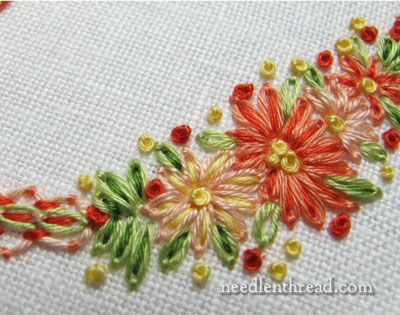
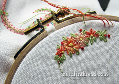
The photo above and the photo below represent well-loved inhabitants of my Color Comfort Zone.
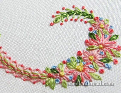
Any similar colors and shades to these get along quite well in my Color Comfort Zone.
I find them fun to play with, easy to mix up into different stitch combinations and so forth. I don’t really have to think about them – I reach for them, and everything just sort of works out. I like them. They like me. We’re good together.
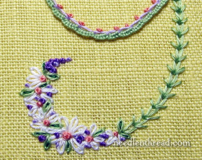
This is most assuredly not my Color Comfort Zone. I find myself muddled, fumbling over what colors to add here or take away there…what colors to mix for this combination or that group of stitching.
I find it slow and laborious to work outside my Color Comfort Zone. It’s more difficult to be profuse with my stitches. I don’t feel nearly as free and easy as I go along.
I’ll tell you a little secret: everything outside my Color Comfort Zone takes on the characteristics of a color nightmare. Colors outside my comfort zone loom like… like… a big purple and yellow Stay Puft Marshmallow Man!
But then we come back to the Comfort Zone, and ahhhhhh. Happiness abounds.
All that being said, the discomfort of breaking out of my Color Comfort Zone doesn’t necessarily deter me from doing it. After all, that’s part of the adventure!
What about you? What’s your color comfort zone? If you try to break out of it, what do you imagine would be the complete opposite of your color comfort zone? Do you find it difficult to stitch outside your color comfort zone? Do those difficulties deter you from trying something different? Feel free to leave your comment below!
I’ve noticed I tend to be drawn to the cooler end of the spectrum–blues, greens, and purples. Especially blues. And more jewel and earth tones than lighter colors. It’s something I want to challenge in myself, because I do love all those other colors too–I just seem to skip right over them if I don’t catch myself.
I love these groups of flowers and swooping lines. Am I right in thinking they look monogram-y?
Dear Mary,
When I read your blog I suddenly realised I don’t have a colour zone 🙂 I gave it a long thought and came to the conclusion with needle painting you love all the colours equal. The simple reason for this you need about all the colours of the colour spectrum to mix and match and blend to get the required effect. All I would admit too is, I love colourful birds 🙂 xxx
Elza from Cape Town
Hi Mary,
I am a purple person and many of the things I stitch and collect are purple. Even my hair has a purple tint. When I change colors it doesn’t upset my world, but it tends to rock the world of my friends and co-workers. They will mention that it is not purple and ask if I am okay? I love to play with color and I am glad to see you wrote on the subject. So many people are afraid to change the color that the designer had suggested.
I like your ‘comfort’ colours, Mary. They remind me of my grandmothers’ treasured afternoon tea sets – dainty and delicate. and they are perfect for those floral initials.
I think everyone has colours they tend to pick or to avoid. Our colour choices are part of our personal style and taste. But there are ‘scales and exercises’ with colour that can help widen our options and give us confidence in making colour schemes work. Playing with coloured pencils or pens on paper is a great way to experiment with a scheme before stitching, so you can get the balance right and put the contrasts and harmonies where they will be most useful in the composition.
I love to challenge my colour prejudices! I am naturally drawn to “quiet” colours, and would tend to tone rather than contrast if it was up to me. But a while back, when I was making some jewellery, I decided to start challenging myself and trying out whacky, and even RANDOM colour combinations. this was inspired by my 5 year old son, who loves to make jewellery with me and has a strategy for beading that he prefers, I call it the “symmetrical magpie” technique. He delves in my bead box and pulls out all his favourites, in all colours, shapes and sizes. Then he threads on about 10 of them, in a random order. Then he makes a mirror image of the sequence to complete the design. He really does choose the wackiest beads, but you know what? it nearly always works! I get complimented on one in particular, the one he made me for mother’s day, which is red rose shaped spacers, lime green miracle beads, purple glass and the odd yellow rocaille, with a red/orange crackle bead in the middle. I wear it a lot, and not just because I am being sentimental (that too!). It has inspired me to be more adventurous with my colour choices in general, with just one rule – balance it. So you get a pleasing, almost picturesque, distribution of colours. If I’m doing a “serious” project, also try to ensure I have some neutrals in there and take an inspiration from nature. Nature is not constrained by the colours that “go well” or create a certain “mood”, but it does favour greens, browns, blues and whites as the background or majority colours, and they help to focus on a feature colour and stop it feeling too frenzied.
True! One only has to look at a flower border, pref one with butterflies visiting, and see just how much colour can go together without the least suggestion of offence to the eyes!
Hi Mary,
Thank you for your site I look for your updates every time I check my emails.
Wow what a “wake up call”, I never realised that I’d gotten into the habit of ‘Comfort zone colours’ it was just natural for me to grab the colours and get going on my project. Sooo, this time I to have gone outside my ‘norm’ and oh boy talk about slow progress, I’ve had to write everything down (what stitch is with what colour) whereas normally I just know. Certainly a mind expanding exercise.
Now where is my comfort box, I need my fix…*sigh* happiness =)
I am an earthy girl. Any color from nature is for me, be it FALL colors! I am doing my best to try and come into the light of sprain and summer. Brights, lights and pastels. Yikes. ;D
Mary;
I find the color comfort zones interesting. I hear ladies talk about this all the time. I tend to stay away from loud colors. But then there are times when I love them! Usually that is when I can use them with another single color like white or black. When I am using paper, fabric, or thread it is the same. I love pinks, muted greens, browns/tans, blues and purples. Red has it’s place as does yellow and black. Perhaps color being an energy wave speaks to our own energy wave–just a thought. Thanks for talking about this subject as many people think they are odd and don’t understand that it is pretty common. C
Browns and grays make me groan. I love the sample that was outside your zone; I’d add medium lavender straight stitches inside the white lazy daisy stitches and a little more dark green to the leaves. Years ago there were consultants helping women determine their color palettes based on the seasons. I’ve found that analysis to be accurate for me in clothing, decorating and stitching. I’m drawn to rich glowing colors and repelled by dull muddy neutrals. When I buy embroidery kits I often change the colors of thread or ribbon to make myself happier while stitching.
Funny, Nancy! I just spent the last hour doing exactly that!
To be honest, I don’t know if I have a colour comfort zone or not. Perhaps someone ‘in the know’ could have a look at my projects on my blog’s gallery pages and tell me what they think!!=) Having had a look myself I can see that, apart from pale, neutral and black backgrounds, the only colours I tend to use are blues and greens/green-browns (for a natural look), but there are pink, lilac and red in counted thread work and I have a piece of yellow slub silk I’m longing to add some glorious florals to! As for threads, I use whatever the subject requires. – I *think*!
Having said that, colour is extremely important to me and I’ve spent an hour or more this morning on the Pipers Silk website selecting all the shades I want to enlarge my collection, but still sending in enquiries about certain blues…!!
you know i definitely have a color comfort zone and yes, i continually return to it. it is yellow, all shades, green, all shades, white, and gold, both dull and metallic. i also love white denim to stich on. and there you go. i just love it and don’t venture outside of it all that often, unless i’m doing something for someone, such as my daughter, who loves, red, greens, burgundies, golds, then i do what i know the person loves. thanks mary, again, for making me think about stichery, what i love, why i love it, it just enhances my interest even more.
lyn
I admire your colours, Mary, but your comfort zone is uncomfortable for me.
I like cool colours – blues, purples, green and some pinks, all the ones you are not happy with – I seem to be like Rene S.- however, have found that I can switch my zone a little with Temari, because one can go to town with any combination, unlike other embroideries.
Thank you Mary, I look forward to your thoughts, experiments and ideas. Peggy
Hi Mary, how about using the books on colour by Trish Burr,? Would that help? I am a soft autimn when it comes to clothes and colours to pick and I find it hard to pick colours that are not from my palette. But basing my colours on a gorgeous printed fabric always does the trick for me. I ilke to see what the same design does on white and on black, using the same thread colours. Totally different project!
When teaching, I challenge each student to use a thread and color outside their comfort zone. Sometimes it’s like pulling teeth. Some like it, some unpick, bit it’s always a good lesson.
Unfortunately for me, all colorways are scary. 🙂 I have no sense of what goes together. So I either duplicate what someone else has done with a pattern or if I’m very brave, I’ll try to look at a flower or floral arrangement and choose their colors. Also, going to the fabric store is a big help. Someone else has already done the work and I pick a fabric I like and use those colors. I’m always impressed with what you do.
Mary: is this pattern available or something similar? This seems like it would be fairly easy for a beginner like me. I love the colors also.
Thanks, Mary
Hi, Mary – Thanks for the question! Right now, I’m just working up the samples, but as soon as they are finished, yes, the instructions, patterns, etc. will be made available. It will take at least another three – four weeks to finish it all up. ~MC
HI Mary!
I, too, have the “best” colors I love to work in.But I recently started adding a touch of blue-red here and there as an accent….and I like it! It really sparkles up my favorite blues.
So, how about adding a few purple french knots with the orange, or a white accent with the yellow flowers? As Dorothy in the Wizard of Oz, says “Just ease on down the road”….and maybe you’ll find you like it.
What stood out was you changed not only your comfort zone colors , you changed color of your embroidery material. Too many changes at once. Try only one change at a time I believe that will be more comfortable.
I am most happy with shades of blue and more subdued tones. I can stay in my comfort zone with my embroidery, but not with quilting. I make a wedding quilt for each grandchild’s wedding present and have them pick the color scheme. This has sure jerked me out of my comfort zone at times. One couple requested red and black. One wanted teals, oranges and yellows, with no floral fabrics at all. The latest couple wants white and cream. There are some color combos that I would object to, like using that neon acid lime green with yellow and purple, but for the most part it’s a good thing to try something different.
Dear Mary
Like you my colour comfort zones are reds, yellow, greens, browns and all pastel colours. I find blues and similar colours the complete opposite and difficult to work with and outside my colour comfort zone. But it doesn’t deter me from trying something new I recently completed a Guardian Angel which required using blue thread and I did not enjoy embroidering with blue and considered changing the colour but I kept to the original colour, although I was glad when that part had finished. Thanks for the reflection.
Regards Anita Simmance
Stay Puft! You absolutely crack me up with that one. I now have visions of the ghost busters being covered with, instead of mounds of white, but now mounds of purple and yellow! Truly though, a lovely dark, almost eggplant purple looks beautiful with a rich, golden yellow decorating it. So maybe Bill Murray et al. will not look so silly in my mind, after all.
I, too, am uncomfortable outside my color comfort zone, so I rarely go out of it. If it isn’t fun, why do it? Commissions, however, are a different story – then I am only working someone else’s ideas, so I grit my teeth and get on with it. I don’t have to like it, just the party I am doing it for. Love the new Little Things book!! I am so glad I have it. Thanks for all your hard work, so many of us are very grateful, indeed!!
I love peaches, pinks and reds with greens or blues. Really like you say your color comfort zone is 🙂 I only use purple in small accents. Kind of like you find in a garden. In my stitching or quilting I find I don’t enjoy it as much when I get a request for something “purple or black” I definitely like to work with my favorite colors.
I love striking,lively,fresh colors in all the hadwork I do, especialy if I have to work on something that I feel it’s dreary (crazy quilting group’s blocks) I love blues and greens, purple is my favorite in all its shades, so I tend to go for those.
I wonder why you go for colors that are not your favorites if you have trouble with their combination?
Yes. I’m a “blue” girl in my Color Comfort Zone. Say it for bluebonnets since I live in Texas!! I go from grey to sapphire and back again. Maybe I can be forced to add a little yellow in my flowers faces, but that’s it. Red, black, orange – I don’t go there without getting grumpy. Love all your exhibits and work. I’ve only been receiving your newsletter for one week and it’s super. There’s just not enough time each day to do all this wonderful handwork I love.
Dear Mary
Like all others I live in my comfort zone too. A hint given to me about colour. Those wonderful people that design patchwork materials make all colours work. Pick your base colour and visit the local patchwork shop. A material with that base colour would show what others would work with it. It does make it more fun to explore outside the known world.
I think color can be one of the most stymying challenges to any project. When I see a pattern, I usually try to emulate it as closely as possible to the color if possible unless I have something specific in mind. Someone has done, or computerized a mockup, the project in the colors, textures, patterns and apparently it was appealing to at least me. I hate to deviate and then be sorely disappointed. I know I avoid greens like a plague. Nature is full of greens yet I do not tend to use greens unless it is for trees, leaves, grass – obvious, obvious things. Even in making quilts, I would be hard pressed to find green in a quilt except for a little in a print, probably a floral and the green is a stem, a leaf, etc. I know from whence the distaste of green comes and it obviously it still haunts me. Gold is a very close second for the same reason. As I age I am becoming more tolerant of more shades. Yet, I agree when I am working with colors with which I am less comfortable, it takes me longer. I even have trouble going back to the project. I just don’t have the comfort level to continue and have to push myself to continue. I think it is a lack of confidence in embracing my creativity and spending time to have what I consider a failure. A couple of months ago, I took a Free Mothion Quilting class with my best quilting buddess (we have taken craft classes together for over 30 years). I thought her quilting was much, much superior to mine. She showed her samples to the other ladies at our small stitch group. I would not have dreamed of doing that. Yet, a few weeks ago, I pulled out my samples and mine were not as bad as I had initially thought. I am my own worst critic. Thanks for the encouragement to try some new things. No matter our age or our experience, we can learn. I was thinking about my fear of having a failure in crafting – I would not have had that fear in my professional career. I had confidence in that ability. Of course, I had some negative feedback about a project and it is still in the attic unfinished probably 25 years later. It’s a king size hand pieced and partially hand quilted quilt.
Dear Mary, I tend to pink with green and red but I’m doing Allie Aller’s crazy quilt course that is challenging my concept of colour and I’m enjoying new colour combinations. One pale pink feather stitch seam has morphed to being wrapped with lilac, embroidered with dark grape and red brick french knots and having tiny black beads as fruit. Somehow it works and enhances the whole work but I didn’t reach for those colours initially! Perhaps I might need to “up” my supply of purples.
Mary – You should get Joen Wolfrom’s
“Ultimate 3-in-1 COLOR TOOL” (Updated 3rd Edition) This will expand your “comfort zone” or color zone way beyond what you would ever imagine. She allows you to put colors together that you would think could not possibly go together.
You will be amazed. I use it all the time with my quilting. I think it would work with thread play.
For others…requests for a different color combination of a favorite pattern or additional colors …favorites of the requesting person.. I understand that others have favorites, too…and I accommodate and mostly it requires effort and discipline to finish…others are delighted however, normally I am very glad to be done with it! I really do not care for most of other peoples favorites…then, an unlikely color combination with a different pattern! and…a new FAVORITE is Discovered…then, I feel that I don’t know so much after all…really takes me down a peg or two and rewards me at the same time…try fail recover do it all over until another surprise!
This is such a personal thing. When I was a very small child visiting my grandmother (who had no colour sense at all), I was directed to wear a red dress and a pink cardigan. Even at age 3 I rebelled and said I would not wear red and pink together! There was also that old saying ‘blue and green should never be seen without a colour in between’. It worked until the 1970’s when colour exploded and one of the most popular combos was lime green and ultramarine blue.
My personal comfort colours are all the way around the colour wheel from red to blue-green. I don’t go for orange, yellow or green. Now it is difficult to do embroidery without at least the odd bit of green, so my compromise is for muddy, olive or khaki greens from light to dark. I rarely stray. I make a lot of crazy quilt blocks and they are almost always monotone. This year I have challenged myself to step out of my comfort zone and so far I have made an orange block, a yellow block and a green one. Next will have to be multi-coloured.
I empathise with the purple-lover; I tend to use lots of purple too, from red-violets to blue-violets in all tints and tones.
Sorry Mary, some of your faves leave me cold. But I have to admit they look pretty all stitched together.
I don’t think I have a color comfort zone. I like a variety of colors and color combinations. My discomfort results from work that is too busy. I admire the talent, but would never try a pattern that doesn’t allow the eye/mind space to rest.
Dear Mary,
I know what you mean! My comfort zone is pastel apricots, terracottas, celadon greens, green grey, more apricot, blue-green, aqua, teal, steel blue… Despite the fact that my clothing is in the warm range, with lots of red and cherry, I cannot find it in me to pick up a bright red thread! Nor lime, emerald, brown, purple. Shades of black, grey white, yes; baby pinks and blues, yuk! And like you, I am trying, and trying, but it is trying!
I tend to either do deep, non-saturated colours with warm greys and burnished metallics (bronze, old gold, pewter), or I go for bright, rich jewel colours with bright metallics to match.
Sometimes I do pastels, but I’m more likely to use cool pastels than pinks, and sometimes I use very bright colours on black for a neon or night sky effect.
I wouldn’t say anything goes. I’m not much of a girly girl, I generally have trouble working out what to do with pinks, and I’d be reluctant to do an entire sampler in greens and browns unless it had a specific earthy theme (more likely to put purple with green, really…)
People have told me I have a unique colour sense. That’s good, right?
Dear Mary i am very much impressed by the color comfort zone ..can u please share which all sticheds were used in this design ??. I want to do this design ! where can i get this full design??. Hope u’ll help me please!
viraja.
Whether in color choices or stitches or almost anything in life it’s easy to get into a false sense of security with regular habits, they feel comfortable just as you describe. It’s SOOO good for your brain activity to move out of your comfort zone and challenge yourself, often! Well done.
SAO PAULO BRASIL OLHA ADOREI SEU TRABALHO É LINDO VOCE ESTÁ DE PARABENS “”””””
UM ABRAÇO MADA.
I don’t mind leaving my comfort zone and make a right mess of any pattern I choose, then I read Mary and feel ouch!
Don’t like white, adore saffron yellow cotton, but my transfers get lost in the colour.
I know what you mean about a color comfort zone. I am currently working on hardanger bookmarks for a fundraiser next fall and am having a really good time coming up with new and different color combinations. So far, there haven’t been any garish combos, but there is still time! What is especially fun is seeing the thread and the fabric together before stitching, then seeing the finished product. It almost always looks great. I am becoming much more adventurous in my color choices. All it takes is practice. I tend towards bright colors, which can look a little “loud” if I’m not careful. But combining a bright color with a more subdued hue is working really well. BTW, I love your newsletters. Keep them coming.
I love these patterns that you’re stitching, are they available for us?
Thank you!
I totally understand the color thing, funny how after years I came to realize that I really seem to like purple and greens. Though I always say I don’t have a favorite color because I appreciate them ALL to some degree. ;^)
Hi Mary,
Would you mind sharing what type of thread you are using in the photos above. I’m making quilts for my granddaughters & I’m adding rick rack & trim where I want in preparation for the embroidery & beads. This is my first embroidery project & I’m not settled on what type of thread I should use. I have lots of DMC floss on hand that was given to me by my mother & that’s the only thread that is readily available.
Thanks, Jennifer
In these projects, I’m using floche and coton a broder, both of which are non-divisible cotton embroidery threads. You can substitute two strands of regular embroidery floss (taken out of the six).