Whenever I come across monograms for an I or the J (or is the J or the I?) in old publications, I mourn the absence of one or the other, or at least of one distinct from the other.
In old monogram alphabets, it is very common to see only the I or the J. The reason? It’s really because they can be substituted for each other, in most of the scripted monogram alphabets. Whether you use the offered letter as an I or as a J is up to you – it can work for either.
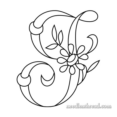
You normally can’t get away with substituting an I for a J or a J for an I in a block print alphabet, but if you look at the ambiguous I-or-J form above, you can see how it works for either in this style of lettering.
The original publication featuring this alphabet only offered the ambiguous I, so I doodled a bit to come up with a letter somewhat distinct from the offered one, to use as a J:
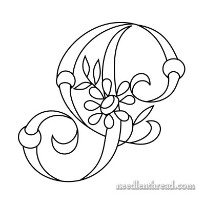
But the more I look at the letter above, the more I realize that it is ambiguous as well – you could use my J for the I, the I above for the J, the I for the J or the I, or just the J for either the I or the J!
Are we confused yet?!
In any case, if you want two distinct letters for I and J, here they are. You decide which you want for which!
Printable Monogram Patterns
Here are the printable pages for the I and J. If you choose “no scaling” (or a similar setting) on your printer, the letters should print at 2″, 3″, and 4″ high. You can enlarge and reduce them to suit your needs!
Daisy & Rings Monogram for Hand Embroidery: I
Daisy & Rings Monogram for Hand Embroidery: J
Favorite Monograms – PDF Collection
You’ll find this complete alphabet – along with 15 other decorative alphabets – all in one place in Favorite Monograms, a downloadable PDF collection of 16 monogram alphabets perfect for hand embroidery and other crafts.
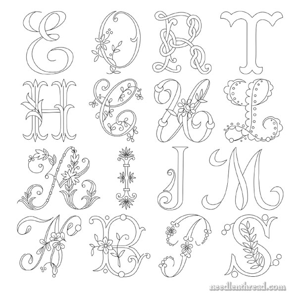
In the photo above, you can see samples of each alphabet available in Favorite Monograms.
Each letter in each alphabet in Favorite Monograms has been carefully traced into a clean line drawing that can be easily enlarged or reduced on a home printer or a photocopier.
The 16-alphabet collection is delivered as via a download link to your inbox shortly after purchase, so that you can begin creating right away! Priced at less than $1.00 per complete alphabet, monogram lovers can’t go wrong with this collection!
Favorite Monograms is available in my shop, here.


Dear Mary
The I and J Daisy & Rings monograms are very similar but pretty and as you say both can be used for either so if you know different people with the initials I or J you can switch between the two. Thanks for taking the time to create the J monogram and for the free Daisy & Rings monogrammed patterns they are lovely.
Regards Anita Simmance
Nice job with your doodling, Mrs. Corbet. 🙂
P.S.
I hope I’m not being impertinent, but when will you tell us what the letters were in that half monogram/half cipher from your post of days back?
Sarah
I have something slotted for later this week! 🙂
I’ll be honest and say that I thought you turned the I into a P, because that’s what it looks like to me in the last picture.
I do wish they had distinguished more between I and J in the old monogram/initial alphabets, because some of them just look way too much like one and not the other.
You know, I thought the same thing after I saw it online! It doesn’t quite look like the P in the alphabet. In fact, it looks more like a P than the original P!
Well. in the words of your newly-minted 4yr old fan, “Those letters are different!” LOL He’s still mastering his print. Anyway, I’m of the opinion that you’re I looks more like a J and vice versa. That said, LOVE IT!
Thanks for all the wonderful work. I agree with the other comments…I think the original letter looks like a “J” and the new “J” looks like a “P.” 😉
I’m terrible at graphics design, but a question/suggestion for those of you who are more artistic…would an “I” look better if you took the original letter, removed the curlicue on the bottom and replicated the top “bar” on the bottom right?
I think the “I” should either be a straight line, or a line with a top and a bottom mark. Actually I think the last letter looks like an S. I’ve seen some alphabets where the S looked similar. And, the first letter is definitely a J. Can you make an almost straight line for the I with just a circle around its middle?
Hi Mary
Thanks so much for sharing your workmanship and knowledhe. I love getting your emails through as I get very motivated by them.
I was really excited when I was reading about the BlueMax HD lights. I thought what you described would be perfect for my needs so I went online to order one. I emailed the company about the shipping to Australia and found that they do not ship to Australia at all. I was so disappointed as I am getting a little older and need good lighting more than ever.
At the moment I am using an Ott light, but I need something better, both in a desk and floor lamp. I have searched the internet and cannot find a supplier for the BlueMax HD lights in Australia. Can you or any of your readers shed any light on this?(pardon the pun)
Kind regards, Maria
Actually, at first glance your J reminds me of a P! Oh, well, it’s still a pretty design!
Mary I really need some help I am doing a wedding hankie. It is a Medieval R I had a stitch guide done. I am do one thread of silk lame petite satin stitch on linen and I do not no what embroidery needle to use. There are vine in the inside of the R and was told that I should use to threads of splendor and do the Reverse chain stitch this is a lot thinner then the R and I am worry about its thickness on little vines. also what embroidery needle what I Use. I am asking you PLEASE HELP ME! This is so improtant to me.
Thank you,
Sandra
Hi, Sandra – well, without knowing exactly what the thread is like, I’m not really sure. I don’t know what the Silk Lame Petite is, exactly – is that by Rainbow Gallery? I don’t use their threads very often so I’m not familiar with them. I’d probably get a couple combo packs of crewel needles and try various sizes, until you find the one that works for you.
Normally, those braid-type threads are meant more for use on canvas (for needlepoint) or for use in counted cross stitch on fabrics that have more “open” weaves. They’re not necessarily something used in surface embroidery and they may not hold up to passing through the ground fabric. Still, it’s worth trying, if that’s what the design calls for – they just require a different approach. So my guess is that you’ll need a bigger needle than you think you’ll need (otherwise, the braid will fall apart), and you’ll have to work with short lengths, because it will probably fray and snag a bit.
For the two strands of Splendor, I suppose that’s just two strands of spun silk, in which case, a #9 crewel needle should suffice.
Hope that helps!