


Remember last week when we looked at my first sorry attempt at embroidering the hummingbird beak? So many of you chimed in, echoing my misgivings about the outcome with the split stitched beak in dull browns.
I’m ever grateful for the feedback and the suggestions! I’ve said it before, and I’m sure I’ll say it again: you’re the best! What would Needle ‘n Thread be without you?
Following that first Beak Blunder, I undertook the battle for a better beak right away, and this is what I’ve come up with so far. Let’s see how you like it!
The first step: get rid of the split stitch in the dull browns. Every battle begins with a little reconnoitering, and, with embroidery, battles often include reverse stitching.
This was probably the Most Fun I’ve ever had, picking out embroidery stitches on a project. I had no qualms at all, snipping up those split stitches and pulling them out with tweezers. I went at it with lusty gusto!
And as always, when finished, I was ever grateful for the good linen ground fabric for this embroidery piece. There are very few fabrics that hold up to “frogging” (that’s picking out – rip it, rip it!) like linen does.

(You can click on the photos for larger versions!)
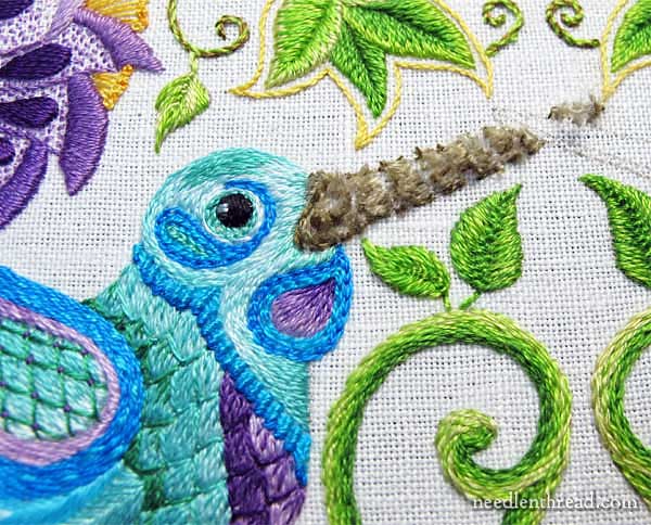
Then, using long and short stitch and working with shades of gray and the reds and corals on the flowers, I stitched in a new beak.
I know the beak is heavy – much heavier than what you’d expect on a hummingbird – but since the design is already drawn, I’m not going to re-draw this area and work in different beaks.
The grays worked out well, I think. There are a couple little areas I will touch up still, once I have the second beak in.
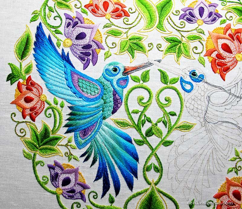
Here’s the beak in context with the whole bird and more of the whole piece, so you can get an idea of how it works with the colors in the rest of the embroidery.
And finally:
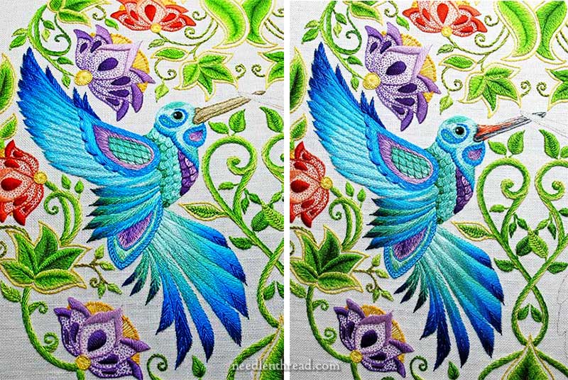
Here are the two attempts, side by side.
One of the areas on the new beak that I want to touch up is where the red graduates to a very light gray towards the top of the beak. The light color there is hard to see, and it makes the beak look as if it bulges out further down, so I’ll try to improve that with a well-placed sneaky stitch or two.
Overall, I like the beak much better. I think I’ll keep it!
My next step on the project is to embroider the beak and head on Bird Two. I’m embroidering the second bird in the same colors as the first and pretty much the same techniques, in hopes that Bird Two will work up much faster, since I already know where I’m going.
What do you reckon? Does beak two work better? Did you still have some other idea in mind for the color? What’s your take on it? Feel free to use the comment form below to weigh in!
If you’d like to follow along with the Secret Garden Hummingbirds project, you can find all the articles relating to it in this Secret Garden Embroidery Project index. The articles are arranged chronologically, so that you can follow the development from start to finish.
Hi,
Lovely! May I suggest a close-up photo of the beak?
thanks,
m
Hi, Maria – you can click on the photos above for much larger versions, where you’ll be able to see more detail!
Mary,
Yes, I like the “second beak” much better!
I forgot to mention you can click on the photos for larger versions!
I love the dimension the new beak has provided! Fabulous work,Mary, I can not wait to see the finished project.
Hi Mary
Well you’ve done it again. What a difference. I love the optical illusion that the red and corals give to the beak. Really a beautiful pièce of work! !
I like beak 2. It has more color and interest.
Have a super great stitching day!
It also has a higher level of contrast, which was a bit lacking in the first colour choice.
mooch beatah!
Mary that is just beautiful, very lifelike.
And how very reassuring to have such an accomplished stitcher unpicking. It makes the rest of us feel so much better.
Roma
Wow, at first glance I thought you had coloured it in, it looks so painterly. Absolutely beautiful.
Love your website, Marion
WOW what a difference the colors make. They really bring everything together.
Mary you are very clever! The first was too indefinite, not enough substance, almost like a piece of branch. The second has much life, and depth with a amazingly light touch echoing the flowers he has just dipped into! Well done!
Much better indeed!matching the whole embroidery
Congratulations!
Wow what a difference! It doesn’t look as heavy now either, especially when you look at the side-by-side pictures of before and after. The beak feels like it fits in with the rest of the picture now.
Your new version looks so much better. The lack of color in the first one stands out too much (and not in a good way.)
I love seeing the progress on your project and enjoy your posts a lot. You are an amazing artist.
Definitely beak two. When I initially glanced at the first photo (where you are frogging the old) without reading any of the text I thought that was certainly an interesting take on how to do the beak. Tee hee. Must finish morning coffee now so brain can engage.
OMGoodness – what a difference a little color makes … never fails. If you don’t like something add color and see what happens. Love beak two … definitely and positively you are on the right track. I have followed this from the beginning and I have not been disappointed. Thanks from Judy C in NC
Love the new beak–it’s a good blend of realistic and stylized and fits much better than the dull brown solid beak. The first beak looked…sulky, somehow. This version looks much more cheerful! 🙂
I think the second beak looks so much better. The colors you used just seem to ‘flow’ with the rest of the picture. You mentioned a ‘heavy look’ maybe try a ‘blend’ at the area where the beak meets the head of the bird and has black/dark grey outlining, in the curve of the beak and on the bottom half of the beak (the top of the beak has a beautiful blended look)Perhaps use the same ‘blending technique’ in those two areas, as you did on the top, will ‘lighten’ the look? Either way I think the work is stunning!
The splash of red is inspirational – it just lifts the whole thing, and of course complements the flowers perfectly. 🙂
The oranges seem too bright for the beak that’s behind the yet to be stitched beak. It’s more pronounced than the bird.
Love the second version, so beautiful. Will you let us know exactly what shades you have used later on?
Mary,
Congratulations! The new beak is so much better than the first one. The red gives it more definition. Please don’t tear this one out & start over.
Sheila from CA
Yep. I like the second beak better. I like the color.
Lovely!
Good morning Mrs. Corbet,
What a beautiful hummingbird to enjoy first thing in the morning!
BeaK two work fantastic. The coral red/grey combination just add the “je ne sais quoi” to the bird. It is different yet complements the embroidery. Lovely work!
Regards,
Jackie
Beak two is much better…reflects what nature does much better.
It looks very, very good! Love the way the color plays w/ the rest of the piece. who knew! Exellent work, Mary.
Mary, I have to say when I saw the first photo I thought what is she thinking! I do like the second beak better I was wondering if a highlight of yellow /gold might be nice toward the tip of the beak.just a thought! Have a great day.
I would say that beak #2 works much better.
Wow! The beak looks like it’s *painted* onto the fabric! Has a nice smooth, hard beak-ie look to it.
Love the second version much better…looks much more realistic.
I’ve been lurking through this project, but I wanted to pop in and agree that this beak is way better than the previous version.
Your work is phenomenal and I would like to try this project (in the new year) and watching your progress has been very helpful for planning 🙂
The second beak looks gorgeous as embroidery. However, this is one of those times where art supersedes reality. I’ve just come in from watching the hummingbirds at the feeder (it’s still warm and sunny in the southwest) and their beaks are much less eye-catching, more slender dark and rapier-like.
But. as I say, the fantasy world in which your hummingbirds live is delightful, and they are a perfect part of it.
The new version doesn’t go well with the overall color scheme. It seems to be heather-toned with a sophisticated cinnabar/warm look while the rest of the bird is quite clear-toned.
Maybe keep to a lighter brown, add a few strokes of lavender and a pale lemon for hightlight.
Good morning, Mrs. Corbet! I love the Orange-red but the grays throw me off. Now, the beak seems too prominent to me. Still, I think it works. I guess I just had gold and oranges in my head since day 1. Happy stitching.
Oh, I love the second beak. You brought in the color of the flowers beautifully, and it makes the whole bird just come to life. Excellent! 🙂
Really like the colors in the 2nd beak. It pops the beak out!
Much better, friendlier and more cheerful
I like the colors better than the first version but I would personaly like it lighter on the top edge.I don’t think it would look quite so heavy. Maybe take the lightest red tint farther out across the top.
I notice that on beak #1 there is a line of demarcation between the little blob at the top of the beak that isn’t there on beak #2.
I kinda like that line.
Love the second beak, it really has made the bird come to life. Thanks for sharing this project with us.
Dear Mary
I really love the new beak in the reds, coral and shades of grey thread beautiful and it blends in nicely with the rest of the embroidery, which is so vibrant and beautifully stitched and only one bird left before it’s completed I can’t wait to see the finished project. Thanks so much for sharing your adventures with us on this project and for the tips and techniques used on it.
Regards Anita Simmance
PERFECT! The new beak is much better & more in proportion to the rest of the piece. Fabulous work! Thanks so much for sharing this project.
Mary,
I like the new beak much better. I didn’t write before because I didn’t know if you’d want color advise from a Home Decorator, but in decorating our homes we’re best off if our colors all have the same values. By that I mean, if you have plaids, strips and florals you want to use together get them in the similar colors of the same value.
Beak #1. was too dull for all the other strong colors you used throughout the picture. Beak #2. reflects those strong colors without being overbearing.
Hope this helps. Keep up the good work.
Maureen
once again your expertise in choosing color to make an object appear to be alive is exhibited. The new beak you have stitched has “literally” brought this bird to life. What a difference! Your are indeed, an artist with thread. I love the new beak and can hardly wait to see the other bird next to this one. You are such an inspiration to me! Deonia
The colors are definitely better. And I personally appreciate that the lumpy cere has been smoothed out. 🙂 Now it doesn’t resemble a Chinese goose so much. LOL (you can google a picture of that if you want a giggle)
One tiny stitch though near the tip of the beak seems to angle upwards giving the bird an underbite look. Or maybe it just looks that way to me. Hmmm.
But yes, a great improvement over all. Thank you.
I love the new beak with the pop of coral!
Yes yes YES! I like it much better! Your work is just beautiful! Thanks for all the lessons!
I looked at Google images of hummingbirds and many of them have beautifully colored beaks, so I definitely like the 2 color one and perhaps would even try more color rather than grey.
Great job.
Love the new beak. You notice the beak, but it does not overwhelm the bird itself. Wonderful solution.
Looks fabulous – beak also looks more delicate
Perfect…….. the added coral bring the beak to life, love it.
Absolutely beautiful. Love it! I am so inspired.
Immeasurably better beak. Looks like a “real” deal now!
The beak- watching the work – i almost think that lightening the impact- fewer threads or a very light blended will help take the size of the beak down visually. Also a very flat stitch to pull it under the upper beak. maybe?
I love the new beak. Shading the red to coral to gray makes all the difference.
I really like the second beak better, and it looks more natural. thank you
Hi Mary,
In the comparison photos The second beak visually looks smaller than the first beak don in tan. Great visual impact on the red and grey beak.
Mary…the second beak is FANTASTIC and the colors really “work” and I feel HAPPY HAPPY HAPPY!
I am working on this project and I am a bit behind you…I am finishing up the flowers, leaves and stems. I will be starting the humming birds very soon. I am rethinking the colors I was going to use for the beaks…thanks for sharing your thought processes on changing the colors.
Great save!!! Bill was drawn incorrectly and your redo makes it much better…
Much better – I really like it now!
Now this more like it. The long and short stitch works so much better and best of all the beak does not look heavy any longer. Love Elza Cape towm xxx
I think the new beak is a huge improvement! I love the bits of orange. The whole piece is stunning! I love the colors, the variety of stitches you’ve used and the shading you’ve done, all of which adds so much interest.
I prefer the variation on the picture of the bird on the left.
The second beak is so much better. Your work is beautiful.
Hi,
A big improvement – it looks like it belongs to the hummingbird now!
Mary,
It is so beautiful and you even manage to make it appear smaller.
You are the best of the best !
Now can you give us the colors numbers you used, so that we try to do the same. Also would like to know if 2 skeins of each color is enough.
Thanks and hugs
Ginette
Oh wow, so much better. I like it.
Perfecto! These are awesome colors, I really like them. I see what you mean about the trouble spot but since you already have a plan in place, just go forward with that. I can hardly wait to see the second beak in place for the full effect. Go Mary go!
Love the rich darkish tones. pulls in the flowers well. Genius!
Beak 2 is much improved! It’s amazing how the dull browns in the original stuck out like a beacon amid all those bright colors. The new on looks like it belongs with that bird.
Much, much better Mary! Gorgeous beak! Highlights the rest of the bird just perfectly.
In Christ,
Gail J.
I like that new beak. It just gels better with the whole sweet bird
Mary,
It looks hugely better. The bird even looks happy now. It is nice that you have the before and after to compare the changes.
I agree it needs a little bit of minor tweaking but I love it.
Heather
So much better. I thought it looked nice at first but the second is strikingly better. Beautiful project totally.
I LOVE the new beak! Much improved.
The new beak is perfect!! Love it, you are the Master!
Your second beak is FABULOUS! What a difference. I remember you received a comment from another stitcher recommending you introduce the colors of the bird. It must have gotten you thinking…..I never would have thought of the orange tone, but it is perfect!
Second beak is much better. Thanks for showing the comparison picture.
What a difference! The first one just didn’t fit the style/aesthetic of the piece, but this second one looks lovely. Bringing in those reds and corals makes the blues absolutely POP even more.
Thank you for showing us so many detailed photos, it’s a huge help.
I absolutely love this second version!!!! I also thought it had been painted on like someone else’s comment noted. The beak is now beautiful like the rest of the piece!!!
I do agree that the second beak has more depth with the red/orange added in,but I still feel that a little of the blue tones should be worked in along the base and top of the beak .Just my thinking and I haven’t even got that far probably till next year !
Mary, this is beautiful. Jude
Perfect! Boy, do I have an lot to learn. Your work is exquisite!
Wow! The whole bird came alive with the change of colours. What a beautiful embroiderer you are.
Yes, Mary, I think the new beak works really well. I think it blends wonderfully with the rest of the hummingbird and I don’t even notice that bulgy bit you’re talking about. Well done -for taking my advice and adding in the corals from the flowers ;-).
Hi Mary,
it’s astounding whitch difference the second beaks makes.
If you want, you cold add a few yellow specks, on foreheads and beaks. The same yellow you used for the flowers.
This spots cold mimic the little pollen grains, which sit on the birds after drinking on the flowers.
Maybe it would give even more life to this wonderful work, as if the birds are fluttering to the next flower in the following second, after they met.
I’m curious to see the further progress… you are so gifted, it is a honour you share this with us.
Just a thought. Add some yellow towards the end of the beak to lighten it up since hummingbird beaks are much more slender it would give the illusion of being thinner.
The remainder of the project if fantastic.
I love the new beak!
I think the colour change is much better, what a difference it has made. Absolutely beautiful. I love this project.
Daphne L
Much better.
I love it! It looks perfect with the rest of the pretty colors on the bird. Love it!
Hi Mary,
When I first saw the second beak my first thought was Oh No. After the initial shock I realized it was not the color of orange but intensity of it. To bright for me. I like the new stitch technique but I am with you the original beak outline is way to thick for this bird. However that being said I definitely like the second version better.
Barbara La Belle
I really like the new beak. As you say, it is still pretty heavy for a hummingbird but since the design was drawn in pen–you do what you have to do. Well done.
Hi,
Definitely beak number 2. Much less heavy. Now it appears long and thin like the real thing. Good colors. You work magic! Thanks for the Hardanger Book Review.
HI Mary,
HI Mary,
A trick I use with my custom napkins might also work for you in this situation. One way to reduce the size of the beak which I think is still a little too heavy but also cover the pattern lines would be to use a thread in the same color as the linen (cream) to outline the beak. I sometime need to make my rolled hems “narrower” rather than wider and I will use a needle thread to match the fabric instead of the rolled hem color. This concept might work for you. And BTW I love your work and especially the hummingbird. It is spectacular!!
k
K Style Design
I love the second beak!!
Mary, you have done it again! Inspirational change which has brought that little bird to life. Exquisite stitching.
Wow Mary, when I first looked at it, it looked like you painted it on!!!! Love, Love the second beak!!! Love the whole bird! Beautiful work!!!
I like the second beak tons better! It is looking beautiful!
Mary,
I really like the red with a few touches of gold in the beak. That was a very good choice. The fading out into grays is a nice touch also. I also like that you smoothed out the little bump at the base of the beak. It looks like a beak now to me. Great embroidery.
Absolutely love the new embroidery of the beak on your Humming Bird. At the Morninton Victorian Embroidere Guild Branch (Australia). I saw this piece of embroidery on display completed and looked wonderful.
Hi Mary, Perfect.
I am enjoying watching the progress of the whole piece and look forward to seeing the end result and what you intend to do with it.
I love the UP piece, made me and I’d say many others feel great. Judy.
Much better, great job.
This beak is 100% better. I totally enjoyed reading all the comments. And I too wondered at the first photo where you were removing the stitches – was this the new attempt? Then I saw the new beak and it fits into the overall picture. Susan
Hi Mary Beak 2 is so much better, amazing difference really.
At one stage I thought maybe you could have used beetle wings, black shiny.
I see now that the colour fits with the rest of the project.
Would never have thought of that shading. *
I like beak two much better. I am forever in awe of your willingness to redo parts of the work you are unhappy with. Always informative and inspiring.
No comparison! #2 absolutely better but I’m glad to see you plan to tweak it just a bit because I do note a certain lack of refinement in the outline where colors meet. You’re the best! Kate
A fitting beak for a beautiful bird!
Oh Mary- this is so much better! the project is so beautiful, I’m so glad you changed it. When I looked at the beaks side by side, what also popped out at me was how much bigger the brown beak looked-the orange and gray is so much nicer….big sigh of relief-and good on you for not only taking comments, but reading them and taking them to heart.
The second bird’s beak is definitely much
better .I feel it would be better if you could
Added little mustard colour to the lower lip
The new beak looks like it belongs on a bird. The first one (in the side-by-side view) looks like someone gave the bird a sword so the two of them could fight.
Another thought, don’t make the birds exactly alike. There should be more green on the second bird. I’ve never seen two birds that were mirror images of each other.
The new beak version is much better.
Dear Mary,
The new beak is gorgeous, much, much nicer than the first. Looks like the real thing.
Beak on 2nd bird is beautiful and so defined. Beak #2 is my choice!
Congratulations! The beak looks much better with the detail added.
I like the second beak much better! it looks so different and just right for this embroidery piece.
I like the new beak colors much better than the browns. The red/gray seems to balance better with the whole design. Choosing colors is often difficult for me, but It is easy to see that your second attempt works very well. Thank you for sharing your thoughts and results along the way. I really enjoy your writing!
The latest version of the beak is better. I do think it needs some yellow/gold tones, though, to keep it bright like the rest of the piece.
I didn’t think that beak could look less thick and heavy without redrawing it but changing the colors and technique had a nearly magic effect. I never, never come away from a post of yours without learning something.
Thank you for sharing your frogging experience! I’ve admired your work for what seems like forever, and it is encouraging to see that even a “master” has an occasional struggle! Your work is do beautiful and you are so kind to share your talents! Bless you!
You know, after starting my ‘color test’ using the coloring book, I’ve seen pictures of hummingbirds with short stubby beaks, so the thickness in the drawing Is not so jarring to me anymore. I’m so glad you couldn’t alter the original pattern.
YES!!! This is a significant improvement… the way you used the orange/pink shading is perfect. Its delicacy of the stitches and shading helps to offset the heaviness of those beaks and the color choice pulls in the bright flowers and unifies the entire piece! I’m really liking this!
I love the dimensional colors of the new beak. This one is a keeper.
Oh, My, Mary. I knew you would come up with a much better beak, and you did! It’s lovely.
I like your 2nd beak much better. The comments on beak 1 were so hard for me to write, critisism of the embroidery goddess, by a peon!!!! It is nice to know our voices are heard, good or bad. The Grey’s seem to melt in as they get lighter. From the pics it appears the end of the beak disappears into the background, which happens with hummingbirds as their beaks are do sharp at the ends. Good job, as ever. Daniece
I liked the brown as being a focal point, but the new beak is *just beautiful* and the ‘flare’ of the colour changes provides that focal point. 🙂
Thanks, Megan!
Gorgeous. Exquisite. Brilliant.