


You know the saying, A bird in the hand is worth two in the bush? It means that what we already have is more valuable than what we hope to get some day.
I’m thinking we could apply this to the Secret Garden Hummingbirds, now that one of them is completely finished. I learned a lot when embroidering the first bird – and I suspect the future hope of having the second bird eventually finished will not be quite as interesting a journey.
But … it will certainly be a faster journey!
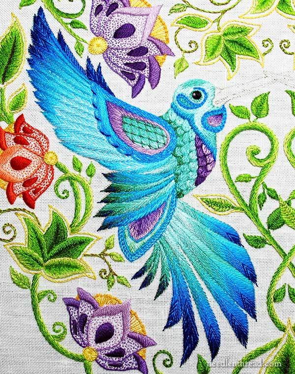
So, I finished all the embroidery on the first hummingbird, including the bird’s beak, which I’m still debating about. Perhaps you can help me?
You’re welcome to click on any of the images in this article for larger versions.
Last time we looked at the hummingbird, I had 9 feathers left to embroider. Because most of them were very small, they went quite quickly.
On the little feathers on the far left of the tail, I stuck with a darker and greener version, to mirror the darker, greener feathers in the lower wing above.
The small feathery bits showing behind the top of the wing, I worked in the darkest blue with a little bit of bright blue thrown in to lighten it up and give the feathers some direction.
Then, I moved on to the beak of the bird.
Now, when I chose these colors for the beak, I had in mind the browns that will be worked into the stems & veins on the larger leaves (they’re not all finished yet), thinking that all the brownish hues would pull together in the project.
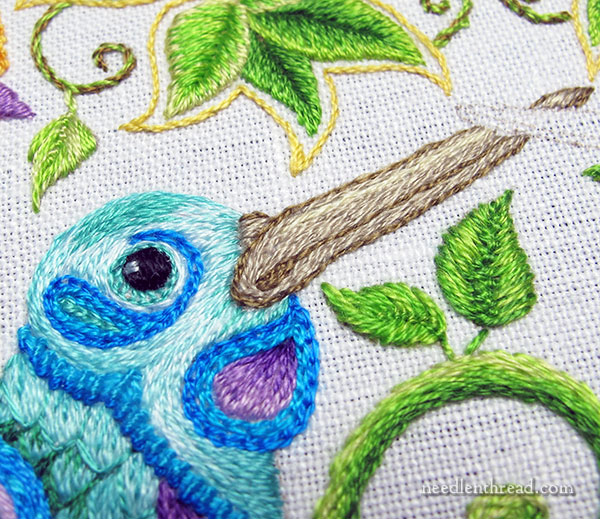
I worked the beak in split stitch, starting with the darker edges and the inside line. Then I filled with the medium brown, and then finished with a little strip of a highlight in a light creamy color.
The problem is that I’m just not sure of the browns.
The beak itself is large – it’s heavy for a hummingbird. I think it should be lighter in color than, say, a grey / black / white combination, which I think would add even more weightiness.
This is it, in context:
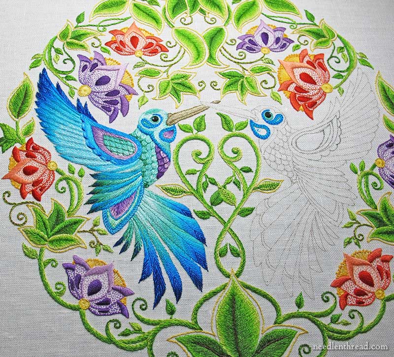
(Don’t forget to click the photo for the larger image…)
It just hasn’t grown on me yet.
I’ve decided to leave it for now. Later, I may re-stitch it if some scathingly brilliant idea strikes.
But in the meantime, I thought I’d open it up for your opinion. What do you think of the beak, and what would you do differently?
Feel free to chime in below!
You can find all the articles relating to this project listed in chronological order in the Secret Garden Project Index, including the pattern source, the materials used, transfer and set-up of the project, and stitching tips along the way!
Like What You See?
If you like what you see on Needle ’n Thread, if you want to help keep the website thriving and free of annoying network advertising, why not become a patron on Patreon? Check out my Patreon page here, where I’ll occasionally add special needlework bonuses for patrons.
If you shop on Amazon, you can support Needle ’n Thread without any extra expense to you by visiting my Amazon Recommendations page here, where you’ll find books and sundries for the needleworker available on Amazon.
Gorgeous work Mary! Many birds have beaks that carry shades of the plumage colors onto the beak, closest to the face, and then fading out into the actual beak color. Would something like that work here, perhaps the deep colors from the plumage fading into, perhaps, light brownish and goldish shades for the beak?
That’s a good idea! I may play with that….
I know this isn’t meant to be a realistic rendition of a hummer but if I was stitching it, I would get rid of the cere (that knobby part near the face). It makes it look even heavier and most hummers don’t have a noticeable cere.
And the little opening of the mouth near the face reminds me of the native american versions of the Thunderbird. Cut the beak short, make it a bit heavier with a hook on the end and it looks like it’s ready for a totem pole. 🙂
It’s probably too late to thin the beak a bit since the design is sketched onto the fabric. But is there a way to create a thinner outline or taper the beak more?
As for the color, if you’ll be using it other areas, it might just work. A bit of a shock compared to the other body parts but not sure of another option. Unless you use a more gold brown instead of that grayish tone. ???
As you see, I don’t know what I’m talking about. LOL
Hi! Total newby here. I should’ve read these replies before making my own (#153 way WAY down there;).
I agree completely. The color isn’t so much the problem, as it will blend in to the overall image.
The problem is the beak itself. If it were me, which it isn’t (your work is stunning), I’d just remove the bottom part of the beak altogether, leaving the narrow top only.
That’s my story and I’m sticking to it;)
PS-I’m loving the evolution of this piece:)
Hi Mary,
Just love love love the feathers!! Super!! As for the beak how about some bananas and oranges instead of coconut and walnuts?
This would be my choice too.
Yes, I agree with Angela & Donna as well. Gold colours softened with some yellows. The entire piece uses such a bold use of light, the neutral shaded beak doesn’t work for me.
I’m also in the Vote For Yellows camp (though the whole project is so far out of my league that it feels cheeky to vote!)
Hi Mary,
I think in this case I would do the beak in a grayish blue or a bluish gray. If you look online at Hummingbird photos the beaks are usually very dark gray/black but the top line of the beak will catch the sun and shine more than the lower part of the beak. So may add a brighter color along the top line like you did with the browns but in the grays/blue. I would also consider adding in a bit of a soft metallic along the top line of the beak.
Hope this helps!
Cynthia M.
I agree with this. The long, sleek beak is what defines a hummer and makes it different from other birds. Metallic on top would set it off.
Consider stitching the bump on the beak in blue to simulate feathers instead of beak, minimize the bottom bill by using a lighter color and feature the top to showcase a wielded sword.
I love what you’ve done with this piece. This is outstanding embroidery! Gorgeous!
beautiful work!!! not sure about the color on the beak – what if you took out the “outline stitching” – just a suggestion. thanks for your wonderful web site and all the great information!!!
Take away the darker outline – it looks “fake”, I like you didn’t go for yellow, but still it pops out and looks a bit out of context 🙂
I would like it better in the grey, white, black scheme…the eye is black.
Look at pictures of hummingbirds to see what colors Mother Nature uses. I would suggest more yellow tones.
The very first thing that popped into my head was a touch of gold…
I only have a couple of comments.
Because the two beaks cross, they will each have to be a different color (or shades etc) or it will look a bit wonky. Keep that in mind. 🙂
I can say that the beak does look a bit, well, off, for lack of a better word. Maybe the shades of brown are too far apart? Perhaps because you have done a lot more shading on the feathers, having an unshaded beak looks a bit weird? I would wait until the other beak pops up to see how it goes.
Just my two cents.
The blues are so beautiful, but the Browns to me have too much of a yellow cast. Perhaps a grey or a cooler brown would work better.
Dear Mary
Really, Really beautiful stitching, I can’t believe you have nearly finished and you are starting the second Hummingbird. I agree with you on the brown colours, I think what Lore said about using the deep colours from the plumage and light brownish, goldfish shades for the beak might blend better, but as you say sit with it for a while that always helps to decide whether to re-stitch or not. But really lovely work and the colours are so vibrant. Thanks for sharing your progress with us and for updating us on the Secret Garden Project.
Regards Anita Simmance
Good Morning, Mrs. Corbet! First, Congratulations on completing the feathers. They are EXQUISITE! I especially love how you incorporated more emerald in there.
Now for the beak… I’m sorry to say it looks like an anemic beak. It just sort of melts away and doesn’t define the light turquoise head. I think the light golden-ish brown is a good start, but it just needs more oomph. Maybe some darker golds, or even a dash of muted orange could help. Not something to POW, just enough that lets the beak say “I’m here”
Mary, You are right about the beak being a bit large for a hummingbird. I wonder if the dark outside edge increases the size?
I do like the idea of the color from the feathers being extended onto that little knob at the base of the beak especially.
My thought when i looked at your beautiful bird was a gold tone beak with maybe a bit of black at the tip.
I just looked at pictures of a LOT of hummingbirds and those with blue/greens in the body and a straight beak, seem to have yellow/gold and/or orange red in the beak, and often with some black at the tip, so I guess I was remembering real birds and I do like that color combo.
I agree the beak doesn’t seem to blend with the rest of the piece. I think Lore’s idea is quite good. I also wonder about a more yellowish tone.
I think the darker outline is what stands out to me, but I don’t have any suggestions for “fixing” it. Your work is magnificent!
When looking on line at hummingbirds the beak is dark to black looking except it takes on some of the color of the bird closest to the face.
I agree with Lore. Those colours don´t “match” with the rest.
Beautiful work, though.
I like the light color and the outline but I think there should be more shading in the beige. Once the second one is done they might look too stark. Everything else is shaded then the beaks are BIEGE. This is gorgeous.
As I recall, hummingbird beaks are black or dark at the tip — but brightly colored near the face. I would play with the light orangey silks/bright oranges of the flowers you have stitched so far, fading to dark.
I think the browns you’ve used on the beak(and will use in the stems) are too cool of a brown. A warmer golden brown would look less out of place. Over all I love the project, though.
I am enjoying your progress. I would add a little of the yellow to the beak. I do not think of bird beaks as brown but more golden but looking at pictures I see more of the orange and very little brown. They also appear very fine.
Beautiful work, Mary. The bird really is splendid but I can see why you are undecided by the beak. While I like the browns, the beak does look a little bland next to the jewel colours of his plumage. How about using the gold used to outline the leaves for the dark outline of his beak, filling with a paler gold and highlighting with the same creamy colour you used here? I’d be careful of making it bright gold, the beaks could end up looking like crossed swords, but I think they could be more flashy than the brown version.
I think goldish shades would be better. I don’t think they should be as vivid as yellows in the flowers. Lore’s suggestion about shading in from plumage colors sounds interesting, but I would have to see it. Maybe if you took some of the lighter greens like those last tail feathers. Place that closest to the head for a very short distance. Would that shade into gold somehow? In any event, I think this is too much brown. It seems out of place in the design.
The brown beak does not show up when viewed from far away. Could you pick up the coral /peach/ yellow colors from the flower?
For me the colors you’ve chosen are too pale in contrast to the bird and the background.-sort of washed out and/wishy washy-I like the idea below- when I look at it now, the browns look like you’ve padded the beak and have yet to stitch it.
Hi Mary: Perhaps the beak should be darker or deeper brown. At least the underside, and maybe toward the face should start out darker/deeper and blend to a lighter shade. Instead of the whitish shades, perhaps going to a little golden or soft yellow blended with brown, for the lighter areas. Can you make the point of the beak sharper, instead of rounded?
Thanx for the opportunity for feedback, this project is absolutely lovely. Regards, Ann
Beautiful But I would put a little more shadow on the bottom of the beak
If it were mine to choose, I’d go with a yellow palette for the beak, one that would pick up the bits of yellow in the flowers.
Also (having looked at the beak again), I think darker is better than lighter. The beak as is looks like it’s floating closer to the viewer than the bird is. You’re thinking darker is weightier, but I believe that darker will recede, and look more like it’s attached to the bird. I also like Lore’s suggestion of carrying some of the plumage colors into the beak.
I’m thinking the beak needs liven up – maybe with some shades of yellow/brown? That would tie it in with the yellow on the flowers and the yellow green around the leaves. Just a thought
The beak just disappears into all the stitching. It looks so blah. The bird is beautiful and stunning and vibrant and just perfect, but the beak? I’d put some dark gold or something like that in with the brown.
Mary, I was surprised by the brown. I was more expecting the beak to be in gold tones or even gold/oranges. The two beaks do need delineation, but I think the brown overstates it.
Hi Mary
I think the beak should be darker and have some shadings of the colours you have already used
Would this be something that’s sold as as kit
Thanks
Susan
hmm, I too think the brown is not quite right. Wouldn’t dark colors recede better? It’s all quite luscious looking!
Sorry Mary but the beak doesn’t work for me. It looks so drab – all the other colours used in this design are so vibrant.
Regards,
Allison
That is just beautiful.
I wonder if the base of the beak should have less of the contrasting outline? Just a softer meeting of feather and beak.
(Of course, if you want it to look like the hummingbirds in our garden, the tip of the beak should be yellow with pollen for about 1/2 an inch or so…)
Gold for the break. Brown’s are deal with jewel tones
The work is lovely. I just spent a few minutes looking at pictures of hummingbirds on Google. Most of the images show a grey beak, but there are a few that have a pinkish/peachish coloration closest to the head and are only grey at the very tip. I even saw a few that had a blue coloring, much like the darker colors you used at the wing tips, to the beak.
Mary, I agree with Lore. The beak doesn’t look as if it’s attached to the bird. I think the dark outline is the reason. Bringing aome ot the bird colore into the beak should make it look attached.
Mary,
So lovely. I have really enjoyed following this project. I agree with Lore about shading the face into the beak. The outline stitch seems abit strong. Using some of the gold colors found in the flowers with some light beige-brown may be the better choice.
Hi Mary Gorgeous work. I agree with Lore if you look at a picture of the humming bird you will notice that the knob at the top of the beak next to its head is the colour of the plumage or the head
then it goes into the beak colour either browns or what ever specie it is their beaks are different.
And yes I agree with you the beak looks heavy
but maybe thats because its not suppose to be a real hummingbird its a fantasy hummingbird.
Good luck. But the piece is absolutely gorgeous.
Have a great day
i would like more of a cream/barely beige for the beak
Wow, you’re right, that’s some beak. I never noticed how heavy it is until you filled it in. It’s not the length, I think, but the thickness that makes it look so unwieldy. Maybe if you made the outline a lighter color; less contrast may make it look slimmer and less weighty. Poor little humming-raven!
But overall he’s lovely, I was so looking forward to seeing him in his glory! What gorgeous, luminous plumage, you’ve really made him glow. This has been my favorite project of yours to follow and it’s because of all those beautiful, beautiful colors. I smile every time I look at it.
I LOVE the hummingbirds! They are so beautiful! But I agree with you about the beak…I’m not sure but I think it’s too dull for the colors that are everywhere else. What about using the yellows and golds that are already in the flowers? You certainly know more about this type of embroidery than I do so it’s just a suggestion. I think you’re right to sleep on it for a bit. It can be changed when you know which direction you want to go. LOVE your work! You are my new embroidery hero!! 🙂 Beth
This is just beautiful. The beak of a Hummingbird seems to appear like a sword or needle to me – long and shimmering. What about shades silver/gray or even adding a shade of purple or adding a shade of lime green to the silver/gray?
Your choice of browns for the beak caught me a bit off guard… my mind’s eye has all along seen the beak in the brighter yellow/golds of the flowers with brownish shades to emphasize the details. I think golden colors would help me to see the beak… as is it I have to look for the full bird… the beak is lost to my eye. I think brighter/stronger colors would also help to balance the bird’s head. The swirls on the head are so vivid I think stronger beak colors would help to not make the swirls such a focal point to me. Love your deep color choices on the last nine feathers! Stunning project.
I agree entirely
Mary….You are an inspiration! I think maybe shiny gold would catch the eye and bring the focus closer into the center of the design….just a thought…
I love the stitch choices of the beak Mary but I agree that the brown isn’t attractive. I would choose pale yellows with brighter yellows around the edges; even echoing the yellows you have used in the flowers.
This has been an enjoyable process to follow. About the beak, you were saying that you find it heavy looking. Remember that light colors seem to expand and dark colors give the opposite effect. Could that be the case?
My two cents – I think the beaks need to be either shades of silver or shades of gold. You have this glorious explosion of color, and the crossing of “swords”, shall we say, is a small but very important focal point. In very basic heraldry, you don’t place a color on a color, but a color on a metal, for greater contrast. So with your colors, you would use either the metal silver (or white [Argent]) or gold (or yellow [Or]). Your current color could go either way, but I think it needs brightening of some sort. OK, that was my two cents. I also think it looks so FABULOUS!! I love, love, Love the blues of the birds, and the flowers and leaves frame it all so well!
How about tying it in with the yellow/gold round the leaves?
Mary,
After seeing hundreds of hummingbirds migrating in south coastal Texas, I’ve observed many different beak colors from dark brown, buff, to several shades of yellow. If you wanted to change the color the yellows might make it pop even more than it does now. Your work is very beautiful.
Carole D.
Surely the birds’ beaks should be in some shade of yellow or gold?
I know most garden birds beaks are brownish, BUT this is a fantasy bird, right? Budgies, parrots, etc have yellow beaks….. why not these?
And there is yellow already in the flowers…….
Lore’s idea might work well. Some of that deep purple near the head, blue-er as the beak extends and brown towards the end. Sortof a base of brown, but with the others there to blend. The beak does seem kinda big for such a small bird. can you narrow it a bit more?
The other thought I had was to go entirely the other way and use the oranges from the flowers in the beak. That also would tie things together. Here’s what I mean: http://www.sugarspunmarketing.com/wp-content/uploads/2013/10/hummingbird.jpg
I’m looking forward to seeing what you decide. It’s so pretty and following along is ‘almost’ as good as stitching myself. 🙂 Love how it has progressed.
Dear Mary, I would go for the black grey white idea. You are right the browns and cream. That will also go well with eye. I think the black,grey, white combination will rather make the beak less heavy too.
Kind regards,
Elza Cape Town
The hummingbird pictures I have seen, that are the most striking I believe, are those whose beak contains a splash if pinkish/rust near the head, with the rest of the beak in light to dark greys, with the tip being a dark grey. The piece is really beautiful but I know I would change the beak colors from browns to greys.
The bird looks beautiful, so well shaded. As for its beak, it stand out in two ways. First is the color. The brown has the wrong tone, so it doesn’t match the rest of your palette. Also the beak doesn’t have the subtly in shading that the rest of the bird or even the vines do.
Several types of hummingbirds have beaks that are the same color as their darkest feathers. Others like the tufted long tailed or broad billed hummingbirds have beaks with orange highlights. Maybe you could bring in an orange hue?
I like the beak, but I agree, something just feels off about it. I’m not sure what.
It kind of feels like it doesn’t fit with the rest because the rest of the project is so bright and bold, the beak feels too muted and, not bright/bold.
This looks beautiful, Mary. I look forward eagerly to each post on this project. I agree that the beak is kind of dull by comparison to the brilliance of the plumage. Instead of trying to pull in the brown shades, what about working in the orangey-yellow shades from the flowers? Hummingbird beaks seem to come in different colours. Here’s one that is in shades of orange and red.
http://s.hswstatic.com/gif/hummingbird-garden-hover.jpg
Needs yellow, gold or something in that neighborhood. I love your work, eye for color and blog.
The beak is beautifully stitched, but I don’t think lighter will do. How about brighter. The whole piece is so colorful, I was hoping for an orange beak or maybe ochre–something that would be a nice contrast with the blues and greens, although I like the idea of incorporating some of the plumage colors into it as well.
It is gorgeous work! I agree, though, that the brown beak may not be quite right. It may not be natural, but what about trying yellow? It would pick up the yellow in the flowers and be of a more consistent intensity with the rest of the bird. The brown is just too muted and, paradoxically, stands out for that.
I’ve just been looking at pictures of hummingbirds on the net. Most of the brilliantly colored birds also have brilliantly colored beaks. And a number of them have gold beaks.
I know it seems like all I have done is complain about the Secret Garden, but all in all I do like it – even though the greens you used set my nerves on fire – the overall look is very nice.
I think I would try a warmer color. Perhaps a golden brown.
Hi Mary, this is a beautiful project. I’ve been following your progress and I appreciate your willingness to share your choices and thinking process – it’s really valuable.
I’d suggest that you take out the outline. The upper portion of the beak could go from light to medium as you have it. The lower portion of the beak could be medium-dark (perhaps the colour you have used for the outline) with a dark strand blended in at the very bottom.
I agree with Lore about blending some of the feather colours into the beak. The blending you have been doing all along has been so successful.
Hi Mary,
I think the shades of grey are so different in tone among all of those bright colors that the beak stands out too much, and in a “dingy” sort of way because of the proximity of the “hot” colors. I would suggest playing around with yellow, maybe not the same yellows you’ve already used in the flowers. Maybe even a yellow to orange spectrum…
Boy, is that bird a thing of beauty!
Such a beautiful hummingbird. I wasn’t always sure where you were going with some of your colors, but you obviously knew. I agree that the beak isn’t just what you probably want, but perhaps you should leave it until you do put the other browns in. I wonder how it would look with a touch of the red-orange that is in the center petal of the red flowers? I know that whatever you decide will be simply marvelous, you have such a good sense of color.
Dear Mary, love your work and your website. And the daily mail. I couldn’t resist googling hummingbirds and saw some beaks that might be more to your liking.i thought your blending technique would be”stunning”in reds and or blues with colors to make it turn.
I noticed that the beaks on real h.birds is more needle-like.I wondered if you might want to consider having it slightly narrower to take the emphasis off it a little. Don’t want it to own the picture.
The beauty of your work is such an inspiration. Thank you .
Susan Coates
Hi, Susan! Thanks for the comment – the problem with narrowing the beak is that the design was traced directly from the original artist’s drawing – it’s already on the fabric, so narrowing it would be problematic as the lines wouldn’t be covered…
I’m wondering how the beak would look without the darker outline? I think the dark outline makes the beak look even larger. Maybe use the darker shades in the center to show the separation between the upper and lower parts of the beak, shading lighter and lighter towards the top and bottom. I think the brown shades work as would blues, purples, or grays.
It looks lovely! I like Lore’s suggestions, but I could also see pulling in a hint of the yellow or orange from the flowers to brighten up those browns in the beak. It seems just a little dull compared to the rest of the piece.
Hi Mary I think that the beak needs a more delicate type of shading. And possibly darker on the underside. The darker outline stitch does not seem to match the rest of the bird. Still a very wonderful bird Diane.
If you squint your eyes when looking at the beak, the first thing you see is the darker outline, I feel that the beak should be a warmer, more golden brown, and should be equal in depth to the beautiful, vibrant colors in the hummingbird. The beak actually fades into the background, as though it’s not important. The first thing we usually notice about a hummingbird is its beautiful, iridescent plumage. The next thing we may notice is the birds slender needle-like beak. I think the beak needs to be darker and warmer, and much more noticeable. We have a large number of hummers nesting in our trees, and when the tiny twin chicks have hatched you can see the teeny-tiny dark, nearly black, beaks poking out of the nest.
Carolyn in SoCal
I might try a grey with more purple undertones in it to pick up the purples in the feathers. I might add more light highlighting at the top and perhaps a bit more of a charcoal outline. That should all make the beak pop.
Hi Mary,
Thank you for sharing your secret garden journey. Your colour choices have been wonderful, but I feel the brown beak is dragging this poor fellow down. I’m wondering how a blended coral shading,or even a warm, maybe burnished gold would look?
Our little hummingbirds seem to have more yellow in their beaks. I’m not sure about these tan/browns, either. As far as being not so enthused about doing the second bird, maybe you can pass it along to one of your students to complete (as Michelangelo often did). I think this is so beautiful.
Hi Mary,
I would do the beak darker and save the colors you just used for the beak that is on top. Perhaps bring in some burnt sienna for outlining? This
would bring in some “depth” to that area of your embroidery.
Wow..it’s looking beautiful!
I wonder, along with some others it seems, if the outline stitching on the beak is making it look rather clumsy and heavy?
After 73 comments this may be redundant but…
What if you did a medium grey body of the beak, with a silvery color on the top or as the outline and a dark grey where the beak line is to minimize the width of the beak? Maybe make the lower bead a touch darker than the top? Also the little bit on the top by the head could be stitched in the same color as the feathers, which would minimize the weight of the beak. Photos of hummingbirds show this area as feathered. Another thing to minimize the beak would be to not outline where the beak meets the feathers, but to let the beak threads and feather threads slightly overlap.
Mary…The beak kind of disappears — for me — on the picture where you show the whole project. Somehow, I envisioned the beak would be as “wow”ing me as the fantastically placed colors of the bird! Maybe a bit of the feather colors blended with gold… Just a thought!
It looks really good. I have not sewed along as I have just had too much on but I do intend to do it from your postings.
G’day Mary,
Absolutely loving this project, but I have to say I don’t like the beak, sorry =(
When I look at the whole picture it is gorgeous but the beak is kinda there…insipid (it may just be me). The hummingbirds we get around here have colour close to their head then it tapers to a dark colour.
Thank you for embarking on this project Mary, I’m so excited to begin this, now if I could just make a final decision on the colours hehe
I’m not an expert, but I think that the beak could be perhaps lighter? The rest of the bird is so vibrant, the beak looks a bit … hard?
Hi Mary – The hummingbird is lovely. For the beak, I would use colors that range from wheat to a very very pale yellow at the tip. close to the head the wheat can be a bit darker and even have a tinge of pink closet to the beak opening. The pale yellow to gold wheat colors would also compliment the yellows that are in the surrounding flowers. Good luck!
Judy C
Mary-
The beak, to me, seems a bit wide (top to bottom). Maybe if you reversed the tones – light on the outside and darker interior – it would appear more slender?
(It’s hard to critique your work in any way because it’s so impressive)
I think I agree about the beak. Sometimes about it seems off. The bird is so bright and beautiful, and then the beak is so plain and brown. I don’t know.
I’d like to say thank you for making it so that clicking on an image enlarges it! I love this feature so much. 🙂
Mary, This has been an interesting project to follow. I love the vibrant colors, they all compliment each other, except for the beak. Was looking for something livelier that went with the
rest of the project, light yellow to gold perhaps. That’s just my opinion. Thank you everyday for sending us such inspirational things to contemplate and work on in our own fashion. Can’t wait to see what’s next.
Barbara
I think it looks off because it is so dull/matter, and the rest of the bird is so shiny. Try a dark green, like what you used on the darkest of the feathers. The dark beak should recede, whereas the light one is very prominent, adding to it’s heaviness.
I think that the brown beak just falls flat. I would like to see it done in the yellow and gold shades in the flower just above the birds head.
Flat is a good word for it, Christine. When I look at it, I feel flat. It’s a let-down! And the more I look at it, and the more I hear from everyone else, I think we’re all agreed!
I think I would look to the yellows or light golden browns…the project overall is beautiful!
Beautiful, Mary. Not that you need my two cents with so many contributions, but here’s my opinion. First, the beak is way too light. I have lots of hummingbirds and their beaks are very dark. As for the beak appearing too large/heavy, dark colors will make it look smaller. Maybe skip outlining the entire beak and only outline the split between upper and lower beak. Maybe a bit of deep golden yellow there. Whatever you do will be lovely, I’m sure!
The beak is way to heavy. We have a lot of hummingbirds in our yard, so I can really observe them closely when they sit on the fence. The beak is much more needle-like and it is darker than the one you embroidered. It is also shorter than the one you have depicted. The ones we have are Anna’s Hummingbird, green body, red throat and head.
You got me to looking up different hummingbirds. On average, most of them have a darkish brown, needle-like beak that flares out a bit where. it “attaches” to its head. I am sorry I can’t offer a color or stitch choice. My “thing” is cross stitch.
The beak is fine, the eye is fine, but that paisley shape under the neck is way too large, and looks like a second eye. It throws the whole head off.
A hummingbird’s neck curves in, not out. If you removed that, the head would look much better.
The project is exquisite, beautiful, gorgeous. I like the beak color, but think the beak is too thick. Can you make it narrower? And add Lore’s suggestion of feathering the plumage a bit onto the beak.
I checked on line for photos of hummingbirds. One was interesting because it had the blue/green coloring of the feathers, but the bill was rosy-colored shading to a light grey. That could echo the colors of the flowers to which they are attracted. The cere was very subtle and barely visible. I agree with others that the darker brown outline is too heavy and fake looking.
I vote for adding some green to the brown or going with oranges and yellows. I agree with the others that the outline isn’t working. But I know you’ll ponder it and come up with something fantastic.
Cindy L
I agree with a lot of others–I think pale gold or yellow would look best 🙂
I have been waiting patiently for you to stitch the beak. When I saw it this morning it looked flat to me. My first thought was, I think when I get to the beak I want to use the purples and a grey to do my beak. I also like the idea of Lore’s to use some of the other plumage colors. As always a wonderful job. I am constantly telling friends and other stitching lovers to join in your website and read your newsletters. Great information. Thanks again for all you do.
In nature, blue hummingbird has a slightly darker gray bill.
But I think in your embroidery, change your color with darker gray would “spot” and it would be a shame. Your work is so beautiful ….. do not change !
Sincerly
I think the colour of the beak is too bland
should be in gold or yellow tones to fit in with feather colours
First of all, the beak is huge…. I feel the dark outline detracts. You haven’t outlined anything else on the bird that I recall. if you need to outline, please do in a much duller color. The whole piece is so awesome…so don’t let the beak ruin it!!!!! In checking my birdbooks, there is some green in the beaks as well as a very dark brown. Go for it!!!The books show no details on the beaks..just solid colors.
Mary when I first saw the beak I thought I wish she had used yellow and gold and that seems to be a lot of other peoples idea too. Will look forward to seeing what you decide to do.
I would try very pale, buttery yellows, shading into a kindof goldy outline. Maybe use the outermost colors from the leaves near it as the inner and build out from there.
Looking at Google images of hummingbirds, I can see that almost none have a brown beak. Some are all black. Others are all green. Some have an orange or blue section close to the head to almost 3/4 of the beak. I think this bird needs a dark grey outline, with some of the bright blue of his head on the upper beak, and some purple on the lower beak. They can be shaded out to the dark grey toward the end of the beak.
Mary, I like the color of the beak! At first in the up close picture I wasn’t sure if the color was correct. However, when the next photo showed the entire area and all the colors were together, well, the beak looked great. It tones the over all look. I think it would be really easy to get the wrong color and then the large beaks together would take over the piece. I really like the colors you choose because it blends so nicely.
I have enjoyed watch every step of this piece and learned all about color and highlighting. It was a pleasure to watch the piece go alive!
yours in stitching,
allison
I agree with you – the brown is not right on the hummingbird – it makes it look too heavy – sort of like a cigar hanging out there. You could even try a dark green or something in the yellows.
I love this project and hope to start on my own version as soon as I’m settled in my new home. I don’t lije the brown beak. It looks out of place and dull compared to the lovely colors in the rest of the piece. When I do mine I think I will use some of the yellows and even gold with maybe a little cream to lighten it up. Thanks for taking us on the journey of this beautiful piece
oh my gosh! i just cant believe how beautiful you embroider. i’d settle for a quarter of how good you are.
My humble opinion is that the intensity of the shade of brown (for the hummingbird beaks) needs to be the same intensity as the bright blues of the feathers. Maybe a very dark hazelnut brown (869), dark golden brown (975), very dark beige brown (838), or very dark desert sand (632)…whichever looks best with the other colors.
Oh yes, this is why I love you all! Thanks for taking the time to add the specific color numbers, Danna! I’ll pull those and see how they pan out. So many good ideas here!
Lovely job so far, but I disagree with the beak colors. I think that the would look better in yellows blending with some of the flower details. Just my opinion, though.
Thanks, by the way for discovering the pattern source. I am presently working on another pattern from the same book on the back of a chambrey shirt to use as a light jacket
I think your beautiful bird’s beak needs to be more delicate looking, it’s perhaps a little ‘chunky’, i think it’s the outline that bothers me, particularly where the beak meets the face.
Most of the blue hummers I see in my area or on images have dark beaks instead of light beaks. Most of the blue hummers have blue or dull black beaks. The beaks kind of fade into the face plummage and isn’t as noticeable as the browns you have used.
Sigh!!! So much beauty that I don’t have the expertise to do. Your work is gorgeous! Thanks for sharing.
Dear Mary,
I have to say I don’t think the brown is right for the hummingbird at all. If anything I think it takes away from the bird. The project is so bright, colorful, and cheerful it has so much life and vivacity.
Perhaps a mixture of bright orange and golds? Something from either flower to tie into the birds? I think it would all flow much better then.
As always you do such lovely work, keep it up.
Mattie
I keep seeing the beak in gold work.
Je crois que j’utiliserais de préférence 3 tons de bleu, le plus foncé au centre du bec en dégradant vers l’extérieur.
Micheline G.
Bonne idée Micheline. This reverse shading could make the beak look thinner. Une illusion optique qui rendra le bec plus mince.
The project is coming along nicely. The bird is sticking! My suggestion for the beak is to include some of the gold accent color with the the tans that you have used. As it is now it appears to be muddied.
brown is too dull for the other colors. I would prefer a golden or even silver color
there is an argument for reddish tones worked into the brown http://www.goodwp.com/animals/21685-humming-bird-flower-wings-beak.html
This is becoming my favorite project that I have seen you do. Watching the “hummers” each year at my feeders is something I look forward to and the beaks here cry out for a more realistic look. Were it me i’d leave in the outlining you have done and then i’d fill with golds and some light yellows and a cream for the highlights. Keep in mind I am by no stretch of the imagination, as adept as you are at color, but i’m just not feeling the colors for the fill-in of the beak are the best choice. They just don’t look natural to me like everything else in this piece does.
The bird itself is gorgeous. I’d strongly suggest you embroider the other bird before you make any changes to the beak, and since you were aiming to pick up on the colour, work all the brown in the leaf veining and stems as well. If the beak still doesn’t work for you, that would be the time to make changes.
My first thought (before reading anyone else’s comment) was creams & yellows – maybe a soft gold as well.
It is a large beak, and should fade into the background a bit more – perhaps.
But what do I know?
The shading you have in the entire piece is awesome. Wish I could do it like that!
I think he needs a yellow beak. Nice and bright to mirror his beautiful plumage.
I suggest warmer tones for the beak.
You’ve received a TON of good advice. I would go with those who say darker. The piece is breathtaking!!
hmm – i can see what you mean – it is a very heavy beck – maybe some light yellow in there, which wouyld tie it in with the yellow in the leaves????
Blessings
Maxine
Well.. I think the beak is too fat and not dark enough… when I look at the hummingbirds that come to my feeder their beaks look almost black… and I suppose the light or lack of light on them and the feeder plays into that.. (my feeders hang under the eves of the house to keep the sun off of them as much as possible) and they are skinny to my eye
Mary,
I think that the beak is too ‘beigey- brown’. It needs a little more yellowish tone.
The beak works well for me. And I like the concept of tying it to the Browns in the stems and leaves.
Mary, your work is simply superb. I have loved watching the evolution of this piece.
I would yse lighter shades of tan and cream
the beak is perfect just the way it is!
Hi Mary, I like the stitching – I think a slightly warmer brown – like a light cinnamon or honey brown would be pretty. There’s a lot going on in the piece and that would be a warm resting place for the eye. So gorgeous! Thanks for the riches in stitches you provide us all the time!
Beautiful work Mary! In regards to the beaks, I think maybe something more golden in color would make them standout more and also bring out the other gold you already have in your piece.
Wow, wow, wow this hummer is sooo beautiful! I really like all the treatments of the final feathers. All those color choices are so rich and luxe. The overall effect is so exquisite. As for the beak I don’t know which way to go either. First I didn’t know what color you were going to go with, so it was a surprise. I like the brown. I think of darker when I think of a real bird, but when it see it in this composition these colors are distinctive. They serve to highlight the importance of the two birds touching in heart of the design. I was also wondering if the second bird would also be blue. I figured it would be, but was prepared for anything. So imagining the other bird filled in then you see the beaks standing out, sending the message of the design, unity. Maybe you should fill both beaks first to see? Maybe its better to have both birds done first. Here’s an idea to try, on the second beak, do the same except without the lightest highlight to see which you like better. Another possible idea is a darker medium brown beak with very dark brown outlines for an overall darker look. I do like to see those feature lines, the beaks are important. I’m looking forward to seeing your choices. Your stitching is just so remarkable, a feast for the eyes! Thanks for taking such clear pictures, its almost as if seeing it in real life and holding it in my own hands! C’est magnifique!
I LOVE the bird! The feathers look great, the dark green in the back of the bottom seems to be just perfect, like they are shaded a bit. The whole piece looks great together. The beak, I’m on the fence about. I like the color scheme, but the outline makes it seem, to use your word, heavy. A little awkward. But I’m sure wherever you decide, the overall effect will be just right, as your work has always been great!
Feathers look fantastic. Beak not so sure about. I think it should have a glossy look to it and I understand what you say about the weight, but I think it does need to be dark. If you print the photo in colour could you then colour it in with dark colours, grey, brown etc as mentioned as a test?
Sandy
I think the substantial wing mass can easily support a darker beak, which would balance the overall weight of the bird. How about using the greens in the small feathers rather than black/grey tones. Shading should add to the dimensionality of it and, as suggested elsewhere, a bit of highlight on the top edge would minimize the thickness some.
Mary
This is just beautiful!!!!
My husband, an avid wildlife photographer, has taken a multitude of hummingbird photographs. All of them are mainly black, with a subtle grey running along the top and underside of the beak, where light is reflected. I think a black beak would compliment the bright blue hummingbird and the swirling green leaves. My two cents worth!
Dear Mary,
Beautiful! I don’t have anything to add to the conversation about the beak. I was thinking about the many comments about the gorget, though. I like what you’ve done here. If you were thinking about trying something different on the second bird, though, perhaps you might treat the traced lines as guidelines for something lighter & wispy-er. I have an image in mind of my hummingbirds flaring out their neck feathers for show. Just a thought.
Thanks again for sharing this process with us! I’ve been holding off working on the peacock until I had a chance to see how you would work the hummingbirds.
Maybe it would work to outline the bottom of the beak in black – or darker gray. Those feathers are so gorgeous, the beak looks a little left out. Maybe a touch of the blue on the underside?
Mary,
Feathers are gorgeous. Have you thought of doing the beak in reverse? Lighter browns as the outline and darker in the middle? It might make it look thinner.
Heather
Thank you for the beautiful work. We need to see the finished work when you are finished.
It doesn’t have to be realistic. I would carry the purples onto the beak and that would lead the eye from one side to the other from the purple flowers via the beak. Do one beak darker and the other bird’s lighter.
I don’t like the introduction of the browns at all, they don’t do anything for the bright singing colours you are using.
Hi Mary, feathers look fab but I think the beak needs to be darker. I did look at a few pictures of hummers and they all seemed to have dark beaks. I did mine in stem stitch filling in a very fine machine thread in a dark reddish brown that has a bit of a shine to it (its on the flikr site). I also left out the outline to make the beak look a bit thinner and just put a black line to separate the beak. I was happy with how it looked. You could try out something different on the right hand bird before you take out the one you have already done and see if you like it better.
Are you going to do the other bird exactly the same or vary the colours a bit?? Mine have slightly different colours in them, I thought that I would’t be able to get them the same so I might as well make them different anyway! 🙂
I think yhe beak should be in a brighter shade of yellow. It looks too prominant and heavy in the colours you have used now.
Hi Mary,
First let me say that I find your hummingbird (and the hummingbird project at large) just stunningly beautiful! Thank you so much for sharing your passion with us.
Regarding the beak I must confess I don’t like it as it is for the moment. For me it’s too dull compared to the brightness of the bird’s colours. I would go for a yellow beak that would echo the yellow around the leaves. If I remember well, you didn’t plan the yellow around the leaves from the beginning of the project so maybe that’s why you didn’t think “yellow” while planning the colours for the beak.
But I’m not an expert, you are 🙂 and I’m sure you’ll come up with the right solution in time.
Best regards,
Séverine
Your work is awesome. Lot’s of great ideas already stated.
The one missed problem I see is where the beaks cross. The beak looks slightly pinched. Take a single thread and set at the base then to tip, you will see the indentions on top and bottom. I believe this adds to the thicker look. I have truly enjoyed following the secret garden project. I love it. It is amazing.
I think you need brighter colours on the beak. The current colours is leaving a drab spot in the middle of the piece. Why not try adding some orange or yellow to lighten it and make it zing
Did you do the split stitch with the stranded cotton floss you had been using for the rest of the project? Is it possible to do the split stitch with stranded cotton? I never used it because I thought it only worked with wools…
You can work the split stitch with practically any kind of thread. It works great with wool, especially, because wool is a little thicker but still has a loose twist, and it’s a lot easier to see to make the split! Split stitch works best when you’re just using one strand of whatever thread. I’m using one strand of regular DMC cotton embroidery floss here, with the split stitch. Definitely doable, and a great stitch for tiny details.
It is gorgeous, of course Mary. I love the shading and colors you used on the remaining feathers. I think you should leave the beak as-is. The colors are the thing with this piece. The beak should not be darker or stand out — it fits fine as you have stitched it, as the bird now looks complete, but what you see and focus on are the colors of the bird and flowers, which I think is what you should with this piece. Love the progress reports on this! Thanks!
Hi! ‘Newby here.
First, thank you for such a wonderful site. I’ve learned more in the past few days, browsing here, than I’ve learned over the past year!
Regarding the (absolutley stunning!) hummingbirds:
1. I think you’re right, about the color being “off”, but I really don’t think that will stand out once completed. So, I’d stick with the same colors.
2. I think (this is just my very humble opinion here) that the trouble is with the overall size of their beaks. If it were me, I’d just remove the bottom part of the beaks in the design, leaving just the narrow top part, shading appropriately. .
This is a gorgeous piece of work and I love watching the evolution of it!
Hi Mary,
I googled “hummingbird picture” to see what color hummingbird beaks were in real life. What I observed is the beak could be the color of the bird’s crown or a color that complimented the bird’s feather colors. That would mean your bird should have a turquoise beak or some shades of orange with brown or gold mixed in. I don’t think turquoise would be good but maybe something orangy would work.
I love the way this project is turning out! It’s been an interesting journey!
Dolores in Michigan
Hi Mary!I would like to suggest using dark orange and scarlette for the beak, with a touch of darkest gray accents. Your lovely bird is mainly blues, and orange is the complimentary color for blue, and Nature uses that palette quite a bit. Great luck!
The beak color is all off, my opinion only….it takes away from the beauty of the bird. I would expect pale yellows into golden colors…it just grates…and it hurts to say to someone I consider an embroidery Goddess….
Maybe a pale yellow orange colour?
Very beatiful work! All the work done in warm palette, didn’t you think about more warm-brown (with yellow-gold accent) for the beak?
i vote for a darker beak… In the dark blue color way from the wing tips. Also what about shading the beak from the head and then add a lighter gray on the top edge for light?
I think the brown beak draws the eye to the centre of the embroidery, allowing it to wander around the work from there. A focal point.
What about light yellow and gold? I might like a bright center of the piece.
Just a thought.
Debbie
I’m definitely in the ‘make it slimmer, drop that dark outline’ group…and as for color? It’s blah compared to the rest – maybe a warmer golden yellow…Then again, I keep thinking perhaps a bit of the pinkish red. Whatever you choose to do, this is going to be in the center of the image and the eye is going to naturally go to those crossed beaks…hammmmm. As always, a technical triumph in the making – the work itself is beautiful.
Mary, I am relatively new to yr blog/site & I love it. This page has had me amazed at your skills. I have no ability to advise you except to say as a bird lover these blokes have made me delighted. Btw how you achieve wot u do each day in itself is an inspiration…..so I say only put these birds aside briefly….then come back….as a kiwi (nz) we have wonderful birds here. I was surprised at the lack of colour in these stunning bird’s beaks….so colourful as a bird, is that why the beak albeit beautiful in itself is a little bland in colour.. just a wee contact really. You are an inspiration!! Sue.
I love it ! This is a wonderful bird !
I have been trying to figure out what’s been bothering me about the tail. Of the 10 feathers, I feel the color change in the lower part of feather #3 is too abrupt. Just my opinion! Cinder
Second part of the wing is somehow not gelling. It looks like its separate and kind of dysfunctional wing. I think it might be because of the design or…
Beak: if there could be some kind of continuity or hint of existing colour in the beak it would look great.
Till now u have done a fantastic job…. keep it up… and I love u,,,:)
Mary, when I first saw the beak I thought “That doesn’t look natural” then I had to remind myself that this is all fantisy. The colors you have used are neutral looking. They show but do not grab you when looking at the whole. I think you have made a good choice.
The feathers are stunning x 10.
I feel the beak looks dull and dirty relative to the rest of the embroidery. My first thought was that it should be darker, although I see what you mean about the size. There have been some great suggestions already. I do like the idea of some shading the beak rather than outlining it – the bird appears to me to be grimacing.
I just love the work that you have done here!
So expressive!
Thank you.
Suggestions for the hummingbirds beak. I looked up images of these cute birds in the colors you have embroidered, and found they have a dark charcoal with purple highlights beak or an orange red beak. Hope this helps.
I just came to say that i have NEVER seen such a wonderful embroidery. Hope God keep blessing you and improving evento more your gift.
If you remove the top half of the top of the beak, prior to where the right hummer beak crosses, it would be a more normal size. The color seems to be okay, I would not remove it for the color, but perhaps if you are going to remove it, it seems to me after perusing photos of hummers, that their beaks are ranging from medium gray to dark gray. I do not think hummers have that little lumpy thingy (technical term for sure) at the top of their beak, and their feathers “feather” outwards towards the beak, hiding where they merge. The “grumpy” look on the face comes from that deep rounded check mark crevice under the lump that is also not seen on actual live birds.I hope that makes sense. One last little remark is that the paisley dark blue coloring under the beak is quite beautiful, but is pointing up and inwards. If it would have the tail of that paisley point up and out, it would create a more narrow neck, hence making the whole bird more elongated and graceful and slim as they are in nature. And now that I have sliced your beautiful little birds beak and neck all to shreds, I would like to tell you that I caught my breath when I first saw this. I absolutely love it, even with the grumpy face. Plus I am a hummer fan. Absolutely beautiful.
I have a resident hummingbird in my front yard tree right now. He’s been here for about 2 weeks. His beak is quite dark and does appear to be black. It is also so thin that it looks like a needle. Your work is just beautiful and in my opinion it would look even better with a thinner darker beak.
To my mind the colors are marvellous but the beak is heavy and light. I’m feeling it should be a slender dark stiletto
I love the bright colors of the humming bird but I see them as having a sharp pointed dark beak. Very stiletto like
Mary, have you done the design from the book directly. Thank you.
I think the beak is perfect.
I would make the beaks narrower and use dark brown or black like real ones. Their beaks are real tiny. If you send me your email i can send you three photos of hummers which might help. One actually has a bit of red in it. Laura V.
I love this! Do you have the pattern I could purchase?
Thank you!
Elle
Hi, Elle – Thanks for your comment – I’m glad you like the hummingbirds. If you read through the articles associated with this project, you’ll see where I sourced the design, which I used with permission from the artist, Johanna Basford.