


Welcome to Tuesday! And to a Very Quiet Week at Needle ‘n Thread.
Anna, you see, is gone for the week.
And while neither of us may be the Most Talkative People in the World while we are working, it’s strange to be working alone again, in silence. It’s funny, though – I’m making it through my daily to-do lists in record time, for some reason. I feel so accomplished!
Today, I thought I’d share the results of the appliquéd lettering project that I told you about a couple months back, and that I updated you on here. My deadline for that was the end of May, and I was able to deliver it on May 30th.
If you’ve been around Needle ‘n Thread for the past few years, you might recall that Anna and I already embroidered an altar cover for this church. You can see the original goldwork embroidery cover here.
This appliquéd cover that I just finished is not nearly as “fancy.” Because of the wear and tear on the goldwork embroidery, we wanted a not-quite-so-fancy-but-sturdier option for the altar cover. We’ll have to do some repair work on the original goldwork embroidery, due to folding problems that the cloth encountered during use. So this new appliquéd cloth will stand up to the rigors of daily use much better in the meantime.
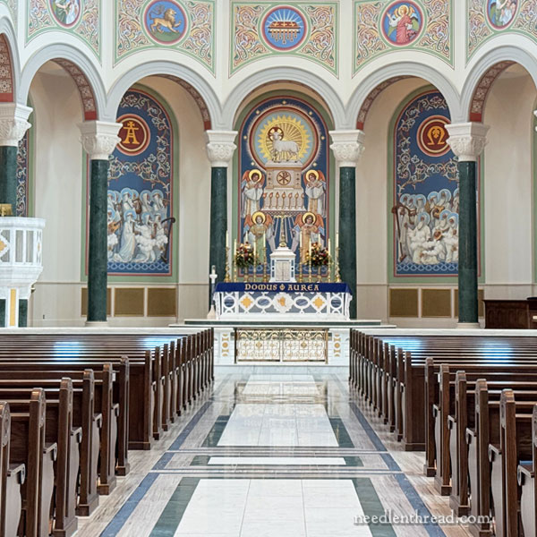
The space, as you can see in the photo above, is quite large. That photo was taken about halfway down the length of the nave of the church, so the altar is pretty far away from the back of the church. Still, the letters can be read from a distance – they just don’t show up so great in the photo.

As you move up the center aisle, of course, the lettering is even clearer.
I’ve never loved the spacing on this, as far as the lettering goes. The D, O, and M in “domus” are such large letters, that the word seems much more compact that “aurea” on the right side of the center, which seems much more spread out. The space both words occupy is the same, but the letters fill the space differently.
That’s always bugged me, but I can’t really see how it could be done differently, keeping the size of the letters proportionately the same.
No one else seems to notice it – or they haven’t said so – so maybe it’s just me.
But now that I’ve mentioned it, it’s probably going to bother you, too! LOL!
I wish I had thought to take a camera when we delivered and installed the cover, but unfortunately, I had to rely on phone photos again. Sorry about that! That’s what happens when I’m hitting so close on a deadline – I forget the peripheral stuff!
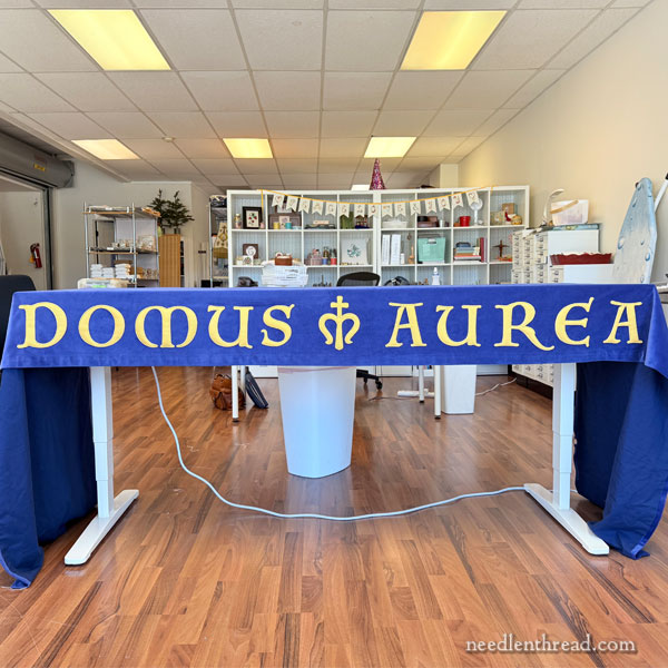
I managed to snap a few photos in the studio before leaving to deliver the cloth.
The effect is somehow not quite the same, is it?

I think the method of preparing the letters worked out well. They are definitely sturdy. They were relatively easy to apply. The trickiest part was taking the trim over sharp angles (which I only had to do on a few letters) and, of course, securing the ends of the trim. You can see where the ends meet up on this closer photo above, but it’s not noticeable at all from a distance.
It worked out. It was a relief to get it done and delivered.
Having a project like this out of the way is delightfully invigorating. Now we have more space now to do our normal daily work in the studio, and, better yet, I don’t have the pressure of that particular deadline looming over me!
Coming Up!
Coming up, I’ll share a blooper with you. Have you ever picked the Absolute Wrong Stitch for a project? Gosh, I have. Too many times to count. But I picked an exceptionally bad one last week, so I’ll share it with you.
That, and more to come!
Hope your week is off to a great start!

From a calligrapher’s point of view I think it looks great. I see what you say about DOMUS feeling closer than AUREA and it is. But if you want to center it like you did with the symbol in the middle, it just has to be that way unless you possibly choose a different lettering style. Good job!
It’s gorgeous Mary! I was a sign painter in the early days and calligrapher so I have spent many years dealing with “space between letters” and I must say, that you did an excellent job dealing with this lettering. It has to be one of the most complicated typefaces to deal with because of those odd serifs and the shapes of the letters. I could not have improved on your spacing!! Bravo! I admire your attention to detail so much.
Congratulations on the beautiful alter cloth. What a JOB! The letter spacing is not noticeable…even after reading your spoiler, lol
I see exactly what you are talking about regarding the spacing of the letters. Yes, the letters in “aurea” have more space between them than the letters in “domus,” but no, it doesn’t bother me because you’ve made the entire thing balanced. Rather than be bothered by the spacing, you should be congratulating yourself on the excellent design and the skill with which you were able to space the letters so that the difference in spacing is only noticeable until you point it out. This was well-thought-out, well-planned, highly skilled, and meticulous work I’ve taken pleasure in following.
Mary,
Your church is so very beautiful. I looked and looked at the lettering and do not see a problem with the spacing.
A beautiful altar cloth for a beautiful church. You have such a great talent.
Thanks for sharing.
Fran
Thanks Mary for the pictures. It was great to see the finished cloth in place
I don’t see a thing wrong with it it’s beautiful, and what a gorgeous church!
The altar cloth looks stunning! I see the problem with the spacing of the letters but it doesn’t bother me at all, especially in that beautiful setting in the church.