


If you’ve ever set out to tackle an embroidery project that doesn’t come out of a book or a kit, you know what it’s like to mull over color choices.
For me, making good color decisions can be a fairly arduous task. Thankfully, there are some good books on the market that can help with this – Trish Burr’s Colour Confidence in Embroidery (which I reviewed a few years ago) is one of my favorites!
Besides books, though, there are myriad ways to find color ideas for embroidery projects. The most obvious way: take a look around you!
Recently, I found inspiration for a small embroidery project in a most unlikely place.
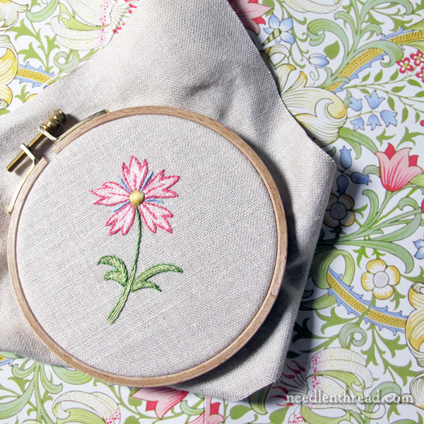
When I originally sat down to embroider the little flower above, which is a sample for an article I’m writing later this year, I pondered a color scheme.
Sometimes, it can take me forever to work up a color scheme, even on a simple little project, because that’s just the way I am. I try. It doesn’t grab me. I try again. It doesn’t grab me. I try again. Get the idea? It can be a long, drawn-out process.
So there I was, pondering.
Ponder, ponder, ponder.
I was sitting at my desk. In front of me were scattered – oh, many, many things! And among them was a stack of William Morris decorated file folders that I use for sorting patterns and projects. I wrote about these file folders and what I use them for quite a while ago.
But I never thought of using them for color inspiration, even though I think they’re quite pretty.
I’m a sucker for organizational supplies that are pretty… but it doesn’t necessarily follow that I’m super organized, trust me!
In any case, I looked at one of the file folders (which you can see in the background of the photo above), and I thought, Why not?
I pulled out my floche and started sorting colors, and there they were, a perfect selection of colors in the same scheme. And they looked good on this particular linen I was planning to use.
It was a happy conclusion to what could have been a real time killer. Color selection is not always easy! Often, it involves painting, colored pencils, starting over… but in this case, it was just a matter of laying out some office supplies and throwing some threads down to find a match.
The moral of the story: Never underestimate the color inspiration that you can find even in the most mundane things, including office supplies!
Enjoy your Monday!
Like what you see?
If you enjoyed this article and you’re looking for more inspiration, information, and instruction on hand embroidery, why not sign up for my daily newsletter?
There are all kinds of reasons to have Needle ’n Thread delivered to your inbox – check them out and sign up today!
Because I have no color sense at all, when I do pick colors, I have to rely on other’s choices. It could be fabric I have at home for quilting, colors in nature or even house colors in the neighborhood. LOL Yes, I am desperate. Even then I don’t always get it right. What looks great in a skein doesn’t always show up or look as nice when it’s one or two strands stitched up.
Dear Mary
Yes I’ve had that problem of choosing colours for a project and it is difficult. I am also the proud owner of Trish Burr’s Colour confidence and I love it. I really like your file folders they are so pretty and functional. The flower is beautifully stitched and I love the colours you have chosen. Yes pondering does help when you are stuck for colour inspiration and I’m glad you found the right colours. Thanks for sharing your pondering thoughts on choosing colours for a project.
Regards Anita Simmance
I find this website very useful for picking colours:
http://www.degraeve.com/color-palette/
I truly believe that most creative people have almost as much fun on the office supply stores as stitching shops. ALMOST! I can always find something, but never used file folders for color guides! ☺ Thanks for the tip!
Hi Mary – When I was traveling for work and I was stuck in a hotel meeting room, I would imagine I was embroidering the carpeting. I looked at the design but definitely the colors!
Doing this over the years has helped me hone my eye for colors. It turns out that some carpets are really ugly but others are actually beautiful. I also examine draperies, table linens, etc. They all provide inspiration. I naturally lean toward subdued colors but I’m always surprised by that one bright color that brings a “nice” design to a “wow.”
Good luck on this color journey.
Judy
Hahaha! I have a collection of William Morris fabric that’s going to turn itself into a quilt someday. That fabric is amongst them.
I have a terrible time choosing colors. 2, I’m ok. 3? Maybe. After that I’m lost.
Cindy
I have a “collection” of pages that have attracted me (when I go through magazines, brochures, whatever…..). If something just “appeals” to me and I am not sure why — it is mostly always about the colors. So I tear it out or remember it and when I go to pick a group of colors for a project, I do the “floss toss” thing right on the advertisement/plate/fabric/etc. Even if the colors are not “exact matches” you can always tell if they “fit in” or not. Then I have a group of colors that give me the same “feel” that attracted me in the first place.
Now that’s a good idea. I have patterned fabric for quilting that I turn to for color ideas but that takes up quite a bit of room. Using magazine photos would be much more compact. Thanks for the tip.
Yes, that’s what art is. Seeing in life; the ‘mundane’, a new spin , a new take. Then interpreting that so it rings true in another person’s life.
Sharing the light.
The flower is lovely. I shall remember this with my embroidery and look around me more for inspiration. x
Your little flower is lovely. Even a ‘neutral’ fabric can deaden or enhance the colour of the floss, so I usually start a with an idea for the dominant colour scheme and then spread my floss out on the fabric under natural light to choose what seems to work with that fabric.
Thank you so much for you step by step manturgia instructions. I was asked by my brother in law to make his and after I said “Yes” I thought what did I get myself into. The Holy Spirit lead me to your site and I am forever grateful for the detail you put in the instructions. I got it done and though not near perfect it turned out ok. God Bless your works!
Zita
Thanks so much for your site. several years ago I found the site, Design Seeds.
design-seeds.com which identifies the colors in a picture. I have used it at least once with crochet projects.
i like looking out the window. The sunset the other day showed me how salmon works with sky blue and new grass or leaves against most anything always surprise me.