


Purple and green. It’s a color combination I’ve always loved!
Strangely enough, I don’t wear it. I don’t decorate with it. But golly, I do like it.
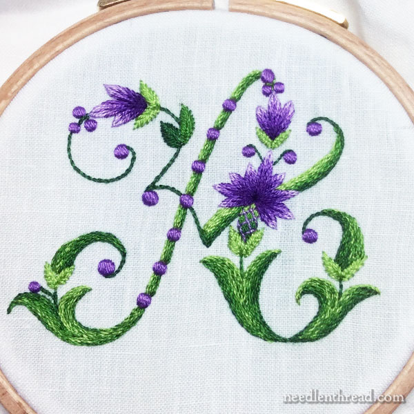
And it was with purple and green in mind that I first fell for the “Leafy Blooms & Dots” alphabet that you’ll find in Favorite Monograms.
Today, I’ll show you a stitched sample from that alphabet. As always, there are parts of the letter that I really like, and parts that I’d do differently if I were stitching it again. But it was a fun little sample to stitch, and it worked up pretty quickly. And it provided a good purple and green fix – it’s been a while since I’ve stitched with this combination!
If you want to stitch it with the same approach, you can always change the color palette if you’re not a purple and green fan and make any other adjustments you want along the way, too!
All the techniques in this particular monogram have already been discussed in previous letters, so I’ll give you a run-down on the embroidery techniques and stitches I used, with links to tutorials or articles where they are explained.
Embroidery Stitches & Techniques
For example, the green filling that predominates is all stem stitch filling, shaded by combining two different colors in the needle at once. This is exactly the method I explained when we looked at this E monogram a couple weeks ago.
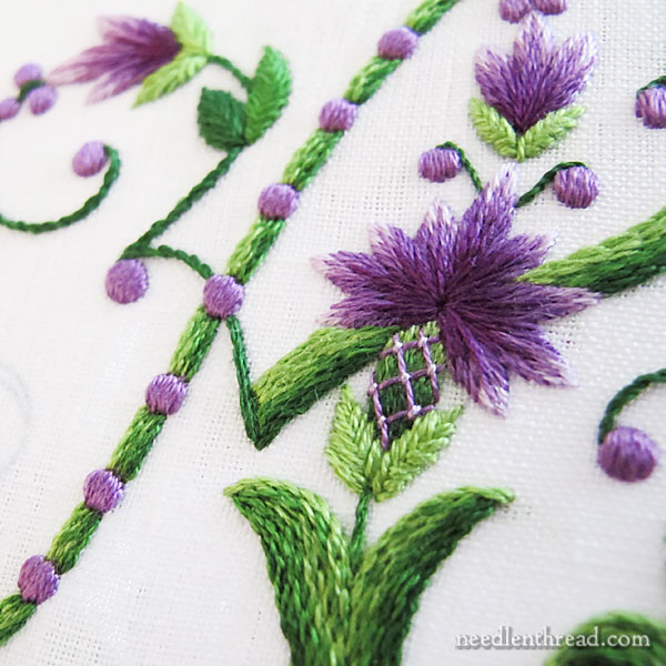
All the little purple dots are worked in satin stitch, in the same manner as the little dots in the E monogram, too, explained in this article that shows the finished E.
The purple flowers were embroidered in long & short stitch. This particular tutorial will come in handy to work the flowers, and this is where you’ll find a video on long & short stitch.
All the small leaves in the monogram are worked in fishbone stitch in two strands of floss.
The base of the main flower is embroidered first in greens in long and short stitch, and then crossed over with a lattice in purple, with couched intersections in a lighter purple. You can find a video for lattice work here.
I added the lattice over the green long and short stitch because I wanted to convey a vague idea of a thistly look. That’s what the design reminds me of, but in reality, the letters aren’t really adorned with thistles. Still, with a little manipulation, I think the idea comes across a bit!
The majority of the stitching in green is done with two strands of floss in the needle, except for the tiniest stems that show up here and there, and those are worked with one strand of green. You can see two of those above the main flower in the photo above, stitched with one strand of dark green.
All the satin stitching and all the long and short stitching are done with one strand of floss in the needle.
Embroidery Materials & Supplies
The materials and supplies I’m using on all the monograms are pretty much the same. I might switch up the linen ground fabric, depending on what small cuts of unused linen I have available and I might switch up the threads a bit.
Here’s what I used on this particular letter.
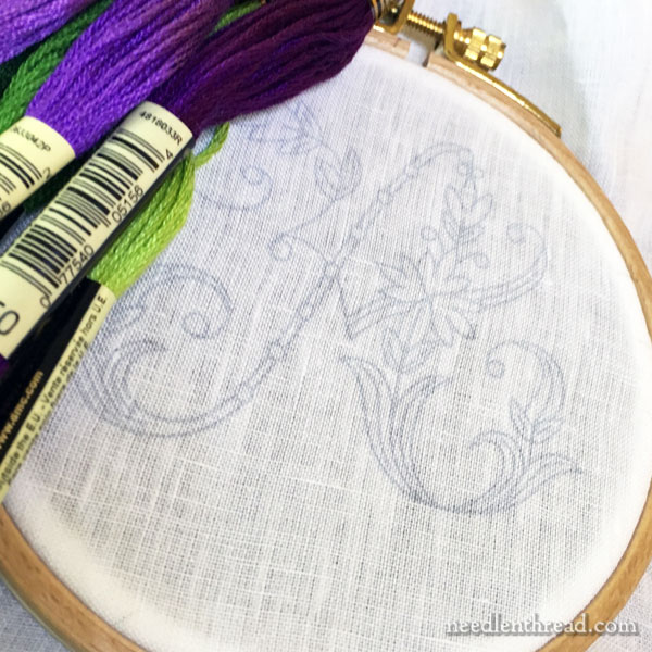
I used a 4″ hoop (with the inner ring bound – here’s a tutorial for that).
For needles, I used crewel needles #7 and #9.
The linen is just a good white Italian linen I had on hand, but you can use any good, closely woven linen (or cotton, or silk, or wool – whatever ground fabric you want to use!).
To transfer, tracing over a bright window with a pencil works pretty well. If you have a light box, that’s even better. I use this particular light box and I love it!
You can also use an iron-on transfer pen like this one that I reviewed here. I like those for quickly transferring a design that will have all the lines completely covered by embroidery.
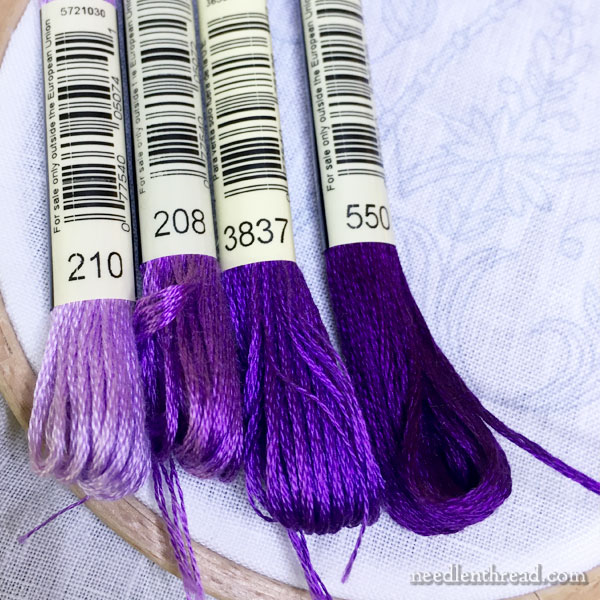
These are the purples I used – 210, 208, 3837, and 550.
I always find that the selection of purples in any embroidery thread line a bit sparse. Compared to other colors, the purples are not quite as abundant! But these four shades worked well for this, I think.
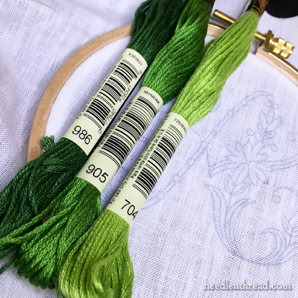
And these are the greens that I used: 704, 905, 986.
What I Like
I like the color palette and I would definitely stitch the whole alphabet in these colors!
I like the satin stitch dots. They look like … I don’t know. Little pieces of shiny purple candy!
I like the long and short stitch flowers. And I like the lattice work over the green long and short stitch at the base of the main flower.
I even like most of the stem stitch shading. It’s a technique I use frequently and find it enjoyable to stitch. In this letter, I like it on the skinny left side of the main body of the A.
What I would Do Differently
If I were to embroider this letter again, I’d do the lower right “foot” of the A differently. I didn’t pay any real attention to the layout of the shading. I wasn’t trying to create a “natural” look to it, but if I were to do it again with the stem stitch technique, I’d pay more attention to the way I worked out the shading to give it a little more dimension.
This is a letter I wouldn’t mind working entirely in long and short stitch. But that’s for another day!
More Monogram Techniques & Tips
You can find a whole list of articles with techniques and tips on embroidered monograms here, if you’re looking for other stitching ideas.
The letters that I’m covering in this recent series of samples come from Favorite Monograms, an ebook that’s available in my shop.
If you’re looking for decorative letters that feature step-by-step photo instructions, you might enjoy Stitch Sampler Alphabet – a full alphabet with step-by-step instructions for over 65 stitches and stitch combinations that can be mixed and matched to create your own unique embroidered letters.
Coming Up!
By the end of this week, if all goes as planned, Needle ‘n Thread will be sporting a whole new look. You’ll still be able to find things in approximately the same places – the content structure will be pretty much the same, but the site will be mobile friendly (it will show up a little differently on your phones or tablets), and the look of the site will be slightly different. But all the same content will be here, I promise!
To celebrate the new look, I’ll have a free pattern and project for you, from the kaleidoscopes I showed you earlier this summer.
And in the meantime, this week, I’m working on an article for Stitch Magazine, photographing and testing some extra special thread that I’ll be writing about for you, and setting up a couple more little projects.
Next week, I launch into a workroom overhaul. I plan to take photos as I go, but … gosh. The “before” photos might just be too embarrassing.
Hope your week is off to a great start!
Wow, that is just gorgeous!!
Oh Mary, This one is just stunning! I have a soft spot for thistles. On my husbands and my honeymoon, 36 years ago this last week, we came upon a huge field of purple thistles on a walk. We have been giving each other thistle gifts occasionally on anniversaries ever since. The sight of them was so beautiful. I am always embroidering handkerchiefs for him. I think this one is going to show up next year on our anniversary.
Love your website!
I refer to it all the time when home in nz.
However as I currently travel Europe thought you might be interested in that I have not found a single embroidery shop in France or east Germany. I was expecting so much. We are better serviced in NZ. Next stop is las Vegas!! Not expecting much there either. Maybe it is all going on line.
Keep up your wonderful work. We love you in new Zealand
If you happen to come into the San Francisco Bay area, there are 3 stores that carry a beautiful selections of threads. And if you are in Las Vegas, there is a quilt store that does carry Valdani pearl cottens and fine wool threads. It’s called the Christmas Goose, 2988 S Durango Dr #109, Las Vegas. Hope this helps. Have fun in the US: we welcome you here!! (I’m not affiliated with any of them: just have had fun shopping at them!)
I also just found this online: Stitchers Paradise, 2550 S Rainbow Blvd
Las Vegas, NV Good luck!!
I feel the same way you do about purple and green. The proof that it’s a great combo is in the finished monogram–you’ve done this pair proud. Love the dots. Looks like a great alphabet.
The purple and green look awesome but more than that I appreciate all your instructions and encouragement to start a project. I always feel like I can succeed after I visit your blog, thank you!!
Hooray! Exciting times ahead!
Yet again another gorgeous letter! I was surprised to see what you choose for your greens. I assume that you have every regular DMC floss color known to man, I see that you didn’t pick your greens from a coordinating set for greens that run from light to dark in a number sequence. Any tips on choosing colors to use? Was there just not enough of a change when using a ‘set’ of colors, or you just wanted a special look. I think many of us would like you reasoning for picking out colors to use in projects that you basically design yourself. Personally I end up feeling a bit overwhelmed with all the choices.
Can’t wait to see the Kaleidoscope pattern: I’ve been waiting with bated breath!! And this monogram is so beautiful: I love green and purple together too (and if you add orange it’s amazing!!) And your stitching room couldn’t be more embarrassing than mine!! Thanks for all you do to educate us: I love your posts!! Hugs, H in Healdsburg
I love this colour combo too, especially with a bit of white around when it reminds me of the suffragettes and all they went through to get the vote for women. It depresses me too when I think of all the women I know how who would rather not have to vote (it is compulsory in Australia). But I do still love the colours and this looks so fresh and beautiful. I feel some purple and green coming on….
Suberb monogramm, with so beautiful colors … I love it !
Delphine
Hi Mary These are beautiful colors! I really appreciated the detailed list of materials for those of us who are beginners in embroidery. Do you know approximately what count the linen is so I can put that together for reference with the thread sizes? Most of my experience is in counted techniques so I would like to understand how fine a linen works for this type of project. Thanks!
Hi, K –
While linen used in counted techniques is often labeled by thread count, linen for surface embroidery is not. Counted work usually employs what’s called an even-weave fabric, while surface embroidery generally relies on what’s called a “plain weave” fabric, where the warp and weft threads don’t necessarily count out equally in any given measurable increment, horizontally and vertically. So, in an even weave, say you have a 32 count linen. This means that there are 32 threads per inch both horizontally and vertically. In a plain weave fabric, there might be 32 threads per inch horizontally, but only 30 threads per inch vertically. So with plain weave fabrics used for surface embroidery, a “per inch” thread count is not always available.
This doesn’t mean that you can’t use an even weave linen for surface work, though. Linens with higher thread counts (say, 32 threads per inch or higher) can make a decent surface embroidery ground fabric, too. Often, though, even-weave linens don’t have as close a weave as plain weave, so it can be difficult to get the smooth lines and curves, or the clean, smooth edges needed for surface embroidery line and filling stitches. So, to give the embroidery floss something to “grip” into, besides just the holes in the linen, backing an even-weave linen with another fabric will often do the trick. A good quality muslin or cotton behind the linen ground fabric will make it much easier to work a satin stitch filling, for example, with nice smooth edges, because you won’t have to rely solely on the linen to hold the stitches in place. The backing fabric will help.
As far as thread weight in relation to fabric is concerned, in surface work, you don’t normally need to correlate a thread thickness with a certain type of fabric, because you’re not relying on the holes in the fabric to accommodate the thread thickness. In surface embroidery, you can begin and end your stitch wherever you want, using whatever weight of thread you want, because your needle makes the hole that your thread will pass through. So you can use a heavy wool thread, a very fine tiny silk thread – whatever you need to create the impression you want to create with your embroidery.
I hope that helps a little bit!
Yay! I’m been anxiously waiting for a kaleidoscope pattern (or two!!) to play with.
I do like the modern take on your thistle look. I will give this a try. ~Sally-Ann
I love purple and green too. Also purple/yellow. =)
You remind me that I need to do a ‘coming up’ blog post as well AND I need to sort out my blog template so that it’s much more mobile friendly. I’ve been meaning to create a single image header banner for years. One of those things I never seem to get to….
Is that the ‘Stitch with the Embroiderers’ Guild’ mag that you’re writing for? I’ll look out for that. I rarely buy mags these days – I’m being sickeningly good on my long-term craft, book and make-up ‘NO Buy’, but I’ll certainly keep an eye out for it.
I love Stitch magazine. I have a subscription but it is pricey coming from the UK. I can at times, pre-subscription) buy it at Barnes & Noble if you have one in your ares. The ‘other’ Stitch magazine from Interweave, Has now stopped publishing. I liked it too, but I always went for the UK Stitch as it was all embroidery with some simple projects and harder ones in each issue.
I find it interesting just how few actual embroidery magazines are to come by. Seems to be a lot for cross-stitchers, of which I used to be one until older eyes and bifocals made it hard to see and count the holes 🙂
The only two fully embroidery magazines that I know of is Inspirations (no longer carried at my B&N) and Stitch – UK. And of course we have Mary’s website.
Hi, Elizabeth! Well, you’re in good company. I think this website overhaul – the new site should go up today! – has been in the works for 18 months or so. :-/ Well, sometimes, these things just take time! Yes, it’s the Stitch magazine from the Embroiderers’ Guild. It’s a condensed version of the stash Christmas ornament that I published here on NNT a couple years ago.
And that reminds me, I need to start thinking of an ornament for this year….
Good thing we’re here to remind each other of things! 🙂
I’m another who would tend to pick the colors from the same number sets. So maybe the key is that they coordinate, not necessarily too matched?
I can’t wait to see your work room overhaul. Please show before photos! They should not be considered embarrassing. They show how a room is used and why it maybe isn’t working as well as it could any more. After shots are great, but don’t show the life of the room.
Thank you so much for this beautiful piece and your terrific explanations.
Great article on monograms and color! I am USUALLY happy with my color choices, so what I am taking away from your writing is the embellishments and design choices. Those are my weakness, seeing what stitches or embellishments would awe the final result. I really like the base of the yellow monogram, but then you added blue flowers and dots…WOW. Then the purple and green monogram with the placement of the colors, I’m inspired. Thank you for sharing these and for sharing your love of stitching with us.
Mary Kaye Bailey