


Lately, I’ve been sharing with you all kinds of ways you can embroider monograms, using techniques that are accessible for beginners and beyond, and highlighting different lettering styles from my recently released e-book, Favorite Monograms.
The purpose of these sample monograms is to show you that you can embroider beautiful monograms in a variety of stitches – that monogramming isn’t limited to any one kind of stitching technique.
So far, we’ve looked at several styles of voided monograms: this voided confetti monogram, this simpler voided monogram in just three colors, and this rather elaborate floral voided monogram featuring lots of color and texture.
Just last week, we looked at this monogram, embroidered with a few simple stitches in a few colors.
Today, I want to show you the beginnings of a filled monogram that’s easy to stitch and that incorporates a little bit of shading. The results: a classy, pretty monogram that’s a little more intricate than last week’s simple monogram, but that’s still super accessible.
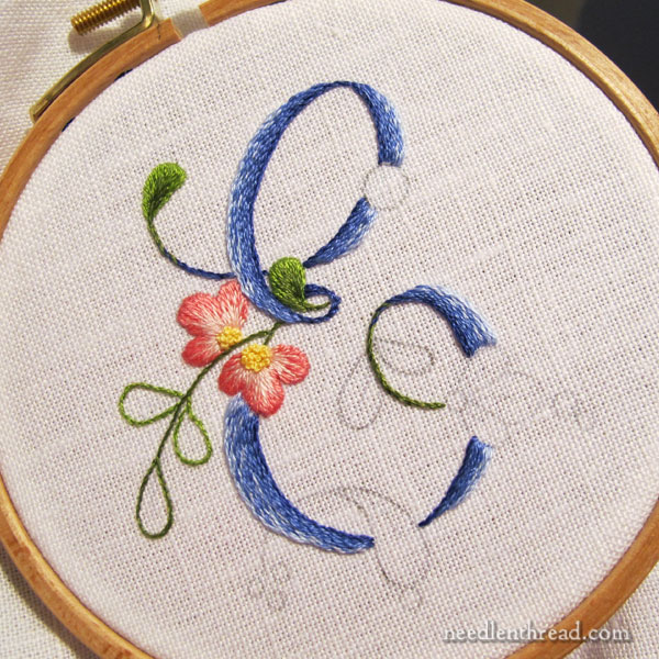
This monogram E is taken from the floral script alphabet in Favorite Monograms. You can also find letters A-L available here for free. Eventually, I’ll finish adding the rest of the alphabet to Needle ‘n Thread, but if you’d like to find it all in one place, it’s available here, in Favorite Monograms.
As you read this article, you can click on the photos to examine larger versions. Anywhere there’s a link on a stitch name, the link will take you directly to a tutorial for that stitch.
Materials
For this particular E monogram I’m using the following materials:
Alba Maxima embroidery linen
DMC stranded cotton in the following colors: Blue (light to dark: 3840, 3838, 792, 791); Green (light to dark: 470, 937); Pink (light to dark: 3713, 899); and Yellow (727).
4″ embroidery hoop, with the inner ring bound
#7 & #9 crewel needles
Stitches
Once finished, the monogram will involves fives stitches: stem stitch, split stitch, long & short stitch, French knot, and satin stitch dots.
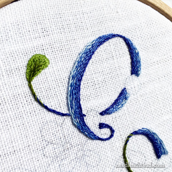
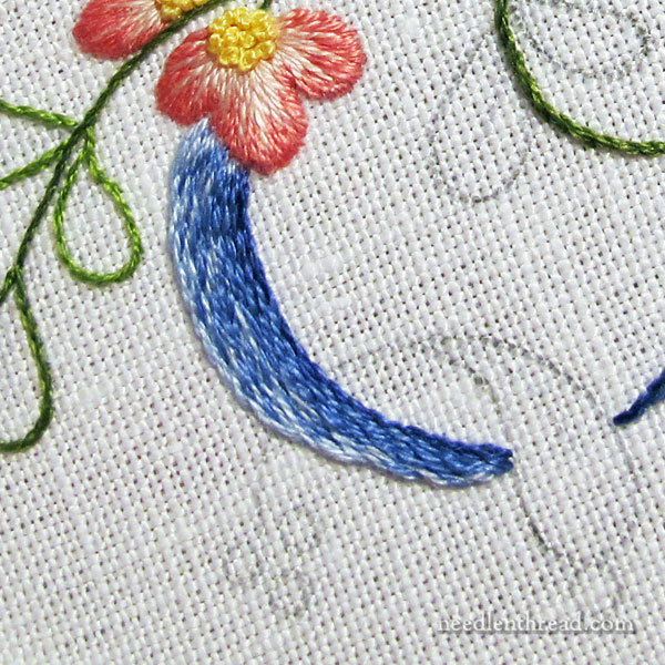
I embroidered the letter first, using stem stitch filling.
Since I wanted the filling to be a little sketchy in shading from dark on the innermost line of the letter to light on the outermost line, I mixed the shades of blue in the needle.
So, on the inside of the letter, I had two strands of floss in the needle (the two darkest blues, 791 and 792). I stitched the inside outline of the letter in stem stitch with these two shades in the needle at once.
Then, I switched to 792 and 3838 in the needle, working another line of stem stitch right up next to the first.
The next two lines of stem stitch were worked in two strands of 3838, which is the medium blue in the range I used.
Then, I switched to a strand of 3838 (medium blue) and a strand of 3840 (light blue) in the needle, for the next two rows.
I finished the outermost edge of the letter with two strands of light blue (3840) in the needle.
Switching the colors up like this gave the shading on the letter a more natural look and made the whole letter look a little heathery or sketchy. That’s exactly the look I was going for. I wanted shading, but I wanted it to be subtle, avoiding a stripy look that can often result when shading with stem stitch.
This is the letter part, finished.
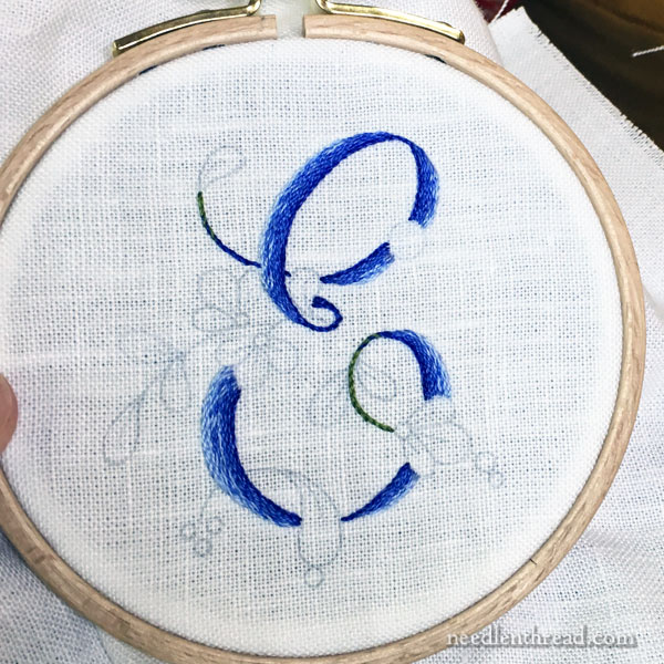
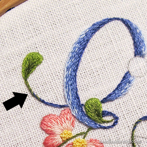
When you’re working stem stitch with two shades of color in the needle at once, you can’t always predict which of those shades is going to be dominant, and where it’s going to show up.
While the upper half of the letter worked great, I wasn’t as pleased with the medium and light blue shading on the left side of the lower half of the E.
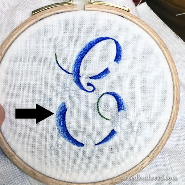
That’s right in here. See how blotchy it is? The light blue is dominant in that area, due to the twist of the two threads while I worked the stem stitch. There’s very little medium blue, and when it does show up, it all clumps together!
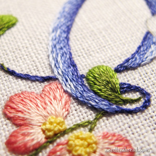
To solve that, I took one strand of medium blue in the needle, and I worked it over a few of the stem stitches in that area, to “speckle in” a little more of the medium blue.
This helped spread the medium blue out in the lower half of the E and got rid of the blotchy look.
I’m still not perfectly happy with the area just below the flower, where the stem stitch starts. I may yet fiddle with that a little bit and touch it up.
On the tips of the E, where they end in what looks like the rest of the leaves in this design, I combined the darkest blue (791) with the dark green (937) in the needle as I worked the stem stitch towards the base of the leaf.
When I was about three stitches away from the base of the leaf, I switched to two strands of dark green in the needle. This helped create a gradual transition from blue to green as I approached the leaf.
I embroidered the flowers and the leaves in long and short stitch, worked over an outline of split stitch. Both the outline and the long and short stitch are worked with one strand of floss.
You can find a photo tutorial on how to embroider a petal shape in long and short stitch here. It’s a pretty old article and the photos aren’t the best, but the principles are there.
The center of the flowers are worked in French knots, in yellow, using two strands of thread.
The Tongue
I know I’m not the only one who sees the overlapping element on the base of the E as a tongue! I can’t help it!
Now, I could increase that effect (why would I want to?!?) and embroider that in pink, but don’t worry. I won’t. That overlapping element will be embroidered in blue, like the rest of the letter, and I believe it will minimize the look of the tongue.
We can always hope, anyway!
So, that’s this letter so far. I’ll show you the finish pretty soon!
Any questions? Comments? Suggestions? Feel free to chime in below!
Wow! This looks amazing!! I really love all the monograms you have stitched. Is the stem stitch filling done using all 6 strands of cotton thread?
Hi! No, the article explains the number of threads used and the color switch out for the shading.
Dear Mary
The E monogram is lovely and I like the overlapping flowers in the colours you have chosen they really blend in well with the overall design. I wouldn’t have noticed the blotchy area unless you had pointed it out but I have to say it does look better with the cover of the medium blue thread. The same with the overlapping tongue leaf I wouldn’t have noticed that either unless you had pointed it out, not very observant am I. Thanks for sharing this lovely monogram with us, I don’t know how you think up all these different ideas on stitching monograms they are great. I can’t wait to see the finished project.
Regards Anita Simmance
This one is my favorite so far. Simple, yet elegant.
Inspiring – I really need to do some monograms!
Hahaha! You are SO funny! Seriously, though, you are teaching me so very much about exactly what I want to learn in embroidery. Thank you so much. Keep up the good work. I love your style!! 😀
The monograms are my favorite, and yours are lovely. I especially like that are relatively simple. My biggest problem is I don’t know what to do with pieces when I am finished. Framing them for my wall does not appeal to me nor pillows. Does anyone have other ideas for using these designs? Many thanks.
Hi, Lynne – I’ve used them for making needlebooks for people for gifts (for people I know who like to embroider or sew, that is!). I’ve also used them in the tops of decorative wood boxes, to make keepsake boxes for gifts. (Like these Sudberry House boxes: http://www.sudberry.com/catalog/index.html) They also work well for pockets on tote bags (project bags!). So those are some ideas. I’m sure there are plenty of folks who will have better ones – I hope they chime in, too!
I think journal covers would be a good use.
Hi Lynne,
I think monograms would work well (and be really lovely) on traditional linens like towels, table runners and pillow cases. You could also use monograms on non-traditional items like travel bags, lingerie bags, even shopping bags :).
I would love to do this type of embroidery, but my question is how do you get the pattern on the fabric? It seems that is always passed by.
For beginners, we really need to start at the beginning. Am I missing the beginning?
Thank you for any help,
Katherine
Hi, Katherine – You might want to start with this article, which covers all kinds of transfer methods: https://needlenthread.wpengine.com/2010/09/beginning-embroidery-design-transfer.html Read the comments, too – they’re helpful! If you like the idea of an iron-on, you can check out these pens: https://needlenthread.wpengine.com/2015/05/sublime-stitching-iron-on-transfer-pens-review.html They work pretty well! In the last monogram article on the C (that’s this article from last week: https://needlenthread.wpengine.com/2016/09/embroidering-a-pretty-monogram-with-simple-stitches.html I talked about tracing. I use the light pad mentioned in that article and pretty much trace most of my monogram designs, using a pencil, or sometimes, even a micron pen, depending on the piece. If it’s something like this that I would probably want to wash, though, a pencil on linen that’s been spray starched works well and it washes out pretty easily. Oh, and here’s another article on a transfer pencil for tracing that works well: https://needlenthread.wpengine.com/2016/05/transfer-whitework-embroidery-designs-with-confidence.html But a mechanical pencil with a #2 lead also works, especially if you use spray starch on the fabric (and assuming it’s something you’re going to wash). Once you’ve tried different methods of transferring, you’ll end up with one you prefer. For me, with small projects, tracing is my preferred method. With larger projects or with dark fabric, etc., I might use different methods, but with this little monograms, I trace.
The search feature on Needle’n Thread will bring up other articles that deal with transfer methods, too, in case you want to explore a bit.
Hope that helps!
Mary – Every time I read one of your articles I am reminded what an amazing teacher you are. You take us step by step so that our finished product can resemble yours. Notice I didn’t say it would be just like yours…..just a resemblance. And we think of you every step of the way. Thank you, Mary. A thousand times, thank you. You are our inspiration!!!!
Dear Mary,
I am so thrilled you are doing examples of different embroidery styles for monograms!
I’m doing bookmarks with initials for friends for Christmas. I’m using a reduced size on banding from Nordic Needle. The first two turned out well with split stitch. I couldn’t get the stem stitch to do right
Your site is the first one I go to each day
Thank you so much. God bless.
Susan
You are so funny and inspiring. I have avoided the long and short stitch but this looks doable and small enough to finish. I could practice first but time is precious. Ha. No, I did not see the tongue until you pointed it out. Thanks for giving me a good laugh before I go off to work instead of stitching the day away. Tonight I will practice long and short stitch.
I would do the ‘tongue’ in green, I think. Isn’t it supposed to be a leaf?
I thought about that, Ros, but it’s fairly long, compared to all the other leaves. I might try it both ways and see how it works out!
Lovely as always Mary,
I’m with you Ros, I was thinking green.
Lovely. I also vote to make the “tongue” green, as it ends in a leaf shape and has the little circle buds. If you think it is too long, you could always make the line part of it begin in blue and shade to green…
I also think the “tongue” would be nice in green. It will be neat to compare what it looks like if you try it both ways though!
Maybe sometimes you just need to stick your tongue out at the world!
(Okay. Not on a monogram. I know. The point stands…)
You are amazing! Thank you for sharing your talent!
Hi Mary, so glad you are doing better. I love your monograms, but could you please come up with some more musculine monograms. Thank you. Juliet
Hi, Juliet – the modern Roman in Favorite Monograms is a more masculine monogram design – no frills or anything, just clean lines in a nice lettering.
It’s beautiful!! my oldest daughters’ name is Elizabeth and I was going to make her an embroidered monogram: now I know which one I’m going to do!! 🙂 Thanks for all your tips and hints. Hugs, H
Hello Mary,
Thank you so much for all this hard work of teaching us
all the tips and tricks for the Monograms. I am making a
special file on my computer so I can go and look for
information when I need it.
I hope you are well ?
Take care and have a great day tomorrow.
Louise
Mary this fabulous, even if I am a bit partial to the”E.” I see what you mean about the tongue shape, but I don’t think it should be blue. It should be green and treated like a large leaf. Then you could embellish the dots in the coral colors. Clearly it’s not a part of the E, it’s part of the floral sprigs. Keeping it as a green leaf will tone down the tongue effect and stay true to the design as well. Anyhow it is a real treat to see my initial done by a master embroiderist, thank you!
By the way the blue is my favorite color and I love all the other color choices as well. I probably would have picked them out myself exactly the same. Wow Mary you made this for me! If I had a tail it’d be wagging. Ha ha.
The tongue jumped out at me! unlike your problems with shading, which I only saw when you mentioned them 🙂
Using the monogram as a personalized cloth covered clothes hanger makes a special gift for self or others, and you never have to worry about washability of fibers used. Same thing if adapted as an ornament to suspend from door knob or door hook, or the fireplace mantle hook off season from holiday stockings.
Hello Mary
I am always happy when I open my computer and see an email from you, since that means you are well and happy enough to write for us, your adoring fans. It seems everyone loves Mary, and with good reason.
This monogram is lovely. I agree, the ‘tongue’ is troublesome but overall I think it should be green too (fwiw). Blue is my favourite colour and one not often seen in embroidery as there are not many true blue flowers and I am ornithophobic so I don’t look at those.
Mary, I really think that “tongue” would look better treated as one of the leaves, and embroidered in green. Embroidering it in blue could make it confusing to figure out what letter it’s supposed to be, since one’s eye will tend to read the tongue as an actual part of the letter.
My favourites of all your blogs are the ones about fixing errors; second favourite is the tips & tricks. I have been watching your monograms and have been inspired. However, my biggest question: How to make a monogram that is masculine, and yet a little adorned??
This week I made a cushion for my brother, who is moving house next week to a flat where he cannot hang anything on the walls. So a cushion with his first initial seemed the natural choice. His name is Robert. But when I showed the monogram I chose, and the samples of the free hand stitches I planned, hubby said it was too feminine. No matter what I chose, he said no. In the end I chose a very basic R with a sheaf of wheat (I think it is) running through it. The R is appliquéd with denim, and edged with a wide, long and short buttonhole stitch. The wheat is stem stitch. But I ask is there a way to adorn a monogram that would be suitable for a middle aged man (who is single to anyone interested…)
Yes, I agree with the others, the tongue looks like a leaf to me too. Maybe if you make the dots more flowery, that will carry it.
Mary, when you do stem stitch in the hoop, are you using stab stitches?
Your long and short stitch is gorgeous, it looks padded! That must be more than just the split stitch outline, is there a lot of thread in there?
Hi, Monica – no, the long and short stitch is not padded. It just has the split stitch outline underneath the edge. The padded look comes from the fact that there’s an outline under it, and it is a very small space. Yes, I always stab stitch my stem stitch, unless I’m working without a hoop or frame. Hope that helps!
Yes, thanks Mary! And that 2009 tutorial was a big help too. 😀
I have always ALWAYS seen that as a tongue. I think there’s one of those things in every letter in this particular style of monograms, no? Because I feel like I’ve seen that tongue in the whole alphabet and it drives me nuts. I find them creepy.
But! You know… Halloween is coming up… A tongue here, an eyeball there… What’s the harm? You can hide em and see if anyone notices.
Also, I love the blue. It looks like denim. Denim, currently, is going through a well-worn imperfect stage with variations in color. Lots of holes, too. (I don’t care for that, though.) My point, however, is that your monogram is fine. So, settle down. Or, as I read in one of your posts, “That’ll do, pig.” (I laughed so hard! I love that movie! And I’ve been saying that to my mom for years.) There’s a Leonard Cohen quote that I shall now butcher: The cracks are where the light comes in.
Embrace imperfections! That monogram has a tongue on it, and you want it to be perfect? Dude. Just… Dude.
All my best,
Whitney W. (The “w” stands for not knowing when to stop, so, you know… Pot. Kettle. Havin’ hypocritical arguments on the stove.)
LOL!
I think I agree with the others’ suggestion of doing the tongue to match the other leaves. It might appear as part of the letter if done in blue, but then again, it might simply appear as a tongue that’s just been feasting on cake with blue frosting.
Why not leave the tongue out, if it bothers you?
Lovely work ma’am. Can’t wait for my book to get here to get started on my Ebook. Thanks for the tip on Sudberry house! My local needlework store has boxes but they start at an appalling $45 and just go up from there…..
So far, I’ve done simple monograms on kitchen towels, pillowcases and handkerchiefs. My son and husband were both wowed with even simple lettering on handkerchiefs.
Hola Mary
I love the tutorial, is my letter, the details and the clarity of the instructions.
Thank you so much.
Dear Mary:
I love this monogram as well as all the others. I have printed them all and trying to find the time to do them all!
I am in a quandary and I need help please.
I have a project I’m doing with satin thread and I would like to know how you deal with the slickness of the thread on the back when ending a strand. I don’t like the way the floss shreds itself and tying it off is almost impossible. If I try to weave it in I’m afraid it will slide back out.
Any suggestions would be greatly appreciated. If I have to use hot melt glue, I will, rather not though.
Hi, Norleem – you might be able to end the threads more easily by taking three tiny back stitches into each other in an area that will be covered by other stitches. This will probably help lock the stitches into place. I’d try it that way. I’ve never actually used that particular thread for anything but embroidery on paper, where you can use tape on the back of the paper. But if I were using it on fabric, I’d use some tiny holding stitches like I described.
Hi Mary, after reading your article on the DMV I think you must be reasonably close to me. Do you give lessons or classes?
Hi, Becky – I’m in Pottawatomie County, in St. Marys. Unfortunately, I don’t have space to give classes right now. Some day, though, I hope to!
I’ve just started to embroider, and at 60, my eyesight is not great, so neither is my stitching! But I just love practising my embroidery on these monograms. I made a 6 pocket tote bag for my Mum with one worked in. I think these will make wonderful gifts for my holiday list. Thank you Mary, for your inspiring blog!
Hi Mary: I have a question about the alphabet styles. You have said in this article that the monogram comes from your floral alphabet , letters A-L which are available on your site, however, when I look at what is there, the letters are not at all the same. Even the style of letter is different comparing the monogram you have stitched here and what is on the site. Is the style as you have stitched it available only in your e-book? I love this “E” but am not such abig fan of the liral alphabet as it is on the site. Thank you for your help. Amanda
Hi, Amanda – are you looking at the right letter? If you scroll down to the end of the monogram page there, it’s the last one. The A is showing in the index, but if you click the letters underneath, it’ll take you to the available letters up to L. I’ll be adding the others over time. It’s the same alphabet, and the same style as this E. Hope that helps!
Do u use a stabilizer when using linen?
Hi, Nancy – Stabilizer is not usually used in hand embroidery. If a second layer of “something” is needed (if, for example, your fabric is rather lightweight and you are planning on stitching densely or using heavier threads), then you might back the ground fabric (that’s the fabric you see right under the embroidery) with a layer of plain cotton muslin or batiste or something similar, to give the lightweight ground fabric and the stitches a little more support. But iron-on stabilizing or similar are rarely used surface embroidery. With a medium-weight linen like that, I don’t back the fabric with anything.