


I’ve made a little more progress on the Mellerstain Firescreen crewel embroidery project that we talked about a couple weeks ago, and that I reviewed here.
Today, I’ll answer some questions and share a couple stitching tips – whether you’re working on this particular project, your own crewel project, or even any other embroidery project where the tips are still relevant.
I’ll also share a quandary and ask your opinion!
Golly! Crewel work is so satisfying! It gives you all the sensory pleasure of other types of surface embroidery, and, on top of that, there’s the speed of crewel. You might not be stitching any faster than you normally do, but the picture sure develops more quickly!
When you finish a stitching session, you see a relatively ginormous amount of progress.
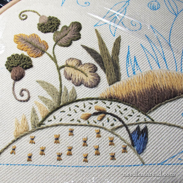
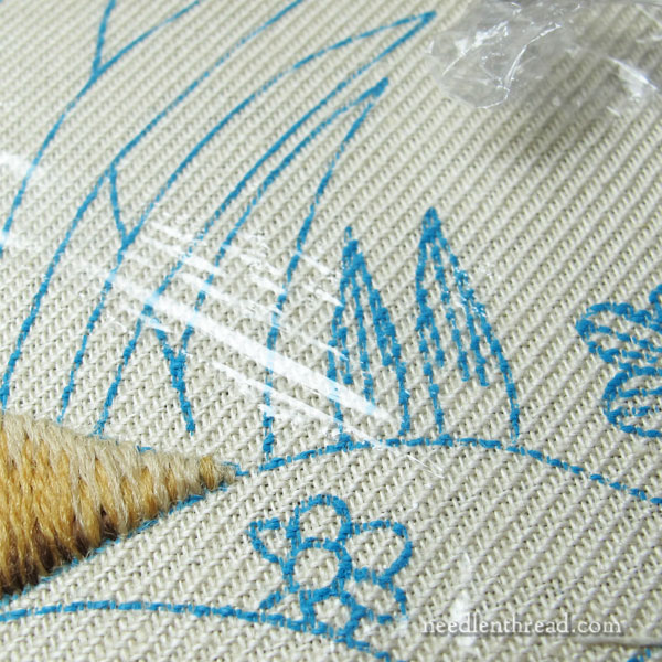
These little bumps or hillocks are called “hummocks” in the design manual. A hummock is just a little hillock or mound … or bump. Or knoll.
(You get the idea!)
For some reason, I keep wanting to call them “humpies.” But here in America (well, in the Northwest, anyway), a humpy is a fish (it’s a nickname for humpback salmon). Apparently, there are other meanings of the word, varying from culture to culture, none of which work for these little bumpies.
I suppose I’ll stick with hummocks. Or hillocks. Or knolls.
In any case, whatever you call them, these design features on traditional “tree of life” type crewel pieces are great fun to work!
Why? Because every bumpie features a different type of filling stitch or technique. But many of these fillings are fairly light, making them quick to work. The bumpocks develop quickly, so you get to enjoy a frequent feeling of satisfaction in finishing a section or reaching a small goal.
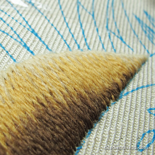
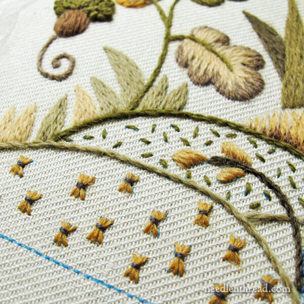
I do have one little quandary with my hilly-bumpy-thingies, and it’s this long and short stitch mound.
Overall, the soft shading here worked out “ok,” but in fact, the lower part of it is quite dark, compared to the picture of the original firescreen. On the original, it shows the darker brown at the base just barely sketched into the other long and short stitches.
But when I look at my hillock, all I see is the very dark contrasting shadow.
I’ve contemplated taking this out.
But I do like the dark, just because it’s a rich deep brown that provides a deep contrast on the piece so far.
The thing is, this particular crewel piece has nice colors, but they’re not exactly vivid colors. But contrasts can help make the piece look more vivid.
So I’m torn: do I pick it out? Do I leave it in?
So far, I’ve left it in. And the more I stitch around it, the less inclined I’ll be to pick it out. But that doesn’t mean I can’t pick it out.
Right now, I’m just letting it talk to me a bit.
But what do you think? Too much contrast?
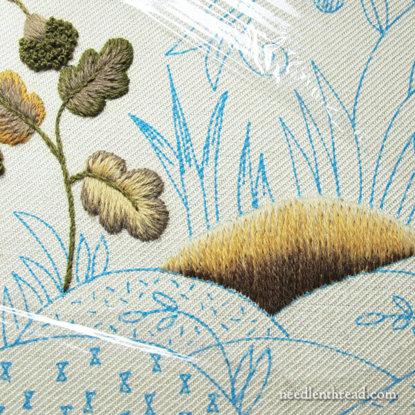
Speaking of letting things talk to me, the two blades of grass in the photo above have been talking to me ever since I started on the hills.
It’s probably sacrilege when you’re working on historical re-creative sorts of pieces, but I think I’m going to make an adjustment on these.
I can’t help it! I just have to do it! I’ll never be happy with the piece if I don’t.
I’ll show you the adjustment once it’s accomplished and explain why (and how) I did it.
Answering Some Questions
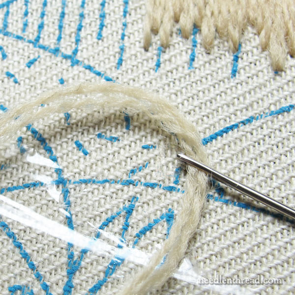
Some stitcher have written in to ask about the first layer of long & short stitch and how to keep it smooth.
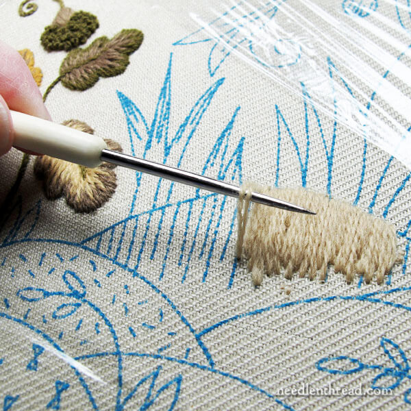
The first layer of stitching on the hillocks when working the long & short stitch is done with a double thread in the needle, to give some height to the edge and to give the long & short stitch a good foundation to bite into while filling the rest of the hill.
I use a laying tool to keep the two threads parallel when they go into place, so that they aren’t twisting over each other. I like a smooooooth long & short stitch filling!
But there are some points to keep in mind if you’re going to use a laying tool in this application:
1. Don’t stroke the wool. Wool just doesn’t stroke the way silk and cotton do. Just use the tool to keep the threads parallel as the stitch is placed on the fabric.
2. If you have a laying tool with a rounded tip, that’s the best option. A sharp-tipped laying tool is murder to wool if you snag the threads.
If you’re not sure what a laying tool is, here’s an article explaining what a laying tool is, and here’s my video showing how to use a laying tool.
Split Stitch Outlines
A couple stitchers have written to ask about working a split stitch outline under the long and short stitch on this project – whether on the leaves or on the hills or on the animals.
It’s true that I usually work a split stitch line on the design line, and then I work the long & short stitch over this split stitch line. Especially when working with cotton and silk, the split stitch line helps lift the edge and helps achieve a smooth edge along the design line.
With this project, so far, I’ve found no reason to add a split stitch outline under any of the long & short stitch filling. The thicker wool thread provides plenty of lift on the edge (remember, with the first row, you’re going down on the design line, which also helps lift the edge), and it hasn’t been difficult to maintain a smooth edge.
Also, if you’re working the kit, the instructions don’t call for the split stitch line. If you do decide to work it under all the long & short stitch elements, you’re going to be using a lot more wool than required for completing the project as written, which may leave you short on wool as you near the end.
Personally, I’d skip it. But it’s up to you! The nice thing is, Appleton wool is easily ordered, it’s not that expensive, and the colors are consistent across dye lots. So if you end up needing an extra skein or two, relatively speaking, it won’t be a huge investment.
Increase the Longevity of Your Wool Thread
Crewel thread is notorious for being short-lived when you’re stitching with it. You can’t get away with long lengths.
Even when using short lengths, you can further increase the longevity of the wool thread in the needle by shifting the location of the thread in the needle every now and then.
Every several stitches, if you move the needle a little way along the thread, it won’t wear down around the eye as quickly.
This will help the thread last a little longer and it will decrease the amount of fuzziness at the end of the thread (by the eye), which will help decrease the amount of fuzzy residue that can show up on the fabric as you stitch.
Onwards!
So, that’s where the project is at the moment! I’m having a swell time with it!
A busy week ahead here, though – lots of other things I’m working on for the website, and then, you know, there’s that holiday popping up on Thursday! – so I’ve put the firescreen aside for little bit, to concentrate on other delights.
If you have comments, suggestions, ideas, criticisms… feel free to join in the chatter by leaving a comment below! I’d love to hear from you!
I’d leave it in, remember colours change as other colours sit next to them, so, while it may feel far too dark now with the white next to it, as soon as you do more of the hillocks it will change how it feels. Looking at the first picture the darker green used already makes it less dark 🙂
Hi, Mary! I think of you all the time, and your wonderful emails brighten my day each day they appear.
Before I onew what your “quandry” was I noticed the photo and thought the dark brown looked really DARK….
As you know better than any of us, when other colors are worked, and more of the work co pleted it may look more balanced, after all. It may just be an artifact of so much blank cNvass still….
It is a pretty, deep, rich brown, but heavy for the other colors there. But you could always judiciaously place a little of it elsewhere as the work continues if you want to leave it there and see what happns.
But you know all this! You are the BEST!!!
-Marion
One other thing I have found helps with avoiding abrasion at the eye (with stitchable metals as well as wool) is to pinch the needle right at the eye when pulling the thread through.
I love the big dark shadow on the hill, and it makes sense since there are other hills in front of it. The proportions of the colors still make it clear the hill’s base color is yellow and the dark brown is shadow. (If the dark brown had crept any higher, the yellow might read as sun/highlight on a brown hill.) What a lovely piece!
I am totally unqualified to comment, as I’ve never done crewel embroidery (though I really want to give it a try as I love the look of it 🙂 However, from the perspective of a fiberist, I have a couple thoughts about your hillock. One, where is the light coming from in the overall design? To me, the darker brown suggests a shadow, and as such is fine unless the direction of light in the design is from that side. If there’s no real feel for the direction the light is coming from, I might adjust the hillock by adding a bit more of the lightest color. It seems a bit skimpy compared to the other two.
I do love watching your larger projects progress!
Holly
Regarding the dark base of your hillock, I would leave it in, but maybe bring a few more light and or medium threads down further into the dark section toward the center point, so that the break between dark and medium is less horizontal and follows the contour of the lower edge. One of the things I love about working long and short in crewel wools is this opportunity to add just a few stitches somewhere to totally change the look!
I would leave it. I think it is very attractive.
Your screen is beautiful as is. Well the Hillock or whatever. I think when you get the rest filled in, it will look awesome. You do such good work and have an eye for color and such. You are my hero!
If the might be “too dark” part on the hilly humpy bump REALLY bothers you unpick it BUT… It may not be too dark once you get the surrounding hilly humpy bumpy parts stitched in. Personally I’d wait till I was done with the surrounding areas & see if it was ok or not & take it from there. This is YOUR piece of art make it your own, step outside the box, it doesn’t HAVE to look exactly like the picture. Frankly I seldom following directions to the T but instead ….. But then again I am a wild & crazy stitcher lol— Blessings Baa
Dear Mary
Your stitching is beautiful and unless you had pointed out the dark and light contrast on the hilly bit I wouldn’t have noticed the difference, so I would say keep it in as you progress with the project you probably won’t notice it after a while. It looks a great project and I like the design and the wool colours. Thanks for sharing your dilemma with us and for the lovely photos of fire screen project and for the tips and techniques of the L&S stitch I will be using this stitch in the near future as my next project is a Poppy flower for my Sister’s 70th Birthday, I’m looking for an on-line pattern at the moment and looking at red silks which I will need.
Regards Anita Simmance
Thank YOU for all you do for all of us. Today, Thursday, and everyday.
Good morning Mary
Ah! Crewel Embroidery. One of my favourites!
Should you take it out; should you leave it in?
I would leave it in until you have completed the work adjacent to the hillock. If you
then do not care for it, then remove it.
It is your choice, of course.
Sharon
Winnipeg, Canada
I wouldn’t take out the dark brown. The contrast makes a great look to the piece. Love all the info and tips you share with us, they are so helpful.
It is nice that you would love to hear from me – but I would love to get an answer on my earlier question 🙂
Kind regards
Jette Sauerberg
Hi, Jette – Was your earlier question about sending a photo? I just found it in the article on October 21. I had 367 comments on that article, and I just couldn’t respond to each of them personally. Sorry! You can use the contact form right here on the website to send email, or you can just send a photo to mary(at)needlenthread(dot)com.
Hi Mary, I’d leave it be at least for now. If it still seems to dark after working the other areas around it, you can always add in a few lighter stitches.
Hi Mary,
If it were me, I would leave the contrasting brown in. I think you are right and will find that as you work more around the hill you will like the contrast more and more. So that is my humble opinion.
Enjoy your week and Happy Thanksgiving! (We’ve had ours).
Cynthia, Vancouver Island, British Columbia, CA
I would leave the hillock in. I like the way it looks. It may not look like the finished picture that came with the kit, but then you will be making other tweaks along the way that will also change your finished look.
So happy you are feeling better and have posted more! It is such a treat to visit the web site and see a new post! Happy Thanksgiving to you.
Love watching your progress on this piece. I’d leave the hillock as it is. The contrast adds to the other textures.
Leave the stitches. This is my opinion. I like the contrast. Without it would look like a blob. Again, my opinion.
My Dear Mary, I am so sorry that you of all people are having trouble with the person who is plagiarizing you on Utube! I have thought about this all weekend, and it really is bothering me. After all you do so much for us all, and we appreciate it. I wish there was more we could do to help. Has Utube offered any more help? Any way I wanted you to know how I feel. Thanks for all you do.
Terry
Mary, first of all I enjoyed reading your series in which you deconstructed the gold work. Spent too much of yesterday reading through it all, and was so bummed to be left with a cliffhanger. However, it was great! I know you said you lost the pictures for the last part of it, but I would love to just hear how the book upon which the lamb rest it was made. I think that description would be great, and it would provide closure for those of us with cliffhanger issues. 😉
As to your work on this fireplace screen, I would leave the dark. I’ve been obsessively watching Bob Ross, The Joy of Painting, and think that the contrast will make rest of it stand out even more. I highly recommend Bob Ross because I really learned a lot about looking at colors and the variations between them to create depth and perspective. I think every sticher should watch Bob make happy little trees and happy little mountains. I’m even considering doing an embroidery painting of one of his works. Not sure if I can pull it off, but I know I can give it a try.
Again, thank you for all your work, and it’s making my morning even better.
I’ll be brave and say that the two little thingies that appeared on the canvas might be the ubiquitous “Indian Paintbrush”, as my mother used to call them. They would appear by the side of the road in mid-summer to fall of the year here in Minnesota. She would behold them from afar….never picking one because according to mom, they were sacred to the Native Americans. They were an orange-yellow-red combination and ever-so-beautiful!
I like the amount of contrast on your hillock. It makes it seem steep and mysterious. I would do several more of the ones underneath to see if it needs to go.
I think you have too much dark brown showing. Just my opinion.
Love the articles on crewel work. It is encouraging me to try it.
Mary… ok…I’m having a “senior moment” this morning!!! Here is a parenthetical statement that you made in today’s post:
“(remember, with the first row, you’re going down on the design line, which also helps lift the edge)” …
What the beegeebees is “going down on the design”? Does that mean that you are coming “up” in the middle of the section and “going down” on the edge…or coming “up” on the edge and going “down” in the middle of the section?
Hi, Bonnie – Sorry about that. I was writing, I suppose, as if you were working the project, too. On this project, Phillipa instructs the long and short stitch with the first row stitched from the inside to the design line, so coming up inside the shape with your needle and thread, and going down on the design line (or just a hair over), to end the stitch. This really does make a difference in the way the stitch lies right along the design line. If you come UP in the fabric on the design line, the fabric pulls upward slightly and the stitch lies flatter, but when you go down into the fabric with the stitch, there’s more of a lift on the edge where you went down. Of course, this is all rather microscopic, but in the overall scheme of things, it’s noticeable. Hope that helps explain it! 🙂
Yes, Mary…this is a wonderful explanation! Thanks!
When did you start covering your “not working on it now ” areas with plastic? I have used hankies for this. Is it heavy sheets or just plastic wrap? How does it stay in place?
Besides speed, other nice things about crewel work are ease of covering up and ease of taking out!
Hi, Donna -We discussed the cling wrap thing in the first article on this project. Normally, I don’t use it, but since Phillipa recommended using it, I thought I’d go ahead and give it a try! At first, I was just using Cling Wrap, but on another reader’s recommendation, I picked up a small box of Saran Wrap Premium, to see if it behaves better. We shall see! I’m not a huge lover of plastic wrap, but I’m always game to try anything!
your work is just perfect the way it is. I love the contrast in colour it gives great meanaing to the work. you have got it just right.
Marjoriexxxxx
I laughed about your “relationship” with cling wrap. My mother called that stuff a “modern inconvenience” and, believe me, I remember her words every time I use it. However, using it to keep embroidery-under-construction clean, looks like a convenient use.
I would add a few stitches of lighter yarn below the edge of colors just to blend it up a tiny bit.
I have taken two classes from Phillipa and have stitched 5 of her kits. Some of her kits have some contrast, many do not due to the historic reproduction nature, the colors are more blended. That being said, I love the contrast you have achieved on this little hillock. If you look at the photo on the Crewelwork website, it is very muted. The addition of the deep shading appeals visually to me and I think enhances the piece overall.
I am following your progress with lots of interest as I have ordered The Crewel Work Company’s most recent kit ‘The Glamis Crown, Rose and Thistle’. It’s a Christmas present to myself. It hasn’t arrived yet but I can’t wait and I surely won’t be able to wait until Christmas to start it. Happy Thanksgiving to you and your family. Sandra
I’d leave it in and finish the area around it. The colors around the hill should soften the contrast so it will not stand out.
Beautiful work, Mary, I love the acorns and oak leaves.
I know nothing really, but I vote to leave it. I am basing my opinion on the squinting eye theory. Right now it is surrounded by the white canvas, to much contrast but if you squint your eyes just a little the look is much softer.
Thank you for all of your work and lessons. I love receiving your emails.
I like the dark brown so far, it think you’re right that it lends some rich contrast to the piece.
I’m a handspinner and have been thinking of using my handspun wool in embroidered pieces. Do you have any experience using handspun in crewel? Any tips on how to handle or fabrics to recommend?
Thanks for sharing your lovely work!
Hi Mary!
I hope you don’t mind me jumping in after reading through the comments so far. It is lovely to see this design progress with so much care and attention to detail, although of course the original in Mellerstain House, Scotland, is stitched with a little less skill!
Just to reassure everyone – We always send more skeins of wools (free of charge) if anyone runs out of any of our colours. I really want to encourage crewel workers to use longer stitches and more of them especially in the first layer of Long and Short Stitch.
I do not outline each feature in Split Stitch, I agree there is no need. Also the 17th Century professional embroiderers did not do this. Outlining in Split Stitch was, I think, started by those who used early transfers which left an ugly thick dark line which was difficult to cover. Yuk.
If you feel the dark colours at the base of the hummocks (that word again) then you could add more small flowers over the top of your Long and Short as in the ‘naked’ next door hummock.
I hope this makes sense to you!
I love Saran wrap also, and some of my American friends bring it over when they visit! (Brits take note that this is extra strong cling film, also available at Lakeland Plastics). It was a chef in Australia who offered me cling wrap when I visited in 2007, and now everyone offers me this tip. Love it, aren’t we a happy sharing community.
Back to the 17th Century,
Phillipa T in snow covered Northern England
Phillipa- I have sent 2 emails to your web site, but I’m certain you must receive so very many…
Please instruct me how to clean the completed fire screen prior to framing. Once framed, I intend to add pieces to the frame so it looks like a historical firescreen.
My next project is the bedspread !!
Loved your tip about moving the needle down the thread. I’m just trying it now and it’s great! Thank you.
I would leave the dark brown until you fill the two hills in the front. Depending on those colors and shading, the brown might be more “blendy” than having too much contrast.
Love all your information, and I look forward to reading your emails. My library has grown because of you. All of your reviews for books or products have been right on!
Hope you are feeling better! You sound better.
Thank you for all you do for all of us!
Linda S
Pewaukee, WI
Dear Mary- I love the hillock in question. Leave it alone!! I just finished this fire screen and I adjusted the directions to include some of my own stitches, as well as colors. Now- I need to locate a beautiful and unique frame that I can convert to a proper fire screen. A totally fun project!!
Catherine
Keep the contrast! I love a good dark shadow. I can never get my shadows dark enough. But, dude, the lightest color is a total line! Blend!
My super-detailed, articulate opinion. You’re welcome.
I’m suddenly overwhelmed with the urge to take this away from you and be all, “Well, if you can’t do it right…” but I really mean, “my preciousssss…..” (I’m not sure if you’re a Lord of the Rings kinda gal, but it’s creepy either way!)
So, Mary- Tell me how to prepare the finished fire screen for framing- should I rinse in cold water, use a mild soap…?
After all the wonderful hours of stitching, I don’t want to mess anything up!!
Leave the dark…at least until the more forward hillock is finished. To me the dark is like the artists use behind objects so that the object stands out. Rather 3-D. I’m not an artist but learned this in tole painting. I too love to do crewel work. Yours is beautiful. jc
Mary, I like the contrast too – I would leave it in 🙂
Hi
I would leave it. Its shouldn’t be a carbon copy of the original its your own piece, it adds character.
I have just ordered this piece from Philipa it will be my third crewel kit, its highly addictive.
Look forward to keeping up with your progress
Helen
Mary when I first looked at the piece I was drawn into it because of the darker shadows. It forces the eyes around the picture and I love it. I have always loved crewel, been some time since I worked with it, but I love the colours of the artist behind the design and this is what must have drawn you to this piece, it is and will be beautiful.
Hullo Mary, I was fortunate enough to do a workshop with Phillipa Turnbull in Auckland (NZ) earlier this year, and what a wonderful experience. I remember Phillipa saying that if you don’t like something, leave it until later (much later), and when you go back to look at it, you’ll be more objective about it and probably wonder why you were even worrying about it in the first place. It’s a good message which is serving me well. I am doing Lady Anne’s flowers at present and loving it. Isabelle
Hi there from the very snowy upstate N. Y.
I am as thrilled with your blog as I am with your beautiful designs. Thank you so much for sharing your talent with us.
As for your question on your “hills” I only have this to offer, If it were me I would finish the surrounding area & see if things don’t blend in more before picking out. Have a wonderful thanksgiving.
I have two observations about your quandary. First, I’ve done a couple of Crewel Work Company kits and I just go with the colours they designate; I figure there must a reason. Second, since I am an historian, I would be more inclined to use the colours Philippa specifies since she’s adapted her kit to the original. Historically, the person who originally stitched the firescreen wouldn’t have had as many shades available to her so it’s likely she used the dark brown because that’s what she had. Dyes were less exact back then so to keep your project as authentic to the original as possible, I suggest you go with the dark brown in the pattern. Personally, I actually think it looks quite nice.
Love watching your progress! You have inspired me to dig out my one, it is fun to stitch
Personally, I like the contrast as it seems to look natural, even a green hillock would have a rather dark contrast. Your work is gorgeous as always.
I agree with your decision to leave the dark hillock alone until you get more of the surrounding area done to evaluate if the contrast is too much. It looks fine to me, but you will know better as the design fills in I think.
I’m wondering if the two problematic “grass leaves” are perhaps not grass leaves at all—they don’t look like the longer ones they’re next to. Perhaps these are actually some kind of “sprouts”–new little plants just starting to grow. If so, you could choose to make them look entirely different from the blades of grass, and it won’t bother you in the future!
Peggy Hunt
Harriman, TN
I would leave it in. It’s there for a reason which is to provide punctuation to an otherwise bland spot. Granted I don’t know what all the other color choices will be, but you need to take the overall view of the entire screen.
Hi Mary,
After looking at the picture of the whole firescreen at the Crewel Work website, I believe you will need that dark base as an anchor especially after the birds are finished.
The other little hummocks are so light they seem to be floating and your tree of life may be in danger of tipping over! Your work is so lovely and I eagerly await each update.
I would think it might be a good idea to leave the dark colour of the hillock in place until you have stitched the surrounding hillocks. Sometimes colours look different depending on the colours near them.
Thanks so much for all of the information you share and for letting us live vicariously through your stitching!
Hi Mary,
I do so enjoy receiving your emails -almost one every day. The joys of internet and You Yube eh?? Packed with lots of ideas, tips and useful websites. Thank you for all your efforts – they are really valued!
I’m at a hiatus in my stitching journey at present. Finishing off several UFOs to clear the deck for some more exciting projects in 2017. Done some classes with Hazel Blomkamp and Jenny MacWhinney recently and that’s fired me up! Just been exploring Sarah Homfrey’s website and online teaching which is very good. Thanks for the lead! You inspire me Mary. Keep up your excellent work. Jx
Hi Mary. I am fairly new to your blog & enjoying it – look forward to seeing the fire screen progress. I think I would just leave the stitching in & not cut it out -(I don’t like undoing stitches) – you could tone the dark stitched area down a bit with a fabric pen maybe . Look forward to seeing your next blog. Happy sewing
I did the Lady Anne’s cushion from crewel Company. Being in New Zealand, a very green country, green hills, trees etc, I founds some of the “hillock” colours and the tree trunk colour just didn’t seem right to me as we don’t have much yellow in our lanscape. So I used heaps more green. It matches my decor better and most importantly it “looked right” to me. At first it seemed wrong to change the kit but since finishing it I have never regretted it for a moment. My advice use colours that give you that “look right” feeling.
I echo your comments about crewel work. It is interesting to change stitches and it grows fast. I have just finished an armchair in crewel work ( the arms were wooden and weren’t stitched). Looks great and it really didn’t take long to do.
Oh, I just have to say that you are so lucky to live in New Zealand! Such a beautiful country. (Sorry! I just couldn’t pass this comment without giving your country some love. )
I think we’d all like to see your greener version of the kit. Is it in the “reader embroidery” section?
Don’t pick it out unless you want a very dull piece. I know that antique pieces may have faded and become almost monochromatic, but this is a lovely firescreen that I hope you plan to use. Thus, some contrast in shade will be pleasing, since the colors are muted. I certainly look forward to seeing the completed piece.
A faithful follower, Carole Kniepkamp
My thought on your crewel work would be to thin the brown some. I think if you thin it by half of what it is now it will still be seen but not as strong in color. My eye seems to jump right to that dark color.
Hi Mary, as to your quandary about the darkest area of your hillock…. I would definitely leave it alone. When you get the rest done, I think you will find it gives extra depth and definition to the piece. As a long time creweler, I’ve done this many times.
I hope your health situation is improving. My best wishes for good health.
Cookie Ziemba
One thing that bothered me about the original design is that the hill under the tree appears to have reddish brown for the shadow while the other two have the dark brown you have used. I think the design will balance nicely without taking anything out.
I like the contrast, I wouldn’t change it. Your work is inspiring and I would like to thank you for all of the wonderful tips and instruction that you provide!
Leave it in Mary, it is a lovely contrast and it will change as other colours are stitched closer to it.
Looking at the first photo, I would take it out if it were mine. It didn’t stand out the first time I looked at the photo, but after you pointed it our, my eye kept going right back to the dark spot. Looking at the original, from an earlier post, it only has the brown in a small area. There seems to be much more of the middle shade. which starts lower than yours does. I know from experience that once picked out, you can’t reuse the thread, and there will be fuzzies to pick off the fabric.
I do like your hillock – it’s looks so soft and furry-looking that I want to stroke it! I’d wait until you can have done more of the design before deciding whether to rework it with less brown.
Reducing thread-wear: there are three tips I pass on regularly. Make sure your needle is large enough to open up the fabric properly, and check it has no rough edges in the eye. When pulling the thread through the fabric, take the strain off the needle by gripping the thread between your third and fourth fingers – this takes a bit of practice if you’re not used to it, but soon becomes second nature. And finally, if the thread is still wearing too quickly, you can try hitching a short bit of silk or floss into the needle’s eye to act as a pad between the thread and the metal – that’s rarely needed.
Hi Mary. Before adding my ideas to this discussion I should confess that I absolutely HATE (really dislike??) unpicking so will try everything else before resorting to the dreaded reverse stitching … So, could you wait until all the other colours are added and, if you still think the change between the light and dark browns is too abrupt, perhaps add a few stitches in a medium colour to soften the transition between the shades? I love thread/needle painting for this reason – you can always carefully squeeze in a few extra threads to change the effect of colour change if needed.
Muy bueno el artículo.
Claro y sencillo. Fácil de comprender.
Trataré de seguirte. Nunca borde en lana, y me has despertado el interés por hacerlo!
Gracias!!
Hi,
You asked about the contrast on the hillock in the firescreen project . I think it looks very good; and it could be that when you add the colors to the details below the hillock, the contrast will not be so strong, or that it will make the details a little more dimensional, so to speak.
I agree with you–at this point, the dark color in the mound does seem to demand more than its share of attention in the design. I am inclined to think that the original stitcher was much like us in that when the project was completed, there were things about it that she would change if doing it again. This may be one of those elements. So, in that line of thinking, I see no harm in making the improvement that she would likely have made. If this is to be an exact replica, then making changes would certainly not be advisable. But if it is just for your own enjoyment in your home, then why not make the improvement? Just because something is old does not mean it “holy”; everything can be improved in some way!
Would the dark brown be gentler if limited to an outline shading such as in the leaf to the upper left? Or perhaps bringing the lighter color deeper into the brown for a more gradual color change? Or an additional value between the dark and light that eases the transition?
You are a far more experienced stitcher than I, so I believe your thoughts on the matter count far more than mine. I do see the wisdom in waiting until more of the design is in place. It could change how that element appears in the overall design and what seems too much at this point may be exactly what was needed there once everything is in place. Referring to the original design may be the best idea.
I envy your being able to work that screen. If I had the time, that would be my go-to project. I’m going to get picky here – As to the hillock, I looked at the finished screen online and noticed that the gold section followed the dip a little more. Maybe if you’re able to work in a LITTLE more gold down into the brown in the center to counter the straight line, you may like it better. But it will be stunning no matter what you end up doing.
Mary, Since I teach and design painting pieces more than I stitch, I’ll pass on what I tell my painting students. Light Advances – Dark Recedes, Bright Advances – Dull Recedes, Warm Advances – Cool Recedes. They learn this mantra over and over in every class. Your lights and darks are all affected by the areas around them. You are not far enough along in your project to make a decision to pick it out. The lights you’ll add will make your darks darker. And your darks you’ll add in other areas will make your lights lighter. It’s an ongoing balancing act and your final decision will become blatantly apparent as you get more and more stitched. But, being the pro that you are, I’m pretty sure you already know this and just haven’t gotten far enough to FEEL what is needed.
Always a delight to see what you’re working on. I’m still working up the courage to start on my bunad. The kit was so expensive I’m terrified to touch it!
We haven’t heard anything in quite awhile so I’m hoping no news related to your health battle is good news. Bless you for all you do for the stitching world. Happy, Happy Thanksgiving.
Mary,
I suggest you leave it because in the traditional crewel hillocks the shadow is important for the visual dimension in the design. An alternative to frogging would be to use a doodle cloth to draw a portion of that section and do a test run on how the colors in the lower hillocks will interact with it. Then you have an opportunity to see if it pleases you or not. If you still think it is too dark then go ahead and frog it.
Hello Mary,
Not being an expert on Crewel (first try for me) I like the way you
stitched it.
Other ladies may give you some other input.
Like you said, the stitching covers surface quite fast.
So this was my little comment.
Have a great day tomorrow.
Louise
I looked at it from an artistic viewpoint and IMHO, would like to see a middle color between the dark and the light. All of your work is so beautiful, I really enjoy your posts.
Thank you Mary for all your wonderful emails etc. ,they really make my day. With regard to the “humpies” in Australia they mean lean too shacks, I think you should leave it as is, because the dark will give you a shadow in the hills which should show up the other hills surrounding it. Keep well and happy stitching.
I’d say leave it be – at least for now. You’ve only just done one part of that area and it may look great with the others. I see nothing wrong with it myself. 🙂
Firstly I am delighted that everyone is enjoying The Mellerstain Firescreen kit in real life or by virtual stitching seeing Mary’s blog. since this discussion I have replied to email queries from several of our customers about the blue design which is printed onto our linen.
The blue lines are permanently printed and cannot be removed. This is deliberate as many people stitch over a long period and we do not wish their design to disappear before they complete it. To cover the printed blue outlines you should to use a generous amount of stitches in your first layer of Long and Short Stitch. This is usually done when you stitch the first colour (note Mary’s lovely dense embroidery) but you can also easily add stitches now on your completed embroidery. Using a single thread, just repeat the instructions for the first layer of Long and Short Stitch for the first colour only. This will give you a slightly raised edge to your feature and make it even more attractive (and historically accurate). I always think of crewel work as half way between silk embroidery and ‘Stump” Work and aim for a slightly 3D effect. Use considerably less stitches for subsequent colours.
If anyone needs any crewel work help then do email me via our contact form or direct to me: [email protected], or just comment on this super blog.
All very best wishes,
Phillipa T
P.S. We are now very low on our stock of The Mellerstain Firescreen Kits but M’s Canvas House in Lexington Kentucky sell our kits in the US and currently have three in stock.
Looks like you are really having fun with this. I would leave the dark colour in it looks good and will probably all balance out beautifully in the end. Looking forward to seeing the end results .At the rate you are going it shouldn’t be all that long !!! Its good to hear you so sparky and bright Take care Chris M
Mary, as always such lovely work! My thought on the knoll is to leave it as is. I find the strong contrast in your piece attractive, especially because of the beautiful shades of colour. The contrast also seems to personalize the piece.
Perfect timing for me with your recent posts on crewel stitching as I’ve begun my first piece of crewel work from Phillipa. So, very timely help with the stitch instructions + suggestions!
If you completed your needlepoint from the Traquair series I would enjoy seeing a picture of the project!
Thanks so much for the tips on moving the needle. I love the looks of crewel but get so frustrated when the yarn starts to fuzz up, despite using shorter lengths. I’ll try this tip next time.
Mary, Thank you for your column I read it with great interest each morning. After many years of machine sewing and only occasionally doing some hand work. I have found with your help my love is hand sewing in many different forms. Enjoy your Christmas and New Year,
Looking forward to more from you in the New Year. Lynne
Hi, Mary! I wouldn’t pick out the brown until I was finished with the piece since I wouldn’t be able to tell until then if the contrast was too much in the overall design.
Hi Mary… I am learning so much from this crewel work series. I went to order the kit and it is sold out! Hope they get some more! I was wondering.. Are you still liking the plastic wrap over your work? I had never heard of this before and I am very interested in your continued experience with it.
Terri P, Albany NY
Hi, Terri – I am still maneuvering with the plastic wrap! I did invest in some Saran Wrap Premium, and it’s a much better quality plastic wrap, compared to Cling Wrap (for this, anyway – I haven’t tried it on anything else!). I’ll probably use it through the whole adventure. I’m curious to see how much of a difference it makes when I actually hoop up over other stitching. I didn’t realize the fire screens are sold out. Hopefully, they’ll restock!
It must be your informative series that has spurred our enthusiasm! Ya know.. we all want to be Mary when we grow up! 🙂
Hi Mary and Terri.
I started using the plastic wrap (plain old Saran at the moment), and I now find I can’t work without it. At the very least, it holds the fabric in the hoop so much more tautly because of its sticky quality. It doesn’t matter if I’m doing crewel, cross-stitch, or as now, a mixture of cross-stitch, surface embroidery, and blackwork, I make sure my plastic wrap is in place. The only thing I do that I think is different from what Philippa and Laura Turnbull suggest is that once I have the hoops in place with the plastic covering the area I want to stitch, I snip away the entire circle of plastic so the fabric within the hoop is exposed. I think, from what I’ve seen in photos, the Turnbulls advocate just snipping an opening in the plastic wrap so you can access what you’re stitching. Also their plastic wrap doesn’t look as though it’s pulled as tight as the fabric but is a bit bunchier so when they snip their openings, it falls back in place over the recently stitched area. I have to say that while you can see the hoop marks when you move the hoop, they don’t last at all but ease out and flatten quite quickly.
Thanks Sarah… I’m going to give it a try!
Terri
thank you for giving me wonderful information
Thank you so much for explaining about outline for long and short stitch. I couldn’t find any suggestions, tutorial about it.
Dear Mary, I have seen your sites all over and admire your work. I have a question. As I was sorting and cleaning, came accross a crewel project from 1972. I remember stitching it, she is Miss Mousey. Never did frame it. So now, some of the background is discolored. I’d love to salvage it. Any advice on how to clean without colors running? In Stitches, Kate
Oooooo. It’s hard to advise on that kind of thing! I would go at it pretty gently, using only water at first, to see if soaking in cool water will help lift any of the discoloration. If it doesn’t, you could look for a wool-safe gentle cleaner. The Wooly Thread might have something in that line. You could also just try a very gentle liquid soap, like Ivory clear. Whatever you do, I wouldn’t use warm water and I would avoid agitating it.
And you might spot check, if possible – maybe just soak a small corner of the embroidery to see if anything starts to run.