


Did you know that, once upon a time, the color green killed people? Up into the latter half of the 1800’s, arsenic was used as part of the green coloring process for different textiles, with deadly results.
These days, thankfully, we don’t have that particular worry when we use greens in textiles.
There’s another notion of “poison” in color theory, too, that can be helpful when choosing colors. Quilters use this approach quite often – adding a “poison” color to a main color scheme by choosing a color directly opposite on the color wheel to the main color scheme. This makes the main color scheme spring to life in a curious way and can add a certain vivacity to a scheme that may otherwise seem somewhat lifeless.
Today, let’s chat about a shade of green that was the springboard for a discussion I had last week. It comes across as a kind of poisonous shade – something you might expect to find glowing eerily through the heavy mist on a dark night when that radioactive thingamabob from your nightmares comes lumbering after you.
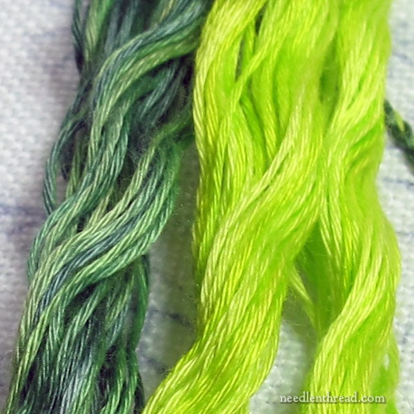
Here you have two shades of green, out of the floche selection I showed you last week from Colour Complements.
You might be mildly tempted, as my cohort was during the discussion we had, to say, “I would never use those two greens together in the same project.”
And you could be right.
But you could also be missing an opportunity.
The green on the left has a good bit of blue in it, and it is cool and calm. Very evergreen-tree-ish. Spruce-ish, even. (Try saying “spruce-ish” ten times fast!)
It’s an overdyed thread, which means that it’s dyed in a series of colors over each other, so that the colors blend and meld together, but in some areas, some colors retain their own character. You can see subtle and sometimes dramatic changes in the shades along the thread.
The thread on the right is also overdyed. It exerts much yellow, and is almost neon in its brightness. It’s vivid. It’s crazy green! It evokes, to me, the newness of green. New green in spring. It’s surprising.
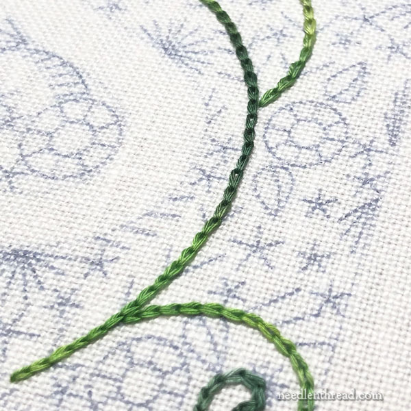
On the sample I’m stitching and photographing along the way right now, I used the spruce green floche as the basis of the green vines and as the fill on the leaves throughout the design.
I stitched the vines in chain stitch, to give them a bit of heft. And the leaves are fishbone stitch. I always seem to go back to fishbone stitch.
I like the way the overdyed floche works its way along the vines, slipping in and out of various shades of green. It makes a nice base for the vine, and the changes in shade will add something, I think, to the overall finish of the piece.
BUT…
…taken by itself, it can seem somewhat dull.
Since this piece will feature vivid and lively colors, there should be a bit more vivacity to the vine, I think.
To really bring the greens out – to bring that whole vine to life – that’s where the neon green comes into the picture!
It doesn’t take much.
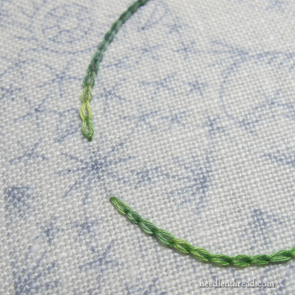
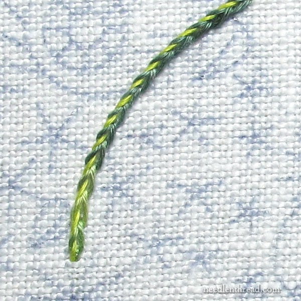
Using the neon green, I whipped one side of the chain stitch line. (You can read about various ways of whipping embroidery stitches here.)
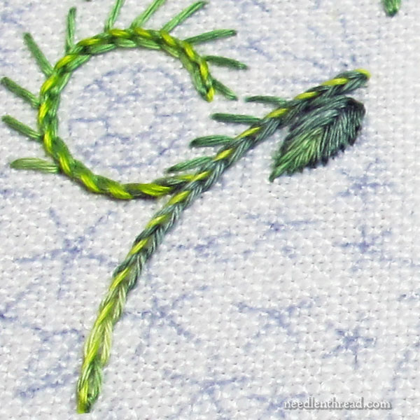
By adding just a touch of this bright-bright yellow-green to the previous chain stitch vines, the whole vine brightens up, but not in an obnoxious, glaring way.
The vine comes to life, but it retains the blended characteristics of the darker, bluer greens. The yellow green barely highlights one side of the stitching as it runs through the whole vine.
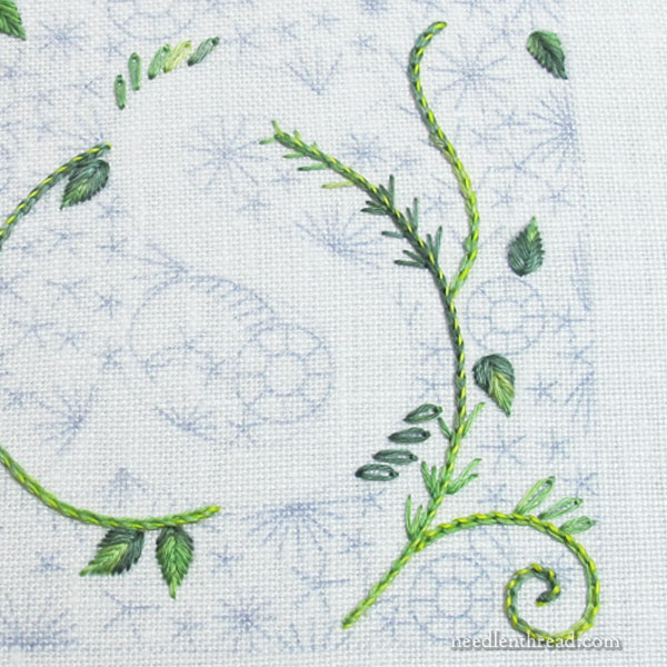
As I add more growth to the vine and surrounding areas, I’ll find places to touch in the brighter green.
I’ll also most likely mix in solid greens, too. The sample twists of the floche I have don’t go too far, so I’m almost out of the base green, anyway. In a piece like this, a mix-up of greens will work well.
Adding other vivid colors to the embroidery will make the duller green in the vine more valuable, too, as the whole thing develops. It will retain its role as the “foundation” of the design.
The vine will be visible, despite the vivacious growth around it, thanks to the darker green.
The Take-Away
Never underestimate the power of a color you might be tempted to reject! Try it. It just might bring your embroidery to life in an unexpected way.
Hope your week is off to a good start!
Mary you’re a genius! I LOVE the result and the entire idea behind the “poison” color theory! BTW, there is a writer named Ellen Byerrum who wrote a series of books, the Crimes of Fashion series; one of which she focuses on this particular topic. The title of the book is “Lethal Black Dress”, in case any others want to read it.
A pop of lime green is often what’s needed to wake up a sleepy quilt design, too!
The result is beautiful! I personally really liked the green on the right on its own, but it’s true that I wouldn’t have thought to use it the way you did and wow! It feels magical! Also I tried pronouncing “spruce-ish” and I couldn’t even do it once haha!
You’re right, Mary. I wouldn’t have considered that neon green, but it’s gonna do the job. I can’t wait to see the finish on this one. I love bright, varied colors. To me that spells embroidery.
Well, that worked a treat! My initial reaction to the bright green thread would probably have been the same as your friend, so lesson learnt. Thank you 🙂
Love the colors used and the design and I am hoping that this will be in your shop as an ebook! Thank you so much for sharing this with all of us.
Looking forward to watching your journey through color and over-dyed threads! I love over-dyed threads, and want to learn more how to use them.
Thanks for the color lesson, Mary!
I’ll try to remember to add one complimentary color to my projects.
Hi Mary, Beautiful as always. Picking colors is the toughest part of designs. And, pulling colors out from an overdyed is an excellent way to proceed. Do you find yourself having to stand back to look at the results very often? I find a piece looks different up close than from afar. Thanks for sharing your process. Melita
Love the addition of the bright green. It adds instant shading to the vine … WOW! Thanks Mary!!!
That’s a favorite color of mine, and therefore I LOVE this whole post! What a great way to bring in a great color!
I find it easier to “identify” the poison color than to choose it!! For some reason, bright turquoise ends up being my “poison” often…. I must analyze this!!
Hurray, you are doing the S! At home we call that nudibranch green. I love it.
Mordant is usually used to set dyes. (late 15th cent.: from French, present participle of mordre ‘to bite’, from Latin mordere) Mordant bites cloth and fixes the dye. But some mordants are toxic, especially the ones that are from heavy metals. They are not good for the planet and can still kill you if you eat them. Mostly, they are bad for the dyer and the planet.
Most synthetic dyes have small amounts of toxic chemicals. Even ones that use a lot of “green” marketing, may contain small amounts of chrome, lead, and manganese. These are metals which are toxic in smaller quanties and have higher health risks than alum, iron, copper, or tin. Since thread is not meant to be eaten, you will rarely find what it was dyed with.
Safe dyers using chemical dyes, wear gloves and respirators. They dispose of their dyes responsibly. I buy my dye from Pro-Chemical because they provide Material Safety Data Sheets for everything they sell.
Because I am a dyer, I don’t lick my threads to thread a needle.
Good afternoon! I just subscribed to your emails, talk about being slow! I’ve looked to your site as being my inspiration for ages and somehow missed that I could have my morning coffee with you! Yea!
Today’s chat was especially profound. See? My world is truly easy to please! Amongst the other talents you have in stitchery is the unique ability to “talk” to us without lecturing. To guide a student with the felt/found technique and for them to feel that hope, eagerness to get out the needles and threads and try again… is really a sign of a wonderful and rare gift. This you have in aces!
Thank you!
You’re very kind, Berta! 🙂
Your blog is quickly becoming one of my favorite hand embroidery sites! I have been working on wool applique projects for about 1 1/2 years. However, I started a crazy quilt about 8 years ago. I decided all the embellishment stitches would be done by hand (vs. using the fancier stitches on a sewing machine.) The gal that taught us was incredible when it came to Brazilian embroidery, ribbon work, etc. Unfortunately, I haven’t worked on it for at least 7 years and I have forgotten all about those fancy stitches. The wool applique has gotten me back to the basics and now I want to go further and reacquaint myself with my crazy quilt. THANK YOU for the instructional blogs and inspiration!!
A quilt I made for my mom had this ghastly dreadful batik that was blue/green and yellow raindrops. I was newer to quilting and the ladies at the quilt store were helping me pick.
The pattern was Storm at Sea, so lots of little bits. That ugly batik made the quilt pop. One other thing, I made sure I didn’t have any left.
This discussion makes me think of something Alex Anderson said at a quilting lecture on the topic of the color orange, which most quilters will tell you they hate, never buy and never use. “Anyone who says they hate a color just doesn’t understand it’s uses.” When I talk to people about color preferences I liken it to music. No one says, “I just hate middle C.” Colors are just the same as the notes in the musical scale. You need to know how and when to use them all (and when NOT to use them) to make a harmonious symphony!
Thanks for sharing your thoughts about both the uses of and the history of “poison green.”
I see what you mean about the neon green highlighting your design. I have to find where I left mine to try it right away. Thanks for the ideas!
Brilliant! It’s like adding highlights when drawing a picture with colored pencils!
I’d like to make the “S” with you. Will you be sharing the design? Thanks!
Hi, Lynn – I won’t be putting the designs out until I’ve worked through all the details myself. I will most likely be making changes in the designs (I’ve already changed quite a few things while stitching them…)
Thank you for this post Mary! You are right, I wouldn’t have thought to work these two colors together but what a great highlight! I love bold colors. Your photography is so clear my fingers are itching to stitch. Can’t wait to see where you take this project.
You are so talented and such an artist! Thank you for all the sharing you do. I know it is your work as well, but I think if you had gone into the science of making [roducts out of petroleum, most of us wouldn’t be following along. God has given you a great deal of talent and you have nurtured it as well. I generally save your posts for when I need a pick me up. 🙂
That’s a really interesting effect and quite a revelation, Mary! I would definitely be inclined to give neon colours a miss but I can see how a small amount does enhance this design. Fascinating! 🙂
I don’t have a tip, but I do want to say THANK YOU! I have always been puzzled about the needle sizes and types. Who knew that there was a John James needle guide???? I have only been a subscriber for a week or so, and I have already gained so much from your emails! Thanks to the Shining Needle Society SNS for sending me here!
One of the things I do that keeps me busy so I don’t turn into a couch potato waiting for my monthly disability check is that I do reviews for Amazon products and I get to choose them. I was able to get a set of three embroidery pictures that are all floral designs, with different color backgrounds as well as different types of stitching. Since they even came with the hoops, even though I have everything to make a zillion projects, this was fun to get a kit ready to go and I have made great progress on it just since I got it at lunch time. However, none of them use variegated threads, just solid colors and no threading blending. I have this feeling that before I start on the next color to stitch I will be getting out some of my own threads and do a few things to the designs like you did to the vines. They also have three grape hyacinths and I know my fingers will absolutely refuse to do all the many French knots in only one color of purple. I will have to blend them. Otherwise I am having fun. Just some difficulty in jumping from one spot to another along with making knots that won’t show through. I may have to look through you site to check for articles on knots.
Thanks again for all your valuable advice.
What a helpful lesson this is Mary! I’m glad you thought to demonstrate a poison color because it’s astounding how well it works when played with a standard color. Thanks!
Lovely design, Mary. The colours go very well together, indeed, also the neon green.
Can you tell me if there is a difference between variegated and overdyed threads and which?
You can read about overdid threads here: https://needlenthread.wpengine.com/2013/08/thread-talk-overdyed-threads-your-take.html
I love your articles and always learn so much from reading them and looking at the photographs. Your stitches are perfection and I love this design! I am so glad that I found your website, your work always inspires me.
Do you have a pattern for this ? or did you hand draw all of the design
Hi, Catherine – I’ll be releasing this as a set of patterns in the future. I’m working on putting together transfers and stitch guides.