


October 30, 2020
Embroidery with Beads What Threads?
Once upon a time here on Needle ‘n Thread, I distinguished between “bead embroidery” and “embroidery with beads.” I’m not really sure if there’s an official distinction, but if there isn’t, I think there should be (just for the sake of clarity).
And just for the sake of clarity, when I’m writing about beads and embroidery, I tend to think of “bead embroidery” as embroidery that is done entirely with beads. Take, for example, these beautiful bead embroidery kits by Mary Alice Sinton at Blue Bonnet Studio. Exquisite! And entirely beaded.
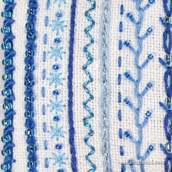
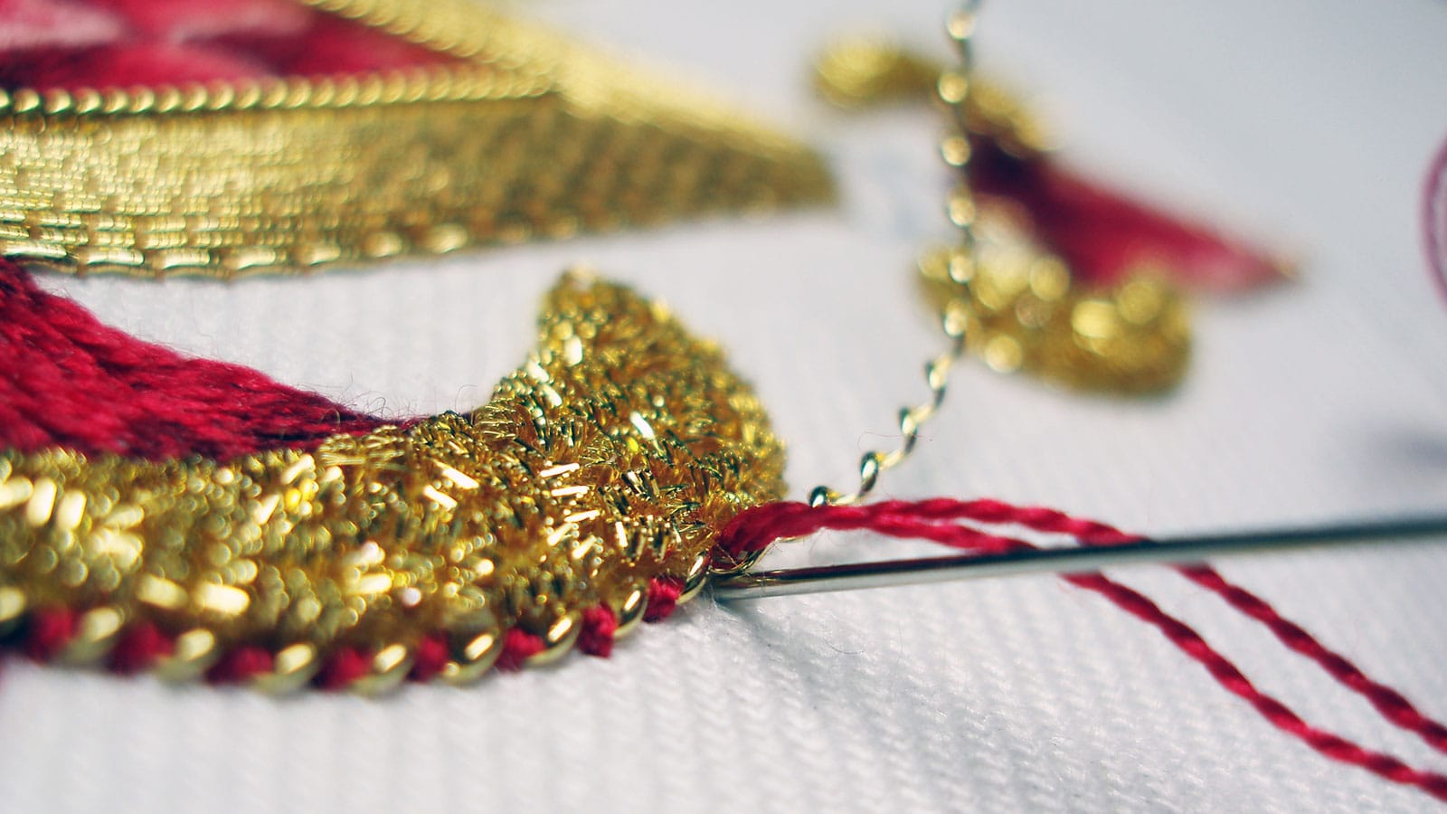
When I think of “embroidery with beads,” on the other hand, I think of work that is predominantly thread-executed embroidery, accented with beads.
I like both. (Who am I kidding? I love both!) There’s just something that appeals to me about the sparkle of beads.
But most frequently, when I’m playing with beads, I indulge in the latter – embroidery with beads.
Incidentally, neither of these should be confused with beading – creating jewelry or other structures, usually devoid of fabric and relying only on thread or wire as the structure, entirely from beads. Nor should either be confused with weaving with beads. Both of these are entirely different from embroidery, or the embellishment of fabric, with beads (even if some beading can involve fabric and weaving results in a kind of fabric…)
Confusing enough? Well, for today’s topic, let’s just stick with the notion of embellishing fabric with embroidery that is accented with beads.