


For the past couple days, we’ve looked at some silk options to use as a ground fabric for hand embroidery, specifically goldwork and silk embroidery. I tried out some very nice Italian silk satin and a beautiful Japanese silk dupioni.
Today, I’ll tell you my final choice, which is neither of the above, and tell you why.
You see, while I was contemplating exactly what to do fabric-wise, I started flipping through photos I’ve collected of different ecclesiastical works. This particular photo caught my attention:
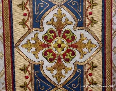
I love the colors in this piece of embroidery, but it’s not actually the color scheme I’m looking at here. It’s the various backgrounds that you can see in the piece.
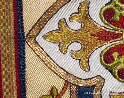
The white background is definitely a twill weave of some sort. The gold background off to the side…. well, I think it’s stitched!
Kind of a gobelin stitch, in a bargello-type pattern, wouldn’t you say? But maybe not – it could be a special weave of fabric, but it sure looks stitched. Now, don’t get any ideas – this isn’t my plan at all. (Not right now, anyway!) but I do love the smooth dots on this textured background. And I do have quite a few dots in my design. The difference is, I’m planning on working my dots in different gold purls, which already have texture to them. Something else to think about!
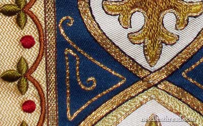
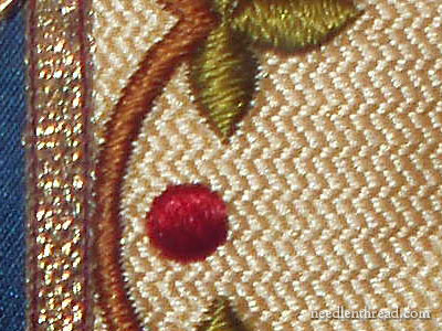
The other part of the piece that caught my interest is the dark blue background here, with the gold worked over it. The dark blue is fabric. I like the gold worked on top of it. I want to do something like this, only not with appliquéd fabric. I’ll show you how, later!
Now, this whole piece gave me all kinds of ideas. But one idea that has stuck is that, for the ground fabric of my class piece here, I’m going to stick with what I know best and love best as a ground fabric, and which is very versatile. Any guesses? Yes, it’s true. I’m going to use linen.
I won’t be appliquéing any colored fabrics onto the piece, though it sounds like an interesting idea – to appliqué the background onto the fabric (kind of backwards, but it would work!). Why not? you may ask. There are two reasons: the first is that the student I’m working with wants to work a piece that is completely embroidered, without appliqué (I could probably change her mind if I had to!); and 2. I read an old embroidery book once, where the author (foremost in the field of this type of embroidery at the time) asserted that applique should never be used in areas that can be covered with embroidery, as it tends to look as if shortcuts were taken. I don’t necessarily agree entirely with that statement in all circumstances, but I’ve been trying to picture an appliquéd background on this piece, and I have to admit, I think it might end up looking a little short-cuttish.
All that being said, I just may give it a try, to see if it could work. That’s another one of those “testing” situations, though, and I’m running out of time!
I’ll show you some pictures of my stitch testing later on – I’ve decided on the stitches I’ll use (and some of the threads) for the goldwork in the center. I can’t wait to get started on that part – it’s So Much Fun! I’ll show you it, step-by-step, I promise!
So, whatdya reckon? Is linen an ok choice? Any thoughts? Leave a comment!
Tomorrow, I’ve got a guest post for you, for those of you who are interested in a quick summer project in gingham embroidery. Look for it!
Mary what a beautiful journey you have taken us on in the selection of fabrics and the treasure at the end of the road is the ‘ masterpiece .’ How I wish I lived closer and could take your classes, you are one very talented teacher, who not only teaches but shares her love of the artform. You are a true artist.
G’day Mary,
I’m no help in the decision process but am loving reading along and absorbing your thoughts on different fabrics etc.
The gingham embroidery guest post will be most interesting. Will certainly look for it.
Cheers, Kath.
My first thought was…. Wow, you’re up early! And my second thought was… I think the piece would look better without any applique work, but i sure can’t wait to see the end result.
I’ll be very interested to see what type of linen you use and whether that might effect the transfer method and the thread you use. Thank you for sharing your design process. I’m learning a lot.
Mary, I too plan on trying the prick & pounce method. I read about it in the past, but felt intimidated by the process. Your website and instructions give me confidence. I ordered the “pounce and Pouncer” from Tanja. I’m really enjoying your newsletter. Thank you.
Hi Mary. I think linen will be a beautiful choice as long as its a close weave one. Not sure about the applique but can’t wait to see the work progress. Are you using goldwire thread?
Reading your thought process is wonderfully instructive. Is the white center background fabric laid on the blue fabric? Is all that cream-colored area stitching or fabric?
Where is that beautiful work that you photographed?
Hi, all – thanks for your comments. I’ll see if I can answer some questions!
Enid – I think the white center is the ground fabric, and that the blue is appliqued on the white. It’s probably not even technically “applique” – the edges probably are not turned under, but just basted on, and then the other work is done over the edges. I think the cream colored background is stitching (discussed in the post… could be wrong…) This piece is at the museum at the mission in Carmel, in California.
Laura – transfer for whitework is always tricky. I always use as fine a blue pencil as I can find, or blue dressmaker’s carbon. The blue absorbs into the white, and even if small traces remain, they aren’t noticeable, and over time (and with laundering) they fade.
Rhianon – Thanks. Yes, it’s a close weave. The linen won’t be showing, as the whole piece will be covered with embroidery – that’s the plan at this point, anyway! I’m using real metal threads, yes. And silk!
Patricia – Tanja is the best source for dark pounce powder. She makes her own! I’ve thought about it, as I certainly have a massive source for the wood charcoal (my sister’s wood-fired brick oven, which is going practically every day), but I just can’t get my head around the idea of putting burnt wood charcoal chunks in a blender! Anyway, I’ll eventually be putting in an order with Tanya myself if I can’t convince myself to ruin the blender!
Hi Mary,
Do you have a pattern for the embroidery pictured today? Not being too computer savvy, is it possible for me to print the picture from your newsletter? Thanks
This post sent me to my samples folder. I found two herringbone fabrics – a bit more interesting than a twill.
One is described as Herringbone Silk Lazuli, the other as Herringbone Linen. Either would make an interesting texture for a background fabric which would show in the finished piece
The gold off to the side actually looks like a metal-thread tape to me–I think it may have a special name in the gold thread industry, which I don’t know, but I have seen identical stuff at Benton & Johnson.
I’m not at all surprised because of the many times you have talked about the superior quality in working on linen’s. Are you going to use an oatmeal color or a darker linen, which would highlight the beautiful threads. I can’t imagine doing embrodery on silk, I’ve never done that. I’ll have to try it and see what happens.
Mary,
What I see when I look at that piece is two gold/white narrow (maybe 1 1/2″) woven braids attached either side to a wider band of navy fabric probably about 6″ wide that has a scroll design worked onto it using a very narrow gold braid that is couched into place. Those gold/white braids have a scallop and leaf and red dot design embroidered upon hem and some sort of darker navy or black stitching or edging on the outside. The about 9″ white twill fabric piece where the cross design is embroidered is appliqued upon it all and trimmed with a narrow flexible braid. Narrow thin flat gold braids cover the places where the gold/white braids are attached to the navy fabric band. And wider and heavier gold braids that are rimmed in red cover where the whole orphrey banding is attached to the vestment itself. If you look closely at the left and right “arms” of the appliqued cross, you see there is a slightly raised or “different” appearance to the white twill fabric where the gold/white braid meets the navy band….also, there’s a slight “hump” in the gold flexible braid that outlines the white twill applique where the narrow gold band that covers the stitching lines where gold/white braid meets navy band ends and is folded over (hence there’s no gold braid beneath the white twill applique at those spots). There’s a considerable amount of work in this piece!! More than I’d ever consider doing.
I’ve done this kind of piecing and patchwork many times to get the width of an orphrey band that I needed…. butt braid up against braid or over the edge of a band of fabric and cover the stitching line with another tiny ribbon of gold braid. I admire all the work it took to applique those embroidered cross shaped twill pieces over the banding and cover the outline of each one with the narrow flexible gold banding. Very few would take the trouble to do all that work in a “modern” vestment.
Hi Mary,
If you love Linen and it gives you the results you want it seems like the natural (no pun intended) choice. The piece you have in this post is amazing! I love to read about your process, how you go about thinking, testing, choosing fabrics, flosses etcetera. Your results are always beautiful and inspiring!
Just a comment on the gold background. It’s not stitched, just a different type of twill (I weave, too, and recognized it).
Thanks, Barbara! Good to know. I went digging through some old vestment “scraps” this morning, to check out background fabrics, and came up with something similar, in a darker color – obviously a weave. I wish I had checked that yesterday! I’d love to find a nice fabric woven like the straw-colored fabric in this piece. I think it’s beautiful!
Tess, thanks for the analysis of the work – that’s pretty much how I see it, too, except I assumed the blue was appliqued onto the white. That makes more sense, though, that the white is the applique, given the extension of the design over the blue and the straw colored fabric. Thanks!
Edith – yes, the strip over on the far left (the gold edged with red) is likely a pre-woven band. I’ll be working on white linen, if I use linen. I was just playing with the whole design again (again, and again!) and I may very well go back to the second silk. There’s a bit of a difficulty with threads to cover the background area – I don’t like the silks that I presently have, in the blues I have. My palette of blues is really limited, to the point of frustrating!
Ah well – back to the drawing board! (Well, not literally. More like the stitching board!)
MC
Mary,
I must agree that the twill background has a certain richness to it. A sort of strength that a background for such a piece should have. I wonder if that chevron stitched gold and white backgrond is not stitched over that base twill fabric. following the twill lines of the faric as stitching lines. Three stitches on the line, three acoss, two up…that sort of pattern. They navy background would have to be a dense stitch to cover the white background unless of course you used the paint as with marking the pattern. Maybe fill in the area with a navy paint and stitch over it. Would that be short cuttish too? I love that term, so much nicer than “half-a**ed”.
Deb
I am enjoying reading what process you go through on your design and fabric selection process. It makes me know I’m not alone in my focus to detail. LOL
I am really excited about your gingham project. I was just hoping to find a gingham project for either myself or my daughter.
Thanks!
I agree with Barbara Imboden, the fabric on either side is woven. It appears to be a weft- face twill. The warp is very fine and spaced so as to be invisible. This allows the weft to be beaten in very closely and it does have the effect of being a stitched pattern.
I think it is probably made of tussah silk, which has a pale honey color due to the type of leaves the silk worms are given to eat. Mulberry leaves yield the white color. Leaves with tannin in, for instance oak leaves, yield a range of cream to brown colors.
I love the workmanship and inventive combination of braids, fabrics and stitches in this design. The colors are lovely too!
Mary what a stunning piece! I’m no expert but I think linen would work just fine. You could make something gorgeous on burlap! Can’t wait to see how the project evolves.
When I saw these fabrics I thought they were begging for embroidery. what do you think? http://www.picknatural.com/products_hemp.html
Thanks all, for your input! Very much appreciated, as usual!
Sharon – I’ve not tried embroidery on hemp fabric before, but it does look like interesting fabric! Go for it, and let me know how it works!! 🙂
Karen – Thanks! Funny, though, about burlap – I just had an e-mail about embroidering on burlap. I suppose with very heavy threads – and not silk, as it would snag all over the fabric – something could be done!
Thanks, Elisabeth, for the input on the fabric. Interesting about the different colors produced by different moths!
Hi, Judy – Good! Then you’ll enjoy tomorrow’s guest post. Lots of pictures!
Just spent the day trying to work out a variety of different stitching approaches on this piece. It keeps morphing. :-/ Isn’t that always the way of it?
MC
you and needlenthread.com are great.i love you.
I’m probably wrong, especially after Tess’ analysis, but when I saw that border I thought “surface couching over a thick yellow thread”
Mary,
I noticed your comment on the selections of blues being limited. I’ve come across two ecclesiastical fabric houses in the UK that are wonderful! The first is M Perkins and Sons. The second is Watts and Company. I just receive a piece of a fabric call Evesham in the green from M. Perkins and Co. I could only afford the less expensive version of this pattern, but it is stunning. There is someone in the states who placed the order for me for the fabric from M Perkins. The patterns available from these houses are the true ecclesiastical fabrics. If anyone is interested on where to order these from, I’d be happy to share.
The real question burning in my mind is WHERE to you find the photos and pictures of the ecclesiastical pieces? I’ve sent hours searching on the web, and have had a hard time finding things. Not that you need another project, but some day, could you create a photo album of some of your photo collection of ecclesiastical works – maybe another e-book?
I can’t wait for your e-book of ecclesiastical embroidery patterns!
Hey, Mary, The cream herringbone fabric reminds me of a woven silk/linen suiting fabric. Is that possible?
I think the white twill silk is over the blue.
Also, I agree with Rose, above. I think the gold edge and edging around the center motifs are all a pair of couched gold passing threads.
Mary,
Just an addition to my observations… a band of decoration like this put on a vestment or any liturgical piece like an altar frontal, ambo hanging or book cover, etc is called an “orphrey band”. It can be made all of one piece, or as in this case, made up of several pieces sewn together. Braids are usually used to cover those seam stitches. “Orphrey” comes from the French word for band or ribbon.
That white piece that is stitched over the band upon which the fancy cross has been embroidered is called a “vesica”… which translates as a “frame” and can be made in several fancy shapes… everything from round to oval to diamond shaped or scalloped or as here…cross shaped.
There is usually a “vesica” placed on a vestment where one band meets another to cover all those seams…. as you often see when there is a “cross” shape used on the front or back of a vestment… usually with the “arms” of the cross lifted toward the shoulders. It’s usually the centerpiece of a vestment, whether on the fron or on the back.
It appears to me as if more than one “vesica” is used in this vestment, as I see the beginnings and ends of other white applied “vesicas” above and below the one you’ve featured. Those particular pieces used to make these vesicas are white twill fabric and any piece of white fabric being how they are (thinner than the same fabric in any other color), I bet dollars to donuts that there is an interfacing or interlining piece behind that white vesica, or you’d probably be seeing the edge of that blue band show through behind it. Vesicas behave better when they’re interfaced anyhow… the better to turn under their edges and applique them on. You cut the interfacing to the proper size of the finished piece and attach to the back, outline stitch around the interfacing where the “vesica” seam is to be turned, trim seam allowance to 1/4″, clip corners and curves, then iron the 1/4″ seam allowance to the back over the interfacing …at least that’s how I proceed to ready them for attaching to the vestment or parament.
I think the linen will be a good fabric and will especially hold up if it is a twill weave. I also agree that the gold backround is stitched. To me, the pattern looks very remineceint of pattern # 55, Baydere on pg 127 in Pauline Fischer and Anabel Lasker’s Bargello Magic–how to design your own. The color scheme is not there but the pattern almost is.
By accident, I came across this site and saw the above article dated 24 June 2011, which happens to be the date of my ordination anniversary. I am wondering where the ecclesiastical banding might be found. I think it is simply stunning and would be beautiful on a set of vestments. I will be ordained 25 years next June and to have a set of vestments with the banding you have in the picture would be amazing. Please let me know where this might be found if at all possible.
Fr. Douglas Loecke
Hello, Father – the vestment featured here is over 100 years old, and mostly hand embroidered. I think it would be difficult to find anything of similar quality today. You might try LaLame in NYC, though. They do carry a large variety of interesting galloons, bands, etc., for vestment making. Hope that helps – MC
Where can can I find and buy this ribbon?!
Hi, mary, I want hand embroidery on silk fabric, using sating stitch, and painting whit thread, I use DMC cotton, can you help me,
Thank you
Hi, Leonor – Well, I can try! Do you have a specific question? How can I help you?