


Occasionally, I’ve been dribbling out photos of the embroidered letters in this monograph alphabet that I mentioned a few weeks back. They’ve also been showing up here and there on my Needle ‘n Thread Facebook page.
Today, I’ll show you a few more photos, discuss the project a bit, and ask for your input, too!
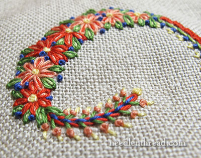
As mentioned in the previous article on these decorative initials, one of my goals in the whole project was to incorporate 25 or so stitches and combinations into the alphabet.
The stitches and combinations can be mixed and matched on any of the individual letters, and so can the color combinations.
For example, if I really like the color combination used on the S and the stitch combination used on the R, I can adopt some of the stitches from R and the colors from S and embroidery an M with them.
The stitches and stitch combinations in each letter are not too far off or different – just enough to keep them exciting and interesting – and there are some stitched elements that are always the same.
This lends the whole group of letters a certain coherence.
A little secret about this alphabet project: It’s been stewing in my head for a good year and a half. It came down to choosing between doing the Lavender Honey & Other Little Things projects, or these letters.
I thought, after finishing Lavender Honey, that I would be hard pressed to have so much fun again with a series a projects. But I was So Wrong! This alphabet has been a thoroughly enjoyable exercise in color combining and in stitch exploration. To me, it’s been an ideal outlet for Just Plain Fun Stitching.
Another fun thing about this type of exercise with decorative initials (I always find it hard to call them “monograms” when they are individual decorative letters – there’s a difference, even though the terms are often used interchangeably today) is that the ground fabric can also come into play.
While I always tend towards white and creams as a ground fabric – a topic we already discussed in this article on the color comfort zone – any preferred color ground fabric will work!
It’s just a matter of ensuring the thread colors work with the ground fabric.
I’m not always 100% sure, though, that this is the case. But it’s good to experiment!
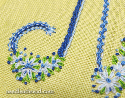
Sometimes, you know before you start that the ground fabric and the overall color scheme will work well together – blues and whites on yellow are a favorite combination.
But then there’s the matter of finding just the right green that will work with them. A green that’s too blue makes the piece look dull. A green that’s too yellow can make the piece look garish. And depending on the type of thread you’re using, you may find yourself quite limited in the choices of colors and shades within a general color family.
Again, that’s part of the fun of experimenting!
Ahhhh…. when working on white, it is a lot easier to be sure of a color combination! I love this particular group.
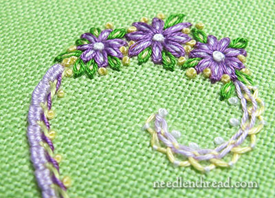
If you’ve been hanging about on Needle ‘n Thread for years, you might also know that I like green and purple and white. Ages ago, Needle ‘n Thread was green and purple!
When hemming and hawing over color combos, I often think of things I’ve seen or liked – color combinations in an outfit or on a website or in a favorite room of someone’s house – and try to work those together.
Sometimes it works. Sometimes it doesn’t.
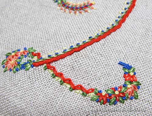
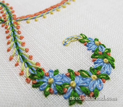
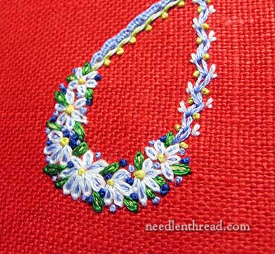
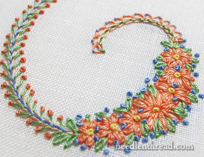
With this particular project, I’m finding that the letters work just as well in vibrant colors (remember the photo at the beginning of this article?), in classic color combinations, in pastels, primaries, muted earthy tones – whatever the color preference, it will work!
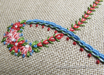
I find myself leaning very much towards natural colored linen as a ground fabric with this project, too. There’s just something about the way colors show up on this oaty background.
Your Take?
So, what’s your take on some of the color schemes in the photos here? Do any of them pop out at you and make you yelp “OH NO” – or does any one of them particularly grab your attention and make you cry out a resounding “YES!”?
Is there a particular type of color scheme that hasn’t been represented that you think would look particularly good and that I should consider working up for one of these samples?
And what about stitch combinations? Is there any stitch combination you see here that you think doesn’t work, or that you think looks odd?
I would love to have your input! Any thoughts to share on colors or stitches? Have your say below!
How about black, off white and shades of gray? Or or orange to peach shades, with a dash of bright blue?
I’m always drawn to peachy coral shades, but these all look good to me! Thank you so much for your wonderful articles and insights.
For me the red background is an ‘OH NO’ and the blue on yellow is a definite ‘OH YES!’ As to unrepresented colour combinations, what about an all pastel one, a black background or even an all-one-colour e.g. whitework – of is that going too far into another direction?
Looking forward to seeing more!
How about a monochromatic scheme, that is a letter in shades of a single color ?
I especially liked the red ground. It really makes those flowers pop! I also like the purple/yellow/green scheme even though I am not a big purple fan.
What about using magenta and turquiose or other jewel tones? That would look quite different.
I forgot to mention a redwork.
I like the variety of different colored backgrounds, even if some are a little non-traditional. Your work, as always, is gorgeous. Could you please tell us where we could get this alphabet? Maybe you mentioned it previously and I missed it.
I have a great liking of greens, and love the green you have displayed here. I love the striking red example too. I’m not so keen on the grey, although I can see that it might be just the thing for some projects. I’d be interested to see how blues would display – maybe a Delft, or an ultramarine, and a powder blue.
Hi Mary!
There’s nothing there that I think looks dreadful, but I do agree with you on the green and purple and that’s the combination that draws my eyes.
Generally speaking, as long as the shades are kept to the warm or the cool spectrum, then most things tend to look OK. Of course, there are plenty of exceptions to that too, but….!!=)
Another “oh, no” vote for the red background. But a black background with white and silvery grays, maybe even some silvery green, sounds very appealing. Jewel tones, yes, I’d love to see what background you would choose for that. (You have no really gray background fabric yet….) Such a VERY interesting study!
Hello, What a pleasure to have found and be able to enjoy your newsletter! You make embroidery the exciting, satisfying thing it SHOULD be! These letter details – to sigh over! I’m a retired 67 yr old hairstylist with a wife who tolerates my crafts (there are many!) Is there somewhere to get this or similar alphabet? As for the color combos, you are so right. I’ve often been turned off by a kit due to the poor choice of cloth color – texture! Or some dreary Fall colored threads on olive green. Still, to each there own! I’ve been thinking some professional lessons would be a treat but for now……YOU’RE IT!!! Thanks so very much for brightening my day and making you’re fabulous site so welcoming and unpretentious! You do not set yourself up as more than a passionate embroiderer! Sorry for running on so, with my sincerest best to you, Rick Peerboom St. Petersburg, FL
I’m with you Rick….Mary, where are the patterns for these letters? did i miss them somewhere?
I think each of the color combinations (including fabric color) is beautiful. I like to see the variety of threads and fabrics, because if I have a project that needs a decorative initial, I can see how the colors work together. I have a needle tools project that I never finished because I never found the initial that seemed right. I LIKE THESE!!
… just saw Gillian’s comment about the gray background. Maybe it is my monitor, I don’t see a true steel gray, but more than one beige. Could someone tell me which is the gray?
Hi, Beverly – there’s no grey background…. White, green, yellow, red, naturals….
I like seem to like the more muted and lighter color schemes shown. How about some deep colors – burgundy, hunter green, rich blues and greens. I’m not one for the bright colors.
Thank you for this delightful web site. I have learned so much since I began following your work.
As for color combinations, I love black backgrounds and jewel toned colors. Purple and slime green with a dash of red/orange are favorites. Color is my friend.
Oh yes to the oaty background in the natural linen. None of the others are wrong or garish (although I am not loving the red), but I just love the way your project shows up on the natural background.
The black, white gray idea is genius too. have you tried it?
Dear Mary
I would normally go for deep reds, greens, yellow or pastel colours. I normally stay away from blues but I do like your A monogram with the blue and white stitches on the yellow fabric.
I like all your colour combinations that you have chosen above they really match and I like the different stitches and fabric combination that you have used they blend in well together. I particularly like the grouped flowers they are really lovely, I think you have chosen the right combination they are really lovely.
Regards Anita Simmance
To me the blue on yellow is wonderful–2 of my favorite colors. Also, when colors are on a background of navy blue, or really dark brown or black, they appear even more vibrant. “Non colors” like white on ecru or the other way are are awesome to me. Actually, the use of many many different colors on the colored backgrounds, look “old fashioned” like my grandmother’s dresser scarfs and tablecloths, although these are my old treasures.
All the designs are very pretty. Like the red background the least although I love red. Maybe different colors for stitches- less cool and more warm. Would love to see some very dark backgrounds-black, navy, dark brown.
Hi Mary. I like most of the colour and stitch combinations, except for the 2nd last picture. It doesn’t sing at all. I’d like to see monochromatic schemes as well as analogous ones.
Please please please let this be your next book. I want to see all the letters in their entirety cuz I already love the bits and pieces you have shared
Your designs and color combinations are beautiful. I wish that I could make such lovely choices on my own.
They are all lovely to me. I do have favorite colors, but I embroider a lot of gifts, so I use most colors, so none of those scream negatively at me.
The green background with the lavender is striking, but then the one just above it is also lovely. The neutral linen is so classic. If I don’t stop I will mention all of them. I think they are all wonderful combinations.
Love, love, love it. I really like all the different color combos too.
YES to all! Beautiful!
I think these letters are absolutely beautiful. I am eagerly awaiting their availability so we can have a meeting program at our local EGA, The Laurel Chapter in Hendersonville NC.
I am a fan of your newsletter.Whatever you present is superb.Hats off to your creativeness.The combination of different stitches and the color scheme is marvelous .God bless you.
Mary — are you KIDding?!?!?!?? All the stitching and color combinations and ground fabric are soooooooo beautiful!!! What fun! What beauty! Thanks for sharing that — I’d love to see the whole alphabet.
I am more oriented to contemporary designs and much of my home is done in black and white and has a lot of rock, stone and wood. I’d love to see an initial in blacks, whites, silvers and such. I love whitework monograms! I’d also like to see some letters done in structural methods, not flowers. Cubes, triangles, circles – more geometry, if that is possible. I’m not a flower girl, yet I do love, love, love your work! All of it!
I love, love, love these flowered flourishes! I think you’d really have to judge the color palette based on what the final project was to be. I’m not necessarily drawn to red, but maybe red would be a great color in the right setting. Based only on these photos, I’m drawn to the yellow and pale green cloth, with any color threads, and the natural linen. The light blue and red really stand out in the last photo. I like the blue palette on the yellow cloth very much. I’m not much for violettes usually, but it looks great on the green. Some of the green leaves seem a bit too dominate for the flowers they surround. They seem to hold up well against the purple, though. But really, I love them all, and I probably wouldn’t think about the colors unless you had told me to think about them.
Mary, These are all lovely and wonderful eye candy to start my day! As for color combinations, I think much depends on our personal preference, and being a “spring” color person I was especially taken with the second and sixth embroidery combo. pictured. And I LOVE the way you’ve used the little (french?) knots in these examples. To my eye it looks very much like a floral component. As always, thanks so much for sharing!
Definitely the lilac on green for me, closely followed by the coral colours. Sorry, the red does nothing for me – but I dislike red I’m afraid. I also like the blue on yellow and the muted colours on the beige. I suppose I’m a muted colour sort of person! I like Resmi’s idea of a monochromatic colour scheme. As for the stitch combinations, I love them all.
When I first saw the red background my first reaction was “Oh No” but somehow I kept scrolling back up to this pic and by the time I finished reading, I actually changed my mind. Yep I actually like it. How a blend of all cool colours and then another with warm colours.
Have an awesome day =)
For the “OH NO” category the red ground fabric overwhelms the stitching, and the yellow ground fabric looks dull. The green ground is my “YES!”. I would like to see a light blue background with green and purple stitching shades. And I love all of the stitch combinations with some parts being very similar while other parts are different but complementary. Lastly, I am always delighted with your imagination and with your ability to mix different stitches in one motif while keeping those stitches coordinated.
I’m not a big fan of peach/salmon, especially on white, but that’s just me. I love everything you’ve done with blue and purple, but especially the bright red with blue. I just finished a decorative letter on oat colored ground fabric and used shades of peach (it was for someone else)but also a red-orange that gave the design a lot of depth. The greens were moss/olive and it worked out really well. Blue/green, like spruce, and red work well together, too. Keep up the beautiful work.
I really like the purples ans pale yellow on the green background. It just makes me think of spring! 🙂
I like them all. They are just gorgeous and who knew you could do all that with embroidery. I particularly like the blue on the yellow and the purple on green, but some of the brighter colours also look very nice. The red looks very nice and I would not have chosen that colour, but it could be quite striking in the right setting.
Hi Mary,
Again, your work is so beautiful! I’m getting ready to do the initial D for my newest granddaughter and I am planning to do it in teal, green, and blues. I’m really excited about it because they are such popular colors right now and beautiful as well.
I really like the green cloth you used. Can you point me to where to get colored fabrics? My local store only stocks natural colors. I prefer a more colored background at times.
Thanks!
I don’t want to comment on the letters per se, but on another use for the stitch combinations. I have done a lot of crazy-patch in the past – clutch purses, vests, etc. These stitch combinations would look great as seam embellishments for that purpose.
Absolutely Wonderful! I am totally addicted to colored and hand-dyed linens and spend hours and hours deciding on which ground fabric I will use for major projects. This is so much fun for me.
Be careful it might turn into an addiction and your fabric stash will become ENORMOUS!!!!
I’m more of a tone on tone sort of person, and not too enamored of the really colorful stitching, but I do have to admit it’s pretty! I like the white or oat backgrounds as well. The second green isn’t bad, but the red, I’m not too sure about that one.
Oh, oohh, Mary, please pretty please do something with aqua, sea green, and other colours of the mediterreanen sea..
Bright blue, lavendar, and caramel/gold, lime green..
I’d love to see what you would do with these combinations..
The red and green background fabric pop for me. Then the yellow with blue, my favorite colors. The white is pretty.
Patricia
Beautiful! I love them all!!!
Beautiful! Oooohhhh! Ahhhhhh! Stunning! That’s MY take on it all! I guess it comes down to personal preference and the individual project. I love the pastels. Makes me think of girly stuff. Really pretty girly stuff. But I would also be drawn to something in black, white, silver….which would bring me to thinking about anniversary’s – weddings – that sort of thing.
I give a thumbs up to all the above comments! You are a treasure!!
How about peacock colors – I just love peacocks!
Thanks, this didn’t occur to me. I’m new to sewing and I’m going to remember your suggestion.
🙂 Regards. Chandra
I liked them all except the oaty colour. To me it looks grubby. But then,
your work would look good on an oily rag!
I like them all pretty well but the 5th and 6th photos are my favorites. Love the crisp, fresh look of the blue, green and white flowers. And the 6th one is bright but subtle at the same time. I wouldn’t have thought of all those colors together and yet they look like a well planned garden.
The only one that doesn’t excite me is the first one with the wide red line and very few flowers. Seems the red is too heavy compared to the few, tiny flowers. And that’s interesting because I love reds. My car is red. 🙂
Love them all but not so much on the orange fabric with blues I would probably go with yellows ,greens and corals for that one.really enjoying your needle news I’m just a beginner and learning a lot from your articles thank you so much
The yellow fabric with blue threads and the green fabric with purple threads are my favorites ones “yes yes yes”. The one with red fabric I don’t like at all is a “Ah no no no”, the red is too strong and too much contrast. The rest are very nice.
I like the more neutral colors for background, however enjoy the pop of that bright red. The (what I call) straw and natural linen colors lets you play with the colored threads. I am curious about the backgrounds. You are using different pieces so this is not one big sampler, how big are the indivual pieces and the letters? This must make a difference in the threads you use. The whole idea is wonderful
Hi, Ellenmae – The individual letters are three inches tall. You’re right, it’s not one big sampler – they are decorative initials that are worked individually, for monogramming or personalizing items. They could be reduced in size and perhaps put on one large sampler, I suppose, but the stitch gauge and threads would have to change.
I think anything you do is beautiful – so I’m a little biased. When are you publishing these patterns so those of us less talented can use them? I hope its soon.
Thanks for all your hard work – it is so appreciated.
Me, too, Janice! I’ve seen the letters in lines but it’s as much the choice of stitches as anything that I’d like detailed for me…at least for awhile, until I get practiced!
They are all pretty. How about a yellow flower with a brownish center? You could also try something in an over dye.
Debra Puma
Dear Mary,
INMHO, 4,5,6,7 appeal to me color-wise. Bright colors are outside my comfort zone. Blues and greens are my main attractions. Your stitching is gorgeous as usual and I love all the combinations.
I really liked the dyed perle cotton shown in yesterdays article.
Thank you for all your tutorials. I enjoy every one of them.
Lynne
Although red is not my favorite color I do love the combination here. The color does really make the threads pop. I would love to see a black and pink combination with white. I also think a turquoise, pink and yellow would be pretty. I can’t wait to see the finished alphabet and wonder if you will be showing it with the stitches used to create each letter, just for us newbies!! Thank you for sharing your amazing talent with us.
It’s the orange, green shades. This is me but if I saw these at a flea market type setting, my first thought, “the work is impeccable. < but those colors are 'yuk'". Right now my eyes are saying, "the work"…it's impeccable!!
To me, the colors look ? 50's dated. would I buy any? No. I collect, not massively but a healthy range of medium sized collecting and I've learned about my tastes. "Deeper, richer colors of autumn/fall… burgundy, burnt orange, certain shades of red (ruby), purples.
Thank you having a really interesting blog; I love it here.
Best regards. Chandra fr Chicago
I think a black ground fabric would make the colors really pop.
For me the red background is an “Oh, no”. That orange red isn’t my favorite color but if I were going to use it I’d choose much bolder thread colors and more dramatic stitching. To me it doesn’t belong in the same series with the others, all of which I found very appealing. I like both the color choices and the stitch combinations.
Hi Mary
I have really enjoyed watching the progress and movement of the monograms with the different colours and stitches. I know it would not show up too much in photos, but what about tone on tone eg blues on blue, dusty pinks on pink. Perhaps the colours of the linen could be used as a base colour. Even introducing some of the DMC Diamante threads might look good. I would also like to see this as one of your e-books like Lavender and little things!
Regards
Chris
hmmmm having had a wee nosy at these … not sure about the red fabric .. love the yellow and the purple one :)and the green is nice too .. actually prefer them to the white 🙂
really love looking at your stitches and combinations :)thanks for showing us all that you do as well … don’t often comment but thought I would today 🙂 love mouse xxxxx
Mary, I did not like the red background with color combo. Blue and yellow, oh yeah! But I love yellow! The purple combo was a delight but the “oat” background was disappointing. I prefer neutrals but this oat color was too drab.
My wish is like another fan, please make these letters available to us. I was thrilled to purchase your lattice project, hope these letters will be an option. As usual thank you for sharing your talents with us. I look forward to your daily emails.
Oh my! How to choose just one!! I love them all but my favorites are the light green background and then of course the purples! I so wish I had your talent & skill at choosing the lovely stitches!
I haven’t seen any that make me say “OH NO!” but my favorite colors to work with a very bright, pure hue colors on very black background.
These are lovely Mary and so inspiring. The colour range also takes us back to a different palette range
I am looking forward to seeing these Alphabet series in book/downloading for purchase! I love it all. Bright colors are not my favorite–but somehow you are doing a great job of making them look so- yummy. Thanks-C
Mary–this whole project is such a great idea! What a pleasant way to learn stitches. White & neutral backgrounds rarely appeal to me–the more color the better in my book. Monitors differ & it’s difficult to critique your color choices when I’m not certain of what I’m seeing. As a confirmed Francophile, the red background works for me–sort of a Provencal vibe. The yellow seems to have a grey cast, but if it’s actually a Monet-like combo of yellow & blue, I’m hooked there too. Traditional colors are well represented in your samples so I’d like to see some Lilly Pulitzer pinks & greens or tropical shades of the Keys. There’s never enough summer!
I have been following your newsletters and have really enjoyed them soooo very much. Now I’ve decided to have ago on the alphabet letters!
Where do l get the information from — to show me how to start on a letter to finish. ( just starting for the first time) thank you Jeanette
I like all the stitch colors. I also like the stitch combinations.
I think the red background overwhelms the embroidery. Perhaps black or other dark thread colors combined with neon yellow or green.
I like the green and yellow backgrounds. I would like to see a letter on a dark background.
What types (brands) of colored linen do you use?
Did you major in marketing? Teasing us with partial views.
love all your combos. love your stiching. hope someday to be half as good. thanks for all the pretty stiching to look at.
I am in complete awe of every stitch you make!
Your color combinations are beautiful.
I love all these colour combinations/stitch combinations. They remind me of the fun of embellishing crazy quilt projects with lots of stitch variations, and contrasting colour.
I particularly am fond of yellow fabric with the blues, whites, bright yellow green. However, I am so inspired with the project I would love to do the whole alphabet each photo is better then the one before.
thank you for being here
Hi Mary, I’ve just ordered Josef Albers’ “Interaction of Color” from the Book Depository UK. Mr Albers is also well known for his “Homage to the Square” where he experimented with colour against colour and the change it made to the viewer’s perception (of colour). However, I think that the different colour-ways you have created will give embroiderers a great idea of how they will work their letters.
Each letter looks very good in its own way and colour combinations. I would like to see some softer colours and perhaps a letter with shades from light to dark of the same colour like lavender or peach with some contrasting colours too. Also I am wondering if you could try some different “flowers” from the daisy look?
Thanks and best wishes, Dianne
The last two photo’s with the gray backgroud did not fload my boat. I really loved the light green, yellow, and red backgrounds along with the stitch combinations.
This is a good website for colour combination suggestions/inspirations.
http://design-seeds.com/index.php/search
Nice site. Thanx Coral
This is really working up wonderfully! It’s going to be an amazing resource, Mary, and will inspire a whole lot of people who love making something functional and giftable to stretch their skills because you break it down into doable steps, that mean even beginners can make something gorgeous.
I love your color combinations and the playful arrangement of stitch combinations. I love that you’re playing with so many elements, and pushing your own color choices. I don’t see much in the way of some neutral, or fall colors, here but it seems to me like you’re playing with contrasts of very bright colors. Maybe you can do a set of numbers (1-10) in Neutrals, and Punctuation in Black and White?
😀
There are several great suggestions for new color combinations. It’s hard for many people to visualize how a set of color combinations might work, and having a set of letters already worked out, each one in different backgrounds and colors will be be the best visual dictionary of all.
Can’t wait to see how it all turns out! 🙂
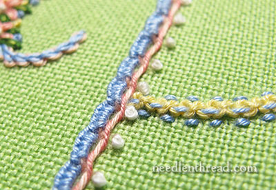
Hello Mary, Could you tell me what the stitch is that is in the 3rd photo on the right side, which looks a bit like Parma but doesn’t look wide enough. I think it goes well with the line of letter.
Blues and lemon will always endear themselves to me.
I enjoy your emails immensely.
Many thanks Lesley
Maybe include some in cream, white, and black. When I think of initials, I think of table linens, and these colors would coordinate with many neutral china pieces.
Hi Mary,
Thankyou so much for a wonderful site. I look forward to sitting and having a cup of coffee with you everyday.
I am with the people who would like to see something done with a black background whites, grays, and silvers. Maybe a black background with yellows browns golds. Like the stunning bee at this site. http://heavenandearthdesigns.com/index.php?main_page=product_info&products_id=4875.
These combinations would be exquisite enhanced with metalics. Get out the gold!!!!
Hi Mary. Popular color combinations I would like you to consider are (1) pinks and green with white, (2) aqua and reds with white, (3) brown and pinks, and (4) lime and oranges with white. Will you be showing a “monogram” in solid colors? Also, I really appreciate seeing your stitching combinations on colored backgrounds. You create so many choices for us; something for everyone. Thanks. Joann
I particularly like the colored ground fabrics. The yellow fabric with the blue and white stitching is my favorite! However, I don’t see any combination here that I dislike.
Well, I am all for bright and unusual combinations. I was pleased with all, but really liked the red background – the flowers really popped.
Mary, they are all so beautiful. But…where do you start? Somehow it is like looking at a finished house wondering if you started at the roof or the front porch or just where. Give us more details or steps if you will. Changing threads – layering – I get lost! Thanks.
Mary, I love, love, love the monograms! The color combinations are adventurous, but gorgeous. The stitch combinations add such richness to the work and are so beautiful. I hope this will eventually become one of your books that we can purchase. Any chance?
I love your color schemes. Makes me smile. Yours is my favorite email that greets me every morning.
I love them all, you’ve chosen some amazing colour schemes. How about a yellow, white and green one?
will you be releasing this as an ebook in the future, I’d love to do something like this.
Dear Mary,
We all have color favorites, but I find all the combinations that I have seen to be pleasing. I’m bad at picking colors to use on my own, but would not have rejected any of your stitched pieces. And I love the stitches you chose.
I’m looking forward to that monogram class that you have planned. A few years ago I wouldn’t have shown any interest, but now I’m thinking of all I can learn through the class.
Depending on the fabric color/type one is working on, is the decisive color choice. I made a monogramed hanky for a friend,on white linen with a very light mauve embroidery. Color she chose.
Me parecen preciosas todas las letras y por supuesto todos los puntos no creo que se pueda cambiar nada esta guapisimo
I love the Colors, designs of all the Monograms. Thank you for sharing and teaching these stitches to us. It is so very inspiring!
Mary, your beauty in thread never ceases to amaze me. I love the work and the way you are bringing the colours out on different threads and linens. Your work is exquisite.
Pour moi, tout est magnifique, je découvre une nouvelle broderie,et de nouveaux points.Je vais donc faire quelques essais dès que possible. J’aime beaucoup votre site. Amicalement Christiane
I like all the combinations shown – even the one on the yellow background (& I’m not a “yellow person”).
I grew up in south Florida, with tropical colors. As a child, I colored everything possible in pink, chartreuse & turquoise, and I still love that combination. Designer Lilly Pulitzer & needlepoint designer Barbara Bergsten rock the pink & lime…I’d love to see what you do with it.
OMG!
I loved all of them!
Hi Mary,
Victoria magazine has a special edition out on Monograms that makes my heart beat faster. I know you love monograms and page 12 has linens
with your initials. I don’t know if you remember me but I mailed you a piece with the
initials MC.
Take care, Sandy
Hi, Sandra! Of course I remember you! I framed the linen on the same blue background I displayed it over on the website. Looks lovely! I reviewed the special edition of Victoria a couple weeks ago – it’s beautiful! Thanks for thinking of me! – MC
Mary, I would like to see these beautiful initials featuring so many stitches and colors develop into an E-book. Of course I’d want to see a complete alphabet of capital letters and lower case letters, too, I’d buy it!
I have to confess to generally detesting green and about the only time I use it is for foliage and stems. Your green fabric with the purple and white gives me the heebies, I’m sorry. However let me also say that it would be a sad world if we all liked the same thing; it’s the differences that make life worth living, imho. The other combos look good, although I personally (I know that’s a tautology Mary, it’s for emphasis) don’t seem to be able to break out of my monochromy. Would it be going too far to say that the brighter the background, eg, the red, the green, make the whole thing look…um…cheap? To me, they lose their class on those colours and your work is pure class. (I would really like your feedback on this, please Mary.)
I’d love to see one done in shades of taupe and white. Maybe a pale taupe-ish background with darker embroidery livened up with a dash of white. Please don’t think this means I am anti-colour, I am not. This weekend I bought a new hat in a plummy/dark fuchsia sort of colour!
Hello Mary,I really did not like the oaty one. I guess I like a light color linen or white. But I am making a crazy Quilt so I am working
with many colors and combos. I sure do like your work though.
Margaret Geen
I think with bright colors in general the piece tends to date it’s self.
The red was difficult for me to look at and it’s my favorite color. I think the very bright colors used on the red were not the best choices. Sort of a throwback to the 60’s and some of the 70’s.
As soon as I scrolled down to the next photo my instant reaction was Ahhhh.
Interesting how we perceive color.
I love all of them–and the red is charming! It seems very Scandinavian to me, Swedish somehow.
Nice colour or nice pictures
I’m looking forward toyour alpha sampler. I can never find a suitable V for me, either looks like an upsidedown A or like a truncated W.
Hi, what a lovely piece of letter! Could you please tell us where we could get this alphabet? I like your colors, threads and fabrics, they are cheerful. We can see all details with different colors that the only one. I very like the purple one on green fabric. If its possible to found the pattern, I make it in differents shade of pink, with green for foliage, bleu for forget-me-not, white flowers heartily yellow… I love pastel colors. You have a beautiful site with clear tutorial, a lot of description of all stitch you use. I very appreciate.
Hi! I was just wondering whether you are going to be selling this alphabet project pattern any time soon? My little girl needs a beautiful “N”!
Hi, Karen! Yes, I’m working on putting the collection together right now! Hopefully, soon!
Good morning, Just a historical note to your favorite color combination. Green, white and purple (violet); they were the colors used by the Suffragettes. In looking at brooches from that period (1840’s – 1920’s), quite often that color combination was worn by women. It translates to “Give Women the Vote”. 1848 the first Women’s Rights Convention; August 1920, passage of the 19th Amendment to the Constitution giving women the right to vote.
I love your work and articles — and can’t wait for your book on letters. Sharon Barrea
Lindos estou começado com estes pontos estou maravilhada com tudo, já bordo em ponto cruz nomes mas me apaixonei por estes pontos e cada dia bordo um pouco pra pegar prática. Se puder me mandar uns passo a passo ia amar. beijos.
Beautiful! Can’t wait to try a project using your mix & match system from your alphabet chart.
Not as big a fan of the red background above, but then red is a hard background to work in.
A fun suggestion to try— a midnight blue or deep green as a background for a Christmas piece. Perhaps ‘NOEL’ or any other holiday word using a holiday color scheme? With your beautiful alphabet and all the different stitches it would give it richness and depth. Really love the alphabet!