


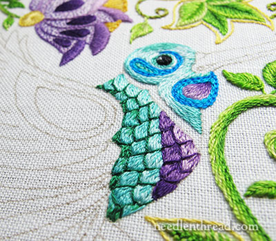
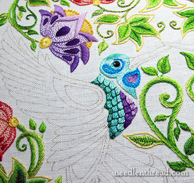
Ok, maybe they aren’t supposed to be scales. In fact, I’m pretty sure they’re supposed to be feathers.
But I made what I think is a bad choice when embroidering the feathers on the hummingbird chest.
I liked the initial colors and stitches I showed you last week, but then I got carried away with the emerald green. Instead of feathers, I ended up with scales.
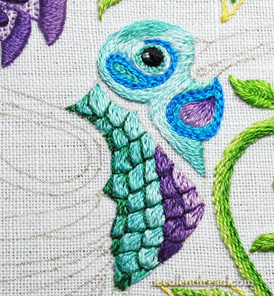
This is the result up close. I used fly stitch to embroider an out lie around the scales…errrr…feathers on the chest, in emerald green around the greeny-blues, and in dark purple around the purples.
Up close, I don’t really like it.
From different angles, I don’t really like it.
It looks like the poor fellow’s wearing a bubble jacket.
From far away, it isn’t as bad – I don’t dislike it as much – but only if I squint.
And if you have to squint in order to like something just a little bit, that’s a bad sign.
The most obvious problem: the emerald green is too dark, and the outlines, instead of providing just a hint of depth, become pronounced edges. They look sharp and hard, especially in relation to that very smooth head floating above.
You know, I don’t mind the dark on the purple part so much – the purple part of the chest seems to invite a bit of vividness.
But for me, it doesn’t work with the green.
My plan is to try a more moderate shade of the colors used in that area instead. I also want a bit of texture in there – something to help individualize the feathers a bit without the obvious dark outlining.
I’ll embroider the little band on the neck next, though, just to double-check my impressions before picking out the dark green outlines. We’ll see what happens!
Questions? Comments? Suggestions? Have your say below!
If you’d like to follow along with the Secret Garden Hummingbirds project, you can find all the articles relating to this project arranged in chronological order in the Secret Garden Project Index.
Why not use a diagonal leaf or ray stitch?
Since they are feathers, maybe you need to blend them in to one another a
little more rather than the defined scale approach. You could still get the gradations of color and the distinctions. I like the heavier texture of the feathers
compared to the head. More real bird like.
Just a thought.
Darcy
Ah, yes, you are so right, as you usually are. Those feathers do look like scales with your outlining. The head is so delightful with the blending of different threads, you are doing that right. So, more unstitching? You aren’t afraid of that, and I am sure you will solve this problem as you have so many others, with panache.
Why do they need to be outlined – I would think that Needlepainting would apply to a bird more than any thing else.
Well, it’s not really meant to look like needle painting…. I don’t really want it to, anyway. The background of the head does (if you’re thinking in terms of long & short stitch), but the swashes don’t, and I’m planning to try different stitches for the tail feathers, etc., too.
Mary, we can all count on your to be in awe. The sheen and color of the threads, can you share again what thread you are using? Did I see something about floche? seems to have more sheen though we all know you can make anything look its best.
Hi, Karen – It’s just regular DMC cotton embroidery floss, the six-stranded kind.
Have to agree with you here.
The emeralds green is too strong around the scallops,
BUT I do like it in the last row. Maybe a shade or two darker of the blue for the scallops?
Not fun picking out but the end results have been better when you have seen a problem before.
Happy stitching
As I suggested before, use a paler green and the dark purple is way to harsh. Maybe move all the values up one on the purple and use a paler green for the outlines and a pale lavender for the breast.
Hmmmm. I like the dark purple. In fact, I think it’s the one thing I like most about the whole area. But I’m also thinking in terms of how it will balance with the wings and tail, which will feature some darker shades.
Oh, Mrs. Corbet, my mom and I LOVE this just as it is. As you said yourself these birds are stylized and shouldn’t look like real birds. I love the Emerald green and it’s heartbreaking that you’re so dissatisfied with the beauty of your stitching here. I think I might cry.
If you don’t like the scales, I agree you need to change them. Although I like them, if it was mine I’d do something to make the head stand out a bit more so it doesn’t get lost in the background. The idea of scales on the bird rings more true for this stylized version than on a realistic version. My advice would be to do what you said, but only up to a point – start by replacing the dark fly stitches with something a bit lighter in color, and also see if you like it using just one thread, not two, for the fly stitching. I can’t make up my mind yet on the purple, perhaps just a bit lighter, too. Looking at the photos you have published here, the gorgeous colors you used in the top of the head (this poor bird needs a name) look a bit lost, perhaps a few stitches of a bit darker thread near the upper edge would change that. Thank you Mary, for teaching us all so much about embroidery!
Try just removing the outline stitches around the feathers. I think that might change the scales back to feathers
I am inclined to agree, it looks slightly suit of armour-ish. I had a similar quadry with my jacobean birdy project. It is supposed to be stylised, but I still wanted it to have movement and shading. Here’s an idea: what about a fairly closed buttonhole, with a few straight stitches added at the top for shading? the outline would take care of itself then. to add in a flash of the green for that iridescent look, you could do a bit of whipping?
Good morning, Mary,
I, too, suggest trying a close Blanket Stitch for the feathers. I had stitched a stylized owl and used this for the scalloped feathers on his breast to great effect.The raised edge of the blanket creates texture, shadow, and depth.
I am enjoying the development of this piece very much.
Rosalie
Looks to me as if the stitches IN the “scales” are going the wrong way. Too much down and not enough swirled off to the left toward the body. And maybe the outline ought to shade off that way. Emphasis on the underside of the scale.
Just my opinion.
After I do the humming birds (which will take years at the rate I’m progressing) I want to do the fish. You just showed me how to make wonderful scales. 🙂
I’m glad you let us see mistakes you make. By the way, even the little mistakes you make are beautiful. Can’t call it ‘mistakes” when the stitches are that good! I’m glad you let us see when you “change your mind” during a project. I love your work.
I would have relied on shading, with long and short stitches of darker (at the ‘bases’ of the feathers) and lighter shades. I did something like this once with a pine cone.
You did that, but perhaps the shades were not as different as you needed, but perhaps if the outline was close to the dark of the feathers, that would work. The dark purple feathers, outlined with slightly darker purple, look good. Why would you outline with dark green?
Hi Mary,
I like the purple part as is stands . . . I also like the colors for the blue-green feathers. But I agree that the emerald green fly stitches are too dark.
I’m thinking of two possibilities and would have to try them both to see how they work – if I were doing the stitching.
1st possibility would be to shade the outlines – leaving the emerald green at the far left side (as one is looking at the photo) and then using progressively lighter shades on each row of feathers as you move to the right. I think the dark purple outlines work on the purple feathers simply because you only have two rows of feathers in that section . . .
2nd possibility might be to try one (or two) of the shades of bright blue from the head as the outline for the blue-green feathers – maybe shading lighter as you go to the right. You might find that leaving the emerald on the far left row would still work best . . . I’m especially curious about trying the bright blue here, because it *might* give a feeling of the iridescence of the bright feathers of birds . . . without making such a hard edged effect.
I’ll be most curious to see what you discover and decide as you work this out. Wishing you much luck and a speedy resolution without too much picking out!
Sharlotte
First i love that you post all the ups and downs, thank you for sharing wvertying.
Hummingbirds often have a lovely hint of gold in their plumage and the chest feathers might look better shown as one silky skin, like they do whn viewed up close and personal.
Anyhow i think you need navy and gold in the chest feathers and yes, with the bubble wrap vest.
Keep up the amazing work.
I love the colours Mary this is not suppose to look like a real Hummingbird but one in a Fantasy setting. So he can be all kinds of colours. I think once you add a few more stitches it just might all come together. Fantasy birds are not suppose to look real. They are full of colour. I’m sure you will come up with something. You always do Mary.
Keep stitching. Have a great Day and Week.
Hi – I’d go with almost the same colour or just one tone darker than the feather. Just changing the stich can often be enough to add the edge you want to define the area while keeping to the same colour.
You may need to use different colours for the different rows, i.e. not one colour for all of it, but going tonal again.
Alternatively you could try a heavier weight of thread – but that may be too much for such a small area in the overall piece.
Mary, I agree with you about how it looks close up, but when I held my iPad further away from me I like the shadowing effect you having going on there. The overall effect of that may pay off. Once we get it in our heads that something isn’t working out to our taste,,, rip, rip and out it goes!
agree…..gorgeous, gorgeous colors, but needs to look a bit more feathery
your stitching is so lovely!!!
Mrs. Corbet,
I love the purple. I think it’s a nice contrast against the lighter colours. But I think the emerald green outlining is too harsh. It makes the feathers look like, as you said, scales. Maybe a very light blue would work better.
Sarah 😀
Your work is beautiful and I appreciate the fact you invite critiquing, it helps us all. As artists we tend to be hardest on our own work, actually pointing out a possible mistake that others wouldn’t even notice. I do Norwegian rosemaling, so would shade from light to dark on each section. This gives gradation without harsh lines. I find I have to step back from projects and walk by it a number of times a day before changing anything. A little tool that helps is the peekhole (thingy that is installed in doors) so you can see who is outside your door. It helps in seeing what colors stand out and overpower everything else. Also good for quilting.
I believe I agree with others, that the green outline may be too drastic a contrast for the blues of the feathers. It may be too early to tell, until the bird is finished, but easier to change now. No matter what, the finished piece is bound to be gorgeous !!!
Dear Mary
I don’t know what to advise but I see what you mean about the green and the dark on the purple, as you say perhaps a more moderate shade and texture would work better. I will wait in anticipation to see what you decide and how you will tackle this difficulty. Thanks for sharing your dilemma with us and I’m sure what ever you decide it will look great.
Regards Anita Simmance
I like it!
I must admit I don’t like the way it looks right now – though do love the colours. I think the feathers should blend together. I often watch the birds in the garden and you just can’t see the individual feathers, just the shading of the colours. I think that would make it look more natural if that is what you are aiming for.
Mary, if you are planning on picking it out anyway, why not try one more thing before you commit to the removal. I know you are not trying to make them look realistic, but real feathers often do have strong lines of dark color around the edges. (Pheasants come to mind.) I suggest that to attempt to stop them from looking so much like scales, use the same color you did the outlines in and add some long & short stitches (mostly short!) going up into each feather to soften the look.
I would blend them together and get rid of the outline, and maybe even use a slightly lighter shade of green.
Mary, these things are always to your personal taste, but please consider: it seems to me that the reason it stands out so much is because the wings aren’t done yet, so there is nothing for those colors to “compete” with. You have chosen a very bright coloration, and if the wings are also going to be just as bright, when it is finished the breast will not stand out so much. Also, even on brightly colored birds, in nature, it seems to me that there is often some neutral browns or greys on the bird, so maybe a little neutral added in would tone down the contrast. (But I am not clever enough to say exactly where!)
Mary, I really appreciate that you show how creating something can be a process of trial and error. And that you trust your eye and your gut to know when something is not right and you re-do it. Thank you!
Lauren
My first impression was to use a krenik thread in a similar color to the feathers it would give a nice glint to the bird. I don’t know if this would be a no no to the type of threads you had decided to use on this project. I will still unset krenik even though it bled on my quilt. Diana.
Mary,
I love that you share your needlework dilemmas with your readers and ask for feedback. I continue to learn so much from your “happy” mistakes and your input has greatly improved the quality of my own work.
I love what you did with the head of the hummingbird, but I agree that the outlining did not quite work. I almost hate to mention it, but I noticed that on a few of the feathers that the direction of the stitches may need to be adjusted to flow towards/with the body. I really hate to mention it given how many stitches you have already pulled out, but I think that it may help a bit with the finished look of the feathers.
As far as the outlining, I would stick with a single strand of possibly the same colors that you have already used- maybe a tad lighter. Sometimes when I want to outline something but I don’t want a hard edge, I will “tuck” a stitch under the other stitches so that only a tiny sliver of the darker thread shows. The other thing you could do is to add the outline stitches randomly- like shadow lines on a painting. That is to say, do not complete the outline on every feather and do not encircle the entire feather either. Simply add a small stitch to the left side of the feather here and a small stitch at the base of the feather there… This technique does not work on every project; it takes some experimenting to get the balance right.
Keep up your BEAUTIFUL work. I love seeing how this is progressing!
You do the most loviest of work! I personally like the deep green. Everything is starting to look too sugary sweet to me. It needs some contrast. I quilt and sometimes it’s an odd color that makes everything pop.
Hi Mary,
I just love your Blogs, and I have followed you on this project from the start. I love the “Scales and/or feathers”, they go with the rest of the design. I don’t however care for the throat. It takes away from the beautiful eye area and looks as if she has a swollen growth. I love all other areas, but the throat draws my eye to that area every time I open the page and not in a good way. I’m one that voices my opinion, and although you didn’t ask me for it I share it with you out of love for your work.
Thanks for the wonderful embroidery lessons and giving me something to look forward to when I open my mail each day.
Happy sewing,
Tippy
I thought you would enjoy this hummingbird. This real live bird looks to me like he has been embroidered! http://www.thisiscolossal.com/2014/07/remarkable-macro-photograph-of-a-hummingbird-by-chris-morgan/?src=footer
Thank you for giving us this picture. When I saw it I understood better how the embroidered bird should look. The ‘scales’ are correct, but the outline is a tiny bit too dark. Needlepainting would give a completely different bird. Your photo is the key we needed.
Thank you, Laura!
Laura, this is, indeed, a fatastic photo.
Perhaps you could stem stitch the edge of the feathers, then satin stitch over the “ridge” to create depth and shadow?
Hi Mary,
I think the number of feathers on the drawing works, but does not translate into stitched feathers. The area looks crowded and not sleek enough. I think of bird feathers as smooth and silky and the head conveys that look. Your work and choices on the rest of the project are stunning and I’m sure that whatever you end up doing with the neck feathers will be beautiful.
Laura, VA Beach
I look at it like a painter and see an underlayer. I would add another layer on top to soften the hard edges and highlight, the darks would provide the shadows.
I don’t like the outlining either. It seemed more natural before you did it. However a lighter shade of the color might work better. I still don’t care for the direction of the stitches in the ‘bib’ under the beak. all in all your handling of the stitch choice adds interest without making it appear true to nature.
Might I suggest you look up hummingbird images before you pick out all that beautiful work. Their little feathers look scalloped. They are short and rounded. I so enjoy watching you progress on a project.
Hi Mary, When I went to do the chest section, I used an opposite color of similar intensity to outline in split stitch around each feather. It did not give such a sharp outline to each feather but only slightly emphasized it. I did the chest in shades of magenta and then outlined each feather with a complimentary coral of medium intensity. That same coral and magenta were then on each cheek swirl as well.
In Christ,
Gail J.
Well, I suppose it could be the lesser-spotted humming-dragon, Mary? Trying to think how I might tackle that stitching, I keep looking at the bunch of leaves inside the yellow outlines, just above the top of the beak.
What if the same kind of stitching was done in a slightly more feather-shaped unit than the leaves, at a simliar sort of size and direction of stitching to those leaves? And if the rows of ‘feathers’ still overlapped scale fashion but with no hard contrast between them, then I think you’d be about there. (The scales need to be longer than they are wide to say ‘feather’.)
Lighter colours at the edge of each feather, deeper in the middle, but changing the range of shades used (as you did on the leaves) so that the lightest feather-shapes are at the top and back, nearest to the head, and the darkest are at the base, below the purple bit. It also gives you a useful visual link to the stitching on the leaves, even though it’s in different colours.
I’m sure you’ll come up with a much better idea yourself – thinking aloud with other people is very useful for getting your own answers to bubble up in your brain! The head is lovely. It’s worth re-working this doubtful section or you’ll always be dissatisfied with it.
Hi Mary! I love these “group projects” where you do all the work and you ask for our input!! I agree with most everyone above — the dark, straight “outline” kind of stops you in your tracks. feathering the bottom edges with some dark strokes will probably suffice for separation. Did you ever think of streaking in a little bijoux or some other darkish metallic? That’s is what I love on hummingbird throats….
I liked the first eye you did. Try getting rid of the black outline on the feathers and maybe use something less server.
In an embroidery book the author out lined in a stem stitch her darker colors for the out line and to create a shadow effect then filled. Needless to say I was working on a peacock and I wish I would have seen this sooner and save me a lot time and to have a more real look than what I got. I did this on another project and it was a very nice effect.
Maybe this is really a pterodactyl, Mary, and not a humming bird?
We have had hummingbirds banded at our house a few times, so I had the privilege of holding one in my hand. While you think your neck feathers look like scales, they actually look like scallops when you can see them close. It amazes me how those tiny feathers can look like such a perfect scallop. They almost look like someone put tiny sequins on their necks.
Yours really do look nice and close to authentic.
Think scallops instead of scales and you might be
ok with them too.
I may be last response for the day. My take is to use the same shade or a tiny bit darker for the feathers( scales ). The fly stitch will still give some definition and depth. The other thing is , I agree with some others about the throat . It is just an awfully strong statement. I love your blues and greens.
And thank you for teaching me about stitch selection as you do this project. That’s my hardest thing: knowing what stitch to use and where .
Please can we have some color numbers. I really love doing this but it has been so long since I have been able to do anything. I am now moving on to other embroidery projects. I look forward to seeing your
email every day and recommend it to everyone as I think it is the best site. So please can we have some numbers to progress with. Thanks.
Hi, Crystine – thanks for your comment! I should have mentioned again that I will definitely be listing the thread numbers, but not until I finish this part, because I don’t want to list colors that I don’t end up using. Since I’m feeling my way through parts of it, I may make some significant changes.
Kind of on the same page as you except I am not a big fan of scallops because they never look great when I do them. The green outline is truly to dark, but the purple looks great-well almost great. My suggestion would also be great if I could think of one but will leave that to your expertise. But, maybe not. How about the lighter purple with a shade or two darker all through the
the light purple. That is it. No more scales for these hummers.
Dear Mary,
Why use such bulky thread? Almost all birds have smooth, silky, breast feathers not chain mail.
Perhaps just a single thread per scallop? The colors are beautiful together. But in the pattern the scallops are rounded and the fly stitch makes them look too pointy. And maybe switch the colors with the purple along the lower edge working up to the lighter blue?
Your devoted reader,
Jane
I suppose that is kind of confusing, since you’re seeing this very up close. It is indeed only one strand of thread!
Hi Mary
I don’t mind the definition at all. But the purple and turquoise for me doesn’t work. If it were me I’d stick to the turqoise shadings and just add a bit of yellow perhaps on the belly. Either that or change all of the colours to the purple range with accents of pink perhaps? But definitely not purple and turqoise.
Oh, dear. You’re right, of course. I feel awful saying maybe you should do some ripping out but you have the best eye ever!
I love the colors, but I agree the emerald outline is too dark. What about something just barely darker or the same color as the blue-green section?
Me thinks you are far too harsh on yourself!, looks amazing…
For the feathers, what about going 1 shade darker for the outline instead of the dark green looking outlines you have now. It would look more like a shadow in a shade just a little darker than the one you used for the fill.
Hi Mary,
Love the colours. What about using spaced buttonhole stitch as edging, with the “legs” various lengths?
I totally agree with you. I do have a question, I just found your site and it is awesome. I’m a beginner (will be for a long long time). I ordered the book and will receive it in about 2 days. I will start then. How long will you keep this information? I’m way behind as you can tell and I don’t want to miss a thing. Thank you so much for sharing. You are a wealth of information
It’ll be here forever, Rebecca! Well, as close to forever as one can count on, I suppose. All the articles are listed under the index for the project….
Mary, I’ve been looking at the hummingbird. I don’t think they really look like scales, but I do think they are not delicate enough. Perhaps if they were more like the shape of peacock feathers, you know, oval with a point on one end, they would read more like little feathers. Also, the darker blue is too much of a contrast and makes them look a bit like square checks.
I’m still hoping to see some more really rich colors like iridescent blues and violets in the birds. Also, emerald green and some periwinkle (because its my favorite color).
I can’t believe I’m not totally in love with your work here because I think everything you do is magnificent. But this entire piece seems to have colors in the same light color values and I keep hoping for some darker contrasting colors. What I mean is if you put the piece on a copy machine and made a black and white copy, all the greys that come out would be similar (I think). But please understand, that’s just me. I still love your work!!
Sometimes we are our own worst critics … personally, I love how it looks
The purple looks great. I can see why you aren’t satisfied with the rest of the body, but I wonder if the problem is not that the emerald green is too dark but that the lighter shades are too light? As for scales, that’s not a problem – the breast feathers of the Australian nectar-feeding Regent Honeyeater are pearly, almost opalescent, white, edged with black, and they look almost as if it has been tiled.
I’m just a lurker, but have been enjoying watching your progress, and loving your dialogue about your creative process. Have you considered a metallic for outlining? Hummingbirds usually have a little bit of iridescence in their plumage. Whatever you decide on will be gorgeous I’m sure.
Yes the colors are maybe to bold. And maybe not squares instead make patterns like you would a leaf. Just a thought
Mary, I wish you lived next door. Your comments are just what I would say. You mentioned squinting and as I am reading it I too am squinting, and yes I agree with the bubbles. So we all thank you for your honestly. This way we learn from your mistakes. thank you.
I agree. I don’t like it. I had thought you might do a satin blanket stitch on each feather without the darker color around. That may be too much texture for a hummingbird, but our bird is not realistic anyway. Just food for thought. I am anxious to see YOUR solution.
I don’t like the part under the beak. M aybe remove the outer blue stripe to reduce the size of whatever that wattle is.
So, when’s the joust? I mean he has the armor and the lance (beak)…. (haha) I am sure you and the birds will work everything out and what you learn will make the Sir Birds wife a lot easier. 🙂
My pedantic input. Sometimes these feathers look scaly. Google Images hummingbird photos show this. If it were mine, I would leave it and see how it goes. Because of the way that the wings and tail feathers are drawn, the pattern’s chest area appears proportionally smaller than it could be. But you always look for the more perfect solution. It is an incredible teaching tool.
Does this help?
http://drawsketch.about.com/cs/pencilgraphite/a/tonal_drawing.htm
Dear Mary,
Love the blue greens and the purples. I also love the scales. It reminds me of the male species during mating season all puffed up showing off his plumage. The transition between the two color families is a little harsh. Maybe blend the colors together for a more even transition.
Maybe try light to dark with purples and then dark to light with the greens butting the dark purple to the dark green then fade out (darks in the center. Or the other way around lights in the center and darks on the outside.
mary – your’e the expert, but i’m having a real hard time looking at any other part of the hummingbird but what appears to me to be a dark growth on the beak. it’s just to dark compared with the rest of the head.
Hi Mary, I have a suggestion for you, start by using a feather stitch, it really works well, you just basically apply the stitch the way you desire. I like to start at the top of the bird, and I use just the feather stitch until it is complete ( I like to use a single strand for the feather stitch and then I fill in the feathers with desired fiber, and I like to use needles to stabilize each feather as I fill them in. Have a sweet evening,
Lisette Root in Oregon
I love the feathers. I am working on the fish drawing from this book and wasn’t sure how to do the scales of the fish. This is perfect for how I want the scales to look. Thanks so much for showing these up close and describing how they were worked. You are very talented.
I have been watching so many hummingbirds in my yard as this time of year the traffic really picks up. This is looking quite nice to me! I always think that the feathers do look like scales and they change colors as the light hits them differently.
Love your site! I was looking for Stumpwork tutorials when I came across it and had an OMG moment. I’ve done simple embroideries for years (straight stitch birds mostly) and now I’m looking forward to reading more. Your work is really inspiring. I live on Vancouver Island, British Columbia and have lots of outdoor inspiration. thank-you so much for the work you’ve put into your beautiful site.
Thanks, Laurie! I’m glad you enjoy Needle ‘n Thread!