


Wow – this alphabet went fast! We’re only four letters from The End!
The previous monograms I added to the free embroidery patterns here on Needle ‘n Thread took months and months – and sometimes, over a year! – to make the whole alphabet available. This time, I decided larger groups of letters over a shorter period of time would be more helpful for folks looking for pretty monogram alphabets for hand embroidery.
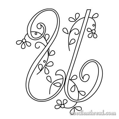
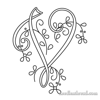
And happily, these 26 letters have gotten to you rather quickly! So, here’s the second to the last set of letters – the S, T, U, and V.
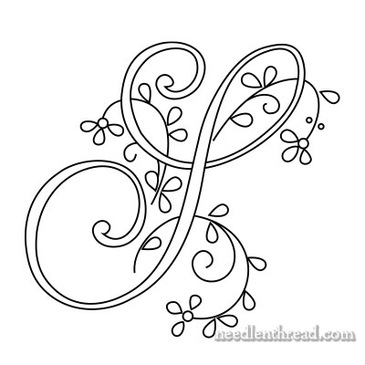
This particular style of S for embroidered monograms is not one of my favorites, admittedly. It’s typical of the late 1800’s and early 1900’s, but it’s not really as recognizable today as an S. I should draw up a more modern S, methinks, to offer an alternative.
Even though a modern S might detract a little bit from the classic and historical “feel” of the alphabet, I believe that designs like this can be (and should be) updated.
That’s embroidery, after all! It’s a living art, and something that changes with the times. We bring to it newness, building on what has come before. Otherwise, it wouldn’t be art, really. It would just be repetition, strict imitation, duplication. When we update a style or bring to it something new, we further the art a little bit and keep it alive. Right?
In any case, this is a typical S for monogram alphabets. When I have a chance, I’ll work up an updated alternative.
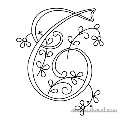
This particular style of T, though, I like. It’s a nice T!
More Stitch Suggestions
I received an email the other day asking if I could recommend a braid-looking stitch for these letters.
The are some difficulties you’ll run into with braid-like stitches for these letters, but that’s not to say braid-like stitches can’t be used. It might take a little playing to make them work, a little manipulation here and there of design or stitch structure, but I think it can be done.
Where the letters narrow (for example, the top of the T above), many braid-like stitches would be too cramped.
However, if you want the braided look on the wider parts of the letters, you could always work into the narrow parts with a different stitch.
Some braid stitches, for example, might morph easily into stem stitch, while others might morph into an elongated herringbone stitch, and still others might work into a simple chain stitch or something similar.
You’d have to play with the narrowing and widening of the letters, to get braid-like stitches to work, but I think some of them could work pretty well.
Here are some braid-like stitches that you could play with for monogramming:
Braid / Cable Plait Stitch
Spanish Knotted Feather Stitch (worked close)
Plaited Braid Stitch
Herringbone Stitch (worked closed)
Basket Stitch
You could even work some raised stitches – like raised stem stitch or raised chain stitch – over the broader areas of the letters, and then morph into regular stem stitch or chain stitch in the narrows.
You’d have to use a fairly fine thread to manage some of these; otherwise, the letters will come out quite bulky. You wouldn’t want to lose the delicate look of the letters with too much bulk or texture.
Definitely something fun to play with and experiment with!
Monograms for Hand Embroidery – Printables
Here are the PDFs for today’s monograms. The letters will print at 1.5″, 3″ and 4″ high if you choose no scaling (or a similar setting) on your printer. You can enlarge and reduce them by using the scaling feature on your printer or by using a photocopier.
Monogram for Hand Embroidery – Delicate Spray S (PDF)
Monogram for Hand Embroidery – Delicate Spray T (PDF)
Monogram for Hand Embroidery – Delicate Spray U (PDF)
Monogram for Hand Embroidery – Delicate Spray V (PDF)
Favorite Monograms – PDF Collection
You’ll find this complete alphabet – along with 15 other decorative alphabets – all in one place in Favorite Monograms, a downloadable PDF collection of 16 monogram alphabets perfect for hand embroidery and other crafts.
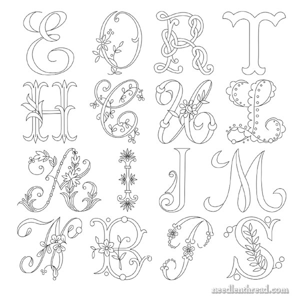
In the photo above, you can see samples of each alphabet available in Favorite Monograms.
Each letter in each alphabet in Favorite Monograms has been carefully traced into a clean line drawing that can be easily enlarged or reduced on a home printer or a photocopier.
The 16-alphabet collection is delivered as via a download link to your inbox shortly after purchase, so that you can begin creating right away! Priced at less than $1.00 per complete alphabet, monogram lovers can’t go wrong with this collection!
Favorite Monograms is available in my shop, here.
I think that style of ‘S’ would look fine under certain circumstances. In others, it might look better to choose a different style to better ‘fit’ the overall appearance of what you’re embroidering. But that’s just my opinion.
I am still glad to see the ‘S’. I’ll have to come up with something to stitch it onto.
Thanks for sharing, Mrs. Corbet!
Sarah 🙂
Dear Mrs. Corbet! Good Morning, I hope it’s as lovely in Kansas as it is here today. Thanks for the update, it is making me rethink the entire concept of the monogram I wanted to do for my sister.
I may be in the minority but I recognize the S as an S. I find the T a bit unusual but I love it. I agree with you that Embroidery must be updated at times because it’s a living art, but I don’t see the need for this particular alphabet.
Quick question… Do you think that this alphabet has the same potential as the flower one did for a 26 letter project?
Dear Mary
The above monograms are really lovely I like the U and the V, very delicate and stylish, I can see these stitched in L & S stitch and Satin stitch. They certainly are a living art. Thanks for the monogram patterns and sharing them with us.
Regards Anita Simmance
Dear Mary,
The S looks just like the S I was still tought to write in the early 90’s – back than in Prague 😀 I hear they changed the script a couple of years ago and the parents and teachers alike are rioting to have the old S and L back…
Thanks for the great website, your newsletter is the highlight of my day…
While the S is not the simplest letter to read in this alphabet, it does have lovely curves, and is decipherable. I’ve been anxiously awaiting the T, a letter I have great affinity to. It is often not an attractive letter, represented by lines that are too simple and unadorned. While this T certainly is not oversimplified, it is also the most disappointing in this alphabet. I find it less recognizable than the S, looking more like an E or even an ampersand. I would like to see the T recrafted. After all, what good is a monogram that is illegible.
Hi, Terry – the T is the typical uncial-type shape used in calligraphy. You’re right that it isn’t as easily recognizable as a modern T. I always think this T is much prettier, though, in a scripted alphabet, than the typical scripted T or the block style capital T. If you want to change this to a scripted T, you could elongate the lines on the J or I, and work out a scripted T petty easily.
Hi Mary,
Oh, rats!! 😉 I’ve been waiting for that darned “S” to show up! I’m hoping to do a monogram for the back of a handbag mirror for a friend’s early August birthday. When I saw this alphabet, I knew I wanted to use it and have been watching for the “S”. You are right, though. I’d much rather do this with a more modern “S”. Her first and last initial are both “S”, so this needs to be “obvious” and the 1800’s version isn’t.
So here is a vote for reworking the “S”. In the meantime, I’ll go back to looking for something similar that has a more modern shape. 😉
Thank you for doing these. This will be an experiment for me, since I’ve not tackled a traditional monogram yet. I’ve drooled over them for years and finally have worked up the nerve!
Sharlotte
Oh! I just printed it and the C and I think if I turn the S more upright and re-work the bottom sprig to be closer to the position of the bottom sprig on the C, it just might work. I’ll play with this later today or tomorrow and will let you know if it is successful.
Mary these are wonderful! They look so graceful and elegant. I have noticed that my 24 year old daughter and her friends now love monograms. I did one article of clothing and the next thing i knew the requests started coming in to do collars and pockets and even the yoke on jean jacket.
Dear Marie,
It is true that in some alphabets, letters are not recognizable at first glance, especially true with numbers, collapsing under the decorations, even with accurate drawings … the letter is sought. All the skill of the embroiderer’s there. I agree with Terry, but not easy embroidering from left to right and starting as if we wrote, we can better understand the lettering, that I made along with my finger on the screen of the computer. Marie always thank you for this great printing facility that you put at our disposal.
Mary, I do agree with you about the continuing evolution of embroidery. Each person who makes a small change or detail to a pattern is part of a long line of artists/craftsmen who add to the rich history of needlework. I love that it is developing and evolving. I don’t want exact copies that are strictly followed. Where is the personality and character in that? Love your blog which I lalways look forward to with pleasure. Thank you.
Hi Mary, I love this alphabet, it is really beautiful. I would love a more modern S as I think this one is easy to confuse with an I. I have been stitching a D G on a small pouch for a birthday gift for my sister-in-law. i have just used a simple stem stitch and I am so pleased with how it looks. Would love to send you a photo but I am not sure how to do that on your site. Thank you. Sally
Hi Mary, I love this alphabet…it’s so pretty! But I’m always on the look out for an ‘S’ that is recognizable as an ‘S’ because of my last name, and I’ll be anxious to see what you do with it. Thanks again for sharing these beautiful letters.
I’ve been waiting for the letter T, I’m so disappointed it looks nothing like a T…wow!
I suppose it depends on what type of T you’re used to in these types of alphabets. You’ll find lots of uncial type T’s in these older alphabets, and this one is pretty typical. You could always manipulate some elements, as suggested in an earlier comment, from different letters (like J or I) to come up with a scripted T pretty easily.
Hi Mary,
Thanks so much for the beautiful Alphabet patterns! I just love them and can’t wait to embroider them. I may even have to make a quilt out of them, because that’s what I really am … a fanatical quilter.
Thanks for sharing your wonderful talent with me!
Nancy
Thank you very much for monograms.
Best regards
Matilda