


After yesterday’s True Confessions about the small monogram sample that went from an hour-long project to an almost-five-hour-long project – and all the doubts and discoveries along the way – I thought I’d share the finished monogram with you.
Upon finishing the embroidery on the little R and blocking it, I drew some more conclusions about it.
One may surprise you!
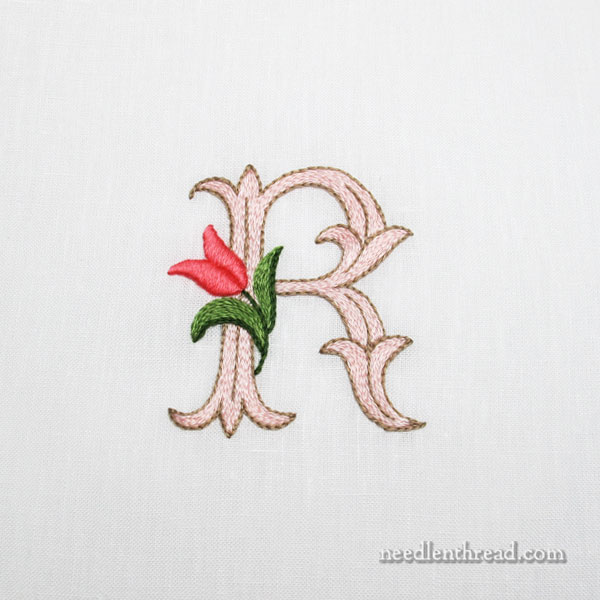
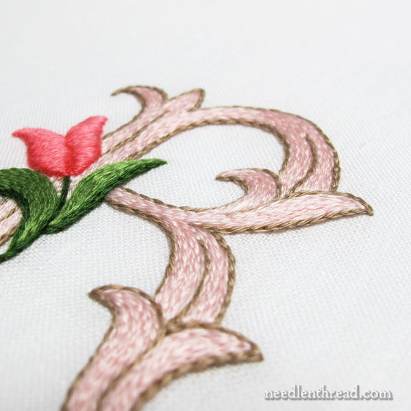
Here’s the finished R, decorated with a little tulip, and embroidered with floche using split stitch, stem stitch, and padded satin stitch.
The letter itself is 2.5″ high, so it’s not a small monogram, but it’s also not a huge monogram. I think I would like this particular letter style better a little smaller, at about 2″ high.
(You’re welcome to click on the photos for larger images, by the way…)
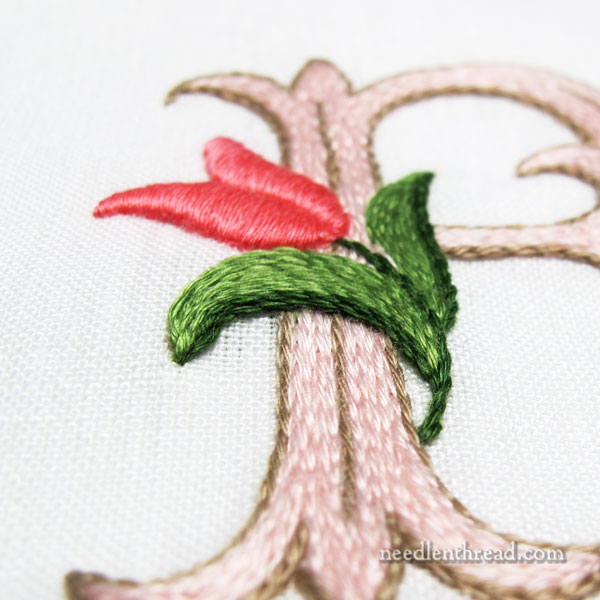
If I were to work this monogram again in split stitch, one definite change would be the tulip’s leaves.
The texture of the leaves (worked in stem stitch) and the letter (worked in split stitch) is similar. There should be more contrast in textures there, especially due to the proximity of the smooth surface of the flower in satin stitch.
In fact, the flower ends up rather isolated, even from the leaves, because it is the only element of a different texture.
These are the options I’d consider, if I were maintaining the split stitch filling:
1. Stitch the whole thing flattish, using split stitch and stem stitch (including the tulip). It would look a little cartoony, I think, but it would be more coherent.
2. Embroider the flower, including the leaves and stem, all in padded satin stitch, which would offer decidedly more contrast across the whole decorative element. And the height of the padded satin stitch would impart a little illusion of shading to the flower element.
3. Use long and short stitch on the flower and the leaves and satin stitch on the stem. This would offer a little textural contrast (not as much as padded satin stitch) and also some contrast in the color arrangement. You can see an example of long and short stitch worked in floche here.
My gut instinct, if the letter were to remain split stitched in the color scheme on the sample, would be approach #2. I think option #2 would work best with the design of the letter, which seems to demand a clean, simple approach.
Concerning the color scheme, would I change it?
Actually…in retrospect…
I wouldn’t.
If I were maintaining this stitching approach (split stitch, outlined and filled), I like this taupe-y brown / pale pink. It’s somewhat ice-cream-parlorish, but it’s still classic and it doesn’t jar the eyes.
If I were to go with a blue-green version, I’d probably maintain the taupe-y brown and go with the palest of blue-ish greens, turquoises, sea greens – something like that – very, very pale. In which case, the color of the leaves on the tulip might change, and perhaps the color of the flower, too.
Interestingly enough, upon finishing the monogram and blocking it, the Optimistic Half of Me that I told you about yesterday won out.
Despite all my misgivings, despite my grumbling with and berating of myself along the way, despite the fact that I still don’t like the ground fabric, when all was said and done, I discovered that the finished monogram isn’t all that bad. If I were doing it again, I’d make a few changes, but overall, I like it a lot!
Another lesson learned: sometimes, perspectives change when you come to the finish line!
Favorite Monograms – PDF Collection
You’ll find this complete alphabet – along with 15 other decorative alphabets – all in one place in Favorite Monograms, a downloadable PDF collection of 16 monogram alphabets perfect for hand embroidery and other crafts.
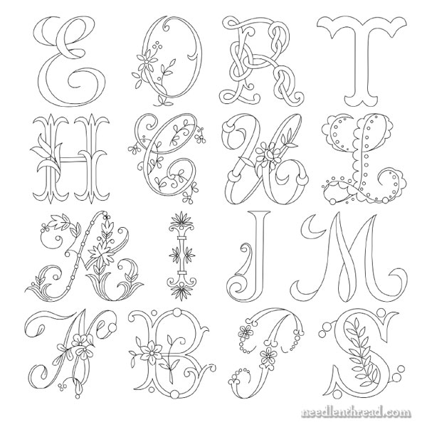
In the photo above, you can see samples of each alphabet available in Favorite Monograms.
Each letter in each alphabet in Favorite Monograms has been carefully traced into a clean line drawing that can be easily enlarged or reduced on a home printer or a photocopier.
The 16-alphabet collection is delivered as via a download link to your inbox shortly after purchase, so that you can begin creating right away! Priced at less than $1.00 per complete alphabet, monogram lovers can’t go wrong with this collection!
Favorite Monograms is available in my shop, here.
I think that it is beautiful!
Thank you, Margaret. Now that it’s finished, I find myself wishing I had done an “M” instead of an “R.” I picked the R randomly, by dropping a pin on the design sheet and doing whatever letter it landed on.
I’ve been looking at this monogram for a bit, and I agree with you that, if you were to stitch it again, option #2 is best. I’m also thinking that the letter itself would look nice in long and short stitch, with the tips of the flourishes shaded a bit darker.
It’s an interesting idea that has dug itself into my brain and is entirely your fault, because it’s going to taunt me until I try it…and I have far too much other work I need to do, right now!
Which means I’ll probably resist for another day or so, then completely give in and experiment with both the straight stitch and L&S ideas. That’s how I rationalize playing with a project I don’t really HAVE to do…
Oh, just give in, Liz!! >:-) You know you will, anyway! Might as well get it out of the system. (Sorry!)
I’m going to work another sample up, using option #2 and a 2″ letter. I’m also going to work another sample in a different combination of techniques. I suppose we can weigh in at the end on favorites.
I may or may not have posted that comment and then gone straight to the embroidery box to consider shades of sea glass… 😉
Yes, good choice! 🙂 I may join you in that color range!
Ooooo, love the idea of shaded tips. Now I must try that!!
Well, I didn’t take a picture, but I’ve finished the letter R experiment…Took me awhile to find the same monogram in my files. The one I have is the same letter, but has a different floral motif, so I just sketched up a tulip. Anyway…
I used DMC 564, 563, and 562 (three shades of Jade) for the body in L&S stitch, with 562 (Jade medium) at the tips for the darkest part of the shading and for the decorative lines within the body of the letter. I wanted to see how it looked outlined, and stitched a bit of split stitch and a bit of stem stitch in #612 (Drab Brown, light). The color was perfect with the sea glass jade tones, but I didn’t like how the outline looked with L&S stitching.
For the tulip, I forget which two greens I used, sorry…I think 702 Kelly and 699 Dark Green… I chose 350 and 352 (Coral medium and light), and I very much like them with those bluish-green jades!
Next up is to try your Option #2, but that’s for tomorrow…and maybe with a rose…and definitely using brown for the outline.
Oh…I used stranded floss, because I was too lazy to go out and shop for the one shade of jade I didn’t have in floche.
oh, I am so glad to read you like it now!
I did find all the colours to go well together, and the embroidery stitches are so neat and plump and perfectly executed – only one’s worst judge (i.e. oneself) would notice all the bits you kept being bothered by.
and it is so very nice to let the Practical side win from time to time, 😉
I wouldn’t be too annoyed by the fact that it’s not an M, you can indeed start an M monogram now on a fabric you like better, with other colours you might want to try, and who knows, perhaps that one will actually take one hour to do! 😀
lots of hugs and happy stitches
ha! provided I’m not asking something, I have the habit to comment before reading other people’s comments.. well, now I see you are indeed starting two more, one of which will certainly be an M – can I put dibs on a C?
Well……………. I don’t know if I’ll do two more of this particular letter style. I’m still churning options around in my head. But one more, definitely, to try a couple theories.
I look forward to seeing these theories of yours in action, they’ll certainly look as good as butter tastes!
you’re right, you did stitch a C so many times already, it’s welcoming me every time I open your homepage, with the Stitch Sampler Alphabet in the slideshow! 😀
I’m certainly no expert, but I think it is lovely! Why the R?
It was totally random, Evie – I wanted to stitch the sample, but I didn’t want to stitch an A, an M, or a C, because I’ve stitched myself out on those letters recently (or so I thought). So I dropped a pin on the page, and chose whatever letter it landed on. R won.
Oh Mary, that is beautiful, but all your stitching is fabulous! Let me quilt one of your monograms! I don’t know what we would do with it then, but maybe sell it for charity 😉
Now, there’s an idea! I’ll keep that in mind, Kelly! Thanks!
I really like it, plus after reading your post yesterday, I am really glad that you like it! Thank you for sharing everything that you do! I have learned and continue to learn from you all of the time. Have a wonderful day!
so “R” is for Random? Literally.
I like the result, one thing I noticed was that all flower, leaves and letter embellishments(? – I’m not sure what to call them) match shapes – pointy. Are there any rules…no – make that guidelines, about whether to make them match vs combining shapes. What I mean is, on this letter, would a round daisy or rounder leaves work?
Oh, I think it would! It would definitely soften the design a bit and it would provide another level of contrast….
I totally agree with all you’ve said and decided. 🙂 I like it, and if redone, I also think #2 would be the way to go. Great minds think alike. LOL. Have a wonderful day, Mary.
Once again I agree with all you said…but I STILL like it!
It looks terrific. Somewhat ornate and prettily stylized. To amend the background issue, can’t you cut it away and place the initial onto another cloth? Looking forward to seeing the next one! May I suggest an X or a Y?
Yes, the finished piece is actually quite lovely. There’s a certain charm, a bucolic prettiness.
I think your insights and observations along the way are still valid; I learned a lot from these two posts.
Lovely
It is a nice little letter. I’m pleased your practical side wasn’t as wrong as you feared.
What about a splash of gold, Mary? The letter ‘R’ monogram alternatives could be gold couched with pink thread, or pink thread couched with gold, (both with a deeper pink tulip and slightly lighter green leaves) or gold thread couched with gold thread and the tulip and leaves to remain the same intensity.
I am sorry Mary, but I don’t much like the colour scheme, but it would be very dull if we all liked the same thing all the time. I think the flower and its leaves are just too bright for the icecream-parlourish letter. For me, it would have to be one or the other.
However, aside from the leaves, it does look quite lovely now it’s all done and dusted.