


Picture the scene:
It’s the dawn of the 20th century. You’re a kid at a fair.
But not just any fair, mind you! It’s the 1904 World’s Fair in St. Louis!
There, all your sugar-coated, sweet-tooth dreams just came true. You plunked down 25 cents – which was a lot of money! – and bought yourself a box of “fairy floss.”
And someone captured you in a photograph delighting in what we now know as cotton candy.
About ten or so years later, your doting mother took that photo to a photography artist and had it hand-painted, because by about 1915, hand painted photographs were all the rage.
And your family has treasured the keepsake ever since, each generation contending that the newest edition – little Fred or sweet Sally – looks just like Great (Great) (Great) Uncle Charlie or Aunt Dahlia in that old photo of the Kid at the Fair with the Cotton Candy.
All I can think of when I pick up my latest monogram-embroidering endeavor is Vintage Cotton Candy. I’m pretty sure it looks just like the cotton candy you were reveling in, back in 1904.
And I’ll be honest: though it seems like a sweet thought, I’m not all that sweet on the current outcome!
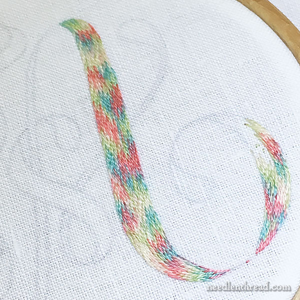
When I showed you this monogram embroidered in long & short stitch using DMC Variations, I was pretty pleased with the outcome. The subtle color changes worked well with the long & short stitch. The resulting monogram was rather pretty – it seemed to gleam a nice pinky gold.
At that time, a few people wrote in to ask what the effect would be, if I used Coloris instead of Variations.
I wrote about Coloris a while ago, explaining what it is and how it is different from Variations.
Well, in the Spirit of Exploration and Adventure, I decided to try it! The color I chose for the experiment was 4501.
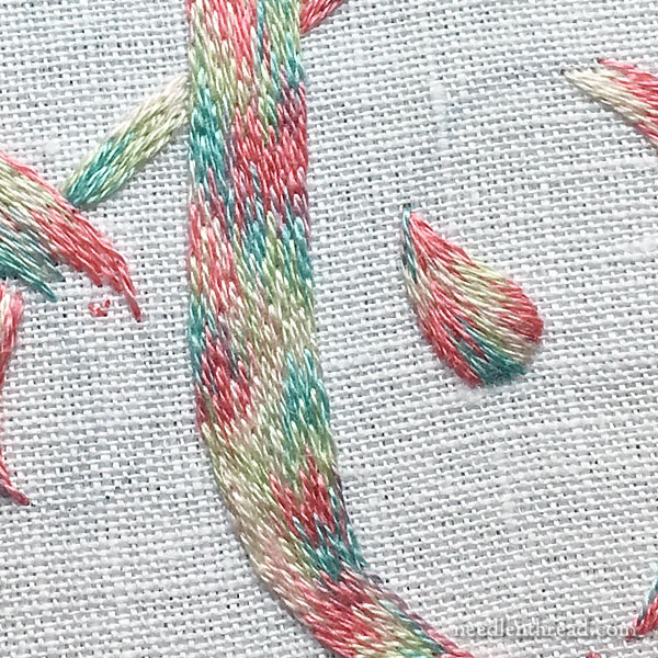
With the more vivid mix of colors and the more frequent color changes in a skein of Coloris, I discovered that I’d have to use a different stitching approach.
Instead of working the long & short stitch in definite rows across the shape and then down from row to row, I decided to work in clusters or clumps of color from side to side.
Otherwise, the effect would have been distinctly stripey, and I think it would have looked even odder than it already does.
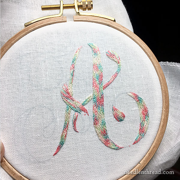
Do you know what comes to mind when I look at this?
I think of a poor little kid who glutted himself on cotton candy and couldn’t hold it down.
Either that, or Vintage Cotton Candy Camouflage.
At this point, I’m not super sweet on the experiment. So far, I don’t like the effect of the Coloris with the long & short stitch. I’m not too keen on this family of colors, anyway, now that I’ve worked with them a bit. They are a bit duller than I’d like – definitely a vintage look to them, which I normally don’t mind, but when combined in the long & short stitch, the colors tend to look dingy.
However, never say die! (Or is that dye? Chortle, chortle!)
I’m going to finish the long & short stitch and embroider a coordinating color just around the outside edge, using a fine stem stitch.
And at that point, I’ll make my final decision to like it or lump it!
If I like it, I think I’ll call it Impressionism instead of Vintage Cotton Candy, in an attempt to feel a bit more sophisticated about it.
What do you think? Does it grab you? Or no? Feel free to add your input in the comments below!
Looking for More Monograms with Stitching Tips?
You can find a whole list of monogram embroidery tips here, with tutorials for different styles of stitched initials.
You’ll find the patterns for these letters and more decorative alphabets in my e-book, Favorite Monograms.
If you’re looking for tutorials for stitching written words and lettering, you might enjoy this series of tutorials on hand embroidered lettering and text.
For adventurous stitchers who like working up fun stitch combinations, Stitch Sampler Alphabet is a thorough instructional guide with over 65 stitch combinations used to create beautiful and fun embroidered letters.
Actually, I really like the way 4501 worked up for you! So much so, I intend to copy it…shamelessly!!
No, not loving it. I’m with you-colors are too dingy. Just loved the look with the Variations that you used before.
I like it actually. To me it looks like someone colored a Bargello pattern with sidewalk chalk and it got rained on a bit. I think the outlining will make the colors a bit brighter. I’m quite surprised that I like it since I’m not usually drawn to pinks or blues. Very interesting experiment!
Now I really think someone has to color a Bargello pattern in sidewalk chalk. It would be AWESOME.
I just enjoy your work and your comments. I really like how you just explore with threads and colors and fabrics. So encouraging.
Mary, When I saw what you had done with the Coloris floss it made me instantly be happy, smile and cheerful (does that make sense?) and made me want to stitch one also. It is so different from what you normally stitch and don’t get me wrong I love ALL your projects but this one really spoke to me. I can’t wait to see the finished project.
I like it a lot! I can’t wait to see the finished product.
I love the colors and I agree the new name of impressionism fits perfectly. I would love to see it outlined in a deep rose.
Hi Mary,
First I want to say, I’m new to your website and your daily email newsletter and I am really enjoying everything! I am a beginner, and I have been learning so much from your information, thank you!
Since I’m a beginner maybe I shouldn’t comment on your Cotton Candy project, but just in my novice opinion, it just doesn’t seem to have the Wow factor, like the other ones I have seen here, I stop and say Wow that is beautiful, I would love to be able to do that! This one I might glance at and move on. The work of course is beautiful, I’m not loving the colors.
It just goes to show, there is a lesson in everything! I am loving everything I’m learning here, and hoping I will be able to stitch something beautiful someday myself!
Sincerely,
Carol
Not keen on pastel camo; it’s not doing justice to your beautiful letter. I keep thinking of flame stitched knits.
I don’t particularly like the color combination. But, maybe it will look better with an outline in a bolder color. I think I like my monograms to either be the color of the ground fabric, or somewhat bold. 😮
You are right Mary, the colors are a bit pastel-y on the white background. I think it could work on a darker background though, but for this, an outline with a slightly darker shade of any of the colors would make it stand out. I am thinking a dark rose or aqua but not yellow!
The variations is definitely much nicer than Coloris. I have been playing with Coloris and have much more difficulty making the color changes work.
Hope you are feeling well. The Nordic Needle had a lovely piece in their newsletter about meeting you.
I wanted to thank you for alerting us to the Crewel Work Co.’s Glasgow bedspread .
The kit just arrived and I am about to start that effort !
Darcy Walker
Yeah, this one really grabs me! I am a sucker for variegated threads. I did a Quaker sampler that was supposed to be in black or dark blue but my eyes got stuck on a thread called”jellybean”. Everyone was watching progress of that sampler which turned out to be gorgeous. I don’t have the sampler anymore nor any pictures but it was one of my better projects.
Shirla, I’m a sucker for variagted thread as well. Even when I was younger (about 50 years ago), I used to hate how the only vaiations you could get was skeins that went from white to dark red, blus, green, whatever, I wanted one with the palest shades, then one for the medium, and then one for the darks. Didn’t realize then that you could do that by careful cutting of the skein! Anyhow I just love all the great color combos that we can work with like you do.
I wasn’t sure about it either, it reminded me of something, but I couldn’t put my finger on it. But you nailed it! It’s totally Cotton Candy Camouflage!
Let’s wait until it is finished to make a decision. I for one find that I like it. Thanks for your experiment.
Going to reserve judgement until we see this version complete, but I find it interesting so far – just very, very different from the Variations monogram. The Coloris doesn’t look dingy to me, but is it possible the cream/yellow of the lightest strands is fighting with the bright white background?
The color interplay almost looks like braided ribbons rather than camouflage to me.
I love ur work, cause it usually jumps out at me and says ” look at me, ain’t I pertty? ” This however doesn’t. It looks to me as if someone was trying to choose a dull nail polish to put on their nails. As people have said to me and my tie-dyed .. “Did Walt Disney throw up on ya?”
Not a big fan of this, but perhaps with the right border, it could make a world of difference.
Good morning Mary
I am with you on this; I will wait until you are finished.
Sharon
Here in the UK we call Cotton Candy “Candy Floss” – which is sort of apt for an embroidered initial. I rather like it, the colours aren’t too brash, the only bit I don’t like is the bit on the left hand side of the horizontal stroke of the A, and the very end of the horizontal bit – it seems to be a bit less checkerboardy (I think that may be a made up word) than the rest, so doesn’t look quite so smooth. But I’d be pretty happy with it if it had been my work!
I love it! It gives me the impression of a fantastical field of flowers.
I’m not much of a cotton candy person. My husband can’t get enough of it. While reading your post I was agreeing with you on the monogram. Then I went back and just looked at the A for awhile. I think it grows on you after a bit. I feel you should put it away for a day and then finish it Mary. I don’t think it will be your best monogram ever…but you have said in the past that you choose the letters you do because of gift giving possibilities. I really think this one has that. And whoever has the name with the A will love this. When and if you finish it, it would look so much better on completion.
Cotton candy camouflage, indeed.
I don’t really like the effect. It reminds me too much of the color “pooling” one gets knitting with a variegated yarn if the color repeats and the length of row are not compatible.
An outline might improve it. In any event, thanks for doing all this work so the rest of us don’t have to.
This does indeed grab me so to speak. I love the color combination(s). Wish I could think of a reason to order this thread but I don’t do monograms and I can’t think off hand what I could use this thread for other than monograms. As always, hope you are hanging in there and doing well.
I really like the way it came out, and I love the colors. I’ll be trying this, but maybe on something other than a monogram as well — such as a small pin cushion (I love making pincushions of all sizes and shapes!)
My mother in law knit a sweater for me in a variegated yarn years ago. Because the color changes were evenly repeated throughout the skein, patterns developed depending on the width of the piece she was working on. A few areas were plaid, but what I remember most was the large Christmas tree shape in the middle of the back (I loved it!) … all unintentional. What I see in your sample are interlocking trapezoidal blocks of color looking a bit like braided shoe laces …or verging on plaid.
The colors are beautiful! I’m wondering if working from several skeins randomly or if fading to almost white between areas before changing hue would give you more of the effect you want. I’m thinking of scattered swirls of color in white frosting.
.
I like the pastel monogram! It reminds me of melon salad. Ooo, better yet, butter mints! Soft and rich.
I think it’s amusing that you mentioned Impressionism. The first thought that popped into my head when I saw the picture was that it reminded me of a Monet painting of flowers! 🙂 I agree with some of the other commenters that the background color may be washing out the thread color. I too wonder what this would look like on a darker background. And I’m eager to see it finished.
I like the idea of cotton candy camo!
Okay, so it is a bit odd. But! It made you create an intricate story involving generations of a family and the 1904 World’s Fair. (By the way, isn’t that the World’s Fair where a president was shot? It happened around that time, anyway… I think… Gotta read Assassination Vacation by Sarah Vowell again. It doesn’t have a damn thing to do with embroidery, but I think you would like it. She literally, as in literally, travels around looking for bits of history related to presidential assassinations. Minus JFK. She genuinely gets excited about plaques. Great book, highly recommended.) Back to my point: your reaction to the coloring was very strong and vivid! Isn’t that art? Isn’t that what good art does? You were creating something kind of amazing without realizing it. That’s, like, what artists do! This isn’t perfectionist crafting, it is textile art. And I’m sticking to that, even though I personally had no reaction to it whatsoever. Except feeling a little sorry for it, as though your little embroidery had feelings. It’s just a little guy entering the big, scary world of the internet and its own mom doesn’t even like it. Poor thing.
Whitney…I was interested in your message to Mary about her creating a story around her recent embroidery project. Your remarks reminded me that one thing we are — not — proud of here in Buffalo, NY is that US President William McKinley was shot during the Pan-American Exposition on Sept 6, 1901. He died about 2 weeks later of…get this…gangrene caused by the bullet wound! Then VP Teddy Roosevelt took the oath of office here in Buffalo. What we locals call “The Wilcox Mansion” … located on Delaware Ave in Buffalo … is the site of Teddy Roosevelt’s inauguration. A number of years ago, the National Park Service took over the Wilcox Mansion and has restored it to the 1901 vintage. When you tour the building, you can see all sorts exhibits about historical “stuff”…but what I enjoy is looking through the restored library, dining room, etc. to find various embroidered items…like linen on tables and the flowers stitched into the backs of chairs…things like that. I am happy that the National Parks makes this available for all of us to tour.
The monogram is really pretty both the stitching and the combinations of colors. I like the piece a lot.
Doesn’t grab me.
Dear Mary
It is different from your usual thread colours, although I will reserve judgement until you have completed the project with the stem stitch outline to say whether I like it or not. I like the technique you used on the L&S stitch using clusters of colours together. As always your stitching is beautiful and I look forward to seeing the completed project. Thanks for sharing with us your views on Coloris thread and the L&S technique you used on this monogram.
Regards Anita Simmance
I think that a monogram looks better in a plain colour as there is enough going on in the shape of the letter without confusing it with many colours. Your assisi monogram worked well with all the colours around the letter but the actual letter left blank.
Well, sometimes you have to see it to really know what’s going to happen with the color. Now if you put a variety of flowers and leaves around it, even if you outline the heck out of it, that letter will just be lost.
Thanks Mary for the interesting visual of the thread look especially the part about the kid lol, but I am with you it is not working for your monogram. The colors just seem off, they are not blending well. That tan takes away from the pink and green, I it is to dispersed into the colors so you are not getting those lovely blocks of color just a muddy mixing of colors
….a little too busy for me with the monogram and so many colours! If it was something larger, it would be lovely.
I love them both but I do like the original one better than the Coloris. But I am looking forward to your outline stitch on the Coloris one. I think that will give it a more modern look. Lets face it Mary, you can do NO wrong!!!!!
Actually Mary, I love this monogram, it is sweet and would look lovely on a baby blanket.
I like your vintage cotton candy Mary. Your embroidery is always lovely.
You know, I think that would look good with a rather antique-gold metallic outline, Mary. And I feel it needs a medium-dark mount around it, petrel blue, antique rose or a duller version of the green-blue in the thread, so that the random colours and the white background have something to set them off.
Sometimes I find that it helps to use a toning plain colour in he needle with very variegated threads – one strand of each – to soften the colours. Alternately, two strands cut from different parts of the thread, so the colour gets well-mixed and heathery. If I’m only using one strand, it needs a lot of planning to get the changes to look right on fillings – outline stitches work better than filling stitches with multi-coloured variegated threads like these. I do love multi-coloured threads, even though I often curse them.
I think i agree with you vis a vis the colors looking a bit muddled…it reminds me of the pooling effect you get when crocheting cotton dishcloths….especially the ones in those colorways that are so ubiquitous, and often named things like Beachy Peachy, or….Cotton Candy. I am not sure what stitch would show this colorway off to it’s best advantage. Maybe if you added a single stand of a solid when filling the needle it would give the overall effect a little more cohesiveness…or maybe something like a pearlescent to give it some real shine?Could i see it in cross stitch on a baby’s knitted top?
Well, there it is, the best i can come up with for those colors…..lol.
You have done both beautifully – it does not translate to dull at all! When you do the fine stitch around the edge it will look fantastic!
Have to admit I’ve never been much of a fan of variegated threads or yarns, but I think clustering the colors works well here — it has a particolor, harlequin feel (especially on the right-hand, on the wider strokes) without being hard diamond shapes.
I like it. I would like to see it done in rows to see the effect..
Does not translate to dull on my screen. With the outline you intend to do it will look fantastic. Have a good day. ttfn
I like it. Looking forward to seeing what it will look like when you add the stem stitch outline.
Maybe not what you’d choose again, but to my eyes – and on my monitor – it’s really rather pretty, and certainly not run of the mill. cb
As always, your work is perfect, Mary; but I don’t like the threads. To me it’s almost a “muddy” look. I did love the previous one you did with DMC Variations. I thoroughly enjoy your blog!!!
Sorry, I don’t think it is that impressive. For some reason it reminds me of my dad’s old knitted ties. I think I would rather see it done in two or maybe three shades of one colour or contrasting colours in the same tone. Either something soft or else very bold.
I like the cotton candy monogram but I agree it’s more impressionistic but I really like the effect and color
Well, it is different. I wouldn’t call it bad. I did like the one done in long and short better. But also the stitching was different, so can you compare apples to oranges? I think both have their merits, finish with the detailing and it will help the overall look. If you didn’t have a comparison you probably would be perfectly ok with it.
I think the upright elements look lovely it seems to be the side to side bits that don’t.
Maybe a solid outline would bring it all together.
Regards
Lesley
The monogram is lovely and you do the long n short stitch so well. I do like the title, Impressionism better than cotton candy. Like ‘the water lilies’.
Chortle! I love your description of this as the effect of overindulgence! It was still fairy floss here in Oz when I was in the appropriate age group many decades ago. Your description of the effect as ‘Impressionist’ is spot-on; I was thinking Pointillist. The colours remind me of a 1940s rayon crepe dress. As for my assessment: it works on the broad upright of the A, but the effect is streaky on the horizontal swash and the very tip of that swash at top right. So the thread works where you are able to cluster the long-and-short stitching, but not in the narrower bits. Not ideal. I’ll be interested to see the effect of outlining, and also your thoughts on where a thread with colour changes like this could be used.
I kind of like it; at least, I like the wider vertical parts of the A, they have a braided look to me. The more horizontal areas are more stripy/clumpy. I wish you could give it that braided look throughout.
I think this one’s a fail Mary. Very distracting. The variations thread came out beautifully.
If you compliment the colors with solid colors I think it will look pretty awesome. Thinking outside the box.
Hi Mary the first thing I thought was it might be better with a line embroidered along the edge, possibly a deeper tone of one of the colours in the thread.
Stick to it, I know you will make it work.
Sandy Southern Highlands NSW Australia
The colors remind me of a Monet painting called Spring 1880, I love it, a flower garden in a monogram! Beautiful and when you outline it I think it will really enhance the beauty of it.
Not my favourite thing either, sorry Mary. I think the best description is yours about the child who over-indulged in fairly floss, lol. That was very well put.
I can’t say I like multi-coloured variegated threads; my preference is for monochromatic threads with shades and tints of one colour. Occasionally I find one with more colours that I like but this one isn’t it. For my money I would frog-stitch it all and start again.
I smiled when I first saw the colors, and I usually don’t like pink or red. I think the final product will depend on whether you choose the pink or the green, and which shade, the light or the dark, that you choose. I don’t really want you to try it four ways, but maybe hold a strand of one shade against the embroidery, look at it for a while, then try another shade.
I love it but then I love fire opals of which this reminds me. I might would like to see a bit of pearly white in it but the colors sparkle without it. I think I must acquire a skein or two of this and see what I can do with it. Phyllis
I’m with you…unfortunately…not a huge fan of the colors and clumpiness. However, you work miracles and it will probably turn out gorgeous, once you add the stem stitch!
I for one love it! I like dull colors and the patches look so cool!
Have you thought about doing the outline in a vibrant color instead of a coordinating color? Maybe a bright teal/blue to draw out the blue in the thread? Might make it look more like the circus than regurgitated cotton candy.
I think it’s beautiful just the way it is, it show cases the colors in the floss better when they are stitched side by side.
The pink and the green look as if they would produce a very neutral grey if you mixed them in paint; perhaps that is why it looks a little dull?
(BTW, love the monogram book – working on my fourth monogram right now)
Mary, I love the colors actually, but I can not say I care for the effect on the monogram. I guess I’m just a more “formal” person. I much prefer the solid color ones you’ve done with little floral touches, etc. I wasn’t too crazy about the yellow and pink one either. So sorry, just me I guess. I love all the others you’ve done. I’m not a monogram type girl, but your ones with the floral touches have made me think about doing one for myself, now that’s saying something about your influence. LOL.
Hope all is going well with you. About time for another update I’m thinking. 😉 We worry about you you know. Still keeping you in my prayers. Hugs from Arkansas.
I think you should use gold metallic thread as the contrast color to give it that pop it needs
I’m so sorry you are not liking this outcome because I LOVE, LOVE, LOVE it! Can’t wait to see the finished product!
When I saw your picture of the mostly-done monogram, I thought “That needs an outline to really finish it” Ha!
Well, I do not like this look (of the thread I mean) as much as the other treatments/threads you have used. But it is fun, and it is different. Thanks for sharing Mary!
I love it and the colors. Will look forward to you finishing it. I suppose what you use for the stem stich will be interesting to see how it sets off the other colors.
Outlining with a solid color will definitely help. I am just not too impressed with variegated floss in general. As things are now, you monogram looks more than a bit “washed out.”
Elaine in New Mexico
I think it looks like cotton candy in the rain! With a solid border it will be quite pretty, although I agree that it doesn’t look like “your” colorway.
Personally I like it. A lot. 🙂 More Superman ice cream than cotton candy though, to me. (one of the off brands that are paler than the ‘good’ brands of ice cream). Looking forward to seeing it finished!
I absolutely love it! Please finish it and show it off.
Hello, I think everyone is going to be pleasantly surprised by the finished article. I lovely stem stitch edge in a deep rose colour will pull it all together. I look forward to seeing the end result. D
I have to say I really like it, the muted tones to me give the vibe of gentler bygone days. I’m impressed with the Coloris floss and have it on my Christmas wish list.
It’s a tricky thread to work with… I just finished a cross stitch piece working with 4501, it’s a bright & lively skein, except for a serious flaw – how some colours blend into others, bright blue into pink, in particular.
So I had to avoid using those few millimeters of dark blue/violet tinge, ..which doesn’t suit the rest of colours and can completely spoil the look… (I think that’s where one should cut the thread when one prepares the strands)
in the end I think it worked out well… I think bright blue from 4501 isn’t present among DMC solids, so it makes it valuable…
But coloris is not to be worked with carelessly…it has to be thought through…
unless one likes motley
Mary is there a way to flip the embroidered in your monograms book, so that they can be ironed on. I found that cool site on Etsy and I’d love to be able to send my favorites in to be made into iron ons. Alas, since it’s a PDF, I can’t make them mirror image.
Any ideas?
Hi, Holly – Have you tried Suplime Stitching’a fine tipped iron-on transfer pens? I find the blue one works great! You just have to turn the paper over, trace the letter, and iron it on.
I don’t have her PDF of designs, but can’t you print out the design and then flip it? Of they have new Sulky 8-1/2-Inch by 11-Inch Printable Sticky Fabri-Solvy Stabilizer, 12-Pack not sure how it works, but I’ve heard good things about it. You can use it to help you transfer your designs when printing them. If I had to hand trace a design to embroider it, I would never get anything done. I got it off of Amazon and plan to use it when life slows down some to start doing some letters.