


Do you ever have problems making good color decisions for your own embroidery projects? I do!
There are ways to help yourself when it comes to choosing colors for embroidery projects – I’ll give you some suggestions on that topic below.
But I thought I’d share with you some monograms I’ve been fiddling with lately. I gave you a sneak peek of one of them in this article about my leafy tree project a few weeks ago.
Since then, I worked up another sample letter in a color scheme that I thought I’d really like. As it turns out, I’m not that keen on it! We’ll chat about why, what I can do to improve it, what my limitations are in these particular circumstances, and what I’m going to do next.
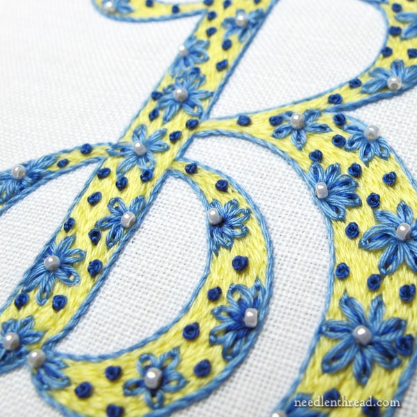
This is the monogram that showed up at the end of my tree article several weeks back. It was really meant to be a quick in-between project, something fun and relaxing that I could pick up for a quick stitching fix, and I really didn’t have deep plans for it. I just wanted to play with some ideas that were floating in my head.
I’m using a hand written calligraphy alphabet that I re-worked to make suitable for filled embroidered letters. The ground fabric is linen (Alba Maxima, which is my favorite for general surface embroidery) with cotton floche for the thread. The letters at this point of play are 3″ high, but I will reduce them in size on the next round of experiments.
I love yellow and blue and white. It’s a favorite color combination. And I think, for this letter, the idea came together pretty well.
But I like other color combinations, too, so while working through the lettering experiments, I thought I’d test some other favorites.
Purple and green? Sure!
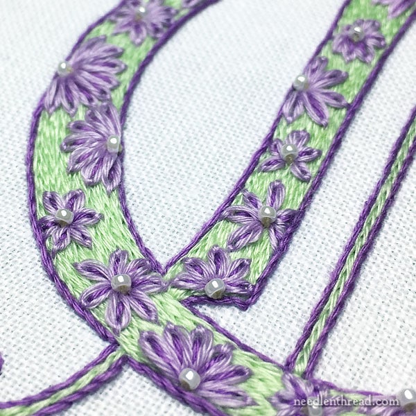
Normally, I’m a huge fan of purple and green – I used it in this embroidered monogram and loved it! And for those who have been hanging around Needle ‘n Thread for a long, long time, you might remember that my original website sported a purple and green color scheme.
So I have nothing against the combination, and in fact, I like it very much.
But… it doesn’t always work.
On the letter above, the green hue is just slightly “not it.” It doesn’t do it for me.
I don’t think the icy green is the best choice with these particular purples.
The value, too, of the lighter purple and the lighter green, while not exactly the same, is a little too similar. The flowers just don’t pop.
The whole piece comes off as somewhat insipid and weak, which isn’t quite the look I’m going for on these letters.
How to Fix It
I think, to bring a little life to the letter, the key is changing the green to a slightly brighter, light grass green.
My limitation is in this case is that floche is not available in the color of green I would like to use. The grassy green it’s available in is too dark. The lighter greens that have a tinge of yellow to them are too olive.
There is the possibility of passing on purple and green, and trying purple and yellow instead. A bright sunny yellow would most likely work, but it’s not quite purple and green then, is it?
So, I can try a different thread, or I can switch color combinations.
I will most likely play with both approaches and let you know what works and what doesn’t and why.
Some Helpful Resources
If you’re looking for some help with color choices, or if you want to learn about color, here are some resources that may come in handy.
Books:
Colour Confident Stitching by Karen Barbé is an excellent book that can help the stitcher make good color choices, while learning about color concepts. I’ve reviewed the book here, if you want to see what it’s all about. The book has usable color schemes in it in abundance. It’s worth having on your bookshelf.
Trish Burr also has written a book called Colour Confidence in Embroidery. While her book touches on color theory, too, it’s a little lighter in that regard, compared to Barbé’s book. It has many good points about choosing colors for embroidery projects. It’s also got quite a few colorful needlepainting projects in it and it features some great color schemes. You can find my review of it here, if you want to read more about it.
Many folks find Joen Wolfrom’s 3-in-1 Color Tool (used more in quilting) helpful for selecting colors that work together. I have one, I’ve used it, and it has helped me select colors in some cases, but mostly, I go by eye. Things seem to get too complicated if I start using tools and over-thinking! But other folks really like having a tool like this one handy.
You can find both of these books and the 3-in-1 Color Tool listed on my Amazon recommendations page, here, if you want to look at what other people are saying about them, too.
Online Articles:
This is a good basic article on understanding color theory. It’s not super in-depth, but it will give you the basics in a way that’s easy to understand.
Lifehacker also offers this decent article on the basics of color theory. They also mention some color apps that perhaps could be helpful.
Most online design articles about color usually focus on digital or print color, but the basic concepts regarding color combinations, choices, hues, values, shades, and so forth are the same, whether you’re using it in print, in online work, or in embroidery.
Chime In!
Any questions, comments, suggestions about color? What do you think of the purple-green combination? What would you change? Any color resources you’ve found helpful that you’d like to share with other stitchers? Feel free to chime in on the conversation below!
Hi, Mary, Yes, the earlier monogram has more ‘pop’ to it. Maybe you are mentally comparing this letter to the other? I know I’m drawn to more intense colors over pastels, but this combination works for me. And there are other people who prefer a subtle approach such as this. So — do you have someone in mind for this piece? What does he/she like? Color — when it works, it works. When it doesn’t match what’s in my head, it bugs me. But it doesn’t stop me from experimenting, and I know it won’t stop you.
Your work is amazing! I wouldn’t change a thing. I really enjoy your newsletters and I’m constantly in awe of your talent. Thank you for sharing.
Well, while the green and purple may not pop in fireworks fashion, I think it has a lovely look to it. Makes me think of softer spring colors, new baby item or (not to be morbid here) calming colors for a sympathy card. I’ll be watching to see what other colors you prefer.
Generally, purple recedes and green advances. What happens if you reverse the colors. That bright green, if changed, would really pop! (But I like the colors as they are!)
I personally like the mint and lavender. It’s delicate, not weak.
To change things up, for a little more contrast, does the floche come in more of a red-based purple instead of a blue-based purple? I think replacing the darker purple with more of a red-violet would give you the pop you’re looking for without having to replace the green.
Or you could keep the purples and go for a brighter, more yellowy new-grass-and-spring-leaves green. Either combination will push you more toward the complimentary color scheme you’re looking for.
Well, your embroidery is always lovely, but I agree that the icy green just doesn’t “click” with those purples. Perhaps it could be saved by adding a third color? I can kind of see a teal-ish color pulling the combination together.
Like this:
https://www.pinterest.com/pin/100205160432292685/
And on that note, whenever I’m designing a paper doll or illustration, I have found it really helpful to go to Pinterest and look up “color palette” or “design seeds,” often prefacing these terms with an idea of the colors I have in mind – for example: “yellow and blue color palette,” or just writing “purple and green,” etc.
But it is true that is isn’t always easy to translate those colors into floss colors when I embroider, because of the limitations of each company; I do so wish DMC cotton floss was available in better shades of blue (I like 995 and 996 but most of the other blues seem too dull, too purple, or too turquoise).
Maybe the Pinterest trick will help you, though?
Yes, I like to browse through color palettes, too! True, they don’t always translate into embroidery threads, but they sure are fun to look at!
Hi Mary,
One of the tools I use to check color values (mostly in painting, but it will work for anything) is a sheet of red cellophane. When it’s laid on top of something, it takes out the color variations and all you see are light and dark values. Very helpful.
I agree, the colors in your “Purple & Green – A Thistly, Leafy, Dotty Monogram” are striking! But the purple and green in the monogram here are very pretty, too – they look baby soft. How will you change it, I wonder… will you take out the light green or stitch over it? Will you put the grass green at the edges of the monogram for a ’rounded’ look, or do you have something else in mind? It will be fun to see!
I just finished making a sewing organizer using vibrant peacock-colored fabric – it took a week of intense sewing to put it together and then I wasn’t totally happy with it, so I took a lot of it apart and spent another three days re-vamping it. Now it functions the way it should and has all my favorite hand sewing tools in it (I couldn’t think of any more tools to add). It’s only 9″ x 3.5″ x 5″ – a great size for toting around.
A couple things I noticed when I looked at the other purple/green: the purple is really purple, not pastel; and the purple has a couple good blocks of color in the flowers, where in this monogram it’s spread out more thinly and evenly.
So I would make the flowers completely in the solid, darker purple, giving it more emphasis; maybe actually change your design a little to spread the flowers farther apart and not so evenly spaced; or switch the pastel color to the inside of the flower petals instead of the outside if you want to keep both.
But that’s me, and no matter what, color is personal. You’ll figure out what you want.
FYI: I’ve recently returned to embroidery after a couple decades off, and I’m amazed at all that has happened. I’ve bought tons of books and spent hours (eek!) on Pinterest but when I’m following a link for something I think will really clarify something for me … I mostly seem to wind up right here. Thanks for what you do. You have a genuine calling.
Love the topic! Starting a new project is always stressful. There are soooo many colors to choose from. Variegated and hombre’ threads get me because I don’t know to go with contrast or what’s just looks pretty together. I also struggle with how many strands of floss to use, and how to use the thin perle cottons. Once I get those issues solved, its clear sailing! Thanks for a great site Mary!
Hi Mary. I wonder if your purple and green letter would look better on black fabric rather than white. That minty/icy green is tough to pair up. Maybe hot pink instead of purple if you love the green?
Blue & Yellow is my all time favorite combination – and daisies are another favorite – I love them in your monogram.
Lavender & green go together also but I agree with you on the shades in your example – at least how it looks on my machine.
I’d love to see some examples with red – fire engine red…..
Mary, I think you’re right, you need a green with a hue similar to the dark purple.
You’re light green and light purple are the same tint, so they play nicely together. You might have tried swapping the white beads for a green bead, if you can’t find the floche you like. Maybe you have a bit of the right colored silk and could just wiggle in a couple of leaves?
Color is one of those things. I call this dilemma the value of values. When you combine 3 or more colors (unless they are analogous), mixing values results in a spotty look that is distracting. If you aren’t sure that your values match, try this: take your threads and lay them on your copy machine or scanner bed, and make a black and white copy. If the copy has similar gray tones for each color, your values will match. You can also do this if your camera or photo program has a way to switch to black and white.
When quilt making, I’ve run into this. (Why doesn’t my cream, burgundy and green work?) Should be elegant…it wasn’t. It was blah. In my case, the values were right, but the proportions were off. The eye loves thirds. I had used each color equally. I went back and added 1/3 more green and 2/3 more cream. (I stuck in sashing).
In my embroidery work, I’ve had some failures. Just recently I’ve picked out an entire thistle. I couldn’t get the shades of blue gray or green gray that I needed. So I’m working Renaissance Dye Works to select a nice triad for this troublesome thistle.
I could not afford a color wheel, visit the paint store, chose TWO each color paint samples cards (50) one set I keep together, second set I play with , mix and match color cards, till I find the shades I need. FREE!!! Remember the code: three (triangle) five (star) and eight (North star). My mom taught my sister and I this code many (74) years ago. Keep them cards and letters a comin, thank ya, pat
Both are lovely. The dark blue French knots add a lot of comtrast to the first picture. If the second picture had intense purple French knots, peraps it would “pop” as well?
For what it’s worth, the best book on color theory I have seen recently is Wanda Kerr’s book on color for rug hookers. (I’m a hooker (!) AND I paint) THE COLOR LAB: COLOR CUES FOR RUG HOOKING She goes beyond the “color wheel,” and usual combinations (complimentary, analgous, etc) and includes value contrasts, tints and shades.
this isn’t about the subject of the article, but I was just noticing how you are continually deepening our needlework education. slowly. surely. painlessly! the concept displayed in this monogram: embroidering OVER an embroidered background. not something seen in the average kit/design over the past 75 years…. you rock, Mary!!
I think these two letters are a great example of how two similar embroidery designs can look so different when you change the colours 🙂 As I said on your tree post, I love the yellow and blue. It is bright and bold, and fun with the polka dots and puts me in mind of a bright, sunny retro kitchen. But I love that mint green and lavender combination too – without the polka dots, it’s more elegant, delicate and more like a well-appointed and calming front parlour or bedroom 🙂
Both letters have a very different energy, but they are both beautiful! Perhaps you might leave this purple and green combination for a while; as you add in more colour variations you might find that it has a place after all. I hope these letters will be a new e-book!
Hi Mary,
I LOVE this new monogram style! I have a strong preference for the blue/yellow one as well, but think the purple/green is nice; reminiscent of lilacs or violets and leaves … so maybe just a tiny tweak to the green and purple so the values provide a bit more contrast? I’d love to make this in an H, using real freshwater pearls, for my friend who is a jewelry designer and owner of a pearl company. Have the pearls, will hope for an H!
I love the purple and green, but since I’m working on a computer screen that isn’t very trustworthy, I can’t judge those finer points.
I actually DO need help with color right now, as I’m about to start working on a project where I want the really bright colors of Indian taste. I have silk fabric in some lovely colors, but I couldn’t get the bright orange I wanted, so I’m feeling a little worried. The embroidery needs to coordinate…
Part of the “problem” with the purple and green combination is that the proportion of purple to green is out of balance. There is more purple and it is the dominant color. There is also an imbalance in that the background is lighter than the flowers. It feels backwards. Think of how many bright flowers you would put on a white blouse. This combination would work better with fewer purple flowers. At least that is what I would say if I used this as a sample I my color class presentations.
Hello Mary,
I like the colors in both letters. I understand your hesitation with the purple and green.
Maybe it looks a bit like Easter colors. But in any case the two look good together.
It’s so much fun to pick colors for a project. Sometimes a go with the author’s choice of colors. But other times I make my personal choices of colors.
So either way we love all your work and look forward to some new projects.
Louise
Mary,
I really like the yellow/blue combination. I think to make it stand out more would be to add a dark blue (the color of the French knots) drop shadow. I’m a retired graphic designer and this process would usually make a word or headline show up better. I’m always amazed at your choice of colors. They are wonderful!!
I like the purple and green but would have chosen a darker purple.
Dear Mary
Trying to add a comment
Your know what? I like the purple and green. But I don’t like those pearly beads. Too grey. Swap them for tiny white French knots and see what happens? Or lighter green ones.
You are too critical of your work
..i love your monograms and the color choices. Not seeing what you are using them on, I would only question, any colors on the item where you are placing the monogram. Love your work and writings.
I agree with Irene. The purple/green looks good as is.
Both these color sets look great to me, and the embroidery is of course exquisite. The blue/yellow looks like Claude Monet’s blue and yellow dining room (not a painting, it’s the actual room, which is sure to be online somewhere), which has more ‘pop’ than your monogram from the addition of yellows toward the gold/orange range. Thanks so much for the links to color theory articles.
II would like monograms using ribbon. florence