


I’m pretty sure I’m not the only one who has ever run into a rather major problem right in the middle of an embroidery project.
This problem is entirely of my own making – it’s one of underestimating (or perhaps of being overly optimistic? I can’t decide!)
In any case, I have a dilemma, and I’m totally open to your suggestions on how to solve it!
A while ago, I shared the beginning of this round goldwork frame that I’m working on right now. I’ll include the links at the end of this article, so you can see the backstory and how the project has developed step-by-step.
But in the meantime, let’s just launch into my little problem…
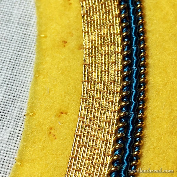
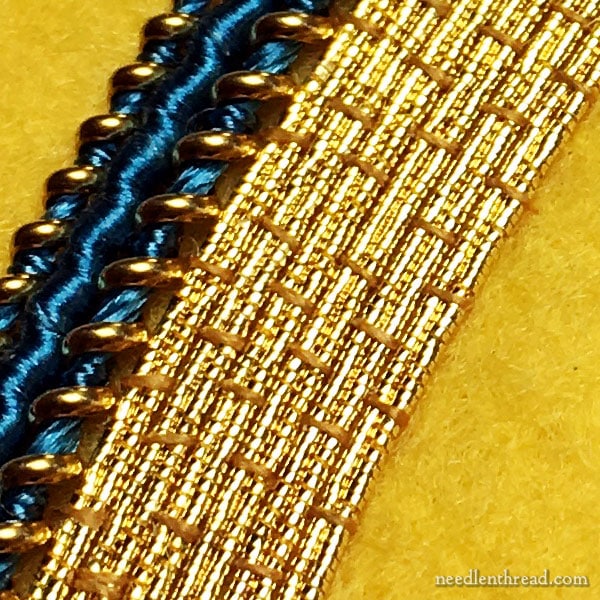
I’ve managed a bit of the filling on the frame, using couched pairs of gold passing thread.
I was going to say, “I’ve managed quite a bit of the filling,” but when you look at the photos, it doesn’t look like much at all.
Believe me, going around and around that area, couching tiny stitches over a pair of relatively tiny thread, it is a lot.
Now, my couching is not perfect, and I know it. But that’s not the dilemma or the mistake I’m talking about.
I would never pick out this kind of work just because I have the occasional not-perfectly-perpendicular couching stitch.
And the spacing with the couching stitches is not perfect, either.
Again…no! I wouldn’t consider that a dilemma. Occasionally, there are spacing discrepancies. When I noticed I had shifted my spacing, I did my best to get on track, but I wouldn’t beat myself up over it.
And there’s no way on this good earth that I’d pick it out!
So, nope. That’s not the problem, either.
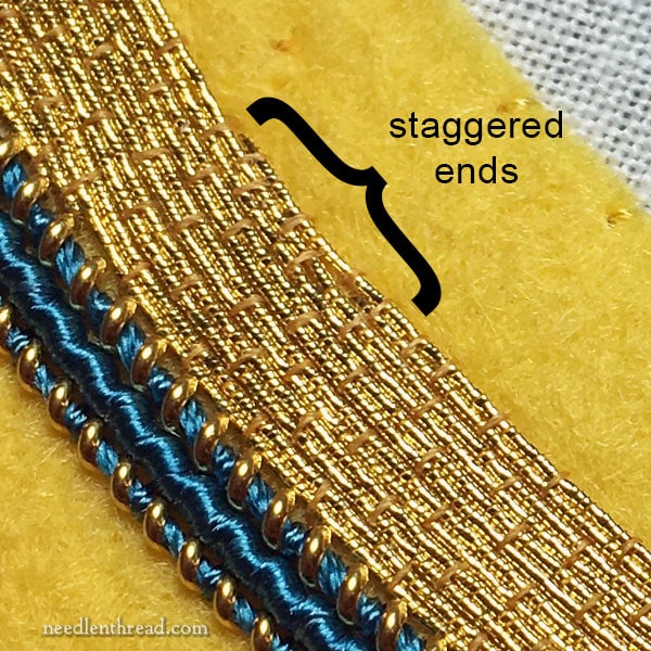
Here, you can see that I’ve ended the passing thread. Now we’re getting to the problem!
To end the passing thread, incidentally, I staggered the two threads, ending the inside one first and taking the outside of the pair a little farther, to create a smoother end and to bring it into alignment with the complete circle.
And, even though it might not look “perfect” up close, once the frame is finished, it won’t draw the eye, which is the point. I’m satisfied with the end – so, in itself, the technique of ending the thread and how well (or not well) it was executed isn’t even the problem!
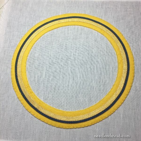
Here’s the whole frame so far.
And while you can’t exactly see the problem within the goldwork already stitched, there is definitely a problem!
And here it is:
I Grossly Underestimated the amount of passing thread I’d need, and I’m all out.
And you might think I could remedy that by getting more, but in fact, I can’t.
And let me tell you why: I used a spool of passing thread that I’ve had (wrapped in acid free tissue in a drawer) for about 6 years.
Purchasing a new spool at this point to continue with the filling will result, without a doubt, in two tones of gold passing thread, because this type of thread changes slightly in color over time.
Now, that’s the problem.
My dilemma is how to remedy the problem!
At this point, do I …
1. Split the frame in thirds, adding a new “break” with a heavier thread (like pearl purl, a twist, or something similar) and then fill the remainder with a different type of thread – say, a check thread or rococo, with a little wiggle in it?
2. Do I start all over again, using something like a gold Japanese thread (I have a huge hank of it) to fill this area in the same manner?
3. Do I start all over again, purchasing an adequate amount of the same type of gold passing thread?
Choice #1 leads me to question whether or not the frame will look pieced and really choppy.
Choice #2 makes me a little wary, because Japanese thread is so shiny, and this frame is being paired up with some antique embroidery that doesn’t have that kind of gleam to it.
Choice #3 … well, first, I’d have to find someone who would supply me with gold passing, uncut, with about twice the amount usually sold on a spool; and I’d have to buy it (my budget’s inordinately stretched at the moment); and I’d have to wait for it.
I’m Leaning Toward…
I’m leaning pretty heavily towards choice #1. But I want to know what you think!
Will the frame look like it’s been broken up in too many sections?
Will it look like I made a mistake and I’m trying to cover it, or will it look intentional as part of the original concept?
What do you think? Feel free to weigh in below – I’m all ears, and I’m eager to have some sound input from our little community!
Previous Articles on the Goldwork Frame
In chronological order, here are the previous articles on this project:
Salvaging Figure Embroidery: Combining Old and New
Slate Frame Adventures: Setting up for Goldwork
Selecting Goldwork & Silk Threads
Linen, Felt Padding, Silk, and Gold
Goldwork Frame: Small Progress
Definitely #1. I think your choice of another band of thread is sure to be handsome.
Hi Mary,
What if you add another inner circle like the dark blue, but in a lighter or complementary shade and continue with pearls. The antique piece you are saving is perfect for a gold & pearl embroidery finish.
Ohhhhh dear. I like the idea of stopping the gold here and continuing with something else (silks and pearls?).
Would you consider silver?
I would take a look at the stained glass windows and other vestments in the church— you might find an answer there.
My thoughts exactly, Janice! Echoing the shade of blue, but lighter, and the same size as the passing thread.
That’s so frustrating! I like your idea #1, if it were me I would just do a new texture for the interior part of the frame. Antique picture frames often have multiple gold moldings and fillets to provide interest. I would stay as close in gold shade to what you have, and I don’t know that you need a heavier division between, unless you need it to tidy up. Good luck, I know it will turn out well, whatever you decide.
I would go for option 1, but instead of making a heavy break with some purl, i would just use a gold thread in the same weight that has a clear difference in color (but still gold). This way you’ll get a beveled effect without adding a stark division. This gives depth to the frame without adding weight. Hope this helps!
I think option #1 is the best. The work you have so far is beautiful, and it would be a shame to take it out and start over, not to mention the additional expense. Adding the shinier Japanes thread doesn’t seem like a good option, and I suspect would be something that would always “bug” you a bit. I am sure you can break the area into thirds and make it look like it was planned that way all along. Just step back, take a breath, and I think you’ll more easily decide what to do. 😉
Hi Mary
The main concern I would have with option 1 would be your current thread ending and how to start your new thread? I would probably draw out a few options and see how they look on paper before starting, but certainly removing all of your existing couching would be a shame if you could avoid that one!
Is it possible to see your frame next to the figure it will be placed around/on? Seeing how they work together might help decide if adding a new color thread will be a big issue or not so big issue.
I think #1 is your best option. Dividing it into thirds adds more dimension and more interest as well as reinspired creative energy.
Starting all over is too painful.
I hate to say this but could you remove back to the first passing round and then alternately introduce the new passing thread with your existing thread to blend it in until older thread runs out?
If you have any of the blue left I would add that in a single row to separate the golds and continue on with something of a different texture on the inside. On the outside I would use the Japanese gold as an accent to frame the duller golds.
I think number 1 is the choice. Think of it as layered matting. Deby
I reviewed the original embroidery piece and note a silver section in her halo. You could mirror that by adding 1 or 2 rows of silver then finishing with another gold section perhaps with a different couching pattern.
I’m sure this has happened to us all! A colonial picture on a small basket did not have sufficient dark blue variegated. Luckily some old Mom stash had the same number. Slightly different dye lot but ok to finish.
Hello Mary. I would go with option 1. I think your concerns about shiny thread clashing with the antique embroidery. Option 3 would be very costly and disheartening after all the work you have completed.
Aside from the reasons for discounting options 2 and 3 listed above, I also think that Option 1 would work because frames are often bevelled (as is matting for framed work). However, I would not make the remaining two “thirds: the same width as the first. I would make each slightly smaller to make the changes look intentional and to fit in with the conventional matting of pictures within frames. I think your eye would look on the finished frame as a layered dimension rather than an error (if that makes sense),
Hope that helps.
I would definitely add a break/separator and then use a different thread. Turn that minus into a plus! I always think some of my best artistic efforts come about in situations where I have to overcome some obstacle or problem. (In playing music, my husband and I have a motto: if you make a mistake, just repeat it, and then it becomes a pattern instead of a mistake. 🙂
I was just last night reading about fixing a sweater that’s Too Short. If you try to pick up stitches to tack on ribbing (or whatever it is), there’ll be a jog. So you add a couple of rows of garter stitch or something and then go back to ribbing and now you have a design element and a longer sweater.
Just as an aside, I think the area of couching you’ve finished *does* look like a lot of mileage covered. I’ve only recently starting doing couching, and I love it! but…covering a lot of territory with it can be daunting, especially if you’re pressed for time. Not that this has happened to me or anything. (*eye roll*)
Firstly, let me say that it is very reassuring to know that someone of your expertise runs into problems. If it was my stitchery and I had put so much work into it I wouldn’t have the heart to unpick it. I would try doing an inner ring to match the dark outer one (is it blue?) either the same shade or one slightly lighter. I think I would then go back to the gold, with some newly purchased thread, and then, hopefully, that would be slightly lighter than your original gold. That way it would look as if you intended the slight changes in hue. It would all depend on whether the changes will look right in the finished article, of course, but you could lay the threads round the existing project and get a feel for it. It will be interesting to see what you decide to do. Best of luck. X
Just a thought…bring the beautiful piece to a professional art framer, someone who works at museum or gallery level. They have a keen eye for placement of objects with aesthetics as guideline. Your art is spectacular.
#1, pull in a color from the original salvaged figure. It will help to marry the two together in a harmony that will look like it was intended from the beginning.
Hi Mary
I’m going out on a limb here. I’ve been following these blogs fairly closely as I have a similar project in the wings snd wanted to see how you went. Early on in the piece you mentioned you wanted to essentially play with visual perspective and create a virtual frame using the blue detail section as the frame ridge from which the gold work fell away from.
In your current situation why not use this illustrative perspective to its full extent? Create another ridge of blue detail on the inner side. Couch the remaining section with darker gold thread. Couch the outer section with something brighter than the central band or use the darker thread again depending on the look you want to achieve. This creates a tonal bevel for the frame. It’s not a mistake it’s an opportunity.
I hope this helps
Kind Regards
Faith
I would go with #1. This just may be an opportunity to make it even more beautiful! Your work is stunning, even magnified…
In looking at the piece you’re framing, the halo seems to have lighter and darker areas in it, as do the bands on her clothing. In one image, it looks almost like a silver band inside the gold halo. I think you could use several different golds to finish the piece and it would seem to echo what’s already on the piece.
Mary – EVERYTHING you do is beautiful!!!! Solution 1 sounds perfect!!!!!
I like option 1 as starting a slightly new color of passing thread next to the old, will draw the eye. I wouldn’t break it into thirds, but rather make the next section narrow, but enough to visually separate it (and the color difference). I like the check or rococo thread idea. Enough variety to distract the eye from what you are trying to distract it from. Embroidery magic trick?
It is looking beautiful! Take heart. These “set-backs” generally tend to improve our work. Brain teasers are good for us.
For what it is worth, I think 2 shades of passing thread would be less noticeable than the other options. You won’t know how much of a difference there might be unless you have the two threads together.
Linda
Could you do a combo of #1 and #3? Buy some additional passing thread. Stitch something else (colored or gold) between the old and new passing thread. This might break up the old and new enough to keep the eye from comparing them.
I would use #1. When establishing the second break perhaps use a darker gold that bridges but with definition to the innermost gold. I would not change the texture of the innermost ring. I think this will give the effect of a sculpted ring of gold.
Stop where you are. Change Colors and stitches for 1 – 2 rounds of a color that will be in the center design. Or, one tiny thin line of the darker color, then your center design or, change to another gold to complete the size needed. Anyway you choose, will we think it was intended.
I enjoy your e-mails and teachings.
Cindy Beach
Hi Mary,
I would ask myself what will I be putting into the frame? If you incorporate a piece with colors that takes your eye away from the frame, then it may not be noticeable at all. When I want to “hide” something, doing it in plain sight works instead of trying to fix the problem. Your eye will not gravitate to one part, looking at it as an all over piece does the work for you.
Choice #1, of course! It won’t be choppy, it will be beautiful. Go for it.
Gosh, what a dilemma! How about blending? Could you simply use similar sized passing thread but in two different shades of gold, or use a one lighter gold and then finish with silver? You may need to undo a little of the current thread to blend it but at least not all of it….. Just an idea I have borrowed from knitting ‘fade’ shawls.
Mary, I think that choice #1 could actually look really great. Your next choice of thread might not even be gold. I’d photo copy the figure that you’re placing inside the frame and put the photo in the middle. Then try different colors next to it. I think that sometimes the solution to “mistakes” makes pieces more interesting than what we initially intended. Lauren
I’d probably just leave it as it is, as it seems big enough to me, but since you want widen the frame size, I would take a look at Mary’s halo. It’s gold, then silver, then (hard for me to see) one row of gold and then black? How would adding some silver look?
Hi Mary–first off, you do BEAUTIFUL work and I love your tutorials. Regarding the frame dilemma, I would lean toward solution #1. The break you use between gold thread (or whatever color you choose to use) does not have to be large or bulky–just another color and a small stitch which would give it exactly what you are needing at this point–a “break.” Good luck and I can’t wait to see how you proceed!
Thanks again for all of the tips!
Susan
Dear Mary
It would seem to me that you have 2 viable options. Try option #1, complete the work with new threads; if you are not satisfied with how it is looking even before it is finished, leave it alone, perhaps put it to one side for maybe another project, which may be better suited to the new threads you have thought to include.
Or, start all over again with sufficient thread to complete the original project as you had envisaged making sure you had enough thread of each type to complete the project. This of course sets you back in time but; I feel you may be better satisfied with the finished project. Each of us has a line we cannot cross. Where is your line? Often times our mistakes turn out to be our biggest triumph, you have to give it a go, but never give up, either start again or complete it using complementary threads. This is an intrinsic part of the project, your investment in it has to be what you believe is best.
If it were me, I would choose option #1, BUT instead of making the divider a different kind of gold, I would make it a very narrow ring of your blue again. Two more different textures/sheens of gold (divider and new thread) could look like you were using up scraps, or tried to match and missed. But toss in a narrow band of just blue, then your new gold, perhaps with a slightly different couching pattern, and it will look like you planned it.
What about getting another spool (or two) of passing thread in an obviously darker or lighter shade and continuing with the established technique. I’m thinking the change will give the appearance of some dimensionality – almost like a molding – while continuing the simplicity and elegance of your frame.
I also would go with #1. My first thought was another row of the dark blue that is before the gold, but anything would work. It will look planned and exquisite like your work always does. Good luck.
Hi Mary, I’d also lean on option #1. If you use pearl purl how about a lighter shade of blue through it to keep the theme going? Or a coloured twist?
I would go with option 1. And maybe break up the different sections of passing thread with a small border of a different colour of thread entirely (like in your piece already…with the dark blue). Looking forward to seeing your next update 🙂
Mary,
I don’t know what thread you are couching down but can you contact someone like Gay Ann Rogers, who may have older gold in her stash? There are several EGA teachers who use gold so they may be able to help you. I know how much work you have put into this so far. I would hate to see you start over. EGA headquarters may give you addresses or email for teachers. Betty Chen Loius and Michele Roberts are two i can think of. Tony Minieri may be able to help.
I have 2 thoughts:
1. Divide the area in half as in choice #1, but then, after the separating row(s), continue using the “new” gold passing thread. It might look quite similar if it wasn’t right up against the original thread. Or it could look like an intentional choice to highlight the halo around the face if it was a tad lighter in value.
2. Put the call out to your needlework tribe for your gold passing thread. There are probably many of us who could have purchased the same thing 6 years ago for an intended project and never used it. You are so generous with your knowledge that it would be lovely to be able to help you out.
I am so in awe of your work! I think option #1 is still your best bet – and if you can insert a narrow ring of a colored thread and then more (different) gold threads in a pattern that is replicated inside, it will be unifying, rather than chopped up!
Kudos to you!
After screaming at myself, lol, I would start over with your Japanese thread or number 1. I’m no pro here.
I say go with #1. To make it look very intentional, you could make another ring in the frame using the same gold coil (sorry, I don’t remember the name of it) that you added the royal blue thread to, but add another color from the original embroidery, like a a lighter blue or a red. Then continue in the passing thread that is a slightly different color. I don’t think it will looked chopped up. And after all, most people won’t know you aren’t following your original plan.
I would go with option 1. It could give the whole frame a bit more visual interest and would look intentional.
Since you seem concerned about it looking choppy, I would think using a newer spool of passing thread would be least choppy even with a slight color change which may actually give the piece more dimension. Perhaps with a single round in between the two areas of passing threads using a thread with different texture bur near in color to delineate that the switch is on purpose. Well, I would try this and see how it looks.
So far I am going with #1 choice. I am liking what Janice and Lisa have to suggest. Lots of choices out there.
Personally, I’d buy some more of the gold passing thread, and just go with it. And if the color is a bit different, so what? Once it’s all done, I don’t think it would draw attention. I’ve run into this before with overdyed threads, and ending up with a noticeably different dye lot when you compare the skein side by side, but stitched into the piece, you don’t notice.
I like your idea for choice # 1 and would definitely go for it. It looks beautiful now, and will so when you completed it!
One possibility: consider using one of the paler blues from the figure to couch next to the current gold couching. I’d use a thinner thread than that of the dark blue of the outer ring, and lay down maybe 2 or 3 lines of it, and then another gold or perhaps even silver as shown on the halo. Or just go from gold to silver as in the halo.
I would think a 2nd round of the blue would be a good choice, just narrow enough to look like a deliberate design feature.
How much thicker did you want the frame to be? I think I would either just stop or add a break with another type of thread and then do more with a new, slightly differently colored thread. I think it is gorgeous.
Well I’ve never done gold work; haven’t even seen the thread except in photos. But it seems to me that if you are considering changing the whole rest of the frame to a different thread, different twist, adding a break etc…. changing it to just a new passing thread might not be that drastic of a change. The beauty of the gold might look just lovely as it approaches the actual motif it is framing! I envision the lusters from less shiney to a bit more brilliant to make that saint look surrounded by heavenly gold.
Alternatively, is it possible someone has “aged” passing thread for sale on ebay or Craig’s list that might be closer to what you began with?
If it were me, I’d continue on with new thread and love the new luster, knowing that it also will age and the entirety of the project will probabaly draw the eye to the beauty of the artistry in the piece. ♥️
No question. Option #1. You’re calling that area a frame. It actually is a picture frame. Now when one frames a picture, one often chooses a molding with various ridges and bumps which create shadows. Personally, I like the added texture that a frame gives, like crown molding frames a room. The bumps and shadows add interest to a room or to a picture. They also affect color and value. Notice the crown molding in a room at the corners. If you sit and stare for a minute or two you will notice that, depending on the light (daylight or lamplight), the colors will actually appear different on each plane. Now, if you think, this variance doesn’t disturb the eye at all. Personally, I think, those differences are what help our depth perception. You know, all those little changes that our brain uses to determine distance, angle, direction of light, etc. They’re interesting! To break up the span of passing with a row of jaceron (pearl purl) would add interest, not distraction, in the manner of wood molding for a picture frame. My personal opinion, but if you’re looking for justification for #1… Just saying…
I agree solution #1 would end up being too fussy. I’m voting for option #3.
I thought of Choice #1 before I even read your 3 options. Perhaps you could put a thinner line of a contrasting or coordinating color between the two gold bands so that it looks deliberate–which it would be!
I vote for number 1 – but something narrow, gold and 1 round, with a different texture. Just enough to make a break from the last section so no issue with new thread, but not enough difference to make it look too choppy.
Agree with you on option #1. You have such good taste that whatever you choose is bound to be lovely! Also, who is to know that how the piece turns out, isn’t the way it was envisioned by you all along? Shake your head. Clear your mind. Thinking outside the box is sure to make a wonderful frame.
I would go with a different texture and stitch, perhaps something with a twisted cord which would alter the look, without it looking like an error. Twisted threads take on a different hue which could help explain the change. Good luck!!
A follow up on my previous post – For the inner circle, what about changing the couching thread from gold to blue. That would resemble or nue’ and would make the color differences between the two golds less noticeable.
No more comments from me – I’m confusing the situation.
Carol
How much more thread do you need? I am not familiar with goldwork thread, but is it possible that someone on this site might have some in their stash that would match?
Hi Mary,
Tough decisions.
I wouldn’t add another heavy division and continue with a new spool of the same type thread. But maybe with a couching thread that’s a shade darker than what you used on the existing. Maybe even changing the couching thread again to wards the center. It could end up giving the optical illusion of a darker bevel or shading.
But as Lisa already said, whatever you’ll end up doing it will turn out well!!
http://www.johnmarshall.to/I-PriceList.htm
Here’s a link to john Marshall. I don’t know if you know of him.
John carries vintage Japanese gold threads. They aren’t on his site but maybe he could match your thread?
Thank you for your generous sharing. I alway enjoy your offering.
Maggie
Can you repeat the blue pattern you did on the outside of the frame? That would add to the coherence so it wouldn’t look bitty. Of course, whatever you do will have to go with whatever is adjacent on the inside circle
I would definitely say option #1. I think incorporating a different type of thread would make it appear that it was part of the original plan much more than trying to ‘match’ your original thread. Can’t wait to see what you choose to do!
What if you did a narrow break, say another blue line, and then finished off with new gold passing? The break would make the change look intentional and the brighter passing would make the darker recede and give dimension?
I have never done this type of work but I think #1 is the only way to go. I think it will look intentional and a way for you to stretch your creativity. As with many of our mistakes, no one would notice them unless we pointed them out. I would go for it and if it turns out looking odd, you still have the other options to fall back on.
I think that your decision to use a different thread is just fine. If you look at the halos on saints figures and such ( I have a Catholic background) many have variations in their Halos. This variation give the halo it’s ethereal glowing effect of being special and out of the ordinary. From my esthetic background I think that it would look very nice to have some variation in the endless rows of couched gold work.
Thank is just my opinion but I understand the dilemma of not enough thread and what to do!
Mary, I vote with you: number 1. However, this choice may have to be repeated, as a total of three breaks and then new gold may look more planned and appealing than just two breaks and two different areas of gold. Just saying. Go easy on yourself. I mean, it WAS 6 years ago, and nobody is a true needlework psychic.
I would go with option #1, too. I think a bolder gold thread would focus the viewer’s eye more on the work; both the content in the centre of the frame (sorry about the spelling, I am English!), and the fabulous goldwork that you are executing. The passing thread rings, though gorgeous, don’t exactly scream ‘look at me!’.
I am a great believer in fortuitous mistakes!
Go for #1! No one would know your decision was to cover a mistake. You have a great eye, so select the ideal next threads to make it seem part of the design plan. I applaud you and appreciate all of your tips.
I agree with the other comments so far. Go with choice #1, you’re so creative I’m sure you can make it work.
Miss Mary,
If there’s something I’ve learned in my embroidery, it’s that other people don’t see my mistakes unless I point them out! And I don’t think people will see this as a mistake either! Your work is so fine, beautiful and exacting that whatever changes there are will probably be unnoticed my the vast majority of people. You are saving a beautiful piece of antique embroidery and my guess is that it will be the focal point not your change in thread. Go with option #1 and let your current work stay. Besides, folks may think you’ve done the change on purpose!
God’s blessings to you, Nila
PS-In the Amish culture, they always make a mistake in their quilts on purpose because only God makes perfection.
I never really understood the issue of intentionally making a mistake. I always have a mistake, and it’s NOT intentional!!
I don’t possess your easy but I would purchase a new colored thread and retrace the final ring then finish in the new color that matches the color design but I’m extreme in problematic amateurism
I like the first option. Added ideas, 1. since the blue is thicker than the gold, continue the size progression in the next inside section. 2. Use a thinner blue as a break and then change the direction of the filler gold check so it is perpendicular to the gold passing. I think that will give you a tiered effect, like they do on framed pictures with multiple mat boards.
Option 1. You can go bold or subtle- two totally different looks!!!
Hi Mary,
I discovered you about 2 months ago and have spent many pleasant hours perusing your posts and tutorials. THANK YOU! I come from an art school background and often find myself designing and re-designing over the course of a project. It can be fun! (Note: my projects are more often dyeing and printing and applique — not embroidery. Embroidery is a recent passion.) I’d be for solution #1. How would it work if, instead of using 1 new thread, you used several — one turn around the circle for each — achieving a color gradation (dark to light or light to dark???) from the existing gold to the final row next to your gold background fabric. Don’t know whether different gold tones would be best or a color. You have to take my suggestion with a grain of salt because I have never done couching so don’t know if this would result in too many breaks between threads. Maybe a different stitch would be more effective.
Best wishes and good luck!
June
Definitely just add a bit of the blue to transition. Either a solid blue like the out border or something combined with the “new” gold you’re adding? No way would I pull out all that work and material.
Keep us updated
Definitely choice number 1, as someone else said pearl would go well with antique embroidery
I was working on a much, much more simpler project just the other day and what a mess I made. My first thought, “What would Mary do?” I have to laugh at myself and just compliment you on your honesty and upfront attitude in letting all of us know that you do make mistakes. Makes me feel so much better and also encourages me to keep reading and taking in everything you are writing about. So, back to your situation: Option #1 would be my choice. I would refer back to the halo and try to find something that would not clash with that, possibly continuing the framing with narrower bands in lighter colors – a graduated change. Good luck Mary. I am sure it will come out just beautiful and I look forward to seeing the next steps.
In my experience (though not very large) as our esteemed embroiderers pass they pass their multitudes of threads on to other embroiderers they know. This often leads to having massive amounts of threads which have no intended project. A call out to those people through your state or national group may surprise you with offers of the threads you need. Good luck with this.
I follow your blog daily and your web training has been a tool I use to help new people re-discover their joy of stitching. Thank you so much for all you do.
1. My question would be are you attempting to duplicate an existing piece or is this your own creation? Some of the most interesting work may have developed from a challenge or two being addressed in a novel manner.
2. Would starting over not cause some damage to the fabric? Not to mention the effort involved in careful unstitching (is that a word?).
3. A limited budget can be frustrating when creativity is in play. Would this option also mean option 2 as well as 3, so #1 seems the best choice., in my very humble opinion.
Could you add one round of blue, then continue with the gold, getting the same type of gold as close in tone as you can? That way if the gold is slightly different, being separated by the extra line of blue will obscure the difference a bit, since they won’t be right next to each other. Or a line of blue could be a break between what you’ve already done and a different tor of good thread too?
I noticed there was a little silver in the halo so if you can get a similar color silver to that perhaps you can fill in the rest with silver.
I have 2 suggestions:
1. Divide the area in half or so and stitch a row or 2 of “break,” then continue in the “new” passing thread. It might look okay with a line or 2 of separation between the areas. It could look more intentional if you used a slightly lighter “new” thread to highlight the face.
2. Put a call out to your vast stitching tribe. I’m sure there are some who may have put away purchased goldwork threads but never used them – like me. You do so much for the stitchers of the world, it would be lovely to be able to return the favor.
If possible, I would be tempted to repeat the dark blue rings – then you could carry on with whatever you feel looks better (jap, twist, check, rococo) without it looking like a mistake.
Definitely Choice #1
I’m uncertain about how much of the halo is intended to be covered (do you plan any of the felt showing?) but I think I would use the same kind of gold thread in the closest color possible, separated by a single row of the darker thread, to separate off what you have already done. This would go to whatever edge you had planned already. I don’t think it would look too choppy (think of the rings of Saturn), and a darker separation would mitigate a color difference. I might fiddle a bit with the width of the separating stripes, but I don’t think I would introduce a totally new texture or color.
It’s going to be beautiful, however you do it!
I would go back to what you did in the beginning. It would bring it together and look like it should border the gold work. But again, only another opinion.
Hi Mary! This issue comes up fairly frequently in needlepoint land. Have you considered putting out the call for another spool or two of the product you are using? Needlepoint ladies regularly search their stashes for orphan & discontinued threads to help a fellow stitcher. I continue to be amazed at the helpful & generous nature of ANG members who seem to find 20yr old threads! Surely one or more of your loyal readers would be willing to sell or donate thread to solve your dilemma if we knew the brand & size details. Just sayin….
Hi Mary!
Hope you’re doing well! I would use another type of thread similar to the first part of this frame, so it doesn’t look like a near miss. It will look like it was done that way on purpose. Your work is so beautiful!
#1 & Check.
I have thread older than 6 years in my hoard. Got a brand and size you could shout out? Maybe one of us has it.
I was surprised recently when someone in the EGA came up with exactly the thread I was missing from a project 25 years old. The project wasn’t mine to begin with, and somehow the rest of the thread of one color had gone missing, or whoever started it had run out. I mentioned it, and lo and behold someone said they thought they had that thread. A few days later, it arrived in the mail; fait accompli.
IF I HAD A QUESTION ON A METALLIC THREAD I WOULD CONTACT ONE OF THE MANUFACTURERS. I KNOW IF YOU CALL DOUG AT KREINIK’S HE MIGHT BE ABLE TO HELP YOU. BUT WITH EXPERIENCE OF BEING AROUND THIS FOR 45 YEARS DYE LOTS MAKE A HUGE DIFFERENCE. I WILL BE WAITING TO FIND OUT HOW YOU SOLVED IT.
Mary, I feel for you, I really do. Here’s what I wouldn’t do – I would definitely not take out all of that work and start again. Ifyour couching is not perfect, it is definitely good enough and nobody is going to get as up close and personal as your camera! And the spacing of the couching stitches? Well, adjustments have to be made when couching round and round!
I think you should go with option #1 but make the break slightly different from the first break, maybe a single line of the dark blue. If the difference between the passing threads is noticable in the beginning, I think they will settle to be closer as time goes by.
What you have done so far is beautiful!
I’m thinking that a few rounds of the last blue wrapped with gold round, then using a pair of gold threads in a similar color and texture to finish off the remainder, might look lovely.
It is no fun to run of either thread or fabric when constructing a project!
Rip it out?!? Aaaaggghhh!! It will be perfectly beautiful with another section added. Please do not break our hearts by starting over. AND wasting the thread you have used. I love following along on your fabulous projects. Thanks for all you do.
Dearest Mary what have you planned for the outer part of your framing? That might help decide what to do complete the inner part of frame.
Usually when you have that gut feeling it is best to go with it.
I trust your judgment as you have a lot of knowledge and experience.
If still undecided try sketching it out on paper to see what you think best. it will give you an idea of what it looks like before you do anything more.
I know it will be stunning when finished.
Definitely option 1. Another dark band followed by possibly a bronze or even silver might do the trick.
Definitely #1. No one will ever know about your “design decision”!
How about do some sections using a passing thread which matches the blue then go back to a gold passing thread which is similar in color to the one you ran out? The blue makes sure they aren’t side by side but is similar enough not to chop up the area.
Or throw some silver in there. I would change colors for a bit rather than thread type.
Hi Mary!
What a frustrating spot to find oneself in! I’d definitely go with #1. No way I’d sacrifice all that beautiful work and gold thread!
I would not do any sort of ‘heavier thread’ division, at least it would not include a colored thread. I’d go with either a different gold thread – either adding a different and more textured look or a darker shade of gold, trying to make the inner edge of the circle recede a bit to look like a beveled edge. OR I’d think about using silks in shades of gold to accomplish that beveled effect – either rows of stem stitch or maybe long and short.
Good luck, can’t wait to see the beautiful solution you end up using.
Most people aren’t that focused on looking for something that could be a ‘mistake’ and then taking it on like a crusade. Those who do that have a personal problem and mustn’t be rewarded. Nothing can ever be ‘perfect’. Every project is a series of problem solving steps. Recognize what seems to be a problem, choose a solution, then continue on. You can’t please everyone.
I would go with #1. Changing threads will add interest and texture to the frame.
If it were me, and it often has been me in this exact situation, I would also go with choice #1. Because no matter what my budget looks like, and it NEVER looks very large at all, it is my time and labor that won’t be compromised, no matter the end results! I could live with it. You need to ask yourself if you could! I know this all sounds dramatic, but in the end, what will you feel? My first thought is to add those beautiful vermicelli stitches you’ve use once before on your silver project. Place it on the inside, over a strip of midnight blue satin to match the thread and save time! As for the outer edge, a strong twisted braid in antique gold? (Question mark indicates I’m not sure but I think it would look balanced. )
Instead of going to a different type of gold thread (and change the texture), why not consider mimicking the halo and using silver passing threads? As the piece aged, the frame will mellow and the differences will minimize as they have on the figure, but changing the type of thread texture will remain forever. Just a thought.
Hi Mary,
I would use an entirely different kind/color of passing thread. It would look intentional as opposed to accidental, which a close color might appear. Different types or colors (maybe a strong color from the picture itself) would bring out the chosen color and be unifying to the overall design. – Judy
#1 —I think it will look planned!!
do a narrow line in blue or a subtle textured line in silver and then do the rest in silver passing thread to match the halo.
A slightly darker gold heavy texture on the very outside will help make it cohesive.
Mary, condolences! That is an awful lot of work. I think I’d go with Option 1, but apply some of the same logic you used in ending your thread. If you went for a light colored break thread, maybe a cream or ivory purl, from a distance it will blend for the eye and avoid the choppiness. Best of luck, no matter what you do!
I agree #1 but I would do a thin line of blue then continue. I have just done the same thing but found some more of the same wool,
I think choice #1. I would add a narrower band of another color from the antique piece and then finish with another gold section. I think it would almost be like an accent inner border like a custom mat in picture framing. What ever you decide to do will be fabulous, because you don’t seem to know how to do anything less than fabulous.
Option #1 without a doubt. You could even do a row of beads/pearls at this point and then change the thread.
What if you make a thin line of the blue and then change the gold. That way the change looks intentional.
Hi Ma’am. If a bit of Gold Shade changes. It will look natural. As it is any GOLD has a tendency to change the shade after certain time.
Thanking You,
Shehnaz Bajaria.
I feel better knowing I’m not the only one temporarily sidelined by an occasional Uff-Da! Of course, the decision is yours, but I have a potential 4th option for you to consider. Looking at the picture, it seems to me the inner area of the frame left unfinished is a suitable size for a mat, as in framing documents, etc. While not routinely used in embroidery, a mat for a frame could be easily suggested by covering the remaining inner padding with silk satin stitches in a color/shade of darker value. The “mat” thus created would be elevated above the salvaged saint but recede behind the now thinner frame. Appropriate choice of color and value for a mat can cause the edge between the mat and the frame to fade and suitably camouflage the thinness of the frame from the average viewer’s vantage point.
Hello Mary.
The exterior of your work is a nice “blue” couched with gold. So couldn’t you do the reverse? Gold couched with the same blue color? Don’t have to be the same blue thread for me, but the same color.
The inside of the frame work will be darker perhaps, so it depends on how you will fill it I expect.
I am sure you will find a wonderful way to continue your work, I will look after the progress with pleasure!
Maureen
Hello Mary
Now I have NEVER done any gold work, so can’t comment on suitability of some of your suggestions. However this is what could be called a ‘solutions opportunity’. So for what it’s worth here goes.
Mary what were you going to do on the outer ring? Could you do similar on the inner part?
Or.. Could you make the ring smaller and cut some of the felt away?
Or..the halo around the figure comprises gold and silver so could you use silver?
Or..if you used new gold passing could you couch it in say the blue?
Or..if the gold passing comes in different colours could you use say 2 lighter shades or 2 darker shades. So the gold passing you have already put in could then be gradually shaded to complete circle.
See told you I didn’t know what I was talking about.
Good luck finding the solution that works
I would opt for #1. Reason being the amount of work already done. Now I have a question: can you add another layer of padding for the “new” thread? Just a little higher. So that the “older” gold would act as a frame for the “new” gold? Just a thought
Do you know the brand and color number for what you are out of so we can all go digging into our stashes to see if we might have what you need? I know I would be very happy to send you something if I had the correct item. I’m sure other folks here would also be happy to help.
You are using just one strand aren’t you so this isn’t a case of add-on a different color to the original one and then eventually drop the original and go along with the new 2 threads? But I guess that only works if you are doing two threads not one.
Based on my own experiences over the years, I would choose your option #1. I have found that I am happiest with a project just doing it over again so I can get it ‘right’. I would always see the mistakes even though someone else might not. It would not be my best work and I would know that, which would lessen my satisfaction with the finished project. I know it takes more time to just do it over, but in the long run I consider the first time to be a dress rehearsal so I can have a better finished item! Best wishes,
Bridgit Moore
Eddy, Texas,USA
I would do one round of the blue (not the three as you have in the first blue circle) to break it up but not too much, then do something different in the rest. DO NOT START AGAIN!!!
Definitely the first option. If you can use the same blue, I would add a narrower band if that color and then move into a different gold thread and texture. I things a thinner blue division would lend itself to an impression of an intentional graduated, step down of color and texture as opposed to a purely striped effect.
#1, without a second guess.
Make the new thread even more different from the thread already used.
Go big or go home.
#1, as long as the contrast is high enough to differentiate from gold. Suggest silver, white, or copper — something of same value to create a subtle band, not a high contrast band, like blue.
2 cents
“If you can’t fix it, feature it.”
I think option #1, is fine. As other commenters have suggested, don’t try to match the gold thread, go away from it with a blue or silver or ???? Then use the new gold threads. It will look like you intended all the color changes to be there.
Mary, solution number one seems to be the way to go. Beautiful work, just beautiful.
I agree Mary that option 1 would be best, were it mine I think I would do another row of silk threaded pearl purl to make a break and then continue with passing thread, albeit a slightly different shade. I thoroughly recommend emailing Neal at Benton and Johnson, UK. If anyone can help you with matching the colour, it would be him. He really is a most helpful man.
What about doing a narrower blue band in the same silk color, and then doing both the inner and outer frames in the same textured gold? That would tie the edges together and look less patchwork.
What if you just stop there? How would your figure fit into the frame at this point? I feel your pain!
I also vote for #1. I think the slight texture of a pearl purl would be lovely.
What about overstretched purl with a core…. like you used initially? Could that be filled with the shinier Japanese??? Use to make the transition to the shinier Japanese?
First of all let me say, I am new to blogs, yours is my first and I enjoy your posts tremendously…
Second, it makes me feel better to know that an expert like yourself runs into the same issues the rest of us do…
Third, I can picture solution #1 the best…I am thinking it might actually add a vintage type flare to the new sections that would soften the transition between the old and new….
Please share with us what you decide, I am sure it will be lovely no matter what…
Sally Walser
I am a risk taker and would try the slightly different gold tone next to what you have already finished. It might bw more interesting than “all the same”.
Dear Ms. Corbet,
My suggestion would be to choose option 1, adding a single row of stretched purl couched with blue silk thread between the two sections of metallic thread. It would echo your previous blue band, and successfully mask any difference in the colors of gold (if you choose to work the rest with a slightly different gold).
No matter what you decide to do, I am certain that it will look stunning. Also, remember that goldwork has a somewhat forgiving nature in that the play of the light on the metal threads distracts the eye from any minor inconsistencies. I have made couched goldwork projects that seem to have glaring errors (even with errors inconsistent across repetitions) and nobody sees the mistakes but me.
Good luck,
C. L. Fingristion
Mary ~ Maybe a silly question, but since I do not do Goldwork, but I do have some goldwork elements. Who is the gold passing thread from? Is it called ‘passing thread’ At one time I was going to learn how to do Goldwork and have some supplies. If you would tell me exactly what I am looking for, I will check what I have.
At least you are getting some great suggestions. It will be interesting to see what you decide. In the mean time, let me know so I can check my stash.
I would go with choice 1, definitely! It won’t look like a mistake at all, I don’t think anyone would even guess that. This looks awesome so far! I love being able to follow along through your newsletter.
Oh goodness, what a horrible dilemma for you Mary! I have another suggestion for you but I’m afraid it’s a painful one.
You could unpick all your beautiful couching of the passing thread. Then put another line of the turquoise in, another row of the pearl purl with the turquoise inside in. And then do the passing thread all over again. It would probably go all the way then because if the ever tightening circles.
I almost feel like the turquoise rings aren’t big/bold enough yet for the frame as a whole so it would balance that too, but that is purely my own opinion which you may not agree with at all.
None of the options are good, although my first eye action was clearly no. 2 because it kept the sizing and everything as you had it, but you don’t want the shininess of the jap thread.
Go with #1 and add the pearls as suggested.
I’ve never done gold work so I can’t really answer, but I do know that you know the answer yourself. Many of your readers would gladly give you the passing thread with no strings attached. Stitchers just seem to be that kind of people. Overall, you need to ask yourself what you will be happy with. If it’s going to give you nightmares for the rest of your life, tear it out and do it over in a way that is pleasing to you. It’s not about pleasing others. It’s about being proud of what you do and being satisfied with it for the rest of your life.
It’s beautiful! I would go with #1. I think,it will add some texture and make it even more interesting!
Mary, is the passing thread from Tanja? If it is then what I have is probably from the same source, RSN &/or Benton&Johnson and I’d be happy to send some to you. Most is probably a similar vintage to the one you are using.
Would any of these passing threads help you out?
Gold #6 Smooth Passing
Gilt #6 Smooth Passing 2 reels + 21 metres
Gilt #4 Smooth Passing
13 Passing
They are on the large 2 3/4” spools.
Hi Mary,
Beautifully done, of course. I love the idea that it does not have to be perfect! I do not think I would use anything wiggly or plaid, etc. That, I think, would distract from the beauty of the framed figure. I think I would use graduating, lighter shades of gold (as gradual as possible) or yellow to yellowish white, to draw the eye inward toward the figure. This may also give it a suggestion of a halo which might be nice. I like the couching you have done on the outer layer but maybe leave it off the inner layers unless you line them up (instead of staggering them) to give a radiating affect. I would definitely NOT rip out what you have already done!
Or……add another much smaller band of blue silk and purchase more of the same or similar gold and repeat!
You did not mention #4…..Does anyone have ???? kind of gold thread?
What did you use. I have an old xmas pattern I was going to do way back and have never done it. I have some I would gladly donate to your project if it matches. You are welcome to it. I can always get some new gold thread.
Let me know.
Marla Hunt
Let us know what size, brand and approximate age of your thread. You may be able to use us as a resource to get more to match.
option #1 is the first to try: I agree with using the halo as your guide. You have the wide gold section – now a silver section – then a different gold? or will the silver be wide enough. End with a round of black? Lay the threads on the fabric to get a clue as to how they will look.
You will make it look beautiful and no one but us two (or so) will ever know!
Definitely #1.
I would do another dark ring, then a section of different color gold. It will still look stunning. Hugs, Mary.
Add a thin line of the blue and then, perhaps, add a different color inside that. I have picture frames with dual color surrounds and they look fine. Or you could duplicate what you have on the outer ring, but with the blue in the middle and a new color on either side. And now that I have read some earlier suggestions, I like pearls too..
Good luck!
Just a thought and maybe not possible or even design worthy. But how about running a single much thinner line of the same blue as the outside frame to provide a definite, looked-like-you-planned-it break in the gold and then continuing with whichever gold thread you thought would work. Would give you the break needed to possibly overcome the change in gold thread.
I like the whole silks and pearls idea. It seems to bring honor to Our Lady in such a distinct way.
I would choose #1, doing it in 3rds…. it will look purposeful and evenly divided. No, no, no on starting again!
Mary,
I suggest you use one round of the blue then finish the inner round with the same gold you are going to use on the outer rounds. I’ d choose a gold that was similar in brightness ( finish ) as the old one.
Why not pick up the silver like it is in the halo without an intervening border and finish it off with the blue and silver.
I would go for option #1 for sure.
I am in the middle of doing a celtic knot with silver rococco in the center. A row of Jap gold #12 British Glossy on either side. Then Jap #12 British Burnished, then one thread of Jap #12 copper. I’m quite happy with the colour change and texture contrasts.
Berlin Embroidery sells Jap thread in 10 yard lengths
Because I am so NOT an expert, it is difficult to make suggestions to a master, but it seems to me that numbers 2 and 3 should really not be in the running…so if you go with #1 you are left with possibilities. Was it your intent to have the gold surround the vintage embroidered piece? Could you add a thinner round of blue and then add a similar gold? That would make it look more planned but perhaps disguise the change in gold tones? Is it possible to make the frame work as a smaller size and add some sort of fine cloth “frame” to the vintage piece?
I admit that I cannot quite imagine what you want/need the finished frame to look like.
Why don’t you go with a band of the blue? It would be wider than the narrower one on the outside edge and would look like a design element. I’m not sure about finding another gold to finish it with. If you want more gold in the frame the last row (or two) could be done in gold. Good luck!
Glad I am not the only one who runs out of thread/fabric for a project.
Judy
So what about repeating the blue section – or a single blue line – to separate the different shades of gold? It’s so beautiful and it may just look like part of the original plan.
I think you do Option 1. However, if you want to keep it from looking choppy, add more rounds in a tone on tone way. Light gold, pearly gold, etc. It will add depth and not break up the light halo you were trying to create toward the center.
You hit the nail on the head choice #1
Option #1 will work fine, honestly! I like the suggestions of another round of blue, then making the inner rings narrower to look like beveling, and using some silver to reflect the halo. Maybe couch a ring or two of another gold with blue instead of gold silk? That might look a little choppy, or it might call up images of opus anglicanum!
Option 1! I looked up historic painted ceiling borders to see if I thought the multi tiered edges looked chopped up or like a beautiful frame. They act as a multicolor and multi pattern frame for the central motif. I think it will be beautiful.
I would go with option one. you can make the dividing round either very bold – to look as though it is definitely part of the design, or more subtle to kind of fade into each other. I don’t know what the end result is supposed to look like, so I can’t tell if it would looked chipped up or not.
Good luck!
I think if you go with Option #1 to fill in where the rest of the yellow wool is it will look balanced, since this new thread/color/level of shine will be both the outside and inside border.
I’d see if anyone offering thread has a match, and use that.
If not, I’d just buy some new gold thread, same type, and continue with it. It won’t “match” now, but will look like a design feature–slightly lighter or darker or yellower or whatever the difference is. Eventually, they will probably age to the same color anyway, maybe in a few decades.
You could change the couching thread too, lighter or darker, which will make the difference a little more pronounced, and thus it’ll look more deliberate.
Because you’re going around in circles, and you already have the blue edge outside it, I think it will just look like a slightly more detailed frame by having a second “shade” in it. (It’s not as if you stitched the left side with one thread and now need a different thread for the right side–which I’m sure would look odd.)
Definitely No 1, no matter how you do it. Don’t undo all that work, life is too short. And best of luck whichever you choose.
I would go for choice #1 but without anything to break up the two types of thread. I feel that if you add another ‘break’ it might look choppy, but if you just switch to a different texture it will create a more subtle dimensional, faceted look.
I would not add another blue ring. I would chose anothe Gold thread and do the outer ring and inner ring in this thread. To me it calls for some king of gold satin stitch or laid Gold work. I rather like the bright yellow.
Hi Mary,
I am sorry to say, but it is heartening to see that more experienced artists have problems like this, and it is such a good opportunity for us all to learn, thank you for bringing it to us.
I would certainly go for option 1. At the point where you are I would put one round of the soie de paris with the pearl purl, the same as the outer round of the blue silks, either in a lighter shade of blue or another colour picked up from the main embroidery that reads as a light shade. Using the gold over it blends it more while the colour gives a slight break. Then continue with another gold that reads lighter (in weight) rather than heavier, perhaps with a slight texture. In my mind the idea of a frame is to lead the eye into what it is framing, something heavier in weight would, I think stop the eye from moving on into the frame.
Unfortunately whatever you do will probably never be entirely pleasing to you as you know it was not what you intended in the first place, but to someone who doesn’t know it will look stunning.
Your work is always striking and I look forward to seeing what you end up doing. Thank you for sharing with us.
Cheers Judy
SE Queensland
Australia
I most definitely vote for the first solution. I don’t think it will look choppy it will look unique and beautiful
#1, absolutely.
I’m not sure what the end look is you’re going for, but if you make rings ‘graduated’ in terms of ‘standing out from the ground fabric’, i don’t think choice #1 would look too bad. Also, that way, the frame would sort of ‘lead’ to the embroidery, with the outermost ring being the most proud of the ground fabric, and the innermost ring the shortest, so to speak.
-Monika in Mobile
If you can stitch it to look as though it is gold over a wooden frame which has been turned on a lathe, it would look as though it was meant to be. I am a stitcher but have never done any gold work, so good luck with your task. Pam
Do #1, don’t tear it out, my aunt used to do that all the time then usually wouldn’t finish the project. The worst part of it was there was nothing wrong with it in the first place, never something anyone would notice or be able to see!!
Definitely option 1 but could you use a different type of gold like the rococco to create the break, i.e. a break in texture but less of a colour change. If you think about antique plaster or wood frames they have several different textures on them all in the same gold. e.g. a bead like line and then a valley and then a ridge.
This could lessen the financial impact and be in keeping with what you are aiming for.
Hope this helps and I look forqard to seeing what you do choose to do.
Hi Mary,
I think I would go with No.1 but think about the silver as a break or for the remainder with only a small edge of gold and then it would tie up with the halo.
Me, I would start over. I do not think I would be happy with a choppy look. If you can live with it, and since budget is an issue I would go with #1.
I would go with option 1. Using complementary threads in even amounts will look more intentional. And who is to say it isn’t? Only you and your readers will know. The people viewing the piece, from far away I might add, will believe this is how it was meant to be. It is your eyes seeing an imperfection, not theirs.
I’d go with Option 3 and try to be patient while you wait, but if you aren’t comfortable or happy with that, then Option 1.
Hi Mary,
I would go with option one.
1. You have already done wonderful work on this.
2. Budget does matter in all decisions.
3. The new bright gold would be too much for the piece of work it is meant for – design always matters.
Design then – I would go with just part of the blue edge pattern. In fact, go with only one row of the wrapped gold. It would not be as ‘heavy’ and let the current band stand out on its own merit, and would still create a barrier between the new and the old gold. Then finished with another single wrapped gold at the inner edge. I do not know what your plans are for the outside rim of the frame. I would still go lighter towards the centre.
I would go with option one, make it unquely yours.
I’d like to poise another option… you could complete a round of Soie Gobelin followed by the Facitte Gimp? This would mirror what you started with [it would look balanced].
Hi Is there any way if you would get the new Gold embroidery thread to make it look faded so it looks older? If you know of a way you could do that, I know you can do that with some yarns and fabrics, maybe with a tea dye or coffee dye. Perhaps you could get a darker gold dye as well and do it.
So exquisite. Add a row of pearl purl with a lighter shade of blue inside and continue with your new couching thread. Do not unpick or start again with that beautiful stitching.
I would print our the photo several times and set to it with your pencil set
A couple of rows of something in a subtle shade or contrasting shade or a shade that picks out something from the picture to be framed. Then on with the new passing thread and perhaps use the blue in the outer ring as the couching thread or a different shade of couching thread to hide the newness of the new passing thread.
Your work is lovely and your blog inspires me you are my go person 🙂
Mary,
You could order more passing thread and store it in acid free tissue for 6 years and see if it matches. Just kidding. I thing your first idea is best and it might turn out prettier with different thread. I would go forward, not back.
Thanks Mary for all you do.
Hi Mary, I would go with option no.1. If you like what you`ve done so far then don`t unpick it that would be a big waste of your time, adjust and move on with your next idea of changing it up. They teach us at the RSN that unless it is a horrible mistake and you can see it and there`s no doubt about it, adjust your idea and keep moving forward. Only unpick unless you have no other alternative.
I would hate to remove what is already done. How many more lines of the gold fill are there to be laid down?
Perhaps you should look at doing a redesign of the remaining space to be filled rather than braking the gold fill with something. I am not a gold worker, so I have little to actually offer as an actual solution, but even if you broke the gold with something & then resumed it would the difference in the shine of the couching stitches still not show up too much? I think it better to do another design for the remaining area that complements what is already done.
Hi Mary….I would go with choice #1
The stitching is beautifully pleasing to the eye
Life is too short to sweat it on something that is so beautiful anyway ( it’s not going to be a tragedy)
It’s just going to be a bit different to how you originally pictured it
Plough on
Happy weekend
Mary, I might be speaking in ignorance here because I haven’t seen your original plan for this frame, so I don’t know “what the frame has to frame” ie. what is going in the middle,but what immediately comes to my mind is:
Leave the frame as it is, why does it need further work? The present proportions look right to me.
Good luck whatever you decide
I would be inclined to stitch a couple of rows of rococo or check and maybe a row of a lighter blue and then continue with the new passing thread to complete the area to be stitched
I guess it would help if we all knew what kind/color of thread you were using and needed. If I had that info, I could look in my stash and see if I have anything you could use. If I do have any, you would be welcome to have it. Please post the info.
#1 sounds the best. Perhaps another pass or two with blue, same or perhaps a touch lighter or darker, and then go with the gold.
I feel that we are our own worst critics, we’re always looking at what we’re working so close. Take a break, step back and admire your work, be proud of your work.
Personally I wouldn’t split the frame in thirds because like you stated it might make it look too choppy. I’m wondering how many rows more of the gold were you planning to make? Can you use other colors like bringing back the blue from the outside making a smaller pattern inside the circle?
What a disappointing conundrum that must be for you. I’ll look forward to seeing what you decide to do. And THANKS SO MUCH for your wonderful website and all of your generously-shared instructions.
I would repeat the blue rounds. But whatever you choose, the end result will be gorgeous!
I agree with Mary. I think I would repeat the blue on the inside
Why not put in one round of the thread that is on the outside that is in blue and gold? Then put in your new gold thread. Otherwise, I would do #1! It is lovely and I would not redo the whole thing!!
Janice in small town Texas
Mary nothing is impossible it is just finding another way to go about it.
Your first thought in No 1. use a Rococo wiggle. Making a total change better than trying to match in this inst. I do like texture.
As it is not the halo, a change in texture would not go astray.
There is silver in the halo that could be used. Even so, given that it is a more historic work, pearls other than beads or crystals could be used in consideration for era.
Ok then, continuing couching an embroidery thread (5 strand) in either a complimentary colour, using the same coloured thread to couch. As you move into the middle the thread that you are counting, decreases.
The outer ring could be the opposite. Graduating from a low number of thread to a larger number and that would frame the woman and the halo without looking like another halo.
What is required is another frame that does not over power the person of interest.
That is a few ideas.
Mary I do think whatever you choose you will get it looking the best that it can be.
Looking forward to updated.
It will all come to pass and peace will reign about us.
Maybe another dividing break however instead of using color, how about another gold with more weight placed in a very narrow band? Maybe a small bead.
Then return to another passing gold of similar weight and reflective qualities but enough color difference to sooth the eye.
I have made similar mistakes and have really had to push myself to find something that suits.
All the best
Susan
I have been following your work for quite awhile and I am positive you can successfully accomplish option 1. You have a great eye and your details always work beautifully together.
Def, #1. `I do not think it will be choppy. Instead, it will offer more variety and texture. I think the amount completed is “flat” enough and due to the width of , it could benefit from more color and textural interest .
If you identify the thread specifically, maybe one of your followers has what you need.
Hi Mary,
Wouldn’t that just rot your socks! I’ve been a victim of underestimating in the past, very frustrating.
I would run with Option #1 and see how you go. If you decide the effect doesn’t please you unpicking it is. But if it looks good you haven’t undone your good work for nothing!
Love your emails, so generous with your tips and knowledge.
Kindest regards,
Heather
I think option one would be fine as long as the separating row is quite narrow and quite contrasting
Love your emails. You’be got me plying my silks again but with added gusto
Many thanks com downunder in oz
So sorry you’re in a pickle, Mary, but I think you’re overly concerned. #1 sounds good to me, and I see you already have a lot of responses with much support for it and many variations on the theme. I have complete faith that whatever you decide to do will be lovely.
Definitely go with your first option. I think that you’re worried about it looking choppy or an obvious cover-up of a mistake because the new design doesn’t fit the image that you’ve had in your head up until now. Create your new design and then give yourself a time to get used to it. I have no doubt that this piece will end up looking exactly the way you want it to.
I was taking an art class many years ago and we were required to write down a quote every class. One quote has stuck with me, while I know it was written by a famous artist, I can remember who wrote it. ” A mistake is just a nudge by your unconscious to do something different.” So take the opportunity to do the choppy and create some new art. Most of the time my solution is better than the original plan.
#1 definitely, just pretend its a design choice rather than a mistake.
Not sure what the best solution is but IF the only problem with the Japanese thread is the shine, you might try dipping the thread in diluted Whink to dull the shine and make it appear antique. Whink has gotten me out of more than a few dilemmas in many different situations, most especially regarding shine. Whink is rust remover and can burn your skin if you don’t wear gloves. I always start out with a weak solution and increase the strength as needed to get the desired effect. Leaving it in longer is sometimes necessary and then rinse in cool water. Good luck!
Number 1 definately. I don’t think dividing the space up will make anyone who doesn’t know the background think that it was not meant to be that way. Looking forward to seeing the finished piece. Take care, Julia. PS I live about 20 minutes away firm the factory that makes some of these threads here in central England.
I’d choose #1. This is just another opportunity to exercise your creativity.
Don’t start over. A break would look very good. You could pick up a color in the antique embroidery and I like the suggestions with pearls.
Yes, yes, definitely #1. You’ve completed the gold part, making very efficient use of your supplies. The gold part of the border will become a stunning accent to the next part of the border, which will contrast.
I can’t tell you how much I look forward to my emails from you. You are my go to for advice and an inspiration to strive for beauty in effort as well as results. Thank you.
Use number 1. Are you perhaps “thinking to hard”? People will not be focusing
/seeing what you are right now with each stitch. When this happens to me, when
I am doing needlepoint, I throw the needlepoint up on my design wall for quilting.
Then I leave it there for a relaxed length of time. The question solves itself. I often
work on another of my many projects (either quilting or needlepoint). I do this with my quilting all the time. When I am working on a design I am never really sure that
I know what will happen during a project. The individual project gets really “bossy”. Listen to it. It’s always right.
The eye will compensate for minor discrepancies I am told.
Could you use some blue silk to divide the newer shiner thread? It would draw the eye into your center motif to have the newer thread closer to the center.
Whatever you decide, surely it will be a beautiful and inspirational work of art!
Mary
Truly a dilemma, I would not start over, your work is gorgeous. I would choose choice #1 adding a different thread would work, even though it was not the original design it could work out to be a better design.
I feel for you. I did this on a Christmas stocking I bought off Ebay so it was older. I didn’t realize when I bought it that it was beaded and had gold thread everywhere. I had never used gold thread so mucked up and then redo it. I got two thirds of the way finished when I ran out of thread. The manufacture was kind enough to send me more but the color didn’t match. I bought every spool of gold thread I could find and nothing matched.
In the end I did take it all out and used gold from a new spool (with several back ups). In this case I like the gold felt. I know that isn’t the look but why not just plain gold silk thread not metallic? May be change direction of the stitching or a pattern fill with the gold you have that is the best match. It would appear as a play of light then.
There are so many elements involved that I don’t think starting over is necessary. You’ll make it look as though that’s what you always planned!
Oh dear. I must admit that it is somewhat comforting to know that even you run into some of the same problems we all do while working a project! That said, I vote for option #1. You have such excellent skills that I am sure that whatever other materials you choose, it will not look choppy, but exquisite!
Number 2 is out – It’s not your vision. In terms of your budget, I guess number three is out, which leaves #1. Honestly? As it is a frame, one would hope that the picture is the focal point. Take your cue from the picture, to make a choice on a thread that would enhance it.
Just my 3 cents.
I agree, choice #1. Pearls would enrich the frame. The halo above her head has a narrow silver band that you could repeat. Or add bands of the blues in her robe would add more color, although I don’t know if you where thinking of color.
If you will make another figure from the original piece you could use colors from the other to bring the two, or more, into a grouping.
Without a doubt, option 1.
Mary, I feel for you! This happens to knitters and seamstresses all the time. I think #1 is the most sensible solution. I don’t have the technical knowledge to suggest more, but I’m positive that if you pray, sleep on it, give it time, the answer will come and look as though you planned it all along. How about laying different types of thread across the frame as well as the work you’re framing? You might be surprised by what tones beautifully. Then order enough of that to finish the work! Explore different colors. It helps to audition something really awful like ochre to make sure what won’t work. Then silvery rose or some glowing taupe might be perfect and you’ll know. In the end, nobody will guess there was a problem.
Oh boy, Mary! I’ve had this problem. It has always comes down to who the finished piece was for, and what the finished product would look like. For instance, when the entire piece was finished, would anyone notice a thing like a different colored thread?
I agree with you — I think option one is the best bet. The only other option I would consider is buying replacement thread and taking my old thread out. Good luck!
I think if you went with a narrow bit of blue it would look planned and very pretty.
Well Mary, I’m not qualified to weigh in on a solution to your dilemma, I sooooo admire your work. Reading this brought the question to mind…..how would one of those embroidering ladies of beautiful historic works hundreds of years ago have dealt with the same or similar problem? I doubt they had the resources to start over and they certainly didn’t have internet shopping. I’m sure they adapted.
Option 1 seems most sensible to me. I’m sure it won’t look like a mistake! I would repeat just one row as is in the outside of the three row blue band then fill with rococo
Mary, how stressful for you! I’m wondering if there is any other area on the embroidery that will be filled in a similar manner. If there is and you could divide that one into sections also it would help it to look more cohesive I think. Even if you cannot match the thread exactly as long as the areas all have a similar feel it could work. Another solution might be to purposely brighten or darken the thread in steps to add depth.
In any case sleep on it and maybe your brain will find a solution while you are dreaming. Good luck!
Change colour and weight of thread and go on!
When it is finished it will not look out of place and each piece is never framed with the pattern beside it.
I look forward to seeing the final piece.
Right now you have the dark rounds with the gold inside it. I would make some cartoons of the options.. adding one or more additional gold and/or dark. Then you’ll have a sense of whether it looks like an intentional change — putting some gold outside the dark.. so the dark looks like a bead. How close to the head &halo did you intend to go?… AND,.. visit a frame shop and have them show you samples of multiple frames.
I am a beginner but I’ll share my initial reaction. It seems option one is the best. Looking at the whole frame, if the inner portion was more subtle/lighter in color it might draw your eye inward toward whatever you are framing and not look choppy
I think option #1 would actually work beautifully. In looking at the frame this far, the sections all look similar, yet different. I think a third section would carry that along in a very complementary fashion without looking the least bit awkward.
This would also save your sanity, eyesight, fingers & budget through not having to redo the entire section in a matching thread!
I think option #1. Since you have an idea of what you want to frame. Maybe add a color that is complimentary to the piece that you are planning to use in this frame.
I vote for #1 🙂
Would repeating the outside blue and gold part of the frame on the inside work?
I think if you repeat the blue band, and end it there, it will look deliberately designed that way. Obviously not what you had originally planned, but it would look like you “meant to do that”, which is what we all hope for our mistakes and other oopsies…
I too would go with choice #1. after all, who’s to say it’s a mistake, it’s just a design choice !
as soon as you said the problem, my thought was “another thin blue ring, then a new thread!”. I think it would work, especially if the blue purl pearl is thinner than the previous ring.
Hi Mary
Not sure if you have solved the problem of your goldwork frame yet, but thought I might leave a comment. I am a member of the Goldwork Guild here in Gloucester, England and do a lot of goldwork projects. I too have had this problem. I solved it by doing a couple of rows in a totally different shade of gold, I used a bronze colour, then continued with my new passing thread and the difference in colour was then hardly noticeable. A good supplier for passing thread here in England is Golden Hinde, they have an on line shop. Hope this helps.
Regards
Sheila
I like option 1. It would look great as a gradient, light->dark or dark->light.
Definitely do not take it all out! Way too much work for that. I like option #1. What if, though, you used just a single round of the plain blue that you used on the outer border and then, use another spool of the slightly different gold that you used when you ran out. The blue might mask the slight change in colour and wouldn’t be so heavy that it looked chunky.
I think I would go for option 1 if it was me
Hello,
I’m not a english speaker sorry for the language.
Why not gold thread couching (similar size) like sunbeam. Perpendicular with the ring. Effect radiation around “orfroid” Virgin Mother. Negative, it’s more more time work.
I would go with choice 1 as well. Depending on the the threads used it will look intentional. As long it does not over power the last of your threads.
This is an interesting project and wait to see the finish which I am sure will be magnificent.
Yes, #1 is the way to go. Purl pearl in a heavier gauge will make a subtle but intentional looking break, especially if followed by another thread that is different from, but complimentary to, the thread already used (used up!).
#1 will be absolutely fine.
Hello Mary, Pray you are ding better today as I read you had surgery over the week end. I know how you feel as I had 5 major cancer surgerys, Along with Gaul bladder surgery, at age 83 years young, juss fine. My prayers are with you, hope to read the emails and great embroidery stories from ya, Pat/Texas
Though a beginner, I’m completely fascinated with your challenge.My choice is option #1 and I’d recommend a darker gold with more texture to balance the blue and draw the eye inward toward the center of the piece.
I’d go with #1. If you use something subtle to make the break, it’ll look intentional and not like a “fix”, while still not looking too busy. That blue is what draws my eye!
I think option #1 to be your best option. I don’t think there any mistakes, just what you do with the “bumps in the road”. I call them “design decisions”.
I’d repeat one line of the outer thread then use a different batch of the thread you ran out of to complete the inner area. If anyone asks about a change in the color I’d say “I wanted a slight change to give it depth and an aged quality.” It’s all in the explanation.
Mary,
I hope you have decided on number 1 as your solution. I don’t think that your changing the color is going to look like a mistake, since you’ve done such a neat job – and the change will add something. I like the idea of making a break with a different texture/color of thread, too
The goldwork frame – definitely option 1. Choose a color to make the gold stand out. It will look intentional, you’ll be fine.
Thank you so much for this web site. I have recently gotten back into embroidery (after a 30 year hiatus) and this site has been invaluable to me.
Why dont you put a blue(as the outside) thread as though the gold work is split in an oute and inner circle.
Consider this…I don’t know how many strands will be affected, but if you stagger the new thread, whatever that might be, then the change in color will look more like a design rather than a mistake.
In other words, finish the piece with the new thread. Measure the area, and over-stitch around the frame in more or less the same area of the new stitching. Not sure if you understand me, if not, (and if you’re interested) you can email me and I’ll send a sketch of what I am talking about!
Hope this helps,
Sandra
Mary,
Regarding the above “dilemma”: I’m new at this, so please forgive me if I sound ignorant or naive. I’m thinking, with all that you are presently enduring (with outstanding Grace, I may add), I think you have every right to add YOUR PERSONAL TOUCH to this design…breaking the “mold”, so to speak. Why not? YOU HAVE GAINED STRENGTH IN YOUR COURAGEOUS TRIAL, why not add a bit of YOU, and new, to the design? Instead of worrying about what to do to blend the color, match it or start from scratch…why not add a Spirited twist to the whole project?…break the mold of “old”. I would so love to see you let loose with some carefree twist not limited to the options you mentioned? Your creative genius must be nudging you to do “new”. I respect you so that I feel you deserve “creative license”.
With respect, and humor….
An admiring fan…. Joan
Imo… A thread change will simply look like a design element, a subtle change in shading. We are all too critical of our own work, but anyone else will see it it as a planned, well executed, color change in your frame design. It will look lovely!
I like choice #1 as well. I see what you’re thinking but di not think the frame will be choppy. Depending on what you end up doing, it may add interest
My father always said if a job is worth doing, it is worth doing well. A friend used to say about a small discrepancy, a blind man would be glad to see it. I say can I live with it. I side with my father and then I can live with it. Pam
I have never done goldwork but I definitely think #1 is the way to go. I agree with Janice Connors about pulling in something with the blue or a similar shade/mix. I think it will look great!! Looking forward to seeing what you come up with.
Hi Mary
What a dilemma. If you have had the problem of not knowing how much thread you would need – no wonder the rest of us don’t have a clue!
I see from your original plans (20th June 2018) that you were intending to use the plain gold passing thread right into the middle, and a bright check on the outside – the other side of the blue colour break. And you were concerned that the gold check might be too bright and sparkly.
Question 1: Could you finish the circle where it is – ie, make it narrower? Maybe add to the outside of the circle? (Don’t like that idea much – too many reasons why it wouldn’t work)
Question 2: How about using a MUCH lighter blue to finish off the inside?
Q 3: Could you get a lighter version of the check? Maybe lighter in colour, too? Could that go on the inside?
I will be really interested in seeing what you do – and whatever it is, I am sure that it will look like it’s deliberate.
Cheers
What were you intending to do on the felt in front of the blue work? Could you mirror it? If not what about a completely different colour such as antique gold but without the wiggle?? Otherwise I think its a case of no. 2!!!!
Sorry to hear about your Mom and I am glad she has a caring daughter to be by her side. I’m sure I am not the only one who has spent time stitching in a hospital chair but the nurses always act like it is a rarity. Some of my favorite projects have been stitched along side of a hospital bed.
I’ll be thinking of your family whenever I pick up my stitching.
If the circle is made up of 3 complementary rings it should look okay.
I hope you’ve gone with option 1, but has there been any progress in the last 6 months? Your ecclesiastical goldwork is what drew me to your blog years ago, and it is still my favorite content. Thanks for teaching me to embroider!
Hi, Joshua – I haven’t gotten back to this piece yet. It’s set up to stitch and covered with a cloth to keep it clean and out of the light, but I just haven’t had a chance to get back to it. I will schedule it into my “rotation” as soon as I meet a few looming deadlines on things. I will definitely be getting back to it!
Hi Mary!
As a Picture Framer and embroiderer I’d suggest taking a look at some framed pieces and observe the proportions framers use on matts – especially the lovely ones that have hand drawn lines and watercolor-wash panels on them. You can also take a look at the proportions on moulding used as frames. There are circular frames out there too.
The ideas behind the Golden Ratio and Rule of Thirds can be applied to the spacing of the “divisions” of your “frame” to get a balanced/appealing/pleasing result.
My initial reaction is to suggest a “fine, dark line” at this point where you have ended the current passing thread. (Possibly matching the dark blue you’ve used already or a shade lighter – maybe just a single round of the stretched purl with the blue silk in it.) Then continue to fill with a different “texture” of gold thread – I’m inclined to suggest a gold passing again, maybe a finer weight and a shade or two darker gold if that’s possible. I think this could add a bit to your idea of a beveled effect with the “inner edge” sloping down to the inside – with the gold a shade darker giving a shadowed appearance. Then I would definitely go with much texture on the outside band of the frame, bright and sparkly to make it look to be the highest part of the frame.
I can’t wait to see your solution to this issue. My bet is that it will look wonderful and nobody would think it wasn’t your original plan! For me, most often the “happy accidents” (bumps in the road!) that come up as I work a design, end up improving the end result over my ‘original plan’.