


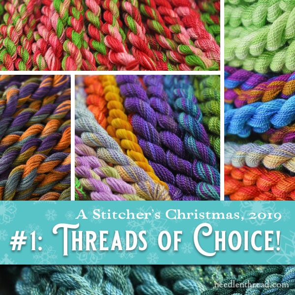
It’s time to kick off this year’s series of A Stitcher’s Christmas, the original needlework Christmas series featuring honest-to-goodness give-aways of needlework treasures with no gimmicks attached!
For those of you who have been around for a while, you know what to expect! For newcomers to Needle ‘n Thread, I’ll explain below how the series works so you can know what to expect.
Today, we’re going to kick off the 2019 series with some luscious embroidery thread, courtesy of Colour Complements – because, after all, who doesn’t love thread?
Each give-away in this year’s A Stitcher’s Christmas features needlework delights from embroidery-related businesses. In each article, I’ll feature the gifts for the give-away and tell you a little about the business. My hope is that you will visit the businesses and put them on your needlework-supply radar. They are excellent small businesses run by real people who bring something unique to the embroidery world. Your support will help keep them around for years to come!
I’ll pose a question for you to answer in the comment section on that article if you want to be part of the drawing. You can enter as many of the give-aways in the series that you wish, but you can only enter each give-away once. The drawings are open to anyone, anywhere. Winners are randomly drawn and announced at the beginning of a later give-away. Most of the give-away prizes will ship directly from the business.
Ready?
Give-Away #1 from Colour Complements
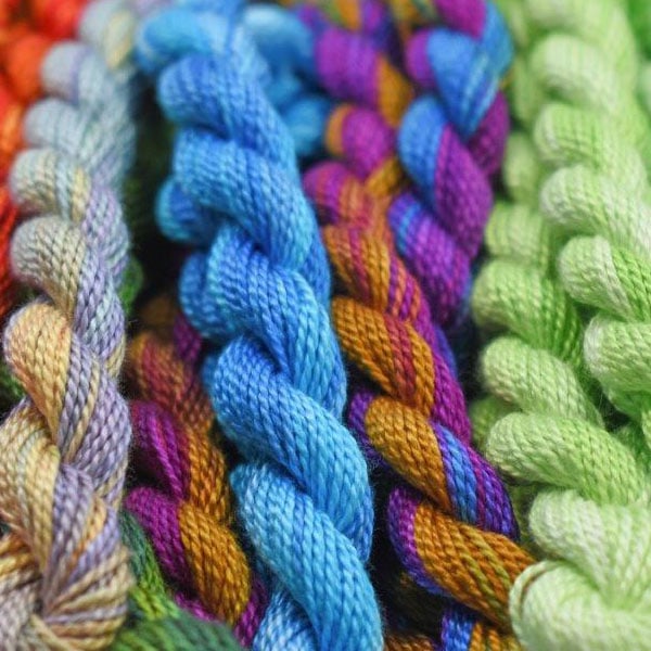
Lorraine at Colour Complements up in Canada hand-dyes a range of embroidery threads and fibers with enticing color schemes. Her threads are lovely to stitch with and beautiful to behold!
If you want to see what can be done with her threads, you should stroll through her blog, where she features the works of folks who design and stitch with her threads. The play of color and texture is fascinating!
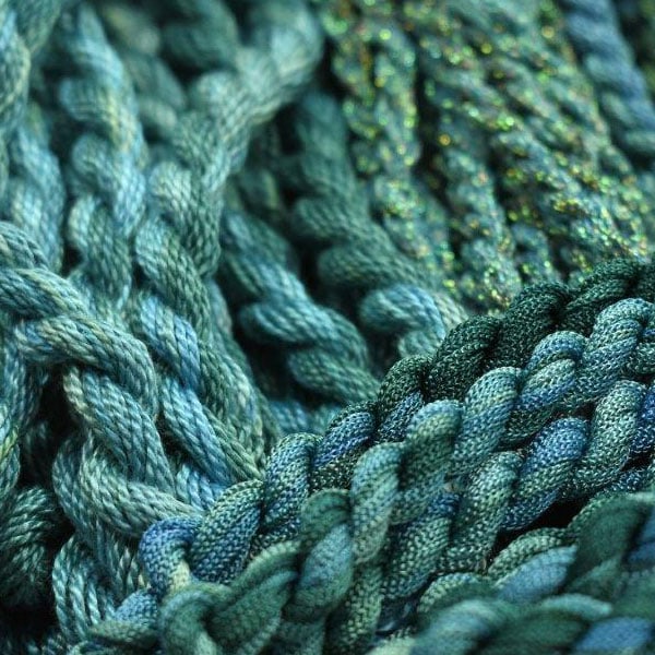
You can view her entire line of hand-dyed perle cottons, floss, and specialty fibers on her website, where you’ll find right now a sale going on as she makes way for new stock. (Need some special threads? Now’s a great time to pick some up!)
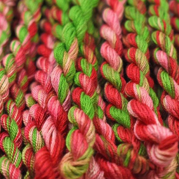
Lorraine’s threads and specialty fibers – such as hand-dyed ric-rac, petite very velvet, and flat ribbon floss – are wonderful for a whole array of needlework techniques. Think: crazy quilting, needlepointing, cross stitching, and surface embroidery.
Today’s give-away features the winner’s choice of five of any skeins offered on the Colour Complements website.
If you win, I’ll send your information on to Lorraine and Lorraine’s information on to you. Then, you’ll drop by her website and pick out what you want! Five of anything! She’ll ship it right to you – and since we’re pretty far out in the series and fairly early in December, you may very well be able to put it your Christmas stocking and surprise yourself on Christmas morning.
Give-Away Guidelines
This give-away has ended. Thanks for participating!
1. Leave a comment on the comment form below. If you’re not sure how to get to the comment form, click on this link – it will take you straight there. Your comment must be left on the website on today’s article, not on any other article. Comments submitted via email are not eligible and I am not able to reply to them due to time constraints. They’ll just be deleted. Please do not comment as a reply to another comment. Replies are not counted and will be deleted.
2. Be sure that your comment has a name on it that is recognizable as yours. For example, Mary is a pretty common name, so if your name is Mary, you might put your last name or your last initial, or maybe your middle name. Or might put a recognizable-to-you nick name. Or you might add a reference to where you live – for example, “Mary in Santa Clause, AZ” or something like that.
The reason I particularly mention this one is that it reduces confusion when the winner is announced. It’s always hard to disappoint people if they mistake the name for their own!
3. Make certain your email address on the comment form is entered correctly, so that I can email you if you win. Leave the “website” line of the comment form empty.
4. In your comment, answer the following question:
Pick two of your favorite colors of Colour Complement threads. Tell us the color numbers and how you imagine using them. If you visit this listing for perle cotton and floss, you can browse through and pick the colors that you find particularly enticing.
5. Leave your comment before 5:00 AM central time (Kansas, USA) Friday, December 6th. The winner will be randomly drawn that morning and will be announced at the beginning of that day’s give-away.
So, go forth and comment, and let’s get this year’s Stitcher’s Christmas series underway!
See you Wednesday, with the next installment!
Oohing and aahing! I am a magnet for fall outdoor colours, so I would stitch something cosy and magic with GREEN #18 and FALL COLORS #48
I really like the Easter Colours (#23) and the Pink Yellow Colours.
I like spring green 184 and purple 183 perle cotton the best. I would use them to stitch a spring garden with irises and crocus – to keep me cheerful through the blast of winter that has arrived here this weekend.
I’m always looking for blues for skies and water. These would be great additions to my stash. #175 and #28.
I would use thread no:187 and 188 to make a Christmas docoration.
I think #57 and #18 would be lovely to use in my favorite Christmas tree pattern from Needle and Thread on a tea towel and given as a hostess gift this Christmas season.
Love using these threads, especially the perle cottons. I used #48 in a recent foray into needlelace for a fall oak leaf and hope to use #3 soon for spring flowers.
They are all so beautiful! I’ve managed to decide on Rainbow Colours #44 and Purple Perle #183. Thanks, Mary!
I do a lot of smocking and would like to try these colors:
Watermelon Perle #31
Pink perle#41
So many wonderful colors! I think I would use #175 for a snowflake with beads and #183 to stitch a one color mandala.
Thank you so much Mary!
I like the perl cotton numbers 23 and 31. I feel like embroidering more spring related projects when it’s cold outside. Thank you for the opportunity to win!
All of these colors are lovely! I would probably choose 47 & 49 though. I am planning a pair of suspenders, and I think they would go beautifully in a long geometric pattern.
Hi Mary and Lorraine, I love # 18 and #45 in cotton floss. I would use them to substitute in a crosstitch project. I love the colour depth of both. I receive both of your blogs. Thanks
What luscious colors! I’d probably pick the #14 blue green & #28 blues. I love the blues! I make small angel ornaments out of over-dyed threads, and these would be perfect! It would also motivate me to find other patterns that use these threads. Fun, fun!
I want to stitch a beautiful mermaid design as a gift for my niece. I love the bold and vibrant colors of the blue green pearls cotton #14 and the green pearl cotton #18.
I love the colours #5 tan green aqua and #47 olive green blue.
When I went looking, I was looking for colours to represent waves, which is a project I want to start. These colours remind me of the coast.
After an embarrassingly long time, I’ve decided my favourite is the Green Perle Cotton #18.
I live right on the coast here in Australia and Colour 32 is so evocative of the landscape.. sea, sky and sand, just beautifully blended. And my second choice is Colour 44, just because I love colour, and this packs a wonderful punch. I’ve ‘dipped into’ Lorraine’s site before and have made some very gorgeous selections, and so would welcome the chance to win. Cheers, and happy Christmas, Jane
I love the green #18 and rainbow#44!
Tropical and Peacock are my two favorite colors: Peacock is rich and vibrant and Tropical is soothing and relaxing. I will say any stitcher would be lucky to have any of the beautiful colors to stitch with, TerriG, Charleston
Such pretty colors!
Blue green #14 and green #18. I would use these in a counted canvas needlepoint piece. Green and teal (blue green) are my favorite colors, and I enjoy the counted needlepoint in abstract geometrics, where you can change the colors to all your favorites!
I LOVE Pink Yellow Perle Cotton, Colour Complements Colour #30, which looks amazing to stitch flowers, and Spring Green Perle Cotton, Colour #184 which looks like a great option to stitch leaves and stems.
I tried Colour Complements threads and they are amazing to stitch with. Thank you!
I have purchased threads from Colour Complements and have yet to be disappointed with the selection. I have fallen in love with the Christmas Sampler and looking for a pattern to be able to use it. I also like that it’s a Canadian store. The colors are magnificent.
I like color 37 and I envisioned using it to crazy quilt on a more traditional type crazy quilt size 8 Pearl. Also color
14 size 8 and 12 I would like to use for a hardanger piece.
My favorite colors are 186 and 45. They would be beautiful used in an alphabet sampler!
#44 and #137
I needlepoint many Fiesta and Mexican themed needlepoint canvases. These colors would be great.
Ohhh, those colors are just beautiful! My favorites are #53 Teal & Lime Green, and #189 Halloween.
I would use either one on one of your gorgeous kaleidoscopes.
Thank you for all you do! It is truly appreciated!
Becky Wethington, Crestwood KY
#44 and #137
I needlepoint many Fiesta and Mexican themed needlepoint canvases. These colors would be great.
The fall colours and the peacock feathers skeins caught my eye. Gorgeous! The peacock feathers I would use to stitch…peacock feathers on a tunic my friend has for Renaissance Fairs. The fall colors one…maybe some garden scenes on hand towels I’ve been meaning to finish for a while.
The colours are so beautiful, want them all.
Those greeny-tealy threads look delicious!
I live colors 187 red and 188 autumn colors. I would use the red for a red Christmas sampler and the autumn for a fall tree.
Merry Christmas Mary:
I love all the colors, but especially the #44 Rainbow Colors and #188 Autumn Colors. I am currently working on a tinted embroidery project and the Rainbow Colors would definitely compliment my drawings. The #188 would go perfectly with the leaves pattern I am sketching out. Both are on my Birthday Wish list which I have already sent to my daughter. She is great at seeking out items I would especially be keen on having in my possession. Thanks for a great start to December.
i adore Rainbow #44 – and i would love to do a blackwork piece with this colour!
i love halloween #189 and imagine doing a Jeanette Douglas design with bugs in it with this colour!
I selected two shades of perle cotton: #31 Watermelon because those colors are featured in my bedroom, and #134 Cherry Red just because it’s pretty! I have no concrete what-to-make plans for either color – I’ll just let them tell me what to do with them!
43 and 26 are 2 of my favorites! Hard to limit myself to .
What lovely colors! I am inspired by the Cherry Red #134 and Peacock Feathers #45. I see them in a Hungarian style floral embroidery. I love the deep rich tone of these threads.
I would choose color numbers 57, browns, 133 and 183, autumn leaf colors to create a setting of trees in the woods in the fall as the leaves turn colors. That burst of color so beautiful as the weather changes.
My favorite Colour Complements perle cottons were all of them! But since I have to pick, I would say the Green #55 and Blue #175 because I am designing a piece that uses those colors to represent sea grasses and the blues of water and sky.
Happy December! I am having a difficult time just choosing two! My numbers are 18 and 51. A good start to a new stash of threads. Thank you for generosity
I would use 35 and 43… although it’s hard to choose, to start a wildlife inspired sampler
What a gorgeous array of colours, so hard to choose. I took inspiration from the “hospice heart”. My aunt and sister in law recently died in a hospice in the UK. They use the sunflower as their “logo” and I thought a sunflower design in the yellows – #191 and #37. I’m sure I can find brown in my stash for the centre.
Penny B from Delta BC
I would pick colors 47 & 187 for two crazy quilting projects I’m presently working on in perle 12. I love working with Colour Compliments.
I’d use Colour Compliments #3 & #35 to do some of the christmas tree designs of yours Mary.
I would choose the turquoise blue #33 and the soft blue #162. And I would add blue green perle #14! Blue soothes me and I envision a white Christmas tree decorated with blue snowflakes using your patterns, Mary!
Turquoise blues #33 and Teal purple #186. — 33 says water to me. A beach scene would be perfect. 186 is calling to be Northern Lights!
Oooh, so many beautiful colors! My favorite color is blue, so I would probably choose the Turquoise Blue (#33) and the Blue (#28) to make some snowflake Christmas ornaments from your e-book!
I like #44 for a crazy quilt and #164 for a Hardanger ornament.
What beautiful threads!!
Just wandering the list to pick my favorite colors whether or not they’d really work for the projects I currently have in mind. I really like #188 Autumn Colors, # 48 Fall Colors and #45 Peacock. I only cross stitch, and am definitely a newbie, but one can dream, right?
Not sure what, exactly to do with them beyond using them in a project that would work well with a variegated thread.
Death by Cross Stitch (Long Dog Samplers) maybe? Not sure I’m brave enough to tackle that huge thing, or even how much floss would be necessary. For that sort of thing, I think the vividness of Autumn Colors #48 would be really interesting.
Peacock #45?
I’m planning a sampler of the 23 Psalm, sort of in my father’s memory and can’t help thinking those vivid colors would be nice. Not sure how to cross stitch with Perle Cotton, or even if that’s something people do, but the color certainly is pretty.
Fall Colors? Something whimsical, like Dog’s Declaration (Long Dog Sampler), which reads “Life, liberty and the pursuit of squirrels.” Not sure it’s designed as a mono-color pattern, but I’d bet I could do something interesting with those tones.
I love your website! I would like floss please!
Lately I have been imaging a series of beach scenes, with lots of texture, so I would like to use #14 blue greens for blending in the water, and #47 olive green blue for the work in the intertidal zone. I love this line of threads!!!
Right now I want to just sit and pet the colors and thread!!
I thought going in that I would want the colors for doing snow flakes and then I saw the rich browns and was building trees in my mind and then…… I saw the red!!! yep that is the way to go with hand stitching on a hand dyed fabric quilt of sunset and sunrise colors. Red Perle Cotton, Colour Complements Colour #187
Whopps posted on yesterdays post…lol got it right now.
These threads are so beautiful. Thanks for the giveaway. I think spring greens #184 would make beautiful leaves, trees and bushes. And color autumn colors #188 are to die for. I can picture beautiful fall leaves or a mass of trees with leaves in this floss. I need one of everything in my stash!
Thanks for the opportunity.. I’ve ordered a lot of thread from her and love, love , love the colors and quality. Great customer service too!
These threads are gorgeous! I would love to use the blues in #14 for an underwater piece, and the vibrant colours in $58 to fill in large chunky letters or geometric shapes.
#137 & 183, just want to play with them, possibly small Christmas ornaments
Blue #28 and #175 — they look like they would make some pretty butterfly wings or maybe Autumn #188
The perle cottons are fabulous! The colours that speak to me the loudest are the fall tones, specifically fall colors #48 and autumn colors #188. I have a scissor fob pattern all lined up done in various canvaswork stitches which would really look great in either of these threads!
While I love all of Colour Complements’ shades I would like to stitch with Colour 44 Rainbow to make sunrises/sunsets, and Colour 45 Peacock to stitch feathers! Who knew!
I like #28 blue because wedgewood blues are just my favorite and #32 blue, orange, green because it makes me think of Fall.
These colors are so beautiful. As soon as I saw #23 (Easter) and #44 (Rainbow) I envisioned a design of unicorns for my age 7 granddaughter!
I love the colors of peacocks right now so I would chose Halloween colors or autumn colors. Trudy Garza
Blue 14 and 18 both by color will make great scarf
Thanks
Denise
Hooray! Mary’s doing giveaways again. What a sweetie! Who doesn’t love pretty thread? My two favorite colors on the website are #45, Peacock Feathers, and #133, Red-Green-Burgundy.
Hope your Advent is off to a great start.
I have always been drawn to pinks and greens. I love the Watermelon #31, and the Pink, green, and orange #3. My first appliqué quilt, which has over 800 individually appliquéd pieces on 9 different sized blocks (a Pearl Pereira, P3 pattern) began in primary colors, but that first block was set aside until I found all the pinks, peachy pinks and greens I wanted. It’s not quite finished being quilted, but it’s beautiful. I can see embroidering floral blocks in the Watermelon and Pink, Green, and Orange to go with my gorgeous quilt. Lovely complementary color collections.
I would use 188 and 18 to make fall leaves with green leaves that haven’t changed looking forward to the next cold night when they too will be arrayed in bright splendor. #33 would be great for snow flakes. thank you
Those threads look great!
Lynda ( SALISBURY, UK )
I have used a few of the Colour Complements Stranded Cotton threads and one Kreinik #8 metallic braid in my projects. I really like the fact that the skeins are uncut, especially the metallic braid. The colour runs are fun to play with and I am hoping that she creates more of the metallic braids – my personal favorite!
I jusr love colors 183 and 188. They will be perfect for a new project that I will be starting after the holidays.
I am working on an idea to use Anni Alber ‘s weaving as design inspiration for embroidery. The colors I chose are #133 and 44.
Her thread colors are gorgeous.
I am currently working on wool appliqué and embellishing with various threads and stitches. I am using all brown tones and love the variegated colors especially golden brown #29 and brown #57. Her threads are beautiful and enjoyed working with them in the past!
Thanks, Mary for doing this. It is such fun .
I love the greens #18 and #49 for grasses and leaves. But the blues found in #162 & #175 provide me a picture of ocean waters. Next to my sewing room, my most favorite place to be.
This is Deb Turl from Phoenix, AZ. I think embroidery sampler #3 would be a great addition to my new project — eye glass case. Thanks!
I love Lorraine’s threads and use them in my crazy quilting. I love her silk perle in color 10 a lime green and blue mix and color #4 Sky Blue, because blue is my favorite color.
I loved the Watermelon, and the Purple!
#30 and #100 such gorgeous colours, possibly I would stitch a garden scene.
Love that you are doing this again! I’m in the planning stages for a wool embroidery wall hanging of 15 different owls (Sue Spargo-like) so would love to use the Fall Colours perle (#48) and Golden Brown, Purple, Grey perle (#58) to accent my owls. They should compliment the felted wool pieces Santa will be bringing.
# 29 and 30
I would do a pretty party dress for a little princess # 29 with golden hair30
Have a few butterflies flying around her head and a handful of daises
Colour No 56 – I absolutely adore browns and blues and this combination of tones is absolutely beautiful. I would like to embroider a small clutch bag with an all-over design. Then colour no 31, those lovely pinks and greens, how pretty would they be in a design around the neckline of a black dress?
I recently bought a Finger Step Design by Susan Jones called Running in Line. It is sampler of “nearly 200 stitch patterns using only the running stitch”. However I don’t care for the color palette used in the model. I think that using Green #18 and Green Brown #35 would be a great jumping off place as I change the colors to a fall color palette.
I particularly like color 186. I’ve already used it to do a blackwork pillow top and it works up beautifully. Another pillow would be great
It helps if I read everything.
#58 I would use for a Halloween project.
#28 I would use for snowflakes.
I’ve been buying a Lorraine threads for a few years. They’re so beautiful! I choose colors 182 and 138, because I’m doing a color study of a painting by Charles Burchfield.
Carol D in Laconia, NH
I do all sorts of needlework, from goldwork to wool applique and art quilting. I have used a number of threads from Color Complements, but I especially use the perles and the floss on my wool and collages. In the cotton size 12 perles, I really like No. 183 and No. 175. Those easy gradations from lighter to darker look wonderful embellishing almost anything inspired by nature. My favorite motifs are flowers and animals: between sky, ground, and the focus piece, these colors just fit right in.
I just started a new cq series of Art Deco vintage coffee poster ads so colours 35 and 191 would be perfect
I love the colors of the pink yellow perle and it would look great in something fun and summery, pink lemonade themed perhaps. Satsuma Street has a summer pattern called Verano that would be perfect actually.
And the peacock feathers would be lovely in another Satsuma street pattern I have that will go on the back of my denim jacket.
I love Lorraine’s #56 Perle Cotton Golden Brown, Yellow, and Teal Colour Complements Colour. It has beautiful shading as one would see in a late autumn landscape of trees. I also love her #14 Blue Green Perle Cotton Complements Colour. I see this being used in a seascape. Thanks!
Numbers 28 and 52 would be absolutely wonderful to work with in big stitch on a queen-sized quilt with flowing landscape-type piecing. The threads would work for sky and water, or even as random accent colors.
My favorites (they are all beautiful!) are 45 and 47 and would each look beautiful in pieces done for my room and the guest room (the skeins are just beautiful to have in my stitching area!
What a lovely idea! I like the cherry #134 and the green #55 and can imagine using them with in a quilt for which I am collecting beautiful cloth. The theme is sort of fairy tale, including unicorns and children, and has a lot of the cherry and green colors. I want to do some hand stitching on it, so this would be perfect. Thanks so much for the chance!
All the colors are fantastic.
My favorites are Color 3 and color 18.
I imagine stitching a beautiful flower garden with these lovely threads!
One of the projects I’m planning for 2020 is an embroidery of Starry Night by Vincent Van Gogh. The Blue Green #14 would be beautiful for the sky and the Golden Yellow Orange perfect for the moon and stars.
I like colors 18 green and 28 blue. I can imagine using them to stitch a garden scene on this snowy snow day!
Oh my! So pretty and too many wonderful colours to choose from. If I had to choose just two, they would be …
Peacock feathers pc #45 and Teal purple pc #186.
This would make a wonderful mandala with beads and metallics. Gives me goosebumps just thinking about it!
Fingers crossed
One of the projects I’m planning for 2020 is an embroidery of Starry Night by Vincent Van Gogh. The Blue Green #14 would be beautiful for the sky and the Golden Yellow Orange #37 perfect for the moon and stars.
The two colors that grabbed me this morning are Peacock Feathers #45 which I see as delphiniums in French knots and Olive Green Blue #45 which I see as a sky on a stormy day, not quite sure how I would achieve this, chain stitch or couching in swirls?
I make hand sewn dolls and animals and use embroidery thread for detail work. My colors I like are #188 and #34
Lovely prize. I’d love to win it. Just finished stitching your Twelve Trees for Christmas. Looking forward to stitching the snowflakes.
Mary, this is such a wonderful way to discover new embroidery supplies, thanks so much! I like color numbers 18 (various greens) and 188 (autumn blend). The green I would want in regular floss to use in my ongoing kitchen towels around the year project for anything with leaves. The autumn blend I would want in Perle Cotton to add to a project on canvas. The original pattern is called “Needle Delights-Graphite” but I switched out the colors for an autumn palette of gold, red and green and I think that thread might coordinate with the colors I chose.
I had trouble accessing the Colour Compements website but was able to look at the threads on Etsy.
Kelly Ann D. in Modesto
The Colour Commets colors I choose are:
Pink, green, orange perle cotton #3. I am working on an EGA project & I think this color will make a wonderful background using a bargello stitch.
My second choice is rainbow colours Colour Comments # 44. This combination makes me happy to look at it – I can see it in tin toppers, ornaments- any number of aplications.
Green #18 for leaves and stems and Golden Yellow Orange #37 for gorgeous Autumn leaves
I love variegated green for all types of leaves in my projects and love the greens in Green Perle 18. Watermelon 31 just makes me happy. I’m using these in a spring garden project I am planning. They are just the most beautiful colors.
I love the Cherry Red and Green which I would love to make some canvas work and Hardanger Christmas ornaments; the Teal Purple Autumn colors and Blue Green will be wonderful to use in some Swedish weaving towels and placemats to use as gifts for some friends.
I really like the Watermelon colour #31. I could see a neat Spring/Summer project completed with this colour scheme
My second choice would be Turquiose Blue #33. This is my favourite colour range and complete many projects with this. I could see a doily being made of this scheme
Thanks so much
My two favorite colors are #56 and #18… as they remind me of the colors that surround our mountain cabin in Highland County, VA. I would use the perle cotton on 18ct. mono canvas to stitch a “quilt” inspired by the views there.
I have used many of these threads in a crazy quilt I thought I had finished, but now find I have more to do, so my favourite colours at the moment are #138 & #51 they will help me finish off this mammoth project.
I’m crazy about the blue-green #14 and the green #18, among others. I embroider a lot of fantasy and mythical elements, particularly scenes from Tolkien’s and Lewis’ works. Those deep rich, earth colors perfectly represent the feel and mystique of the fantasy worlds I’ve imagined in my mind since I was a little tike!
I love Lorraine’s threads and am waiting for an order to arrive. But, who doesn’t love MORE beautiful thread?!! So, two of my favourites are colours #138 and # 183. The first is a pink/green and perfect for stitching spring flowers, or an Easter -themed embroidery. The second colour is a purple mix, and as I have several purple projuects on the go, it would be perfect for any of them. Thanks Mary!
My first pick would be #175 as it is the perfect blue for my husband! His favorite color is the blue of the Infantry Cord in the Army where he served and #175 is pretty much a match! I would use it to stitch him a Combat Infantryman Badge (CIB) that he could hang up. I made him one when I first started stitching I put it on a pillow and it just doesn’t look as nice and crisp as I’d like anymore due to my husband washing it.
My second choice is #186, as the dark shades really call to me. I think for this I would show the colors to my daughter and have her draw me something fun to stitch. She loves drawing and art in general and we have made a few pieces together where she draws the picture and I stitch it up. She is fond of purples and greens so I think she would enjoy us doing another collaboration!
I would pick color #51, Lavender and color #183, Purple which I would like to use on some door hangers for my Community Stitch Group. We are a small group which embroiders door hanger pillows to hand out at nursing homes at Christmas time. I would use outline holiday shapes and fill the inside with blackwork.
I would chose color complements colors 56 and 14. A beautiful Florida beach sunset would stitched with these colors.
I am using some Colour Complements thread in a project right now and would love some more.
#56 and #186, i’m thinking of looooong satin stitch trails and borders!
Hi Mary, Thanks
Wishing your Family and you a Merry Christmas and a year of 2020 with lots of success and special good health from the bottom of my heart.
My favorite colors are #48 and #191 – it was hard to choose…
Oh, wow! Another Tut’s Tomb of embroidery Treasures! I love the #37 yellows. I’m rather partial to sunflowers, so #37 would produce some lovely woven picot petals. I’m torn between #44 and #188, as the variegations would look great on whipped spiders web stitches, especially if the color changes are rapid, like every inch! I think #188 wins, though, because I am also partial to autumn colors.
#58, 44, 45, and 186. I’ve been wanting to try crazy quilt embroidery as a way of making a practical stitch sampler (think hand bag or pot holder) and I love bright colors as well as blues and greens.
Gracious, Mary, those thread colors are scrumptious! Thank you for this opportunity to be introduced to a new-to-me thread company!
How beautiful would snowflakes in these colors be?? I loved #183 Purple and #175 Blue……..but then I saw #186 Teal Purple!!! I am new to this type of embroidery so my thread stash is very small. What a great selection to choose from!!
Hello Mary,
So many lovely colors! But, I`m thinking Spring even here in Texas. I think #21 and # 2. They are soft colors that will work well in a gentle Spring rain project. Thank you for the generous give away.
Karole in Texas
#7 &11 silk Peele to stitch an ocen scene. Would really like all of them but will jump for joy at 2.
Hi, I visited the Colour Complements site! Beautiful colors and textures. Is unfair that we only have to pick two to write about.
I really like embroidering wild flowers and nature scenery. In nature the colors of flowers and grasses aren’t all one color. It’s hard to find a good quality variegated thread. Color Complements treads are just the right variations. Anywho, my two favorite are the Green Perle Cotton #18 and the petite Very Velvet red and yellow. (These would add great textures).
Thanks and Happy Holidays.
Heather
From Iowa
#54 and#55 if I have to choose. They are all beautiful
Wow what beautiful threads! I’ve been stitching up Christmas wool projects and reviving my punch needle so my collection of red and green are dangerously low. Green #18 and Red#187 would replenish my supply nicely. I wasn’t familiar with petite very velvet so I’ll be on the lookout for projects with that medium. Thanks for chance to win.
Teal Purple #186, Turquoise Blue #33. I imagine a table runner, possibly in Hardanger.
I’ve received Lorraine’s newsletter/email for a while, but have never ordered any of her threads. I LOVE the Watermelon one and the Fall Colours. I tend to use these types of threads as the base thread for counted needlepoint, building a color palette around them. The fall one would be especially lovely for that.
All those yummy colors!! I’d select #188 to stitch fall leaves, of course. I’d also pick #189 to share with sister as Halloween is her favorite holiday.
I would love to work both #47 and #147 because they are calming colors to me. The combination in #47 is grounding and I’m not sure how I would use it yet but would give it some thought. #147 is a happy color for me, I would use it in snow flakes.
Oh, what a lovely selection of colors! I love the blend of #188, Autumn Colors – this would stitch up a beautiful set of leaves. The colors are similar to my sugar maple tree in fall. I also like the Purples, #183. This is a difficult color to find and use so I would be challenging myself. Perhaps a Delphinium or Aster could be stitched with this.
Happy Holidays.
I love working with Color Compliment Thread. The colors are so richly textured and bring depth to any project. #28 is perfect for moving water both deep and dark and in dazzling sunlight. #18 is the dappled forest with breaks of sunlight and shadowed bushes.
It’s all gorgeous! I’d have to say I’d use #45 for some crazy alpaca and #58 for a feather. I might even keep them for myself.
Colour Complements thread #6 & 7
I recently discovered that variegated perle threads give me effects without having to change threads. As my hands stiffen any help with needlework is desirable. I am stitching Mary’s snowflakes for Christmas gifts and would love to expand my thread/color choices with finer perle threads.
Wow what beautiful threads. Thank you for featuring this Canadian small business. I will be sure to check them out further. The two thread colours that I would like to try are #32 and #189.
I pick the variegated greens #18 and the yellow to orange #37. I love pearl cotton in size 8 best!
#56 and #32 are my favorite – Thanks for introducing us!
I love #14, #18 and number #28. I love doing seascapes so those colours are ideal!
Thanks for this opportunity
#18 and #28
I plan on using them for a forest seaside embroidery
Mary, thank you for this giveaway. Numbers 188 and 186 stood out to me. What beautiful thread.
What gorgeous color combinations!! I have to say that it would be nearly impossible to have a favorite, but I do love the green/brown #35. I’m a fall person and this combination is just right. I’m a cross stitcher at heart, so if I am so lucky to win, I’d love the stranded cotton floss.
Rich,beautiful colors.
Barb In Catalina,AZ
I would love some of the floss in 23, 28, 46, 48, and 184. I’m thinking some crazy quilting using the floss for embellishment of the fabrics. I’ ve used some of the floss and really like it.
I love the color compliment threads!! I would pick #18 green and #190 blues and purples. I love crazy quilting and have done several silk purses. I can see these colors in an iris and/or violet design!
Colour 29 and 189. What beautiful colors!!! I would love to try one of these and may have to add this to my 2020 to-do list. I had just visited this site last week looking for trims.
My two favorite Colour Complement Colours are #29 Golden Brown and #175 Blue, although all of the colours are a special sort of eye candy! I would like to try using them to hand quilt small to medium size art quilts using large-ish primitive/sashiko type stitches.
My 2 picks of colour compliments perle cotton are: #37, golden yellow and orange; and #45, peacock feathers also in perle cotton.
I chose these 2 as I am currently stitching a piece in wool appliqué of 2 birds one being a yellow body and the other in purples. These 2 picks would certainly suit in my creative pursuit.
Thanks from snowy Canada.
Judith Best
Oh my, what yummy colours! I think the Red Green Burgundy (#133) floss would make for some fun Christmas ornies. And the Turquoise Blue makes me think of sunny, warm, tropical beaches away from the cold, Canadian winter. Thanks for the opportunity to win these fabulous threads
Oh my goodness. These beautiful colors are a joy to behold! I visit a small shop in Comfort TX called The Tinsnips Wife and absolutely short out! The treads and yarns are so delicious that I wish so that I could knit sweaters and socks and embroider like Mary Corbet.
My two favorite colors of perle cotton, which was difficult to make, would be #s 48 and 188.
Thank you for a chance to win lovely threads.
I’ve recently made a doll for my granddaughter and I’m now in the process of making clothes for Dolly.
I would use the threads to embroider the little dresses and coats.
I love the Watermelon #31 and the Peacock Feathers #45.
Thank you for this lovely blog.
Oh, how fun! I can’t wait to see all the different businesses you feature. I love this! I can’t wait to add more shops to my supply wishlist.
I have to say, the Colour Complement threads look gorgeous. I’m having a hard time deciding just two to put here. The colors and the variegation are just so beautiful. From just the first page, I can imagine #18 (that green! *swoon*) making beautiful stems and leaves – especially in the perle. The twist would just make the color shifts shine. It would probably become a staple. It would be so easy to use in many projects.
I’m also really drawn to #186 (the teal purple). I’ve never seen a colorway like that. I LOVE it! Maybe some flowers? Lettering? Oh! I can really see myself doing some sort of geometric shapes or outlines with it. Hmm…I can definitely imagine some beautiful crystals. Anything to show off that beautiful and unique color shift!
My favorites are 58 and 14 – both are rather muted fall and winter colors to me which I am attracted to at the moment. I’d love to use them in some of Hazel Blomkamp’s Crewel designs!
Mary – Among other forms of embroidery that I attempt, I love doing Japanese temari which I usually use perle cotton for. I would pick the following two colors because I can see them in my mind on some the balls that have star shapes on the north and south pole.
brown perle cotton colour #57 and pink yellow perle cotton colour #30
Thanks for organizing this event.
Barbara
I would choose #56 and #18. I am working on a silent auction quilt for my quilt guild and the theme is America the Beautiful. These colors would work wonderfully for stitching details on the amber waves of grain and the green fields.
I love blues and greens both cotton and silk. Enchanted by #14 blue and on the other spectrum earth tones #104
Thank you
I’m liking the blue Perle colour compliments and the watermelon colour compliments. I’d use them after Christmas with some other yellow and green fibres to make a spring picture to cheer up a long dark January.
I Love Color Compliments threads, and have many favorites. Colors 137 and 44 are probably my current ones. I have used 137 (did it used to be 109?) on many projects. The combination of colors seem to work well with my wool appliqué projects.
PKBinns in Gig Harbor
What spectacular colors! Thanks for delivering a great web source.
Two of my favorites are #110 & #33. Anything related to water and ocean has to be great so blues and teals are in my wheelhouse. I am in the middle of a quilt with turtles and ocean theme (including embroidered turtles) so these colors would work well as part of this bed quilt.
Oooooooo such lovely colors! How pretty they would look done up in one of my mandalas! I will be visiting her shop to see what she has on sale or not! Thanks Mary for introducing me to another small, woman owned business
I would choose #14 Blue Green (my favorite color scheme) for Hardanger needlework smalls. For gifts, #23 Easter Colours would make terrific Hardanger initials.
Those are some beautiful colors but I’d have to say #44 Rainbow #186 teal purple are my favorites but I love others as well!
Thanks for doing this!
Connie Greaves
I’d pick #14 and #28. Would use these colors to do something nautical since I was in the Navy.
I love colors #175 and #162. I would use in creating Swedish Embroidered had towels.
Watermelon for a cute unicorn for my Granddaughters and Easter for the cutest bunnies!!!!
I love fabric and thread and mostly I just collect it and admire it!!!
I really love the petite velvet threads – both yellow and red, but red would be my first choice of the two. It would be a nice texture addition to any stitching.
I love all things Flamingo and Peacock and therefore I LOVE the #186 and #134 for the vibrant colors!!!
Oh my – they are all gorgeous!! I especially love the Halloween colours #189 and the Rainbow #44
What lovely colors! My two choices would be Brown Colour #57 and Golden Brown #29. I can just imagine creating a “tree of life” in thread painting with these colours! Thanks, Mary, for sharing this website with all of us!
These are so lovely!!! Thank you for sharing this information. I didn’t know about her business!
I especially loved Rainbow Colours complements color #45 and Auntumn Colous Complements #188.
#35, #188
I’ve been working on a (massive) wool applique table runner with autumn-type colors. These two skeins would work beautifully into this long-term project!
(I think we broke her website!! :0 ) Her colors are gorgeous! I esp love Autumn Colours, #188 and Golden Yellow Orange, #37. Our autumn leaves just got covered by snow this morning, and these colors inspire me to stitch them up to have them a little longer!
I’ve been using Lorraine’s #8 perle cottons on an 18th century style “pocket” that I will wear with my 1776 re-enactment dress. Color 3 is for little drop flower buds, and number 186 is used on larger blooms. Love they way they work up!
Such a beautiful assortment of colors.
I’d love to find some in my stocking.
So far I love the colors numbered 32 and 44. I’d likely use them in a free form surface embroidery project or a crazy quilt project.
I would choose #48 fall colours. Autumn is such a beautiful time of year and the colours in this thread remind me of the hillsides where I grew up. My next choice would be #56 golden brown yellow and teal. I think it could work great for a reflection of fall trees in a lake.
Numbers 134 and 28 for me. I have plans to add some color to some hardanger designs.
Gary Parr
Wow, the real Gary Parr! I love love love your Fiber Talk podcast, especially the episodes with Mary. Thank you for all you do for people who like to stab groundcloth with needles!
I love Rainbow Colors #44 and Autumn Colors #188. I probably would not use these two color numbers on the same project but who knows??? They are beautiful.
I can see an Easter project coming soon. Maybe some cute bunnies and a church with some stained glass windows?
To use #188 on a fall project with leaves, pumpkins, and acorns, well just perfection.
Both are just yummy.
I like colors #33 and #46. I have a seashell canvas that I would like to start in the New Year. These colors are the perfect blend for a tropical setting – and a relief from the cold weather in Massachusetts in January!
I especially like colors #3 and #28. I would be using them to embellish felt birds that I am making.
Color 45 for an embroidered peacock
Color 50 for a spring time floral cross stitch
Beautiful threads galore! I would use the green perle #18 for tiny shamrocks on tea towels. Also the Easter colors perle #24 for flowers and dyed eggs for Easter projects such as lavendar satchets.
#32 & #45 are amazing! as are all of the combinations. I’m new to embroidery but have my eye on a peacock embellished sewing tote. This would be beautiful! Thanks for the opportunity.
What beautiful colors!
I have a great love and appreciation for antique and vintage needlework. I have many unworked linens stamped for embroidery and would like to finish them with updated threads and colors. I think colors #47 (olive green blue) and #50 (lavender and yellow) would look particularly lovely.
Jennifer B. in NEPA
What lovely threads! I am usually drawn to autumn colors, but I just moved to Florida and beginning to design a table runner that reflects nature in my new home. I immediately was drawn to the Color Complements Blue Green Perle Cotton #14 and the Green Perle Cotton #55! The colors were all lovely though and each one brought a picture to life in my head.
Laura M. Crafty mom from Forida
my favorites are 51 and 183
Lorraine’s threads are gorgeous!
Color #31 emerald green and red/medium bright pinks
Color #133 burgundy and moss green
I love colors 44 and 45. Not sure what I plan to do with them yet, but I’ll figure it out!
Dawn from Annandale, MN
Greens and blues to create nature scenes.
Oh my what lovely threads! I adore doing seasonal projects and could imagine using Colur Compliments #23 for Spring and Colour Compliments #188 for Fall.
It’s always a delight to check in on your site! I don’t usually comment, but this is a moment to tell you that your instructions for embroidery piece care has helped me over the years. Also your many discussions of thread, fabric, and design considerations! Thank you!
I have 2 colors from Colour Complements, #3, which is an orange, green color and #40, which will be a beautiful water coloring thread. I imagine using both these colors on a water, mermaid themed picture, with coral and seashells.
The 3 colors of floss are :56, 47 and 175.
These beautiful threads would make a lovely thread landscape with trees, grass and carolina sky.
It’s hard to narrow down to just two favorite colors! I love (1) Rainbow Colours, #44, which I would use for decorative stitching on a jacket I plan to make and (2) Brown Perle Cotton, #57, which I want to use for my hair in a series of self-portraits.
All of the colors are absolutely beautiful, but if I have to narrow it down I believe the # 45 the peacock blue and #41 the pinks would be my first choices. My Grandmother loved peacock blue and my Mother’s favorite color was pink.I imagine a garden scene with a glider . Like they enjoyed together. This week marks the anniversary of my Mothers passing. I like to imagine them still enjoying their garden.
I have a photo that I took in New Zealand of lichen and ferns on a tree trunk that these threads would be ideal for! Green brown #35 floss; green perle 3 #55; golden yellow floss #191; spring green perle 5 #184; silk perle #2 and for me to pay – silk perle #2. I have been thinking of this one for a couple years so a win would be a catalyst to a beginning.
Love all of these threads but what I would like to use in my wool applique is #33 and #36. Thank you for this great giveaway!
I find myself drawn to alot of her purple shade threads and the two threads #45 & #186, but i know i would hoard those colors ans never want to use them as they are in my favorite line. So if the question is to use them i would have to pick #48 fall colors and #188 autumn colors because they are perfect and i can see them in soooo many autumn trees and leaves i stitch and they are beuatiful. I also an coveting joan elliotts fairy of the rain right now and can soooo see #28 being used in her dress and it would be perfect. Thank you for this giveaway as ive never heard of her threads before and love finding new cross stitch things.
I would choose #33 and #45. I have been learning canvas work and have completed one piece so far. I would love to try a new project using these colours.
Pick two of your favorite colors of Colour Complement threads. Tell us the color numbers and how you imagine using them
My 2 favorites are Spring Green #184 and Lavender and Yellow #50. I can see a garden with bright green stems and leaves with pale lavender and yellow spring flowers
It was a challenge to pick only 2. There are so many pretty colored threads.
Thanks for having these drawings.
Susan K
The glorious and rich fall colors (no. 48) would be gorgeous in a leaf embroidered table runner.
I would choose nr 45 and 46. They are perfect for the peacock Iam stitching
Lorraine of Colour Compliments has some gorgeous threads! I can see immediate use for the blues and greens – especially #18 and #14!! Hope I win!
#44 – wool applique
#18 – Christmas quilt
I do alot of vintage Stitcheries by hand only. These colors are so rich and stunning! I would love to win #23 for Easter Stitcheries that I do of Peter Rabbit. #49 I would use for alot of ground, grass, and vegetation for the same Stitcheries. Being on a limited income doesn’t always allow me to try new threads, and these would be a blessing to win!
Mickey Davenport, White Oak, PA
Colors 57 and 14. Jacobite flower.
#133 Red/Green/Burgundy in honor of my EGA Chapter’s 40th Anniversary next year and #47 Olive/Green/Blue because I love that color combination. I would like to use the perle for a hardanger project. A change from white on white and one that will highlight the color changes in the thread. Many thanks to you and ColorComplements.
Fall Colour Complement #48 and Green brown embroidery thread #35.
Each year I embroidery my granddaughters’ turkey hands on a white napkin and date it so they can see the growth over the years.
I would love to make Dorsett buttons out of browns # 56 and Easter colors #23
I love ALL the colors, but am a sure-fire blue person. So, I would love Color #5 and Color #11 of the silk perle.
I’m working on a pebbled pathway…2″ wide in a circle with a diameter of 36″. The grey pebbles which are wool will be surrounded with seed stitches on the ground fabric. I would use green Perle cotton, CCC#18 and green brown embroidery threads, CCC#35.
It was hard to pick just two favorites, but I do mostly Hardanger and I have found that I prefer subtle color changes rather than more abrupt ones when stitching Hardanger. So I chose #29 Golden Brown and #48 Fall Colours because fall is my favorite season. Several years ago I designed a piece which I rather like but it was more of an experiment and it is rather blah. These would brighten it up nicely without being too garish.
All of these threads are so beautiful (and I got lured into picking up some of the sale offerings as a result of this post)! Does anyone know what the Very Velvets are used for or what effect they have? I wasn’t familiar with them but they look fun.
My favorite of the current non-sale colors are #48 and #133! I’m clearly still in an autumn stitching mood despite being in the middle of working on Christmas gifts for everyone.
Thanks again for the amazing giveaways this month and for all the work you put in, Mary! I run them as part of my job for my clients and I know how much time it can take.
OMG #30 Yellow/pink and #47 olive/blue are just too beautiful. I’m embroidering a summer tote bag as a surprise for a friend. Thank you all for offering these lovely prizes…and inspiration. Cheers, Mary
I love them all, but most especially Rainbow Pearl #5 and Brown Green #8. I see them in a garden scene – flowers, trees, meadows…
Christmas is always a good reason to try new threads. I will go back and put in an order. thank you.
If I had to choose two colors of Colour Complements, I would choose Color #3, Pink, Green and orange as well as #18, green in size 8 perle cotton.
#3 is so appealing to me because of its brightness. I never learn! I adore working with bright colors and have at times made the mistake of leaving out neutral tones to balance them out. I would use the #3 palette in a canvas counted piece as the foundation for the palette for the rest of the threads. That palette would make me happy and to want to sing.
#18 is the palette for bringing me peace and serenity. I would use these luscious greens for grass, shrubs and leaves in a painted canvas piece. The over dye color tone would bring such texture to those painted areas.
What a fun way to dream!
Thank you for this opportunity to try a new thread and visit a new vendor. Yes, I love threads! and I will purchase from her.
I like the new blues-greens blend and I would pair it with the browns blend. I prefer surface design work on my hand wovens and these colors (plus beads!) will work beautifully with what is currently on my loom.
Thank you again and many happy Holidays, Mary!
Mary,
I love all the colors.
My favorites #50 lavender,yellow and purple. I have a canvas with this beautiful sky.
#45 peacock feathers the same canvas has this dark and swirling sea. It would be perfect.
Thanks for the Christmas giveaways.
Melinda
Lisa Thornton I would use the threads for canvas embroidery and make a book cover
“Believe in Your Dreams” is an embroidery project I have chosen to work on while I am a companion to a 90-year-old client. She loves vibrant colors and Lorraines’ threads would bring many smiles as she watches me sew and visit with her. I will begin with Turquoise Blue #33 to embroidery “Believe in” and to bring out the joy and happiness of good dreams I will use Autumn Colors #188 for “Your Dreams.” One must sleep in Turquoise to have happy dreams in Autumn Colors!
My first color pick would be Blue Perle Cotton, Colour Complements Colour #28. I see myself using this to stitch the ocean.
My second pick would be Golden Yellow Orange, Colour Complements Colour #37. This would look great for stitching Fall foliage.
I like the rainbow colors #44 and the tropical colors #46. I imagine using them for a Mardi Gras themed kaleidoscope to put on a bag for all the stuff I catch at the parades. (I live in Mobile, AL – the grandmother of Mardi Gras.)
I’ve already purchased many fabulous fibers from Color Complement!! The colors are just fantastic… And since free hand needlepoint or wool appliqué are my favorite styles, I canne super creative with them, which is why I absolutely LOVE her Samplers: same color theme but all different fibers (perle 8 and 5, silks, krieik ribbon, etc.). So my favorite, to embroider fall leaves and colors, is: Embroidery Sampler #2.
I love the Golden Brown Perle #29 I would use it for a wooden floor or a cork in #12 Perle
I also love the Blue Perle #175. I do a lot of skies and #175 would work perfectly in a skip tent or “T” stitch.
I love Lorraine’s threads! I don’t need to enter the giveaway since I have most of her colors already, but I wanted to post to say what a pleasure they are to stitch with and how lovely she is to order from. She handled a shipping snafu on my end incredibly graciously.
I have made handmade cards this holiday for my friends and family, and her threads work beautifully , especially on the designs from stitchingcards dot com. I particularly love the Blue Orange Green, Colour Complements Colour #32 in perle #12 for mod snowflakes on a goldenrod card, and Red Green Burgundy, Colour Complements Colour #133 to attach cream-colored paper Christmas trees to darker brown cards.
Perle – #58 and #18
Have two projects in the works and these would be great to use.
OMG These threads are beautiful and would really complement the wool appliqué quilt that I am working on, especially #89 Halloween colors and #48 Fall colors !
I pick numbers 28 and 189 in perle cotton as my favorites, although all of them are my favorite…they are sooo beautiful! I would use 28 in a water ocean scene I am designing, and I would use 189 in a Halloween scene for my daughter, whose birthday is Halloween.
i would pick #30 and #36 and i imagine embroidering a beautiful sunset with them!
I love Colour Complements #31, Watermelon perle cotton for the sheer exuberance of color! I have an alphabet series that I love, from M Designs. I like to stitch initial letters for friends & family members, but I would stitch the “M” for myself in Watermelon.
I also love #191 Golden Yellow floss. I have been looking for the perfect hue to use for my Moms in Prayer group. Because I love the written word, I want to stitch bookmarks listing the attributes of God over which we have prayed. The Golden Yellow is a perfect color to represent the crown of the King.
Gorgeous! And so hard to narrow it down to three. I love doing fall applique and embroidery with wool and felt. Golden brown, yellow and teal #14 and Golden Brown, purple and gray #58 would be beautiful . For my winter applique and embroidery, I love the Blue Green #14. The color blends are so fabulous. Thank you for this website.
Whoops. Got too excited. Listed three instead of two. Sorry!
191 is a golden dream
47 mossy green and big sur blue
I would use these beauties in something representative. Perhaps an image of a sunset on the big sur coast. Something golden and warm over a green and blue. sea
I would use color #14 to create a pillow design reminding me of the Caribbean. An embroidered heart design would look pretty using color #133.
This year I’m still in a Fall mood, even as winter begins. As soon as I visited the Colour Complements Perle Cotton and Floss page 1, the brown #57 and green #18 jumped out at me saying “forest in Fall!” Just perfect to stitch a red-brown squirrel against cool, green mosses.
Love the 45- peacock feather (have been eyeing doing a SAL that features a peacock and this looks like a great thread option). Also intrigued by 48-fall what a great color palate.
It is awesome to see perle cotton offered in such a variety of colors.
I love the variations of the Color Compliments threads! Many ladies in our guild have used them in their projects and say they are lovely to work with.
Oh dear, perhaps third time is the charm. I got distracted ordering your snowflakes. I would love to try the flat ribbon as I have never even seen it. And I am obsessed with blues, greens and lavenders. Oh, my! All those numbers, 33, 46, 110, awesome!!
Goodness, it’s hard to pick, but for some reason green and brown is calling to me today. I love bright greens, so the Spring Green 184 is perfect. And I fell in love with the Brown Color Complements 57. So clearly I need to embroider a tree?
I am always looking for greens for stems and leaves; so I like #18 & #49.
Hi Miss Corbet,
Thanks for another lovely edition of Stitchers Christmas!
These threads look perfect for big-stitch quilting, choosing the colours is much harder though lol.
Not sure #36 and #182 would go with the colour fabrics I have, but they look so delicious they make my mouth water 😉
I forgot to say that my 2 favorite colors are “Peacock Feathers and Rainbow Colors”.
Dec. 2, 2019 Stitcher’s Christmas 2019 #1: Pick Your Own Threads!
I love Colour Compliments threads! I would choose Fall Colours #48 in size 8 perle cotton and Red Green Burgundy #133 in size 8 perle cotton.
Happy Monday!
Leah
I chose these because they compliment each other . I have a half baked for a fall wallhanging where these threads would shine.
56 and 58 would look amazing used on a sunset piece, since they’re varigated blue purple and yellow! My favorite type of winter sunsets are the ones with yellow right at the horizon, this would show that perfectly.
What a wonderful giveaway! Thank you, Lorraine and Mary. I find #58 (Golden Brown, Purple, Gray) to be appealing, as it reminds me of some spinning fiber I’ve had in my stash for ages and love to look at. And then, because I love blues, turquoises, and teals, #33 caught my eye. I think I’d use the #58 in a rich, jewel-colored crazy quilt block, and the #33 in a seascape thread painting.
I love Lorraine’s #30 and #36. I can see these being used in a beautiful sunset, they match the sunsets I see over our lake. Thanks for the give-aways!
Happy Stitcher’s Christmas! #188 Autumn Colors jumped off the page at me. It is Autumn, even here in Aiken, SC, and I can envision a small bargello pillow done in these colors for a unique home decor item.
I love Lorraine’s COLOUR COMPLEMENTS site, originally on Etsy and the new site. I have 4 flosses boxes full of her threads. I use them for a variety of projects. I make cloth art dolls and use them to embroider down the legs and arms and sometimes on the faces if I am making mermaids. I purchase all different sizes from her.
I make a variety of other things using her threads as well. I’ve made cloth purses, wall hangings, embroidered hearts and more.
Her threads are quality, smooth and easy to work with. Her combinations are glorious! I also love the metallics that she has.
I love love love the Colour Complements threads. I am just starting to accumulate a stash of threads, and the few I have ordered in the past are awesome. Lorraine’s colours are amazing. What a talented dyer, as well as a Canadian.
All of the threads were delicious, but my two favorites are
#32 — blue/orange/green and #37 — Yellow/orange
I have the perfect project, a sampler of It Is Well With My Soul to use them on.
Thanks, Mary!’
Bea
Oh, wow! These colors are stunning! I embroider pillow case hems for my little grandchildren throughout the year. A special saying, favorite story character, etc. and gift them for holidays and special occasions. These two colors are perfect for my projects!
Easter Colours, Colour Complements Colour #23
Colour #190, Blues and Purples Blend Cotton Floss
Color Compliments numbers: Rainbow #44 and Autumn #188
I plan to use the colors in a design I created using Hazel Blomkamp’s Crewel Creatures book.
I like green perle #18 and autumn colors #188, I like trees and I am thinking four seasons of a tree, these colors would work for summer and fall, add #184 for spring and #57 for tree trunk and bare tree for winter.
My favorite two pearl cottons from color complements are #33 Turquoise and Blue and #44 Rainbow Colors. I have a small wool applique piece planned that these colors would be perfect for.
I would use colors 51 and 55 to make a field of lavender or heather.
Good Morning: Thank you so much for the opportunity to try new threads. This year has been quite hectic and I had to set aside my embroidery for a while as I transition to the role of full-time caretaker for my husband. Now I am getting back into the swing of things and I will start the new year with Autumn and Winter projects for 2020. I especially like the Golden Yellow Orange #37 and the Fall Colors #48. Thank you, again, for this opportunity. Jan
#23 and#175 I plan to use them in my crazy quilts.
I choose fall colors and Halloween. I would do something with a fall/Halloween theme. Thank you!
Ooohhh. Gorgeous. Colours #51 lavender, and #186 teal purple together somehow in a Valentine setting. I don’t think I can live without trying the petite velvet red. There is no number.
I like Color#58 and #35. I would use them in embellishing a crazy quilt.
These two perle cottons will be perfect for the “Four Seasons” wall hanging that I am designing.
The fall colours, #18 size 5, will enhance the autum scene. color #49.
The summer scene would be enhanceed by the green perle cotton, size 12
Hi Mary!
I love to stitch with these beautiful threads with so much wonderful variation. I can envision stitching some tree trunks and branches with numbers 48 and 57. There is so much richness in these threads that makes canvas painting a wonderful experience.
I love the embroidery sampler colorways #1 and #4. I am felting a purple coat, and I can imagine using these colorways to embroider the edges.
The Rainbow Complement #44 is the nicest rainbow of colors I’ve seen – I generally don’t care for the entire rainbow spectrum. And I like #33’s richness. I have no idea how I’d use these threads, as I’m new to creating through stitchery without a kit, but I’d come up with something!
Love Colour Complements. Golden brown perle #29 and green perle # 18 are calling my name. I see a prairie field of wheat in my future.
Would love to have greens and blues for Christmas Day. Christmas embroidery on pillow I have maybe one with red or dark color
Perle cotton size 5 is perfect for my crazy quilt style pouches. I adore the varigated colors.
i love #183 (purple work is so much prettier than redwork) and #189 (cuz I LURVE Halloween stitching)
I like to use God’s colors: Green Perle Cotton Colour Compliments Colour #18 and #31.
Hi Mary
So many beautiful colors! The first color I like is #28 Blue Perle. I like to stitch a lot of religious pictures of mother Mary I believe this color would be beautiful for her dress/ mantle.
The other #188 Autumn colors would be absolutely perfect for leaves falling from the trees!
I’ve bought Lorraine’s threads for several years now and each one is just beautiful. The colors I gravitate to of hers are #23 and #30, but #138 fits in nicely also. I see spring flowers, Easter candy and Easter eggs in these. A nice grass green like #184 would complete the picture. As you can see limiting myself to just two of her colors is impossible!
Love colours #14 and 56. I picture making a floral design on a purse or wall hanging
I visited her web site and blog. Beautiful threads. Also liked the ric rac. Wondered about size 12 threads as I usually stick with size 8.
I would choose color numbers 56 and 14. I am working on the embroidery for a large casket, and these would be a perfect addition for the land and sea areas,
Thanks Mary!
I have always wanted to do a four seasons project and Autum Colors #188 and Easter Colors #23 would be perfect. I am sorry that I could only pick 2.
The colors in the Colour Complements line of perle cottot are luscious. The 2 that I’m picking to mention today are those that remind me of fall. Fall Colours #48 works well for fall foliage and landscapes. And the Punk Green Orange #182 would make a wonderful sunset. Thanks for the opportunity.
These threads are beautiful! My favorites are all the beautiful blues – #33 and #45 in particular. I’ve started working on some little canvas stars, and they would be beautiful 🙂
The colors I like are numbers 57 and 191. I would use them in stitching the outlines of 2 cats with intertwined tails heart shaped. Between the cats’ bodies I will put the names of my grandson and his bride z d the wedding date.
Such rich colors! I imagine using #191 golden yellow cotton floss to embroider gingerbread people, and #44 rainbow colors for my newest project- the take a stitch Tuesday 2020. Thank you Mary, from Mary Sekula in Texas.
Hi Mary, so many glorious colours, just spoilt for choice. I often use perle cotton in the various weights for hardanger embroidery. The two variations that sing out are the warm and toasty Autumn colours number 188 which would look stunning on a pale ochre fabric, and the fabulously rich Peacock Feathers number 45 which would jump out from a white or pale blue background. Luscious. Thank you for the opportunity to enter.
So hard to decide! I’d pick the red, purple and golden yellow, to do some heraldic designs (SCA), and the easter and green to do some spring flowers.
I would choose numbers 57 and 18 to embroider trees, vines, and flowers. The colors would make lovely Christmas trees.
It’s hard to just pick 2 of Lorraine’s colours but I was recently looking at # 104 which is earth tones – olive, gold, grey. I was thinking it would make a wonderful ground in a fall forest with some bright orange/red leaves on top.
Every time I look at # 100, I see a brilliant setting sun over the water. #2, is the sky seen on a foggy morning as the sun just peeks over the horizon.
Oooh, I love all of them, but I would choose Purple #183 and Green #18 – for flowers, always flowers! Or swirly paisley designs. Thank you for the great giveaway – and thank you to Colour Complements!
It was really hard to choose as so many delicious colours but loved the blue/green for some Japanese kogin stitching for decoration on a bag with a seaside theme and the autumn colours for some modern crewel work ideas that I want to explore involving birds and/or hares!
Thank so much for your offer!
Number 26, teals and golden browns, look perfect for an undersea picture. I can see the sand and shells swirling in the blue water.
Number 27, cream blue and green, is like spring shoots. I see a picture with the little plants just showing up among the little bugs and slugs just appearing.
Linda Schirmer
My favorites are #’s 182 and 29. I plan on using them in a Sue Spargo Stitchology class i will be taking this summer.
I have used Colour Compliments before. I loved it! The colours are so rich. I would choose colours #45 and #55 to embroider flowers on a purse I am sewing. I have made 2 purses in the past and they turned out beautifully.
Oh, what lovely colors! I would choose the collections 55 and 18 as I am working on some stumpwork projects and the variegated greens would be lovely! Thanks so much for the giveaway!
Well, they are all wonderful. I was sold with the first 2 listed: Golden Brown, Yellow and Teal Perle Cotton, Colour Complements Colour #56 and Brown Perle Cotton, Colour Complements Colour #57. My ANG chapter is talking about ordering something as a year long project and using threads from Lorraine because many of us have been admiring them from her newsletters. So, if I win, I would show off the threads to further entice them and stitch a Hearts for Hospice, which is an ongoing project our chapter is donating to. And, I just ordered your eBook for Snowflakes – love the designs. I don’t know where you find the time to write a 100-page eBook, stitch, and do the finishing. You are amazing!! Thanks for your efforts all year long. Happy Holidays!
This is hard because every color Lorraine has is beautiful!! I’ve purchased threads from her in the past and have never been disappointed with either the service or the threads. Anyway, my picks today are #188 (Autumn) and #138 (Pink and Green). I’d probably use them in a crazy quilt block or maybe to stitch one of your snowflake patterns (I just ordered your ebook today). Thanks for the amazing giveaway!!!
My favorite color is purple, so, Color #183 is my first choice. I will use that in stitching ornaments. My second color choice is Teal, Color #14, I will use that to stitch your snowflakes, Mary. Thanks for the wonderful snowflakes you just released.
I’d like to try 28 or 175 in making a couple of your snowflakes – I think the variegation would give an interesting effect.
I would chose #28 Blues to make your snowflakes for my 3 year old niece to have on her very own tree. I am 70 and want to leave her a legacy of embroidered items.
I would then chose #31 Watermelon to create summer ornaments for her tree. A reminder of how much her great Aunt loved her.
Darcy Walket
Thank you for the opportunity! It was very hard to just choose 2, but if I had to have only two it would be Rainbow Colours, Colour Complements Colour #44
and Autumn Colours, Colour Complements Colour #188. Lovely dyeing from Canada.
Orange Red Perle Cotton, Colour Complements Colour #36. I’m in a sling from surgery to fix a broken arm. This floss color makes me happy! I am going to hold it, look at it, hold it some more and think about the flowers I will be able to embroider when the sling is gone at the end of December.
Wow, that was difficult. I love them all. But I would choose #56 and #37 to make fantasy needlelace butterfly wings.
Love Autumn colors and Rainbow colors. So many beautiful colors!!!
Oh I love them all. Can’t you want all of them without a project in mind?:-) But I would love#23 and #44 to embellish some birds on a wool tablerunner right now!
So excited to enter in the giveaway of A Stitcher’s Christmas!
My very Favorite colors are #34, I love the rich colors of Purple and Blue
and #43 the colors of Teals and Blues. I can’t decide which I love the most!
What an exciting offer and great website. Thank You.
Colour has such emotional impact! When faced with paint chips, silk scarves and threads I start to hum: Mesmerized by the feelings that each skein evokes. Some I am instinctively dis-liking and who knows why. But the ones I am drawn too- whee! They make me happy, surprised, in love, content.
Does this happen to you too?
(Variegated- anything variegated 😉
How did I miss this living in Canada! Needless to say it was hard to choose. Love sampler pack #4 and colour #14. However, I treated myself to #186 after I looked at it 3 times. Merry Christmas to me again.
I love the color combinations in these threads!
LucyLee
I love perle cotton #30 – pink yellow combo. I would use them to embroider a sunset.
My second choice is perle cotton #44. This is called rainbow. and would make a lovely, deeply colored, embroidered rainbow!
Thanks.
My favorites are #3 and #35. The would both be beautiful for embroidery stitches on a piece I am working on that has lots of leaves and branches. Stem stitches, Palestrina Knots, on and on!
I’ve seen you refer to Colour Complements in previous posts. Glad for the motivation to check out her web site! I can see colour #18 being very useful for leaves and such. I’m always drawn to yellow/pink/orange blends though, so my other colour choice might be #30. Or #36… I really like the spring greens in #184 too!
I love all these colors but especially #58 & # 3.
LucyLee
I would use “Green Brown Embroidery Threads, Colour Complements Colour #35” to do a geometric pattern in a pretty box for my mom.
But use “Bold Colours, Colour Complements Colour #137” to make a lovely piece of hardanger for me.
These are beautiful hand-dyed flosses that I would probably not know of if not for your blog. Thank you.
Beautiful threads, the decision of colours will be hard for the winner ✂️✂️ Wendy E
My choice of these beautiful threads would be:
#35 – green and brown for close lines of stem stitch in foliage in a wool applique project
#183 – purple for an elaborate embroidered or counted cross stitch monogram for my granddaughter Matilda who LOVES purple.
Thank you.
I love the Easter Colours (#23) and Green (#18) — even though winter is just starting, they make me think of projects for the Spring!
Sometimes I buy Lorraine’s yarns and I love them!
Here I prefer #191 Golden Yellow and #35 Green Brown for an autumnal embroidery.
Beaucoup threads!
I would use n 191 golden yellow, and n45 peacok to stich a dragon….
Thank you!
I had a hard time limiting my choices to just two! I love rich, earthy colors, so I am choosing colors #45 and #188. I am picturing asters, pumpkins and and sunflowers! A glorious Autumn harvest!
I like to do wool appliqué, either houses or flowers. I would choose #14 and #36. I think they could be worked into some gorgeous flowers and leaves. Can I take a moment of your time and let you know how much I enjoy your newsletters.
For starters, blue #175 for flowers and Green #55 for foliage. Thank you. I’m no going to her site for inspirational ideas.
I am looking forward to a new crop of iris in my garden this spring, and Golden Brown, Purple, Gray Perle Cotton, Colour #58 caught my eye (because I love multi colored iris) and the Green, Brown #35 for the leaves
I’m a blue girl; I love the Blue Green #14 and Turquoise Blue #33 Pearl cotton. Great colors for the kalidoscopes from you. Thanks for doing this again this year!!
So many amazing colours! I’m particularly drawn to Green #18 & Purple #183. I can picture using the green to stitch trees & the purple possibly for flowers or some kind of night or prairie sunset scene
I love the Easter colours, they are so soft and pretty, I can see an amazing flower arrangement in silk shading using these colours
I can picture using color 28 for hyacinths and 18 for leaves. Such pretty colors!
My numbers are 175 and 193. I envision these threads used in a beautiful sky/sunset/sunrise. Of course, there are a million different uses for these beautiful colors!
I plan to use #56 (golden brown, yellow, teal) and #58 (golden brown, purple, gray) perle cotton for Hungarian and Florentine type fill stitches on a variety of punched paper box lids, journal covers, bookmarks and so on that are the color of kraft paper or white or black. They are to help raise money for a performing group I volunteer for that does a very large show every year in December (8 performances, possible audience of 10,000).
My two favourite colours would be 33 and 186. i am working on a stumpwork mermaid and i think they would be lovely background colours.
thanks so much.
Greetings Mary, I would choose the two brown colours # 57 and 29 as I think they would be perfect in combination for embroidering trees. I tend to choose bright colours and am sadly lacking in the brown department. Merry December!
I love seeing hand dyed embroidery threads. I never knew this even was a thing, and now that I’m a grown up of 65 or so, it’s so wonderful to be able to find craftspeople who are filling that niche with beautiful unique colors not available anywhere else!
My two favorite colors were #43, the teals/blues, and #44, the rainbows. I work a lot of temari balls, and #8 perle cotton is my thread of choice. My sister died of ovarian cancer five years ago, and I’d love to use the teals/blues in a temari ball just to remember her and honor all women currently fighting this dreadful cancer. The rainbows are my own personal favorite, my eye candy! I’m always drawn to rainbow color combinations, and a temari using this colorway would be glorious!
Two favorites and how I would use them
Golden Brown, Purple, Gray Perle Cotton, Colour Complements Colour #58
I like to embroider kitchen towels. This would make a lovely fall leaf collage
Blue Orange Green, Colour Complements Colour #32
This thread reminds me of California poppies in a field with clear blue skies overhead. I would probably do something swirly like Van Gogh’s Starry Night.
These threads are really tempting!! I do hardanger and get very detailed, so these variations would be something fun to use.
My favorite is the pearl cottons size 8 and 12 in color #47 and #48.
Such gorgeous colors!!!!
I would use the color complements 14 to embellish a sea painting transferred to fabric.
I choose #33 & #41. I love making clothes and blankets for babies. I always hand embroidery a little something on each article, an initial or flower or animal. The Turquoise blues of #33 are perfect colors for a little boy, especially since I live along the Gulf Coast of FL and love to use Turquoise as it matches the water on our beaches. Perle Cotton #41 is perfect for a little girl, with the different hues of pinks. I like to make very girly dresses and blankets with lots of shades of pinks.
Hi,
My two favourite colour ways are:
Peacock Feathers Perle Cotton Complements Colour #45 and
Teal Purple Perle Cotton Complements #186.
I am planning on doing a canvas stitches dragon and these colour would be superb.
Regards
Karin
Morning Mary –
Oh my goodness, you mean I have to choose colors! That would take hours (edit, yes it took me hours) and then I have to choose floss or perle, rick rack or very velvet, Oh my goodness gracious, they’re all so beautiful, what a task to have to undertake! But if necessary I could (?) do it.
First up would be #30 in floss and second would be #23 again in floss. Either one would be perfect for ‘Flora’ a character in a children’s story that I’ve written to be illustrated by a crazy quilt and then donated to our local children’s hospital (in some form or other so it’s accessible to those who are immune compromised, I’m thinking along the lines of a digital book on a tablet that can have a sterile wrapping on it). But first I have to finish her cousin ‘Keith’ so I can know what colors to thread paint her face.
Thank you Mary and Lorraine for the opportunity to help make my dream come true.
What fun! I love the Rainbow silk perle #5. I would use it to make mod lips for makeup bags. I also love the green brown silk perle #8 to use as forest ground cover for a mushroom design.
Thank you so much for introducing us to suppliers where we can purchase from small businesses. These fibers look amazing, I’ll be certain to visit her store. I did needlework as a teen with my grandmother and mother’s assistance. I’m dipping my toe back into that area. I’m also a needlepointer, so its doubly nice to have this resource. Thank you!
Nancy
They’re all so lovely. I’ve been doodling some flowers and I’d use Rainbow #44 for some flowers and Teal Lime Green #53 for leaves.
Lorraine, Thanks for this. I am glad you opened your own store. Etsy can be overwhelming, especially when searching for something.
Mary, I got my ornaments, now I just need a wee blue to get stitching. #14 & #28 please. Of course, with that many threads, I have enough to twist into border braid!
I always like blue and white for Christmas. But I can imagine that green in your Trees designs!
So many to choose from .. wow ..
I would use the compliment colors of Rainbow #44 and Halloween #189 to embroider on a poncho or jacket to wear when I do Balloon Twisting at children’s events. I go by the name of Twisting with Trixie. I love when the children’s eyes get soooo BIG when they get their favorite balloon animal.
Ooo, you always make us pick when I want them all!
Well, it’s finally started raining in the Bay Area. We need it, we do, and it’s only been a week, but I’m already pining for sunshine. So the first pick would be #37, the golden orange/yellow mix. I would bask in it awhile, then stitch up some marigolds. Or wait–I’d add #57, the browns, and go all way. Yes, sunflowers!
Lori
I love Loraine’s threads! The #35 green/brown in Perle cotton 8 and 12 would be super for leaves and/or leaf veins. I especially like to stitch Halloween projects so would love the #189 Halloween in embroidery cotton and perle #8 and #12 to brighten up my pieces!
Love 162 and 28. Love all colors of the sea.
I love #36 because it reminds me of the last rose blooms of summer and the first golden leaves of autumn mixed. Halloween colors #189 gives me beautiful memories of my husband and I taking our 4 Grandkids to Kentucky horse park for our big camping celebration every year.
Oh my! Such beautiful colours!! So hard to pick favourites…#3 and #186. The perle cotton would be beautiful in a hardanger piece…the cotton floss in a monochromatic cross stitch sampler.
Not an easy choice as all the threads are beautiful but I choose Red Pearl cotton #187.I would use this for a Christmas theme redwork design for picture or pillow front. I also like Watermelon Pearl Cotton #31. Looks juicy and would make a nice summertime stitchery for front porch pillows!
I love Colour Complements fibers and have quite a stash of them thanks to you! I would love the purple #183 in floss for a sampler and the #134 in perle cotton for an art quilt I am stitching. Thanks for doing this!
Brown Perle Cotton, Colour Complements Colour #57
And
Fall Colours, Colour Complements Colour #48
I would like these two for a project inspired by Helen Stevens book titled ‘The Embroiderers Year’. In addition to Autumn foliage and flowers I would include a hare, a stag, and a little brown bird. Surface embroidery, I should mention.
Exciting times!
I’ll love to win the colour complements.
Cusy pernas from PR
I like Blue Green Embroidery Sampler, Colour Complements #1 which reminds me of the ocean and colors of sea glass! I’m also fond of Petite Very Velvet Red with great texture and color saturation!
I would choose the Christmas threads to stitch up wreaths or trees….or better yet, something whimsical for my granddaughter.
I love them all but 162 and 18 are probably my first 2 choices. The green would be great for trees and the blue for some embroidery on some clothes I’m sewing.
I went through and was totally committed to one of the greens until my eye spied Color #162 – Soft Blue Blend Cotton Floss. Oh my. Even the picture looks soft. I love it.
Oh wow! Ive never seen anything more gorgeous. I especially like Blue Orange Green Colours, colour #32.
Barbara Anne in Goochland
Oh Beautiful. I’m working on Captured by Flora – designed by Tatiana Popova. Colors #191 Golden Yellow & #182 Pink Green Orange in 12 wt. would look wonderful in that piece.
I would choose #48, and #189. I am redecorating my house, and would love to do a table runner in those colors, for my dining table.
Hi Mary,
I like #47 and #35, and can definitely visualise them in my stumpwork.
Such beautiful choices of threads, so for my two favorites it has to be Olive Green Perle Cotton #49 for stitching trees and Blue Green Perle Cotton that is perfect for french knot hydrangeas.
#44, Rainbow, I’d use for big stitch on a quilt. Or I might just look at it forever–so pretty. #162, Soft Blue Blend, would be nice on a sashiko panel I have.
I love browsing the colors on Colour Complements. Today, the rich purples of Fall #48 called to me. And I would pair it with the Golden Yellow #191 to brighten it up. I usually am attracted to bright colors, but there was something about #48 that said this is my pick!
Thank you for offering us a gift for Christmas.
Kat Kiffle
Purple perle #183 and Turquoise blue perle #33 on a pale gold fabric…. lots and lots of Butterflies! What dreamy colours! Thank you Mary & Colour Compliments for the competition.
#53 I would use for Seahawk dish towels for my son. #33 to sit on my desk and make me happy.
I’m so happy to find a new Canadian business so I can save on shipping and exchange. I like #29 Golden Brown and #45 Peacock Feathers and I have a pattern that can use both of these.
My favourite two colours are no.31 which I see as strawberrys in the garden and no. 32 which is a sea and sand picture with tiny shells and beads dotted around on it plus a few small stones held on like shisha mirrors.
While all the colors and color combinations are beautiful….my first choice(s) are all in the green family. Numbers 18, 55 and 184 will make spectacular leaves ! My sister and I embroider jackets for friends. Well, I embroider, my sister crochets. Our jackets are filled with flowers, leaves, branches, butterflies and all things found in a spring garden. These threads and flosses provide the kind of variations we see in nature….all of them are lovely!
I’m dreaming about the blue-green and the watermelon colors. I feel like I could stitch just about anything with those.
Wow what beautiful colors. I will certainly be shopping there.
I would immediately choose Color #14 & #28. I have an idea for a Stumpwork mirror of mermaids and sailors at a tea party.
Oh, I do love Color Compliments! I particularly like #48, Fall Colors and #191 Golden Yellow. They remind me of looking out my window at the woods and field in late September, and I’d love to do a picture of what I see, using these colors for the color and texture.
How lovely, falling leaf colours to create a beautiful woodland scene of leaves and acorns. Golden yellow#191 and Fall colours #48 would look lovely used to creat needle lace leaves.
50 and 51, love those lavenders. Like so many more too!
I’ve been thinking about an advent calendar based on The Nutcracker snowflake dance. I would use the CC #33, Turquoise Blue floss on white or dark blue wool felt squares with snowflakes (need to get the book) and dancer outlines for the lower numbers around the top. CC #18, Green floss for a few tree-squares at the bottom.
Peacock Feathers Perle Cotton, Colour Complements Colour #45 for an ebullient Aurora Borealis in a cold clime, with a Polar Bear
and
Green Perle Cotton, Colour Complements Colour #55 for a wreath of spring plants on an old wooden door, hungry mouse included!
I will pick colors Pink/Yellow #30 and Peacock #45. I would like to share them with my granddaughter who is learning to embroidery. The peacock colors would go well in my ‘peacock’ bedroom I am redecorating. Lorri F43
I would use the browns and greens of color 35 for a late autumn forest, and the blues of color for a stormy almost winter sky. I think the colors could be manipulated perfectly to give dimension to the forest and drama to the sky.
SO hard to choose from so many delicious colors but I’ll narrow it down for a current project. I’m working on a quilt with various size embroidered blocks, each featuring different fall elements – bittersweet, rose hips, oak leaves and acorns, etc. Color numbers
I would use rainbow colors #44 in redwork designs to give them movement and autumn colors 188 anywhere.
The Perle cotton and floss threads are gorgeous colors. I envision using the Rainbow colours, Complements color #44 and Orange Red , Complements color #36 to embroider the Hospice Heart for a friend who just learned she has Metastasized Cancer.
I had to look at the entire selection several times because there are so many beautiful colors and combinations! Since I should envision a project I would use two color choices for, I had to think of that for a bit. I think I would use them to make a pillow for my living room. A dominant feature in that room is a grouping of three oil paintings my grandmother painted of beach landscapes. Bright, cheery blues and greens (almost turquoise) dominate the paintings. So, even though I loved most of the colors, I would choose colors 137 and 162. Right now I am working on a hand-stitched quilt project and I’m using perle cotton for the first time. I love it! Unlike traditional embroidery floss, all strands stay nicely together without twisting.
I know you said two, but….
56 are the birds of spring
14 are the waters at the cottage
And 18 are the trees of summer
I love the Easter Colors #23 and the Golden Brown #58. I’m not sure what I would stitch with them. They are completely different, so two different projects, but they caught my eye.
Thanks!
I would probably choose the perle cotton colours Autumn Colours #188 and Peacock Feathers #45 but it’d be a tough decision. I’ve gone with these two as they are beautifully rich, Autumn is my favourite time of year and I’ve also always been a sucker for rich purples and blues. I’d probably use them to work on some new Sashiko patterns I’ve got. I find this the easiest form of embroidery to do during breaks at work. I don’t get too engrossed and it’s not frustrating to have to stop just as I’m getting into my stride, so to speak.
I’m going with Autumn Colours (#188) and Green (#18) as embellishment threads for wool applique projects Such yummy colors!
I love to do surface design and right now I am working on “earth, trees, ground” working with threads and wool roving and little bits of fabric. I would love to incorporate green perle cotton #18 and green brown embroidery thread # 35.
Scrumptious color combinations! Just looking at the blog site makes your needle finger twitch….
My list of numbers is loooong! What gorgeous colors. Very hard to choose two favs, though I’ll go with #18 green which I can see as a forest of trees; #188 autumn is just a glorious amalgam of yummy tones that I’m sure would go with many ideas swirling in my head!
I like #48. I would stitch trees or ground cover with this one. My second choice is #23, I would love to stitch spring flowers or Easter eggs with this one.
Wow! Beautiful colors. I would choose Olive Blue Green #47 and Rainbow #44 as my choices. The Olive Blue Green reminds me of snorkeling in the ocean – and the Rainbow hits all of the notes of color . . ie rainbow!
My current stitching project is ‘big stitch’ quilting. Not as sophisticated as what you usually feature, but so fun! Working on baby quilts and either of the colors would be perfect.
Thank you!
Carol
Such wonderful thread selections for colourful and inventive pieces of work ahead for some!
I like the lavender and yellow (number 50) for a beautiful soft colored Easter egg.
All of the colors are gorgeous! I would select the following two:
Green #55 which I would use for leaves
Red # 187 which I would use for Christmas’s ornaments
These threads are lovely, it was hard to pick just 2. However I picked #134 (red) which I’m not sure how I will use it, but red is one of my favorite colors. The other thread is #37 (orange) which I will use on a wool pumpkin for some really different stitches. The pumpkin itself is cream so the yellow/oranges will show up great. Love your news letters. Also love the snowflakes pattern I just bought from you. We have snow outside in Wenatchee, tis the season. Thank you.
So hard to choose! They all make me want to run my fingers over them. Easter #23 and Rainbow #44 really catch my eye!
I really like 36 & 37, pinks and golds. I use pearle cottons for temari, and I’m always looking for colors.
I love all the colors! I particularly love #30 the pink yellow combination and #32 the Blue Orange Green combinations. Looking around her site I found some beautiful hand dyed ric rack that I’m going to order today!
#56–golden brown,yellow and teal
#43–teals and blues
I like to make cast on flowers with stems and leaves on denim shirts. I like variegated floss or threads because of color changes from one skein of floss.
The perle #14 and#33 (blue green and turquoise) wil make a wonderful undersea theme for my newly painted bedroom.
Oh wow! Such beautiful colors to choose from. I would pick Blue Perle Cotton #28 for perhaps a hardanger table runner. For my second choice I would pick Cherry Red Perle Cotton for a Temari ball.
The colors are so rich, I would be delighted with any choice pulled from a “grab-bag” but, I admit I do have plans for the perle cotton.
I would like to surface embroider and/or couch the threads on a collar of a jacket I am working on. For this project my favorites would be #45 “Peacock Feathers,” or #182 “Pink, Orange, Green.” Each variation would give the jacket a distinctive look!
Thank you Mary, for your wonderful column and the variety of educational and commercial links you provide. I read other sites, but I am most loyal to yours. Good Health! Pam
Blue Green Perle Cotton, Colour Complements #14
Teal Purple Perle Cotton, Colur Complements #186
Too many to choose from!
My official response is Teal Lime Green #53 to design a seahorse biscornu for my husband whose SCA device features a hippocampus (seahorse) and Peacock Feathers #45 to design a peacock biscournu for our friend who is creating a peacock-themed holiday tree this year.
—-
I’m going to selfishly get Golden Brown, Yellow and Teal #56 and Blue Orange Green #3 and the yellow Petite Very Velvet for myself!!!
I love the colours in thread #56 as I am a big fan of blues and ochre together.
I am designing an embroidery for the new red handbag I’m making so the colours in the thread #187 would be fabulous.
Of course, so hard to pick just two, but….I love making wool and felt applique and think that the Olive Green Blue #47 perle cotton and the Golden Brown, Purple, Gray #58 perle cotton would both be beautiful in my projects.
Thank you!
I am choosing # 133 [Red, Green,Burgundy] and # 183 [Purples] because I am working on a tambour beading project that needs very dark reds and they are very difficult to find. Because of not having dark red sequins [when applied they all seem to be the same color] I am using threads and purples to darken the piece and give the effect I want.
Hard to pick but I would choose green #18 and blue #28. The green for embroidery leaves on a quilt and the blue for sashiko embroidery.
I like the Easter colour # 23 with its bright pastels and either # 45 or 183 as I gravitate to the pink to purple ranges. I like crazy quilting almost st other types of needlework so I’d most likely use them for that.
I like these 2 greens: #55 which is nice leaf greens & #184 a spring green. I like to use these for small leaves. One can never have too many greens!
#162 are my colors, these are everywhere in my home with a few darker shades just like your number 14…and some corals for sparkle…I will also peruse the rest of your products…
The colors are amazing. I found it really hard to pick just 2 favorites. Watermelon #31 definitely and then I think peacock # 45. I would need to do some simple embroidery that showcases the colours. Like circles on a cushion. And no I wouldn’t use these two on the same cushion.
It’s so hard to pick colors as they are all so beautiful. To start I would go for the purples/#183 and medium greens/#55. They would work up into richly colored pansies, crocus, iris or lilacs.
It is next to impossible to choose a favorite, but #3, #184 are my currant favorites. But, that could change at any moment. I think they would be pretty stitches as Mandalas.
Mary, I wish you and your whanau a truly blessed Christmas. And the same for Lorraine. I LOVE her colours! So hard to choose just two…it took a while!
#3
#184
There are so many gorgeous threads to choose from, it’s hard to pick just two! But if I have to limit myself, I’ll pick #35, Green & Brown, and #48, Fall Colours. They would work very well in a project I’m thinking about for next year – a challenge to interpret the theme of the 2020 EGA National Seminar, Boston Stitch Party. I don’t know if I’ll actually do it, but “Autumn in New England” has a sort of classic ring to it, doesn’t it?? And these threads would work well with that.
Mary in MN
I am a nut for blues, so my first choice would be #28 which could be used for water or sky stitches so easily. My second choice would be #32 which has lush colors of blue, orange and green, just perfect for a geometric design which I am drawn to so often.
I would have to choose #37 which is a Golden-Yellow-Orange floss. I can imagine this is a beautiful flower design. My other choice would be #182 which is Pink-Green-Orange floss. This one I would do a whimsical design that I am sure my granddaughter Ella would love.
The colors are absolutely gorgeous..love them all.
Thank you,
Betty from Maine
The Colour Complements color schemes are very interesting. The two colors that most interest me are #45 Peacock Feathers and #47 Olive Green Blue. Peacock Feathers because they are some of my favorite colors mixed together and I can see a series of matching smalls done with this thread. Olive Green Blue interests me because it’s outside of what I normally gravitate to. It would be fun to determine how best to use this thread.
OMG! What beautiful threads. I would love to win some. Will be buying some later. Thank you for the opportunity.
so many beautiful colors to choose. #31 so pretty I’d like to use this for the recent SAL Noel 2019 from Jardin Prive. and #188 Autumn colors for the 2018 Linen and Threads year long SAl. Thanks
I love the Colour Complements Colours # 188 and # 45.
Perhaps I will use them for a Sashiko kind of embroidery.
What gorgeous colours! As a knitter who is mostly stitching at the moment I appreciate the joy of hand dyed fibres. Thanks for sharing
Beautiful threads: #18 would be perfect for evergreen trees and #28 would stitch up some awesome snowflakes!
Colors 47 and 48 – I think I would try some fancy crochet doilies that have been hanging out in my Ravelry queue for some time.
I make small kimono sachets, each with a different sashiko design. I like to use non-traditional thread and colors for the sashiko. I chose #44 Rainbow and #86 Teal Purple for my next batch of sachets.
I think #18 multigreen shades would be lovely to do the leaves on a sampler that has a floral border. I would love #35 green browns for stitching fall leaves as they change on an autumn sampler or an autumn biscotti! Such beautiful threads! There were a couple of other beautiful autumn tones too!
Tedra Raden-Phoenix, AZ
Easter Colors – I have patterns for hardanger Easter eggs to use as ornaments or to frame as small pieces that would be lovely using this perle cotton. I would probably use several small pieces of pastel linen for this.
Autumn Colors – Again, a hardanger design, this time for a tray cloth using either a soft green or cream fabric.
As someone new to using perle cotton, of the wonderful colors, I would pick Purple #183 and Pink #41 to work on projects for my 11 year old granddaughter.
Peggy J.
To stitch up a Long Dog Wedding sampler in #48 Fall Colors (floss) would be divine. And while Purple, Blue, & Green Brown caught my eye, the Golden Brown, Yellow, Teal in a #8 perle would work up lovely in a hardanger piece.
Stitch on ladies of the needle. Thank you for the chance to win.
Gail in GA
#183 and #187 would blend perfectly into my current garden of flowers project
Silk perle #1 and #2 variegated purple and green. I would use them to make a pincushion with pansies or violets.
So many beautiful colors! I was really drawn to #48 and #188, Fall and Autumn. Thinking it might be time to try some hardanger in colors.
I would choose #32 and #44. I chose the rainbow thread for a child. I hadn’t heard the idea of the hearts for hospice before and I would like to introduce them to our local hospice, Cranford.
The hospice system has a very special place in my heart – when my youngest sister, Becky passed away of stomach cancer at 28, they gave her a peaceful place to spend her last days. For this, I am most grateful to them and the wonderful staff.
Mary, this is like taking a child into a candy shop and telling them to pick their favorite two pieces….I couldn’t do it as a child and I would still have trouble doing it as a senior citizen!!!! After drooling over all the possibilities, I came up with two colors: #188 and #57. They would compliment each other and make a perfect fall scene on a table runner, place-mats or even embroidered on a jean jacket.
I like the Olive Green Blue and the Golden Yellow! Thanks so much
I really love the Pink Yellow #30. When that sun is hiding behind the clouds, I love to bring sunshine yellow into my work. And I like the Fall Colors #48 – so rich and inviting – makes me want to stitch a home scene.
In the next 1-2 years, I need to complete three needlepoint stockings for three new great grandchildren. The spectrum of blue green perle in #14 would make a terrific background for sky. Also the #18 greens would be delightful for trees and greenery.
Such luscious colours! 2 colours that call to me are 191 Goldens and 58 golden brown, purple and grey. I’ve been inspired by the 2020 crazy quilt challenge and I’m planning to do something similar with an Egyptian theme. These colors would make the Embroidery sing
Olive green 49 and purple 183. I would use the green for a scarf embroidery I have in mind, and the purple everywhere! It’s my favourite colour so a little purple manages to find its way into every embroidery I do
Always hard to pick ONE color choice! First pick would probably be Color 14 — the Blue/Greens. I have a number of projects presently that use a “peacock” color theme. I think these would work well! And then there is always Color 18 — those luscious greens! You can NEVER go wrong with leafy greens!
I’m a sucker for Christmas and Easter designs. Easter Colours, Colour 23 just cries out to be Easter eggs for my Grandkids. And, while Watermelon doesn’t sound Christmassey, Colour 21 just looks like a Christmas whirligig to me.
I want to thank you for arranging this Stitcher’s Christmas for us.
Such lovely threads, I would love to work with them.
What glorious colors! I’m especially drawn to #18 (greens) and #48 (Fall colors). Whenever a piece I’m stitching includes leaves, I like to use variegated colors to add some extra interest to the piece. Thank you for offering this give-away!
#28 and #186, lovely!
Sharon G.
These colours are beautiful. My special picks are perle cotton #186, and perle cotton #14. My heart is at the ocean where I manage to live in my little cottage from May until November. These colours live at the beach.Circles, rectangles . squares, and waves, all from these colours.
I love these threads! I would start with 28 and 14 (blues) to start a piece featuring Key West. Then I would pick others to capture the vibrant colors of the Keys.
Floss is my lifeline. I love any floss I come in contact with, especially those with vibrancy and depth. Mary has introduced me to many which have become new favorites. I won a lovely little cross stitch piece in a tea cup auction that says “The one who dies with the most floss wins!” I agree–and that is my goal: to have the most floss. I would love to augment my collection with any of your special offers.
My daughter is getting married next month and I have bought two outfits (could not decide which one I liked the most). I am hoping to crochet a very small clutch purse that will go with either outfit as I cannot find a bag that matches the dresses. I have chosen No 138 (Pink Green cotton floss) and No 49 (Olive Green Perle cotton). I am thinking about adding either gold or silver threads to give them glitz and bling! and this would also give the purses a little more weight and stability.
I love the vivid colors of #3 and #137. I can imagine a stumpwork piece of a children’s party and these colors in the dresses.
I love Lorraine’s colors and I have bought several. Today I especially like #183 and #175.
My two favorite colors are #18 (Green Perle Cotton) and #49 (Olive Green Perle Cotton). I would use either one of these for stems and leaves in my floral embroideries. I also love using verigated greens for Christmas trees and wreaths in my holiday embroidery projects.
Oh, what beautiful threads
Colorway #31 is an immediate day-brightener!!! I can see using it for ornaments this year!! And #32 are all the colors my daughter wears, I could embroider her name on her stocking!!
They’re all lovely but I like 48 Fall and 188 Autumn. I have an ongoing long sampler of all different types of leaves in lots of different stitches and can see these colours adding a beautiful contrast to all the greens I have used so far.
PatsyAnn in Bridgwater UK
I love hardanger with color.
#29 Golden brown would make a great bookmark for a guy.
Love #41 pink, too.
I would pick the #162 Blue and #191 Yellow floss. I would use on a couple embroidery patterns I have with birds and flowers. All the colors are amazing. Don’t you love looking at threads and floss. Thanks!
Just started learning to embroidery this year and am really excited just to find out hand dyed floss is available.
My favorite color is #188, Autumn Colours. I don’t have a project in mind yet, but love the colors and will find something to make from them!
Oh My Gosh! The Green Perle Cotton, Colour Complements Colour #18 and the Golden Brown Perle Cotton, Colour Complements Colour #29 are beautiful. I have been dreaming of a crazy quilt for a while now and I think these two colors would be so complementary together. The only problem is how two stop at two or five or…
Hey Mary, thanks so much for hosting the giveaway! I love all of Colour Complements threads, but I would love to try #32 and #47 because I love mermaids, and these seem like wonderful colors to use for their hair and the seabottom.
Thanks for the chance to win!
I think I’d pick the Rainbow colors #44 and the Green Perle #18 and make a fabulous patch of flowers!
There are so many beautiful ones to pick from!
I wish I could live in a log cabin out in the woods and I would like to embroider just that using #57 Brown Perle cotton and #18 Green Perle cotton. The woods are full of these rich colors and they would be perfect for the cabin and for the trees. Since I can’t live in a log cabin now I would love to create one to dream!
Love all the beautiful colours . My favourites are Peacock Feathers (#45) and Watermelon (#31) I don’t have a specific project in mind at present but would be great addition to my stash!
I love these:
Blue orange green colour complements #32 perle cotton
Watermelon colour complements #31 perle cotton.
These are such happy colours and will be perfect for class projects in our very popular series, Start Stitching, held monthly at The Embroiderers Guild, Queensland Inc., Australia. These classes are to encourage new people to join us and discover our wonderful world of embroidery.
Have drywall dust up my nose and in my other comment forgot to mention colors. Ok, so here, I will try to comment correctly. #57 because I love brown and will find some use for it. And of course #49 because olive is another favorite color. I’d use both of those colors for a snake pillow.
Hi Mary, Merry Christmas!
I would start with colours 183 and 186, but then maybe add a bit of 188. I am looking at stitching a dragon for my daughter, and these colours would be delicious!
To embroider the reindeer strolling through the trees which would look lovely on my table linen.
No 191 and No 18
I love the turquoise #33 and lavender #51!!
Colors 48 and 148 are my favorites. The fall colors for one of my long dog or monochromatic pieces, and the cherry colors for a piece for a special girl in my life. Thank you for the chance.
The two colours I picked are #18 Green & #36 Orange Red, I chose these as I’m planning a goldwork seahorse and I thought the green would be great as sea grass and planting and the orange red would be fantastic as coral or sea anenomies. Thank you for the chance to take part in the draw.
I love the rick rack sampler and the pearl floss #33. I use rickrack when stitching and painting custom clothing. And the floss would be wonderful for your new snowflake patterns! Good luck to everyone!
The colours are Nos. 56 & 49. I would use them in an embroidery of an Australian bush scene seen from my bedroom window – gum trees & shrubs.
I new to embroidery and following Mary’s newsletters carefully to build skills, threads, and equipment. I’m particularly interested in learning to make fabric boxes. My though now is to use #28 – Blue Perle Cotton to embroider one of the snowflakes recently made available from Mary to become the top of a fabric box.
My second color is #188 – Autumn. I just love the colors.
Love all of these gorgeous threads. My 2 favourites would be :-
Autumn Colours #188
Purple Perle Cotton #183
So hard to choose just two. I am choosing #18 for doing greenery like shrubs and trees and #29 for doing hair on the girls I like embroidering.
All of the colors are fantastic, would love to have them all. I really like #45 peacock feathers and #14 green. Together they would stitch up glorious flowers in lush green foliage.
Pick just two? Are you kidding me? Those are some beautiful colors and if I could only have two, I would choose Peacock Feathers (how cool is that name!?) and Teal Purple. I think I see a mermaid in my future!
Oooh! To just pick two . . . that’s asking a lot! LOL! I’m always saying my favorite colors are ‘peacocks and pumpkins’ and so to that end, I’d have to say that the Fall Colours #48 and the Teale Purple #186 are my faves!! 🙂
Pink/Green/Orange Colour #3
Autumn Colours #188
I would use the #3 as the embroidered trim to a table linen…they are such happy colors.
I would use the #188 to create a large rug for a doll house. Such wonderful hues.
The colors are inspirational – I see a picture of wild flowers (lupines) in my future.
Pat R.
I would pick colors #18 and #133. I like a lot of greens #18 and #133 adds burgundy and reds for the holiday season. Beautiful colors
I love Lorraine’s threads, especially perle cotton #12. As to my color choices: #133 red, green, & burgundy(sp?); and #189 Halloween #133 is a little off traditional Christmas colors which I like. #189 is a great mix of traditional Halloween colors plus some of the modern ones. I don’t know what project I’ll use the threads on, but I do crazy quilting so threads are always needed.
Ooo, such pretty choices. I think I would pick the Watermelon (#31) and Halloween Colors (#189). They are just fun and bright. They would be a lovely break from being the responsible one (ha!) I think a fantastic garden with the Halloween colors and maybe an abstract design with the watermelon ones.
I do believe I would use 31 and 41 to decorate candy canes, maybe real ones or made from felt. I love cutting felt and stitching on it every Christmas.
I am working on a crazy patch wall hanging done in fall and vineyard colors so I would love to use Colour 58 and Colour 48.
I am planning an embroidered and appliqued ‘runner’ displaying family-related symbols. As I love flowers there will be many embroidered on my project. I’m planning on using Color Complements Silk Perle color #2 for stems and leaves and Petite Very Velvet- Red to make roses. I’ve already ordered and received the VV-Red and love the color and texture!
I love the embroidery cotton floss pink/green colour 138 – I would use it to make an embroidered box.
I also love the colour 41 pink perle cotton. It would be fab to use to make a hardanger needle book.
Colour Complement: # 33 and # 30 When I moved to FL 8 years ago from the mountains of NC, I was astounded by all of the colors in nature around me! I would use #33 Turquoise Blue to stitch the water of the gulf, to stitch an exotic tropical bird or a beautiful mug/tea cup or even a fantasy fish. I would use #30 Pink yellow to stitch a seahorse, hibiscus flowers, mango or yet another fantasy fish.
I look forward to trying crazy quilting. Meantime I am practicing birds and flowers in embroidery. Would love some of these beautiful threads, especially greens and burgundy. Thank you
So hard to pick favorites because they’re all so beautiful!
#56 – golden brown, yellow, teal – I’m obsessed with Jacobean designs right now and I can envision this blend working well in a design
#47 – blues, greens – perfect for leaves and greenery
… and I had to choose a third
#187 – I can see beautiful blooms done in this vibrant red blend
Love the colors for my sea turtle! Colors 56, 32, 14, 47 and 46. Love the orange and green in 56 for some coral in the bottom. 46 for some wavy sea grass. I am working on a design for my Master Craftsman in Canvas.
I would choose #29 (golden brown) perle cotton to use on a Hardanger doily. My other choice is #137 (bold colours) to use on a canvaswork piece.
Pick two colours, she said. Easy peasy, I thought. But, oh, what colours. So hard to choose only two. So: #23 Easter, and #41 pink. I have in mind to do a design on the back of my pink denim jacket, and the pink will go well. The Easter colours will be super right for our summer here in New Zealand.
I envision using the beautiful colors of blue (28) and golden browns (29) to accent a stitching piece representing the amazing landscape from a recent camping trip to Big Bend, Texas.
My choices of Colour Complements thread would have to include a blue, #14, Blue green perle cotton and maybe #29, Golden brown perle cotton. I chose these because I love nature scenes, landscapes and seascapes, so these colors would be perfect.
I like all the colours of Perle cottons but my favourites at at the moment are #58 and #44. Thank you Mary and Color Compliments
I’d choose Colour Complements #29 Golden Brown & #57 Brown, because I’m always looking for delicious wood colors for trees, boxes, log cabins etc!
I would choose the rainbow perle cotton #44 and watermelon perle cotton # 31 to use for my cross stitch samplers I’m so addicted to stitching!
I pick 33 and 45. I am making a felt gnome for my grandson scheduled to arrive to our world this month. His nursery theme is Mountains so I am making a gnome with a mountain scene on his tall hat that has a small lake in the foreground with pine trees, aspen trees and a few wild irises and Indian paintbrush in front of the lake. Ack! Sounds complex! The 33 will be perfect for the lake. 45 will make mountains with a few fall colors on them.
Such gorgeous perle cottons! I am partial to greens, so I love #18 Green, sort of woodsy looking, and I love the bright cheeriness of #31 Watermelon; I would use the Watermelon perle cotton to surface embellish the open edges of a striped knit cardigan I have of similar colors:)
What lovely colors! My favorites are 44 and 188. I’d like to stitch two small pieces of Hardanger, one in each color, to use as holiday ornaments.
I have picked:
Rainbow Colours #44. My 7 year old granddaughter is stitching her own creations with me during “stitch time”. “Rainbow” is her favorite color.
Fall Colours #48. In my mind, I’m designing a fall canvas piece. I love this combination of colors.
Thank you Mary!
It’s probably not what most people would swoon over, but I am in love with #57 Brown. It’s the exact shade of a suit I had in college that I wore to rags 😀 I’d stitch tree trunks, all kinds of animals, maybe even an old barn! My 2nd favorite is #45 Peacock – though to me it is saying it wants to be stitched into a mermaid!
I love them all but especially 186 and 189 for a special sampler.
133 Red Green Burgundy, 45 Peacock Feathers, 29 Golden Brown are the colours I would choose. Number 133 obviously would be used for some Christmas stitching and the other two would be incorporated into crazy patchwork. I have worked with these threads before and find them very easy to use with little wear as the working thread is used. The variegation for the most part is not subtle which works well in crazy patchwork. The 29 golden brown is excellent to use as stems in floral pieces as its variegation is more subtle !
Best of luck to all who enter the competition and thanks Mary for once again hosting these lovely days of Christmas
Well … it’s a challenge to pick just two, but I’m inclined towards choosing either the Lavender and Yellow #50 or Lavender #51 with one of the green shaded threads like #55. I’ve been reading Lorna Bateman’s new book on embroidered flowers and I could see these colours working beautifully with some of those stitching patterns in there. So those are my picks!
just 2? 186, 14, I have a dragon print I’d like to try embellishing… or some canvaswork patterns that I’d like to try… and almost any of Lorraine’s threads would be fun to experiment with.
Wow, I haven’t stitched in a long time … these lovely threads are very inspiring. I like the blue greens of #14 and the lovely lavenders in #51.
So many beautiful colors, so many, many ideas!
Wonderful threads i love her variegation can’t wait to check out the web site, thank you for sharing.
Jamie C Cerda
I would choose #56 and #58 – love the browns with teal and purple for a geometric needlepoint design.
I’m not so handy using variegated floss/thread but #51, the lavender just whispers “I’m perfect for old fashioned lilac blossoms” and Golden orange/yells “MARIGOLDS!” (I ordered perle cotton in purple/aqua when I didn’t win last year.)
Thanks for the holiday contests.
I love #48, ‘Fall Colours’ and #57, ‘Brown’. I imagine using these to make needle lace leaves, for a stumpwork embroidery autumn scene. But of course all the colours are gorgeous and all the threads too!
I picture the Green Perle Cotton #18 in a landscape. The varied shades of green would give the project so much interest. The Green Brown Embroidery Threads #35 are just beautiful. I don’t have a project in mind so for now I will enjoy looking at them.
I often use variegated threads both in my embroidery and quilting pieces. I think the changes add dimension as the colors change from lighter to darker. I also like the texture of Perl’s cotton threads. I am adding Colour Complements to my list of favorite places to shop on line. Stephanie in Tallahassee
Thank you for the opportunity to win this give away. The colors are so vibrant and amazing. They would make for a wonderfully colorful Christmas. 🙂
I would choose #58 and use it to stitch the letters in your “Be Ye Thankful” pattern and #53 because there are a LOT of Seahawks fans around where I live and it would be a great one for a monogram gift to compliment their decor! 🙂
Hello Mary, thank you so much for organizing this special holiday event. In looking at the threads, I am drawn to #29 and #57. I am often drawn to projects that are monochromatic and have a quilt ahead that I affectionately call ‘the red head.’ (Lots of red heads in my family.) Those threads of golds and browns would go beautifully on a pillow to coordinate with the quilt.
Hi: It is hard to pick just two colors! I love colors and that is why Rainbow Colours, #44, sings to me. A Hardanger piece would be so pretty using this thread. For the second color it would have to be Fall Colours, #48. I envision a tree in Fall that has completely changed from green leafed to beautiful autumn tones. This thread color would make it easy to stitch the leaves.
Thank you,
Charlie
The colors are all so luscious. It was hard to pick two
I picked #37 for the fall foliage on many projects.
It is bright and reminds me of the beauty of that time of year.
Secondly, I chose #14. This would be great for water and for the sky.
It has a very interesting color hues for both of these.
It’s so hard to pick just two favorite colors from her website! I love the golden yellow color 37, it would make a fantastic sunset color. I also love the red green burgundy 133, it would make such a pretty flower bud.
I love teals and purples. My two favorite colors are Turquoise Blue #33 and Peacock Feathers #45
When I commented to enter the drawing I forgot to mention my 2 favorite colors – I LOVE #18 and #31 – reminds me of Peppermint Christmas and all of the beautiful evergreen trees at Christmas.
With Silk Pearl Colours #2 and #8 I would like to make a stripey Christmas Tree decoration
The two thread colours I find particularly striking is the teal purple #186 and the Halloween colours #189. I think the would look amazing in a sampler.
All the colours are stunning, but my two favourites are 49, the Olive green, and 45, Peacock feathers. However, if I won, I would need to chose some of the brighter colours as I need to finish several children’s items such as a tooth fairy pillow.
I am hoping for grandchildren in my future so I have chosen Blue Perle Cotton, Colour Complements Colour #28 and Pink Perle Cotton, Colour Complements Colour #41 to begin some birth announcements. I have some lovely charted designs in counted cross stitch and I plan on doing the background work in 2020. With the Lord’s Blessing I may even have reason to complete the announcements if not for my own grandchildren then perhaps a friend’s.
I seem to be gravitating to purples lately so would choose # 186 teal/purple and # 183 purple in perle 8 for canvaswork and make a travel tray with various stitches yet to be determined.
I love the greens #18 and golds #37. I would probably do something autumnal.
All the color combinations are so beautiful, it’s hard to pick favorites, but the greens look really amazing. I’ll pick #18 and #55. I’d love to use these to stitch leaves and stems.
#36, 48
Doing free-form plants on blue denim jeans this bright orange & gold will be fields of floral blossoms
●Orange Red Perle Cotton, Colour Complements Colour #36. And with
●Fall Colours, Colour Complements Colour #48 I see wonderful foliage, stems, and bark without changing my thread dozens of times.
Hello Mary.
One of the delights of my year was to find you and get connected to the riches on your site and through your newsletter. It has brought me a great deal of pleasure and broadened my knowledge.
To open the newsletter today and find our about Colour Complements and the Christmas gift is a treat. Everything on the site was delightful and the saturated colours made me want to put them in a bowl and have them for lunch.
I am working on a vase of embellished wool appliqué flowers.
The colours that would complement the piece are Colour Complements #31 Watermelon and #189 Halloween .
Thanks for all your inspiration. Elinor
Ooooh exciting! I would choose colours 18 and 31 and use them to stitch a Sashiko design on navy fabric for placemats.
#162 & #175
Thanks for another fun Christmas!
#183 purple and #23 Easter are my favorites. I’m sure I could find a pattern to use these beautiful fibers. Thanks.
I just love the choice of colours on the Colour Complement website. Choosing 2 is difficult but I would love #14 blue green and #49 olive gren. I do a lot of wool embroidery and I can envision these colours in a flower garden scene. I also love the fact this thread comes from my province in Canada. Thank you for this information.
#33, Turquoise Blue–In something ocean related
#56 Golden Brown, Yellow and Teal–Something fall related.
I am currently working on a Christmas stocking for my new granddaughter.
Petite Very Velvet Red would be used to add special touches to the toy section.
Green perle cotton, color #18 would also be used to highlight the Christmas tree. And also to complete a tree I am working on my sampler needle book!
I have some emerald beetle wings I bought is Thailand and they have been calling me to do a peacock with the beetle wings for the feather eyes. Number 34 Peacock Feathers and number 18 Greens would be great threads to do for this project.
What a delight! I choose Blue Green Perle Cotton #14, Green #18, Red #187. I am so glad to have this website on my radar now! Thanks!
All of the threads are beautiful and it is very hard to just pick two!! My favourites are #18 and #32. I would use them to make canvas work bookmarks for my grandchildren as these are their favourite colours.
Love the richness of 187&188. I know I would have picked differently if it had been spring.
2020 is going to be all about red for me. All my new starts are going to be red work. My biggest piece a Bristol orphanage Sampler. I would choose #187 Red to get me started from Colour Complements , thank you.
Colour #37 and Colour #55 Yellow and Green – I’m working on a thread painting with daisies and these will be great!
Thanks for the holiday fun, Mary! I really love variegated 12 perle, but if it has too many colors in it I find it limits the uses, so I’m going with perle green #55 and purple #183.
Colour 191 reminds me of the wheat stalks in the fall. It would make a great tea towel design
Blue green embroidery sampler #1 reminds me of the Chesapeake Bay. An embroidered ocean scene as an insert to a larger trinket box lid would be lovely with those threads.
Thanks for this offer! My two favorite colours are #35 and 137. I would love to use these in making fall trees. I love the variations and all the colours are delicious!!!!!
It’s hard to only pick two Mary. I really love them all. My picks are39,coral and 100 Orange pink. I’d use these for surface embroidery on a sweater.
I would pick colours 138 and 50 to stitch some beautiful flowers.I live in the UK and love using hand dyed threads.
Thanks
Alison
https:stitchesoftime.com
Blue is always a favourite; #14 & #27 are my two favourites, although #47 is up there!
How do you choose a colour from all those wonderful ones on Colour Complements? I do like #31 to make some snow flakes as it looks a bit Christmasy. I also like #138 as it looks like summer. Having met Lorraine, I must say she is a very friendly and creative person. So happy to see all she does with threads.
I found it hard to pick ONE! but the red, green burgundy #144 is so like the colours in the gum leaves here in australia at the moment, it does inspire me to stitch one!
Vicki from Melbourne
Pink,green, and orange perle!
Thank you for introducing me to this luscious hand-dyed yarn!
What lovely threads!
I adore the perle #18, what a gorgeous blend of greens! Perfect for foliage.
I’m also quite fond of periwinkle, so definitely #175.
My very favorite is #133 red green burgundy, very yummy colors perfect for my Christmas embroidery and cross stitch. Thank you Mary for sharing your love of needlework with us.
This time of the year in Australia we have our Jacaranda Tress in full bloom and I would use Purple Perle 183 for the flowers and Autum 188 for the trunk of the tree
Beautiful colours! I tat and would use the size 12 or 8 pearle cotton. Soft blue #162 and turquoise blue #33 would be perfect for snowflakes for the Christmas tree. Floss in those colours would work for your new embroidery snowflakes!
Thank you for introducing us to this beautiful source of thread.
Lovely threads for this first giveaway! I love deep, rich colours, so for me it’s Cherry Red (#134) and Purple (#183). I would imagine these colours would look great in an embroidery of some gorgeous dresses, or as flowers in a jungle.
Heather M.
Thank you so much for hosting A Stitcher’s Christmas again this year Mary, and best of luck to everyone who enters ☘ I would use Rainbow #44 and Bold Colours#137 to stitch a bright, colourful field of flowers to cheer me up on those gray Winter days
What a difficult decision to make to select just two threads from this beautiful selection! I would love to stitch a Christmas decoration onto table napkins to use for Christmas lunch. It would be Christmas holly with the leaves in the green perle Colour Complements Colour 8 to give depth and the berries would be stitched with Petite Very Velvet Red to give a lush texture, and to contrast with the sheen of the green perle used in the leaves.
I’m really drawn to the Red Green Burgundy, Colour Complements Colour #133 right now — I can imagine a seasonal project in these beautiful colours, one that isn’t *too* red & greenish. A little more subdued.
Two ( of the many) colours that popped are watermelon #31 and rainbow #44. I have in mind using them in some mini canvaswork bunting.
Gorgeous threads!
WOW. It’s hard to pick only two colors, but if I have to it would be #188 and #191. I do a lot of wool applique and I would use it for projets. Thanks. So many beautiful colors.
187 and 188 are my favorites. I would use 187 on Toni Gerdes’ piece “Fire and Ice”. For 188, I would use it on a mono color sampler.
I especially love Autumn Colours, Colour Complements Colour #188 to use on a fall stitching project and Turquoise Blue Perle Cotton, Colour Complements Colour #33 to use on something beach or summer related. Her colors are gorgeous!
#58
I would use it to embroider an Australian bush scene; the colours are perfet for it.
I love #36 and #37 – they look like they could be used to stitch some fall leaves on a tree!
My favourite colours are Fall #48 and Purple Green #54. Just beautiful.
The ocean at Bermuda ! Perfect for my “yet to be done” Hamilton Harbor needlepoint!
I love the Watermelon perle cotton #31 and the Tropical colors #16. Both color combinations would work well on temari balls which is my favorite type of embroidery at the moment.
Oh what wonderful choices! I’m making a unicorn embroidery for my granddaughter for Christmas. I’d definitely have to choose color #138 Pink green for all the many colors of her mane.
Second choice was even harder. I guess I’d choose Color complements #48 Fall Colors for myself.
What a delightful way to spend time. perusing those many beautiful color swatches!
Pick two of your favorite colors of Colour Complement threads. Tell us the color numbers and how you imagine using them. If you visit this listing for perle cotton and floss, you can browse through and pick the colors that you find particularly enticing.
Color 28 (blue) and Color 134 (Cherry Red) (but I also really like Color 188 – Autumn) – There are so many wonderful colors, it is hard to choose. I would just experiment and probably make hearts.
The variegated pearl cottons are luscious! I have created a number of contemporary embroidery designs using pearl cotton and wool circles on cotton fabric. Rainbow Colors #44 would be fun in a woven circle. Golden Yellow & Orange #37 would be perfect for the fly stitch I do around a lattice-filled wool circle.
I Love colors 30 and 44. I imagine them in an embroidered vase full of multi-colored Spring flowers. I’m sitting here freezing and would LOVE seeing bundles of Spring flowers popping up outside my window!
(BTW, thank you for doing this for your readers. It is incredible kind of you tho think along these lines!)
Only 2 colors? They are all so beautiful. My pick would be Green # 18 and Peacock Feather #45. I would use them for next year’s Christmas ornaments, Partridge in a Pear Tree.
I love teal and purple, so #186 is my favorite. My second choice is #44, rainbow. I’d find a geometric border to stitch with them.
I love the Blue Green Perle Cotton Colour Complements #14 and also Peacock Feathers Perle Cotton Colour Complements #45. I have been teaching myself hardanger and would love to make a cloth using these colours (not traditional I know but I love trying different things).
#33 and #14 would be perfect to show waves and texture in the ocean around Bermuda. I still have an unstitched canvas of “Front Street, Hamilton”. These would be just what I need.
I like colors #3 and #30 in the Purl Cotton. I would use these for fun spring projects.
I’d use the Teal Purple skein, to make something special for myself – my favourite colours are green and purple so the two combined in these lovely strong shades make me happy! I’d possibly make a bobbin lace bookmark using 1 strand of the floss, or a hardanger/cross-stitch patterned biscornu/pincushion.
Thanks Mary. Color me conflicted! I really want them all, but will settle for #58 & #188. I love brights for contrast the more subtle colors, and have a thought about how I’ll use them for a table runner. Sally
I’m already dreaming of summer so #33 and #44 appeal to me.
Thanks for the contest and the peek at different supplies then what may be available locally.
Number 14 would be perfect for depicting the color of the sea. I have a mermaid themed piece in mind. Number 183 is a beautiful purple which really appeals to me, perhaps for the same embroidery.
Two colors that were favorites, and how I picture using them:
#186 – this is a dramatic combination that could be used in a landscape of shadowy forest.
#51 – calming … a transition color combination would do well in a floral fantasy.
It’s not easy to pick only two but I’m favoring #44-Rainbow Colors and Watermelon #31. They’re both so yummy and perfect in Perle 8 for my crazy quilt book cover with a fun fabric of doughnuts loaded with colorful sprinkles.
My favorite colors are #44 and #32.
My choices of the Color compliments are 190, the blue series, and 193, the golden brown fall colors. The blues I would use for a Ukranian white work piece and the 193 for a fall scene I pass on the highway past the hospital on an experiment on painting backgrounds. I’m probably late but it was worth a try. Her blends are tempting.
Color #18 and 57 would be beautiful to work embroidering trees and than adding different kinds of stitched leaves
I love the two purple heavy colors – 183 and 186. It would be interesting to use the changing colors in a geometric stitch
I pick #48 because I love fall and all the colors it brings. Then i pick #183 because i love all tbe rich shades of purple, one of my all time favorite colors. I don’t know what i would use them on, the project would have to be worthy of them.
I’ve purchased from her before, so it’s easy to say it’s NOT easy to pick just two. Right now, Color #2 in its pale icey blue/purpleness reminds me of the perfect snowflake biscornu. One of these days I’ll add a petite velvet to the order. Petite very velvet red looks yummy enough to make wonderful tied bows on needlepoint patterns or gifts. Or just to stare at. 🙂
Hands down: Fall colours #48 and Olive Green Blue #47!
I’d love to get these in #5 perle cotton and make some great knotted Italian tassels with them.
5 skeins of the same colour could make the most luscious tassel!
Hi this is some thing to do with Christmas tree pattern you offer while back, I never
could download on my PC, so i never got pattern, I’m not complaining, just did not know how to do it my bad I thought let you know.
I love your website
PS sorry my English is not good
Re the giveaway: I see #3 and #23 and I think of my young granddaughter who loves pink. I can see her using the threads to continue her learning of embroidery and sewing. There is felt in the house already, she could make wonderful pictures with them. Or flowers and hearts!
Beautiful colors! I can envision golden #29 and green #55 embroidered in a landscape with a wheat field.
Petite Very Velvet Red and Yellow Petite Very Velvet would be exquisite in embroidering the Lancaster Rose.
I would use #23 Easter colors to make an Easter basket liner and #32 to make tie-backs for the curtains in my family room which are a floral print in those colors.
I LOVE Color#3, they make me think of sherbet. I have been stitching a pincushion with this color combo
I also LOVE #28, blues, just because I love the color blue. I will be stitching some flowers that are in a flower bouquet
I would use #18 in a woodland scene. I would use #14 in a protrait of someone with exactly that color eye.
Love these colors. As a needlepoint addict, I could see using #46 for some modern palm trees. #189, while a great Halloween color with lots of possibilities, would also make some funky fish swimming in a more neutral water colored background.
I love using Color Complements in needlepoint. I have use the blues for background sky and for water. I used a tan/peach combination for tree trunks recently.
I like the warm colors of #48. I’d love to use them in some needlepoint credit card cases I am about to start.
I also love #51. What a beautiful combination. I can see using that for a special embroidery. Thinking of making myself a needle case. Wouldn’t it be lovely with some green leaves?
Thanks,
Joanne
I would love to use the Golden Brown Perle in embroidering my little handsewn foxes. I think the Easter Colours would be great for my handsewn and embroidered unicorns.
Ahh! Only two??? There are some stunning colour combinations listed.
Green Brown #35
Green #18
Lavender Perle cotton #51 and Pink Perle cotton #41 I could see these couched and embroidered onto the hems of the children’s dresses that I sew. Was a hard choice-so many pretty colors.
Such lovely colors, I prefer number 56 and number 28. the brown and golds would be nice to use for any nature scene and I’d love to use the blues for some stunning snowflake designs! Thanks for the chance to win.
~Ginny K.~
We are consumed by college football right now in the South and my alma mater – the LSU Tigers – are having a very good season. Therefore, I would love Golden Yellow #191 and Purple #183 to stitch a design in honor of LSU. Just need the right tiger pattern. Beautiful thread!
First, I would choose the Red Green Burgundy Color Complements, #133. This would be wonderful for a Christmas samples! Second, I would choose the Green Blue Silk Perle, Color #7 for a Spring/Easter tea tablecloth that I have been lusting to make. Lovely collections!
I’m planning a scene to stitch on the back of jean jacket that will be worn for the rest of my life. It is mostly tree trunks around a rustic cabin and flowers in the foreground.
The colors that have me jumping around saying, that’s what I need are #27 and #59. They are exactly shades of what I’ve been looking for.
Thanks!
Hi, I would pick #30 Pink yellow Perle to create a baby card with carriage and blanket. Also #46 Tropical Colours in Perle to create a Bon Voyage card.
Turquoise blue # 33 was the first to catch my eye. The golds on the same page are the most beautiful range of golds I’ve ever seen. On the the next page, blue #175 made me scroll down slower. Finally, on the last page, I settled right in to #186. I immediately felt the need to hear “Poor Unfortunate Souls .” I’d love to see how the petite very velvet might aid the effect of an underwater scene in embroidery.
I absolutely LOVE the pale blue combination of Colour #162 floss. I envision this smocked in Vandyke stitch on an Easter dress for my Granddaughter whose favorite color is sky blue. My second favorite is the Spring Green #184 Perle Cotton. I would use this to make a cloth for my bread basket for St. Patrick’s Day. My husband’s Grandmother’s recipe for Irish Soda Bread tastes wonderful, but the enhanced bread-cloth would just make it that much more special.
As soon as I saw the Golden Brown, Purple, Gray Perle I wanted it for my Mardi Gras mask.
I like the blue perle cotton, #28, & the soft blue blend #162, to stitch ALL the snowflakes! Or maybe the purple perle #183, to stitch some lilacs…
I am working on a scene of a farm house with a fallow field in the background. No. 191 (yellow golden) would be perfect for that. I would love to use No. 175 (blue perle) on those snowflakes that Mary just released.
Oh these colors and variegation are so beautiful! It was hard to pick two. I would choose Blue Green #14 and Green #18 to stitch up a beautiful under water scene, using Green #18 as seaweed swirling around the beautiful scales of the mermaid dancing among the fronds. Her scales of Blue Green #14 shimmering in the light filtered through the water above. ♥
As I looked at the lovely colors of thread on the Colour Compliment website I was drawn to #35, Green/Brown and #3, Pink, Green, Orange. In January I’m going to begin an applique project of birds in natural surroundings. I like to add embroidery to my applique as it gives the piece texture and depth. The green/brown thread would look great highlighting stems and leaves and the pink, green, orange would look good in the small flowers that are in the patterns. These particular threads would enhance my applique project enormously.
#14 and #18 to do a nature scene with the blues and greens
Right now, I like Spring Green Perle Cotton #184, and Brown Perle Cotton, Colour Complements Colour #57 – because at the new year I will be starting a free-style stitch-along that calls for greens and browns (and other colours)! I am excited about the stitch-along because I am really moving outside my comfort zone with it, and will learn a lot.
Colour #34 and Colour #190 – Both of these are blues and purples, one more purple and one more blue. I’m on a mission to add more blue into my life. Last year I realized that I had few blue clothing items and with my blue eyes I felt I needed to include more blue into my wardrobe. Also, my stock of fabrics did not include near enough blues and purples so I have been stocking up. It makes sense that I “need” more beautiful floss in those colours too!
Thank you for your enjoyable website and fun ideas.
I have always ‘eyed off’ the beautiful threads of colour complements!
My choice would be No 37 and 35 or 55 to embroider the Fall Pumpkins I downloaded from Mary’s website. They would suit so well!
Cheers
Hendrika
I love the tonal gradiations of Colour Complements and have been intending to indulge for quite sometime.
Amongt all the tempting goodies the two threads in particular that I have definate opinions about would be #56 and #48.
I have a thirteen panel mixed media work that I have been developing concepts for over the past three years. I have only just recently ‘finally’ started actually stitiching on the first piece! My thread choices would be ideal for the following parts – The second panel is to have a scuptural kantha-type element illustraing a sub terraineous earthen wall with sinuous tree roots and buried seeds, #56 in perle would offer wonderful colour depths to this section. Panel 3 is comprised of a jacobean design garden scene, full of lush foliage, fruits and overblown flowers. #48 floss would produce beautiful hints of autumnal foliage between the greens.
What lovely colors, so many to look at and drool over. I have a quilt on my bed and would like to stitch a pillow to go on my bed. I have the pattern, just need to pick the colors. I like the purple perle #183 and green #18 but there are just so many other yummy colors, anything would be lovely.
Love the pink and green watermelon 31 and lavender and yellow 50. Great colour mixes to embroider on clothes for my new grand daughter
I think silk perle #8 & #9 used in stitching a fall tree full of leaves.
These threads are beautiful! I have a specific chinoiserie project I’ve been planning that #14 and #18 would be perfect for!
It’s good to be back in this space after an absence of some months while we changed internet providers, and just in time for the Chrissy giveaways, thank you Mary.
I like the colours #55 and #187. I have long had an itch to embroider some red poppies and I think these colours would be excellent.
My favorites are #162, Soft Blue – which I see as a winter sky, and #37, Golden Yellow Orange – which I see as a field of sunflowers bursting out in color!
#36 Orange Red, #186 Teal Purple
These would be fun as chunky stitching on mixed media collage pieces
Hi Mary, thank you for another fabulous season of giveaways and gorgeous new stitchery purveyors to discover. I love to stitch garden blooms and I can see myself eagerly using blue #175 for my favorite blue hydrangeas and green #18 would be a beautiful compliment as the foliage for the blooms. I’m excited to order some of these beautiful threads to stitch!
Autumn Colours, Colour Complements Colour #188. Embroider on felt leaves for a table runner.
Fall Colours, Colour Complements Colour #48. Same as above.
Beautiful!
I’m (almost) a complete novice at surface embroidery. I’ve been crocheting for about 8 years, papercrafting for 12 years before that. And, cross stitched pillow cases like other young girls. I made many crewel embroidered pictures when I was in my 20s and 30s, and still have the framed fruits and vegetables decorating my kitchen.
I have many large floral stamps from my papercrafting supplies, that would be excellent designs for embroidery. One in particular, a single hydrangea bloom, is what I’d like to try. The Perle Cotton in #55 and #41 are the colors I envision for my first hydrangea. With so many colors to choose from, there could be a hydrangea garden!!
Oh, so hard to choose! I love the Teal Purple #186 and Rainbow #44. The Rainbow would be perfect to use for smocking a panel for my granddaughter. The Teal Purple is just for me! I have some patterns in my stash that would be perfect.
#103 Tan Brown & (No Number) Red Brown Silk Perle
#103 would be for the sand in a desert scene.
Lucious Red Brown is delicious looking & would be used for a tree trunk done in stem stitch.
Tis all beautiful! Bren in TX
Very hard to pick just two, but #33 (turquoise blue) and #191 (Golden Yellow) would certainly be among those at the top of my list. I would likely use these on stitched hamsas–a kind of ancient Mediterranean amulet in the shape of a hand, given for protection and healing. I like to use variegated thread on my hand-dyed fabric.
I picked #30 and #36. I am going to be reading the story of the Legend of the Indian Paintbrush. The young Native American boy is good at art and is told to use his talents. He finally is given beautiful paint brushes and paints and after several drawings is able to paint a beautiful sunset. The colors in these color complements represent the sky at sunset that I would embroider .
Have used Colour Complements threads before and really like them. The two that stood out to me today are #186 Teal & Purple, which I would like to use for a Hardanger project and #137 Bold Colours for a Holiday Ornament.
Hi Mary
My 2 favourite colours from Colour Complements are Cherry Red #134 and Watermelon #31. I am currently working on embroidering felt hearts to be given away (based on 1000 Hearts program out of Australia) and these colours would be gorgeous for embellishing the hearts.
SherriA fro Calgary
I love Color Compliments. Her thread is beautifully dyed and is so nice to work with
# 45 & # 14 pearl cotton
I would use these in my 3 – D fish and small textile art pieces.
Thanks for a chance to win.
I’ve chosen the color #32 which in Blue, Orange, Green because these are some of the colors I’ll be using in my next crazy quilt. My second color is #28, Blue Perle and I will use it on my new Christmas themed blue and silver quilts for my table.
#33, and #45
hooray for beautiful threads!
Les couleurs d’automne #48 couleur riche pour accentuer les paysage et le #6 rouge pour les travaux de Noel.
Ces fils sont magnifiques. Merci pour ces cadeaux
Green perle #18 and golden yellow #191 would combine to make a lovely fall embroidery!
I really love the Perle Cotton #55 Green and #44 Rainbow. I’ve been working on a design for a duster coat with lots of embroidery and some beading on it. These 2 skeins are inspiring me to keep with my theme of flowers and crazy quilt stitching.
Now back to putting together an order.
Color 45 will be a great accent for a wool appliqué project I am currently working on. It will nicely tie the various colors together.
Color 47 is perfect, perfect for a group of ribbons and fabrics that I am gathering for a large boho- style tote.
I have many favorites but 2 color ways that stand out are:
#54 variegated mauve and green I would use for garden flowers
#5 variegated orange sepia deep magenta I would use stitching a paisley rabbit.
Love Colour Compliments and Mary Corbet
That was hard to just pick two colors. I chose #32 and #44. I could see myself using them in a crazy quilt project.
The colors are gorgeous! I was surprised to see how reasonably priced the threads were. January here I come.
Hi Mary,
I have been wanting to try my hand at putting together a Sampler of stitches from 19th century Mediterranean patterns. I would like to the try the silk Perle threads on 28 count raw linen, in a pattern that uses the Cretan herringbones stitch.
I would like to use colors #4, and #6.
Thanks you,
Katie P. GR
#18 and #55- GREEN. I love stitching organic shapes and trees and leaves are my favorite. Green is year-round- spring, summer, fall and holidays! My favorite view is the undulating hills of the western NC mountains covered in conifers, pine, laurel, sourwood, rhododendrons, – green! ❤️
Each time I go on this web site I pick different favorites. Today the 2 I pick – unfortunately are on the sale pages altho they are not priced in red sale but if they are in fact on their way out I am sad. So, #1 is #190 which I have used for background/sky. If that’s not available, I would go with #175 if I HAD to.
#2 is #193 (rust,brown,orange) because I love fall weather and colors and that makes me think of Penna. oak leaves. If I HAD to, I would go with #48 which just has a bit more green than the leaves in my head. All are beautiful tho!
Oh my gosh I love Lorraine’s threads. They are luscious with beautiful colors. I would love to have a better variety including browns this time.
Such beautiful threads! Peacock feathers #45 and Teale Purple #186 would be perfect for a crazy quilt I am planning!
I love Colour Compliment threads. I have some in my stash but I could use more!
The colors that I liked best were #23, the Easter colors and #188, the autumn colors. I like these for projects that are Easter and autumn themed. I have made so many Christmas projects that I am trying to concentrate on other holidays for my stitching projects.
oh my oh my! these are delicious! As Im in the Christmas mode….I could really use the Olive green # 47 and the red #147.. they are wonderful… currently stitiching ornaments and these would go a longgggggggg way! And that green I could use for so many trees and leaves in my samplers. Good Luck all….and Mary ty again for a chance.
I love #31 and #35. I have enjoyed the couple of hearts for hospice on her site and would like to use these on two separate hearts. #35 would also be used on thanksgiving crackers.
All her colors are luscious.
I just love the vast array of colors. Since I did several fall cross stitch pieces this year, I find Autumn Colors 188 and Halloween colors 189 especially enticing. I can just imagine using them in fall pieces to accent the stitching. Yummy!
My favorite colors to use together are green and red. I use them to make pretty flowers.
#18 and #184 are my favorites. I can see them either for a Christmas tree or wreath. And the lighter color for a spring project.
I like #18 and #184. I am planning a series of Celtic trees and knots. Not sure what I will do with them. I just want to stitch and these colors are beautiful. Thank you for letting me know about this site.
I’m learning to wet felt & needlefelt 2D art. I would love to use #44 & 47 to embroider and accent my felted images!
Thank you for this opportunity.
I like #48 and #57. Such gorgeous colors for a fall-inspired geometric!
Two colors?? I have green leanings -colors #18 and #49 seem to fit what I want to do.
(That and every other color you have!)
I’d use Autumn Colours #188 to stitch one of your kaleidoscopes and Colour #191, Golden Yellow Embroidery Cotton Floss to stitch one of Yumiko Higuchi’s Zakka patterns.
So exciting! I love a lot of those colors! I’ll choose # 28, Blue and # 41 Pink. The Blue because I love all things water related and can see some lovely waves and rolls in those shades. The Pink because it’s just so sweet – maybe I’ll have a new Granddaughter coming soon!
Mary in MN
#50 Lavender and Yellow looks like it would make a nice field of flowers.
#48 Fall Colours looks wonderful for exactly what the name describes, foliage in an autumn scene.
Mary, I have been looking at Lorraine’s website (it’s on my favorites list) and dreaming about ordering her threads for quite a while. I have in mind #186 to design a wedding gift for my niece getting married next year, and #33 to work on a little free Christmas tree project by Anna Scott. Also, I’d like to take the opportunity to say thank you for sharing your knowledge and talent. You have taught me much!
Silk Perle…#11…something mermaidish
Floss…#48…an autumn sampler
Gorgeous colours!!
Thx for the Christmas contest
Numbers 36 and134 are my favs.They remind me of luscious tropical flowers! Right about now, considering the weather, this a uplifting thought to embrace.
Thanks to you for running these giveaways every year. They are a lot of fun!
Jan Y
What beautiful threads! My favs are #32 & 182. I have a lovely Biscornu pattern that would look wonderful in both thread combos.
Choose only two!! They are all gorgeous! I love #56 – Golden brown, Yellow & Teal and I think I would love to make some monogrammed dinner napkins for fall, wouldn’t they be beautiful! And I think #184 – Spring Green would be beautiful as embroidered leaves across a pillowcase edge for my guest bedroom!
All the colours are just fabulous, and choosing any favourites is hard! Purple #183 & Pink-Green #138 would be perfect for a needlepoint project for Easter that has many eggs and flowers.
I would use #33 turquoise blue and #184 spring green to make a temari ball!
33 sea blue is always a draw, thinking of Caribbean water
134 cherry is a primitive Christmas color, rich red
49#olive green would blend in well with a vision of the remains of burnt rain forest and the threat it implies.
46# could be used in a design to play with a tropical reef and the way water can carry colour.
How did I not know that this company is in Canada? I don’t know how I managed to miss that fact. To answer your question (and after much deliberation on the subject because they’re all so pretty!) I would have to choose Green #55 and Pink Green Orange #182 – simply because they would work perfectly with my landscapes I’m doing at the moment. Thank you for the opportunity!
Color 3 and 18 can see trees and flower
Hi Mary: I would pick $57 & #18. I am doing miniature weavings of the foothills here in the CA sierra Nevadas and these colors are perfect. The different textures add interest also. thanks to your emails, I already use Colour Complements fibers. Joy
The perle cotton colors are beautiful and my two favorites are #31 Watermelon perle cotton and #134 Cherry Red perle cotton. I would use these colors in a long term twilling project and in project gifts for friends and family.
I love #44 and #45. I would use them as inspiration for geometric designs.
Thanks for the chance at this giveaway. I like the perle cotton #175, love blues hope to do some kind of denim project.
Merry Christmas ~TJ~
I’d like to use #184 and #138 to do the backstitch & embellishment on some wool Easter eggs I have the patterns for.
It was really hard to narrow it down to just 2, but I love autumn colors so I would choose # 48 and # 188. I don’t know how I’d use them. I’d had to gaze on them and soak in their beauty before committing to a project, maybe one of your glorious designs.
I’m just starting hand embroidery and my favorite floss colors until now have been DMC’s variegated. It could be that I’ve just never seen it, but at craft stores I haven’t ever seen anything that was actually multi-colored vs just different shades of one color. Since I’m still testing the waters I’m not completely sure of a project I’d use it on yet as right now I’m just practicing stitches and using cheap stuff, but when I get to the patterns I’ve downloaded (and ideas I have as far as quotes, etc.), I know they will be used very quickly.
Took me forever to pick 2, but I finally went with these because they’re different than anything I’ve seen: #44 Rainbow Colors & #45 Peacock Feathers
Rachel M K
Bookmarked the site; excited to find a source for crazy quilt notions.
I’m making a crazy quilt walk hanging from my Dad’s clothes (he passed last August) and #47 or #49 would go well with the camo colors my mom picked out.
Such luscious colors ,my 2 favorites are #18 greens I see beautiful leaves and #134 cherry red would make wonderful bullion roses.
I love these threads! I would choose #14 blue green and #47 olive green blue. I could stitch my daily walk along the beach – the dark colours of the Pacific Ocean, the line of kelp in the tideline, the firs standing guard over the beach.
My 2 favorite colours are
1. Pink Yellow Perle Cotton, Colour Complements Colour #30 – this i would used in the 8 and 5 for hardanger embroidery. I love using bright colours in traditional designs.
2. Colour #162, Soft Blue Blend Cotton – i would se this in pearl 8. I have just found some one to teach me bobbin lace and im starting with pearl 8 so this would be ideal. I think it would be very pretty.
Colors #58, #56
I am working on a William Morris quilt with 15 blocks that are all applique. I would love to have this thread to do embroidery on these blocks to enhance the patterns!
Thanks!
Wow what an array of beautiful colours. After much thought I have chosen #41 which I would use for a traditional birth sampler, for a little grand daughter we have recently welcomed into this world. My second favourite is #134. I would use this colour for a reproduction of a Bristol Sampler that I have on my ‘start’ in 2020 list.
Every year I stitch some Xmas trees on perforated paper. Sometimes I make them up. Sometimes I adapt shapes or actual stitch diagrams to my needs. Perle cotton is one of my preferred threads for this. I have used Colour Complement Threads in the past and I find the colors beautiful. The fibers have a lovely hand. My color picks are the greens of #18, obviously because of trees, but my second is #36 because I was completely taken by the orange-reds.
Autumn and rainbow colors are two that got my attention the most. Right now I am working on a counted canvas piece and absolutely can see these stitch up on a future project.
I love the golden brown, purple, grey color way–It looks like purple & orange together, one of my color obsessions for the past decade–when I owned a yarn & fabric store, we painted the walls several shades of orange and gold (my favorite was “Good Vibrations!) and used purples as our accent colors. The pink/green/orange color way would be perfect to embellish the birds in one of my current projects, “Out on a Whim.”
I love your Rainbow Colours #44 and Green Perle Cotton #18. I can see myself using them in a project with vines and flowers.
Robin Sue from Winston-Salem, NC
The rich brown of #57 and the beautiful greens of #18 would make gorgeous trees! Thank you to Lorraine and Mary for this give-away. Just looking at the colorful threads is exciting!
So many lovely colors to chose from. I especially like the Spring Green # 184 and the Blue # 162. Projects could be some nice embroidery on felted wool with flowers and some water or in a crazy quilt.
Picking my favourite is like picking my favourite child – not possible. Top preferences are #30 – Pink Yellow Perle Cotton and #32 – Blue, Orange, Green Perle Cotton. Both are sunny and bright and make me smile. I would use #32 on a bear project I have brewing in the back of my mind. I like to stitch teddy bears and I would like to create the “fabric” for the bear from an embroidered design. Not sure at the moment how I would like to use #30.
It’s hard to limit to two choices. After some deliberation, I would choose Cherry Red #134 and Fall Colors #48. I think the Cherry Red would but fun to use on a temari. Not sure where to use the Fall Colors.
I really like the blue green (#14) and the teal purple (#186) combinations. I draw my own pictures, usually fantasy stuff and then embroider them using as many stitches as I can and give them to family and friends.
The Green Perle #18 would be beautiful in a Japanese Temari design called “Olive Twist”as in an Inspirations magazine of several years ago. The #34 Green Brown will do very nicely in an Aussie outback embroidered design I am working on. The colors are perfect.
# 183 in Perle 8 for French knot hydrangea blossoms with # 18 in floss for the leaves…..oh my !
Have used these threads in the past and love the colors. I could see using #44 Rainbow or #137 Bold in a small geometric shape ornament ot mini-stocking. I like the unexpected in my Christmas decorations.
Lovely threads new to embroidery by hand learn lot by all the links and trying some of the designs and treads love the colours 138 and Easter 23 my kind of colourings looking forward to seeing more of the range
Those colors are so lovely….something about Olive Green Blue #47 calls to me, and I think it wants to be a range of mountains. Blue Green #14 could be a river cascading down from those mountains….
The Fall colours, #48, spoke to me. I HAD a sweater in these lovely shades of oranges, browns, yellows, & they were quiet colours. The floss perfectly captures the mood of Fall & the gentle slide into winter. I think I would enjoy embroidering a tea cozy or tea towels with this. The sweater was eaten by my puppy, & that floss makes me really miss it & how it made me feel.
These threads are absolutely beautiful.
My favorite colors are 33 and 46. I’ve gotten hooked on Hardanger and can see it updated in these two lovely colors
They are all so beautiful. Thanks for introducing us to this site.
I like the rainbow set #44 and #138 for pinks and green.
I can imagine incorporating them into ribbon embroidery projects or crazy quilt themes.
What absolutely great color combinations.
The variegated combos are marvelous.
Babs S
I would love to have Peacock Feathers #45 and Teal Purple #186 as I love the colourway, and want to do a quilt with these used in the embellishments.
Today my favorite colors are #48 fall colors and #191 golden yellow. I have a sampler with fall leaves that these would be perfect for.
#36 and #46 are my favourites – such intense zingy colours. I’d like to use them for a counted Canvaswork piece as they’d look fabulous against a dark canvas background.
Alison
Godalming, UK
I would chose #188, #191, 55,#49,#18 I envision a lovely fall piece with different kinds of lesves.
I have a beautiful sashiko panel that has a tree on it and I would love to have 57 and 29 to wrap together to do the trunk and branches of the tree.
#33 and #184. I am starting an old French General preprinted floral. The blues and spring green would look great in it
Mostly I do embellishment stitching on wool appliqué or make wool pennies – Green Brown #35 would look amazing, especially on stems & leaves. Halloween Colours #189 is fall fun & would like that on just about any color wool penny.
#30  are my choices. The blue greens suggest the sea and the orange, pink sunrise. How about Sunrise over the Pacific stitchery? Sounds like a lovely seascape.
The colours I particularly love are #48 Fall and #191 Golden Yellow. I can’t think of anything in particular I would stitch with them at the moment, but if I won the stranded floss, they would sure come in handy. Thank you for your generosity.
Colour Complements looks like a great source for inspiration. I’d love to try #191 golden yellow embroidery thread, #18 green perle cotton and #35 green brown embroidery thread to work on some flowers, leaves and stems. All the colors are really lovely.
Hi, I love all their colours. My favourites are 48 & 58.
I love the vibrancy of the Colour Complements threads. Halloween #189 is a fave, and I also like #186. They don’t really go together, but each one on some nice hand dyed fabric, would bring some of the Ink Circles mandalas to life.
The yellow petite very velvet and silk perle no 3 are delicious for my planned springtime fields project
I’d use Autumn Colours 188 and Red, Green, Burgundy 133 in the design I’ve created of the standard model of quantum physics! I’d be stitching the electrons as they whirl around the nucleus and the protons, neutrons, gluons and mesons inside the nucleus as they vibrate everything together. The changing shades would reflect the fact that in Quantum physics, nothing stays the same for long – everything is constantly changing and moving and vibrating!
Dear Mary,
A difficult choice, but I go for 57 for embroidering brown furry animals and 41 for pink Pierre de Ronsard roses, one of my favourites. Thank you.
I especially like color complements #14 & #28!!
These would look fabulous in an oceanside needlepoint I am planning,
Those shades of blue & whites, I can see the waves crashing
# 29 Golden brown peeled cotton would be good for autumn wheat.
#162 Blue blend cotton floss would be awesome colors for a snowflake.
It’s hard to pick just two as I can see myself stitching with all of them! But if I must . . . I would use color #56, the golden brown, yellow, and teal, on a desert-themed pattern designed for canvas I bought years ago. I’ve been waiting for the right colors, and I think they’re here! My other favorite is #188, Autumn Colours. That combination is so warm and cozy. Haven’t figured out how I would use it yet, but I do have a Quaker ball that wants some attention.
The colours that particularly excited & grabbed my attention were #188 autumn colours & #44. I imagined some evening clutch bags using a Bargello technique….something like the rainbow ribbon sample on the Colour complements website.
My mother’s name is Lorraine! She passed away in 1963. I can’t wait to try these threads!
These threads are beautiful!
My picks are:
#23 ,Easter Colours, for cross stitching a Quaker Easter Egg design.
#48, Fall Colours, for cross stitching the grass on a Fall design to look like leaves have fallen.
#s 29 & 14
I have always wanted to do one of Mary’s monograms & I think these colors would complement each very well, a bit of earth & sky
I really like the Easter color #23 and pink and green #138 as I’d be preparing to stitch some beautiful Easter eggs.
Wonderful website
This is a very hard choice. I love the vibrant colors especially! Pick two though . . . . Red, Green, Burgundy #133 (in the Christmasy mode) and Golden Brown, Yellow, Teal #56 (love Fallish colors). I am a weaver and knitter more than true embroidery/ needleworker, but use I embroidery for accents on my woven and knitted pieces. These would be so pretty! Thank you.
I love these threads and have purchases some from a previous recommendation from you. I could choose, I would love to have #186 and #33 in cotton floss. I am gathering materials for a crazy quilt as a project that I can carry with me while traveling.
My colors are 35, 45, 55, 183, 189 – I can see projects for fall with the more browns, yellows and greens, but the darker blues and purples are for Van Gogh inspiration for other projects with a darker sky or water.
I would use #14 and #18 on Modern Folk’s Four Season Sampler!
I’m really attracted to the shades of purple (#183) and spring green (#184) – I love those colors together. Pansies, maybe? I also liked the various blues – I’d make some kind of Delft-like pattern with those.
My top pick is teal/purple 186 and my second is the peacock feathers 45. I see some fantasy trees with either of those and some beautiful flowers.
#138 and #162 would be fantastic to stitch a “Frozen”-inspired embroidered box to my 3-year old granddaughter Harriet. Last year her big favorite was Peppa Pig, now it is Elsa. By the way, I could stitch great snow flakes anywhere, thanks to your new E-book Mary!
I am still enchanted with fall colors. My two favorite? Hard, but here are two:
Olive Green Perle Colour #49 Perfect for leaves
Autumn Colours Perle #188 Ooooooo, the maple leaves…
Thank you for the opportunity
Cynthia, Superlibrarian
I just love colour #23 – this one I would use for an Easter Hardanger project. That would be pretty. And colour #45 – I’m thinking something like maybe canvas work leaves as a Thanksgiving piece…but they are all gorgeous.
175 and 186. They look like chilly Minnesota, and would be perfect for embroidery on a winter-themed crazy quilt.
I like 191 because it is relaxing and 18 because I always need greens. I mostly crazy quilt.
I very much enjoy your contests and of course, hope to win something this year, for a change!
I have a project I have been working on for some time now… It is a ‘combination’ Quilt and embroidery project that is quite ambitious for me but keeps me busy. It will be a lap-robe for my husband for winter evenings. I have designed it with (4″)4-squares pieced together with denim 2′ strips between them and between the rows. The 4 squares have two with a pattern on them and 2 solid – that I am embroidering with farm scenes for him. I have one section of 2 rows each almost done with the embroidery (8 scenes in each row). There are “only” 5 sections in the quilt, and I have already spent a year on the project (most of it spent on the quilt top). These hand-dyed range of embroidery threads would be a big help in my project as the threads get expensive on a fixed income.
I would choose the following colours if I were to win: Autumn Colours, Colour Complements Colour #188, and Fall Colours, Colour Complements Colour #48. Thank-you so much for the chance to win!
All of the colors are beautiful. With fall colours #48, I will embroider leaves on a fall table cover I am currently embroidering. WIth blue orange green #32 I can use on a pillow for my kitchen – the colors match the pattern on the chair cushions. I will definitely order them and the other shades of blues . Now I can’t wait to get home from work to start embroidering (after dinner)!!
Wow, I’ve been to this website before from previous articles I’ve read of yours. There are some great looking threads here! I love the lavender color # 51 and can just see the cutest sachet packets made with these; of course I would like to see the green color # 55 added for the leaves. Love your newsletters (even if I don’t comment)! I’ve done several of your ideas from your free pdf files. Loved how the holly and joy pillow I just finished turned out even though I’m just a beginner.
I love the colors. Fall colors #48 I would use on some of the leaves on a table cover I am embroidering. Blue orange green #32 I would use on a pillow. I will definitely order threads.
Starting a tree of life design in the new year so would love the Green #18 for the tree and Pink, Green, Orange #182 for leaves.
Greetings of peace Mary and fellow stitchers, my favorite threads from Colour Compliments are the petite very velvets. The ones in stock now will do! The yellow and red. I do surface embroidery of Islamic calligraphy and the velvet adds to the richness of the design. Hope all have a happy and blessed holiday
It’s so hard to just pick two! But I am drawn toward the brown #57; it has such beautiful texture and it just embodies fall and the bare earth and brown leaves. I can imagine combining this brown with golden brown #29 in a fall scene of bare trees, golden grain stubble in the fields, a path covered with golden & brown leaves.
I choose Green #18 and Peacock Feathers #45.
I am working on a small wall quilt that is appliqued sea shells and birds on a shore. Number 48 Fall Colors would be perfect for embellishing one of the large shells, I am also making a simple candle mat in wool applique that calls for leaf buttons. Rather than buttons, I am going to stitch leaves using a design in my Sue Spargo book Creative Stitching. The number 35 Green Brown has the perfect colors I am looking for and would make beautiful textured multi-colored leaves.
I love Peacock Feathers, #45, and Teal Purple, #186 (although it was hard to pick, there are so many gorgeous colors!). I’m not sure what I’d make with them, probably a winter themed frames hoop for my daughter’s bedroom.
I am VERY excited to participate in my first Stitcher’s Christmas! All of the Colour Complements’ Perle and Floss are beautiful. It was difficult to pick my two favorites as each one is inspiring. However, I’ve decided the Fall Colours (#48) is a favorite that I would use to create (maybe a pillow) of how mountains around me look in the fall. I also love the Golden Brown Perle Cotton (#29) that I can imagine using in a beach scene, showing the nuances of the dunes and dune grass – complimented by shorebirds!
What an impossible choice! No 191 Golden Yellow I would use for an autumnal theme Hardanger. No33 Turquoise Blue for an Ocean Waves design
Hard to choose only 2 colours but #45 peacock feathers and #188 autumn colours are beautiful!
I would end up fondling them for quite some time before using them in a geometric canvas work design
easter colours
pink/green blend
What beautiful colors! I’m making an apron with a pocket that will coordinate with printed fabric and the colors Watermelon #31 and Green #55 will look great.
I love 186, I already have 2 skeins of the floss – I haven’t used them yet, but I love just looking at them! I also like the turquoise in 33, I’m a sucker for pretty blues.
My favorite are #30 and 18. I am going to do a floral monogram on a fleece vest for a friend as a gift and her favorite color is orange and I love that shade of green for the leaves. There are no needlework stores near where I live, the closest is a yarn store that carries a few perele cotton and a little floss, I think I have more regular dmc floss in my collection that she does, and our Joann’s and Michaels also only carry very basic colors in dmc which is no comparison to the threads you showed in today’s post.
Colour #162 Soft Blue and #175 Blue are my faves. I would do something in hardanger.
Love the autumn colors (188) and the turquoise (33)! These would be great to use as theme colors in a geometric needlepoint.
I like the colour #188. I can see that worked into a needlepoint project. Also the colour #182. It would be perfect in a Hardanger piece.
They are all so pretty! I love all things blue, so I would have to say 14 Blu/Green, and Blue 28. As a new stitcher I appreciate everything you’ve taught me and look forward to seeing all the shops you’ll be featuring. Thank you!
I was introduced to Colour Complements several years ago from one of your blog posts and have been using them ever since! Autumn colors #188 is great for fall-themed stitching of 3 x 5 cards I like to make for family and friends. I recently took a class in Shibori indigo dyeing and Bold colors #137 would be perfect to further enhance the final design which I plan to make into a table runner
I would choose –
#47 to embroider a needle felted pouch necklace and use my glass flower beads that match the thread perfectly!
#188 as the background on a monogrammed needlepoint cuff bracelet.
The colours are so beautiful! I would choose the Watermelon Perle Cotton, #31 for use on dark green Christmas stockings ( just to change the traditional red a little) and the Peacock Feather Perle Cotton, #45 to decorate a muslin shirt I am sewing for myself (former hippie). Thanks for the opportunity.
I would choose colours no. 188 and no.37 to combine in an embroidery that evokes the colours of trees in autumn, The subtle shading and change in tones of these two threads would create the perfect blend for this idea. Autumn no. 188 is a truly magical blend and Yellow Orange would set the design and provide contrast. I would also choose a light beige background fabric.
Thanks for this wonderful offer. I love the Water Melon Perle Cotton #31. I would love to use the beautiful colors in a flower garden scene. Really beautiful colors.
Oh what a wonderful choice of colours, it makes it so hard to choose. My favourites at the moment are ‘Fall Colours’ No 48 and
‘Green brown Silk Perle’ No 8. In the New Year I’m starting on a design which has lots of leaves and flowers and the autumnal colours would really look beautiful together with the greens. Thank you Mary for once again giving us a chance to win such wonderful items.
My two favorite colors from Color Compliments are #57, brown and #188, a variegated thread. I can see the browns forming tree trunks and bunnies and deer and squirrels and even just plain dirt. Perhaps the hair on the head of a little child or young woman or even the walls of log house. So many possibilities loom on the horizon. #188 is my second choice. I love the rich oranges, dusky purples and greens and soft golds. Makes me think of a sunset or an autumn forest. Or maybe, I would just pet the thread every now and then until the right idea popped into my head and I grabbed needle and thread and began stitching.
I could imagine using color #14 (blue green) for ocean water, and color #186 ( teal purple) for a dragon.
Fall colors #48, all by itself, will embroider the whole field near our house, and brown perle #57 will handle every tree trunk on the horizon!
Thanks for doing this, Mary. I’m sure it makes your Christmas season even busier.
I am like a kid in a candy store where any embroidery thread is concerned. I think I like #44 and #184 as I am planning quilt blocks with flowers for first of year.
Hi, Mary,
I would choose the green and brown perle cottons (#18 and #57) for a forest scene.
Thanks for running this Christmas giveaway again. It is a lot of fun.
Beth B in Chalrottesville
Best blue overdyes ever!
I would choose #182-Pink,green,orange and 44 Rainbow.
I have a completed quilt made using Leila Gardunia’s Scrappy Triangles and a Tumbling triangles pattern that uses the full rainbow complement. I would use the rainbow floss to embroider pillowcases to go with the quilt (probably using your Stitch Sampler Alphabets). I am working on a second quilt that uses the colors in the Pink-orange-green set. Would also make pillowcases to go with this.
I visited the colour complements site and fell in love with just about everything. The two that hit me for projects I am working on kitting up are the pink/yellow perle cotton #30 for an apron project and Tropical colours # 46 for a celctic knot pillow.
(We live in a very remote area of Washington state, with no cell service, and limited internet access, I was just getting ready to post my comment when my internet connection was lost and had to start over. I scrolled through the other comments and didn’t see my original post so I apologize if I missed it and posted twice.)
Hi Mary,
Numbers 138 and 45 are my favorites. I would use them in crazy quilting. Thank you for the give away.
Colors #56 and #58 look like they capture the beginning and end of a a hazy spring day at the beach. I would work up several contrasting stitch paintings with them to evoke that feeling in punch needle, weaving and embroidery. Bonus answer: #31 needs to be spun up into Laffy Taffy – it looks so yummy! 🙂
Soft Blue Blend #162 and Blue #28
Use for skies (especially winter) and water features in needlepoint
Wow. What lovely colours!! Am making a cornpad cover for my The Embroidery Stitches Bible. My first motif is in a Gumnuts Perle very similar to #41 pink. Have been agonizing what other colours to use that will make a brilliantly vibrant colour scheme to showcase just how great embroidery is. Of the colours provided I’d use numbers 38 blue and 30 pink/yellow. I already have a lovely cream. I can’t wait to finish this project.
I love the Easter Colours #23 and the Golden Brown Colours #29. I can just imagine working a bunch of bunnies in a field of Easter eggs using these two threads!
Thanks
I love Rainbow Colours #44 and Bold Colours #137. Rainbow Colours looks fun to me and could be used in a carnival theme or even a baby needlepoint canvas. Bold Colours would be fabulous in a geometric needlepoint pattern.
A combination of 37 and 57 would make a great fall tree. Dark chocolaty browns for the trunks and branches, followed by the beautiful yellow gold for fall leaves. What fun!
I learned about Colour Complements thread through your website and have been ordering thread from Lorraine ever since. I like to use #12 perle cotton – it is fine and is lovely to needle – is great for tiny stitches. #44 (Rainbow) & #45 (Peacock Feathers) are two of my favorite colors – I do a lot of embroidery on crazy quilting projects and the colors work very well with the multicolor fabric.
Crazy Quilter
These colors are stunning! I would love to use numbers 33 and 45 to stitch Elsa and Anna from Frozen. What a wonderful gift for my niece who adores the movies.
I’m working on an undersea felt wall hanging, so colour 46 (Tropical) is perfect. The other colour I like is #189, Halloween because it is just beautiful and could be used in so many of my pending canvas projects
I’m drawn to blues and purples like Purple #183 and Peacock Feathers #45
Would incorporate it in a canvas design and/ or a hardanger tray cloth.
Choosing two colors is easy peezy because I see sunsets when I imagine using #37 pearl cotton and the color #50 is perfect for a Spring garden. Most of my needlework falls in the category of nature and gardens. Picking 5 colors will be all the more fun if I am the lucky winner and would help me round out some of the colors I already have from Lorraine.
#55 and #57
In my my embroidery ideas folder I saved an image of a tree trunk with a lovely heart shaped hollow with gentle moss and spring greenery that I would like to use these threads for.
Teal/Purple (186) and Turquoise/Blue (33) – both tickle my fancy! I’ve recently fallen in love with Long Dog Samplers, which use only one color floss, and I could certainly see using either of these for one of those samplers (of course, I’d have to order 30-40 skeins).
Thank you Mary, and Colour Complements!
Golden Brown Perle Cotton, Colour Complements Colour #29
I’d use it for Polish folk cross stitch. It’s basically complicated cross stitch patterns using different shades of yellow, brow (like straw, bark colors). One skein of this would substitute several colors 🙂 (If you’d like to see how it looks google ‘Ukrainian shirts embroidery’)
Green Brown Embroidery Threads, Colour Complements Colour #35
Autumn leaves, definitely autumn leaves 🙂
My favorites are green #18 and peacock feathers #45. I would use it in a scene with grass and sky to be determined.
Love her threads….love your newsletters.
I love doing Swedish weaving on huck toweling and giving the towels as gifts. I’d love colors 32 and 44, although not together.
Thanks for your efforts on behalf of embroiderers.
I’m imagining colors #28 and #33 in some beautiful snowflakes (because yes, I’m dreaming about your snowflake patterns also!).
It was sooooo hard to choose. I finally picked #1 & 11. I think they would work beautifully in a pattern I have for a frame weight.
So many beautiful colors to choose from, but I think I like the watermelon #31 and both the green and olive green #18 and 49.
Love these threads. I’m not sure I can totally narrow my colors down to two. But becagg ur se you asked I’ll say no 45 and 5. My list that I wrote down as I browsed the site was much Longer. I will use these for wool applique and perhaps my new venture into crazy quilting. I love the size 5 perle and silk perle threads. The petite velvet also looks interesting.
Monique from Toronto likes ALL the colours on colour complements website. British spelling of colour is still a Canadian thing. If I had to pick 2 colors; #187 – the reds for the holidays would be amazing to stitch with; and #188 – the richest of the autumn colors also a favorite.
What beautiful colors! There are so many I could choose but I would have to go with the Blue perked cotton #175 and Golden yellow #191. I am partial to blues and would love to do some teatime embroidery or cross stitch with the blues; I also have some beautiful fall patterns that would work up beautifully with the golden yellow.
The aquas and turquoise are absolutely beautiful. I can imagine a beautiful ocean scene in those colors and the differrent textures.
Teal Purple #186 and Peacock Feathers #45 would both look spectacular with the pile of silk and velvet scraps I was recently gifted. I’m planning a crazy quilt wall hanging simply groaning with stitching, beads, and sparkly bits.
I really like using size 5 pearl cotton for the drawstrings on treasure bags. And the colors on her website are awesome!
Lovely threads. Drawn to pink perle cotton colour complements colour #41 also blue perle cotton colour complements colour #28 . Great tutorials.
My first favorite color is #45 Peacock, perfect for a bird’s plumage and the second color is #184 Spring Green–perhaps the leaves of the tree the bird is sitting on.
So excited for these giveaways as always, Mary! Those threads are so beautiful. I might pick colours #31 and #137 and stitch some wonderfully bright and fabulous funky flowers with them.
The purple, aqua embroidery sampler #4 reminds me of the beautiful Great Lakes, while Silk Peale #2 reminds me of a Christmas tree farm.
I would see myself embroidering a picture
frame in #33 turquoise or same idea in #46 tropical to frame Florida pictures.
#137 – Bold greens and reds, but not christmassy. Such a vibrant colour choice.
#32 – blue orange green -sooo pretty!
I’ve recently started canvas work – the choices of patterns are endless! So many options for using beautiful thread.
Thank you for supplying quality threads.
Lynley
Perth, Western Australia
My favourites are #186 Teal Purple and the Rainbow Silk Perle #5. I would fondle them lovingly and consider carefully how to stitch with them or, perhaps, do some braiding.
So hard to pick just two, but #18 green and #134 Cherry Red would help make a beautiful garden. I’d add the #37 Golden Yellow Orange and #28 Blue and #45 Peacock Feathers (and so many others) for a more diverse display.
Thanks for the opportunity to win these lovely threads.
The gradual color changes would be delightful in creating a piece with the big waves like we have hear in North Carolina.The reds and pinks would work beautifully to portray our camellias.
The colors resemble what Mother Nature has designed for our area.
That is why I would find them exciting to work with. them
I can imagine using colors #18 green and #187 red for the Christmas trees you posted last year.
I love color #50 lavender and yellow. Here in Baton Rouge LA it’s all things purple and gold for LSU. But the soft lavender with the pale yellows make a nice soft shift from the stronger purples and golds seen everywhere here. hmmmm….what to stitch? Maybe some LSU snowflakes from you’re latest book? I think that would be lovely!
Ava Gerald
My picks are Colour Complements Colour #55 (greens) and Colour #162, Soft Blue Blend. These in cotton floss would be perfect for making a gift for a friend who just had a baby girl!
I would like to embroider a landscape with wild flowers (Rainbow colours #3) and a sky of (Lavendure and yellow # 55). My needlepoint group recently discovered Colour Compliments. Lorraine sent us samples…. we are all very excited about her threads.
Thank you Mary
Oh, my, I so love Threads!! Any color, any texture. However, with this fabulous collection, I would select #187, the bright reds. Can’t you just see this thread used in a redwork pattern.
There are so many lovely combinations. It was hard to pick only two.
#18 Green is my first choice. My daughter has requested an interesting Christmas ornament that has words in the shape of a tree. The sample was stitched in red, and she would like it to be in green. I think an overdye would be perfect for this.
#45 Peacock is my favorite color, and this overdye captures everything I like about using peacock colors. I am working on a piece that is primarily drawn work. I will be using my own designs for these bands. This would work great for a band of birds.
What a great opportunity.
Thank you,
Val
My current favorites are Easter Colors 23 and Autumnn Colors 188 – one for spring and the other for fall! I’d like to try the pearl cotton in a Bargello project and the floss for wool appliqué.
The threads are so gorgeous it’s tough to pick only two, but that’s the rule…#48 would be perfect for a hardanger Autumn banner I have my eye on at Nordic Needle. Also, #188 would make a lovely accent band, worked around the edge of a needlepoint picture of a buffalo grazing in Yellowstone that I already have.
My two favorites are #58 because I’m spinning some wool roving in nearly those same shades and it would be fun to create something using both the wool and the floss, and #33 because I’m a sucker for blue and I’d probably do something to go in my kitchen.
They are all so lucious but I picked #33 to use as sky and #54 for Bougainvillea on a crazy quilt. Thanks for this opportunity.
I love love love these threads. They are amazing to stitch with. My choices are Rainbow colors #44 and Teal Purple # 186 both in Perle.
Lovely colors!!! I like #31–watermelon (my favorite food) and #187 Red Perle,
I enjoy doing red work–the green in watermelon is perfect for leaves too! Although you asked for two—I could keep going as the choices are beautiful (#50 would work in a nice Mardi Gras piece!)
#33 – I’d use it for shades of water. Those colors are beautiful!
#54 – I’d make a Mardi Gras piece with those wonderful shades of color!
Olive green and Golden brown are my colour picks the colours of our bush here in Australia if we were not in drought and didn’t have fires so it would be nice to do some surface embroidery to remind me how beautiful and subtle our bush is. Thank you Mary for your unfailing generousity love to you and yours for Christmas.
Chris M from OZ
I think my two favorite colors are #175 blue, which I can imagine using for one of your snowflake designs (or several), and #47 olive green and blue. Not sure what I’d use that one for, but I don’t think I’ve seen those colors together and it is just lovely. Maybe one of the Long Dog geometric monochrome patterns I have collected?
I love the Colour Complements threads – have used them for years in so many projects, from needlepoint pillows to Christmas ornaments. The feel of the threads and hues of the many colors are fantastic. I really like the browns #57 & the greens #18 for a couple projects I’m planning in the new year.
Although hard to pick just 2, my favorites are #188 the Autumn Colour and #183 the Purple. I like to do designs of the seasons or for special occasions, celebrations because most of my family and friends seem to like designs that commemorate something. I like Autumn designs especially because of the rich colors and I do live where there is a “real” Autumn anymore.
The Purple was my mother’s favorite color. I don’t think I’ve ever seen a design that uses this color of purple. I would like to find one though–maybe something with an alphabet to include her name.
Mary your snowflakes would look lovely in blue No. 175 on white and an ocean of blue green No. 14 with a sailing ship in full sail to top it off are my picks.
Having checked all the gorgeous colours from Colour Complements I would choose the following five:
#18 Green Perle Cotton to add to the ocean and beach scene I am working on
#28 Blue Perle Cotton is gorgeous for this ocean scene
#33 Turquoise Blue Perle Cotton which will add to my typical Australian ocean scene
#56 Golden Brown Yellow & Teal Perle Cotton which can be added in dibs & dabs
#188 Autumn Colours just because I love love these colours.
As the popular advertisement cries “pick me, pick me” I will add my pick me please.
Thank you for allowing us to view and choose. Helen from Queensland
186 and 189 would make beautiful blackwork samplers. I’ve got them on my Christmas list already.
The threads are all so beautiful. I thought of many projects. A project that I have in mind for this year are pillows for my sofa. I would use #188 and 191. They match my decor perfectly. I love woodsy colors and themes. I love thread and animals. The perfect combination for a couple of beautiful pillows. Especially woodland animals (and dogs).
I love all her colors. I would choose #14 and #45 for two ANG projects I have been thinking of making.
Of all of the beautiful threads I would love Spring Green #184 and Turquise Blue #33 in floss. They would look great in a design with flowers. One of my favourite things to stitch.
Thanks Mary.
I love the blues of #14 and the greens of #18. I think the blues would be lovely as sea or sky, and the greens for trees or grass.
All of the colors are luscious!
How do you pick two colors – they are all beautiful. I’ll pick #189 and #137 – I really don’t know what projects I’d use them for, but I’d have fun trying to figure it out.
Laryn
Wow – tough decision – but I decided on #45 and #133 – both of which would complement the colors in my Kaffe Fassett prints I use for purses and embellishing.
Thank you for this wonderful chance.
These threads are astonishing. I always get compliments for my Colour Complements! I’m just using them for a design for my book cover and they always occasion oohs and ahhs. I must have more, she sys, greedily…Hope you pick me!
Love this blog, btw.
Dorothyanne
Blue Green Perle Cotton #14 and Blue Perle Cotton #28. I always add a bit of embroidery on the zippered pouches I sew. These colors would be beautiful.
I would love to own the telescoping tool. And the seam ripper looks so beautiful.
What great colors of fibers. Thanks for the chance to win.
I am a long time cross-stitched and I want to start embroidery. I’ve been thinking about a sort of ‘monochrome’ piece where I use various shades of the same color (I’m thinking blue). I’d use this piece to pratice a bunch of the different types of stiches, using a different color for each type. I saw some examples of this on the embroidery subreddit and they are gorgeous! I can find them and link them if anyone is interested. I would probably us the #33 and #46 skeins for this project.
I plan on using 28 and 162 as I complete snowflakes for my tree
Blue is my favourite colour, especially in variegated threads and yarn. I would choose #33 or #175 in perle cotton size 8 and 12 to stitch a piece of Hardanger for my daughter-in-law as blue is also her favourite colour.
i could have chosen any of the options but I settled on numbers 45, Peacock Feather and 44, Rainbow Colors. I’d like to try some colored Blackwork.
Beautiful colors! I like #137 Bold Colours and#188 Autumn. These two would be used in some Hardanger projects and making needle minder pins for gifts to stitchers.
Ooooh! The (new!) BLT Laying Tool case! I use my BLT tool all the time, and I’m forever misplacing it (or dropping it and damaging the tip). This lovely case makes me smile — it’s beautiful AND useful.
Lorraine’s threads are beautifully made! It was hard to choose just two, but here goes… Lavender and Yellow #50 is just begging me to make a little Easter tea towel or maybe a bathroom finger towel. And I wonder how a monogram would turn out in the Blue Green #4? It’d be fun to try!
I love #34 Purple and blue and #193 Rust Brown and orange. I love the fall season and these colors would be great in fall embroideries.
#’s 14 and 23. I have a perfect place for those blues in an ocean scene I have in mind. And even though 23 is called Easter colors, I see a sunrise in them. Thread painting with Color Compliments…love it.
Of all the fantastic colors, I would pick lot #44. The colors are so very cheerful and would make great bookmarks for friends and family.
Tanis
My first choice of color is tropical #46 and second choice is #51. I would like to make a frame weight and use the color for the basic background. Sharon of Brevard county, Fl.
These colors are so incredibly lovely. What a hard decision – to try and decide 5 skeins of all of these colors. But after perusing back and forth several times, the two I would pick for this question would be #162 and #50 – I think they would be nice for a sky, flowers, water, so many applications. I love the yellow hints and lavender highlights and the gorgeous blues -. I would use these in a crewel design even though they are cotton and I imagine embroidering paisleys with these threads.
Thanks for the giveaway
I imagine using Blue Green #14 and Turquose Blue #33, on an ocean scene, because they remind me of the beautiful colors of the Caribbean.
The two shades I would choose are No. 47 and 133.
I have this idea for a project reflecting the four natural elements earth, fire, water and air. Other colours, beads and fabric would be used to highlight the extremes of the elements.
All of her fibers are so beautiful but I think the Green #18 and the lavender/yellow #50 are my favorites. I can see them in a spring cottage garden piece – various greens for leaves and the lavender/yellow for spring flowers.
Goldenbrown, yellow & teal perle cotton colour complement colour #56, fall colours, colour complement colour #48. I would use them in applique, long stitching. Oh be still my heart the possibilities !
My two favourite colours are #18 (Green) and #45 (Peacock Feathers). I would imagine using them in Jacobean embroidery where flowers and foliage do not need to be realistic – but I would need to play first as I have not used variegated threads..
I love these threads! I have not used and looked at the beautiful threads. My favorite are Watermelon #31 and Halloween #189. I can see these threads in a lot of projects on my “to do” list!
It may be a toss up between the ripper and the laying tool. I have enough rippers though these turned wooden ones are very rich looking. I would go for the exotic wood laying tools as they are so unusual, decorative and probably work better than the bamboo skewers I have been using.
My two favorite colors, purple/turquoise. I am sure I can find some pattern to for that beautiful thread.
I really like the Easter colors # 23 & the Tropical Colors # 46. For the projects I would use them in would be an Easter/ Spring Crazy Quilt Wallhanging and a Sea Tapestry quilt.
I love Rainbow Colours and Peacock Feathers-Dana in Tx
I love the fall colors and also the turquoise skeins.
The colors of the threads are amazing I would love to use all of them. Since that is not the case I would start with #31 the colors would be lovely for hollyhocks on a wool hat I’m working on. Number 188 caught my eye I think it would make a great fill for some squash on a quilted pumpkin . Such lovely threads my mind is in a whirl.
I love all of Lorraines threads, and have a collection of them. I also love the colors of fall, so I was drawn to colors #193 and #20.
Oh, I think I could spend all day playing with the materials from Colour Complements. My current favorites are #191 and #28. I also love the sampler #6. Not yet sure what project I’d make, but it is very inspiring.
Merry Christmas Blessings
Diana B from middle school Illinois
My vision is to use #23, Easter Colors, in a birth sampler for a beautiful baby girl. I have four young grandsons but I had to wait for my young neighbor to have a baby girl. Now to stitch using girly-girl colors.
#32 blue Perl’s cotton and #28.
omg……the colors are exquisite & I can think of a mIllion ways to use them. I really want to win.
Gorgeous threads!! Two of my favorites are Blue Green #14 and Turquoise Blue #33. Would like to make Christmas ornaments with them. Thank you for the chance to win
Lorraine has a beautiful selection of threads!
OMG – Oh My Goodness! What beautiful threads. Picking two is a tough job, but I was able to narrow my selection. My first would be Easter Colours #23 – making colored eggs would be SEW easy. And in the spirit of the season, Watermelon Perle Cotton #31. I have a quilt table topper with holly design in the middle this would complete that design wonderfully and I must have it. So glad I popped over to view these today. Besides Lorraine’s hand-dyed treads, I also love the ric-rac for couching. Her fibers stir visions of stitching projects dancing in my head.
I do a lot of needlepainting projects- mostly flowers. I would love to try a particular poppy flower using floss in number 187. I have never used variegated floss when doing a flower but have seen the effect and think I would love it. Now, for color number 183, I would love to try the perle cotton. I have been collecting fabrics, ribbons, beads, etc. for a crazy quilted pillow I plan on making. I would love to do some seams in this vibrant purple as it would complement the colors I have set aside for the project beautifully!
They are all beautiful, but #18 reminds me of Christmas, and I’d have to stitch some sunflowers with #191.
I want all of the colors. I love to do shadow work on childrens clothes and overdyed flosses add so much to the designs. I like the Easter #23. It would make a delightful design on a baby daydress. The Bold Colours #137 would just be fun on a playful design.
Lorraine does a beautiful job of hand dying these threads!!!!
33 and 45 speak to me of the ocean – I would use them to attempt an impression of the beach.
I love, love the blue green embroidery sampler color compliments #1. The blues and greens would make a beautiful ocean picture
#14 #48 Are my favorites. Either a mountain or deep sea theme for # 14. Fall is my favorite season so woods and trees with #48. Julia
#48 and 49 – lots of beautiful colors and possibilities!
I have purchased fibres from Lorraine at Colour Complements in the past so I know how beautiful they are in real life. I have a forest floor piece in mind with mosses, decaying leaves and lichens. I think that having green #55 and green-brown #35 would work beautifully! I also see a golden brown/yellow and brown/gray #104 that would add lots of depth to my piece.
Thanks Lorraine and Mary!
I would use Colour Complements lovely green perle cotton #18 and pink perle cotton #41 for a rendition of our local mariposa lily, one of my favorite wildflowers. These 2 colors would yield embroidered stems and petals in a lifelike form.
Hi Mary,
These are such lovely fibers that I find it hard to just pick two-I love using the silk perle! I would choose the green blue silk perle #7 and the cotton floss #138 pink green. I have no firm idea at the present what I would do with my choices-maybe something on a crazy quilt; or maybe I’ll just look at them this winter and think of spring! Thank you for all the wonderful blogs that show up in my mail-you always brighten my morning.
I am in love with Purple #183 which I would love to use on the Long Dog Samplers Templar Prophecy pattern and Golden Yellow Orange #37 but I don’t know what I would use it for I just love it!
I would chose #48 in floss, for some beautiful autumn leaves and trees; and #182 in floss or size 12, for spring flowers. I do follow Colour Compliments blog, and enjoy learning about all the different threads and ways to use them.
51 and 138 in perle cotton. I’d use them to make hardanger lavendar sachets.
I would like #135 to use as a tree and #44 in a kaleidoscope.
I would pick two colours of silk Perle ,rainbow#5 and purple#1and use them to make a canvas work scissor case and fob.
Sue Thomas
These are beautiful threads. I would have lots of fun with the blue perle #28, & the purple purle #183. These would look amazing on guest towel designs.
Oh I loved looking at all the beautiful flosses and colors!
I think I would use Tropical #46 and Turquoise #33 to smock a mermaid dress for my granddaughter!
Gina
Easter colors #23!
Turquoise Blue #33 or Green Brown #35 will suit best for a new e-book cover. Or may be Blue Orange Green #32 , or Golden Brown Perle #29. So many many rich colours to choose from!
There are so many beautiful options to choose from but my eye is drawn to teal purple perle cotton #186 and olive green blue #47. Just stunning. I think I would use these to spice up some stitch samplers I acquired recently.
Two of my several favorite colors are 138 and 33. I am about to pick up some crazy quilt patches begun by my husband’s great grandmother(!), and these would be fun colors for embellishments.
OK, so I would have to choose #18 and #35 as possibly very useful for me for doing my artwork pieces which have those type colors in the landscapes that I do. But oh, how I love, love #30, 31, and 32… just because I love the colors! What I would do with them I have no idea, maybe just sit and look and drool over them! LOL.
Ooh! Green Brown (#35) or Fall Colors (#48) for me! Wouldn’t these be fun in big-stitch quilting?
I know embroidery is on most people’s mines, but what beautiful sunsets Golden Brown, Purple, Gray Perle Cotton, Colour Complements Colour #58 and Blue Orange Green, Colour Complements Colour #32 would make in my punchneedle pieces.
Mary, you set forth an impossible task…how to choose from all this splendor? But I will choose #175 and #162 because they look like they would make beautiful snowflakes.
I have been collecting fabrics to do two crazy patch studies. One will be the colors of Key West and the Bahamas. While I’ve never been to the Bahamas, I visit Key West as often as I can. I love the bright tropical colors and the warm sunshine. My choice for this project would be Colour Complements #3, pink, green, orange
My second project is a Mardi Gras theme after attending celebrations in Mobile and southern Alabama the past 2 years. My choice for this one would be Colour Collection #45, Peacock Feathers.
They are all lovely and would be a pleasure to work with.
Hi Mary, I would like to get the Green #18 threads as well as the Pink # 41. And I would use them to do a project to make flowers of Cilaos embroidery that I have been postponing for years.
#37 Golden Yellow Orange and # 30 Pink Yellow – I would make a needlepoint pillow for my sister. A lot of yellow but its her favorite color and she needs some cheering up.
Wow! It’s hard to pick just two of the different shades. I love all of them! But, # 48 & # 56, really appeal to me. They are both soft blends that I think would really look pretty in various stitches. Would love to have them!
I do a lot of different embroidery but I really miss Twilling. It is also called the Palestrina stitch. It’s just a beautiful three dimensional stitch. I would like to pick Watermelon #31 I think it would make a beautiful Twilled poinsettia table runner. I would also choose Autumn Colors #188 I would like to use them with my Cottage Garden Threads from Australia to make something for my fall table.
I am very impressed with the beautiful hues and color combinations that are assemble by Color Compliments.
Absolutely gorgeous to look at and fun to arrange. One has to imagine the endless projects that could be accomplish with these lovely threads.
Hi Mary – wishing you a very Merry Holiday Season! I absolutely love the Blue Green Perle Cotton, #14, and the Purple Perle #183. I envision stitching some lovely botanicals. Of course, I would probably have to get the Green #18 as well… So many wonderful colours. Thank you Lorraine, for the eye candy!
Fall colors reminds me color formation of the east and mid west.
#48 I will use for trees and twigs, # 133 complements fall colors for leaves and more.
I recently joined EGA and am stitching away. I’m working on your needle case sampler and have bookmarked your site. I’m learning a lot but there’s so much more! All the different threads – how to use them? Two of the colors I liked from Color Complements are: Golden Brown #29 and Green #18 and I would love to use them in an embroidered garden (someday when I know what I’m doing). They would be great for leaves, vines, branches, and tree trunks – or old wooden boards and moss.
What an eye’s delight of colour! I recently visited a lovely garden with peacocks showing off their feathers, my daughters’ asked me if I could stitch them in the garden setting. At the time, I thought, maybe, but thread selection would be tricky. But having just seen this wonderful selection, I would definitely choose Purple Perle cotton #183 and Teal purple Perle cotton #186 the complement the overall piece. Stunning colours.
Margaret
I love Lorraine’s threads. My all time favorite color is #44. I have stitched many projects using this one.
Colors 55 and 56. I have discovered stitch meditation and love working with variegated threads. These two colors would give me variety and have distinctly different feel to them. What exquisite threads!
Tough choices. My first instinct is to go to red, blue, and purple. I love those colors but I need colors to go with them. So, I think #184 (greenery for my blue flowers ), and #23. I think these will offset the bright colors I always buy.
Thank you Mary. This is a great place and I will be back.
I love 14 and 37 – I would love to use them in a sea/sunset scene! Lovely threads!
Colour Complements – my picks
57 – Brown – lovely for doing your tree trunks!
47 – Olive green blue – I LOVE that blue in the mixture! I will find something which will look wonderful with it.
191 – Golden yellow. Beautiful daisies, daffodils, other spring flowers.
55 – Green – These would look beautiful on the trees as well. And anything that has green nature in it.
I had a hard time narrowing it down to 2 favorites. I also confined myself to the perle cotton. My 2 choices are:
Green Perle Cotton size 12 colour 18
Teal Purple Perle Cotton size 12 colour 186
I am a crazy quilter and I really like the finer threads for embroidery.
Karen CQPurple
I have always thought that the teal blue autumn sky peaking through the leaves is not done justice in various embroideries or quilts – so Golden Brown, Yellow and Teal Perle Cotton, Colour #56 is very inspiring. I would then add Fall Colours, Colour #48 to widen the leafy spectrum..
My favorite color is Cherry Red Perle Cotton # 134 and Purple Perle Cotton #183 and i would embroider flowers
Give away #1.
I would love to be able to use Colour Complements perle cotton, brown, #57, for some pinecones on a project I’ve started.
I would also love to be able to use the Turquoise/Blue perle cotton, #33, on something like a seascape.
Thank you for the opportunity to win some of these beautiful threads. My favorite colors of the threads that are offered at Colour Complements Threads are #183 Purple and #186 Teal & Purple. That would be so cool to win!
I have chosen colour complements #3 and #30. The color combinations are scrumptious and would look great when worked on dorset buttons. I can hardly wait to start them!!
I’ve been working on a forest floor embroidery for some years now and would love to add Green Browns Complimentary color #35 and Fall colors Complimentary colour #48 to my collection of threads for this project. The Dab of Red Perle would also be great for some of the small coral fungi in the project. You never know I might even get it finished.
Thanks Mary for the chance to again participate in the Christmas Giveaway.
Book marked this site, she has beautiful thread.
I would try them on the snowflakes ornaments that I downloaded yesterday.
Blue Green Perle Cotton, Colour Complements Colour #14
Teal Purple Perle Cotton, Colour Complements Colour #186
Wow! There are so many beautiful color combinations. But being an art quilter, I would probably start with #33 to embellish a tropical ocean, #14 for a northwest river, or #18 for leaves on a tree.
Very difficult to choose, as the colors are all wonderful!
Two favorites:
186 teal purple for spectacular flowers
175 blues – for skies
Thank you!
Color3 44 and 45 are beautiful. I would use them for a buttonhole edging on some handmade notebook covers I am working on.
I’d have to choose Olive Green Blue #47 and Halloween Colours #189. Neither of them are color combinations I would normally choose, and that’s why I picked them! I would love playing with them to challenge myself to create a harmonious piece with colors I don’t love. I don’t know what those pieces look like, but I would want the overdoes to be the predominant thread used with others chosen from the colors to high the threads further.
the 2 colours that I like from Colour Compliments are #45 Peacock Feathers Perle Cotton/Floss and #183 Purple Perle Cotton/Floss. I have requested from my family the newest design from Long Dog Sampler “Dilemma” – the design is for a sampler of 9 small pictures, the “Dilemma” is that there are 16 pictures to choose from. Each picture has a back story – one of which is from Vancouver Island where I live and where Colour Compliments is located. These colours would be work together as one will be for the border and the other will be for the pictures.
I like the colors 57 brown and 184 spring green. I’d like to stitch some small animals like rabbits or cats or mice on a green grass background.
Thanks!
I love the color combination of Golden Brown, Yellow and Teal Perle Cotton, Colour Complements Colour #56. My first thoughts were fall but I also feel ‘seaside’.
My second favorite is Golden Yellow Orange, Colour Complements Colour #37. It reminds me of a field of marigolds!!
I enjoy using overdyes in quilting projects to embellish applique. I also have been experimenting with perle overdyes in traditional white work designs like those of Teri Bey. These would add such dimension to any project.
So excited to find Colour Complements, especially since they’re in Canada. I’m planning a linen jacket with embroidered squares and I now visualize it in soft greens. But… They are so beautiful the choice will be hard.
Oh my are these colors ever so beautiful. I like the Olive Green Blue #47 and the Red Green Burgundy #133 threads.
Hi everyone! HAPPY HOLIDAYS! I’m Hannah, I’m 27, from Portland Oregon and I’m newish to Embroidery. I knew it was for me the second I set eyes on and was able to then get my hands on some beautiful floss for the first time ever, last year. So when I saw Pink Green Orange, Colour Complements Colour #182 I was just in awe. The beautiful colors and the way they compliment each other so wonderfully just made me smile on the inside and obviously on the outside as well. I would love to turn the beautiful colors into a sunrise/sunset Needle Painting embroidered piece to give my father, so he can finally have some art of mine to be proud of. I just started and haven’t wanted to show him my work, he’s just as much of a perfectionist as I am. I know that if I had the awestruck beauty of Color Complement’s threads I couldn’t possibly go wrong and would proud to gift my Father with some much anticipated artwork. <3
Colors #58 and 3 are especially attractive to me. I have always loved blended colorways. I can see myself using #58 on an autumn-themed design. #3 looks like spring or Christmas. I would use it on a Christmas-themed design.
The colors I would choose are Golden Brown, Yellow and Teal #56, and Golden Brown #29. I imagine putting these to use in a book cover featuring strands of wheat in the design.
My favorites TODAY are Purple Perle color 183 and Blue Perle color 175. The purple just made me go “ohhhh” and the blue appears on my screen as though it would go smashingly with it to make an adorable piece for a dear friend whose favorite colors are periwinkle and purple.
My first visit to this site. I’ll be back. So many beautiful colors and textures. As a living historian (Amercan Revolution), I look forward to using these threads for multiple types of historic needlework. Currently I am designing a chair cushion for my Windsor chair ( Cream Blue Green #27 & Earth tones #104), but I can see uses in needle tatting, lucet work,, and bobbin lace….
Pink, green and Orange #3 and Autumn Colours # 188 which I would use in separate canvas works.
So many luscious colours, it’s hard to pick just two. The Autumn colours #188 would go great with a hussif I am making at the moment. Bold Colours #137 also appeals to me but no idea what I would make with it though. Just love the colour.
I am in love with all of these colours, I also love using perle thread. I chose #14 for the gorgeous icy blues and winter blues to stitch the redwork panels for my next quilt. The scenes are all snow scenes, some with houses, village scenes, children skiing, and lots of winter lace trees. I can provide the pattern source if required. My other choice is the fabulous pastels in #23 for my Easter projects in the Spring – I will embroider eggs that have beautiful patterns rather like a stitch sampler – rows of different stitches in bands around the eggs. Thank you for this opportunity.
Oh what fun it is tonight, fa fa la la la la
Peacock feathers # 45 is my favorite. I kind of see that on pillow cases. I also like Autumn Colours #188. I can imagine that on napkins for Thanksgiving. Would love to try working with these threads.
Oh what fun, turquoise blue perle , peacock feathers perle,
Lorraine’s colors are wonderful! I have my eye on a peacock design, so #45, Peacock Feathers, and #186 Teal Purple appeal to me. Thanks to you both for the offer, inspiring visions of stitching.
So many beautiful threads! I would love to use #183 and #18 for some beautiful flowers. Thanks so much for this fabulous website and all the great resources. You have really inspired me to restart needlework.
I have been looking at some of the collections but if I had to pick two currently it would be numbers 14 and 45. I am working on a monogram in blue, green and purple and those would fit nicely for this framed piece!
I love the colours in #44 Rainbow Colours and #188 Autumn Colours. I can envision either making a lovely Temari ball. Would love to give it a try!
If forced to choose, I’d pick #35 & 56 but they are all gorgeous! I love fall colors and would love to use them to quilt a new fall table runner.
My two color choices are 186 and 46. I’ve been learning how to make Temari Balls. Usually we use DMC #5 Pearl Cotton. I think trying some of Lorraine’s colors would be great fun to try.
Wow, great colours. I would choose red and golden yellow. I am currently working on a Queen of Hearts and those colours would be Perfect for the heart and the crown!
I love all the blues & purples, particularly the peacock pearle. I’m not sure what i would make, they are just gorgeous and would lovely in my supply collection.
I was attracted to #185–Autumn Colors and would love to use them in a Southwest geometric design. Big, bold, and beautiful! That is what I envision the canvas to look like.
I also liked #175, Blue, and could imagine designing a seascape with a large expanse of water and making the water move with the stitches I picked.
Thank you, for this opportunity! I’ll start with my second choice of color, which is #182, Pink Green Orange that I’d like to use to chain-stitch a mandala pillow top. My FIRST choice is #57 Brown, which I would like a massive quantity of so that I can pile the skeins altogether into a nest, and then, just lay in them…!
All the colors look luscious, but I pick #187 and #35. They would be lovely in a tropical foresty setting, lots of shrubbery and dark shadowy pools.
Thank-you for your give away! Color Compliments #18 and #191 are may favorites and I would use them to stitch two Long Dog Sampler patterns.
I’m drawn to the blues #28 and #175. Think they would look lovely on a table runner stitched with snowflakes and snowmen.
Love this Christmas giveaway — thanks, Mary and Colour Complements! I have some beautiful Irish embroidery designs that I am excited to begin, so I would love to win colours #18 and #35!
51, 175. Flowers!!!
#188 makes me think of Indian corn and scarecrows. I could see the Cherry Red #134 used quite effectively for a showy flower like a parrot tulip.
Oh my, what beautiful threads!!!!!! I will be sure to put their web site in my go to book.
Blue greens make me want to embroider an underwater scene. Cant wait to start stitching. Merry Christmas .
my favorites are #41 and #162. I believe I would use them to make cross stitch initials for two of my granddaughters–these are their favorite colors!
#56 and #58
Our Granddaughter’s tresses are delightfully auburn. In the centre of NSW where she lives, the bare earth is the same colour auburn but it’s just called red brown and definitely not thought of as delightful in this drought.
With paddocks scorched grassless by the crippling drought and devastating bushfires, red dust storms and smoke haze blurring our vision of better days and dulling the greenness of the trees, I have in mind to use these threads to achieve a pattern of encouragement from hopelessness, looking for the overlooked pleasing hues in brown and grey and bringing auburn dirt to life as surely as the drought must break.
It would be a randomly stitched piece, sort of resembling the patchwork of farming land seen from the air. It would incorporate some gathering and tucking, reminiscent of farming, and most importantly embrace the colours of devastation as seen through hope.
Cheers, Kath Grabham
If I was lucky enough to be a winner of Lorraine at Colour Compliments, I would choose..#41 and #175.
I would aim to use these colours when embroidering ornaments, gifts and little hats and small blankets for neo-natal departments in hospitals.
It is a very generous offer from Lorraine at Colour Compliments and with so many gorgeous colours to choose from, it was a difficult choice!
I would usually go directly for either autumn shades or greens, but I think I would go out of my comfort zone with bold colours #137 and watermelon #31 and use them to stitch a cover design on a fabric scrapbook that I plan to make, which will contain all of my UFOs that I know will never get finished in any other way.
#56 – Golden brown, yellow and teal, and #58 – Golden brown, purple, and gray! I have a stylized Gryphon that I drew and colored as a teenager, and have been slowly working on a design for. He’s very colorful, and finding the right threads has been an issue, but those two are perfect! If I don’t win them, I’ll buy them!
A difficult decision. I finally landed on #18 and #36. A beautiful floral arrangement could be stitched with just those two. Maryann
I like Cherry Red # 134 and Purple Pearl 183. I would use them In a center block of a quilt Im working on.
I love #44 and #183. #44 I would use in a cross-stitch geometrical pattern on dark linen. #183 has my grand daughter’s favorite color so perhaps some embroidery on fabric to be used in a small clutch purse.
These colors are luscious! I would choose #188 in the fall colors and would go to Pinterest to look for inspiration. I have a friend who loves blue tile motifs. I would embroidery a row of tiles along the edge of dish towels (for the practice) and then use these colors for Christmas tree ornaments that she could use for decorations.
I think as of this moment (I could change my mind that being a woman’s right) i would choose #14 blues and greens and #48 greens and browns. I am envisioning a seascape with a lonely but magnificent old weather bent tree.
I love colour #191; I’ve been planning to embroider some Van Gogh-inspired pieces, and this colour would work perfectly for sunflowers or wheat fields. The second colour I love is #28; my partner’s nickname for me is “pigeon”, so I want to embroider a large pigeon for him, and this varied blue would suit the blue/grey of a pigeon perfectly!
I really like the blue orange green #32. These are “my colors” and I use and wear them all the time.
Susie Jordan
I like #3 and #30
These colors are all super dreamy! I love Autumn colors (#188) and Peacock Feathers (#45) and Rainbow colors (#44)
You know how hard it is to choose? Even though you asked for two colours? I would want them all! Fear not, I would have a use for them all.
But if I must I choose #48 and #188. The first one would fit to my illustration of Rapunzel, I think, and the second one (I think it’s floss?) … maybe Cinderella. After her metamorphosis, of course.
First of all, Happy Holidays, Mary.
Second, how dare you make me choose just 2 colours!! It was hard, but I did it, sigh.
I love the Golden Brown, Purple, Gray colour #58 and Red Green Burgundy colour #133. The reason I chose these two is I’ve had an idea rolling around in my head to stitch all the provincial and territorial flowers of Canada. These threads would certainly fit the bill.
Thanks for the chance to win
I love all colors, but I will pick only two to enter! The first is #37 Perle Cotton – I would use this on a small needlepoint canvas I have of Dorothy’s Ruby Slippers. #37 would be the background, brickstitch, to represent the Yellow Brick Road. The second choice is #187 Cotton Floss. A beautiful red thread I would use for Christmas cross stitching.
Since I’m just starting a quilt that is going to focus around the color raspberry I think I’m drawn to #31 Watermelon and the yellow of #30. Raspberry and yellow with green would make beautiful embellishment on a quilt.
Loving #46 & #32, would be lovely in an under the sea landscape
Out of so many beautiful colors I love #14 blue green and #162 soft blue. As my bedroom is painted Williamsburg Blue I am planning to create my own wool applique design of Jacobean style flowers for a wall hanging over my bed
Two of my favorite colours are #182 (pink, green, orange) and #48 (fall colours). I would use them to make some small ornaments in needlepoint for my grandchildren. They love sherbert (#182) and always visit me in the fall (#48). Nice reminders of good times.
Love the colors! Thanks for the opportunity! I would choose #44 and #188 to make something for my grandchildren!
I love Christmas so I would stitch an ornament using red Perle cotton 187 and green Perle #18. I have a pattern that is a geometric that would gorgeous in that combination. Red is my favorite color and 187 is a gorgeous shade. 18 is my favorite green in the collection.
So many luscious colours and so hard to pick! If I must, probably the green brown silk perle #8 and the Autumn Colour Complements #188. I make a lot of landscape style pieces so those would be wonderful additions. And better yet, I didn’t realize that she is practically a neighbour.
Maureen from Vancouver Island
I have been in a stitching mood for a couple of months…..it may have started when you were enticing us with your pumpkin creativity…since I am working on more than one project the #3 and the #32 color combos are my favorites, I would use them on a wool pillow top project I have started.
Although it is hard to pick a favorite color, I narrowed it down to 31 and 183. 31 I think I would do a spring outfit for my granddaughter and 183 I would use for tea towels for my teardrop trailer since purple is my favorite color.
I live in Washington state and am surrounded by beautiful pine trees and the Puget Sound. I envision using your blue/grey #28 for the sea and green # 18 for the large trees.
Thank you!
I love fall and fall colors, so I would choose #48 & #35 to embroider a bunch of leaves with.
Lorraine’s threads and specialty fibers are so beautiful and I would love to use the yellow brown Pepe cotton in a fall project.
Colour Complements has a selection that makes it hard to choose! In the new year I will be working on a Hardanger garden sampler with lots of flowers, so … my favorites for this project are Lavender #51 and Lavender and Yellow #50.
First, thank you, Mary, for another amazing year of embroidery education – and a chance to win some beautiful supplies!
I’ve been following Colour Complements for a while, so this giveaway is super exciting!
I am digging her #58 (golden brown purple gray) and #182 (pink green orange) the most (it took a while to narrow it down to two!).
The latter, because it is my go-to colors so I can see them in anything I make but particularly a wedding gift I am currently working on (an amalgam of embroidery techniques). And #58 reminds me of a lavender field in just the right sunset light so I might try to stitch one up!
Oh my! What a color feast! It was really hard to pick only two, but I’m going with #44 Rainbow Colors and #137 Bold Colors. This was cheating a little as it helps me not to have to pick only two since these contain several colors each 😉
I can totally envision using these as embroidery accents to stitch fancy stitches on colorful jewel-toned velvets in crazy quilting. Since I’ve just finished sewing a velvet top for my daughter-in-law for Christmas, I’ve added a few more scraps to my velvet collection and am definitely in the mood for something crazy-patched and richly colored.
I go for blue: 14. Thanks from Spain
It was way too hard to pick but I love the Fall Colors # 48 and the Olive Green and blue #47 … I would use them in a colorful fall scene …the possibilities are endless for certain … I picture lovely trees and leaves on the ground …. beautiful
I would use # 56 & #32 for some canvas work, with my favourite colors.
Please disregard if this is a copy .. it said the submission did not go through … I adore the Fall Colors #48 and the Olive Green and Blue #47 …. I picture a fall scene with beautiful trees and falling leaves in the air and on the ground . the possibilities are endless with these amazing colors
#56 – autumn sampler
#23 – spring sampler
Fabulous colours! So hard to choose, but I think that orange-red 36 and purple 183 would form the basis for a wonderful stumpwork phoenix.
I really like autumn colours #188 and would combine it with brown greens #45 which I think would make a beautiful field of flowers. A lot of our native flowers have bright red and yellow flowers that these treads would suit.
I love the way she blends her colors. I like to being able to buy sampler packs. The colors blend together so well. Right now I am working with sampler #1 I also like her Petite Very Velvet.
I like color # 36 and #55. I would make some beautiful flowers!
beautiful colors but my choice would be # 14 and # 29 for my huck towels
I liked the green #18 as it looked like it would blend beautifully for leaves and the #30 pink/yellow is gorgeous. I think that working a simple floral design on a tote bag would work well with those colours.
I didn’t realise such beautiful combinations could be achieved through hand dyeing – a truly traditional form. I’d love to see what I can created with these colours
Oh what luscious colors. My two favorites are #134 Cherry Red and #183 Purples. Yum.
I would like to try colors #14 & #18. I envision using the threads in a sampler type project. Thanks!
I have never used variegated floss before, but I would love to learn with colours #33 and #41. They would be so pretty used in a floral, or kaleidoscope pattern.
Thank you for hosting these give-aways.
Merry Christmas!
I am particularly drawn to the intense colors such as #134 Cherry Red and #45 Peacock Feathers. They would make great additions to my current crazy quilt project.
I love colors #23 and #44!
I’d use them to embroider the tiny “pocket treasures” I make out of wool felt. It’s a new hobby that’s been very therapeutic for me-people always smile when I surprise them with one. The bright, happy colors would make such a great impact on my tiny projects!
Hi Mary, Thank you for doing this, it makes the weeks more fun with the chance to get some surprises.
In addition to that sampler on the first page–those all knock my socks off.
i’d have to go with the Light blue for snowflakes on a deep purple backing like the night over the Pacific and the Red 187, because one can never have too many shades of red this time a year for finishing ornaments!
Thanks so much for the chance, Mary! I think my favorite colorways are the Peacock Feathers #45 and the Autumn Colours #188. I would use them to doll up this chocolate brown men’s winter coat that my husband bought me at Rural King to keep my shivers to a minimum lol.
I’d pick the Green Brown and the Golden Yellow skeins to stitch leaves in a fall scene, bare tree with a few leaves hanging on and leaves all around the tree. It’s hard to just pick 2 colors! What beautiful threads!
CC #4 is an aqua/purple combination and #175 is a blue mix. #175 looks like a perfect color for a sky on a painted canvas or embroidered landscape. I think it would lend itself to long smooth stitches. Very pleasing to my mind’s eye. #4 is a puzzler as to use, other than stroking it and visually basking in it! I might use it for a counted canvas ornament, with silver and complementary secondary colors. I have no vision for a surface embroidery use!
My favorite two colors are #36 and #46, but I will have to say that they are all beautiful and I could stitch with any of them. I can imagine using these bright shades in a Hardanger Project, a redwork design for an embroidered towel, or a canvas floral design. Thank you for the opportunity to win these beautiful threads.
I would go with either a stem stitch, outline stitch or maybe even try a split stitch to preserve the colour shiftings. A few of my favorites at a glance seem to be the teal purple #186 and the golden yellow #181. I’m not sure what they’ll end up being used for but an outlined dragon is a possibility and I would work the golden yellow on blue jeans to really get the contrast. The teal purple has many alternatives as well.
Hi Mary, what a choice and how to choose…. Thank you for introducing us to all these suppliers and their blogs. I have so many that I read and learn from thanks to your recommendations.
Every time I look at Watermelon No 31 I see apple trees, blossom and leaves and baby apples. The Rainbow No 44 makes me think of a cushion of flowers, in all the shades I like to have in my own garden.
Thanks for running the competitions again.
Susan
I would enjoy some special threads… teal purple (#186) and spring green (#184) would bring out the beautiful colors of the northern lights when stitched on a baby blanket for our little grand-daughter, Aurora. Many thanks, Mary, for all your work, help & encouragement!
How can a person choose just two favourites?! I love the green #18 – green is always useful for leaves. For my second choice, I’d have to go for the purple #183 – I love the different tones of purples in it, and this would be the perfect thread for flowers with the slight variation giving some realism. I would probably use this for a decorative edge on a quilt.
Hi Mary,
Well well beautifull colors and threads. I think that, viewing the colors to be found on the Etsy shop I’ll go for the Orange Red #36 for roses in an embroidered necklace of my design, and the Peacock Feather #45 for a geometric design on a bracelet. But there are so many different beautiful colors that I’ll have choices !
Thank you for showing so many nice small business work. And for the give away, who ever gets it !
Delphine