


September 29, 2020
Catching Up! 17th Century Beadwork, Samplers, and Other News
Good morning, my friends! If you love historical needlework, today’s news bit is for you!
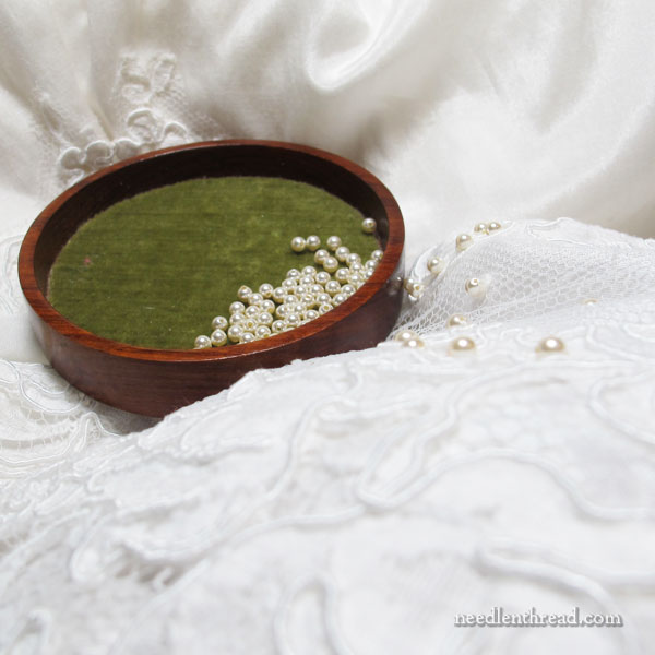
I’m also going to share a picture of the wedding dress that I mentioned the other day, for those who asked. And there were many of you who asked!
The last many months, things have been a bit discombobulated in my life, but I think (I hope) that life will settle down into a controllable routine for a while now. There’s much to catch up on behind the scenes, and I’m working again on a normal publishing schedule for the blog. As the days unfold, you should notice a little more regularity here, if all goes as planned. Thanks for sticking by me!
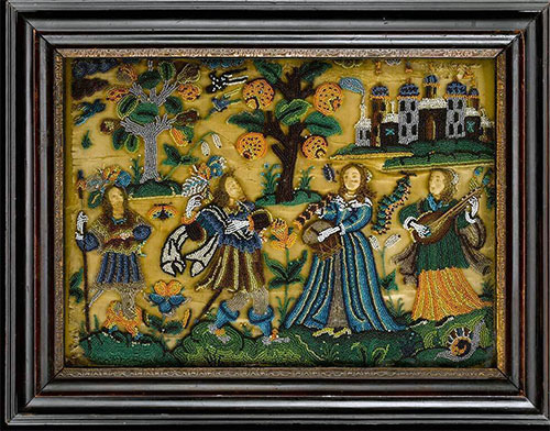
Ok, to move forward, this is time sensitive information. October 2nd and 3rd, an auction of a fabulous collection of historical needlework is available online, and I want you to know about it. You might not be able to participate, but you can certainly take a peek at the items being auctioned and perhaps glean a bit of inspiration for your own pursuits.