


Selecting colors of threads for an embroidery project can be a pretty daunting task! On the bright side, when it comes to working a spot sampler, you aren’t restricted in the same way as you would be if you were embroidering, for example, a picture.
I’ll tell you right off the bat that I’m no expert in color theory! But I’ll show you how I went about selecting colors for the spot sampler, in case it helps.
First of all, whenever I’m working on something like this sampler or anything else that leaves me pretty free to choose whatever colors I want (for example, embroidered flour sack towels that I use as basket liners for gifts, and so forth), I limit the number of color families I’m going to use to a maximum of four (and sometimes, fewer!). I also allow for some shades of brown, in case I need them for anything specific (in case an animal creeps into the sampler, for example… or a tree trunk…)
I don’t really take into consideration the ground color on this type of project, either, because for me, it’s usually white. (If you do use a colored fabric as a ground, you should take the fabric color into consideration and lay out your threads on the fabric to make sure they work together.)
I consider what the purpose of the project is: will the finished project be displayed, and if so, where? With the flour sack towel in the example above, I planned to line a gift basket with it, to give to my sister, who uses a lot of sunshiny colors in her summer table linens. So I chose the colors accordingly.
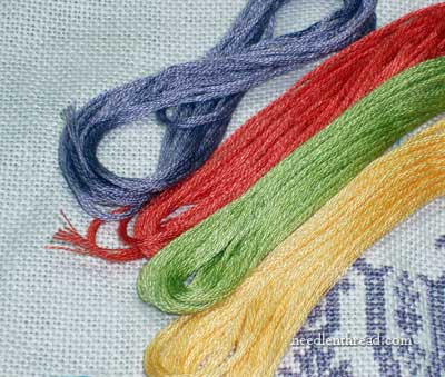
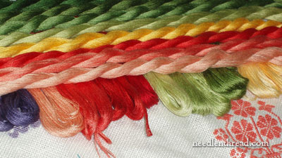
For the spot sampler, if I decide to frame it, I would want to hang it in a specific room in my house, so I took into account the colors in that room – periwinkle, white, and yellow. I added the coral for a touch of contrast, to brighten things up. The green works well with all the colors, and is necessary for stems and leaves, which will undoubtedly turn up at some point on the sampler.
So you see, it wasn’t a very scientific way of selecting colors, in my case! In fact, for projects like this, I think color selection can be very subjective, unless you’re trying to imitate a historical sampler or something of that nature.
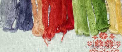
While I only have four color families for the sampler, I have a range of shades within those color families. This will allow me to do some shading, to add a bit of depth to different elements, and to combine different shade ranges of different colors for a little variety.
The sampler is primarily being worked with a 6-stranded cotton floss right now. I’m using Cosmo embroidery floss for my sampler, but my high school students are using DMC, because it is readily available and less expensive. I chose to use the Cosmo to avoid using class supplies.
But I’ve also selected some DMC floche from my stash, in a matching range of colors and shades. I’m not sure I’ll actually incorporate any on my sampler, though, since my students won’t be stitching with floche. It’s a fairly limited-budget class (16 students at $80 each for the year). I need to make sure we have the funds for next semester’s work. So I’ve had to make some prudent decisions on materials, one of which is that, for learning stitches, we’ll stick with the less-expensive DMC stranded cotton. And hey. It works!
But for your sampler, you might consider various types of thread. A sampler is a great way to get familiar not only with stitches, but also with different threads. And the combined results in one piece of needlework can be very interesting. (Come to think of it, it could also be ghastly, so choose with discretion!)
That’s how I went about my color and thread selection process: 1. I limited my color palette to a maximum of four colors (and if necessary, some matching browns); 2. I considered whether the finished project would be displayed, and if so, where; 3. I chose a range of shades within the color families; and 4. I went through my stash and picked out other types of threads (floche, in this case) in coordinating colors.
For those who struggle choosing colors, by the way, here’s some great news: Trish Burr is writing a new book on color selection in needlework, due out next year! I’m looking forward to that!
If you’re interested in following along with this whole Spot Sampler Series, please visit my previous post on selecting and setting up fabric for a spot sampler.
And finally, if you have any input on how you go about selecting colors for your projects, do share! Leave a comment below with any tips or suggestions!
wonderful article! Color selection always throws me for a loop–this is really helpful. Thanks for your blog. G.
Hi, Mary
Your posts are always food for thought. I use a max of 4 colors in my embroidery and sometimes even lesser. For me, it is gut instinct as to what looks good and more importantly if the colors gel well for the project.
Hi Mary,
I first want to tell you how much I am enjoying following this class and it’s progress. This is such a wonderful opportunity for the students to learn about a craft that is part of our heritage. I love following every step you are taking with them and can’t wait to see the results. I have tried to start a similar class in our local high schools only to have the concept fall on deaf ears.
Color is my passion. I am an interior designer and have studied color extensively. There is a contemporary artist named RobertBurridge, from whom I have learned a lot about color selection.
http://www.robertburridge.com/
Bob uses the Munsell color wheel to make his selections. Munsell is a process and is slightly different from the regular color wheel most of us are used to . I won’t take up valuable space explaining because Bob does it very eloquently on his site and has a small, affordable, portable, color wheel I couldn’t live without. Suffice to say that the concept is: flanking colors with other colors makes the center of interest “POP”. The “spice” colors that are recommended furthers the depth and center of the piece. It does take a little while to catch on. Bob works in paint not thread, so the translation can also be complex. Once you get it – it will makes a tremendous difference in the color selection process. Bob is always ready for questions and promptly answers them too. I hope you enjoy this concept. It really works.
I so enjoy your daily communications and admire the breadth of your dedication to this art form!! Thanks!!
Karen
Hi Mary, Thanks for sharing – it’s fascinating to follow the processes that you use. I do much the same, but one thing that I sometimes do when choosing colours for something a bit abstract (i.e. not bound by greens and browns for a natural scene or something) is to choose two complimentary colours (e.g. red/green, blue/orange, violet/yellow) and use those as my main colours in approximately a 3:1 ratio – very approximately! Then I get less scientific and just throw other colours at it for highlights and accents, usually as I’m sewing, rather than in advance, and see what works!
Hi Mary,
I’m very interested to read about your sampler. I find it a very difficult job to choose colours. Those I think make a nice match sometimes prove to be a ghastly combination when they actually go on the fabric. So when I’m planning something from scratch, colour is my biggest headache. So, sorry, can’t be much help to anyone in describing my system of colour combination.
I really want to make a sampler based on a historic style, but made up of motifs that have meaning to me. Are there any good websites to find sampler motifs?
Hi, All –
Thanks for your comments! Like I said, my color choices are hardly scientific!! But so far, they’ve worked well together on the sampler.
Metanoia – hi! – I’d check out Needleprint. Jacqueline specializes in historical samplers and has lots of collections of motifs available (for sale). As far as personal meaning goes, though, you may have to develop some of your own motifs, if you’re trying to get across a certain “story” or something.
Hope that helps!
~MC
There are also some color theory books for art that are good and a bunch of knitting books which deal with color choices. Then there are sites like http://www.knitpicks.com and interweave.com. A good place to start is to choose colors that are across from each other on the color wheel. These are complementary and can add a nice contrast. If you want three or four colors you can add colors which are next to the complementary colors. For example, red is complementary to green. For four colors, you could choose a light blue-green and a light green-yellow with a red-blue (like a raspberry) and an orange-red. Alternately, you could use red and green with one of the colors on either side of the red and green. This could be red with a red-blue and green with a green-yellow or red with an orange-red and green with a blue-green. It helps to look at an actual color wheel to see the colors that fall in each section (a peach would fall in the orange-red range, for example.) You could also choose to go monochromatic and choose blues that are next to each other on the color wheel or choose hues of a specific color (a light, medium, and dark shade of blue.) If you want to add a neutral, check that it is in the same color range as one of the colors you’ve chosen. If you have no greens in your choices, you don’t want a greenish beige or brown. There are plenty of color wheels online or some craft stores and most art stores have them at inexpensive prices. You can even find them with additional sliding pieces of paper with small pie openings which will help you choose good combinations.
Thanks, Mary for the great tips on selecting colors.
Color selection is always an enlightening process for me. I’ll have an idea in my head, but when I put thread to fabric I am almost always surprised at the outcome. I have started doing tryouts on the fabric before I decide. I usually just sketch a simple shape on a corner or edge of the ground fabric and stitch similarly to what I’ll be doing on the pattern. I almost always do not get what I’m after with my first pick, so I guess I have much to learn about thread color selection.
lin taylor
Hi – I just wanted to say a great big thank you for your wonderful newsletter – it makes my day and my week. You are truly an inspiration and a champion. Please be encouraged by this, as you encourage and draw out just the very best in me for my stitching and urge me to carry on when sometimes that zing is gone. Have a great day, be encouraged and remember you make a whole lot of difference in so many lives ………..
Thanks, Jocelyn! 🙂
Interesting comments on selecting colors, by everyone. I can see picking colors based on recipient (including yourself), as in do they like bright ones vs earth tones for example. But I’m not sure about picking color based on what colors are in a room. Had I stitched something based on colors I had 30 years ago, it certainly wouldn’t go with what I have now. Or I may very well change my mind on where the finished item will go. Wouldn’t it give more flexibility to do the item in colors you like and then do the finishing/matting in colors that go with the room? That way it could be re-done if/when the room colors change?
The colors I used in rooms 30 years ago were not really the colors of my choosing – I had not yet matured enough to put my foot down and say “I know those are in fashion. I know that’s what we grew up with. I do NOT like those colors in my house!” OK, I think I actually said something more like “that couch is getting tatty & uncomfortable, how about a change?”. Then over time, it was new carpet (gray), new curtains, etc. Now I’m back to brown carpet, but it’s not the rust-brown of the late 70s-early 80s.
I guess my point is, if I had stitched something in the rust/golds of the 70s, it would not go with the current colors. However, if I had picked colors I loved, it could be rematted, retrimmed, reworked so it still would fit into the scheme.
Does that make any sense, or am I babbling again?
Hi, Gail – Yes, I see your point, and it makes a lot of sense. At the same time, though, if I am going to hang something in my house now, despite future redesigning, I do like it to “match” as much as possible the present decor, especially when it’s something like this. I don’t see the piece actually lasting as decoration ad infinitum – I change the things that hang on the walls quite a bit. But for now, it works with the present decor. Later on, it may not, and that’s ok with me. It might look good somewhere else by that time, or it might just serve as a teaching piece. I pretty much chose the colors because they are colors I like right now, whether I’m hanging the piece or not. A sampler doesn’t have to serve a decorative purpose, but if it is going to, then I think it makes sense to consider where it is going to be displayed.
I actually started thinking that it might develop into something that would make an interesting large album cover, or pillow, or something. I wonder if I could make a 16×16 scrapbook of this year’s class, for example, and make the sampler into a cover? I don’t know. Actually, knowing me, it’ll probably end up being a reference piece kept in a folder for future classes…..!!
Thanks for the link Mary. I guess slowly develop my own is what I’ll have to do. I want to bring elements of the owl and the pussy cat story through it. I have some small graph paper and I’m starting to draw random motifs that look interesting to get going. It seems that a good online reference is lacking these days. I remember 10-15 years ago it was much easier to find free references online.
PS. I’m now following needleprint as well. Looks like a great blog. Thanks again 🙂
Hi I am a bit late, but if you are interested in gardening and not just stitching you may want to give a look to this book:
http://www.amazon.com/Well-Designed-Mixed-Garden-Building-Perennials/dp/0881925594
I pretty much follow my istinct when choosing colours, but if you find it challenging there is a very good chapter about it inthisbook, and useful tipsall through the book. I don’t suggest to buy the book for stitchingpurposes only, but if you are also a gardener it is a really nice book. She has a very bold approach to value and contrast, and the principles that are explained for gardening purposes are equally good in any field of art, I think.
Despite being a relatively inexperienced embroiderer I have been painting all of my life which is why I don’t usually find colour selection difficult: I think that embroidery is a difficult medium to get the hang of colours because any experiment takes a long while to stitch and it’s tedious to undo things if you don’t like them. I think that pottering around with a box of inexpensive watercolours and a couple of brushes is a very nice way to experiment with hues and values without committing to weeks of work for each combination! You don’t need to aim for accomplished paintings, just put colours together and see what happens! Also, keep your eyes open for colour combinations that you like, in whatever shape they come. Magazine advertisings, whatever the subject, are often very nicely crafted, colourwise, and can be used to chose colours if you don’t feel confident enough to go about it on your own. Even movies have become very colour conscious lately,notably so after The Lord of the Rings. Still pictures from many films can be used as a reference for super elegant colour combinations!
Thanks, Katy, for your recommendation! It sounds like a good book. Watercolors are a great way to work out colors for a design. Another thing I like using is prismacolor pencils (or any colored pencils, really). It’s a lot easier (for me) to take out a box of pencils than to contemplate getting out paints, washing up brushes, and so forth. Thanks for the tips on looking for color combos in other places, too – like ads and movies and so forth. Good advice! Funny you should mention it. I painted my bedroom after watching BBC’s most recent version of Emma. I fell in love with the periwinkle & white combo in one of the rooms on the set!! At first I thought, “This is really silly, painting a room because I saw it in a movie.” But once it was finished, I loved it! ~MC