While mucking about the other day with floche and satin stitch, I found myself wanting to check out a theory about contrast in stitches.
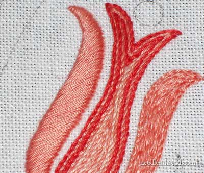
Imagine an embroidery project, where the one design has many separate elements. Try not to imagine a sampler-type design, with blocks or bands, but rather a coherent whole design, like the one I’m stitching on in these photos. (You can find a better view of this design in this article on embroidery design transfer – it’s the one on the right in the top photo.) Now imagine all the separate elements that make up the whole design stitched with different filling techniques. I think that it would look wrong – sloppy, even.
Now, mind you, I’m not saying that any embroidery with filled elements looks sloppy. Rather, my theory is that one design of many filled elements all stitched in different types of fillings might end up looking a bit bizarre and sloppy. Why is this? Too much contrast between the elements, taking away from a coherent whole? Perhaps. Too much for the eye to take in? Instead of the design producing an ordered movement of the eye, it may cause the eye to jump all over the place and not see the “whole” for the parts? Perhaps.
I don’t actually know for certain whether or not this is true. I’m just theorizing.
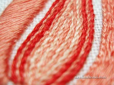
What I do know is that some contrast in embroidered fillings can work quite well. For example, the silky smoothness of satin stitch lined up next to the more textured stem stitch filling looks ok.
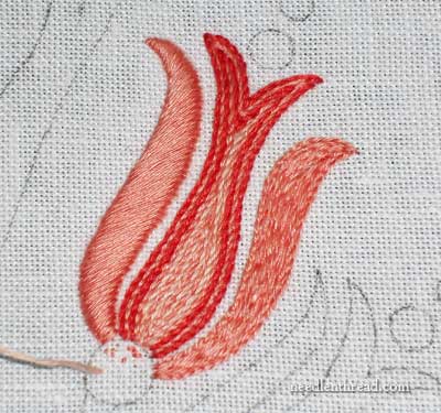
But if I were to leave the element on the right – which is filled with split stitch at the moment – as it is, it just wouldn’t look right, would it? Obviously, it throws things off balance. We expect both sides of that flower thing to be stitched the same, right? Even if the satin stitching that would be done on the right side of the flower is worked in the opposite direction (you can read about the correct slant on satin stitches here), it will still be satin stitch, and that’s what we expect to see there. Not only is the split stitch on the right a completely different type of stitching, but the stitch direction is vertical, following the flow of the element. The light plays off the stitches differently. If I were to leave that as it is, it would just look all wrong, wouldn’t it?
This isn’t to say that I’m shooting for a completely rigid symmetry in the piece, because I’m not. That’s evident with the shape of the center of the flower, which is somewhat wonky. And that brings me to a completely different theory, about shapes and fillings and stitch choice – but I suppose I should save that for another day!
So, what do you think? Do you think I can get away with using a slew of different embroidered fillings across the whole design, and still end up with a coherent whole? Any theories of your own on the subject? Feel free to leave a comment below and share them!


I agree with you. The satin stitch looks good. I like that combination. To add other stitches is too busy for me.
I like the satin stitch on both sides.
I think if the piece were something with movement, I don’t know – ocean waves or something, it could stand to have more texture. The flower is stable, maybe not serene, but calm. The sense, the feeling of the piece dictates the contrast or busyness of the stitching.
Thats my take on deciding what type and how many different stitches are used.
Mary, I agree that it could be chaotic on a delicate embroidered motif. However, here is another scenario. Take 2 canvas’ with identical designs, for example, a little church with a picket fence and wildflower garden. Do one of them entirely in Petitpoint, or Crossstitch. Do the other one in Needlepoint stitches that match the texture, such as the Bbrick Stitch for the brick steps, Slant Stitch for the grass gently blowing, and Lazy Daisy Stitch for the daisy garden. The result is that the first, single stitch canvas has a refined look, while the other, mixed stitch needlepoint has a charming rustic look. The choice comes down to the desired outcome.
I agree with you, Mary, that using different filling designs in a pattern would confuse the eye. To me, it would appear jumbled and chaotic. I would find it disconcerting.
Hi,Mary!
I’m new around here and a beginner,so I think would look nice on the right with satin stitch.This is my humble opinion…Aesthetically I think it can use more stitches,but stitch rate must match very well,like the pace of drawing lines.
It’s wonderful what you do here on your site!
God bless you!
I agree. Crazy quilting calls for contrast that leads the eye around a piece, but with your sample, the right side of the flower just looks – well, wrong. The formality of that kind of embroidery want more symmetry.
Hi Mary,
(In my opinion, take it for what it is…) I think the effectiveness of using a combination of stitches together depends upon the design. I believe there are three main factors in whether this will works or not.
Design:
This will work if, and only if, there is a duplicate or multiple portion of the design element that can be repeated. It will be the repetition of the dissimlar stitching that visually unifies it. (I’m thinking of Jacobean Crewelry.)
In fact some people, who are very animated in their design preferences, prefer this kind of busyness.
Technical Execution:
It usually only works in the hands of someone who has really spent a lot of time mastering design, composition, and the technical aspect of their craft. This is because the uniformity of the stitching, or painting, or metalworking (whatever the medium) is refined enough to give a sort of social credibility to the piece. This is more important than most people realize, especially when you start looking at how tastes and trends change over time. (I’m thinking Victorian or Bauhaus sensibilities here.)
Social Credibility:
Beauty is in the eye of the observer. An amateur can look at something produced by the hands of a master and will think, “Someone this good, wouldn’t spend this much time creating something this dissimilar without a good reason. They must be playing around.” *wink* (I’m thinking of Picasso here.) You have to look at this kind of playing around in terms of an artist’s overall body of work.
Synoposis: In the hands of a beginner, it could look pretty yucky. In the hands of a master, there’s a whole lot of leeway and it’s the fine details that years of mastering a craft that will determine whether it works or not.
I’m of the opinion that the flower would look rather “wonky” if left as is. You do expect the right and left sides of the flower to be somewhat the same. And it’s a small design. But when you did your fish project in blackwork, you used all kinds of different stitches and that looked wonderful. It also brings to mind the turkey and all the different stitches used in that project. I just don’t think it would look right on this flower though. My eye could not settle, it kept trying to settle on one spot and it couldn’t…..
You can combine fill patterns if you balance them against one another. Crewel work is an excellent example of fill patterns successfully combined. In the case of your flower, the split stitch is closer to the fabric than the satin stitch. Add in the difference in texture and light-play, and you have three attributes that clash between the petals I think you can use the split stitch successfully elsewhere in the design, just not there.
Yes, it could be “busy” or confusing to have too many types of stitches. On the other hand, if both outer petals are satin stitch and the inner portion left stem stitch, it would be very symmetrical. Symmetry tends to be formal. If you do the other flower in the same way it could be quite lovely!
In college journalism 101 we were taught to never, ever use more than 3 fonts per page. The fewer the fonts, the more staid & serious the page. I suppose this could be applied to embroidery stitches as well.
Mary,
I believe you could do different filling stitches within a pattern and even within one element on a pattern. I agree that the two sides of the flower thingy would look best with the same type of stitching while the center could be different. I was just looking at the Jacobean patterns on your website and they look pretty with the different patterns that could be filling stitches. It really sets off the different elements in the pattern. I guess it would just be a matter of preference and how the pattern is set up.
No matter what type of embroidery you are doing you need balance balance balance to your design, the colour and texture, only then it is pleasing to the eye.
I thought of Mountmellick Embroidery and some of Yvette Stanton’s designs from her book (Mountmellick Embroidery: Inspired by Nature). Like nature, the designs have consistency within each element, but there is also an exhilarating profusion of texture and stitches throughout each design. I agree, however, that this does not work for every design or technique, but it seems to be what gives Mountmellick Embroidery its characteristic exuberance.
In my opinion, I would agree with you and commenter #8 that the overall design would be what is important in dictating stitch pattern. You could get away with different stitches such as in your contemporary blackwork fish but not in a more formal pattern such as the subject of this newsletter. Then again, in school when I was growing up, one couldn’t get away with coloring the sky green either!!
My eye couldn’t find a satisfactory place to land on the design as it is. Something about the difference in height between the left- and right-hand petals kept throwing me off. Also, the smooth texture of the satin stitch doesn’t mesh quite well enough with the varied texture of the other two filling elements. If you found another stitch to address these two issues (I can’t think of one right now), I think it would be even more lovely.
I would recommend doing the flower part in satin stitch and the outer petals in stem stitch. It would represent the rougher outer shell/petals/leaves of a flower with the softer inner core. But otherwise, not too many different stitches.
I agree Jodi. Jacobean work has many, many kinds of stitches used in a single piece of work. In fact it is the diversity of the stitches that helps define the piece as Jacobean – that and fanciful abstract forms. But, even in Jacobean work, there must be a balance of stitches, forms and colors or the piece looks unsettled. In Mildred Davis’s book, The are of Crewel Embroidery, she talks of working in triangles of color, size of forms and kinds of stitches. While that is a old book it still has much to offer those interested in designing their own embroidery and having balance in their finished project.
I believe the types of stitches used sets the mood of the piece. Or perhaps it is the mood of the defines the stitches to be used. Also I think some types of threads work better with some stitches than others.
So perhaps it is not so much the matter of using different stitches as it is what style you are trying to present, the end use of the finished piece and the over all balance of the completed project.
Well, I hope this doesn’t end up sounding too highfalutin’, but I think when you design a piece of needlework, you give it a kind of grammar. So, for example, if you establish an outer petal in a satin stitch, you set up an expectation that all outer petals will be in satin stitch.
Also, I think there’s an expectation that there will be a level of symmetry to smaller elements within the same design.
So, for example, you could have a piece with six of these flowers in about the same size and successfully work satin stitch on all the outside petals, or probably just as successfully, work each set of outside petals in a different stitch for each flower. What would look very strange, though, would be to have five flowers with outside petals in satin and one in, say, chain stitch, because we know the elements are similar and we expect that similarity to be born out in the execution of the embroidery.
Of course, acknowledging that we have these sorts of expectations is the first step to selectively thwarting those expectations, which is where, I think, the good becomes great. So maybe in the example above, one of the flowers IS rendered completely differently from all the others, because that’s the one that a girl’s hand is reaching for. (I know, that’s kind of a lame example, but you get the idea, right?) Then there’s a good reason for the different treatment, and it adds to the piece.
I like it. I think the colour scheme gives it coherence to compensate for the different stitches and, if it was me, I would get rid of the satin stitch. It seems so bland (satin stitch in general, I mean, your execution is lovely).
It seems like the Jacobean style does just that, doesn’t it? If it’s used all over, it seems right. Now, whether one Likes the look is another matter…of taste.
I agree with you Mary. I remember reading a document that someone had printed out from their computer, many many years ago. Every few words, they had highlighted a word by using a different typeface. There were probably over 20 different typefaces used in a document that was only a page or two long. It was completely over the top, and completely distracting.
What it said was “Look how many different typefaces I have on my computer!”
Similarly, an embroidery that uses as many different embroidery stitches as possible, with no regard for balance, would probably say “Look at how many different stitches I know!”
In Mountmellick embroidery, when we sometimes do use quite a number of different stitches, there are usually a few stitches that are used over and over, bringing balance to the design, and giving a sense of order to it all.
It also makes me think of garden design. Usually a good designer will reuse plants in various places, as a unifying element. There may be quite a number of different plants in the garden, but the repetition of the same plant brings the garden design together as a whole. If you think of a garden where every plant is different – different textures, different coloured flowers, different coloured leaves, different leaf shapes – it would seem bitty and disconnected.
(After writing my comment, I’ve now gone back above and read the previous comments. Interesting to note that someone else mentioned typefaces, and another person mentioned my Mountmellick book! So my only original contribution is the garden design bit. But you can have the other thoughts as a bonus! 😉 )
Hi Mary,
I just finished a piece where I did exactly what you’re wondering about. The design is from an 18th century floral bed cover. I used floche a broder and stitched every flower with different stitches. I was doing it as a fun, experimental piece but I quite liked it when it was finished. It’s like a cottage garden: many flowers but each one different. To give the piece some uniformity I did all the leaves using the same stitches. It is one of the least formal pieces I’ve done but charming in it’s exuberance.
Liebe Grusse,
Kathy
I agree with you, it doesn’t work. I do not have theory it is just the look of it. I would use satin stitch on both side.
I thought, until I read the responses, that you were talking about using different filling stitches underneath the satin stitch “leaves.” I didn’t think they would look all that different to the non-stitching viewer, but would to someone who stitched. If you are talking about leaving the various stitches as part of the overall design, I feel the two leaves need to be stitched alike, and the center can be different. Isn’t that how the old Jacobean stitching was done?
Hi, All – Thanks for your comments!
Just to clear up a misconception, just in case there is one… the petal on the right, in split stitch, is just the padding for the next satin stitched petal. It will be satin stitched! 🙂
I’m not going for a Jacobean look, either, really. In fact, the piece is just an “experiment” so I can take some up close photos of some solid filling techniques. While I was hastily stitching away, I found myself musing over fillings and how they work together. Or how they don’t work together, depending on the piece!
I’ll probably pursue the topic again a bit later, to show you what I’m doing.
Thanks again for your feedback!
MC
Mostly I agree with you, however I can imagine a case where it would actually work quite well. That is if the design were something very Picassoesque. He’s the only name I can think of at the moment, but any art in that style might be enhanced by the very different stitches. Seeing what you have done above actually made me think of that style.
I think that when an item is more or less symetrical, like this flower, we expect it to be the same on both sides. Whether this is due to training or hard-wired, I haven’t a clue. I think that’s why your blackwork fish worked with all different stitches, we don’t expect fish to be the same front to back and top to bottom. Had you wanted to use chain stitch as the 3rd petal, it might work if done a shade darker to give the impression of being in a shadow.
Mary, I heartily agree with you! If one did as you said, filled all elements with different stitches, it would be too “busy”, and the eye would skitter along the top of the whole design instead of being able to find some rest spaces to stop and enjoy the view. That understanding isn’t “rigid”; it’s good design.
Same stitch, multiple stitches, different colors, different thread weights/# of strands. Lots of decisions. I don’t have a lot of experience with this, but I’d make it based on the rhythm and balance of the piece and the general style. What’s in the foreground vs. background? Where do you want the viewer to look?
The comments above seem to be saying the much the same thing.
Thanks for sharing your process. I learn a lot from it.
I like the different stitches in the design and think it will work to create a cohesive whole. It adds texture and complexity to your design. My vote is go for it!
No theories of my own on this. Kind of like the Supreme Court Judge said, “I know it when I see it” although he was referring to pornography. ha I know when I like the way something looks….and when I don’t. Not complete balance, but……..
Hi Mary,
I think you’re right about the coherence of a design depending on some balanced and predictable elements. I do think blackwork is an exception, but I’m not sure why.
I agree that we do expect some symmetry when we stitch elements from nature. Although as a quilter, I also know that sometimes we can develop symmetry in our artwork by using random small pieces of color or stitchery all over. Think of the leaves that fall from the trees in the fall in no real pattern, but they create a combination of colors on the green grassy floor of the yard. These leaves are not plain brown, nor laying in the same direction, but all over in different sizes and shapes and colors that bring us into the whole. Having said that, knowing which way to stitch to make sure the lines grow the right direction or the grain lines of our fabrics are straight makes a huge difference. As usual it is the subtle small things that make the difference when the large things are odd and whimsical by nature or by contrasted designs.
Well, I’m late coming to this discussion, but here’s my take, for what it’s worth.
That flower all together is one element — or more precisely, I see the two outer petals (the one that is satin stitch, and the one that will be satin stitch) as one element. When working on a piece and trying to work out a variety of stitches to use, first I have to identify what are the “elements” — then I normally have each element be all the same stitch. The middle of the flower is a different element, then the leaves, and the other flower are also different elements. (I would probably make the two flowers match, though.)
Thus, if I wanted to bring in different stitches, I would, as you have here, do it in that middle section of the flower(s) and/or in the leaves — but then make that element all the same.
I am currently working on a piece that has a repeated element in each corner. Each corner is being worked in different stitches, but the unifying element, which will be a vine along the edges, will match all the way around. Matching the two flowers will unify the piece.
Now, if you used this whole element (the two flowers and the leaves) in several places of a larger piece, you could either use that as a time to play with stitches, or do them all the same. But, I would only change one element. So, if the same overall design appears somewhere else, then change the middle of the flower to chain stitch or another line stitch.
It’s early, so I hope that made sense.
You know Mary, what I try to strive for these days in my stitching is a harmonious whole. I look to Nature herself to guide me. There are so many wonderful stitches to play with, but it can be challenging to find just the right ones to use. I think harmony can be achieved by letting Nature guide us, and fortunately the shapes and sizes in Nature are wonderfully varied! It is that very challenge that makes me want to stitch to the best of my ability, and I know you are the same:) I can’t wait to unpack now our move is complete, and get to stitching! Lisette